When I saw Eliasson’s book in the library, I was really surprised by how emotional I still get just by looking at the name of him. The feeling of vomiting when I saw his exhibition last time in Beijing came back to me quietly yet so familiarly. And on the way back carrying this book to upstairs, I met a few friends smoking at the gate, they asked:“Oh, do you like his work?” I laughed and said “I kind of vomit last time at his exhibition, but yet I chose him to write an essay, I really can’t answer this question so frivolously now.”
Maybe that’s exactly why I chose his book, I want to discuss this complicated emotion in the form of language. Yes, language, by creating another kind of “reality” on the base of concept to connect with the “reality” he tries to present in his work.
What can I remember about his last work? I remember the crowded crowd in the orange light which made them look like pale zombie , and everyone was either taking picture or standing there for minutes without moving — taking selfies. Kids were jumping and shouting, having so much wild fun. And the air conditioner is working so good, maybe too good, maybe that’s part of reason I wanted to vomit, my stomach always react really strongly to cold air.
Why? I could’t stop asking myself at the exhibition, why I (and so many people) spent at least an hour on cars —it was a quite remote museum, to come here, to experience this kind of, what he called “Reality”. When we can see the real rain, the real sunset, is this kind of imitation “reality” of the nature, somehow touches us more than the real “reality”?
It is very beautiful, I was thinking, it’s almost like the beauty like when I see the real rainbow, then I thought about isn’t the vulnerable and unpredictable character makes rainbow so strikingly impressive? Then what is this ? You drive an hour and paid something like 20 euros, to go into this huge artificial box, which is so cold that makes you wanna vomit in the hot summer, and in this totally dark space when outside is so sun shining , you saw the beauty of nature, and you praised, “Ah, what a sublime scene of this blue planet that we call home.”
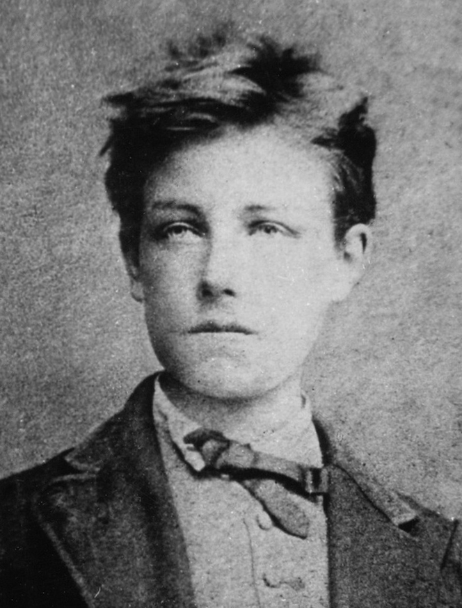
The big gazing eyes on the cover of the book grabbed my attention at the first sight,It reminded me of this poem from the French poet Rimbaud.
I also like it in black and white.It is not that I don’t like color. On the contrary, I think I like color too much to tolerant it being abused in a wrong way. And I don’t always have enough time to find the right color or the right combination of colors, so to keep everything minimal, I developed this obsession for black.
I also like it because the whole book is very thin, I like the artists who keep things minimal.I believe they spent more time in choosing behind the work, to only keep the best things.
When I opened the book, the vogue and zoomed-in images, it’s almost becoming some kind of abstract painting.I can only see the back of the models in the most of pictures, that also makes me feel attracted, the mystery in the movement go their body. They come and go at ease, at their own pace. They are very independent while I felt invited, but there is no pressure that I have to either.
I also really like the casual and comfortable feeling when they are in those clothes, they can run and dance at ease.It is them who is wearing the clothes, but not only as a living hanger to present those clothes.I think fashion design for me, in the end will come back to the point of how it actually makes you feel when you wear it.Do you feel comfortable in it? Do you feel restricted ?Does this clothes make you feel more of being yourself or somebody else?If it is somebody else, is it a better person or a worse person?
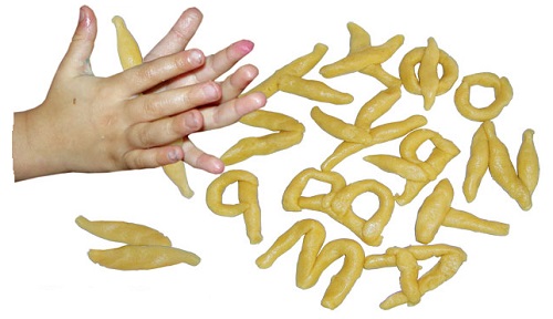
This image is from a project of an hanging typeface that René Knip developed with Janno Hahn for the art academy in Istanbul, Turkey. I thought it was quite a beautiful image regarding typefaces and it got me curious with this idea of building curtains through the act of connecting letters.
In the first place I think it is interesting that we are speaking of objects now. Even though this typeface can and does work in an independent way when printed on a flat surface or on a digital platform, its design was developed based on the fact that it needed to work as a physical thing. The letters needed to be able to be hung and to connect between themselves.
A drawing is a different mechanism and makes use of a wider freedom while when you need to construct or build something it is dependent on a big set of criteria. Not everything is possible and it is ok. 🙂 The material, the craft and the limitations of earthly conditions give some direction on the process of making the design. Possibly they add a new layer or content and richness.
There are two artists about whom I can speak shortly in this sense.
Karl Nawrot(x) is a french graphic designer based in Lyon, France. We can say he has a very hands-on approach on the process of developing his designs. The b&w image above shows two fases of the research for the typeface Lÿno that he designed in coöperation with Radim Pesko: first a sketch of cutout shapes made out of Albert Heijn packaging boxes that were later translated in a flat design. It is indeed a very experimental way of dealing with drawing, to try to find two-dimensional shapes through the making of three-dimensional sculptures.
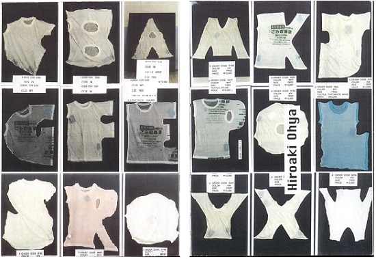
Hiroaki Ohya is a Japanese fashion designer that has been working on the issue of clothing through a more artistic perspective. She transformed old t-shirts into letters (second picture above), keeping recognizable elements of the t-shirt, as neck and arm holes, and making letters that are readable. They are intriguing pieces to look at, I feel, one doesn’t know if they are in fact still t-shirts or letters already.
~-~-~
B
Going a bit further I wonder what does it mean for a letter to become an isolated object…?
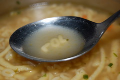
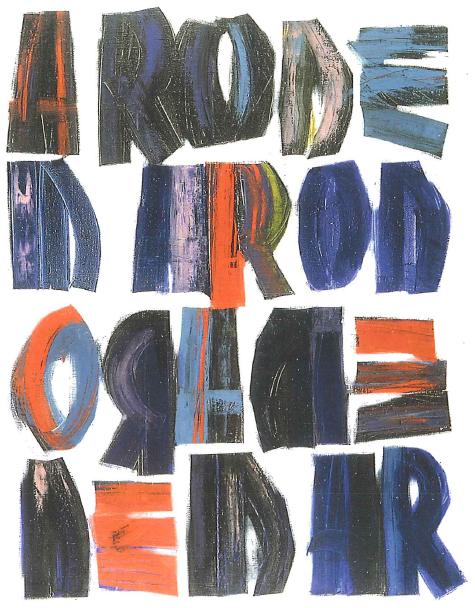
Look at that little G lost on the sidewalk…
(Probably nothing very important but) I cannot help myself from feeling a certain fascination, seeing them out of their context and physically engaged in my world. One thing about symbols and language is how abstract and mysterious they seem to be when you don’t know how to read them. And when they are taken out of their function of communication they get some of these qualities back and open up a space for poetic understandings.
One of the first times it did happen was probably with the invention of movable types on the Gutenberg press. Even though as stamps they were not meant to be read themselves, letters started to take up space and had to be organized by shape and volume, not as a message.
Representative of the democratization of books, letters as objects are also very representative of the alphabetization. It only makes sense to shape so many things in the world as letters because so many know how to read. And actually primary schools are one of the places where you are going to see more letters-objects and to hear the actual speaking of the A, the B or the C as individual entities. This is done in certain schools for pedagogic reasons to get the students familiarized with the alphabet before starting to make words and sentences
A possible association of meaning that one can make of letters as things is with the playfulness of childhood and all the memories of the beginning of education for those who can read. There’s quite an abstract feeling in learning and schools if one thinks of it…
“Do you know what ‘A’ means, little Piglet? It means learning,
it means education, it means all the things that you and Pooh haven’t got”
Winnie The Pooh
I found this quote in the book ‘One letter words, A dictionary’, by Craig Conley, in which he tries to find the possible meanings that each letter can have when used by itself. It is quite interesting to find out a letter can be or mean so much. However I also like the possibility of a more poetic and abstract meaning.
~~
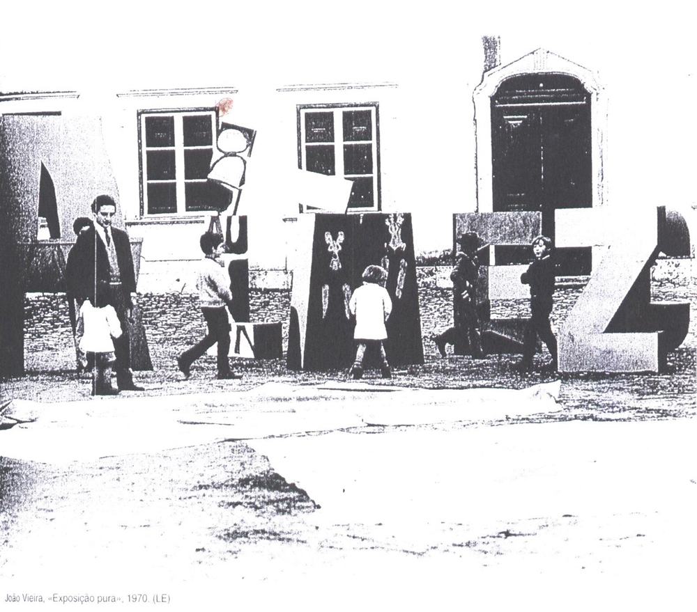
João Vieira (1934-2009) was a portuguese artist very much interested in the alphabet as a theme and on the idea of using letters as objects for their poetics possibilities. Like the situation of the second video above: “a runway of letters”. Which latent meanings are at stake? Or is it a formal exercise?
uma rosa é
Mainly known as a painter of letters,
he said in 2006 “I started to paint letters because I wanted to make poems with painting”.
Quite curious to see the way how this Portuguese artist dealt with the canvas since there is not so much tradition of painting in Portugal. There is a lot of literary tradition though. His first paintings were abstract and gestual and depicted simple shapes; later he started to work also with quotations from famous writers and with the form of the alphabetical letter by themselves. His interest by letters grew into sculpture and into performances. In his first performance The spirit of the Letter (1970) he built several letters in wood that were later destroyed by himself and a group of kids. It was the next year he did the performance Expansions (first video above) where he made giant ones out of foam, plastic and leather and used them to interact and play with the public.
~~
C
The Latin alphabet is based on sounds, the signs are phonographs, and I think it is where some of the interest of the topic lays. Each letter only refers to a sound that is a small fragment of a message. Without that it is a very vague and abstract form or thing and we are attributing to it the materialism of a physical thing. What does this object refers to anyway??
These letters are objects that can get old and used, they can be torn apart, they have a space in our bowls and stomachs. You can touch them, kiss them if you like, throw them in the thrash.
The same way that we animate objects in our imagination – as in filling them with life and identity – we do the same with this letters which is a kind of complex thing at this point. A mute symbol of a sound playing its life again. Yes, complex situation but only an ordinary detail of daily life business.
Writing this I discovered a new aesthetic language through the “way of looking” and the combination of possibility and imagination latent in it. This tends toward the potential unknown reality. The artist has an insight to see through various worlds and this inner eye allows the artist to experience the
other world beyond reality. The work created by this artist is the very gateway leading us to this place across time. Through the operation of thinking and recollecting, we are able to bring out the invisible time and space, experiences, reminiscence, and subconscious. What I have attempted to represent using a metaphoric form of visual language is the faint outlines of the invisible beings, the lingering ambiance of light, and the emotional respiration coming from the stream of subconscious, all experienced through the mutual perception of time and space.
My work intends to be vacant and open rather than to express many things. This is to induce the viewers to read the work as a reflection of their own experience and sensibility. I found that architecture and art consist of the inner abstraction and the perception of light and I have experienced the process of the works in this thesis that starts from the convergence of form, line, color and sensibility and develops into sculpture, painting and building involving space and light. The combination of form and color awakens the sensibility inside this. I tried to enable a more direct visual experience and bring out the abstract forms to the real space in order to substantiate them.
The geometrical forms in these works are imaginative spaces waiting to be filled with serene experiences.
I brought this abstract language form into my work and it will be originate from the restoration of imagination through the “way of looking”. I wish it did not remain in the state of merely reflecting the inner space but rather to be continuously reborn through various interpretations by being read as different stories and experiences.
text by Jisun Nowh [graduate student department of Inter Architecture]
Download my thesis:”Abstract Language of Space and Light;
The metaphor of perception in space and light for correspondence“
The Spirituals of Art – abstract painting 1890-1985 is a peek with a penetrating eye, into abstract painting, with paintings that has stood and still stand symbol for many radical thinkers ideas, and big leaps forward in the visual. From Picasso to Boccioni, from Malevich to Pollock, this “pure art” in painting has played an important role through-out its history, in art and still is. Follow as the Spirituals in Art – abstract painting 1890-1985 takes you on a photo-illustrated journey. An enlightening text, covering in detail the world of abstract painting, its mysteries, in solving many of its riddles.
“A line is a dot that goes for a walk” says Paul Klee. It is impossible to fully understand the genius mind, its visions, ideas, or something like Rothko’s great grief. His paintings however can tell us plenty of our world and personal struggles at the time of the masterpieces creation, and now, as before the works birth. In this book the paintings are presented as keys to great knowledge (also where to find the doors). Read about the process of abstract painters. Read about the progress of abstract painting through time and the conquests within the field. Easy to browse in, rich in information, this book is a true discovery and it is unique.
The Spirituals of art – abstract painting 1890-1985 ispart of the appreciated and influential book series Lacma, covering art with texts of renowned authors.
this post is part of he subjective library project "Unopened Book"

the book can be found at the Rietveld library : catalog no : 735.8-cat-9b