Skip to Content Skip to Search Go to Top Navigation Go to Side Menu


"art" Category


The Dice Man


Sunday, May 26, 2019
I browsed in the blog, partly floating, partly with full attention. I moved in the world of the blog through the tags on the left. I had a method: First post I choose randomly, then I scrolled down until the post ends, if something caught my eye or my mind, I lingered, wrote some notes, seldom made a screenshot.  Then, I clicked on a left purple tag that is located on the same line as the end of the post (the grey tagging section). I had some choice between 2-6 tags, depends on how big the grey tagging section was.

The first post was in Dutch, so the visualization was the only thing I had.

Grey Hypocrisy felt like it was made for me, the first hint, “quest for the dull”, he said. With an image of a room, with a personless solitary chair. These kind of rooms and chairs I’m trying to portray for a while.

5 years ago, Marlies wrote about Imme van der Haak . She reminded me of Yocheved Weinfeld,  Yocheved Weinfeld, and her artworks in the 70’s.

“why?”> ON QUESTIONING > “wrong side”

I encountered a post that was written on my birthday, and then a post that was written on my mother’s birthday. It’s gotta be a sign! I found myself looking for hints, not sure for what. 

Keep scrolling.

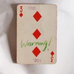
“warning” > “Ability to choose” >

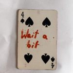
“waiting”! “For the next to come along.”

More and more hints. Like these sentences are designed for me. I realized that I’m browsing like I could wander the streets as a small girl: not being a “believing person” but to believe in traffic lights. wherever there is a green light is the way I should go, it’s the right way for me, no space for free choice, it’s from above. From the god of traffic lights.

> “waiting to be found” > chairs!

“Death”> “yellow and tiny”>

I agreed with Rosa Doornenbal, she wrote some nice stuff. I started to decide for me, what is a metaphor in this infinite data. To find the metaphors.

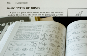
Marie Knudsen wrote about a jewelry book about joints. Extract from the book: ”A joint is a place where two or more parts are united or made to fit together.”– is this about silver or people? she asks herself.

for me, it was About putting stuff out of context on purpose. To give things meaning by taking their context away. It’s about the movement between the details and being far from the details until its abstract.

“alive”>”alienation”>”abstract”>”time”>”enjoying”>”no time”>”absence”>”all sort of apes”>”allegorical”>”queue”

brows like you are looking for a quate. Saw a quaote of Walter Benjamin: “Beauty is not the object and not the shell, but the object in its shell.” Ok. Maybe another day it will mean something, keep it.

“I would like to bring your attention to noticing things.” I think it’s funny.

Walking with a Line was beautiful. Made it clear for me that sometimes the combination of things punctuate your heart. The context is important. Context is everything. to put things out of context means just putting it in a new context, in order to look at them beautifully.

look at this together! It’s so different then as two solitary pictures. 

And this also, it does something only together, when isolated it’s almost nothing.

Scrolled more.

I see more chairs. Van Goch’s chair >”walls” >>>

The browsing led me to this:

“The Dice Man”

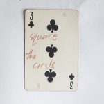
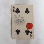
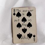
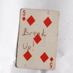
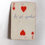
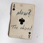
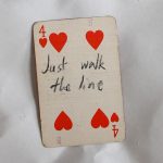
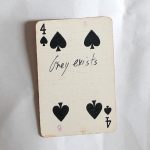
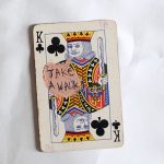
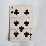
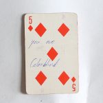
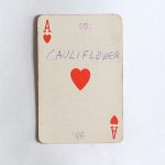
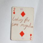
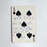
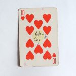
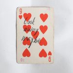
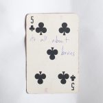
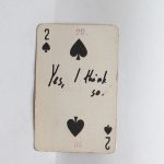
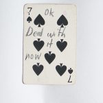
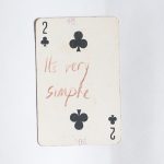
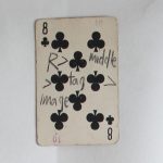
If you are looking for an answer for something, a hint, or that the cosmos will decide things for you, you are in the right place. This blog and this post in particular. You can try to find your answer in the cards below, just click on one and see what it says.

The dice man is a book that tells the story of a New York psychiatrist named Luke Rhinehart who, feeling bored and unfulfilled in life, starts making decisions based only on the roll of a dice. He can’t change the dice’s decisions, including decisions about sex, murder, rape, and more.

This is your dice.

If the cards are not enough, you can start browsing the blog looking for a hint for life or an answer, using the overwhelming amount of posts the blog has to offer and using the randomness surfing that is possible here. But you need a method, you can use mine:

First post I choose randomly, then I scrolled down until the post ends, if something caught my eye or my mind, I lingered, wrote some notes, seldom made a screenshot.  Then, I clicked on a left purple tag that is located on the same line as the end of the post (the grey tagging section). I had some choice between 2-6 tags, depends on how big the grey tagging section was. And then I continued to the next post, scrolled down, chose a tag one the left that is exactly at the end of the post, and so on.

The amount of time you should do it is as the number that is on your card, or until you find your perfect hint.
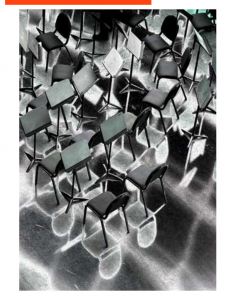
     

Construção


Saturday, May 25, 2019

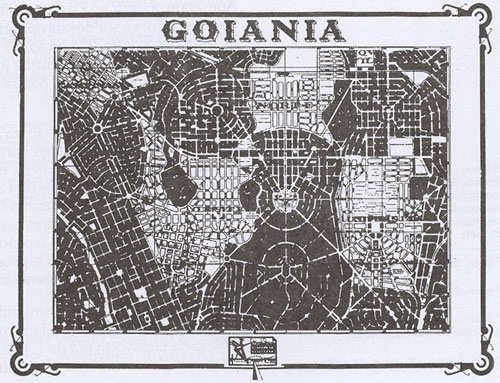
Searching here on the Designblog I tried to find something about my home country, Brazil. I did research about it but found very little significant posts, one mention over here another one over there. Tried something about my hometown Goiânia but there were no results at all. My wish is that in the future a student from my area bump with some content about us in here and get surprised.

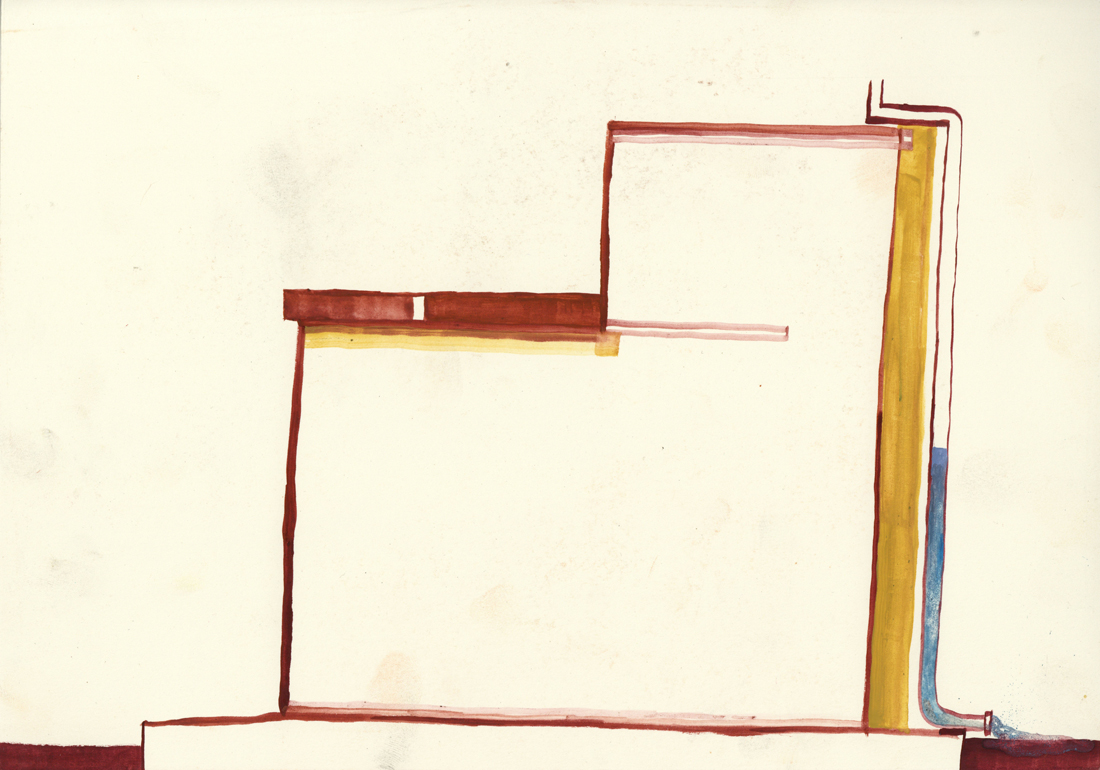
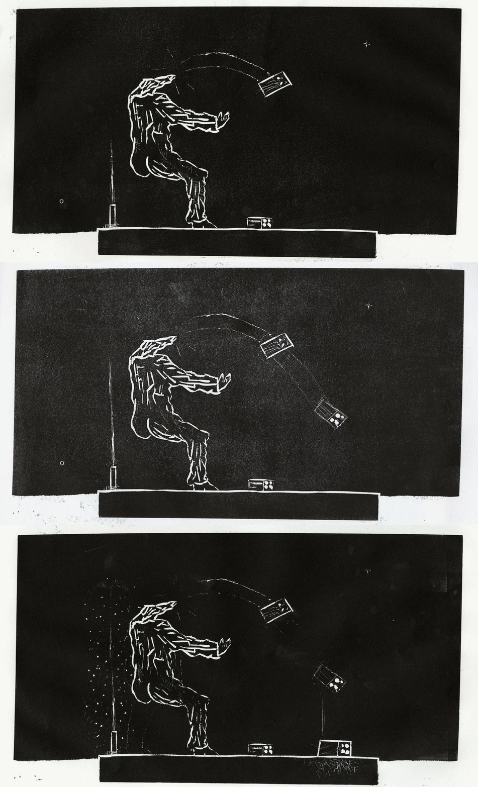
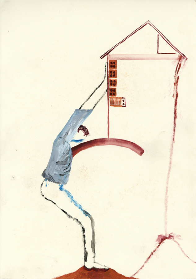
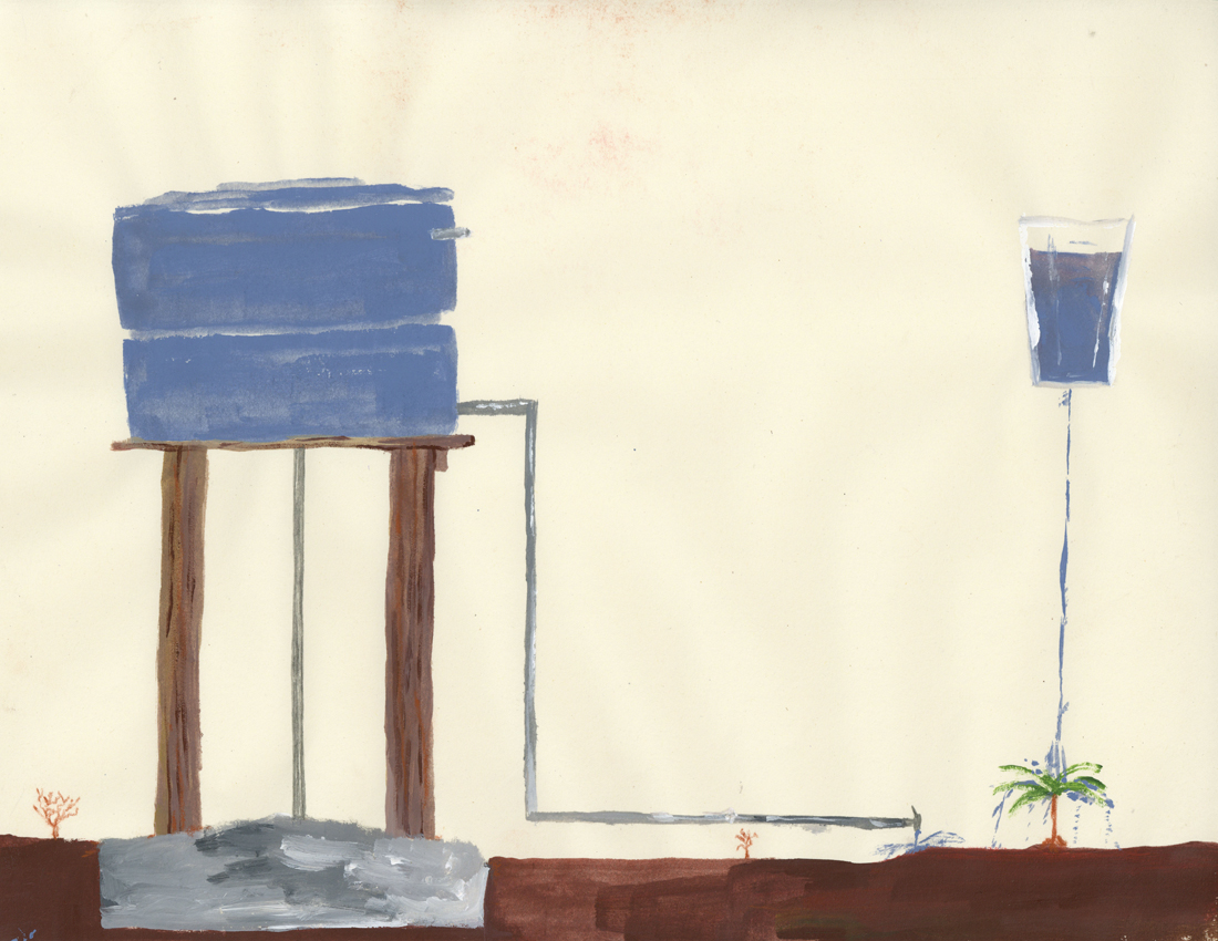
So here I’m going talk about housing in the area I come from, Goiânia, more specifically about construction, I think it’s a good starting point to build some content I would like to see in here too and it also goes along with what I’ve been researching through drawing.


A FOREIGN IN MY OWN PLACE

Living here in the Netherlands for almost 2 years already without coming back to Brazil really sparkle something about my hometown inside my brain. I like to remember about how the landscape looks like, cause it’s just so different from everything I see here, then suddenly I start rediscovering the place where I come from.

Compared to Holland or Amsterdam everything is more precarious, Brazil and the majority of people doesn’t have the same economic background that Holland has, the material situation is much different, what shapes and sculpt the land in a totally different way.

There was a initial city plan that started to be followed but because of many factors people themselves started to change the surrounding the way they could.


Living on a foreign country makes you be able to see with fresh eyes the place where you come from. My family never really traveled around so despite the images that I would see in movies, television or internet everything I would see was Goiânia, Goiânia and Goiânia. I never realised how come the place was so embed visually inside my brain. It came for me very strong recently, everything I would always see but take it for granted, it came back now for me as such a powerful visual source of inspiration.


1. HUMAN FORCE


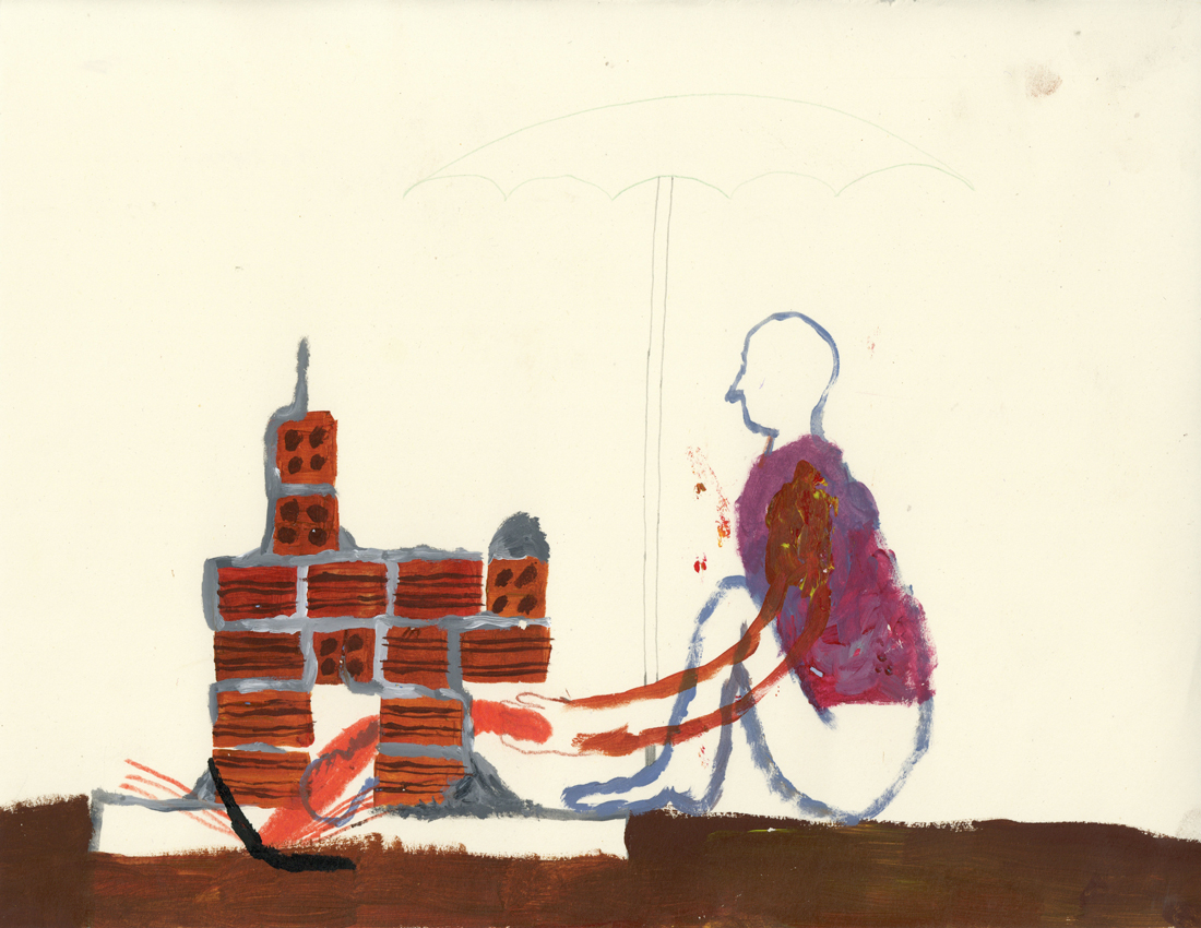
Construction work is normally made by man in Goiânia. It can be normal that the owner also works with the bricklayers and workers. My dad did help to build our house and others too, I remember that my neighbor too, it’s funny because in my dad’s house some of the walls are not so straight and there are always some sort of imperfections around. It’s also possible to build the house in the way you want, there are some protocols to follow but very little people follow it.

The human force can be found everywhere, there are many people working in the service sector in Brazil. It’s also very normal that a lot of jobs happens out of formality, so many times there is no contract or third parties behind the bricklayer and who is paying for the house to be build.


MAKING SHELTER

It can be pretty common that man work without necessary protection in constructions. Jaime was our home-keeping for a long time, and I remember when he did fall from a scaffolding during some work he was doing in my house. He was not specialized on that kind of service at all, he lost some nails in the fall, but he was fine.

Not only people can fall but houses that are build downhill can also fall and get destroyed, that happens often in some areas.


2. MATERIALITY


6 HOLES BRICKS

It’s the most used kind of bricks the 6 holes bricks as my dad says on the video above. I find it quite pretty, they are made out of clay and have a beautiful orange. The sun also make it shine when it’s pretty new.

It’s normal that families start constructions and sometimes the money is over but the house not. You can see many properties with unfinished houses and some material left. These days for me they look like beautiful contemporary sculptures. Symbol of something for the future. Makes me think about some of my plans and goals, the ones that if they were a house, they would be like this sculptures right now. Why did this action was stoped? Is the family taking care that the work continues? What are they dreams and visualisations for when the sculpture it’s done?


UNDESIREBLE BELLYS

Protection is necessary. Against the weather, non wanted looks and also from non invited people and it’s many non wanted actions. My grandmother lived in Urias Magalhães and she had pieces of broken glass on the top of her walls. The pieces were out of green glass and had a pretty colour, even though it did look quite frightening.

“Grandma, why are there pieces of broken glass on the top of your wall?”
“This is to cut the thief’s belly’s”


3 . GRAVITY 


THE LAST FACTOR

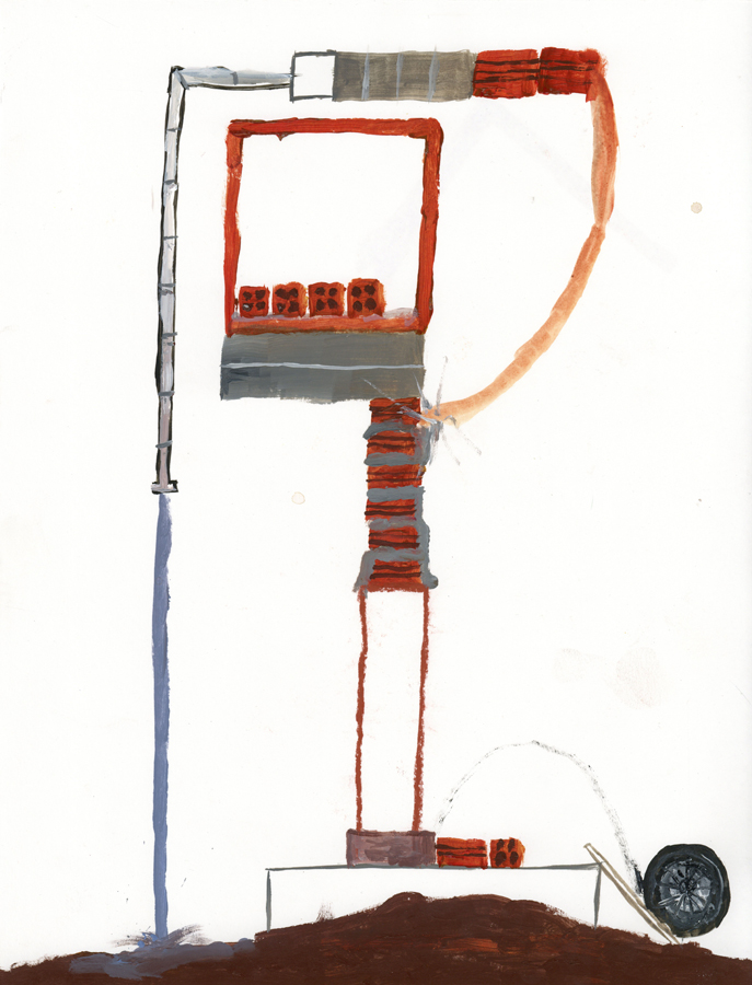
Gravity is an important law of physics, every act or move we do is subjugated by the laws of gravity, we are subordinated by it all the time, so wouldn’t be the case that constructions are out of nature laws.


One important part of a construction that also strikes me visually are water tanks. It’s something necessary once many neighborhoods don’t have sewage treatment sometimes. Water tanks have normally a wonderful blue that goes along with intense blue skies too. It can be normal in some areas to bring water fresh from the ground. It’s also normal that you dig holes and take a look if there is in your area some fresh water, then you are lucky!

I did drink water fresh from the ground my whole life and I prefer it’s taste then the water in Holland. Anyways, socially it’s more interesting that every single house has drinkable tap water available like Holland. In Brasil many people can’t drink water from the tap because it’s not healthy to do it on longterm, it has also a weird taste.

Some Brazilians living abroad are so culturally used to not drink water from the tap that even in countries like Holland they still buy water from bottles.


IT’S NECESSARY TO REST

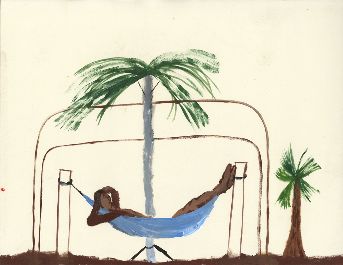
Hammocks were items designed by indigenous people in Brazil to sleep, rest, relax or even to see the time passing. It’s still a highly used item nowadays between Brazilians that normally put it in their porches. It’s not so used to sleep at night by most of the people but it is for naps in the afternoon after a huge almoço on a Sunday, together with the family, that’s a moment that hammocks are quite disputed, for example.

Even though people don’t sleep so much at night on it, the acupuncturist I used to attend told me that many back problems I was having by that time could be solved having a hammock in the room instead of a bed and mattress, he had one himself.


“To work is good but to rest after it’s even better”


Art School or Art Factory?


Tuesday, April 23, 2019

protest poster of rietveld students

The students and teachers of the Gerrit Rietveld Academie are outraged. Protest have broken out the talks of a strike are becoming harder and harder to deny. After a leaked email from the heads of the Rietveld Academie strongly suggesting what many student already suspected, the school is using the students as unpaid workers. There have been talks between students and some teachers for a couple of months about this development which by many is described as criminal and not from this time, anno 2019. The school is under investigation as we speak to see if the way the school has been treating the students is really unethical and it could result in a high fee for the school, the heads of the school are facing jail time and there are even talks about a complete shutdown of the school.

The Gerrit Rietveld Academie is known to be pretty closed off for the public. They don’t have to adhere to certain rules that other higher education institutes have to, like the fact that they don’t have work with a point system. Also does the school not work with professional educators, but with artist, although this is with common other art schools as well. This is so they say, art schools, to stimulate the student in there education in the arts. Being around real artist will help them think and work in ways educator could not. All this makes the school a hard institute to keep an eye on. Many question arise now if this way of educating should be allowed after the news broke.

I saw many of your new pottery yesterday. They’re almost all single pieces and it would be wrong if we wouldn’t find a way to make the really good work that is in the pieces not accessible for a bigger audience.”

“We need to find a way to reproduce some of the works with machines.”

These are some quotes that caused the outrage among the students and some teachers. The students are being used by the school as unpaid designers, if you ask the students themselves. ‘We pay the school a higher tuition fee than other school in the Netherlands and then your own school uses you and your hard work, to sell themselves and our designs to the public. Where is all this money going to. Why am I even in school. I could apparently just start for myself,’ says Maria Sløthja a graduate student for the DesignLab department. Second year ceramics student, Frank Trebull adds;’It is like we are student athletes, but then like student designers.’ Teachers are also not pleased hearing this news, basic-year sculpture teacher Laurie Nagette has this to say;’ We cannot forget that we’re an education institute, that should be our main focus, educating the students. We shouldn’t try to make money off on them, that’s wrong.’

How the email was leaked is unclear, but there is a conjecture that one of the heads of the academy leaked it. The mail in question was send to all the heads of the school. But the remarks were made by Stijn van Kleinheest, Chairman of board of Directors. The authorities are investigating him closely, and the school has put him on inactive indefinitely.

The academy is also facing a complete shutdown, which comes with an even bigger outrage from the students. Especially among the graduate student the outrage of the shutdown was the biggest. They are in danger of not being able to graduate in that state. The academy is trying to figure a way out to prevent this from happening. They also have a problem with accepting new students for the coming year. They are considering not accepting any new students at all next year, but the admission has already started. And what to do with the rest of the students that already are studying in the academy. These are real problems the school has to face and find a solution for. For now they do not seem to have any. The teachers are also in fear of losing their jobs, for many this job is something they do next to being an artist, however for others it is there only source of income. Working at the academy is a steady pay, with is hard to find when you are in the world of arts.

Bauhaus and Communism?


Monday, April 22, 2019

Let us therefore create a new guild of craftsmen without the class-distinctions that raise an arrogant barrier between craftsmen and artist! Let us together desire, conceive and create the new building of the future, which will combine everything – architecture and sculpture and painting – in a single form which will one day rise towards the heavens from the hands of a million workers as the crystalline symbol of a new and coming faith. 

In place of the old bourgeois society, with its classes and class antagonisms, we shall have an association, in which the free development of each is the condition for the free development of all.

Quotations from the ending paragraph of the Bauhaus Manifesto written by Walter Gropius and the the Communist Manifesto.

To me it is striking how both of these quotes talk about equalness, breaking away from classes – in society and in a working context, and how these changes will affect everybody. Yet, both ideologies, Bauhaus as a school and Communism as a form of society practiced around the world, has very prominent leading figures, who in one way or the other, has the power to rule over the students/citizens. For example, when Mies van der Rohe took over the leadership of the Bauhaus school (at this point it was located in Dessau) he had interviews with each student, to determine if they would follow the rules, else they would get kicked out. This can be linked to the arbitrary imprisonments in Cuba, happening both under Fidel Castro and now, as a higher power determining what you can and cannot do, in a society/school that claims freedom and equality as their main goals. The scale of these decisions are of course tremendously different, one is an entire nation and the other an art school in Germany, but still I find the similarities of the Bauhaus and Communism as ideologies and then as practiced in real life quite fascinating.

To look further into this, I have chosen to read Animal Farm by George Orwell and compare the degeneration of the animals original motive, to the Bauhaus and the Rietveld Academy as schools that are, at least to some extent, based on the same ideas of teaching. This, I guess, is very clearly seen in the Basicyear – Vorkurs in Bauhaus – which was created by Bauhaus teacher Johannes Itten

Animal Farm starts of with the animals dreaming of a better life, in which they are all equal and not treated as the means to an end, but like living beings with rights no different from the humans, who rule over them. When the opportunity for their dreams rises, they seize it and try to create a life and society where they all work and receive equally. The story is never specified as communist within the book, but Orwell has stated that it is an allegory to Russia, before and after the revolution in 1917 that then led them into the Stalinist era. This new society first flourishes and is enjoyed by most until one of the pigs, Napoleon, sees a chance to gain more power. He does so by constantly telling the other animals that this is actually what they want, that he is choosing to do and so in their service. Finally *spoiler alert* it comes to a point when the other animals cannot tell a human being from a pig, their “chosen” leader has become what they tried to escape and it seems like an inevitability that this should happen.

To me, at least, this bears a lot of similarities to how the Rietveld Academy functions. A way of showing and telling one thing, but then not fully living it. This can be seen in the departments, how openness and inclusivity is advocated, while in reality inter-fluidness can be quite hard to achieve as a student. With classes only for ones own department (as in TxT), extremely long waiting lists for facilities (as in Glass) and very limited opening hours (as in Ceramics). Of course complete freedom and total sharing is very hard to obtain, if not impossible, but should you then, as a school, really claim these traits? On the other hand, you could claim that TxT, Glass and Ceramics are some of the departments that actually live up to the heritage of the Bauhaus as they are somewhat material and technique based.

In this context I feel it is interesting to bring up the subject of the Fine Arts department, as this goes against all the teachings in the Bauhaus. Creating just for creating, separating art from everyday life, from the craftspeople, from the non-artist. The fact that this is now one of the biggest departments at the Rietveld, can be seen as a sign that the Rietveld is becoming what the Bauhaus set out not to be. It was an animal, that turned out to be a pig and is now indistinguishable from a human. Or almost, at least.

Finally, let us look at how the Bauhaus aimed to integrate art and life, to live with art, to build a gesamtkunstwerk, which is also very much apparent in their inclusion in arts and crafts – creating things that are not art for art’s sake, but are actually usable and meant to be used in real life. When paired with the exhibition Netherlands ? Bauhaus – pioneers of a new world, at Museum Boijmans van Beuningen, it can be eye opening to see that something that was initially meant for use and created in a sense of togetherness is now showed in vitrines, where you cannot touch, feel, or try to use the work for its purpose. Is this exactly the opposite of what the Bauhaus was trying to do?

Doing aerobics before painting?:


Sunday, April 21, 2019

When I first heard “Bauhaus,” my first impression of it was just “big movement important in the history of European art” Because I didn’t have much interest and think it was not really related to me but the Boijmans Museum’s exhibition of Bauhaus, where I went without any expectations, influenced me more than I expected.
The systematic learning of basic things, such as materials and colors, seemed boring at first glance, but turned out to be the most dynamic and interesting things. Exploring the properties of materials, understanding the various and contrary things, geometric shapes and colors are the most essential elements for art, but I had missed them.
Through the writings of Johannes Itten, founder of Bauhaus Vorkurs (preliminary course), I could understand exactly why Bauhaus put so much effort into these things.

Let’s take a look at the works that I saw at the exhibition and the writings of Johannes Itten together.

Two of the most distinct elements of Bauhaus: Geometric form and primitive colors

“The clear geometric form is the one most easily comprehended and its basic elements are the circle, the square and the triangle. Every possible form lies dormant in these formal elements. They are visible to him who sees, invisible to him who does not. Form is also colour. Without colour there is no form. Form and colour are one…Geometric forms and the colours of the spectrum are the simplest, most sensitive forms and colours and therefore the most precise means of expression in a work of art.” •1

It was like the playful work of children. It made me think differently about the concepts and the properties of materials that I had been knowing.

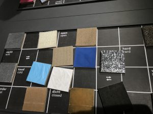
Forms and colours were discussed and presented in any number of polar contrasts. These contrasts can be presented as intellectual concepts…The students had to present these carious contrasts, separately and in combinations, in a manner that allowed our senses to perceive them convincingly.” “All artistic effects are based on the creation of contrasts. We not only studied their contrasts – smooth-rough, hard-soft, light-heavy—visually but also explored them with our fingertips…To deepen and control the experience, students had to contemplate, touch, and raw these textures until they knew them by heart and could reproduce them out of their inner perception, without the natural model.” •2

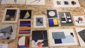
Among the many exhibited items, the drawings that caught my eyes turned out to be Vorkurs works.

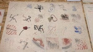
I was fascinated by these rhythmical lines and colors 

“ The teacher’s most difficult problem is the liberation and deepening of the inner spiritual sense of perception. To conduct exercises in that area one needs a very pliable, labile material which reacts immediately to the slightest motion of the hand. I used india ink brushes and soft charcoal” “The success of these studies wholly depends on the student’s ability to overcome his intellect and the function of his senses and give himself totally to spontaneous feeling. An inner automatism quite naturally gives a convincing outer form to his feelings.” 3

Johannes Itten’s ideals of education were very impressive and as a Gerrit Rietveld student, I related to that.
Itten found it difficult to judge students because they all have different talents and characters.
So the vorkurs was built, and students were able to have time to think fully about their interests and aptitudes as they went through this course. I think it is the same reason why Rietveld Academie persists in the basic year while many other schools have given it up already.
Students at Bauhaus had to explore and enlighten themselves without relying on the knowledge from the outside. Itten emphasized inner growth and self-examination, so he went back to the quest for more basic things and helped discover students’ interests and talents through them.

I felt lost when I came to the Rietveld Academie at first. I was used to the crammed Korean education, that was why it was difficult and awkward for me to think about myself and being on one’s own. Now I’m used to it and this new way of education has given me a chance to think deeply about myself.
Drawing and painting, theory, design, mixed media and sculpture, learning these five subjects, and using various workshops, I could see what I liked and disliked, or what I didn’t do well. The fairly free atmosphere of discussion and feedback also helped me broaden my horizons.


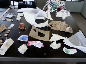
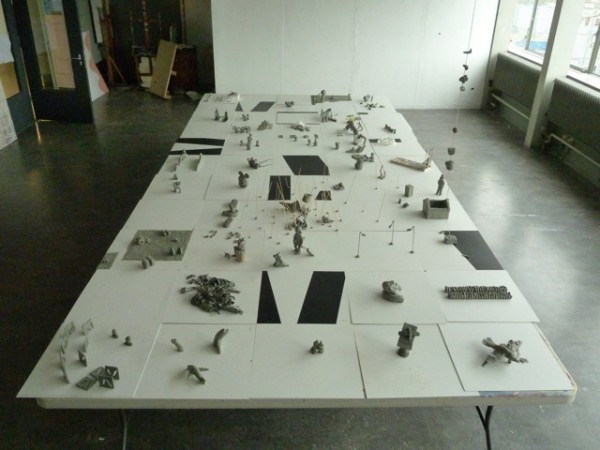
Pictures of Rietveld Academie basic year class


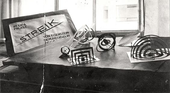
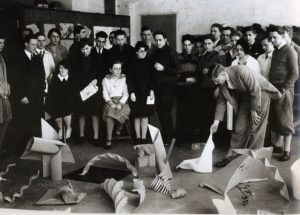
pictures of Bauhaus vorkurs

Interestingly, both educations seem to be exploring materials.

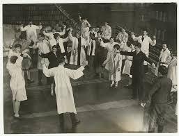
They have a lot in common, but the reason Bauhaus’ education seems more interesting to me is probably because of the physical exercise. Itten gave the class exercises in relation, breathing, and concentration to achieve a spiritual state and physical readiness during the instruction period.•4
He thought the training the body as an instrument of the spirit is essential to an artist’s creativity. That is why, before attempting class, the students were asked to limber up their bodies and minds by physical jerks, controlled breathing, and meditation.•5
I agree with his opinion as a yoga and meditation lover. I believe that the body and mind are connected and the brain also moves more actively when the body is ready and activated.

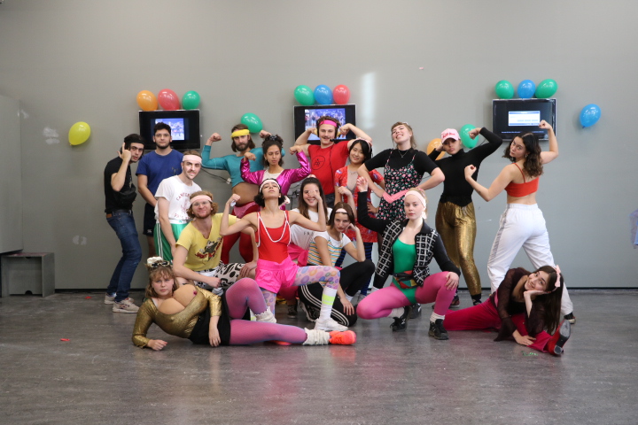
Imagine, wouldn’t it be more fun and energetic if we did yoga together at school or if we did weird exercises before we painted?

pictures of Bauhaus Vorkurs physical exercise

pictures of Rietveld Academie basic year class E’s aerobics performance

Maybe ‘Basicyear’ is the most important time as an artist. This is because it is an opportunity to experience many challenges and failures without constraint. So far, I have been busy just completing my assignments. After learning of Bauhaus’ educational philosophy, I began to reflect on my attitude and to think about how to deal with my work in the future. I will bear in mind the philosophy of Bauhaus, which is attentive to the sounds of body and mind, faithful to the basics and always exploring.
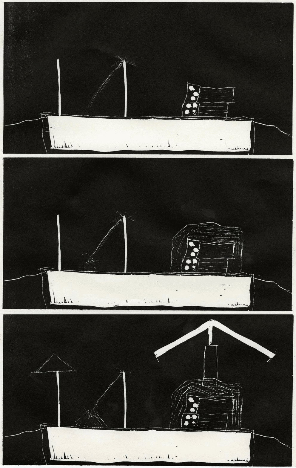
•1,5) Frank Whitford, Bauhaus, Thames and Hudson, 1984, London
•2,3,4) Gyorgy Kepes, Education of Vision, Studio Vista, 1965, New York


Design in Collaboration


Wednesday, February 13, 2019


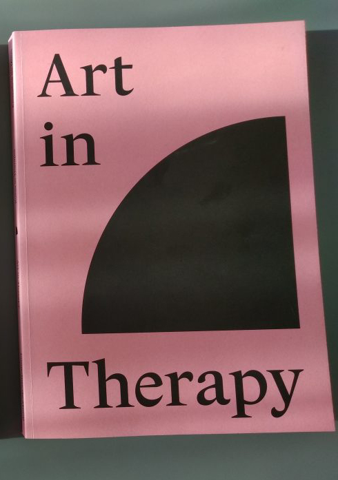
The following text is based on an interview I had with designer Adriaan Mellegers and the artist Emmeline de Mooij about the book "Art in Therapy", design, art and the relationship between those two fields.


Adriaan Mellegers

Emmeline de Mooij

Yelske Luit


So how did you start making this book? I assume Centraal Museum Utrecht wanted a book after Emmeline’s work?

They wanted a book because I did a series of performances commissioned by them, and of course nothing physical remained after this piece. So we really wanted a good record of this work.

Was it immediately clear that Adriaan was going to design it?

Yes, I think I immediately proposed that. I could decide everything myself; who made the book, who filmed etc.

     Edwin Jacobs, the former director of the museum, really trusted us with this project, it was like a warm bath.

  But I think that’s one of the positive sides of working for yourself or with friends. When you have a client, they can sometimes differ in their vision or ideas.

That can be interesting, but it can also go badly.

So where do you start, when you have this open slate?

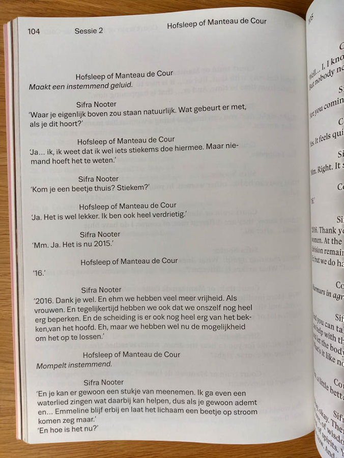
   The project had a quite clear structure, and it was quickly clear that we wanted to have the text from the five performances in two languages [Dutch and English]. So it was a lot of text.

         We also had some film stills and portraits from the performance.

     So those are your “ingredients”, your content, and then you start thinking about what kind of book you want. That process is partly conceptual and partly intuitive.
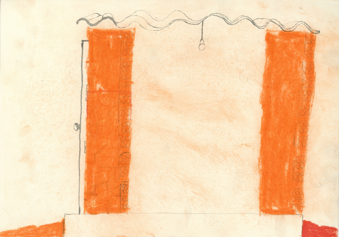
I thought it would be cool if it had a monumental size, quite big, because it would refer to a patient dossier.

I chose to represent the text very clear. The two languages have a different font, but they come from the same font family, Trivia.

I made the letters bigger, to convey some intimacy.

And while he thinks of all this stuff, how much have you [Emmeline] been involved? Do you give feedback after the decision is made, or do you make it together?

I left it up to him, but he showed it a lot during the progress. I was very happy you could think of those things, like that the photos should be on a different paper.

But we still talked about it a lot. There was hardly anything that I didn’t like.
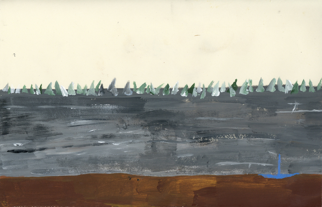
Did it ever happen that you saw a design for your work and you felt like it didn’t look right, or didn’t represent your work? Or does it almost become a work in itself?

Yes it does happen, but it’s usually something small.

I think you’re quite flexible.

I think it’s important to let go when you involve someone else. That you don’t control the other person, give them freedom.

So you also give some autonomy to the designer?

Yes. But it still has to communicate what you initially wanted. It can’t suddenly go in a different direction, so I have to be clear about what the story is.

So that is the risk you take by doing that. You can give them freedom, but you can’t just let it happen. 

I can imagine it’s very different with a client.
Very much so. When it’s an institutional client, they have a more clear vision or policy of how they want to communicate. You always have to get in a discussion if your idea or vision could happen.

It’s also often a lot more political, because there are other interests and parties involved.

So you could say that in the relationship between art and design, when you work for an artist the story is up to the artist, but how it is communicated is more up to the designer. However when you work with a client, this how is also controlled by the client?

It’s possible in both options, it has a lot to do with how you work as a designer. I want people to work with me because they think I make good works, not just because I provide a service.

When you work with an institutional client, you want them to have the same attitude. But there are a lot of interests at play, so sometimes the collaboration goes smoothly, and other times it doesn’t. That’s part of it. 
It can both be fun though, and I wouldn’t want to only work for artist, because those processes can last a very long time.

And I like the challenge of working for an institution, and that the end product is seen by a lot of people.

So working with both, the variety is pleasant.


Emmeline de Mooij: Art in Therapy. design by Adriaan Mellegers, Rietveld library number: 708.4 the 1

An Ocher Sheet


Thursday, February 7, 2019

« The library is unlimited and periodic. If there were an eternal traveler crossing it in any direction, the centuries would eventually teach him that the same volumes are always repeated in the same disorder». These thoughts from Borges’s Fictions often influence my mind when I’m searching for a book, where it seems that your choice will always be part of a gigantic spiderweb.

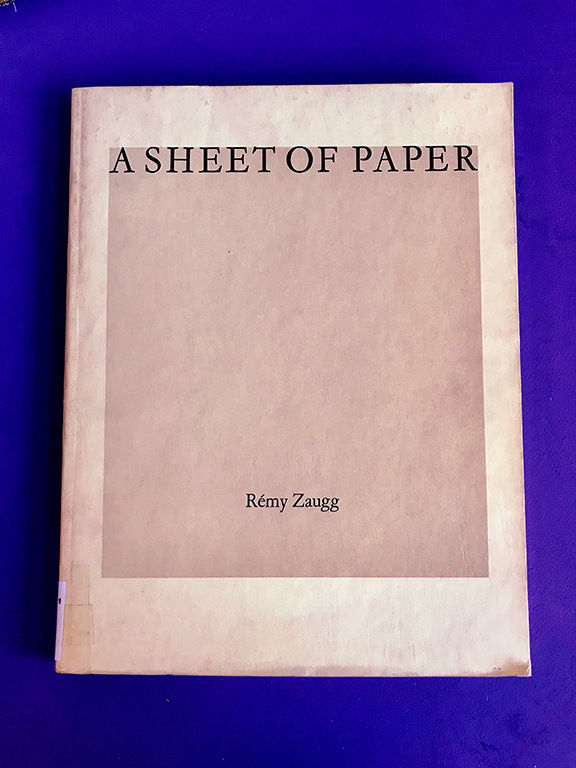
“>The title « A sheet of paper » and the name of the artist, Remy Zaugg, appear centered, in a Times New Roman font. The book, in a rectangular format (23×29.5), has a hard cover with a plain pale ocher background, accompanied by a gray square in the center that hosts the title. At first glance, A sheet of paper does not appear to sollicitate any attention, without breaking away from a very classic aesthetic regarding exhibitions books.

I thought I should reconsider my choice, even if it attracted me, for some other book, with a more modern, singular or attractive design. However, this book then seemed too willingly simple, hidden, to be just let on the side. 

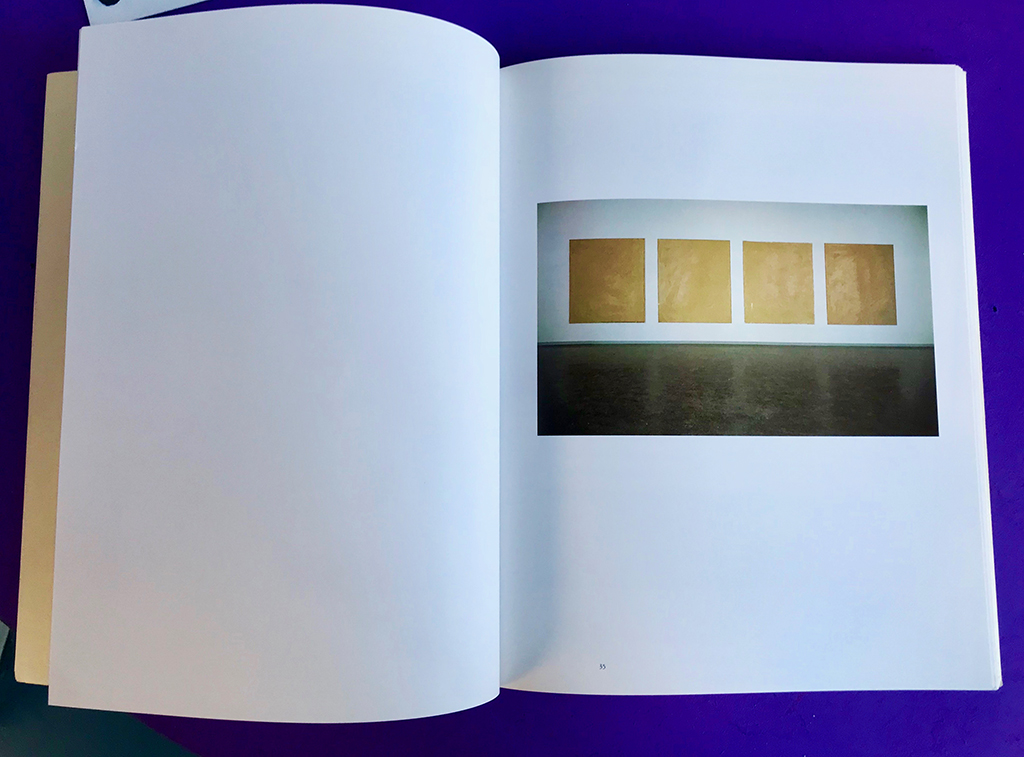
By offering another look at it, I could then notice singular formal protocols that unravel, through visual variations and repetitions, the boundaries between the so-called informative and artistic content. In fact, A sheet of paper has been designed by the artist and his wife, and can be considered as another piece, or a prolongation of his works : on the second page, we can see written « This book as well as the reproduced paintings were produced in collaboration with Michèle Zaugg », exhibition photographs are made by Hans Biezen.

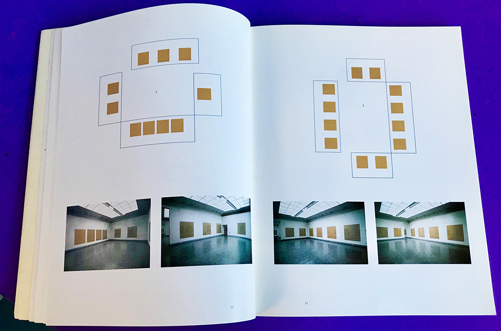
While opening the book, I could discover that the large ocher pale square from the cover multiplies itself in various ways : in the artworks presented, as in the architectural plans of the exhibition that are presented above the photographs, and many other forms.


In fact, Remy Zaugg’s artworks are large pale ocher canvases, and we see the m spread in different forms in the book. They appear sometimes photographed singularly : one big square taking a whole page, existing only in the space of the printed page with the white backgroung. Or, they also appear in an exhibition context (from Zaugg’s solo exhibition held at the Van Abbemuseum in Eindhoven, from August 31 to October 7, 1984.) Finally, they appear in their more abstract form with the different architectural plans that repeat as well the square structure. Thus, these artworks are existing in various forms on context (scans, photographs in exhibition, modeled), creating an effect of echoes, transmission, of this simple ocher square. You cannot discern a proper delimitation or annotation that intervene to say ‘this is the artwork’ and ‘this is the research’. The design seems to be confusing on purpose, to delete the boundaries of the classical artbook and offer something closer to experiment. Then, we can notice that the whole book is designed through an iterative process regarding this pale ocher square, that disseminate itself in every element presented.

The same visual phenomenon is present with the textual content : the text takes place under the same fonts in the artworks as in the information shown. Even if it’s still pretty classical (most of the text content is centered, justified, in a times font), the fact that it appears through different layers contributes to this repetitive visual process that ponctuates the whole book. The title « A sheet of paper » appear different times in the book, in different sizes and font.

These variations of patterns and games between the information and the artistic production creates confusion but then but at the same time they offer the possibility to approach as closely as possible Zaugg’s work. Indeed, all of his work is a reflexion on the absence, the disparition through the « banal » in art. The book A sheet of paper appeared to me entirely trivial at first sight, offering no necessarily different aspect. Yet, it is not the peculiarity of the elements presented that makes it a singular object, but the work accorded to visual rhythm, repetition, variation. It is the relationship between the elements that becomes interesting, where the repetition of extremely banal things suddenly creates a particular set. A contraction between the particular and the general. All of my research focuses on the possibilities and appearances of different forms of rhythm. The choice of this book makes me feel even more at the heart of this spider’s web, ponctuating and creating echoes between every choice.

Remy Zaugg: A Sheet Of Paper. design by the artist, Rietveld library number: zau 1

Who Is Rick Myers In A World Of Broken Music?


Tuesday, February 5, 2019


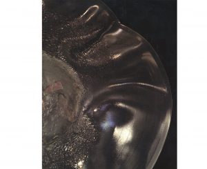
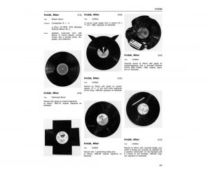
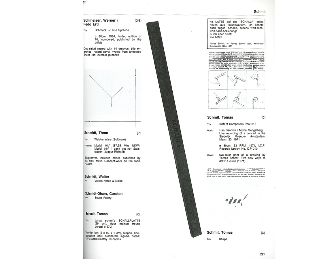
When I was in the library I noticed a pile of newly books stacked on a table. They looked completely fresh and untouched. I could look around the newly acquired books and quite quickly I came upon 2 books about music and art. 1: Records by artists & 2: Broken music. The first book on the left first pulled my attention cause I was interested in the topic. Which great artists also made music and how would it sound? But then i was drawn to the second cover by the misshapen LP and when I looked inside the second book I was immediately drawn in by the nice design. The design was quite straightforward in rows with alot of black and white but I liked that.

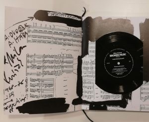
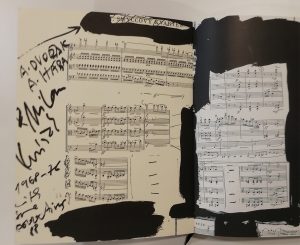
The cover of the book has no title on the cover which is something I still don’t really like. I don’t know if this is because I am used to books with the title on the front cover or that I just don’t like it and think that the book is laying with the wrong side on the table… Apart from the title, the cover has a nice image which is intriguing and brings questions. There is a little LP on the inside’s first pages which has some broken string music composed by Milan Knizak and played by the Arditti string quartet for the book (quite nice). The content of broken music has to do with music and artists. It’s a combination of records created by artists or covers designed by artists, books and publications containing music by artists and sound made by artists. In the design of the book the text is mostly normally arranged.

The way of using negative space and placing of larger objects is sometimes nicely done throughout the book.

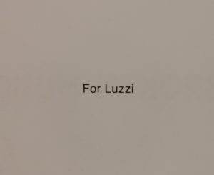
This edition of Broken Music (2018) is a renewed edition of 1989. When I went through the book to find out what the designer Rick Myers changed I actually almost couldn’t find anything. On the second page the new edition 2018 said:

Sadly enough I couldn’t find out anything about Luzzi, who she was or how she was acquainted to anyone in the bookmaking process. This Luzzi was probably known to the designer Rick Myers but nothing can be sure and he also doesn’t respond to my emails.


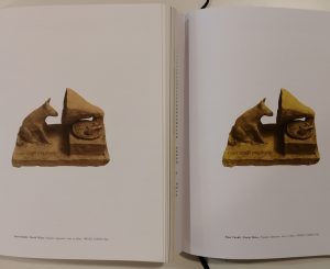
When looking at the colour of the pictures there was a very small difference in the thickness and colour of the inside of the cover. The older edition had a sturdier cover and is 2 to 3 times thicker and had a yellow tint on the inside. The LP was missing but that was not because it wasn’t included in the original edition of 1989.

For the rest there was sometimes this slight difference in the colour of pictures inside.


The black white pictures were just a bit darker in the newer edition but the coloured pictures sometimes had a difference in colour which was quite noticeable.


When I digged in a bit deeper, I found out that he actually made a facsimile of the book ”Broken Music”. This completely explains why there almost are no differences to be found. He tried to make an exact copy of the older book. This was probably due to the great amount of request for the book still and it wasn’t being made anymore. He spent a pretty obscene number of hours on this project with absurd activities such as assessing the tonal values of Bernard Heidsieck’s trousers, checking the density of the shadow cast by Rose Sélavy’s hat or looking for clues in measurements concealed for 30 years prior, delving further into guillotine mis-cuts made in 1989 for the facsimile to sit quietly alongside the original.

So in this case Rick Myers role was to design this new book to be completely the same as the original. In the actual content and design of the layout he didn’t contribute anything (except for Luzzi maybe).

The designer Rick Myers is an designer as artist born in Manchester and working on text, video, installation, drawing and books and editions. He is the founder of Muta which is a publisher of artist books and poetry. Only when you go to their site it’s not that interesting. It seems that Muta is not really that active anymore. On their website you can see the work of 3 artists and that’s all. When you go to their Instagram you see their last post was in 2017.
Also, you can really see that the design of the website of Muta is corresponding to the design of Rick Myers own website. Very straight and everything in the middle but still it’s not really easy to navigate on his website.
In Amsterdam in the shop Boekie Woekie you can also find some books of him that he completely made himself. So apart from remaking the book broken music, he also makes alot of works himself and produces books with recollections of his own works.

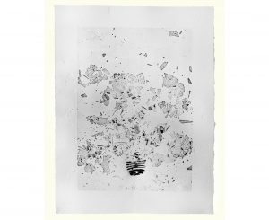
One of his works ”Before and after Death” Has an interesting idea in which he collected light bulbs made before 1908 that were over 100 years old and thereby contained a vacuum of a century.


He then made a print of these light bulbs by stamping them and made it into a book as seen in the picture. I’m curious to see if the whole book only has 1 image because on his website you see 3 times the same print next to each other. Everything here is black and white, he does that a lot but not always.

Another work from Rick Myers is An Excavation / A Reading (Before the Statue of Endymion). He used a technique in which a text is first readable and slowly over time is not readable anymore while an audio fragment is playing and reciting the text. There is a short video fragment of the work on his website.  Check it out, it’s definitely worth it!

Ursula Block & Michael Glasmeer: Broken Music, artists' recordworks. designed by Rick Meyers, Rietveld library number: 708.4 rec 1

blank spaces


Thursday, December 6, 2018

At first, I wanted to find something by using the catalogue, but It wasn’t very long until I realized that it wasn’t relevant knowing that the tags were only subjective,

How could it work without generating something too literal?

At least, this process of research wasn’t the right one with the tags that I chose.

For this book, it took me less than one hour to pick it, as each time I wasn’t able to select a piece without already having a specific idea of what I wanted in my mind.

But still, I felt frustrated

Frustrated by the impossibility, or more precisely the struggle of being opened,

Being able to see, to take the time to observe the books that were surrounding me.

There were so many information and possibilities around that I wasn’t able to decide or to think about what I wanted or at least to consider those things.

I think that, in a way, that book happened to me because of this frustration.

I see this choice as the translation of my state of mind at this precise moment.

Fortunately, this book might have been what I was searching for, I just saw this thin white line between all those imposing and colorful editions.

I needed something simple, purified, that’s precisely, in my view, what I found.


All those blank spaces, accentuated by those vibrant black lines

Those micro architectures, in the form of sketches.

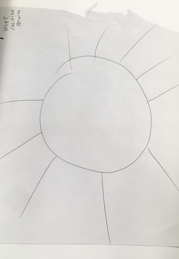
I was struck by a drawing when I opened this book, it is a drawing of the sun.

That reminds me of le Corbusier’s sketches concerning the housing units of Marseille and the principle of the sunshade.

I like this simplicity and this clarity

I also see those lines which I like a lot, thin, imperfect, instinctive.

Naked Dog


Wednesday, November 21, 2018

Thursday, November 22, 2018
Last week we had to look for a book for our design project. I had to look for a book related to design, but here was the catch. I was not allowed to look at the information in the book just its exterior, i had to find a book that attracted ore displeased me only on subjective grounds.

While I was walking through the brand-new library of the Rietveld academy I was primarily buzzy with looking at the library itself. The nice plants they put to the sides and how well put and nice the place looked. In my head a school library is supposed to look old fashioned and dusty not a nice looking clean place like this. Then again, I did not have that much experience with library’s. This was not because I do not enjoy reading. On the contrary I enjoy it to much, so much so that every book I end up liking I want to have as my one. This is why you will not find me in a library but more in a bookstore.

While my head was wandering about like that my eyes fell upon a rather shabby looking book in compere’s ant to all the other rather fancy looking books in the shelfs, the book did not have a title and instead had a cover of what seemed a group of friends siting tighter naked with a dog. The picture did not shook me or anything instead it made me instantly curios what it could be about. For me (someone who is very new to the concept of design) this seemed like a very odd picture to put on the front of a design book. But then again, my idea of design is much more of that of a very clean and tight looking piece than what I was holding. Halve confused and curios I went to the man behind the desk who was the head of the library and asked if this book was also part of the design departed ant and to my surprise it was. This book that seemed to be hand bind with the group of naked friends on the cover of witch in my eyes it looked more like a fine arts project was an actual design book, well…. That made it clear I had made a decision
book 779 -won- 1

A Research about research


Friday, October 26, 2018

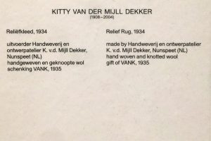
Taking the Work “Relief Rug” from Dutch Artist Kitty van der Mijll Dekker, made in 1934 as a leading example, the following text will try to surround and highlight analogies as well as differences in researching online or in printed matter.
The following articles give additional information about the Artwork itself, the Artist as well as the Bauhaus.
Designblog Rietveld Academie

Stedelijk Amsterdam, Relief Rug by Kitty van der Mijll Dekker

History of Bauhaus in Dessau


1st Inscription; "Relief Rug" by Kitty van der Mijll Dekker


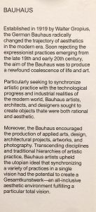
2nd Inscription; "Bauhaus" Stedelijk Museum Amsterdam


Starting with the inscription next to the piece as the first information the audience can get (which definitely is printed information as well), the text doesn’t say anything but the basic information we expect from such source. Juxtaposed with other objects, artworks and artifacts from the same period and art-movement, another inscription announces some facts about the Bauhaus, the educational institute van der Mijll Dekker attended. Therefore the very first appearance of printed information just adds little more as what a viewer could be expected to have as background knowledge.

Printed documentation from and about Bauhaus highlight the emphasis Walter Gropius, founder of the Bauhaus, put on the concern of equality between women and men inside the institution. The Bauhaus was one of the few institutions, where not only men but also women were allowed to attend. What seams ahead of time, quickly turned out as not very long lasting and supportive to the persons concerned. Here, the most significant gaps from printed matter to online material can be pointed out. While printed matter talks about a topic and somehow provides information, online publications and writings mostly start with questioning facts which are already researched and published. Some of them come with an outspoken opinion as well as a contemporary context and  as a reaction to other publications.

The disconnection from general information about the Bauhaus to the issue that female artists and their part of the Bauhaus legacy are barely mentioned in publications, that can be traced back to the difference of “providing information” with printed matter and “reacting on information” in online publication.

Frieze; Women in Bauhaus

Emma; Women in Bauhaus

Artsy; Women in Bauhaus

If assumed, a book or documentary publication is preserving information about its content, and not too much voicing an opinion, unless it is a critique, the reader gets broader information which needs to be classified afterwards by the reader itself. Going through the listened publications underneath, the attempt to sum up or conclude seams to be more present than putting forward a subjective perception or even including a critical position.


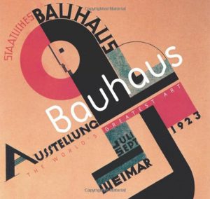
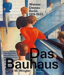
“The Worlds Greatest Art – Bauhaus“ by Andrew Kennedy, 2006 • “Das Bauhaus“ by Hans M. Wingler, 1962


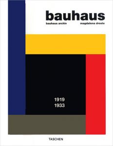
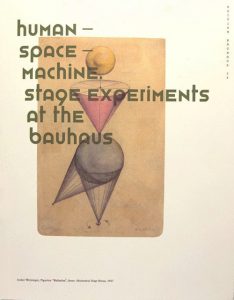
“Bauhaus“ by Magdalena Droste, 1990 • “Human – Space – Machine. Stage Experiments at the Bauhaus“ Eds.: Torsten Blume, Christian Hiller, Bauhaus Dessau Foundation, 2014


Simply spoken, these books come with a quality of objectivity that allows the reader to bring further a general knowledge. It builds up kind of a base where more specific ideas or concerns start to unfold.

Research in literature may appear more challenging, since the linking to connected subjects is not provided and has to be done by the researcher. Google (or any kind of search engine) supports with its algorithm and referring proposals. Although this two faced matter, the advantage of high rated recommendations is considerable. It enables the user to quickly collect a lot of information from many different sources, processing the subject in different contexts. Whereas, as mentioned above, research based on printed matter asks the user itself to fulfill the role of Google’s algorithm. To later on distinguish the quality of information or confirming sources stays an important part of putting research forward to a conclusion. At the same time the internet’s bottomless quality leads to many dead-ends, what creates an alarming but ironical analogy with the lack of importance that was payed to refer female artists to the Bauhaus history.

Heading to a provisional end, the following experience works as an example of applied research.

“Looking for work about v.d. Mijll Dekker I first went to the library of the Rietveld Academie in Amsterdam. But I was not able to find any literature dealing with her or her work. But knowing that the artist was a part of the Bauhaus Dessau, I started looking through the English and German literature the library had to offer about the whole Bauhaus movement. Unfortunately, even looking through the register of them all, I wasn’t able to find anything about her specifically. So I tried finding out more about the women who were part of the Bauhaus. I started researching information about different influential women who were part of the movement. That turned out as quite a challenge. After this I went to the library of the Stedelijk museum in Amsterdam. But also there I could only find few new information on Mijll Dekker and her work.“ progress report, field researcher L.P., Amsterdam October 2018


Text by Luca Putz & Jonas Morgenthaler, GRA 2018

HERMANN EBBINGHAUS’ COLOUR SYSTEM


Friday, March 23, 2018


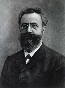
Hermann Ebbinghaus (1850-1909) was a German psychologist who pioneered the experimental psychology of memory. He is mostly known for his discovery of the forgetting curve (describes how the ability of the brain to retain information decreases in time), the learning curve (graphical representation of the rate at which you make progress learning new information) and the spacing effect (phenomenon whereby information is learned and retained more easily and effectively when its studying is spread out over time).


However, Hermann Ebbinghaus has also been known thanks to its colour system. Indeed, the concept of the double pyramid gained in popularity thanks to the latter.


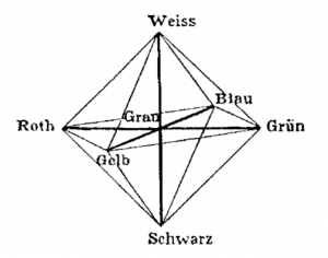
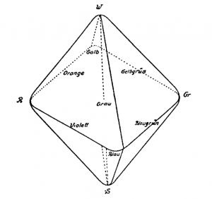
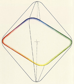
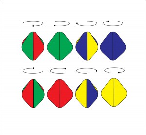
In 1902, he proposed a new version of Hofler’s double pyramid. Ebbinghaus constructed a colour system rest on this system of double pyramid but made few modifications: he put rounded corners and an inclined central plane.


He rounds off the corners of the solid as he considered the transition between colours as fluid and not sharply defined. The Hering-type fundamental opponent colours are located at the six corners (black, green, red, blue, yellow, white).
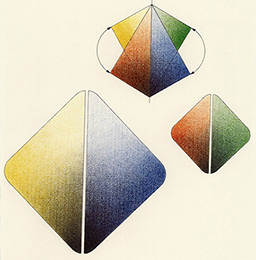
The resulting chromatic body, from the four primary colours, links Leonardo da Vinci’s idea that colours vary in brightness and can thus be differentiated. The idea was to separate and so distinguish those four colours due to the variation of brightness.
The base-square of the double solid is tilted in such a way that the best yellow hues, which are relatively bright, are nearer to white, and the best blue tones, which are relatively dark, are nearer to black. His system does not predict the mixtures of colours and the complementary pairs are not arranged opposite one another.


In 1893, Ebbinghaus published a «Theory of Colour Vision» in the Zeitschrift für Psychology (Journal of Psychology), in which he mentioned that humans perceive colours through higher mental processes. As a psychologist, he knew about the perception of the four elementary colour (yellow, red, green, blue) and thanks to physiologists knew there were only three photo-sensitive substances in the eye’s retina (rods, cones, photosensitive retinal ganglion cells) thanks to which the phenomenon of coloured vision and its anomalies could be explained.


In addition, Ebbinghaus has discovered that two white hues produced by spinning either red and green or blue and yellow, appeared to be the same at certain levels of brightness, but appeared different when the illumination was reduced or the speed was reduced.

Design and Pattern


Tuesday, February 20, 2018

Pattern, cell of design

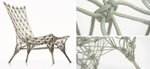
Blog_MarcelWanders_Knotted

Living creatures have evolved as a result of adaptation to daily environment surrounding them. Creators are often inspired by those forms of nature, which is not only aesthetic but also functionally appropriate. So some design objects get to resemble living things. Looking into them deep, we can perhaps find that they both have a powerful element which does not appear on the outside at first glance but still has its influence on the overall appearances.

It is the cell that constitutes the whole body, which also can be called the pattern in design. The knotted chair of Marcel Wanders, made in 1995, shows good example of 3D pattern design. One unit that makes up the chair could have been no more than a twisted line, but it acquired more durability when several units are gathered and patterned under the certain and repetitive rule. (Of course, there was a process of hardening with thermosetting resin.)

It is also noteworthy that a cord, which is not very expected material for furniture, was used to make a chair which can withstand loads over 100 kg. Could this be possible if there wasn’t composed unit with consistent rule? Apart from this, how Teo Jansen could achieve to make kinetic sculpture that shows flexible movement with hard wood? I think a patterned design allow creator to be able to explore the materials and thereby can have its own texture. I would like to mention ‘knotted chair’ as one of the designs that can provide us with vision and tactile sense simultaneously on the basis of its pattern.

To continue with the research on connection between ‘design’ and ‘pattern’, I come to ask first,

“What is pattern?”

Then, look up the dictionary definition of the word-
Pattern is a particular way in which something is done, is organized, or happens; is any regularly repeated arrangement, especially a design made from repeated lines, shapes, or colors on a surface;

The word ‘pattern’ can be regarded as the particular way something is generated or as the regular arrangement that include continuous rules inside. What I can find from those selected meaning of the word is that; whatever we call as pattern has to have regular and repetitive factors, which makes it predictable, organized, and look stable.

So, what does pattern mean to art and design?

It could be one of the foundations that construct the way we see the image as well as deliver it. To explain this, let’s look at a few principles of design. The formative elements such as dot, line, surface, shape, matter can be said to be materials that is used to create image or object. Here, the ways we arranged those material- principles of design- are involving. Some of them are unity, repetition, harmony, rhythm, symmetry, balance, proportion and so on. Each of them, at some point, is related to allowing materials to look similar and coherent. We intentionally or intuitively use those principles for organizing a clear image to deliver our message efficiently. At the same time, our eyes receive those similarity, without even noticing it, and store it as groups in our mind. Therefore, we can realize that discovering the coherent image and patterning it is the basic method how we perceive visual information.

Pattern on 3-dimension

My research have had more focused on pattern in 3D design object than any other kinds of art pattern. It is not only because that the starting point was the knotted chair by Marcel Wanders, but also dealing the pattern in terms of its relation with object’s shape and texture are worth to watch. With the development of technology, more than any other times before, designer can now easily explore the new materials and create their very own way to use it.

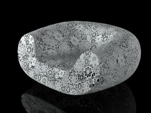
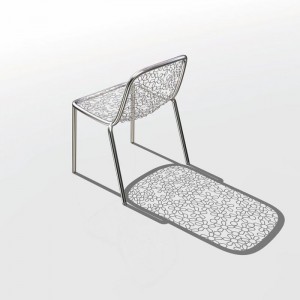
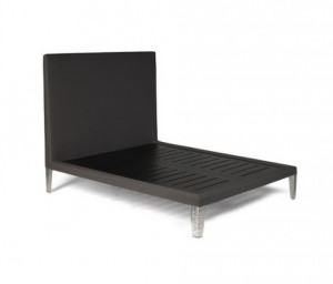
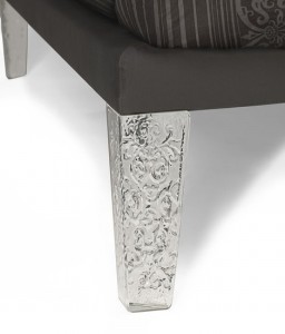
Marcel Wander’s various way of using pattern are illustrated well with Knotted chair, Crochet chair, Flower chair, Cybrog chair and Cinderella broke A Leg bed.

821be91a43c3d0dc3e0ea27b8822ffdcefb3e95d-dbc1-4cbd-9a72-788286daacb1
Modern-Black-Bed-480x410Black-Beds

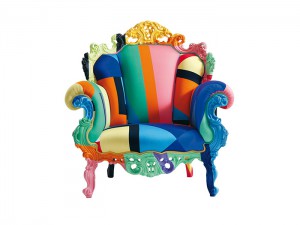
Earlier, Alessandro Mendini used his fabric pattern on the baroque style chair, Magis Proust. By seeing the pattern as ornament, he was marked as the one of those leading the postmodernism. In this case, ‘pattern’ became the mean to deliver the designer’s concept.

Cappellini-Proust-Geometrica-Armchair

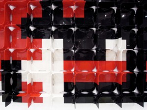
Then, Zaha Hadid presented her colorful patterned furniture, Tide, at 2011 Milan Design Week. This work obviously shows the great promise of using pattern in design. The symmetric shelving module that one can create different compositions through rotations on itself allows individuals to build and rebuild the module to fit the space around them.

tide02

Last but not least, I would like to refer that 3D pattern is also opening the door from craft to industrial design. 2D pattern design can be easily processed and completed on the screen while 3D pattern still needs to be experimented by hands at the first stage, especially if it is for the furniture or architecture that should ensure the stability. For example, the Knotted chair of Marcel Wanders is actually known as a result of handwork knot. Creator, as a human, they also make mistakes, sometimes do fail but later approach the point where they can create the most safety and aesthetic cells. This process is happening with hands. So I can see that link between handwork and industrial design is generated if the design happens under the conditions that need to be experimented and proved before it is systematized to be a mass production.

So far I looked through the definition of pattern and the how important it is on the art and design field, especially with the context of design objects. Also I found that how differently each designer handle the concept of pattern. Some of them would use it as their identity, other see it as a way to express their design philosophy, and another can develop it to interact with users.

At the beginning of the post, I made a connection between ‘cell’ and ‘pattern’. Just as the cell breath, nourish and endure the living body, pattern also function as indispensable part of whole (design object). It can be always developing and has endless possibilities, because there are still numerous ways to make a new rules and compositions out of it.

A commentary on the Lower Level Gallery display design for the STEDELIJK BASE


Monday, February 19, 2018

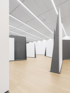
–>On December 14, 2017, the Stedelijk Museum opened its doors to inaugurate the curatorial re-purposing and display of their permanent collection. Under the influence of the research and architectural design of OMA/AMO’s Rem Koolhas and Federico Martinelli, STEDELIJK BASE presents on the Lower Level Gallery, a display and curatorial experiment.

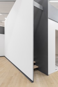
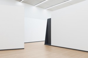
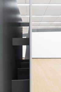
I attended the festivities and found myself overwhelmed by the masses gathered, and the maze of thin steel panel-structures overloaded with works. The crowd of Art enthusiasts traveled the space restlessly and it became a dense environment where all senses where assaulted. Every corner of the space was utilized and the works where closely displayed, interacting and clashing with each other both in context or physically, showing in this first installment of the exhibition pieces from the 1800’s to 1980’s in a great hall tracing endless possible routes by means of the a set of slim self standing steel panels from which most of the artworks where hung or held. Its kind of hard to talk or read about this exhibition if you haven’t seen, so if you are reading and haven’t, and can’t see the animation below, click on the black box.


1


I have visited the exhibition repeatedly in the past month to informally survey the thoughts and reactions of spectators on day-to-day basis, to get a broader sense of how this specific architectural endeavor on artwork display has been perceived. Eavesdropping conversations and asking around, I’ve heard all kinds of inclinations towards this unexpected environment:   A young student anxiously disapproving a Barnett Newman cornered by a pile of chairs collaged into a wall that, in her opinion, deflated the experience of such a powerful painting into a piece of an absurd scalene puzzle where great art works where being interrupted.

A couple eagerly wandering about the labyrinthine pathways, surprised by the fact that every direction their eyes turned to, there was either a piece provocatively displayed or in conversation with another, that otherwise could have never been intertwined. I myself have been in a constant state of flux about how I feel about it, as in the many visits I have payed to the show I could relate in separate occasions to one or both of the previously mentioned comments, both retrieved from my time in  the BASE’s lower level, dismissing the first floor more or less entirely, due to its conventional curation and display that is densely misted over the experience and for some, controversy of the former. In fact, in the last few visits I didn’t even pass by the first floor and proceeded to focus on the lower level.

Looking for more insight on the stimuli behind the final decision to discharge an overload of works  in this particular manner, I consulted the statements made by the people behind this project. Martinelli expressed in a publication in the OMA’s web project description, that the design and display was highly bound to the way in which and due to the multimedia means of communication function, from a users perspective, people have become prone to focus, process and compare abismal amounts of information. As a way to homologate these tendencies, the disposition and amount of works in the gallery, are in fact, a reflection of these communicative behaviors, where artistic perspectives can be assimilated.

That being said, I still am not sure if I fully appreciate the collection’s display management. If, in deed, it seems to have managed a dialogue between works and compiled and engaging environment to freely associate and compare different works, this does not necessarily mean that it has a positive repercussion on the value some pieces can have by themselves. Even though I felt the heavy devaluation of certain works have been a consequence of this overcharged curation, I have to mention that it has been the very reason I returned and have been in a constant state of critical thinking regarding the reasons behind STEDELIJK BASE’s curatorial experience.

I realize that the dominant ways of communication are shifting the way we perceive things, but should we let them stimulate the way in which we view everything else? Are our lives so strictly joint to  the high tides of rapidly flowing information that it is becoming the standardized form of perception? Is this merely a superficial association? How can we evaluate it, in any case?

It’s all about context


Thursday, February 15, 2018


Although being already more then few times now at the Stedeljk museum, it’s always pleasant be here,  environment, the architecture itself and the natural light that create a charming atmosphere all around.We moving towards the so called BASE 1 to see the new permanent installation of iconic works from the collection of the Stedelijk Museum. It occupies the entire new wing of the museum and features a selection of around 700 pieces grouped around historic movements, social themes, and influential artists.

After I’ve made aware about that what I am going to see is going to be like this for the next 10 years, I approached my visiting focusing my attention mostly on the division of the space and the solution founded to display the artworks.


rem-koolhaas-AMO-stedelijk-museum-amsterdam-base-exhibition-space-OMA-designboom-07 700-3

700-1 700-2


The space allow visitors to experience the collection through an open-ended route.The chronology can be followed on the perimeter, while freestanding walls in the middle create separate sectors highlighting groups of artworks that represent a specific theme or aspect of the collection.

I have this constantly feelings of jumping between a sort of labyrinth in which I can keep choosing different directions but as soon as I taken one, those vertical high walls create a dynamic and cozy environment, almost like little galleries inside a enormous place.


The layout display  the collection as a network of relations rather than a presentation of individual artworks. All the artworks do not loose their independence even tough, there are chairs and carpets hanging at the walls, and the displaying of some works are not as we are used to see.


I am  wondering about how they bring inside here this massive standing steel walls? And how they organized  works in different areas of the collection…


I’ll try figure all this out a little bit more

stay tuned…

700

Is there anything to rely on?


Thursday, November 30, 2017

 It is quite common to notice that we have been focusing on automatizing, and motorising any of our work related physical efforts. As for example, the number of workers in a factory has nothing to do with what it was 30 years ago, and also nothing to do with what it was 100 years ago, and it hasn’t increased for sure. As a paradoxical consequence (that can have also other different causes), it is also amusing to observe that in order to stay healthy, more and more people start to work out, going at the gym. The gym has even become a social environment, where people share their tips and advice, and help one another reaching his goal of physical performance.

 This is what Melle Smets points out in his project: the human power plant. The thing is that according to this “gym” trend, the energy that we produce with our physical efforts nowadays is completely wasted, as we only see it as muscle training; we don’t run on the treadmill to make cold water hot but to get a nice ass. It seems unnecessary to develop how a nice butt is useful to sustain life.  Anyway, all of these machines that are handling so much effort could actually stock the energy to use it afterwards. The human power plant project is a proposal of the use of human physical effort to create the energy that we require in our daily life. In their first case study, they planned a conversion of one building of the Utrecht University into a 100% human-powered student house. On the other hand, in its concrete realisation, the project is still quite utopic or futuristic, as the prototypes are for the moment only to charge a phone or a laptop, and the latest to heat a Jacuzzi…

Designblog

 Going back to human attitude towards effort optimisation, we can also to a certain point qualify this quest for automatizing and motorising any work related effort, as the natural egocentric human condition of wanting to do what we want, and not being a machine, or not being a clone. It can also be directly linked with artistic activity, in a way that it commonly comes from us wanting to get something out of what we think is our singular identity or thoughts. Or the link could also be that art is commonly/traditionally seen as completely useless, when artists are the most passionate about their job. Wouldn’t it mean that we just want to make ourselves useless? We could argue in this way to conclude that we obviously live to die. But then, why not act as a mere gear in this gigantic mechanic world? We can observe to confirm what was said before a relentless research to motorise the perpetual motion we live in, with very contrasted fields of research like Leonardo da Vinci, Nikola Tesla, or more recently Theo Jansen. Of course, their views on this topic are all very different, and even how they consider or see this topic varies. For example, Theo Jansen’s approach absolutely didn’t think of the “perpetual motion motor” side of his creation, he just wanted to create life. And even if the approach has to be understood sometimes in a metaphorical way so it doesn’t become contradictory, these enormous solitary creatures wandering on the beach are tightly close to have the possibility of being independent and to continue living eating wind to make their hundred legs move. So here we see that the difference is about what could be qualified as the artistic approach, that the function of the energy is not necessarily to use for us humans but just to contemplate. In a way, the only energy a perpetual motion motor/generator distributes is to itself, and we can only watch the wheel turn.

 Switching back to Melle Smets, the goal here is not to make a wheel turn on its own. The social and cultural context is privileged, and the aim is to make people self-sufficient in what they require concerning energy; we are the perpetual motion machines. It’s interesting to see, that most of the creators, to find a solution to how to produce energy, will try to find or invent something that is not there or that is not known. And they often argue that the world is your oyster, there are so many things outside that we can take advantage from. What is interesting and funny is to see that after thousands of years of trying to widen the distance between our own self and energy production, there is an actual proposal of an alternative where it is ourselves that we can the most directly take advantage from.

The concept is not even this innovative, in a way that we have always been producing energy with our efforts. Actually we don’t even have a choice not to and it is all we will be doing our whole life. Following this alternative perspective’s idea is tending to not only make us self-sufficient but also self-reliable and as a consequence disciplined. Just like a child to who we don’t learn to become autonomous by providing anything that he would need or want to not think about how he could do it himself. We can notice that nowadays, energy like electricity is so much a part of our daily life norm that having lamps in any room of a house is completely natural whereas a house without any would be linked to a spooky fictional movie. We don’t show to the children what electricity is and can do, we just tell them to not put their fingers in the plug. The point is that what we have to do to start, is to make ourselves reconnect to what we essentially do need in our life. Where does it come from, and how can we get it, (energy wise of course, I wasn’t talking about love).

designblog2

Social Design and Relational Art


Thursday, November 30, 2017


“L’art est un état de rencontre” “Art is a meeting state” – Nicolas Bourriaud

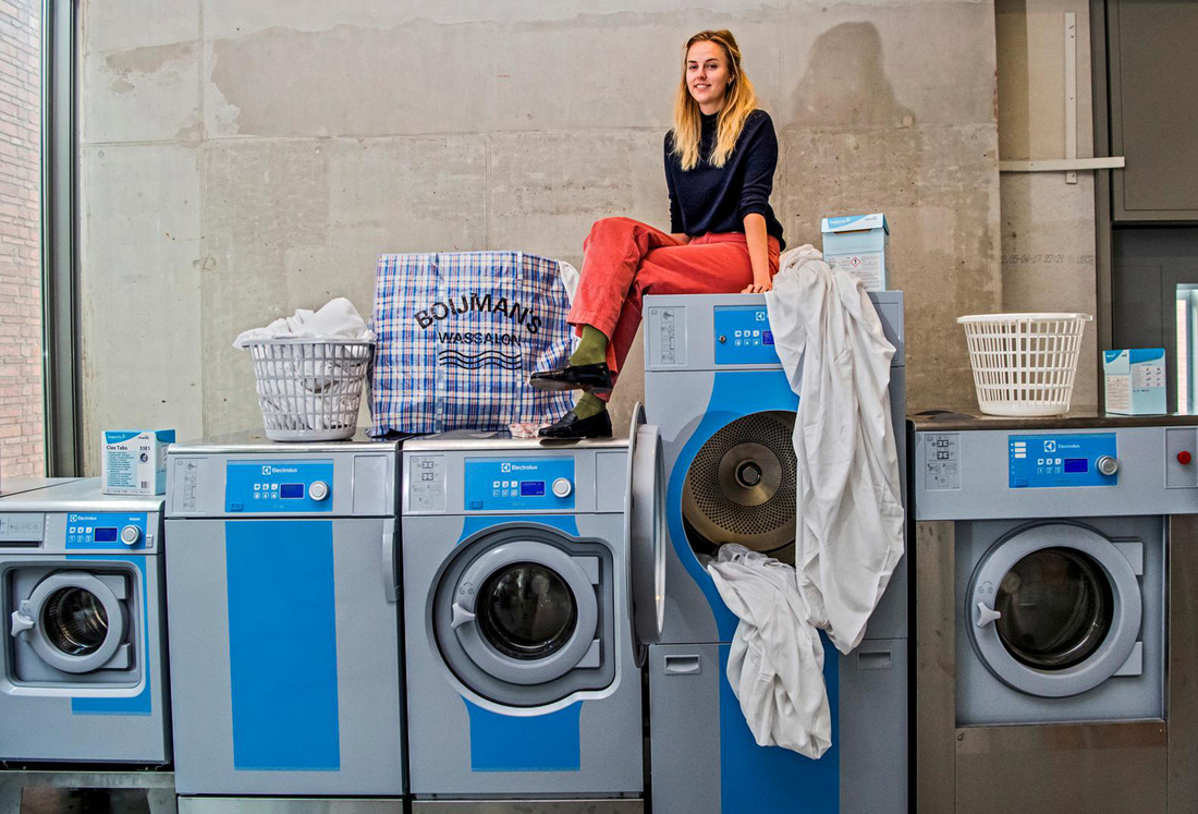
When visiting the exhibition « Change the system » in the Booijmans, I wondered how art and design were differently defined when they both answer the one and only same question. At the very end of the show, I discovered the work of Manon van Hoeckel called ‘the laundry’. Manon is a designer, a social and critical one; she « designs context ». That was the very first time that I saw this term used , regarding a design work that had as a result a social cohabitation and that was human-centered in this way. Wasn’t it an art experience, such as Tino Seghal’s work or Marina Abramovitch’s one? How do design and art meet in social/relational situations to create a better understanding of our modern and future world?


images4.persgroep


In the last decades, through many art movements that raised, two specific ones in art and design have emerged. In art, the relational aesthetic defined by Nicolas Bourriaud as “a set of artistic practices which take as their theoretical and practical point of departure the whole of human relations and their social context, rather than an independent and private space. » In design, a social thinking approach has emerged in the same way, materializing into performances, contexts, tests, always in the finality to contribute to improve human well-being and livelihood. Although these two subjects do not have quite the same purposes, they coincide around the same problems and use the same tools with the purpose of better understanding/changing our world and human behavior.
In current art practices, it is not unusual to visit literally empty exhibitions which display works that turn away from the visual and the visible. Facing these constituent sensibilities, it is sometimes difficult to distinguish the invisible artwork from its exhibition. But let’s say it’s acceptable, because it is art. But what if this happens with design? What’s the result of it? Nothing specific, just an experience. How is it created? What happens? Let’s first have a look at Manon’s work.
As a social designer, Manon creates event, spaces for people to discuss, she creates interaction between humans. In her project for The Boijman’s Museum , Manon actually creates a space where people can come for other reasons than visiting a museum, and also a space to discuss the exhibition itself. As an answer to « change the system », she proposes discussion. But how is her work different from Tino Seghal’s, how is it different from relation aesthetic? Tino Seghal also bases his work on people’s experience of meeting and sharing, the interaction being the piece of art itself, working against the production of an object. Regarding what is relational art, let’s give an other relevant example. Rirkrit Tiravanija is perhaps the most iconic artist of this movement. He moved all the contents of an art gallery storeroom and office into the exhibition space and staged his work in the back rooms; the art consisted of cooking Thai cuisine for his audience. The viewers became active par­ticipants, first locating the backrooms, then consuming the food and engaging in con­versations with the artist and one another, instead of quietly looking at objects in an exhibition space.
So, what’s different from Manon Van Hoecken’s work ? We can nowadays suppose that there exists a correlation between what art and design produce in the way that now they are both no longer results driven, and either of them do not have a specific function/utility (to a certain extent). Regarding both disciplines, the term ‘relational’ offers a more complex understanding than the simple oppositional binary of both art and design – as either socially active or not.
How come design and art became so abstract, looking similar and tending to focus on the human matter so much?
If we had to make distinctions, we might say that regarding social design, as Manon Van Hoecken produces, it is an experience of sociology that enables the designer and the users themselves to better understand how does interaction and human contact work nowadays. Designers then became « expert citizens » and it is more about designing WITH, but not for users. This could be called « Human centered Design », and is definitely very close to relational art.
Regarding relational aesthetic, it is more about taking as its subject the entirety of life as it is lived, or the dynamic social environment (rather than attempting mimetic representation of object removed from daily life, as would be the case in a Dutch Baroque still life). Also, it is important to emphasize that the main purpose of relational aesthetics is not simply to produce social relationships and interactions but also reflect upon society and critique it through the approach of disruption by creating non-produced exhibition and art. Also, participatory and relational art raise important questions about the meaning and purpose of art in society, about the role of the artist and the experience of the audience as participants.
If we look at it from a historical point of view, relational aesthetic are older than social design. Relational art, as we said before, is a term that was created by Nicolas Bourriaud in 1995 in his book « Relational Aesthetic », from his experiences of his artist colleagues in the 90’s. Social design and human centered design are younger, they appear a bit later in time and have become a real subject of interest nowadays. Is then art what inspired design to go into the more performative experience of customers? How does art influence design? This supposition brings us to an other problematic, but from what we’ve seen so far we can confirm two things:
If social design and relational art have the similarity of experience, design tends more to derive analysis and create problematics from it, otherwise art offers another way to experience and create, in contradiction to what is known and defined. Very similar in their forms, nowadays it can be seen how design and art can be closely related. Social design such as human centered design also gives a much more open minded idea of what design is and can be, far from any industrial or concrete problematics.


momo5_800

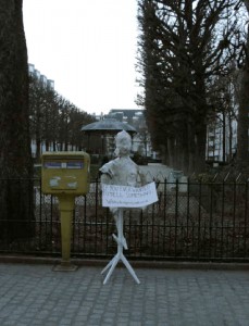
In a project I made myself where I created a fake statue with the words “If you ever wanted to talk to someone, do it here whitestranger@outlook.fr” and waited for people to react by sending me/or not mails.
This project can be seen either as an art piece, bringing strangers and public spectators to help create the work itself. A design, social experiment, about loneliness but also about uses of internet communication.
White Stranger (click here to see the project)


Log in
subscribe