


We were asked to make a colour system.
And in the first phase of assignments, we were asked to go over medieval colour systems that made no sense. I’m not a mathematician.
I even once wrote an article about how little of a mathematician I am.
That’s how little of a mathematician I am. Or am not.
The word system really bugged me.
I thought it had to have a religious structure that made sense and was clever at the same time.
Then I thought, no, It’s okay, it can be anything;
because this is Rietveld and you can get away with a lot.
But then my mind went back to it having to be a system.
System. Mechanism. Complex. Arrangement. Order.
ORDER. Structure. Network. Institution. Rigorous. Mathematical. Detailed. Exact. Accurate. Meticulous. Diligent.
These were some of the words that kept hitting my brain. Some Icelandic ones as well.
Then I thought again, no, this is Rietveld. Everything will be okay.
It can be anything.
Once I calmed myself down, after a week or so,
I thought of a painting I’d wanted to make for a long time. I had never actually made it but the idea of it was in my head.
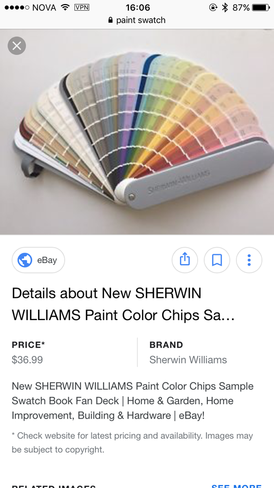
The idea was to collect every single swatch from a paint colour swatch board in a store like GAMMA or Praxis, and exhibit it.
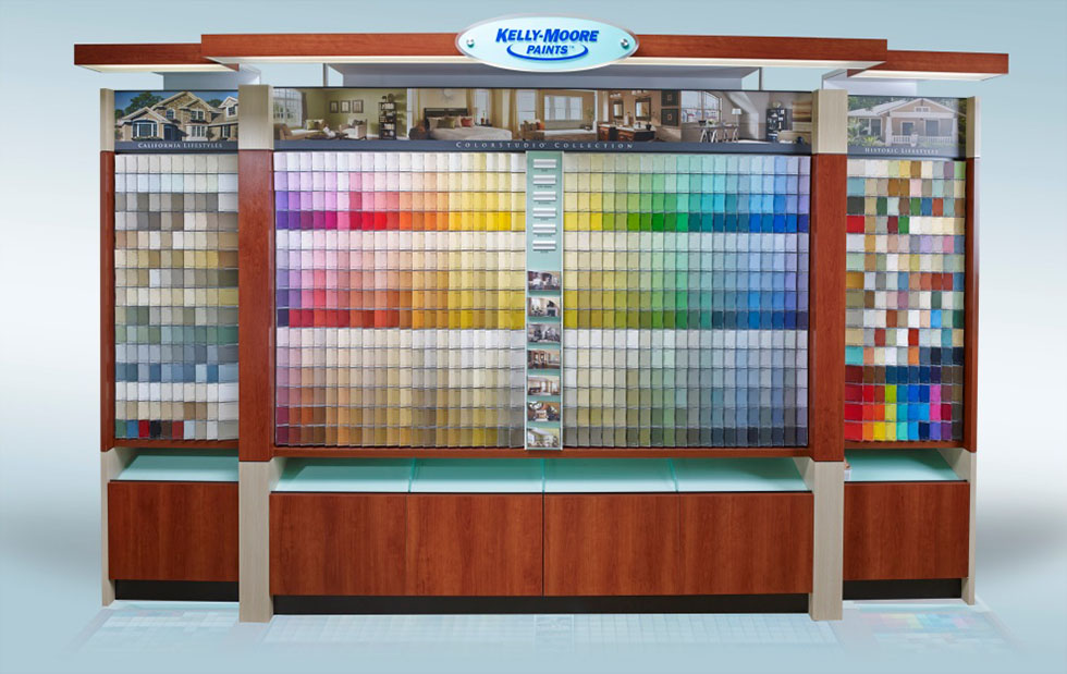
From that idea, came this one: I took all the colours swatches from the wall at GAMMA, or at least I am pretty sure I took every single one… It was very confusing and I almost went blind while doing it because they were SO many.
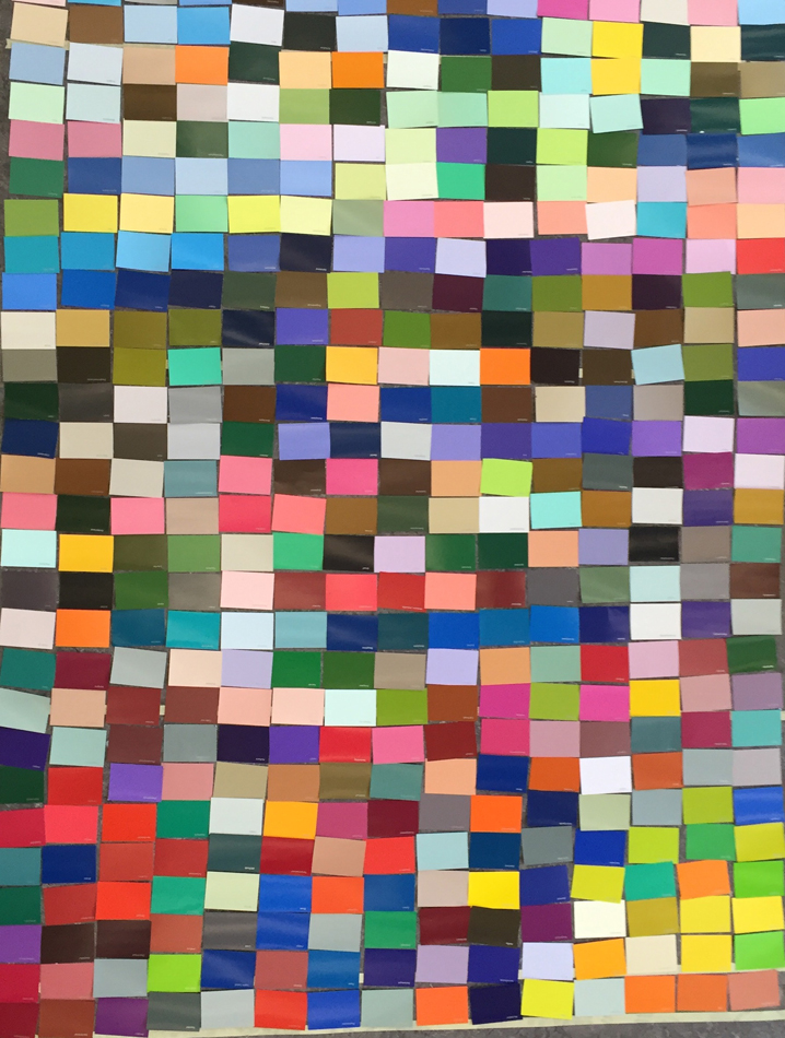
After that I had around 500 swatches.
So my next thought was to arrange all of the swatches by preferance.
I played a game with my friend where she handed me a colour swatch and I had to choose
if I liked it, hated it or thought it was “okay”.
The ones I loved went to the top, the ones I thought were okay went in the middle and the ones I hated went to the bottom. Then I layed them down next to each other, forming a rectangle. It was fun, it was fast, but I wasn’t sure what to do with it. It made an interesting mosaic.
[Insert VIDEO HERE]
This idea of arranging colours by my own beauty preferances,
came from another idea I had at the beginning of the assignment.
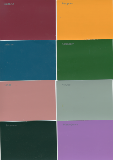
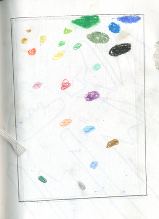
I drew this picture, below, of colors I liked at the top and the ones I didn’t like at the bottom.
Then, these two ideas formed into one.
I painted different kinds of colour combinations that I liked, hated.
Matthias, my mentor, had shown me this book by Sanzo Wada (1883-1967), it is a really thick book with billions of beautiful color combinations. I was very intrigued by it and it made sense now what I should make, my own preferance of color combinations, in the form of a swatch stick.

So, that’s what I did….
I painted on transparent building plastic because it’s smooth
like a baby’s bottom and it is see through
so when I had painted, I could pile them up
and from there they would form all kinds of different paintings&combinations.
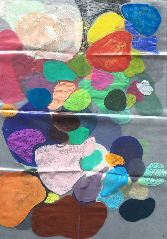
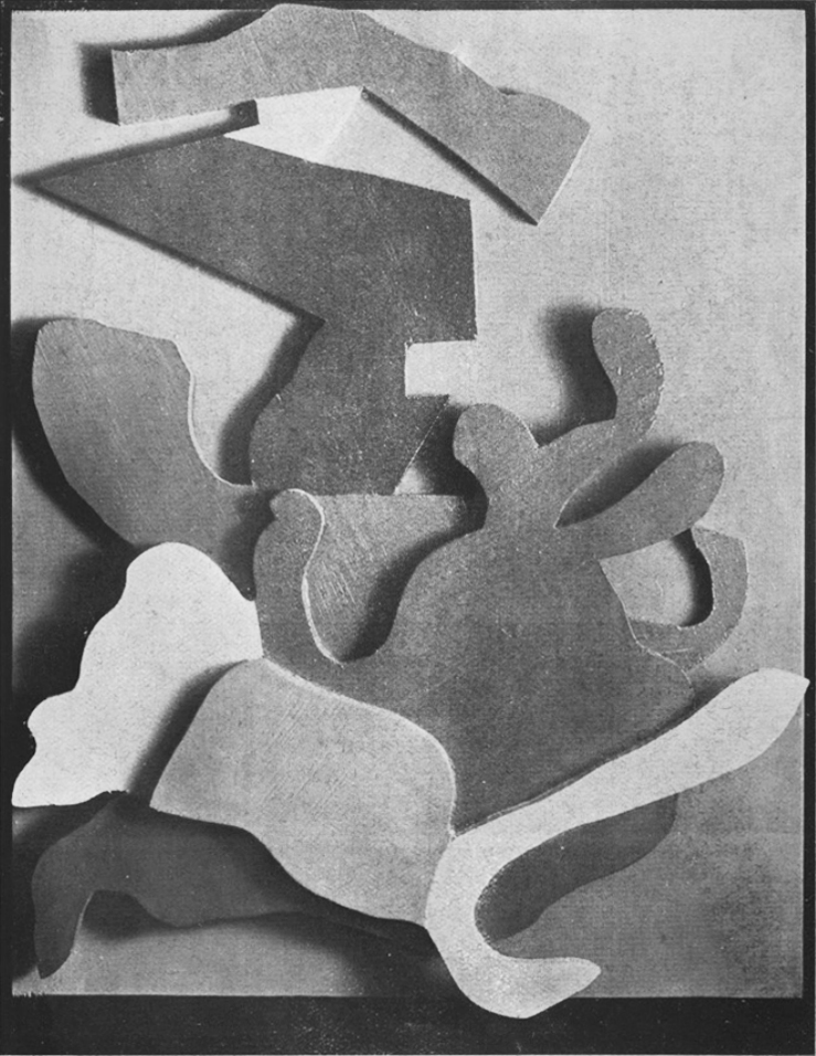
My forms are mildly inspired by Hans/Jean Arp’s paintings and sculptures,
but sometimes I just did what ever, and sometimes the
bigger the colours are the more I loved or hated them.
Depending on my mood.
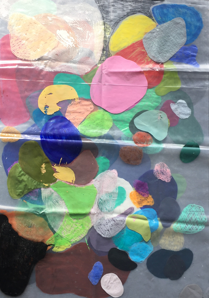
Here you can see Hans/Jean Arp’s form’s stacked on top of each other
forming a composition.
Meanwhile having this assignment in my head I thought A LOT about colour
combinations, more than I’m used to. It was nice..