Skip to Content Skip to Search Go to Top Navigation Go to Side Menu


"history" Tag


verbs in herbs


Monday, April 22, 2019

Rooibos tea.

About redness in tea.  green leafs that dries and take all ascorbic acid away with it, from rudeness that expanded into a settler colony, to a tea latte in a wine glass in jan evertsenstraat. an exploited small mountainous area in cape town , to the Boston tea party that made the biggest tea pot in the sea, I see myself enjoying the last sips of an endemic Fabaceae going to extinction by the time I graduate rietveld.
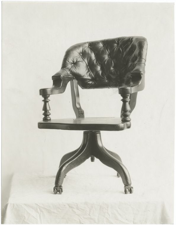
 

GROPIUS.

if clarity is a key tea peculiarity, if metal doesn’t dander in the friction of an almost boiling glass, if the pinky in the air connotes elitism in an anti Bourgeois sphere, if tea cups are in maximum efficiency and simplicity, if the ottomans didn’t invaded the world, if the word design is aware of its meaning, not meaning, and if the cup handle is not a cup handle but an artificial cup hand.

WHAT IF GROPIUS HAD THE ULTIMATE ROOIBOS TEA IN THAT TEA CUP?

Would he have died in his sleep? 


Cup.

Does a cup knows it’s a cup? does a cup like its particular shade? does it knows its position? is it aware of it? I asked a woman from the Boston tea party about this, she said: ”No taxation without representation!”.

I think I like transparency. 


Airplane.

I went on a small 2 days vacation, to come to realizes in the first 3o min on the airplane that I was dinning in west, they gave us cake as the whole dinner meal, and people were clapping when they were done, then the famous exotic pride came after as a rare gem to wash our throats with the over exploited capitalism’s favorite post colonial flavour ROOIBOS… 


What Is The Context?

Well well well, what is not? if potatoes not butter, if butter not cake, let them eat cake! or shell we find some blueberry and make ourselves ink to write on the bathrooms walls and call it vandalism, and stand next to all the isms and SCREAM”. IS IT BETRAYAL, OR ARE WE WRITING FUTURE HISTORY!”

Let them vandal aren’t we all vandalizers.


Taste.

Ummm what does it taste like?

it taste like you my love.

Do you think it tastes like the future?

oh wait, it taste like dancing in fields of yellow flowers on a midday, not so hot mid day.

Do you taste the anxiety?

it smells like their boots.

I am worried.  

Did the flavor change?


Stairs:

she get dizzy every time she go down the stairs, then she forget what she was thinking about. A law of intolerable acts maybe to prevent making a tea pot enough for everyone. Is for everyone? where did you get the tea from? they go or not go to Cape Town, bring or not bring the herb, the red herb!  Is it a flower or or another victimized commodity?


sound:

Manner to not sip laud, a loud sip is to care less. does it depends on the cup, or a glass cup, or cups as glass. Lauder it was as an aquarium bubbling around tiny depressed fishes in a capitalist reality. They knew, fishes signed the petition, the petition was signed for an idea that was stolen from beyond and beyond the idea that was stolen there was an idea of a stolen idea, stolen from an idea that though it will never be stolen, there was the thief that stole the stove, the stove that they made the rooibos tea on, the same tea that he might drank while making that famous teacup, that same transparent love story that was broken after making a tea that was so hot, so hot that never a human drank it ever.


Teaparty.

A card is thickened paper and a paper is a thinned  tree, how can we sustain if we can’t obtain alternation for consumption mania, fixating their future. Tea parties, tea breaks, smoke breaks, call them or not, They gather and discuss all what is so important and not, they assumed and forgot, we are the bitter, but what!


Kanteen.

It was early, early it was, coffee was wondering by herself on the table, on a sugary really sweet pink new paper publication sheet of paper. I poured, poured and poured In that sad paper not paper cup, and throw it in the bin, not so a bin, plastic bin, aren’t we plastic bins after all .
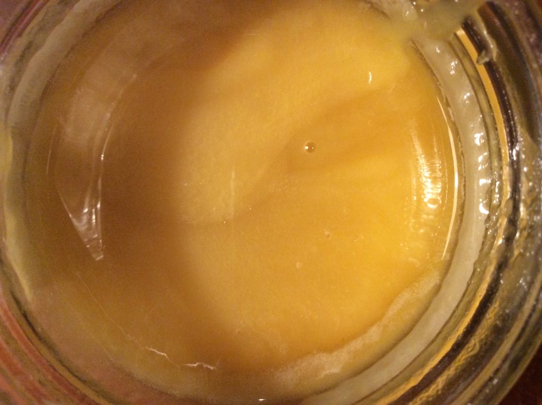
 

More fear and loathing in the library


Monday, December 3, 2018

An overwhelming neutrality swept over me as I entered the Library that dry early winter afternoon.
My brow, void of perspiration and still furrowed from the hours of tedious busy-work that preceded my breaching the  threshold of the Athenaeum.
I looked around at the people sitting and noticed that most of them were not reading, but rather working on their computers. One girl was reading but I knew that she went to a different school, so I will relieve her of any narrative relevancy. Having been given the task of retrieving a book related to the subjects of historical or contemporary typography, I searched through the many rows of graphic design and typographical content; stopping only to dispose of excess mucous secretion that had been accumulating in my upper respiratory tract.
My digits were cold, having remained nearly motionless during the previous class but were slowly regaining their warmth and supple qualities.
My eye caught a black book, titled in small, unassuming characters: Typography : Quand Qui Comment / Typography : When Who How / Typography : Wann Wer Wie.
Upon further inspection, I noticed that the cover was in fact dark blue, which stood in contrast to the playful colors used as backdrops for the letters of the word TYPO. A cathartic feeling was induced by the inherent beauty of the cover alone and I was excited to see its content.
A wide array of depictions of book designs and graphic posters presented themselves upon my opening the cover. Some dated back to ancient times, while some represented the collected works of contemporary designers. I closed the book after inspecting it for about five minutes and walked to the checkout desk to acquire permission of appropriation from the librarian.

* Book no. 757.3-fri-1

Writing as a drawing


Thursday, November 29, 2018

Ideograms and how they can become drawings , loosing their first property of transmitting information , to turn into images we can just contemplate : this is what interested me the most  inside the first book I picked up and this is why I chose « The Art of writing » as as second step. This book gathers a large range of approaches towards writing from different countries and cultures. On every right side of the double pages inside the book, you can find images depicting those ideograms, all in black and white, with an old presentation : captions on the side, numbers & letters under the images :  this gives me the feeling to dive into fragments of a huge archive, travelling through excerpts just like in those history textbooks in high school. The ruined aspect of the book as well as the old list  with all the borrowing dates since 1971 emphasize even more this feeling you can have while entering in an space full of stories. I also appreciate the big « a » on the 4th cover : the « a » as the « starting point of the civilisation » with the creation of the western alphabet ; placed in the end, a kind of inversion is created that i also find interesting. While browsing through the pages, I could notice in the images how present were the ideograms inside architecture and space : on lightpanels of an Asian street, engraved on a south american’s stele or on a catholic church and many more. There is this need for humans to implant visible thoughts in their environments. This need, almost primal, is also what touched me because it carries at the same time a sincerity almost primal (see the page called « primitive signs ») and a desire to understand the world in a more objective way in order also to transmit this knowledge to others.

757.3 une 1

Fear and Loathing in the Library


Wednesday, November 28, 2018


The library in the Rietveld Academie is organized in a spiral form and looking through the books in it’s shelves is much like wandering the streets of Amsterdam as they circle around and around. This layout motivates random discovery but abstains in aiding any targeted intentions.

Luckily, the assignment did not require any knowledge of the library or the contents therein.

With a vague idea of which sections we were to choose a book from, I gazed upon the tall typography section. The individual shelves are lined with countless textbooks and magazines; each bearing their distinct design along the spine. The magazines tend to utilize bright colors, which, when aligned beside one another, blur into an inaccesable mass. Amidst this sea of color I spotted a tall beige book with a black title. The contrast to the surrounding books made it unique. The book’s individuality in this context can be attributed to it’s age; It was printed in 1955.

I took the book off of the shelf the study it in detail. The cover is made of laminated canvas and the title on the spine reads: ALBERT KAPR DEUTSCHE SCHRIFTKUNST.

The font reminded me of the font found on my family grave. Sturdy and very legible with well proportioned serifs. The front depicts a small white on black graphic of writing tools in a frame of black letters. The graphic is humble and unassuming; almost disappearing into the distance of the large beige cover. The first page reads in German “Versuch einer neuen historischen Darstellung” almost apologetically labeling itself a mere  “attempt”.

This honesty won me over immediately and I started leafing through the book. Old battered pages depicted forgotten fonts and the names of their creators. I recognized the name Schneidler from old correspondences between him and my grandfather that I had been reading that very morning. This made me feel like a historian piecing together the forgotten past of his ancestors. Maybe F.H. Ernst Schneidler held this very book. All speculation aside, I seem to have picked the book because I subconsciously recognized aspects of my own identity presented in print. I am book. Book am I.

 
757.3 kap 1

    This is honey.

ART, A LINK TO HISTORY


Monday, December 9, 2013


1979 was the year of victories, revolutions, delusions and cultural innovations; it was the year of the end of the Pol Pot regime in Cambodia, the year of the independence of Catalonia and Basque country, the year of Francis Ford Coppola’s „Apocalypse Now“ and the year of the invention of the IKEA Billy bookshelf.


But why do I all of a sudden care about this particular year? Was that year mentioned in the news lately? Or did something happen in that year that I have a connection to?


The year 1979 got my attention through the “Werker 2” Magazine I found in the “San Serriffe” Bookstore [x] in Amsterdam.


werker2_magazine


Werker 2 – A magazine edition designed by Marc Roig Blesa and Rogier Delfos for the exhibition „1979, A Monument to Radical Instants“ curated by Carles Guerra in 2011 in the Virrena Centre de la Imatge of Barcelona dealing with the issues of daily life in crisis of working class young men.[x]


With photographs and texts selected from secondhand publications – printed enlarged in blue-white – they show us the history of young men at work,  of unemployment and of protests. In the very special way they stage the pictures in the magazine, it becomes very obvious that photography was and is still a medium that communicates the essence of a situation.


Skimming through the pages of the magazine I get roped into the images and texts and I am interested to learn more about the historical context.


Why do these old photographs fascinate me so much that I want to know more about them? And would it be the same if I saw them in an ordinary news paper? What is the link between design / art and history?


A lot of artists or designers are dealing with these kind of questions. In our time, in which everything is well designed and life is getting faster with every new technical invention, our eyes are used to being attracted to things that look nice and are easy to get.


That is why it is getting more and more important that art and design connect with history and trigger people with unusual visual elements into getting interested in whats happening all over the world, about history and its connection to today, since a lot of people don’t even read the newspaper anymore. They don’t bother reading long articles anymore, especially if the layout is unattractive and uninviting.


Not only Marc Roig Blesa and Rogier Delfons are dealing with this issue. Other artists since the post-mordern movement, like Ai Wei Wei, El Anatsui and Allan Sekula who also appears in “Werker 2” magazine, are discussing political events with photographs and philosophical essays.


Such political photographs or artworks have there own language which is mostly stronger than just an article in a news paper, because the artists automatically point out their own view on happenings in a visual way. This brings the topics and concerns closer to the audience. It is often so, that we feel more connected to things as soon as we see that these things bring up emotions in other people to which we can relate.


werker2_magazine3


By zooming into old secondhand publications and combining text with images, the two designers Blesa and Delfos display the line between the different worker-movements during the 20th century. They take us on a journey through history in a very atmospheric manner. This intrigues me. The blue-white colours take away the old notion about the photographs and translate them into a modern design. With this simple „trick“ they show us that history from back then is still fundamental in today’s daily life.


To me, this issue of the “Werker” Magazine makes it very clear that design is very important – if you want to reach people, arouse their interest and trigger their emotions, the layout is very decisive. Don‘t just string together texts, add some pictures and that‘s it. Such a design is outdated in the present media world. But if you present your content in a form which is entertaining and at the same time visually attractive, you will not only attract attention, but also lay a bridge between a interesting topic and an interested audience. I think that Blesa and Delfos have mastered this challenge in their “Werker Magazine”[x] in a very succesful way.


werker2_magazine2

Rietveld library catalog no: magazine

The Dark Side Of The Chair


Tuesday, April 23, 2013

It is funny and scary in the same time to which result I was leaded this time of researching by using the tags chair, history and portrait. The book is dark on the back and the front and shows an image of a chair, the unclear shape of a phantom which covering the shine of its own ghost, heavy and stiff but the best thing is the book is German. Another German book about the history of chairs and again the title of the book is making me to laugh again. “z.B. Stühle: Ein Streifzug durch die Kulturgeschichte des Sitzens” is for me as well absurd and funny as my first choice in the library “A Chair makes history”. This time the book introduces itself as a guide through the cultural history of SITTING, which I think is the most funniest and beautiful way to find a title to describe the history of a design object, which function is mostly to relax the human bag and ass.
As well as last time the image shows no longer a simple picture of a chair, it is almost again a portrait of a chair which you can find on the front cover of the book, but this time tis image becomes for me to something strange. While the last book I took had a really bright and sort of funny, colorful, cover, which was perfectly hanging together with the title, the book “z.B. Stühle” has a really dark and heavy appearance. Without the title and the text it could be misunderstood as a book about satanic rituals with chairs or dark spiritual experiences with chairs but not as a leader through the history of sitting. The title in relation to the book cover design is for me a big paradox. The title “z.B. stühle” which means “for example chairs” sounds really easy, like “let’s talk about something, for example chairs or trees” which is really well supported by the text below. It sounds cool and relaxed, while the book cover is dark and heavy and doesn’t represents coolness at all to me, rather an image of violent and brutal history, which might be also presented in the book, for example chairs as torturing instruments. All in all the most interesting point is that the tags which I used for the research are leading back to a book which is almost as well absurd in its appearance as the first book I’d choose about the history of chairs. It seems to be not easy to write or create a good or well-chosen title for a book about chairs without letting it sounding absurd.

Rietveld Library cat.nr:774.9

A Book Makes History?


Thursday, April 11, 2013

When I search for a book in a library or in a book store the design as well as the title of the book has to be eye catching, recognizable for me and outstanding in its own appearance between hundreds or even thousands of books, especially if I’m not searching for something specific and have to walk through an overwhelming sea of letters and information’s.
Therefore the title, the subject or the design of the book doesn’t have to be beautiful or about something I’m interested in, it could be anything from an absurd, paradox, nonsense title/subject to an extremely kitschy, not aesthetically attracted cover design. The most important thing for me is to not only recognize it in ways of attraction rather as well in ways of questioning the whole appearance, the first impression of it.
The first book that got my attention was the German book “Ein Stuhl macht Geschichte” from Werner Möller and Otkar Mácel, a book about different design chairs of an exhibition in the Bauhaus Dessau in 1992. It was not the subject which interested me; it was the title which first made me laugh. Normally I would connect the sentence “A chair makes history” not with a chair, something that makes history for me are people or certain happenings in the past history which are responsible for certain effects on our society or changing points in our systems of thinking or culture as well as political behaviors.  Of course I can see that the design of some of the chairs could have had a certain influence on a new way of living, a new lifestyle but I still see the title connected to a persona or a personification, a group of people or a movement which changed something more life essential than a chair (which mostly just changed something in the “history” for a smaller group of people). To be honest I think it was just absurd and funny for me to use such a personifying sentence for some object like a chair, which you basically use to relax your ass.
The Cover in that context to this thought was even more interesting, you can see on the front as well as on the back page black and white images of different Bauhaus chairs which have for me the appearance of old portraits of important figures of the human history, covered by a big black and white image of a Mies van der Rohe chair. For me that was definitely an interesting way of the personifications of chairs in context to the title as something historically important, almost holy, like the birth of Jesus Christ. I’m looking right now at the book and I’m still impressed by just the visual effect of it. I think it is the first time that I’m actually more interested in the cover as in the subject of the literature.

Rietveld Library cat.nr: 774.4-cat-20


Log in
subscribe