Skip to Content Skip to Search Go to Top Navigation Go to Side Menu


Archive for March, 2019


Nicolas Bourriaud – The Exform – Designed by Erik Carter


Wednesday, March 13, 2019

I saw this little guy in the library and decided to pick it up.

The first thing that caught my eye was the vibrant neon back cover of the book. It fascinated me to see something so small yell out for attention in such a violent way, almost as if it was a small Chihuahua, barking at the slightest suggestion of danger.

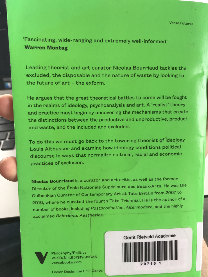
Having fallen for this Chihuahua’s barking, I picked it up and flipped it around, expecting it to yell as loudly as its backside did. However, I was pleasantly surprised. The front of the book showcased a multicolored illustration, displaying repetitive shapes reminiscent of a futuristic painting by Russolo. The stacked curved shapes and the black space beside them caused the illustration to look spacious, as if I was looking through a window into an unknown dimension.

The use of color was quite dimmed, though, which exaggerated the contrast between the front and the back cover. However, there wasn’t a disharmony between the two, due to similar colors being present in the illustration and the neon green corners cutting off the edges of the illustration.

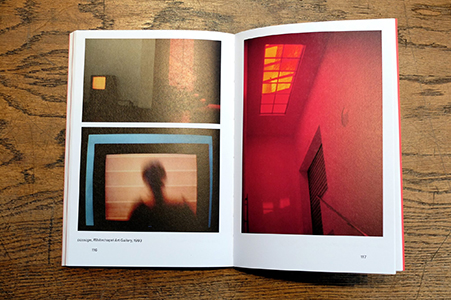
Opening the book was kind of a let-down, I was expecting something as vibrant and thrilling as the cover, but the inside just looked like an ordinary book to me. I guess you really can’t judge a book by its cover! However, I’m sure the content of the book is equally as thrilling as it’s cover.

Regardless of the content, I’m still happy that I chose this book.

I decided to investigate the design a bit more in depth. On the bottom of the back cover, I found the name of the designer; Erik Carter.

With a quick Google search of the name, I found the following information on his website.

Carter is an art director and graphic designer based in California. He’s worked as a senior designer at MTV, an art director at Google and The New York Times. In a brief list of his big clients I found the name Verso Books, which is the publisher of the book I chose in the library. This gave me hope that I’d be able to find a lot of information about my little Chihuahua.


A still image from an animation Erik Carter did for BuzzFeed

Upon reading that Erik Carter worked as a designer of on-air animations for MTV, I was brought back to the afternoons in my teenage years I’d spent mindlessly watching television. A strong memory that stuck with me from those afternoons were the flashy intense animations MTV would present before and after a commercial break. I always found those animations incredibly confusing and interesting, and I’d wonder who came up with these wacky designs. This unexpected link to a memory from the past gives me the impression that I was somehow destined to find this book and research it.

I started reading articles and listening to interviews with Erik Carter, hoping to find some information about my precious little book. And then, in an interview with the “Type Directors Club” I found what I was looking for. Turns out that my book was part of a five part book series that Verso books commissioned Carter to design covers for. The covers form one continuing image when put next to each other. My book is the last book in the series, the youngest of its siblings.

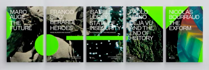
In the interview, Erik Carter talked about the process of creating the covers in collaboration with the publisher. Turns out it was quite a stressful process, with many rejected ideas in the short time frame of only three weeks. Many designs he presented were found to be too busy. This eventually led him to the final design, which, while still having an energetic design, still reads as calm and somewhat minimalist.

A nice detail to the design was the story behind the background. What seemed like a mysterious space-scape to me, was actually part of a collage Carter made of advertisements he found in Playboy magazine. He explained that part of the background was actually just a distorted image of ice cubes. Knowing this, the book and its design gained an element of playfulness to me.

So here I am, knowing what I know now about this (ex-)stranger in front of me, feeling like I’ve learned its entire life-story, no secrets left to uncover. Of course this is completely untrue, since I haven’t read a single word of the book’s content.

I know the book now as a designed object, not as a bearer of information. I can’t help but feel like the book has more of an autonomous identity to me now, than if I had only read its content, even though I only looked at its cover.


Nicolas Bourriaud: The Exform. design by Åbäke, Rietveld library number: 700.6 bour 4

I CAN’T WORK LIKE THIS


Sunday, March 10, 2019

I CAN’T

WORK

LIKE

THIS


      I have chosen an orange book, about the size of a big holiday novel. But with a cover much more animated than a novel.

      The title in bold immediately intrigued me: I CAN NOT WORK LIKE THIS. The title is a point of view, an affirmation, rather mysterious, in any case attractive, which challenges us, and that we want to understand by opening the book. Who is it? What work? What prevents who to work? And what does this negation mean? Is it an edgy, or paranoid character?


      The typography of the title and the first pages, is impersonal, an imposing typo: Helvetica. But page after page, we discover a set of typography that become more and more specific and personalFirst a novel writing: The Times New Roman; then the typographic style of a typewriter: ADLER; and finally, handwritten characters.

        The paragraphs are changing too. At the beginning, they are inserted seriously and strictly to the right of the pages. Then the paragraphs come to life, and bend in every direction; some follow the form of images; others are divided in the same way as on the pages of an agenda. Each time the titles are put forward, they are imposing, and have an important line before the beginning of the paragraph.

        Unlike typography and paragraph, images retain their homogeneity and conductive line throughout the book. These are the torn paper effects that surround the images, and organize the book as a collage. Some images are not limited to pages, and may overflow and continue on the next page. All images are in black and white. Only the cover has color (orange). These images mix a little all times, and all media. These are both old letters, drawings and photos, but also screen shots of Facebook conversations or emails. This kaleidoscope of images and times makes us lose ourselves in time. There are also many scans of manuscripts, with arrows in all directions, words over-lined or surrounded to follow the reasoning of the creator.

      The spine of the book also deserves a comment, because the drawing on the borders of pages overflows and bleeds from the pages. These are black lines that remind of tearing of the book. This creates a dotted pattern when looking at the book from the side which is also convenient for finding your way in the book, since they indicate a beginning of chapters.


        Everything looks like a patchwork. Looking at the graphic designer’s chart, Krysztof Pyda, you immediately recognize the spirit that has imagined the book. The instagram of the designer is indeed a collection of images, and it is exactly this same idea, this same visual ensemble that one finds in his book. It is a multitude of documents, more or less connected at first sight, but which are connected by arrows, handwritten indications, which gradually make us enter into the intimacy of the creator. That’s why I chose this book: it intrigued me like an intimate diary. Each page is a surprise, each time more personal than the previous one.

            In deepening a little more, I realized that it was a book whose subject was about art and politics. First, the subtitle clearly tells us: A READER ON RECENT BOYCOTTS AND CONTEMPORARY ART. Then, the purpose is clarified with images mixing political slogans, caricatures, works of art, photos of events, maps of the world. These images are connected to each other by arrows; some parts of the documents are broken. We enter into the imagination of the creator, having the impression of following the path of her research and her thought. The reader does not read a book whose purpose is purely political, but is drawn to the point of view and the vision of the creator. These are not speeches with dates and facts, as we could see in an history book. They are pieces of image, texts, full of documents, where each page expresses, strengthens and defends the general idea and the point of view of its creator.

           This book immediately reminded me of my sketchbooks and research books. I work a lot with collages, snippets of images, and my notebooks are also disparate collections of papers, covered with drawings and handwriting. All the papers I keep in this notebook have for me a story, show something of our generation, even if they are as everyday and innocuous as for example cash receipts or or transport tickets. All in any case are related to the places I cross, to people I met, all remind me of a particular moment. On each page, I play with the composition, an image in the foreground completes that from below.


I CAN NOT WORK LIKE THIS, is a book that I loved to turn the pages, flip, flip, stop, first for visual pleasure, but also to try to understand how it is organized, graphically. The creator really plunges the reader into his most personal research, his thoughts and his points of view, like an intimate diary.

Joanna Warsza : I Can't Work Like This a reader on recent boycots and contemporary art. designer: Krysztof Pyda, Rietveld Library Cat. no: 700.7 war 1

PANAMARENKO – WORKSTATION BIEKORFSTRAAT.


Sunday, March 10, 2019

It is said that you can’t judge a book by its cover. Can you, then, judge a book by its spine

Without even reading what was actually written on its spine, my attention was already drawn to the book “Panamarenko: Workstation Biekorfstraat” through the way it was presented to me; acting as a successful gateway to everything that it had to offer in terms of material. As a piece that was advocated for and supported by the Museum of Contemporary Art Antwerp, the designers, the duo Van Looveren & Princen, no doubt had a great responsibility on them when tasked to design the book. This becomes evident by looking at even the connective piece between the cover and back-cover that stuck out of the bookshelf, ready to be chosen.

An olive-green, textured fabric, wrapped and spanning from part of the front cover to part of the back cover, with the two separate pieces of text coming together to form the greater title. The two texts are as similar as they are different; One is presented in a care-free and playful manner through its stylized font, as if handwritten, whereas the other gives of a much more stern vibe as if passing an ode to the typewriting system with its more ridged typeface. However they find common ground and confide in each other in the manner that they seamlessly contrast the fabric on top of which they are placed by being left blank in regards to their colour. The use of a more casual and characteristic typeface for the first part of the title of the book presented me with a very personal impression of the contents that the pages would contain, almost intimate; almost as if the artist himself entered the room and wrote his name on top of the spine (Despite this, this does not relate to Panamarenko’s signature). This is then contrasted by the continuation of the book title which is shown in a much more organized in presence, which made it a lot more clear upon even the first glance that everything that was to be presented inside would be done so with an approach aimed to provide a sort of guidance and structure.

In fact, the book does exactly so with its material – providing a very extensive list of everything the artist contained in his house in an, at times, almost satirical catalogue-like manner. This plays well into the duo’s style of work, which tends to present a plethora of objects in a very efficient and condensed style, as can be noticed by some of their other works. The book itself focuses on the preservation of the entirety of the artist’s workspace, which acted as a his hub for creativity from 1970-2002, acting as a means of casting light on the creative process of the artist’s works; Most of which noteworthy for their sciencefiction inspired, machine like structures. The title, as such, give off a strong idea of what was to be shown, by presenting the actual street address >Biekorfstraat< in which the house was situated, in addition to providing the purpose of the house as a workstation.

Despite looking through the book prior to taking it up to the librarian to have it chosen, the simple yet effective presentation of the spine drew me to it as though it exposed the entirety of its contents to me all at once, and opened the world of Panamarenko to me. It was not just the textured fabric, only the typefaces and simply the contrast that drew me to choosing the book, but a combination of all three, indicating that the spine of the book was not a quick idea thought up by Van Looveren and Princen, but rather an important aspect of the book which was deeply thought of before being put into final production.

Willemse, Hans; Baere, Bart De; Coulon, Didier; Deleu, Luc; Willemse, Hans: Panamarenko, Workstation Biekorfstraat. design by Van Looveren & Princen, Rietveld library number: pan 9

ross, m1


Saturday, March 9, 2019

I chose the book Ethical Actions: A Critical Fine Art Practice based on it’s size and colour.
There is a whole section in the middle of the book which is red and the cover has this mystical redness to it.
The book being a red thread I grabbed and then tried to find this red thread throughout the book.
I have been very attracted to the colour red lately and it has been like a red thread in my life having lured me towards it.
I wear a red coat and red glasses and I feel the best if I am wearing the colour red from head to toe. For me the colour red reminds me of something warm. Maybe by being so drawn to the colour I might be getting closer to something of value in life. Getting warmer.

Getting back to the book from the colour red I get so distracted by the book is very convenient both in size and shape.

Fits well in your hand. It’s quite a decent thickness and I like how therefor the pages are matte and quite sturdy. It has quite a strong interior. The overall design and layout is quite clean and well-balanced by text and images which are given enough room to breathe. It also helped that the artist was a woman and the editor are women.
The book is designed by a design practice called Julia.
Here I leave a link to their website but there you can see several images from the book. These images will give you a good idea about what this text is about or the content and layout of the book.

https://julia.studio/project/monica-ross/

                                                http://www.lespressesdureel.com/EN/ouvrage.php?id=5207&menu=

The publication fully documents Ross’s works from the year 1970 to 2013. She worked with video, drawing, installation and text.

She was very socially engaged and a feminist. Her artwork is know for being very performative. Her work is said to have left  a deep effect on contemporary art and society.

When you open the book quickly you can see that it is divided into three sections.
The first section appears to be essays about the artist Monica Ross, by other well known theorists and artists. For each essay there is a lot of space given to the title, the name of the people writing the essay and a photo which seems to be of a piece or an artwork related to the content of each essay.
The first spread before each essay, introducing individual writer with a name of the author and the photograph, are all design in the same way.

The essays themselves on the other hand are either placed vertical, situated in the middle of each page or horizontal, spread over two pages. Some of the essays also have photographs intertwined in the text.
Then we are situated in the exact middle of the book where there is a bunch of red pages. On these pages is a critical text, piece or an essay written by the artist. The text is situated on the left and is written in the style of a prose or a poem.
The colour red seems intentional because when you look at the pages on the inside of the cover of the book, they are also red. So in a way it is like she, the artist, runs through the book. Like a red thread. With the red pages opening, closing and centering the content.
In the second half, the third section of the book, are photographs of works by the artist.

It seems to be more informative and is very clearly sectioned. It is easy to find what the reader might be looking for. A summary of all the works with small pictures and a short text that seems to be information about each artwork. Then the paper changes from matte to slightly more glossy and the photographs of the works are printed bigger so the reader gets the opportunity to observe them. Most of the photographs seemingly being documentation of her performances.
Like I said earlier the book is mostly printed on matte pages. Including the cover. The font is in most cases the same and very approachable to the reader.
Between each section there is enough space that gives the reader time or room to breathe or to contemplate or appreciate the content throughout the book highlighting the essays and the artists work as separate peaces. This book is said to be a valuable art-historical document and is designed in a very accessible way.

Monica Ross : ethical actions: a critical fine art practice , designer: Julia, Rietveld Library Cat. no: ros, m 1


Log in
subscribe