Beginning of a story tree
1683,
mentioned in printers
forgotten for many winters,
The scabbard?
The millboard?
no CARDBOARD!
paper?
no
heavy-duty paper!
The Kellogg brothers,
and by the others,
being used
being wrapper
flaked corn cereal shelter,
heat-sealed bag
for when you need to bake,
than being named
not to be ashamed,
“the brand”
by demand.
Kieckhefer Container Company
“hmmm good idea”
money!
honey!,
being use more
even offshore.
After all,
the way of carton being swerved ,
Being observed
Being tested
Being developed
being differed,
Containerboard
Folding boxboard
Solid bleached board
Solid unbleached board
Binders’s board,
being bored?
Ok,
let’s talk about
CCM,
two paper type paper,
higher grammage
problem?
no!
advantage.
The strength!
like sandwich,
line
wave
line,
brown
white,
poorness
majesty,
till 20th century,
"cardboard" Tag
A story of…
Monday, May 27, 2013
“Traditionel Japanese way, but with a strong european perspective”: Nederlandse trots
Monday, May 27, 2013
The other day I went to „the Frozen Fountain“ to look at the tableware and furniture from Scholten & Baijings. The dutch-designer-duo is famous for its minimalist – but still detailled – designs. They produce furniture, hometextils, various objects and tableware.
When you walk in the shop at the Prinsengracht in Amsterdam, you enter a fairy-tale world full of beautiful things. Every time I’m there, I imagine how it would feel to own a house with all these beautiful things in it. From the large selection that is exhibited, I‘m particularly fascinated by the products of Scholten & Baijings. At first glance, they seem quite banal. But if you‘ll look closer, you‘ll discover a lot of charming little details, an unusual handling of materials and a eye catching play of color. Scholten & Baijings work since many years with the owners of „the Frozen Fountain.“ Their cooperation has enabled quite a few product launches and contributed to the renow of the dutch designer couple.
Scholten and Baijings products are characterized by their minimalistic design, their striking forms and their handsigned colours. But what I like best about their work is the fact, that you can feel the craftmanship behind every object. Their products, regardless of whether their dishes, their „vegetables“ or their furniture, reflect their way of working: To imprint their very own stamp on a product, they first dismantle a common object, they peel it like an onion and then rebuild it based on their own vision, layer by layer, and with their personal signature.
Although they work – as they say – in an intuitive way, start with a sketch, make a model on which they can experiment as long as necessary before converting it into the finished product, they never work only „from the gut“, but always enrich their work with thorough research. During this whole process – the two call it “atelier way of working” – the product is continuously developed.
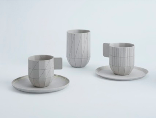
“Colour Porcelain” – Scholten & Baijings, 2012
You can see and feel this process in every object by Scholten & Baijings. Wheter in their interpretation of the „MINI one“, which they showed at the Milan Design week in 2012. Or in their „vegetables“, which they produced from A-Z in their own atelier. For those very realistic objects made of textile, they did everything by hand, dying the fabrics, forming the shapes with threads, stichting in details, with one purpose: To see whether the intencity of the work changes if everything is produce inhouse. For me, those vegetables do not only look good enough to eat, they also carry a soul – a soul that were breathed into them during the intense and intimate work process.
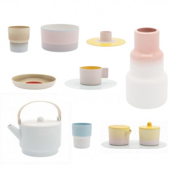
The same goes for their tableware, which are my favorites: The pieces of the „Total Table Design“ collection look as they were made from cardboard, even though they are from porcelain. To achieve this result, Scholten & Baijings started their research with paper. They folded, cutted and worked as long with the bendable material, until the found the desired shape – and the wanted effect: The collection plays with the ephemeral cardboard fragility.
“Paper Porcelain” – Scholten & Baijings, 2010
To reinforce this impression, they used the Japanes porcelain from the firm 1616/Arita for the production. The name says a lot about the history of this manufacture: 1616 stands for the year, when they were founded and Arita is the name of the city, where they come from and still are. Scholten and Baijings met the pepole of 1616/Arita in Milan, where they showed the Dutch duo a piece of raw porcelain, which they liked because of its grey-white color. After this initial contact, they deepened their research of the porcelain from Arista, first with books and then with a trip to Kyoto. They stayed in a house in the mountains, where they realised first designs, which they perfected back in the Netherlands. In the course of this development, they discovered that the porcelain from Arita was exported to Europe extensively from the port of Imari/Saga, between the second half of the 17th century and the first half of the 18th century. For Scholten and Baijings this fact closes a circle:“Our tableware is made in a typical and traditionel Japanese way, but with a strong european perspective.“
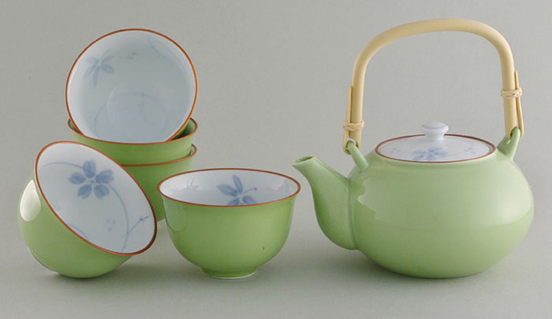
Traditional Japanese Arita Porcelain
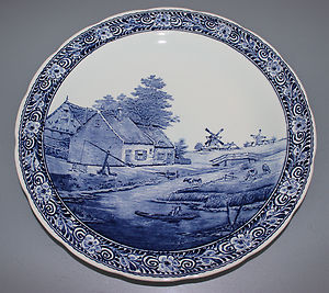
“Delfter Porzellan”
So when I drink my coffee out of a cup by Scholten and Baijings, I do not only hold a beautiful piece of design in my hand, but also a piece of history: In a wider sense a piece of cultural history and in a more personal sense a piece that tells me the story of the journey of two designers, who are constantly exploring their craftmanschip-limits. The coffee out of a Scholten & Baijing cup taste very very good!