GENERAL INFORMATION ABOUT THE CREATORS OF AZART TYPEFACE:
Azart alphabet is designed by Guy Rombouts & Monica Droste
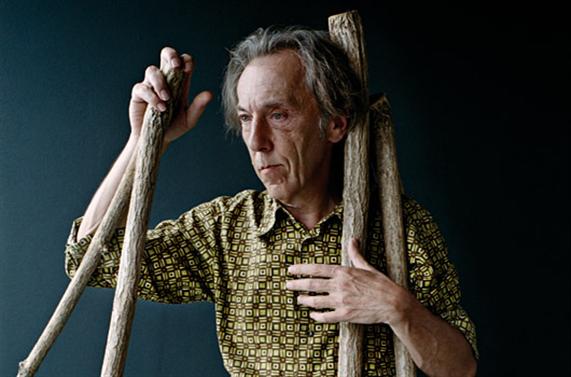
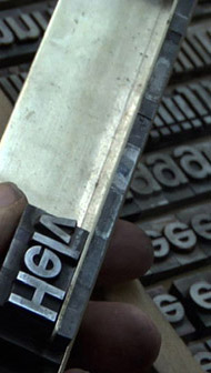
Guy Rombouts is trained as a printer-typographer. Since the seventies, he works on alternative communication systems. According to Rombouts, direct communication is not possible because some ‘feelings’ cannot be expressed through our language. This is the main cause why he is searching for a system where form and content might coexist. which is an almost impossible goal to reach since every language is subjective and languages are constantly changing. Guy Rombouts expands and questions what it means to communicate.
Link to Guy Rombouts lecture: [x]

AZART
In 1984, an abstract alphabet called AZART was finalized by him and his companion Monica Droste. There are few references that term alludes to:
• AZ-Art, art from A to Z, art for art
• French word hazard that means the coincidence
• The Azart is Russian for inspiration or passion in the game
• The bridges: Idea, Word, and Conscience. (pictures will be bellow)
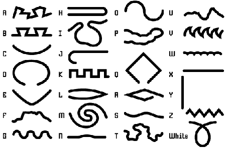
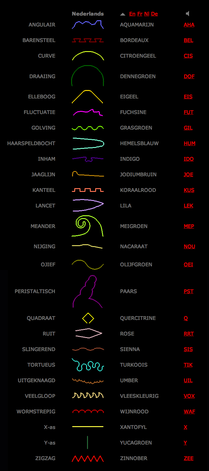
Each letter correlates to:
a line with the specific name,
the color that relates to the first letter of that color and sound
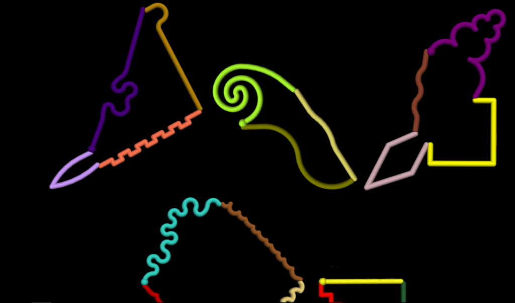
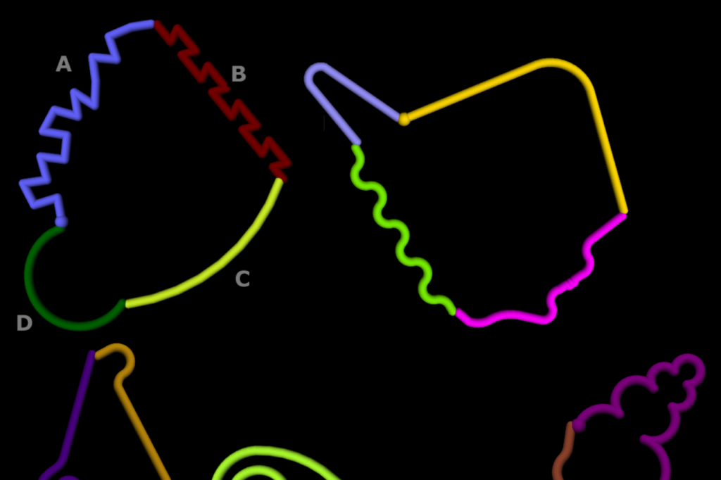
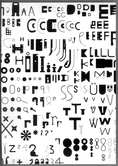
In Azart each letter is translated by a corresponding line, on the basis of the first letter of the word which describes the line.
A is angular, B is barred, C is curve, D is deviation and Z is a zigzag line.
AZART CHARACTERS & AZART COMPUTER PROGRAM
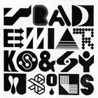
AZART alphabet is very much trying to make word physical or special. It combines letters into words as two-dimensional objects, instead of one-dimensional strings. According to Guy Rombouts, the use of color causes stronger affection between letters than in normal text. Just like in spoken language – where each sound influences the sounds preceding and following it – letters must adapt to their neighbors. This is way sentences appear as 3D characters. It creates an image in which each letter is replaced by a line. When the lines are linked together forms and word as images appear.
Azart words define themselves in a visual way
PRESS THE LINK*
http://www.azart.be/azartstart.html
AZART PROGRAMME
The Azart computer program was made after the alphabet’s completion. It visualizes the natural Azart writing activity and the method/principles how the words/sentences are communicated through Azart.
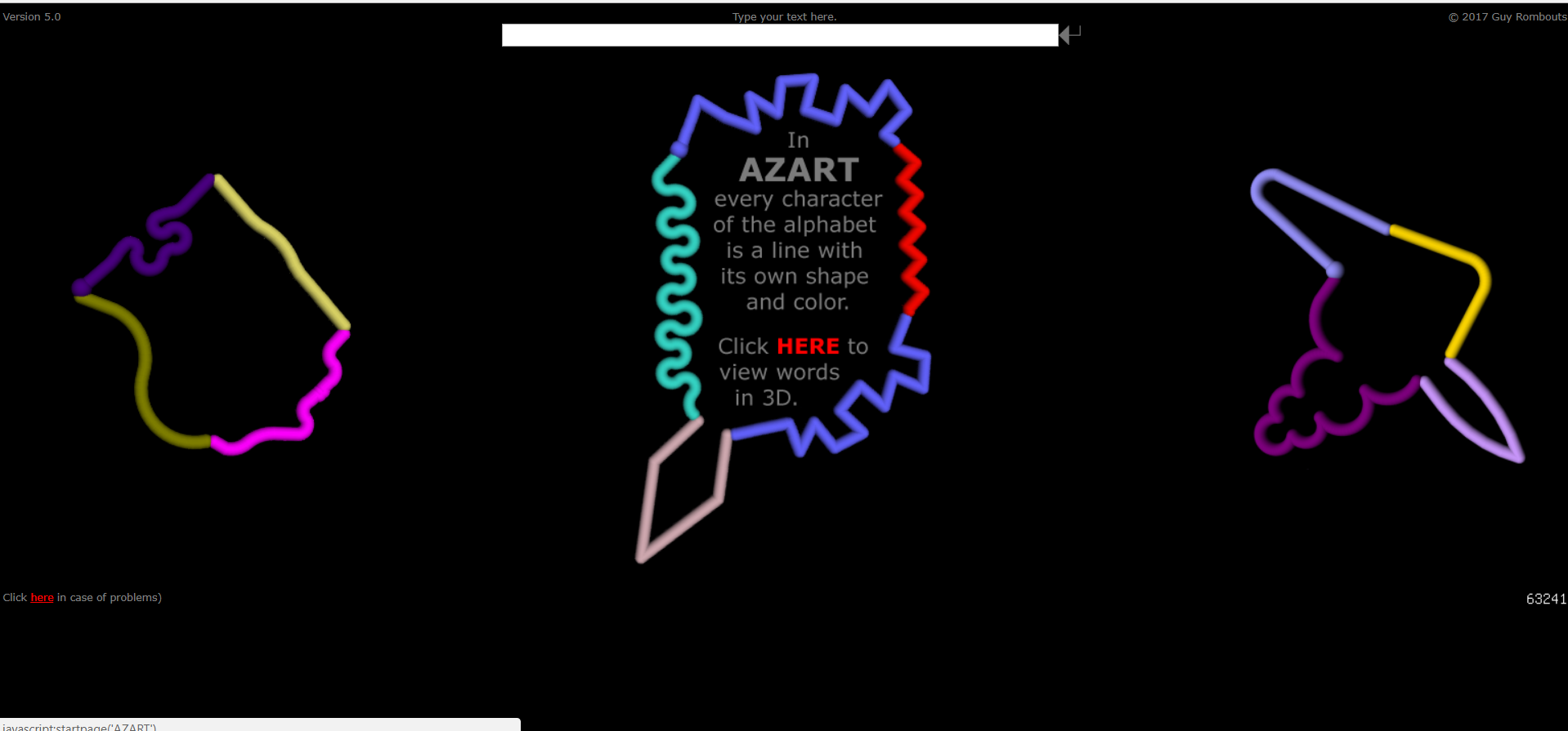
you can create your own Azart word with the image link above:
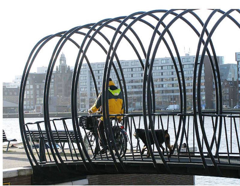
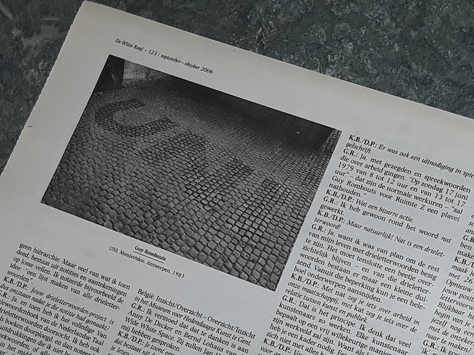
On this website you can see a number of bridges designed by Guy Rombouts and Monica Droste. The serpent figures in the bridge railings forms a word. Nine letter- or Word-bridges by artist couple, 1994. The Belgian artists designed a whole new alphabet, ‘ the regulation ‘, an image in which each letter Azart is replaced by a line. The squiggly figures in the bridge railings forms a Word. Bridges to a certain extend do refer to language they have same function – connection and comunication
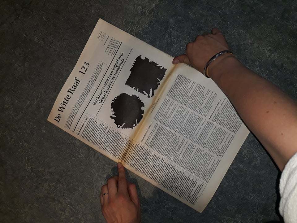
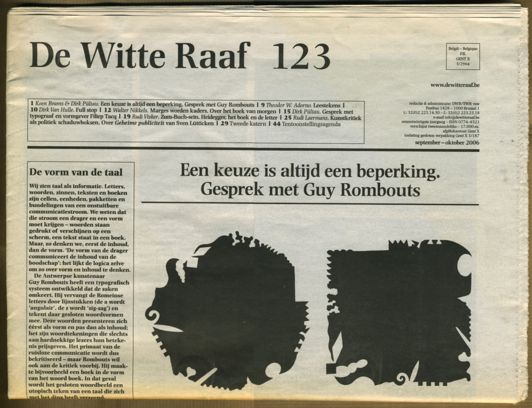
Quotes from the interview of the witte Raaf (that in our opinion give some insight to approach that Rombouts has) :
Volledige interview: https://www.dewitteraaf.be/artikel/detail/nl/3110
‘De verwondering over het gewone; het feit dat wij het normale niet normaal vinden.’
‘The wonder of the ordinary; the fact that we normally do not find it normal. ‘
‘De alfabetische volgorde is een garantie voor neutraliteit, ze kent geen hiërarchie.’
‘The alphabetical order is a guarantee of neutrality, it has no hierarchy.’
‘Ik was gefascineerd door de spanning tussen woorden en dingen. Je hebt die strakke, lineaire lijst van 26 drieletterwoorden, die allemaal even lang zijn; maar de objecten zijn totaal verschillend.’
‘I was fascinated by the tension between words and things. You have that tight, linear list of 26 three-letter words, all of which are equally long; but the objects are completely different.’
‘Obsessies kunnen vervelend worden, vooral als je er niet zelf voor kiest. Als je zelf een obsessie kiest en daar tijdelijk inkruipt – als spel, ironie of knipoog – dan kan het heel ontspannend werken.’
‘Obsessions can become annoying, especially if you do not choose them yourself. If you choose an obsession yourself and temporarily sneak in – as a game, irony or wink – it can be very relaxing.’
‘Ik hou ervan dingen bijeen te brengen zonder ze vast te leggen. Dingen vastleggen is vreselijk. Ik probeer lijm te vermijden.’
‘I love to bring things together without recording them. Capturing things is terrible. I try to avoid glue.’
‘Er is niets zonder moeder. Zonder moeder bestaat niemand.’
‘There is nothing without a mother. No one exists without a mother.’
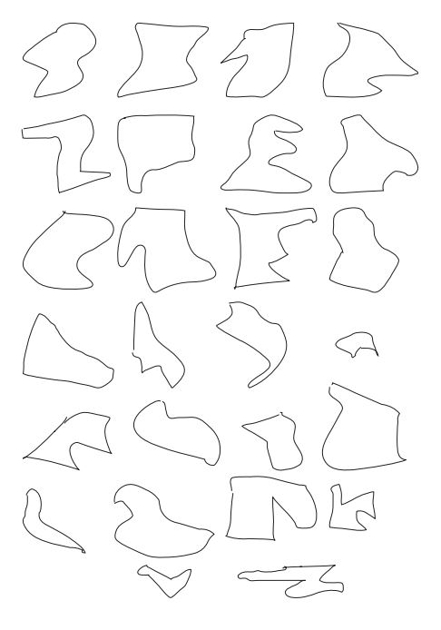
Pam: ‘I also composed a new alphabet with shapes that you can see above. I stood in the form of the letter that, in my opinion, represented the letter. After having been in this form I converted it to a computerized graphic letter. My alphabet is still from A-Z and you can read it in your own way. It was interesting to try out how I could use my body to create an alphabet and not to use the existing form.’
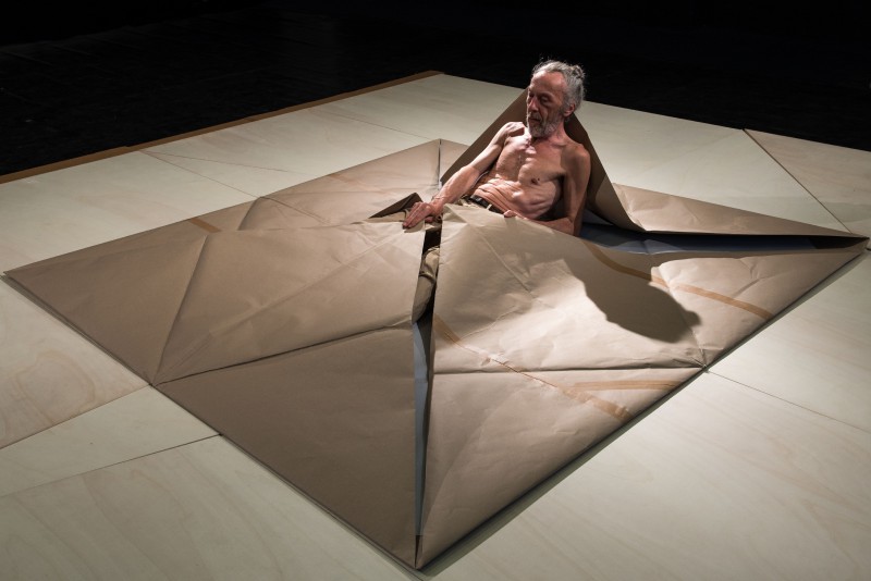
FOURFOLD Autonomous Scenography
Autonomous Scenography-project that started in 2014 by Meryem Bayram
Bayram’s artistic practice as visual artist and scenographyer explores the parallels between humans and their environment. Fourfold will be an interactive installation that challenges our conception of the known and the unknown, the rational and the irrational.
The project is a living encounter between Meryem and visual artist Guy Rombouts. In this work her proposition of a space will be given as a gift to the body of the fellow artist . Guy`s response to it, his “unpacking¨of Meryem`s spatial gift will generate a core of the “Fourfold” event. the communication between both artists extends the field of language+image and action. the ritual itself becomes a form of communicating. Language is not only sound that comes out of your mouth it is also an act.


