REDESIGN THE PAROOLDRIEHOEK BY USING AN ARCHITECTURAL BUILDING, DESIGNED BY GERRIT RIETVELD, AS AN INSPIRATION FOR YOUR PLANS.
I did not consider the essence of the assignment. First I wanted to do research how I could give the space an interesting shape. I had visited the place as Carla Boomkens asked us to do. Unfortunately, I had still no clue how to design a building for this place.
Rietveld’s architecture is a typical demonstration of his logical connections, glass, primary colors, openness and reliability. A building has to invite you in. During the process I’ve chosen specific elements and used them to create my design. Also I found inspiration in contemporary art. The work ‘The World is my Oyster’ by Job Koelewijn was my driving force behind the design for the top section, which mostly determined the shape of the building.
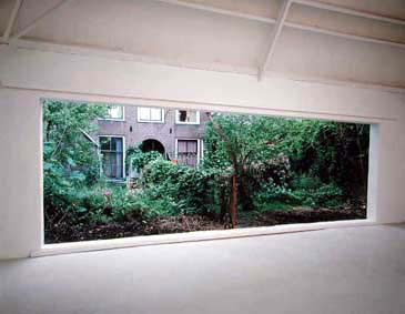
"The World is my Oyster", Job Koelewijn
I started making models out of cardboard, and waited till the last moment to make the floor plan. This gave me the freedom to design a building that corresponded to my wish, and not to the restrictions of the environment.
I used certain principals/elements which I used to dictate my first models, glass for example. I wanted to incorporate the vegetation on the exterior as much as possible to the interior of the building, both to create an open space and to directly link the outside world with that on the inside. This didn’t work out, because of the shape of the building. Later I discovered the building was not correctly positioned towards the slope.
With the other model I’ve made, I put more emphasis on (for me a more fascinating aspect of Gerrit Rietveld’s work) interior, especially on the connections. The most famous chair from him, despite the cliché, it has a brilliant connection. I took that connection for the support of my building. Unfortunately this didn’t work out either, because the supports became more a decoration than a functional addition. In the final model I’ve kept this idea but translated it into my own connection.
I’ve created three models in SketchUp. I used the three main issues as starting points for my digital designs: the involvement of vegetation, the work of Job Koelewijn and the translated connection of the famous Rietveldchair. I made a digital design that corresponds to the environment: a railway 8 meters in height surrounding architecture, the streets, and a green field with trees. Actually, this helped me a lot to see how the buildings reacts on its environment, and vice versa. I really believe that people should not make environment their own (that is to say destroy it by trying to mold it into something other then what it is), but take the environment as an advantage to enforce the power of the building the building.
