Skip to Content Skip to Search Go to Top Navigation Go to Side Menu


"ceramics" Category


Big Bird


Wednesday, October 31, 2018

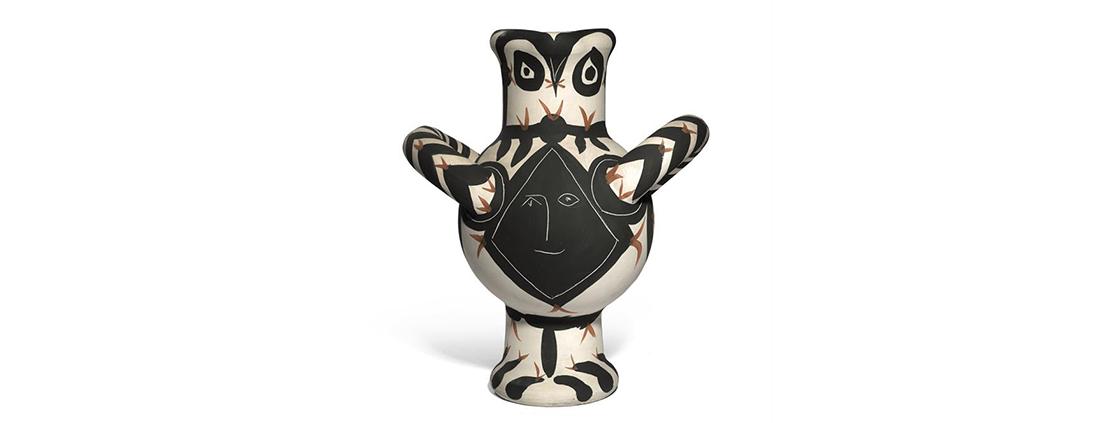
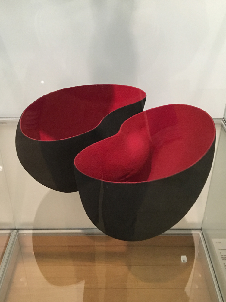
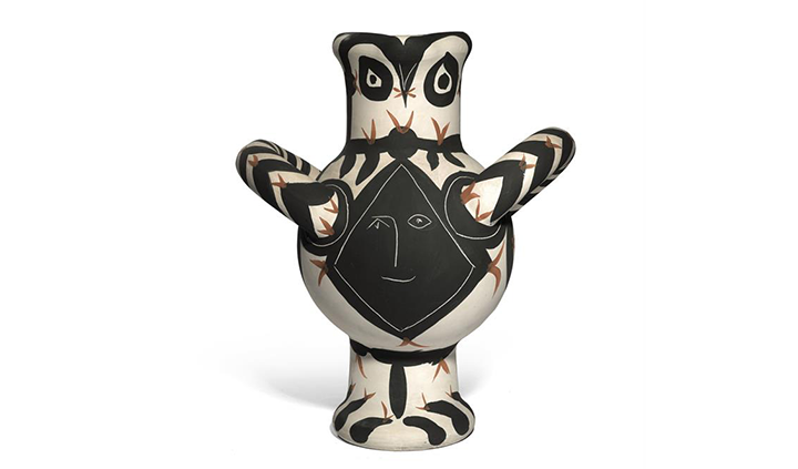
While walking through the basement of the Stedelijk, one object‘s shape caught my eye. When I looked again I saw such a friendly face looking back, cheerfully. I wondered why it was such a friendly face. I noticed a lack of bright colours. But this – what I thought to be at this point a birdmanvaseface – looked so happy and alive, with his wobbly and alive-like-lines and flappy wings or its little beak.

foto1.0 Grote Vogel


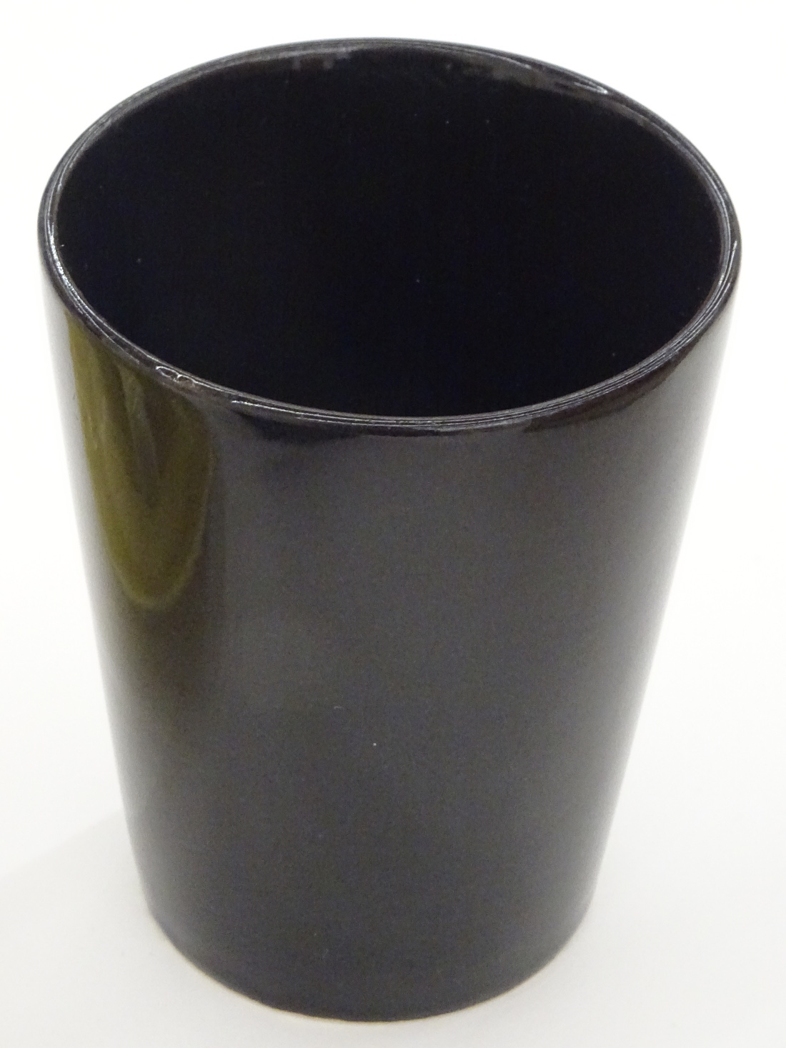
First I tried to search online for this bird and it first brought me to the website of the Stedelijk Museum. Here it is described and documented and in which publications it is mentioned. The second things I found were different spices of Picasso’s ceramics which have been auctioned off back in 2012. Soon I realised that this same auctionhouse/their website, had a whole collection of these ceramics. They called it the Madoura Collection, the best Pablo Picasso auction that has ever been and will be.

 foto2.0 stedelijkweb boekken

foto3.0 Madoura Collection


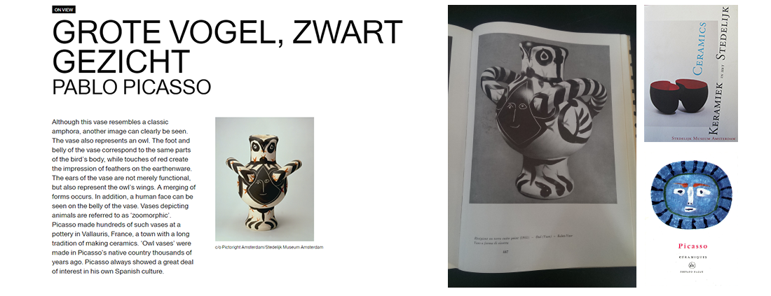
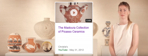
The Auction House Christie’s made a film about the collection. After seeing this film I wondered they sold over 500 ceramic pieces of Picasso so statistically speaking they also could have Picasso’s bird vase. So I set upon the quest to scroll through the entire collection and see if I could find it. There were similar vases but they did not have the bird face so I kept on scrolling, until I got half way through, when I found it.

foto4.0 Video Madoura Collection

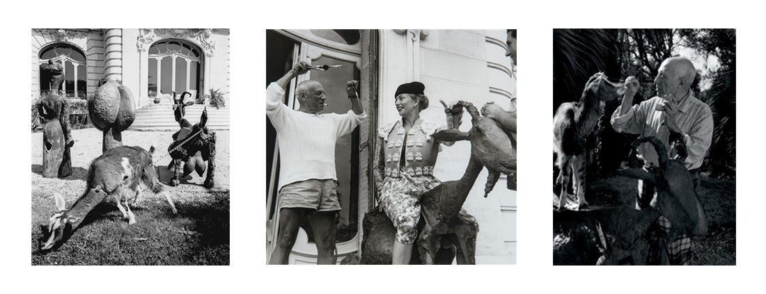
I learned from the auctionfilm, that Picasso was working with the Ramié family in 1946. After a year he returned and stayed working with the family, was living in the same area till he died in 1973. So he must have had a lot of pleasure making these ceramics and maybe that pleasure you see in this bird vase.


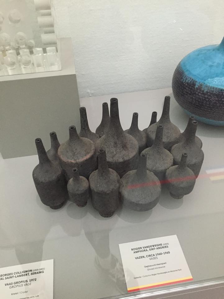
Because now I new of two vases which were the same, I wondered how unique is this vase. So I looked into the catalogue of the auction and learned that this vase was executed in an edition of 25.


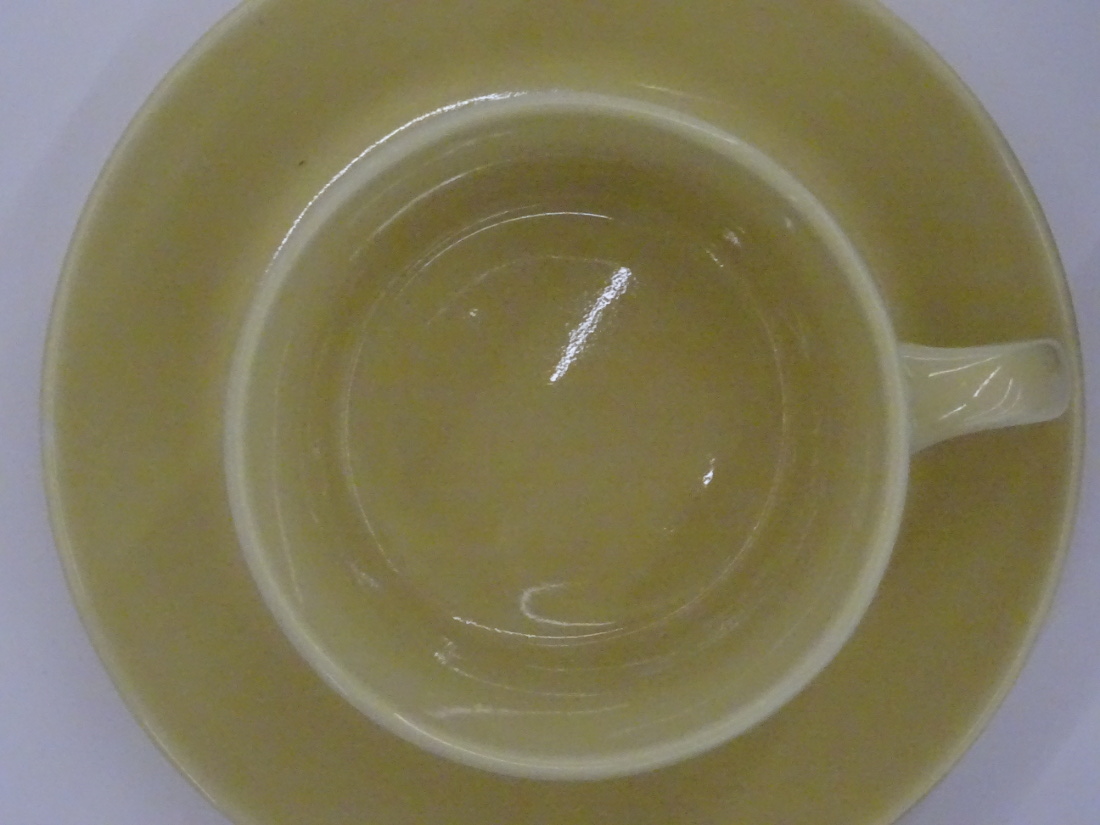
My last  “issue” with this beautiful vase (in fact with all ceramic vases by Picasso) is that you never see the vase being used as a vase: for example on a kitchen table, in a window or as an mantelpiece. I think it is a kind of sad that this vase is always in some kind of studio/museum setting and never in a real environment. Because of several reasons: According to the lady of the video Picasso wanted anybody to come in and buy a piece of his ceramics with their pocket change. That is, I think, the main reason, so many pieces are made.

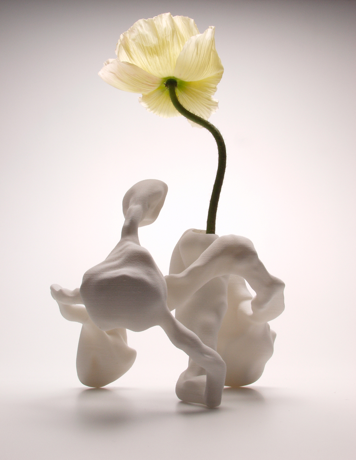
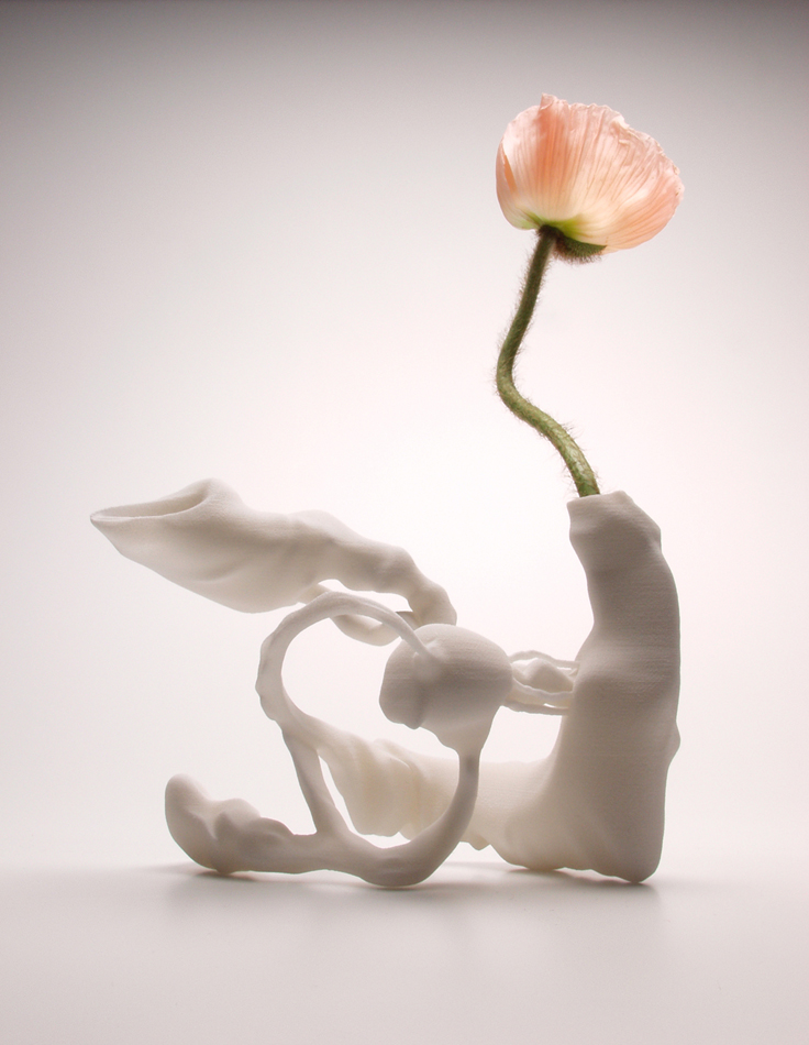
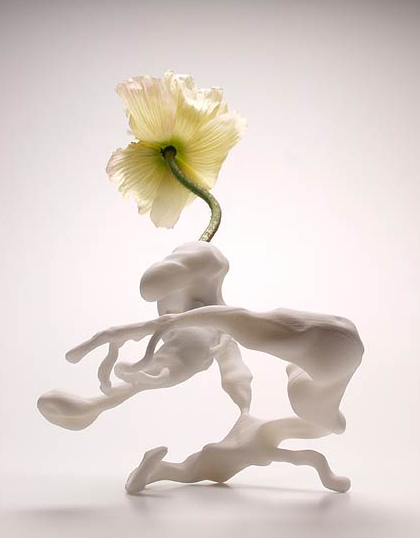
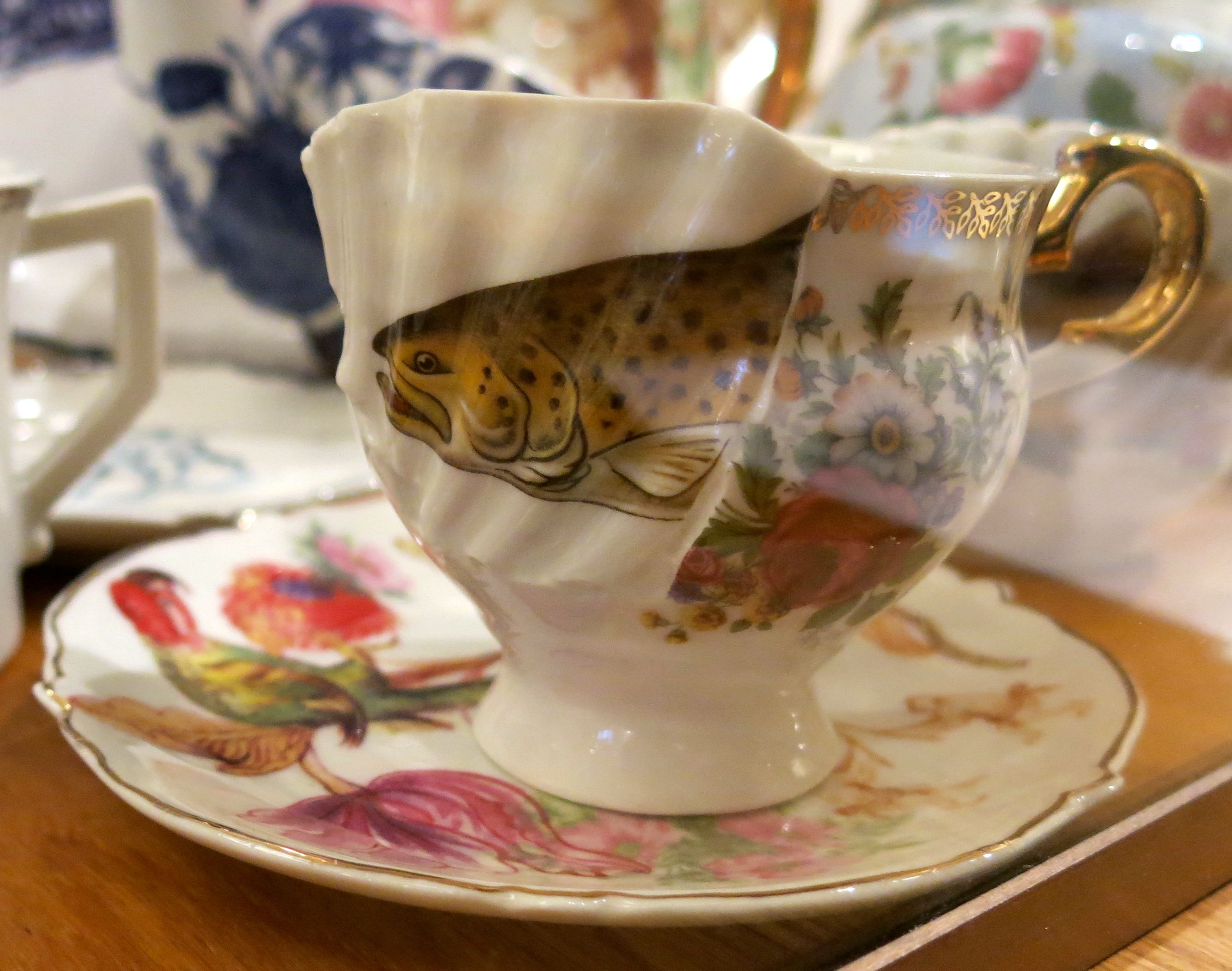
For us, poor people who are not willing or  “able” to buy a 300,000 Euro vase, it is hard to imagine how the vase would look like in a natural environment. In other words for our first impression of the vase we have to read how big it is, to read how the texture is and to guess which flowers I can put in: I mean what kind of vase is this? Would big sunflowers look good, or would daisies look even better. Because after all, it’s still a vase and when it’s used for it’s purpose then a vase filled with flowers gets an extra dimension and can glow with radiance.

I have studied many Picasso’s, paintings, ceramics and pictures of his studio’s and for what I have seen, he himself is very practical with his work. The following pictures show how this statue of a goat is often a cheerful object in his daily life. The only picture of two vases near some flowers shows again that the object is not used for its purpose. Nevertheless this particular picture shows what some colorful hydrangeas do for those vases.

foto5.0 gaot

foto6.0 hydrangeas

My point of view is that a few beautiful sunflowers in Picasso’s bird vase would certainly give an extra dimension to the vase.
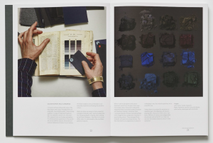
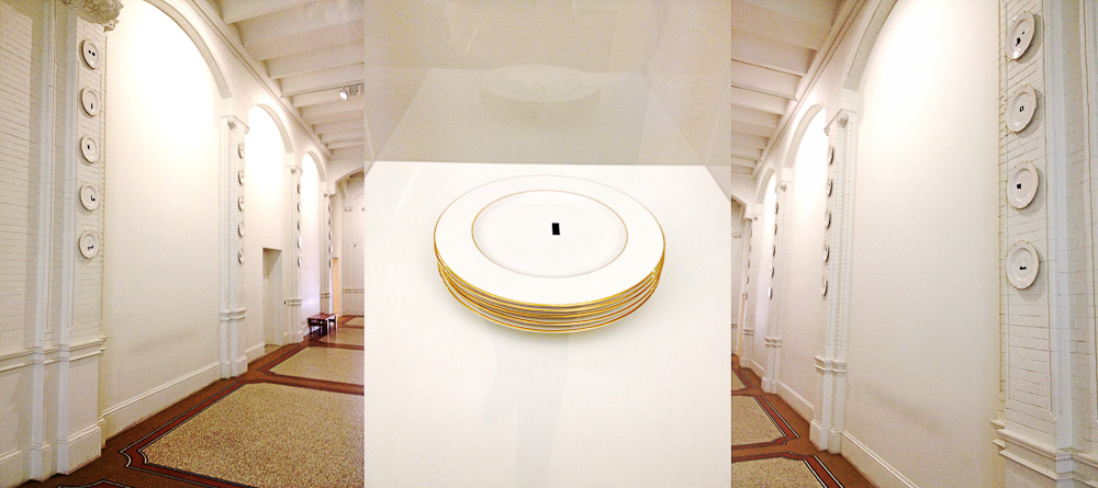
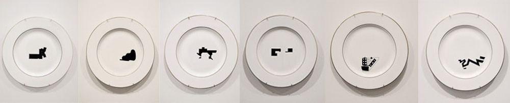
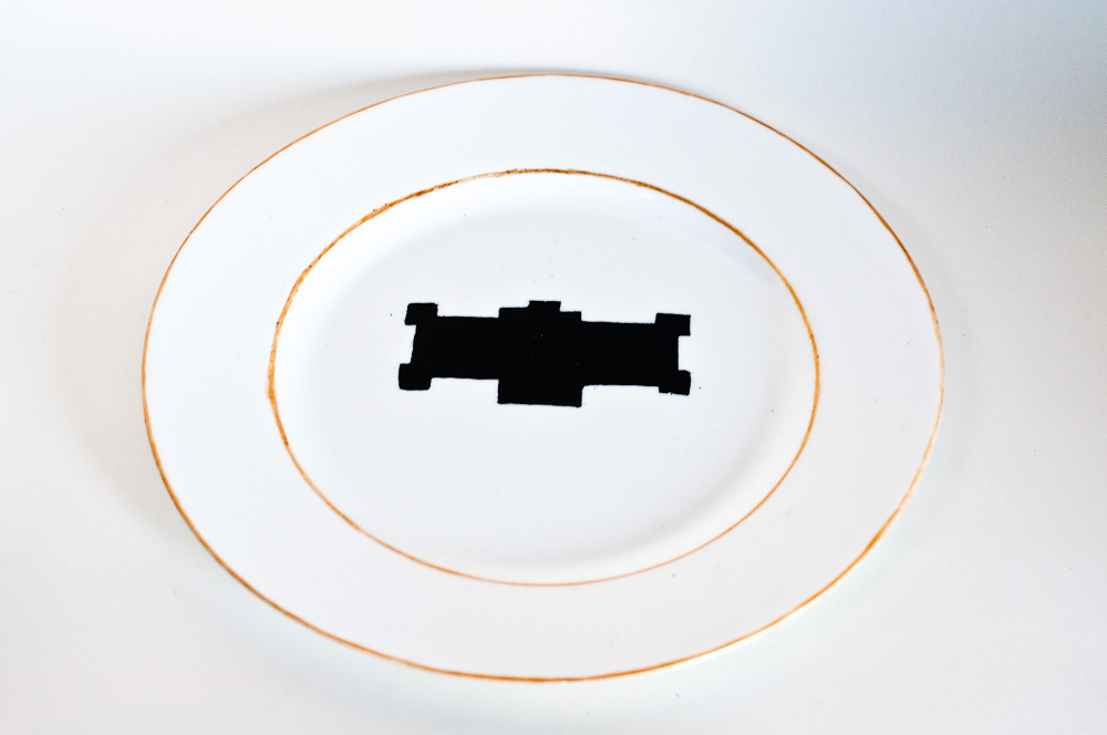
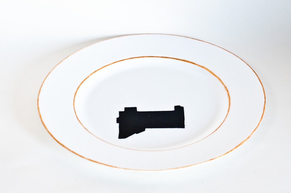


Back to intimacy


Monday, February 19, 2018

When visiting a museum, it is often hard for me to decide what to find more intriguing: The exhibited artworks or the visitors walking carefully among them, observing them. Hardly ever do they physically touch, or if it happens, then in shyly hidden ways. Especially when it comes to everyday design objects, there seems to be a big gap in between the visitors and the exhibited pieces, which are locked away from their original function: to be touched and used. During my last visit at the Stedelijk Museum there was for instance a person standing for quite a long while infront of a vitrine where, in between other objects, Kaj Francks „Kilta Services“ was being exhibited.

Franck was one of the designers who developed the „Iittala philosophy“: creating design that is both beautiful and functional, and lasts a lifetime. „Does not ‘beautiful’ ultimately mean necessary, functional, justified, right?“ (Kaj Franck, 1978)

In the center: service „Kilta“, glazed ceramics, production in 1953 – 1975, designed by Kaj Franck

In the center: service „Kilta“, glazed ceramics, production in 1953 – 1975, designed by Kaj Franck

The person looked at the plates and cups inside, slightly leaning against the glass that was separating him from the objects. Why was he so attentively watching them? The longer I observed the visitor observing the tableware and the distant space between them, the more I started to think the glass vitrine away and imagined him having a real physical experience with one of the cups instead: the two being naturally rejoined, exchanging what is deep inside.

‘He holds the cup that is filled with tea, leads it towards his mouth and drinks from it. The content flows in one direction which is his interior. Luxoriously he sucks the liquid inside and the cup seems to be very willing to feed him.

“The cup is the drone of the ceramics world, perhaps the hardest working of vessels and the least appreciated. In the grandest of tea or coffee services, the cup is usually the most underdesigned object, playing the role of subservient pawn to the teapot’s queen.“ (Garth Clark, „The Book of Cups, Abbeville Publishing Group, New York, 1990, p. 17)

He drinks everything of it until it is empty. But it still contains the warmth of the hot drink, as he inserts his finger he can feel it. For a short moment they contain the same warmth, the cup and him: he contains the warm tea and the cup the rest of warmth of the tea.

„Close space! Close the kangaroo’s pouch! It’s warm in there.“ (Le Temps de la poésie, G.L.M. July 1948, p.32)

cup, Service "Kilta", designed by Kaj Franck

Service “Kilta”, designed by Kaj Franck

He shouts into the cup and holds it close to his ear: he hears a distant echo. The echo vibrates a few times and is gone. He holds it close to his breast and feels that it is vibrating synchronously to his heartbeat.

„When we evaluate everyday objects, we should place more emphasis than we usually do on ergonomic quality and tactile sensibility“ (Kaj Franck, 1978)

He fills it with tea, looks at it and it is roundly opened as if it was calling him. He lifts it towards his mouth and his lips connect to the cup. They softly touch and his tongue reaches the wet content. Then the kiss becomes wild.

„Many a slip twixt cup and lip“ (Garth Clark, „The Book of Cups“, Abbeville Publishing Group, New York, 1990)

service „Kilta“, designed by Kaj Franck

Service „Kilta“, designed by Kaj Franck

After finishing he cleans the cup. The cup is very deep, so it is hard for him to reach the ground. He cleans and dries it with care and attention, outside and inside. That makes the cup shine and renews its promissing interior.

„A house that shines from the care it receives appears to have been rebuilt from the inside.“ (Gaston Bachelard, „The Poetics of Space“, Beacon Press, Boston, 1994, p.68)

Afterward him and the cup are cold and empty. He looks around and decides to continue drinking from it: what comes out is sweet. He feels a strange feeling that is increasing and expanding inside of him. It tickles him in an unknown place and he bursts into tears.

„Moreover the cup does not have any immediate sense of drama (…). But that does not mean the drama is absent, rather that we need to examine the cup a little more closely and consciously to discover its sense of domestic theater“ (The Book of Cups, Abbeville Publishing Group, New York, 1990 p. 19)

     "Venus von Willendorf", 1963, by Otto Piene, oil and soot on canvas

“Venus von Willendorf”, 1963, by Otto Piene, oil and soot on canvas

His tears keep on falling inside the cup. It takes more or less three seconds for the first teardrop to reach the ground, the noise sounds far. When the cup is filled with tears he is still crying. He looks inside and sees his face inbetween reflections of light.

„My cup runneth over“ („The Bible“, Psalm 23:, Ezekiel 34:11-24; John 10:1-21)

Suddenly he grabs the cup and throws it against the wall…’

service „Kilta"

service „Kilta”

„A kind of cosmic anguish precedes the storm. Then the wind starts to howl at the top of its lungs. Soon the entire menagerie of the hurricane lifts its voice.“ (Gaston Bachelard, „The Poetics of Space“, Beacon Press, Boston, 1994, p. 44)

As I awake from my daydream, the visitor of the Stedelijk Museum is gone, leaving no trace of evidence for what in different circumstances might have happened between him and Kaj Francks „Kilta Services“.


Semenova’s Moloko


Thursday, May 18, 2017


The Russian artist Ekaterina Semenova work, Care for Milk, deals with the massive industrialization of milk and attempts to reclaim, or analyse the prior use and value of the popular dairy product. Semonva appears to be fascinated with milk, actually the dairies in general, she graduated from Eindhoven Design Academy in 2016 and it is possible that the Dutch admiration for dairy has reached to an extent by which it has begun to influence her work. The piece consists of various ceramic cups, plates and bowls that have been dipped in dairy products, resulting in a sort of faint dairy glaze that created various shades of silky brown. According to Semenova’s website, the effects of the dairy dipping also makes the clay more durable and waterproof, and depending on the amount of fat in the used milk, resulted in varying coloured remains on the ceramics. The dairy products used for the glazing come from dairy waste as the work also focuses on the over production of milk.

https://www.ekaterinasemenova.com/careformilk

Semenova’s work can be connected to the Faux subject from the little white booklet that accompanied the exhibition in which the dairy dipped cups were shown. Faux, meaning made in imitation, taken from the French word for false, suits Semenova’s dipping. Although the dipping of the ceramics is not a false act or trying to imitate anything other than what it actually is, as an object on its own disconnected from its context simply looks like beautiful colouring of ceramics. Thereby the faux subject is rather sweet suiting, as although it is not fake it might look fake. A reaction to the dairy dipped pottery could easily be that the cups are not dipped in dairies and instead in watercolour or some sort of ceramic glazing. Hence my choice of Semenov’s work, as it’s rather amusingly pretty and charming to know that the carefully flawless cups are simply dipped in varying fatty milks that constitute to the attractive brown shades. The idea was rather simple, to dip things into a substance as ordinary as milk, however the result was rather delightful. Although I found the display of the works along with the space itself uninviting. Semenova’s work sort of disappeared in the corner of the room behind the sweat-smudged glass. As discovered on her website, the work should be accompanied with milk and the pouring of milk, and viewing it behind glass made it seem as if it was an exhibit of ancient pottery at an anthropological museum.


Care for Milk 2016 Earthenware dipped in various dairy products, Ekaterina Semenova exh.cat.no3-faux

CAN THIS BE FAUX?


Thursday, May 18, 2017

mosselschotel-1IMG_20170518_134749


Mussel dish with marbled decoration, Delft 1846 : Openluchtmuseum. exh.cat.no.30-faux

Untouched


Tuesday, March 7, 2017

IMG_3031_1100

Irene Vonck / From Rhythms of Space series 1995

When material is manipulated to make-believe, touch becomes irrelevant for the experience of tactility, the physical experience of touch is exceeded and the brain is provoked. “From the rhythms of space” touches upon the idea that when contact between bodily surface and the object displayed is censored the viewer perception is (mis)leaded into dissonance with reality. This visual contradiction appears when the associations between the artwork as a whole and the material used in brut is not coherent.

Soft

Malleable

Comforting

Pretend

Fake

Play

The art piece appears to be made of cloth but instead it is made of airbrushed stoneware. None of this adjectives mentioned prior seems to describe the properties of cooked stoneware; this is because construction of tactility is build upon the pillars of experience and imagination since we cannot come in contact with it. Due to this I believe this work of art belongs to FAUX (in which nothing is as it seems) and AGENCY (in which paint takes the power back). Colour and subtitle sinuosity trick the viewer, the black colour gives the piece a sense of heaviness whilst the red interior an association with felt fabric. Paint definitely becomes an important element; it gives the object a sense of elegance and mystery and of course exhilarates the desire of touch. There will always be something very special and curious in tactility, in objects that seem ambiguous, objects that lure the viewer into doing what it is highly prohibited – TOUCH. When exploring an art gallery/museum/space etc., objects can be quite novel to us and thus, as young children do, we might feel the urge to touch, touch to understand, touch to explore, to grasp on the full experience of wonder. But … when we cannot touch ( and this is what fascinated me this time)it becomes pure mental construction and sense of touch is replaced by sense of sight.

How deep can you go?


Tuesday, February 28, 2017

Lucie Rie’s story
Born as Lucie Gomperz in Vienna, she grew up in a Jewish family of Sigmund Freud consultants. After studying pottery at the Vienna Kunstgewerbeschule her success came immediately. She could exhibit at the Paris International Exhibition and won there a few years later the silver medal. In 1938, when she was thirty-six years old, she flew to England because of Nazism. She got to know the nineteen years old Hans Coper (also a fugitive of the Nazi regime) and worked with him together from 1946 until 1958.[x]
Mostly Lucie Rie and Hans Coper are called “British Potters” even tough they are neither from England but refugees.


b8664daaf9878f8c048a90abc6101aca


Lucie Rie’s speciality

In some parts of her life she didn’t see a purpose in her objects. But at least with the work of Coper it came fully back to her. She was not following the conventional process of bisque-firing her work, then glazing and re-firing it. Instead she was very experimental and loved to put her glace direct onto the unfired clay before the first bisque.


surface


Lucie Rie in the Stedelijk

In the Stedelijk Museum you’ll find two vases and a plate by Lucie  and a corporation work with Hans Coper. The objects go back to 1953 when Rie and Coper mostly worked together. Rie’s series shows mostly white glazed vases in porcelain. Her work on the surface was very creative. For these objects she used needles to make scratches in the porcelain, which she filled with another colour of glaze. From the look you cannot say if the objects are out of earthenware or something else. Fed with some knowledge you get to know about the content of the ceramics — porcelain. The corporation with Coper, could have been from nowedays. A tea service set in stoneware, black glace — timeless. Even though Coper was mostly a assistant to Rie both names are engraved in the ceramic.


Coper-Rie


Lucie Rie’s surface

Lucie Rie’s way of dealing with the surface attracts me a lot. It is hard to simply stand in front of it in the museum. You want to interact with her art.

«She found her satisfaction in a needle.

A needle to change the surface.

Drive it deep to change the outside — the visible.

To change the way it feels under your hands. Striation.

My imagination.

But, you’re standing in front of a big thick safety glass.

Her object far away of your senses of touch.

Trying to experience the surface by simply looking at it.

How?

Will I ever experience what she experienced with her hands?

I don’t want to see it from the inside.

No.

I want to feel the surface like she did, sitting on the throwing wheel.

Layering glace on that shape.

Let it dry a little.

Take the needle.

Carve through the porcelain — long elegant scratches.

How must it have sounded?

Fill the scratches with a dark colour.

Fire it.

How did the look change?

Let it cool down.

Hold it. Enjoy it. This softness. Smoothness.

Gently drive the finger around the belly of the vase.

Oh, I wish I could experience the surfaces of Lucie Rie’s.»


Ceramic surface study

Lucie Rie used among other things the needle to manipulate the surface. In my first text I showed work by  Ekaterina Semenova who found other inspiring ways to do so by… using milk — old, food waste milk.

Faux Mucus Vases


Monday, February 27, 2017

 
Wanders Wonders Wanders Wonders Screen shot 2017-04-29 at 12.43.46 PM

'Ozaena, Sinusitis and an other vase from the Airborne Snotty series

 
This collection of vases is an example of the creative possibilities of digital production methods, such as 3D scanning and printing.
This series is a materialization of human sneeze, and they’re all called after nasal cavity diseases. The products are made out of enlarged three-dimensional mucus particles emitted during a sneeze. They’re constructed from layers of polyamide powder.
The holes to hold the flowers were made during the process of fabrication to give utility to the object and make it functional.

Trying to relate this with the subject of ‘surface – Act III – faux’, nothing is what it seems. Nobody would ever expect these vases to appropriate the form of mucus and human sneeze, and nor either to be a vase, that holds flowers.
The surface in this case is important due to the fact that it would have been impossible to create such form with another material, like clay, wood or metal.
The fact that is microscopically scanned and printed after it makes it precise, an exact copy or big reproduction of a molecular substance.
 
The Airborne Snotty Vases names and where they come from.

Ozaena: A discharge of fetid matter from the nostril, particularly if associated with ulceration of the soft parts and disease of the bones of the nose.

Coryza: A runny nose. The word coryza came from the Greek koryza thought to have been compounded from kara, head + zeein, to boil=boiling over from the head.

Pollinosis: An inflammatory response in the nasal passages to an allergic stimulus. Often includes: nasal congestion, sneezing, runny or itchy nose. Also known as Hay fever.

Sinusitis: Inflammation of a sinus. The condition may be purulent or non purulent, acute or chronic. Depending on the site of involvement it is known as ethmoid, frontal, maxillary or sphenoid sinusitis.

Influenza: An acute viral infection involving the respiratory tract. It is marked by inflammation  of the nasal mucosa, the pharynx and conjuctive and by headache and severe myalgia. Fever, chills and prostration are common.
 

The making off : Airborne Snotty Vases : Marcel Wanders Studio 2001


To sum up, both of the text I wrote relate somehow to light. Light that tries to imitate the original. You can also read it in my first text here [x].


Meeting with a shape explorer


Tuesday, December 6, 2016

Olivier van Herpt is young Dutch designer from Eindhoven, he graduated in 2014 form the Eindhoven design academy. We discovered his work at the “Dream Out Loud” exhibition in the Stedelijk. Both of us were strongly attracted by the 3D world and process in the show. Therefor van Herpt’s work seemed like the most instructing of all regarding his process but also due to the final objects themselves. The other aspect that catches our eye was the combination of brand new technology and crafts, (3D printing/ceramics, weaving). Van Herpt’s work consists in making ceramic shapes (vase looking shapes) with 3d printing machine that he engineered for it. We were therefor even more fascinated not only by the shapes but even more by how he got there. We had the opportunity of meeting him in his studio and ask him more about his work and work process.

The conversation immediately focused on his work process.
It all started when he was still a student at the academy, he was already interested in 3D printing and was taking ceramics as minor. He also mentioned that he had always been interested in the technical part. But was quickly limited by the technical possibilities of the machines at the academy, size wise, material wise and so on. This is when he started thinking about making his own. His approach was also mainly to combine different techniques. He therefor though about a machine that would combine man action and machine made. He wanted to have an interaction with the machine. That combination also takes place in the process of designing the object and making the object. Van Herpt had some help from student friends at the beginning but not from manufacturing industries. He started with a small machine and they got bigger with time. He designed and engineered the machines himself and learned the technical part while in the process of creating them. Also as a designer, unlike an engineer, he already had an idea about what the machine had to look like from the start. That give it a different approach but of course he had to adapt to technical issues and the machine had to adapt on what he wants to make. « It’s a parallel process between the object and the machine. »

3d-dripping

3d-printing-ceramics-1

After graduation he focused on experimenting with the machine with different techniques all about randomly approach « dripping » with different materials, such as wax, and bee wax. At the time he was experimenting with soft clay by softening it with water but had quickly explored all the possibilities with it so he then decided to focus on ceramics, dive deeper into it and use hard clay for which he had to build a new machine. Again we can see the close relation between the process of making the machine and the object, how one is to the other, and the constant need to develop a machine that is adapted to the material (hard clay).

IMG_8799

The second machine he made for the hard clay is basically like a pomp, he described it as an ‘extruder’, the innovative aspect to it is its openness and the possibility to interact with the machine that works with any kind of hard materials : « the machine is really like a tool » that he uses to make objects with. He explained that there were two ways of working with the machine. You can decided to interact with it or not. The most basic shapes are hand made. Some of the shapes are design then put into the computer and then when a machine prints it then it is machine made, or you can shape it yourself on to the machine because the machine is not closed.
This is it’s way of renewing an very old craft (ceramics). It is a human versus machine collaboration. The shapes of the products are all unique you cannot make one twice. Because of the use of clay it is also fast to make and always reusable until you cook it. It is then possible to make a lot of different try-outs and and shaped it until you are satisfied with it. Meaning that there are endless combination of shapes possible to explore. He also sees it only as the beginning and very much as an on going process of experimentation.
«It is only the beginning » as he said « it can be really random but also really controlled » which gives a bigger range of possibilities, also with the use of different colored clay, creating very different kind of shapes. He also told us that he recently started to experiment with new materials such as porcelain.

IMG_8795 IMG_8790

He is in process of creating a new machine, even bigger, to have the possibly of making bigger shapes and objects. Having the possibility now of collaborating with different fields, which was his idea in combining techniques, he is enthusiast in working not only with designers but also with artists, architects, interior designers and even industries. for example industries ordered his machines for other purposes.

This research project by Daria Nakov and Raphaelle Hugues is based on the "Dreaming Out Load" design exhibition curated by the Stedelijk Museum Amsterdam

CREATING WORLDS


Sunday, November 27, 2016

.. Those kinds of worlds that swallow you whole, the worlds where time stand still and you forget your body. It doesn’t have to be an intellectual or logic world. The worlds you discover in your childhood was often better – more fantastic. Maybe because children’s mind are not so constricted. I loved to emerge myself in books and movies. Now in our world of massive possibilities of streaming we have a free choice of worlds. Who doesn’t love Game of Thrones? I might be a bit more into those kind of worlds than the average, so I was really pleased to find another little world in Clair Verkoyens works. I saw a design work of hers in the exhibition “Dream out loud” at the Stedelijk Museum. Three ceramic bowls with three-dimensional worlds added on. The idea of creating new worlds are an interesting possibility that, for me at least, feels like the work leaves the idea of design and move towards something that looks more like an art concept.

clairV
She uses a generic 3D software program to make the animated landscapes and the little creatures “making” it. She is creating the landscapes with shapes and then deleting the solid part so only the lines are left. The landscapes on the bowls exhibited at the Stedelijk Museum are made with a collage technic, where Clair Verkoyen samples and merges her 3D animation together and make the universe.

As to the question why does this little universe belong on ceramics the answer is, that it maybe does not? It seems nevertheless that it has been a natural process of her design career to this point, working first with 2D, then 3D and shifting from photoshop to 3D animation. In connection to Clair Verkoyen’s work the Stedelijk Museum presents, as exhibition text, the history of the Dutch tradition of importing ceramics from China. And it is true that Clair Verkoyen bought the ceramics in China but it was more because of fascination of material rather than a nod to history.
I have seen more post-internet art works around for the last couple of years, and for me Clair Verkoyen has used some of the same technics of working – creating worlds – (besides the obvious: that the work made by/on the computer program). Why does post-internet artist make utopian worlds? I have seen a work by Cécile B. Evans named “What the heart wants”. It is an animation about the connection between human and technology. Her world is set in a futuristic, sterile and a bit barren world where human and technology has merge so much that it is hard to find out what is what.

Ed Atkins work has esthetically similarities to Cécile B. Evans’s work because the formal presentation (screens/projection) and something else I can’t put my finger on. I perceive Ed Atkins animation works differently, he creates a narrative or a statement and the world he creates somehow implied. And that is the thing about making animation, it has to be created from a blank screen. Because of the digital medium these artists uses it to open up a new platform to show there art. Serpentine Galleries has a website connected too their gallery this opens up fore another art form ‘Net Art’.
The differences between ‘Post-Internet Art'[x] and ‘Net Art'[x], is that in Postinternet it is able to be both online and offline. Where ‘Net Art’ only exists online. In the depth of the internet you can be friends with AGNES at the interactive part of the webpage of Serpentine Galleries.

agnes

AGNES is made by Cécile B. Evans. I have visited AGNES several times during this writing assignment and mostly she follows a pattern but one time she encouraged me to think about the idea of herself and showed me a place where I could learn to write HTML code.

Cécile B. Evans seems captivated by the though of involving others in process of her work. At the exhibition “What the heart wants” Cécile B. Evans had created a part named: “Working On What the Heart Wants”.  Here she shows how the animation/movie was made through chatroom bits, pieces and conversations between her and her programmer. Somehow it a very natural nextstep because all of us have a computer so in principal we can all make our own world and what is more important is that everybody can access it. Public art on the internet makes the definition of art even wider. And raises the question: Can the game SIM’s (as an example) be art? It’s interactive like AGNES and it is a world where you create houses and relationships.

All this research made me realize that the worlds created by Clair Verkoyen, Cécile B. Evans and Ed Adkins in whatever medium they work in are very complex and speaks to the observers fantasy. Nothing is given and more observations opens up new layers of experiences. I love being emerged into those kinds of worlds I find in art, literature and movies.
Being able to make worlds is a specific kind of magic.

Hella Jongerius and the in-between-state of Design.


Sunday, November 27, 2016

Within a era where design industry has been mostly focusing on how-to-reach at quickest the largest market possible by basically allowing marketing and communication departments to take the lead and most companies are sales-increasing-oriented, there’s a figure I’ve been admiring a lot for a certain capability to break this kind of mechanisms. Dutch designer Hella Jongerius has been an attentive observer of the industrial production process and its weaknesses and I could think of her as a designer capable to give the design industry a remarkable, somehow playful response.

Chicle Project, material experiment for The Nature Conservancy, 2009


By having a broad look here and there to her work, I could figure out that the strength of her designs lies in their between-state for both caring about details and imperfections and still being able to fit into an industrial production rhythm. In her work I see some sort of generosity which looks up back to the past (not just to appropriate herself – as most designers nowadays would do – of principles such as authenticity and sustainability) by giving it a further value as a result of her never-ending research around life and ”afterlife” of objects. What strikes me about Jongerius’ design approach is that she pushes design to an almost imperceptible limit which oscillates towards an artistic process. Hers seems to me closer to an art-related way of processing research, brain storming, sketching ideas and projects themselves starting as sketches, always caring about some imperfection which can emerge through unexpectedly magic come outs. This is at least what it means dealing with handicrafts. Something that she has discovered already in the 90s when giving the design industry imperfection as an answer. Concerning to Jongerius, design should firstly be communicative. This is what design is about. Its function lies mainly in its communicative power which can be measured at different levels of meaning.  Even ugliness can be very a strong means of communication. Since handicrafts primarily deal with the impossibility to produce perfect finished products, she has considered it as her own vehicle to face the anonymous perfection that industry has been producing for more than a century. In most of her works, she is been playing with the imagination of the user, by creating fore ex. a ”frog table” which is basically a frog seating at the table itself and a question which comes along with that is: why do we need imagination for (a specific) utility? isn’t use already enough?


Frog Table [Natura Design Magistra] 2009

According to the Dutch designer, there is a persistent prejudice concerning the essential difference, drastic separation between designs that are made to be purely functional and expressive designs which are able to tell stories which go beyond themselves as objects.

Once again the function of design has assumed new meanings and contents. It cannot be formulated strictly depending on terms of use or comfort.
Sometimes the core signifier of design can actually be its paradoxical non-functionality > animal bowls < a project started in 2004 for which Jongerius is been selecting different pieces ouf of the Porcelain Manufacturer Collection of Nymphenburg – as a celebration of age-old crafts and treasures found within the Nymphenburg archive, in Germany.


Bowl with hare / Bowl with fawn / Bowl with hippopotamus

Some other aspects that I really appreciate about Hella Jongerius’ work are the experimentation with the more diverse materials and her deep passion for colours I feel somehow very close to.

In 2009 she’s been leading a project for The Nature Conservancy [x]. In this particular project Jongerius is been experimenting with the natural material of chicle, derived from the rain forests of Mexico. The project itself consisted of a group of internationally renowned designers who have been participating, initiated by the American Nature Conservancy, an organization which strives to protect sustainable materials for use in contemporary art, design and architecture. The results of the project were shown for the first time at the Cooper-Hewitt National Design Museum in New York.

Chicle project [x]


Argali Rugs, 2015

For this project Jongerius has created – within a palette of six colours typical of Nepalese yarns – Kilim rugs which have been hand woven from special Tibetan wool from Argali – a wild sheep breed that resides in the Himalayan mountains. The yarns themselves have been hand spun by local weavers, and their naturally faded colours and irregular character lend each rug a truly individual appeal. Each rug incorporates several design details, including a hand-embroidered area with silk yarn – a reference to an old tradition of repairing the rugs. The fringes are braided, a practice that also refers to an old custom in Nepal – this for its decorative appeal.


argalic0231©danskina

Argali for Danskina [x]


There are some many things which should be told about Hella Jongerius, that comes almost difficult to make a choice ouf of the huge amount of her research. Jongerius has been the Art Director for colours and materials at Vitra for many years, during which she has developed Vitra Colour & Material Library together with a quite recent book ‘I don’t have a favourite colour’ which basically refers to the establishment and +further development of an intelligent system of colours’, materials and textiles that make it easy to create inspiring environments in offices, homes and public spaces. It is definitely an interesting book since the Dutch designer has been illustrating her method of research and the application of its results to the Vitra product portfolio.


'I don't have a favourite colour' [x]


Jongerius way of dealing with the design experience is very fascinating for me since I’ve always felt quite far away from the design process, very related to super appealing – almost perfectly finished products.
Her installation/selection within the textile archive of KLM company for Dream Out Loud exhibition at the Stedelijk has been so inspiring for me. It confirmed me further my pre-existing love for textile matter. It immediately brought me to a sort of aesthetics that I personally feel pretty much related to. By reading part of her book Misfit and her .Manifesto. Beyond The New written together with Louise Schouwenberg so many exciting questions came up – concerning the contemporary era – where are we going to? design/art? this over exploited back to the roots feeling and the over flooded quantity of emerging designers. What can design add to the world of plenty? and What is functionality in the here and now?


Ceramics with Émilie / Ceramics with François


Tuesday, January 26, 2016

650-Emilie_Ferrat_and_Francois_Girard-Meunier_RV_lowres_1 Rietveld Graduation Show

Émilie Ferrat [x] and François Girard-Meunier [x] graduated from the Department of Graphic Design. As part of their graduation show they presented a collaborated project ‘Ceramics with Émilie / Ceramics with François.’ This project was chosen by an independent jury to be nominated for the Design Award and was for that reason part of the exhibition ‘Selected Gerrit Rietveld Academyie Awards 2015’ organized in Castrum Peregrini [x].

Screen shot Peregrini-show

Castrum Peregrini Presentation


Ceramics with Émilie / Ceramics with François

‘The medium is the message.’ These words of Canadian philosopher Marshall McLuhan still offer room for artistic exploration. Because how exactly the message changes when the medium, or the material, is changed remains shrouded in mystery. In their collaborative project, graphic designers Émilie Ferrat and François Girard-Meunier use a classic yet surprising approach: dialogue.
 
Screenshot_Selected-images1
 
    The installation consists of a video of the two designers conversing and a number of glazed clay models –a mobile telephone, for example, and shot glasses, jigsaw pieces and some undefinable models– with which Ferrat and Girard-Meunier stretch the boundaries between form, material and meaning. A new plain field is established. The video shows their fresh and resolute debate on their progress in working with ceramics – a new material for both of them. The dialogue is explicitly overacted, which stresses the artificiality of the form (a recorded conversation about models they made earlier). The overacting harmonizes nicely with the glaze on the clay models: a shiny layer upon robust content. The spoken and material form are one.
 
Screenshot_Selected-images2
 
    ‘Do you think it’s the ceramics that is giving meaning to our talks,’ one of them asks, ‘or rather that our talks are giving meaning to the ceramics?’ The relationship between words and things is a complex one. It is a relationship that has puzzled many philosophers, artists and linguists. By deliberately speaking as amateurs, ferret and Girard-Meunier open up a new perspective on this relationship.
    The material prompts conversations that lead beyond just ceramics: design in a broader sense, a philosophical ‘brain in a vat’ argument, personal insecurities and the history of art, these are all subjects that lay hidden in the material. The ceramics function as a conversation starter: the medium turns out to contain many messages.

text by Thomas van Huut [x]


for full length video [19 minutes 54 seconds] contact François Girard-Meunier


Design Holland and Belgium


Wednesday, October 14, 2015

The composition of the ceramic vases Belgian artist Rogier Vandeweghe and vases Dutch artist Jan de Rooden.

subscription

Firstly, I’d love to explain why I’ve chosen ceramic vases for this essay. I imagine how the fingers are buried in soft brown slimy mass when I am thinking about creating a vase. I remember a few stories associated with clay from childhood. I grew up in a village. I loved poking around in the mud, but I had a special passion for the mud formed after rain on the roadway. Vehicles in the village – trucks, and the land under the wheels was pressed carefully because of heavy machine. As a soft mass, it was very pleasant to touch. Mud was becoming really strong as soon as it started to dry. I loved to do the round cakes of this manure. A day after i used to threw them on the floor and watch them breaking into pieces. This is the first thing I imagine when I’m thinking about ceramics. It seems to me very important to understand people, what events have affected them, how their personalities formed. An artwork produced by the artist containes all the information about his life, sensibility, condition. That’s why I’d love to highlight some events in the biography of Rogier Vanderwede and Jan de Rooden.

Born in 1923, he was the youngest son in the family. They moved a few years later to Beernem. From 17 to 23 years old, he studied at the Art Academy in Ghenthe. In the year of 1974 he was followed by a short internship at Joost Maréchal. In 1948 Rogier formed a business with his elder brother on the basis of fathers larger company. Their studio was named ‘Perignem (Latin for “through the fire”). In 1954 he married in the Church of St.Anne in Bruges on Maryanna Pyck (the collection vase that i chose called: Rogier Vandeweghe en Maryanna Pyck). Maryanna worked since 1952 as a ceramics painter at Perignem. As soon as regular production was established, Rogier decided to change direction towards a more modern product. The cautious, rather conservative attitude of Laurent and especially of Cecile Roets, which is in complete contrast with the radical and total renewal sought by Rogier, are the direct cause of the rupture between the two brothers in the summer of 1956. In 1957, Rogier Vandeweghe didn’t pay much attention to make his first ceramic production. In some cases, his wife Myranna Pyck painted the initials “RVDW”, eventually adding “Sint Andries”, with cold enamel after the firing. Soon however, Rogier adds this mark with glaze. In 1960, the workshop is named “AMPHORA».

Jan de Rooden Born in Nijmegen in 1931. When he was 5 years old his mother died. From 6 to 14 years old, he was admitted to Elementary School of the Heilig Landstichting. The landscape around us formed a beautiful country to grow up in. “In November 1944 I left home for the Passionist monastery in Mook September 1952 I became novice in the Passionist monastery in Pey, but after nine months I left the novitiate forever. Ultimately I could not reconcile myself with life in a monastery. I found that life too cut off, too safe and too well-provided for. ” As autodidact he started working in the studio of ceramist Lucie Q. Bakker in Amsterdam in 1956, and in 1958 started his own studio with Johnny Rolf with whom he later married.

Rogier was studying in artistic school and Jan at theological collage. But the story of the two artists is like when they meet their women and begin to follow their way.

I feel a similar sense when i am looking at the vase, I find something natural in that. Vases Jan de Rooden remind me about the forest, the surface of the vase is like a bark of a tree overgrown with moss and seabed, shells overgrown with silt. Vases Rogier Vandeweghe remind me of the mycelium, or forest spirits, or rocks. I like that he used black clay, I’ve got a association with caves and coal mining. From vases is completely different. Jan de Rooden used a simple sealed form. It gives a sense of confidence and stability, which in combination with glazing, creates the effect of natural stone. Rogier Vandeweghe several vases connects one composition and shape of these vases is like a bottle, but shorter, with a thin neck and a narrowing nizu.eta composition looks like a beehive. The Rogier Vandeweghe vase can be used rather only as an object, and the Jan vase may well accommodate some flowers.

In conclusion I would say that the facilities are beautiful.

Stedelijk Design Show 2015 /Relevant Highlights


Monday, December 1, 2014


16 Rietveld Basic Year students visited the Amsterdam Stedelijk Museum to examine the items in the permanent survey of the design collection.

Does the Stedelijk exhibit all these design items simply because they are in their depot.

Do the collection criteria still have any significance today.

Do these design items have any relevance for us, our life or work,now? Is it possible to make a clear statement about that.

If you click on the image a caption will appear –just as a in a real museum– presenting information and a personal reflection on why that item is considered relevant. You can review the whole exhibition in pop-up mode.


click on images to visit the exhibit

Gijs_Bakker_Waterman_2_Cropped

modelWieke_stool_SM

PatrickJouinWelcome-To-The-StoreBeowatch_SM2

tafel-stoelunfolded

DSC_0321 Schuitema_300

superstudio_gherpe_flippedVaclavCigler_headband

cow-chair_flipped Paulina_glass


The London Supplementary Design Show


Friday, November 1, 2013


< LONDON DESIGN >


< CAREFULLY SELECTED FOR YOU >


17 Rietveld Foundation Year students visited London in the first week of October 2013 where they composed their own London collection of design highlights.

Items were selected from the collections of many renown institutes like the British museum, Victoria & Albert, The Design museum, Off-site ICA or galleries (The White Chapel, Ravenrow etc…..). What is interesting for us? What do we like and why.

Previous to this trip we did visit the permanent design presentation in the Amsterdam Stedelijkmuseum. Compared to the items we selected and researched there [project: Design in the Stedelijk-3], this show presents a personal comparison between that and those of the London institutes.

If you click on them a caption will appear –just as a in a real museum– presenting information and a personal reflection on why that item was selected.
Researching contemporary design we present this “The London Supplementary Design Show” as a mirror of our own selection motives, an imaginary online exhibition space with items carefully selected for you.

click on images to visit the exhibit


Spira-Ribb Westwood_T-shirt

no_angle_no_poise_tiagodafonseca_2 ChloeMeineck_music-memory-box GatewayRouter_redu

8_snow_white_wrist_redubrave-new-world-lamp_1helmet_cropped

Samoerai-armor Sottsas_London_Item_LeftSottsas_London_Item_Right RavenRow_poster_tadanori-yokoo

MarjorieSchick material 3d printer

selected by Wiebe Bouwsema WillyBrown_redu TrojanColumn_VAA G_Force_Cyclonic_James_Dyson


the “ B A T H T U B ”


Tuesday, October 29, 2013

John Knight - Autotypes

Walking through the high white corridors in the Stedelijk Museum, you notice the colorful museum Posters on the left wall. On the opposite wall, there are four rows of five plates. Because of the white background, they do not pop out, but blend in to the surrounding. Next to a vitrine with a stack of five of the plates inside, a sign explains the artwork and the artist. The black graphical forms on the plates, with a gold-trim, are parts of blueprints. These blueprints are the recent additions to Modern and Contemporary Art Museums around the world.

The work, acquired in 2011, is titled Autotypes. The title stands for the desire to expand and to create, which fits the underlying criticism of the artist John Knight (LA, 1945) and his work. With the by mass-production created set of porcelain plates he creates an opening for a critical discussion of the changing role of the museum. Which includes serving a marketing tool for city branding within the ever-expanding spectacle of mass tourism. Because the plan of the original, historic structure are omitted, the blueprints of the additions are isolated, showing the uniformity of museum architecture.

John Knight Autotypes

The moment I looked up at the plates I was intrigued. The gold on the white ceramics looked sophisticated and slightly kitsch, but the black graphic made it modern. Which is just the way I like it, slightly kitsch with a modern touch. Before I read the text about the work, I thought about the forms. ‘What do these forms stand for? Do they tell a story? About a growth? Expansion? Are there any recognizable forms? Is there a specific order?’

So when I read in the information that they are parts of blue prints and that this is part of a debate on the additions to museums now a days, it made me think. I was standing in one of these museums that had expanded. Why did the Stedelijk change? And why did it take so long?

By asking myself these questions, I realized that John Knight had pulled me into the debate. A clever man, that John Knight.

Mysteryman

After seeing this question-raising artwork, I wanted answers. So, what is this debate John Knight is referring to really about, what role does the Stedelijk play in it and WHO is this man I have never heard of? I could not find any images of the man in question, so John Knight’s appearance remains a mystery. I do find out that he has been around in the art circuit for quite some time and that it is not easy to lay a finger on him.

He has been producing art since the late 1960s, early 70s, using existing forms and communication to reconsider the social structures and value systems that support the exchange of ideas and merchandise. He takes the art establishment as his subject of investigation. his practice unpacks conventions and codes that give art its value, using art as a platform to reflect upon larger political and economic systems. Working “in situ,” each project is based on analysis and intervention specific to the venue at hand; its aesthetic logic takes its cues from the structure of that of the gallery, museum, or other exhibition space.

Another stack of plates

I also discovered that Autotypes is a follow up work from Museotypes from 1983: sixty glazed ceramic plates with gold trim. Like he did with Autotypes, he did not represented the particular museum building by its familiar, literal image. Instead, he ironically chose the abstract configuration of the floor plan that on the plate serves as a ready-made code or symbol. In Museotypes John Knight fuses various visual but specifically non-art traditions in order to questions and revalidate contemporary art. He presents the plates as collectable items and reduces them to commercially available, limited-edition souvenirs. The museums are literally put on display, and as the artist explained, the work as a whole becomes “a representation of the museum and its role in culture”.
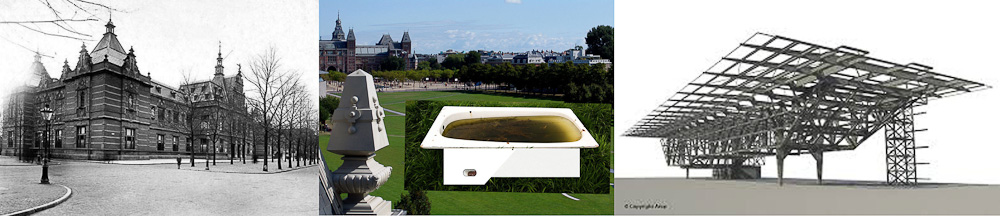
Bathing in art

In the last several years it has become necessary for museums to expand not simply to house their ever-growing collections, but also to stake their claim in a global tourist trade characterized by spectacle and speculation alike. But, why did the Stedelijk Museum change?

Old Stedelijk museum - Nickname Stedelijk museum - New building Stedelijk Museum

The original Stedelijk Museum was designed by A.W. Weissman in 1895 to house modern art and contemporary art. It was built in a Neo-Renaissance style
but in 2003 firemen made the museum shut down temporarily for a renovation. It lasted until September 2012 to re-open in its full glory. A new all white and glass part was added to the existing building by Benthem Crouwel Architekten. A few major changes were made with the renovation: it had created enough space to house the permanent collection in the main building and temporary exhibitions in the new part. Because of its remarkable appearance, it didn’t take long for the museum wing to get nicknamed the Bathtub. To get back to John Knight, the Stedelijk museum closed, not because of too little space for artwork, nor too little space for the public, but because of safety issues. However, in the end the expansion took care of both.


John Knight inspiredJohn Knight inspired

Put it on a plate

I wanted to do something with the information I had gathered. Firstly, the fact that Autotypes is a work that is visually as interesting as the idea behind it. Secondly, the fact that John Knight chose this medium, ceramics, to make a point. Thirdly, the fact that the work Autotypes is the extended version of Museotypes. And lastly, the fact that the Stedelijk did not really need to expand, but during the time it was closed slowly took part in Knights discussion. That is why I expanded John Knights work with three more plates. On one of the plates I drew the old floor plan of the Stedelijk museum. On another I drew the floor plan of the Stedelijk museums extension from 2012 and on one plate I did my own take: the nickname of the Stedelijk Museum. I think it is a very interesting subject, nicknames. I think in the case of John Knight, it doesn’t get deeper into the discussion. But, I do think it goes deeper in to the subject. Knights discussion talks art and tourists, but it doesn’t say anything on the people of the city where the museum expanded. A nickname would then be a symbolic gesture to the reaction and or emotions of the people living in the area.

But then again, maybe it is just me. I am an ‘Amsterdammer in heart and kidneys’ and when this huge white thing was added to the Museum square, near to where I went to school for six years, I had to process this. Apparently in this research, I started with trying to be a participant in an interesting discussion on museums and their expansions and ended up in ceramic therapy.

John Knight inspired


Grayson Perry


Monday, October 28, 2013

From the big design collection of the Stedelijk museum, I could point out a few pieces which I like a lot. Still, by having the limitation of choosing just one, I had no trouble remembering this one big pot I’d seen on my way. Not that I especially like ceramics, (nor shiny pots I would say) but for some reason this specific one got all of my attention in a completely positive way.

Strangely familiar was the name. From Grayson Perry. I thought: never heard of it, but in fact it looks strangely familiar to me. These drawings on it were telling a lot, making sense.

IMG_66581

After this first innocent impression, the investigation process started. First of all, as I cannot deny, I googled it – images. An amazing work collection appeared. I was happy already with my selection. I found out very quickly that apart from ceramics Grayson Perry also makes tapestries. Also it was easy to understand he likes dressing up as a woman.

Research went on for long, and still I know nothing of him. He has his name on a few book covers, is active on discussions about art, culture, education… Made a 3-episodes documentary for channel 4 in which he introduces 6 tapestries and discusses the idea of taste held by the different social classes in the United Kingdom. It was very successful, and won the turner prize in 2013. In 2002, Stedelijk made a solo exhibition with Perry´s work.

I went through one of his books: Grayson Perry, portrait of the artist as a young girl, a biography written by Wendy Jones. I found a lot of interest on his childhood, full of fantasy. He tells about his parents and sister, how they got married and divorced thanks to the affair of his mother with the milkman. His father left the family, which he takes as the event with biggest impact on him and his life; his stepfather violence or his teddy bear, which he sees a bit as a God.
Later on he studied in London, had lot’s of fun and lived in squats.

Grayson Perry has an alter ego, Claire. She is the kind of woman who eats ready-made meals and can barely sew a button. He likes to dress up like a girl since seven. Nothing ever made him stop. But Perry says that he is not pretending to be a woman; he is just a man in a dress. He is married and with a daughter born in 1992.

One of the reasons that made me identify this much with his work is that he likes to make things that he finds beautiful. Not with a big idea behind it, just in a spontaneous way. I think as well that sometimes is nice just to enjoy art, with no interpretation or understanding.
Grayson Perry thinks it is sad that in contemporary art the craft work is getting a bit lost. Like as if the concept is all. On this I agree with him, if it is all about concept, than why is it art and not philosophy? This way most philosophers are doing great works of art every time they use an object to explain their idea. I like to look at an art piece, and together with the concept to see something personal of the artist, that he actually did himself. Perry finds it very interesting about Duchamp and his urinal and all, but that is quite old now. It was new to point at a random object and to say it is art, but not anymore. Also that the question is not about what art is, because we’ve seen already everything can be art. This way the question becomes ‘’what is the good art?’’. For him a good concept is not enough. He compares it with a film that has this great subject but not good visuals and sounds. It might make it a good film, but not a good work of art.

In the end I think the reason why he is so famous is that he provokes other artists and people in general, somehow in a conservative way; but very cleverly, it is hard to criticize or contradict. Also he always speaks his personal opinion, but at the same time he justifies it very well, as if he is praying to people for some new art religion of esthetics and craft work, easy and accessible. He is going back to the old way of looking at art, the beauty of shapes and colours, and the feeling it gives to people. Instead of giving confusion which is after explained with the concept. I see it as the difference of drawing and illustrating. Before works of art were like a drawing, which tells the story by itself. Now it became like illustration, of a concept which should most of the times be told together so that you get the complete picture. Then again it is all a matter of what each identifies with or to find a good balance.

He will give lectures about the state of art on the 21st century on Reith Lectures from BBC radio 4, October or November 2013. I give everyone the advise of taking a look at his work and the things he wrote and says. Enjoy!

I am telling Grayson Perry’s opinion based on this interviews:


Trophy Cups


Sunday, October 6, 2013

6916281473_cc98cbc543_z-1
Trophy Cups by Vika Mitrichenka

Vika Mitrichenka (1972), is originally from Minsk but she moved to Amsterdam on a tourist visa in 2000, because she was fascinated by the Golden Age painters from Holland, like Johannes Vermeer and Pieter Hoogh. This fascination with old things, is still visible in her works today.

She got accepted into the Gerrit Rietveld Academie, and after that she studied at the Rijksacademie.

This work is dedicated to her father and consists of five small trophies made of porcelain painted in blue, yellow and pink, with some golden details. On each trophy cup there is a small text, and a little sports person is posing on the lid. On the pink one, with a little swimmer kneeling at the top it says:

‘For trying to educate his mother-in-law in understanding art till her last days.’

I like the work, because I think what Mitrichenka is trying to do, is give some credit to the little everyday good deed, that means a lot but rarely gets rewarded. Usually trophies are a symbol of achieving something extraordinary, like running really fast, jumping very high or kicking a ball to the goal. Mitrichenkas trophies are small and detailed, not very flashy but very pretty and knickknacky. They look like something you could find on a shelf at your grandmothers house.

The trophies stand out from a lot of the other things at the exhibition, because they are so over-the-top and shiny. Designers like Rietveld, and Poul Henningsen, work with handy, functional, simple furniture with no decoration. In the exhibition you see a lot of wood, metal, plastic and other strong, long lasting materials. The colors are only black and white or blue, red and yellow.

The trophy cups are multicolored, decorated and detailed. They are made of porcelain, and they are difficult and expensive to produce. Still they are made to reward the normal simple person. 

In 2005, the Frozen Fountain, a design store in Amsterdam gave Mitrichenka an artistic assignment to make a tea service. When she had finished it one of them were immediately purchased by the Stedelijk museum.

I went to the Frozen Fountain to look at some more of Mitrichenkas’ work. One of the first thing I noticed when I got there was the tea set called “Victoria” that she made in 2005. It is a set of 15 pieces, made especially for the Frozen Fountain. 


Grandmothers treasures


At first, the tea set looks like it is made from old pieces of Chinese porcelain, that has been glued together in kind of a clumsy way. Different styles and colors gets mixed up, and sharp edges appear where the pieces has been put together. But when you look closer the set actually looks like it would be nice to use at a tea party. The sugar bowl is made from two different cups, one has a fish printed on it and one with little flowers. The lid is light blue with a colorful pattern, and with a head of an angry, pink gorilla on top of it.


tea cup and saucer with a perch and some parrots


What inspired Mitrichenka to make the tea set was her Russian grandmothers’ Chinese porcelain, which she would never throw away, not even if it was broken. The work is very nostalgic, and it reminds me of my own grandmother, who also used to collect different porcelain tea cups. I remember that I used to take them out of her cabinet and look at them all together. The nice thing about them was that they were all different, and had a little story of their own. One was bought on a holiday in Italy, one was inherited by my great grandmother and another one was from some small flea market in Birkerød where she lives. The porcelain cups would never have given me the same feeling if they all looked the same.

When I walked further into the shop I found some more trophy cups! I was happy! I didn’t know that she had made so many of them! And some of them I thought were even more cute and funny, than the ones in the Stedelijk. They were displayed in a showcase in the back of the store, and most of them looked a bit like try outs, but somehow they seemed more personal, than the ones I had seen before.


"For having said please forgive me if I ever hurt you"

For having said please forgive me if I ever hurt you


"For giving lectures on the history of art to his bedside neighbors in the hospital during his rehabilitation after a heart attack"

"For giving lectures on the history of art to his bedside neighbours in the hospital during his rehabilitation after a heart attack"

This day I already felt a little emotional, so the texts on the cups almost brought a little tear to my eye.

Not all of these trophy cups have a sportsman/woman posing on the lid, but instead a glazed, white roman sculpture. They are put together from a square bottom with the text on, something from a Chinese porcelain set and a little sculpture posing at the top. I like this kind of clumsy way that they are put together. It is not at all ‘tasteful’ or in a stylish design. The texts are not at all pretensions, but very honest and down to earth. One of them had the caption: “For looking in the distance and doing noting”. The theme of the cups is for me again about the intimate memories of home, about the stuff that happens in the everyday life, that is actually really important, but we never really take the time to think about.


Log in
subscribe