Skip to Content Skip to Search Go to Top Navigation Go to Side Menu


"experiment" Tag


Freestanding Architecture


Thursday, October 27, 2016

What can you do for the world?
A man who had already been expelled from Harvard twice, a man who had taken his own company into bankruptcy and suffered from alcohol abuse due to remorse for his daughter’s death from childhood paralysis. And it even goes so far as to think of jumping into the icy waters of Lake Michigan.
 
00826792.JPG
 
At this point the reader must already be asking himself, “Should I really know this man?” My answer is yes, because this man decided to make an experiment that consisted in finding the answer to the following question, in his words:
“To discover how much a miserable and unknown individual with a dependant wife and a new born child can do for the benefit of all mankind.”


buckminsterfuller_drawing


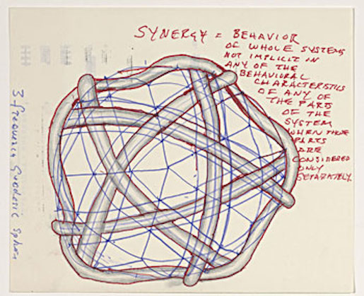
Synergy – one of the key words to understand the world in which Fuller lived. It describes the unexpected effects that arise within a system that could not be predicted by the individual analysis of its parts. From the synergy comes the holistic vision that guides much of Fuller’s ideas.
The conception of the planet as a regenerative system where each organism being guided by its instincts of survival also ends up playing a secondary role that helps to balance the planet as a whole. As, for example, a bee that in obtaining the nectar for its survival ends up helping in the reproduction of the plants through the pollination.
According to Fuller, the alienation of man from nature in migration to large urban centers has caused mankind to lose this notion of how nature works globally and to consume resources in an irrational and unsustainable way because of its ceaseless pursuit for money.
However, Fuller believed that the technology and resources that mankind already has is sufficient to supply it with food, home and transportation. However, he believed that this revolution should not come by the control of people’s thinking through speeches or violent revolutions, as did and presently do many heads of state, but by a design revolution.


7193_815104ed949f9deaf45165c4b8337013


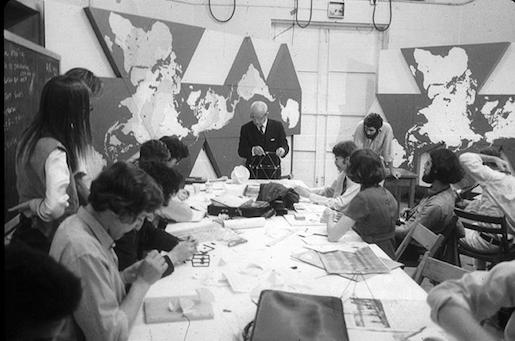
Such a revolution consisted in proposing practical and sustainable solutions as alternatives to the problems of humanity, which would make the population’s adherence to a sustainable way of life much faster. Since this solution does not disprove the educational effects of people’s awareness, Bucky came up with a game called World Game to educate people about this holistic view of resource use.
“Make the world work for 100% of humanity, by spontaneous collaboration, without ecological damage and without harming anyone.”

Buckminster Fuller’s inventions were called artifacts, all built on the idea of doing more and more with less and less, using maximum efficiency by using resources and technology to build sustainable solutions.
 
dymaxion-14D153A04D54F0383C7
 
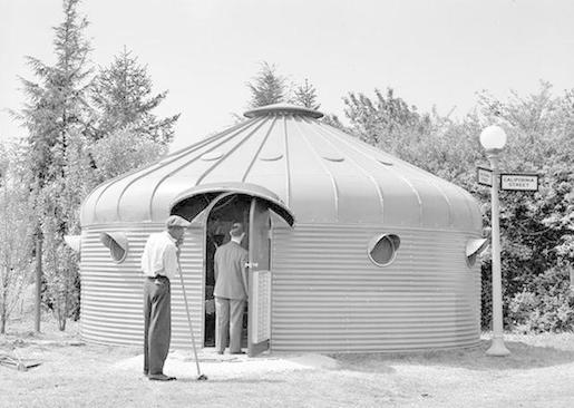
I think his project ‘’dymaxion house’’ relates to this story. It is designed in the late 1920’s but not actually built until 1945, the Dymaxion House was Fuller’s solution to the need for a mass-produced, affordable, easily transportable and environmentally efficient house. What fascinates me is that the whole construction is build around one central extremely strong mast, it has the same kind of idea as an umbrella.
The house was even self-sufficient, heated and cooled by natural means, that made its own power, was earthquake and storm-proof, and made of permanent, engineered materials that required no periodic painting, reroofing, or other maintenance. You could easily change the floor plan as required – squeezing the bedrooms to make the living room bigger for a party, for instance.
The round shape of the building minimized heat loss and the amount of materials needed, while bestowing the strength to successfully fend off a 1964 tornado that missed by only a few hundred yards. And the Dymaxion only weighs about 3000 pounds versus the 150 tons of an average home!


Biosphere15


From this project we can move on to his next building project what became his lifework;
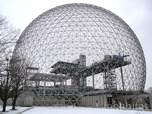
The geodesic dome.

The geodesic domes were responsible for making Fuller world famous. They are extremely lightweight structures, however quite resistant because of their ability to distribute the stresses applied at one point throughout the structure. As the geodesic domes have a spherical shape, this construction has a high volume per surface ratio, which results in a lower consumption of materials and less heat exchange with the environment, resulting in savings in air conditioning costs.
The part what interested me the most was the difference between the dome and his other project, the dymaxion house. This building is standing because of one mast, and the dome has none, it is standing because of the smart construction. So actually it is in that sense the opposite of each other.
These projects were based on what Fuller called the Science of Comprehensive and Anticipatory Design, which was characterized by thinking holistically, anticipating problems, proposing a solution through prototypes, and testing it scientifically while the whole process is documented.
 
IMG_MDA100513_1600px
 
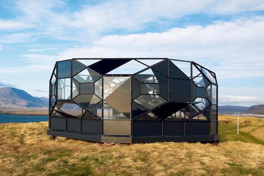
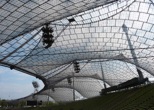
Fuller’s elegant geometries, pioneering principles, and holistic thinking have left their mark on contemporary architecture. In the field of art, he has probably left his deepest mark on the work of Olafur Eliasson, partly due to a personal connection. One of the key staff members in Eliasson’s laboratory-like Berlin studio is Einar Thorsteinn. The Icelandic architect not only worked closely with Frei Otto, the creator of the suspended roof constructions for the Olympia grounds in Munich, but also with Fuller himself.

You can definitely see the similarity in the base of this stadium. I have been here myself in 2009, and i was really impressed by the design, for me at that moment it felt really modern and futuristic and I was surprised that this stadium was build in 1972.


Frei-Otto_Pritzker-Prize-laureate-2015_dezeen_784_24


Fuller left a great number of contributions and ideas in the most diverse areas such as engineering, architecture and education, serving as inspiration for several alternative movements and communities. His thoughts in favor of a collaborative, sustainability-focused world are increasingly present and more discussed.


Syndicate of original and contemporary typography


Thursday, October 23, 2014

Typeface_as_Program_00

Typeface as Program: Applied Research and Development in Typography
Designed by David Keshavjee and Julien Tavelli


The book “Typeface as Program” is a book about the graduation project of David Keshavjee and Julien Tavelli. They graduated at the ECAL/University of Art and Design [x] in Lausanne, Switserland.
The first thing you will notice when you see this book is, of course, the cover. As seen in the picture, this cover contains the colours red, white and black. I think this, and the typeface on the cover appealed to me the most at first sight. It also seems like a book that makes you move closer, because you see the cover but you cannot read at first side what is written on the cover, because it’s vertical. You also do not yet really understand what it is about and what you will find inside. As the title is situated very small in the left corner, it draws you come closer. When you read it, Typeface as Program, more questions pop up. What is this book about? Why did they situated the words like this?


When you open the book you’ll see a very outstanding orange colour which I really like.

front page

Next you will see the table of contents and introduction. What I don’t really like about that is that it’s vertical written, so you have to turn the book which is not very practical. It does look nice.

What I already mentioned in the beginning, is the typeface. If you actually start to read this book you’ll find out the whole book is about this typeface and how they developed and produced it.


spread_CreatingTools
A view into the book about their graduation project


The size is a little bit smaller then A4-size, which I also like because it fits easily into my bag, and A4 mostly doesn’t. The cover is soft but not too soft. The size and the material makes the book approachable because it is not too big and heavy to open it.

The book is representing the graduation project of Keshavjee and Tavelli collaborated by other people. The project “Creating tools, Using tools” earned Keshavjee and Tavelli the Federal Design Grant in 2009 [x]. This project is realised by several steps. They decided to develop their own tools. First they programmed a script that could automatically generate character sets based on a group of specified variables. Then, with the digital font they created, they made wood types and an automatic layout tool.


maximage6Maximage-1
Pictures of the handmade woodcuts they made for their typeface


By combining these tools, they printed the posters seen in the beginning of the book. Using a digital font and manual wood types, they wanted to contrast different kinds of typographic languages.
In the result you can see the programmed randomness. Their type design is impossible to regenerate with either only traditional- or digital methods. The typeface was based on the idea that the, let’s call it, “DNA” was only containing the letters “o” and “n”, and from those two letters on they built the complete Latin alphabet.


The typeface is called “Programme”. Primitiv is the first version, which was automatically generated. Its very light, almost like a sketch with a skeletal structure. Later they made more calligraphic cuts. In the typeface it’s possible to see marks made by pen, brushes or computer. The typeface looks, even though its automatically generated, almost like an old typeface.


programmae1 programmae
Programme, 2009, Keshavjee&Tavelli’s typeface they made as a graduation project


After their graduation project they, of course, didn’t sit still. They continued a lot to work in an experimental way combining different tools and using them in a twisted way, to try to reach an innovating and interesting effect. Seen in the catalog “Acid Test”, their first experiments with chemical products.


Maximage-AcidTest-cover Maximage-AcidTest-spread

Acid Test, 2010, in collaboration with Tatiana Rihs and Körner Union


In this book, they tried to work completely manual, without computer but with for example tape, razor blades, acids or brushes. They were trying to understand better how colours on colours overlay and how chemicals would react on other material. “Les impressionists Magiques” is a final product of the best outcomes they got by using these new tools, shapes and gestures. They try to see the good also in “mistakes” and unexpected surprises. It marks their work. They push tools to their boundaries and use them in a wrong/different way to get new results.


maximage2 maximage3
Maximage Formula Guide, 2011


They made several more catalogs, booklets, posters for festivals and record covers. Also, they work a lot in collaboration with other artists. Their latest is “The Most Beautiful Swiss Books of the year 2013”. Again they combined new methods, for example all the parameters in the book are changing all the time. Furthermore are some pages glossy and some aren’t. I think this is an innovating view on typography to use subtle and original gestures. They also used different screening types. This all comes out in a book full of varieties [x].


Katalog-cover Katalog-2013_Content
The most beautiful Swiss Books, 2013


plaat1plaat3plaat5 plaat2plaat 4

La Grida Loca (2010) is a short booklet for graphic design students. It is about common mistakes and solutions for graphic designers and it also contains designer tips — in collaboration with Körner Union.


ohne titel1
ohne titel2
Untitled, in collaboration with Körner Union and Tatiana Rihs

Rietveld library catalog no : 757.3 kel1


My experiment


Tuesday, April 10, 2012

“What is art?” would be a long discussion subject. So there is no discussions about it, I claim my own hypothesis on this question -art is an experiment of telling your personal motion /thought /opinion via any form of communication . Let’s stick to the word experiment.

What is experiment? Wikipedia says An experiment is a methodical trial and error procedure carried out with the goal of verifying, falsifying, or establishing the validity of a hypothesis. I think  everything you are giving to show to other person becomes an experiment based decision because you can predict but you’ll never know for sure how she or he will respond . So every story/ movement/ your daily life processes when viewer involved becomes experiment/art  …if you ever had doubts who you are –my congratulations you are an artist!

Let’s go deep in to the first steps of this kind hypothesis ART creating , the part that is before the “showing out on public” experiment. Richard Niessen (graphic design artist) gave me some background to start from with answering “What is your opinion on experiments ?

-“Well, it’s not that I like to do experimental work because I want to experiment. It’s just that I need to do these experiments to find solutions that do not yet exist. I always believed in work that is very outspoken, but I do not want to lean only on style. So the experiment comes from the search to make something appropriate for the subject, in a radical way. The experiments are always design-driven.”

and “Do you prepare yourself for experiments or sometimes they just happens during the working process ?

-“Sometimes there is little experimentation necessary, sometimes it takes a very long time and a lot of try outs before I come to the right solution. And talking about experiments: there is always this element of risk, like in scientific experiments, you never know if it really is going to work. In the case of printed matter, I only know this when the poster or the book is in the street or in the store. I have the ‘feeling’ that it will work, that’s the hypothesis.”

So process of making art piece is experiment based cooperation of doing and thinking.

One day on my back way home from academy I stopped with this thought:

Usually materials I am using are like viewers -they act, sometimes predictable sometimes not and my decision is based on the particular stage of creating art /so i become viewer for my own experiment/art. In this moment you can increase your idea to keep it going where it goes or change the way it goes to keep your idea.

So I could use more speakable materials like people to find out flexibility of my thoughts and acts in unusually open way in usual environment .

I decided that the simplest moment of our everyday life where we see other people is road (way home or to your job or somewhere, whatever you go) . You “meet” people on the road and you seeing them act somehow/for example you think about them – that’s already an act ,especially if you make serious face during this thinking process ><. The idea is that people can choose reaction or make it up to tell more /show more not just keeping on automate their reactions. I mean If we are an artists…than we are not really good ones. This moment of 3 seconds ,when you look in to the stranger eyes walking by you is used uncreative, it doesn’t go farther than a smile or “hy” I mean that’s great(!), but how much does it says about your mood, day and personality? I do believe you can even start conversation from that , but that’s not colourful on the level of act/standard experiment .But if you have new language involved that was made up on the spot  that’s freedom of expression what allows  to play with this moment as much as you can…as artists in museums playing with their art pieces viewers. Making them wander/questioning/screaming “HELL YEAH” or “NO WAY” !

Playing around with/conclusion of  this hypothesis:


Amstelveen

like I wrote before: I want to try change idea by starting acting and change the way I am acting to keep the idea .


first part: I was pretty tired this morning and i started from showing my mood of willpower to stay awake (“look broadly”)

Amstelveen

It came out good-people were smiling .


second part: I changed my expression of mood after their reaction on my “look broadly” act.

Amstelveen


Second part was more communicable, although people where running on their job  and I didn’t interact with anyone longer than few seconds . So I didn’t wait for something more than a smile ,on which I reacted with my expression of happiness.


i approved my own hypothesis with getting  light motion like after visiting a museum ….and exhibiting the same time as well . Bit sad that people didn’t go wild in their own expressions.By reations of some people i did saw that there is difference between museum and everyday life –it’s criterion of insanity.

But if art (as an experiment) process is the same like life process why should we behave in boarders “to look sane”? ……

Amstelveen


p.s.  For me personally I have a feeling that people I met that experimental day will remember this day how they meet my art like a day when they should shown their own.

KEEP IT EXPERIMENTING !

Get the Flash Player to see this content.


Research David Keshavjee & Julien Tavelli


Sunday, March 6, 2011

David Keshavjee (born 1985) and Julien Tavelli (born 1984) are two Swiss graphic designers/typographers, they both studied at Ecole Cantonale d’Art de Lausanne (ECAL) They where one of the winners of the Swiss Federal Design Award with their graduating project, ‘Using Tool,’ in 2009. They just made a pedagogic booklet at the Federal Office of Culture in New York, Acid Test. In collaboration with Körner Union and Tatiana Rihs they made offset cmyk experiments. Later they printed a reproduction of that handmade booklet, “Les impressions magiques“. They are part of Maximage Société Suisse, an exploration in the field of emotion and technology.

Their Using Tool project is, I think, the most interesting thing to discover about them, it explains a lot about how they work and how their poster series for music concerts where build up. The posters where published in Wallpaper and in the book ‘Typeface as Program,’ witch was published by Ecole Cantonale d’Art de Lausanne (ECAL) Especially the last one is very related to their process and what they are designing. They also explain in this book how Keshavjee and Tavelli approached their works by using half digital half manual tools during the process.

They started in their design process of the posters by first programming a script, inspired by a workshop of Frederik Berlaen on ECAL, that could automatically create a system of characters by using the already by Keshavjee and Tavelli designed ‘o’ and ‘n.’ Those two are the essence of the typeface, so with this characters the script is able to create the other characters of the alphabet. Keshavjee and Tavelli like to keep the random and uncertain factor in this system and in their font by giving the computer the control of the typeface. I think the script also helps them to design the first layer of the poster, the digital printed part, the black thin lines. When their computer created the characters they use a machine next to the computer that cut the letters out of a 2mm thin wooden plate what is still very raw then, but they do the final touch by hand. After they manufactured the wooden characters they cut pieces wood all the same size to glue the 2mm thin wooden characters on it. After they did this crucial step, they can think and work with the spacing of the letters, and build up the composition. The last step for them is to combine the background layer and the composition of the typography, the wooden characters into the final poster.

I think with the combination of manual and digital processes that are repeated at each step, from the production and application of the typography until in the composition and final print, Keshavjee and Tavelli create a refreshing and inspiring result of the raw woodcut with the smooth digital print. They work according to the principle that the means influence the form and that new forms of expression in graphic design can be created by combining different tools. These ideas are applied to the poster series as well, it’s the essence of their project. The posters are also published together with the thoughts about this series and an interview where they explain more in the book, ‘Typeface as Program.‘ There is also an interesting article on boston.com about the swiss designer thoughts of typography by Cate McQuaid.

For me they work a bit like typographic engineers I would say. They really are working with developing scripts and systems to help them approach typography in another way, not very usual and practical way, but an interesting one. You could think if you read about how controlled they work in a way, that they are probably to much controlling their work. But their prints are very open for unexpected accidents within its system, there is a lot that can go wrong, all trough this process the accidents are creating new opportunities in the creative process of their typographic experiments, that’s a good value of their work I think. They also always start projects by experiments. It could be interesting to learn and see more of the projects of David Keshavjee and Julian Tavelli, and see how they treat their project during the process of designing typography.

Look for the unusual (2)


Sunday, October 10, 2010

book  (bOOk)

n.

1. A set of written, printed, or blank pages fastened along one side and encased between protective covers.

there were some books in the library that didn’t fit this description of a ‘usual’ book.I chose a rather mysterious one.

(more…)

Elastic minds


Monday, March 30, 2009


The choice of projects, which are presented in this book is very various and reaches almost any kind of design. Many international designers are introduced with their latest works.
A lot of the projects are highly conceptual and touch the blurry spaces in between design and art.
I found the title “design and the elastic mind” very appealing in opposite to the cover, which is rather scary.
Therefore I posted a picture of Elio Caccavale’s project “Utility Pets”.
He is concerning himself with the various effects, that inter-species organ transplantation might have in our lives in the not-so-distant future.
The tools he invented, presented on the picture, are supposed to generate an intense contact/relationship in between the donor (in this case the pig) and the receiver.
From the upper left to the lower right:

– Smoke Eater- Toy Comunicator- Memento Service- Comforting Device

cat.no. 772.9-ant-

keyword: overview


Log in
subscribe