Skip to Content Skip to Search Go to Top Navigation Go to Side Menu


"letters" Tag


I’m new here


Friday, May 24, 2019

.

*****

I don’t really know the way, but I want to. I have this habit to wander off randomly when I’m unknown with a place. Just to see where I’ll end up if I let go of control. “Let fate decide” says the romantic in me.

After a while I see patterns and I believe that I know where I am. Finding attractive by-streets in every corner. But that’s an illusion. By the next turn this pattern is shattered by reality.

I don’t know where I’m going, but I know I don’t want to stay. Just keep going, till this frame turns into bedlam. Borders can’t contain me anymore. Looking back I can’t trace back my origins. I’m not lost. I’m new here.

I am chaos.

.

Type in Space


Tuesday, May 22, 2018

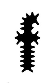
In 1995, the graphic designer Zuzana Licko created the typeface
Modula Ribbed, a variation from the original Modula font :

Zuzana Lincko - Modula Ribbed

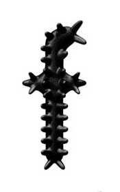
Then Guy Williams, made an 3D virtual interpretation of it with the program Alias, called Polymorphous : (see Dimensional Typography [x], J.Abbott Miller, 1996)

b

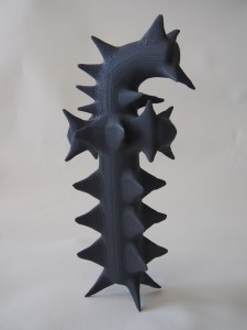
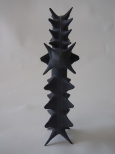
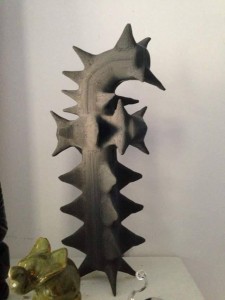
An former student of basic year, Suzanne Jensen, realized a 3D printed version of this letter as part of this research program back in 2016

42-225x3003-225x300

Modula


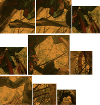
The original version of Zuzana Licko already shows an interest around a 3D perspective. Flat but already shaped; round, but with a sharp feeling. As if Licko already had in her mind the physical sensation of this letter in her hands. Considering this, we even could imagine this one as the shadow of Suzanne Jensen’s object, realized years after. Surprising how the shadow come first, before the object.

Simple, efficient, and very particular, Licko’s « f » gives a lot of inspiration for who’s interested in 3D environment.

Guy Williams obviously got inspired by those multiple peaks, and came naturally to this virtual 3D representation, which doesn’t surprise next to the original one.

S. Jensen challenged to finally give this « f » a physical form. The next step for her was to think about the materials and a  technical realization : how to choose a material which gives the physical feeling expected through the previous examples, and how to realize it with a practical and efficient technique. The 3D printer was obviously the most clever solution, to get quickly if we can say, a first physical result.

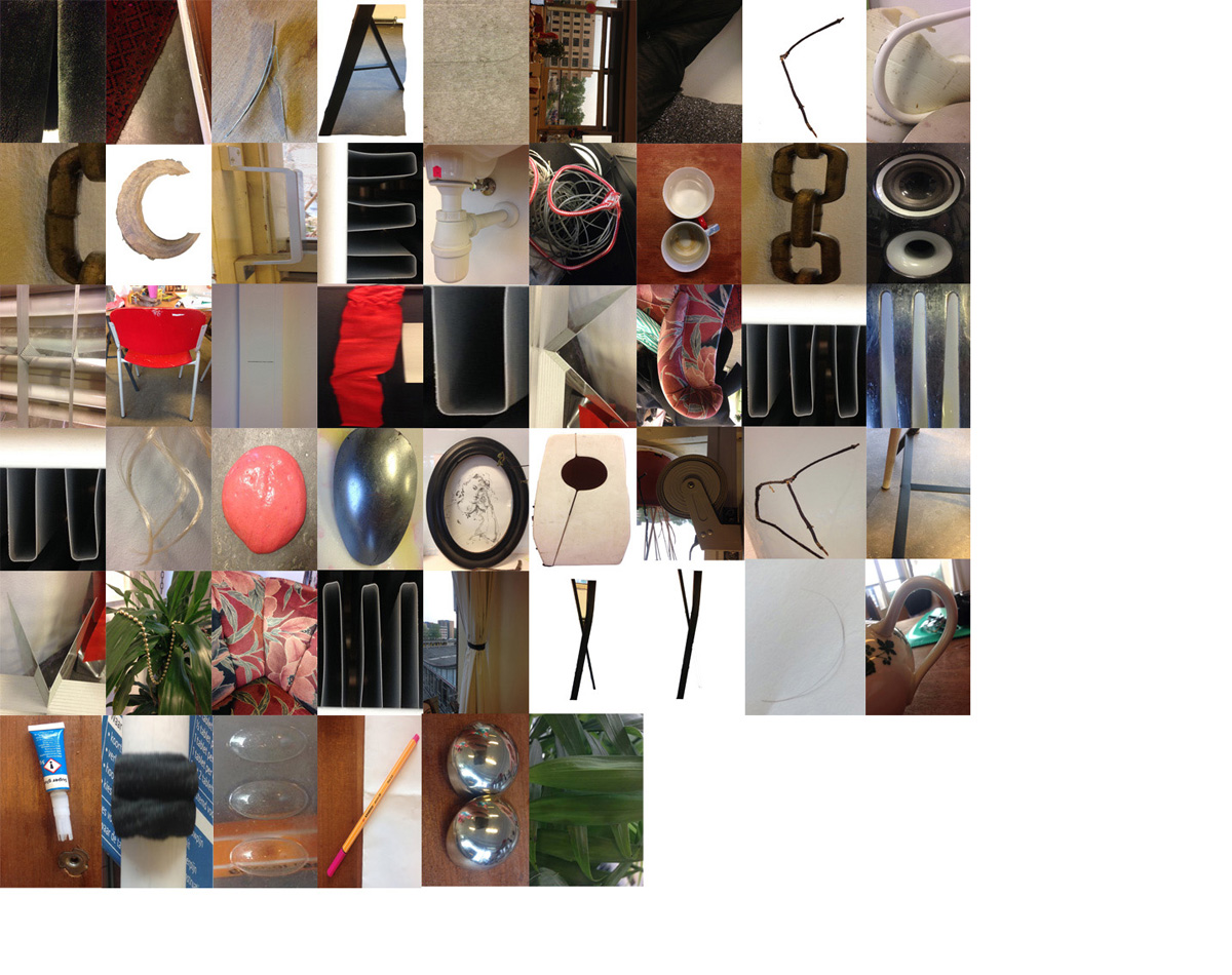
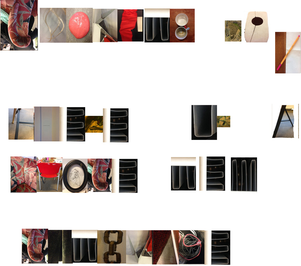
On the basis of those 2D to 3D experiments, and the desire to give a physical touch to a letter, comes naturally a curiosity for the other way around. Observing our daily environment, well known from us as a 3D space where everything get a shape, a form, a touch. The thing is to get into the same processes as Licko, Williams and Jensen did : looking at the qualities given by the dimension we work on, to see how they can relate to another dimension. The idea isn’t really to get a space visually flat, to then guess typography on it, but to perceive letters as 3D objects. Doing so gives almost infinite possibilities, typography appears everywhere, as long as we make a visual effort and look through different points of view around a portion of a space.


blog

In an apartment

p p2 p3 p4


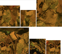
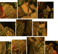
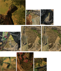
As well as in nature

A skyline of colorful contrast talks in different shapes and by every millimeter i move my head a new letter appears by light incidence


A 2D surface already offers a lot of possibilities, considering that 3D got this 360° properties, we can imagine how far it can go. After looking around for  some time, the viewer get quite used, and letters pop up naturally to the eyes. They start to get bigger and bigger, as we don’t look only at human sized space and elements, notion of close and far disappear: buildings, trees, highways, clouds, …


blog fin

Looking up, there is a whole new language


So you like patterns?


Sunday, November 26, 2017

The book I choose to research is called ‘Biogea’ and was written by Michael Serres, and designed by Jason Wagner. Published in 2012 by Univocal Publishing, which Jason Wagner co-created with Drew Burk.
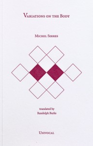
From the design of this book and from other books that Jason Wagner has designed I can see hints of his personality if not that then definitely his direction of interest. The way all the patterns are so precise and clean cut gives me the impression that he has a methodological nature and an obvious love of patterns both simple and complicated, while enjoying a subtle use of colour. As seen in another book designed by Jason Wagner ‘Variations on the Body’, which is also written by Michel Serres.

Variations -Cover

The fact that Jason Wagner is a part of the Univocal means that a critical look at the company can give an insight on the designer and ultimately the design itself.

Univocal Publishing was founded in 2011 as an independent publishing house specializing in small-scale editions and translations of texts spanning the areas of cultural theory, continental philosophy, aesthetics, anthropology and more. Univocal’s books including Biogea combine traditional printmaking techniques with the create evolutions of the digital age and feature letterpress covers designed by Jason Wagner, who demonstrates the technique in a video.

https://youtu.be/qwQSNhor1EQhttp://

Using techniques similar to this the publishing company oversaw the printing and binding of books from 2012 to May 2017, in which it ceased operations and merged with another company. This could seem to fall down to Jason Wagner who is stated to be moving on to pursue other projects.

But why did I choose this book? I decided on this book for a variety of reasons. I enjoyed its’ simple yet complex design containing a neat revolving spiral-like pattern which is placed in the middle of the book and looks pleasing to the eye. The pattern it self drew my gaze as I found it really intriguing as it resonated with my own interest in complex and unique patterns which I like to create.

The plain colours and easygoing layout of the book for me made it feel more approachable. The design it self didn’t take anything away from the content, for sometimes I feel that the cover of a book can sometimes give you false expectations of what it contains. Being misled into buying something based on its looks. This book however balances this nicely I think by not taking anything away from the content but instead relating and highlighting the themes within.

Biogea

The Typography is placed on top of the design and relates to and supports it nicely. Accentuating its colours and giving the book a clean and natural feel. The pattern initially drew my attention to the book, but as I took a closer look I found that the texture around the design on the cover felt good to the hand and gave it a thicker and more solid feel. This impacted on my decision as the pattern and texture subtly blend their delicate qualities together to create a book that i found aesthetically pleasing. While the design since imprinted on a thicker material felt noticeably different making it stand out from other designs and books.

The almost scientific complexity of the simple and delicate design also relates well to the content of the book for it’s a mixture of poetry and science. While also presenting a philosophy that merges the humanities with all creation. This has made Michel Serres “one of the most intriguing thinkers of his age”, and I believe is a reason why Univocal publishing has design and printed most of his books. Because of the authors philosophical and poetic inquiry sings praise of earth and life, and what Michel Serres names singularly as ‘Biogea’. The design relates well to the content as it mixes light fresh colours with an intricate pattern, which gives a natural clean aesthetic relating to some of the topics within the book. Some of the obvious examples being the use of blue in the typography which links with text within. “ Today we have other neighbours, constituents of the Biogea; the sea, my lover; our mother, the Earth, becomes our daughter; this beautiful breeze which inspires the spirit, a spiritual mistress; our light friends, the fresh and flowing waters.

Even though the design itself is quite precise it has a sense of movement to it and gives the book a poetic feel to it, this also relates to the content, as it’s a mixture of poetic statements revolving around natural themes. “In these times when species are disappearing, when catastrophic events such as earthquakes and tsunamis impale the earth” the author wonders if anyone “worries about the death pangs of the rivers”.

The author asks the same question of philosophy “as the humanities increasingly find themselves in need of defenders. Today, all living organisms discover themselves part of the Biogea”. Knowing the content of the book also ends up shaping my view on the design of the cover as the series of lines almost create a shield like swirl or sea creature, protected by the bold strong title Biogea.
 

Biogea, designer: Jason Wagner, Rietveld Library Cat. no: 157.3 ser 3

Not A Complete Story…..


Monday, April 9, 2012

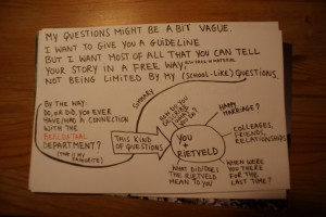
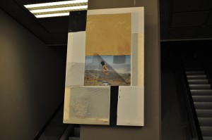
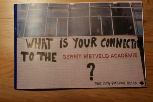
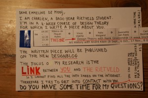
At the Fashion&FOAM exhibition in the Vijzelstraat, the work of Emmeline de Mooij was a real eye catcher. Not because of its colors, not because of its size, not because of its position, but because it was ‘different’. In an exhibition on fashion design, she chose not to show clothing or fashion photography, but to present a canvas with a picture of a jumping naked woman and collected sand, called ‘Gravity and Domestic Dust’. A very (strange?) personal approach to what fashion design is? How does she describe herself, and what –as an ex-Rietveld student- is her connection to the Rietveld after 10 years of graduation? As a reaction on her visual work, I chose a personal formal approach by sending her a letter full of loose questions, written on pictures of the Rietveld building and on photographs of her own work. What I got back was not a complete story, not a letter either, but a bunch of answers giving a slight insight in the relation between this versatile artist and ‘our’ Rietveld.
How do you describe what you do?
Emmeline de Mooij (born in Delft, The Netherlands, 1978) investigates in her installations, photo’s and performances, the human being looking for something to hold on, confronted with the sight of a dizzying big universe. Comfort and a therapeutic effect is often found in surrounding oneself with as much objects as possible.
In her work she creates artifacts and remnants of fictional societies and scenes from apocalyptic scenario’s, removing the contradictions between the everyday and the improbable. Materials such as clothing, utensils, plastic, clay and Styrofoam, she molds together into images referring to science-fiction, archeological finds and pseudo-scientific theories.
The complex, with objects surrounded modern life and the nostalgic desire for simplicity, she captures in an ironic way. Where concepts of freedom and panic are inextricably linked to each other.

You+Rietveld: Happy marriage?
Yeah, quite a happy marriage! Although I wouldn’t describe the Rietveld at that time as a top level institute. I thrived well in the general focus at the Rietveld at giving the students a lot of freedom and responsibility, but I also think that there were a lot of not really good teachers. Teaching on a bad level, not up to date with developments within the international art world, or just not dedicated enough (absent all the time, sick, burn-out etc). I had the feeling some of those teachers where teaching there since ages, having this contract, so they were save for the next 10 years, they were friendly to the director and that seemed enough to keep their job.
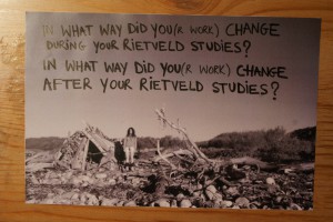
In what way did you(r work) change during your Rietveld studies?
I guess, due to the fact the Rietveld being quite an international community, the same counts for Amsterdam where I moved to for my studies, my horizon was broadened. And I felt I could finally fully express myself, surrounded by like minded people, quite different from the provincial town I grew up.
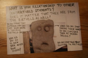
What is your relationship to other (ex-)Rietveld students?
I have some friends that went to the Rietveld as well, maybe 30% of my friends? But I’m not one of those that keep hanging out with only Rietveld people, there’s quite a big community in Amsterdam that is like that.

Does it matter that they are from the Rietveld as well?
See answer above.

Do you think that someone can say that your work is “typically Rietveld -based”?
To be honest, I hope not. I hope my work is not too strongly part of just one particular tradition.
Although sometimes I have the feeling, especially compared to artists with a background in American art education, people who studied at the Rietveld have quite an elaborate/intuitive way of working, which feels to me more natural. So I wouldn’t mind if people would connect me to the Rietveld in that sense.
I can’t ignore though that my work can be typical Dutch sometimes.
Especially in photography I think there is a certain approach that a lot of Dutch artists unites, “improvised” looking still lives for example, or snap shot like photo’s with strong flash light, the use of humor in the work. And many times I think Dutch art isn’t very political, again especially compared to artists with a background in American art education (for me this is a strong reference just because I recently lived/studied in the States for 1,5 years), artists here are not extremely engaged or making political statements.

Why did you go to NYC after your studies?
Because I got offered a scholarship for the Photo Global Residency Program

When did you start making these (canvas)works? Do you consider them as fashion design?
I started making them in New York in 2010. I wouldn’t consider them as fashion design.
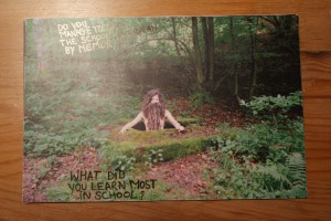

Do you manage to draw the school-floorplan by memory?
No.

What did you learn most in school?
Working from my intuition.
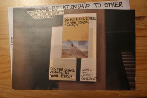
Did the school change in your eyes?
Don’t know.

Would you change something?
If there are still these teachers that aren’t dedicated and not good at teaching, I would throw them out and really try to upscale the general level. There are enough great artists and theorists living in or close to Amsterdam who could teach at the Rietveld.

Did you ever think about quitting the Rietveld?
No.

When where you there for the last time?
I think 2008, for the graduation show.

Do you feel linked to the school today?
Not so much, although coincidentally two weeks ago or so I ended up at a lecture from the Italian thinker Bifo and I heard he was going to speak at the Rietveld Studium Generale the next day. So I checked the Rietveld website and some lectures looked interesting, but I had to finish some works for a show so I couldn’t go. But maybe definitely next time.
Letters


Thursday, April 14, 2011


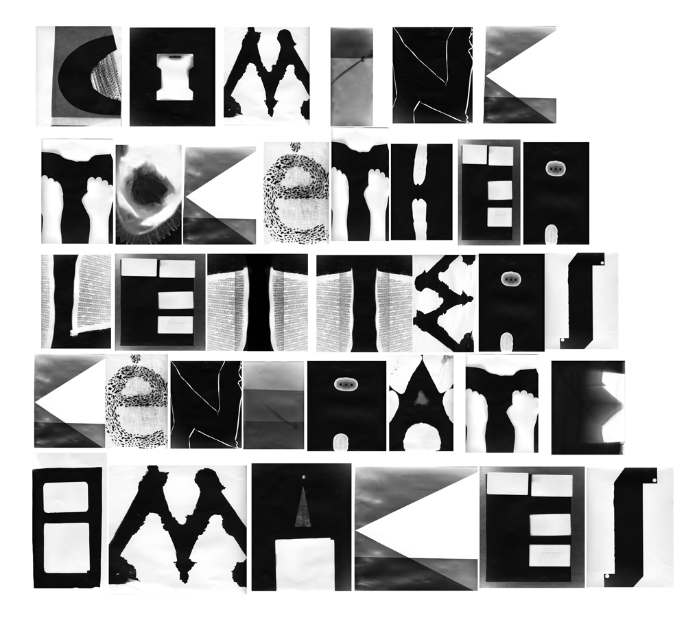
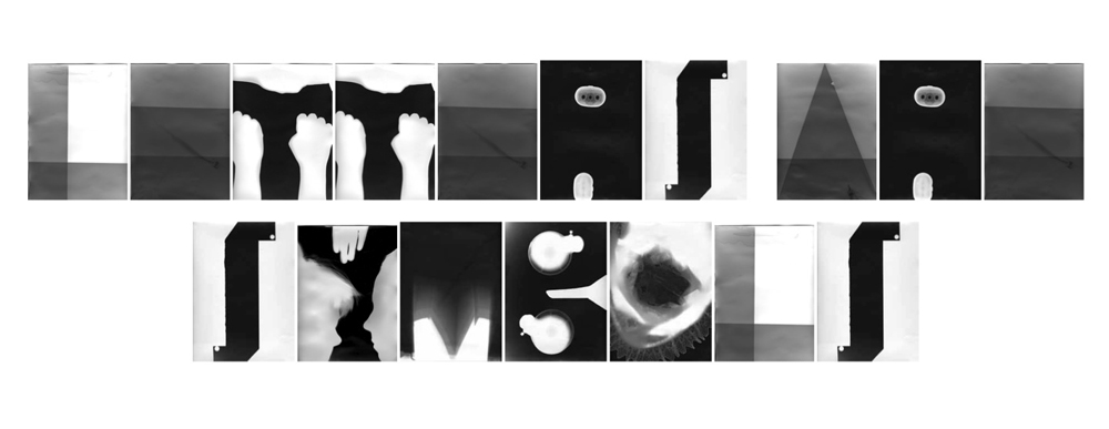
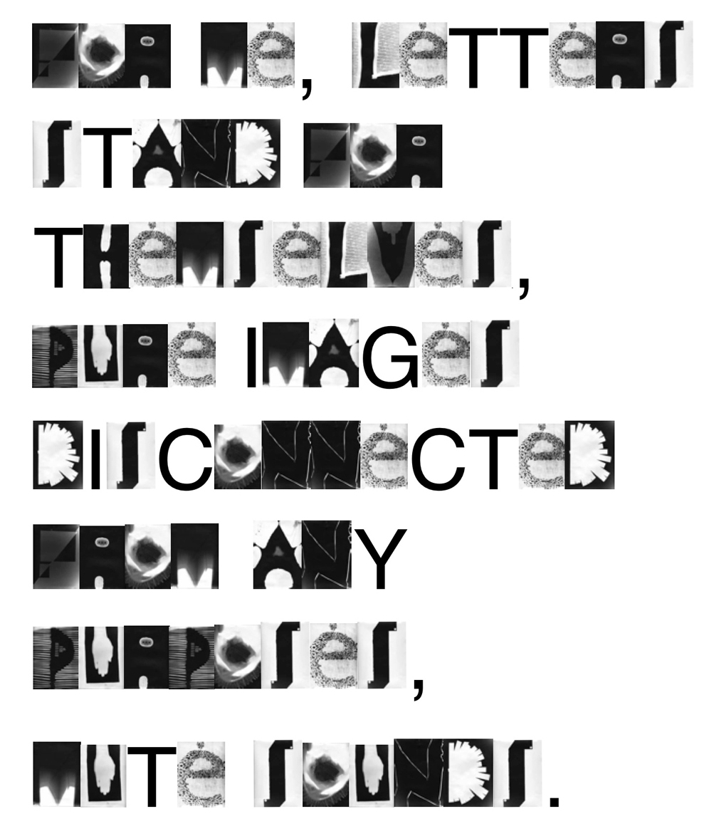
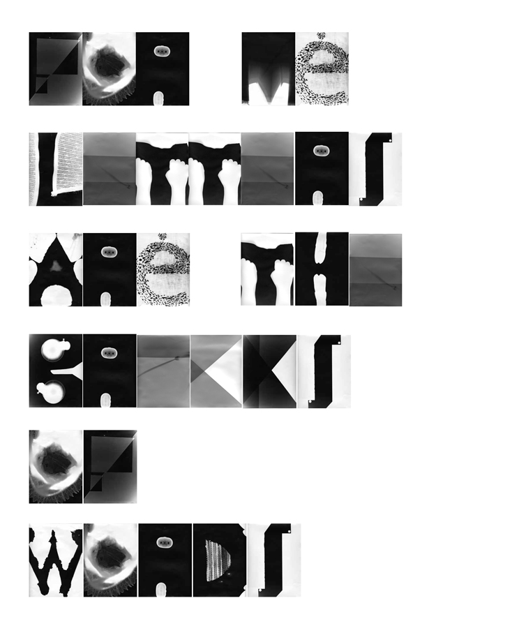
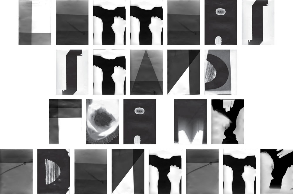
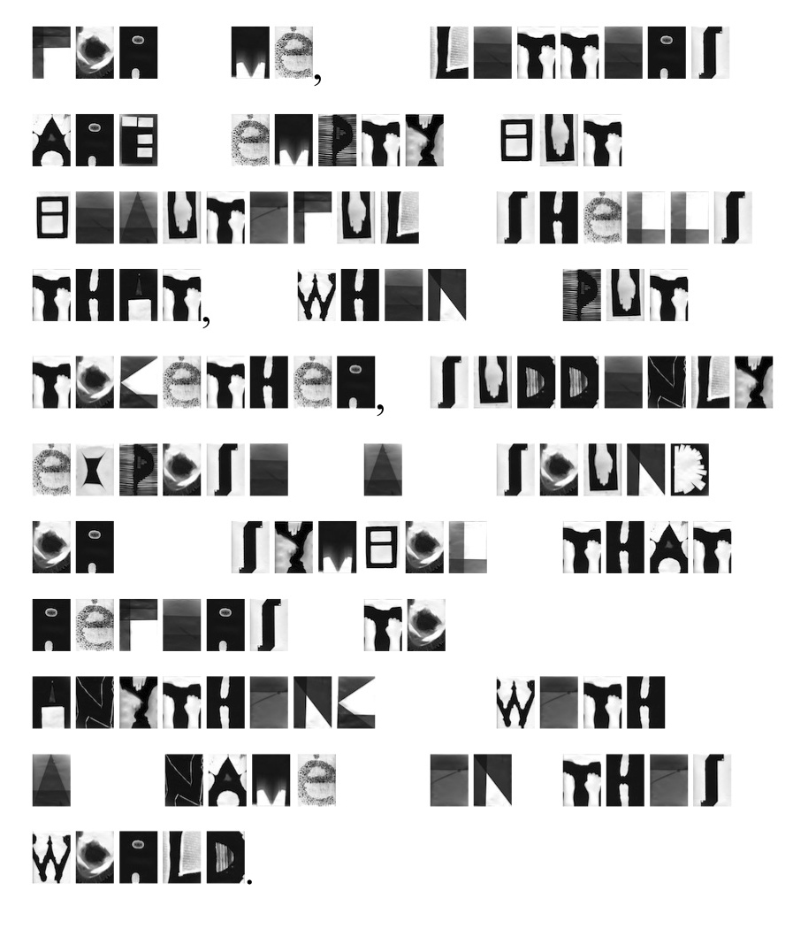
inspired by 'words about words...' from s. themerson's semantic poetry

Letters


Wednesday, March 30, 2011

Letters


Monday, March 14, 2011

Letters


Thursday, March 10, 2011

Letters


Monday, March 7, 2011

Letters


Monday, March 7, 2011

Letters


Monday, March 7, 2011

Letters


Monday, March 7, 2011

Letters


Sunday, March 6, 2011

Letters


Saturday, March 5, 2011

New eyes


Friday, March 4, 2011

Looking back in time, trying to remember how I’ve learned to write and read, no memories appears. At least no memories that create a clear image of the learning process.

In elementary school we learned the letters. We learned how they look like, how they sound, how to write them and connect them into words. This process took quite long time I think and it’s difficult to be described in retrospect. In these classes, we all had to study on writing the same letters, but we all created different handwriting. Some could do it beautifully, some ugly to unreadable. How a handwriting can be unreadable?

Now, reading a ‘small’ book from a ‘big’ man – Gerrit Noordzij, helps me to realize why and how I can do this today. A book written even before I was born answers the question as simple as ‘the space’ and with writing especially the ‘white space’.

In our current time we see hundreds of images every day. Some we remember for a reason, some we forget immediately. How does our human brain read those images? What helps it in this process?

The “boom” of a new ways to process images started in the second half of the 19th century, when people started creating more spaces for museums and galleries. Later on with the use of architectural deconstructions, making them fairly big and “clean”, with the only purpose to contain some of those special images for us.

The use of space is very common in modern art. In some cases we actually perceive the space as a piece of the art. For example, if a work of art is placed in surrounding A, which is empty, it will be processed in your mind differently than in surrounding B, which is full with other objects.

In modern art we refer to surrounding A as the ‘White cube’, with its square or oblong shape, white walls and a light usually coming from the ceiling. A book from Brian O’Doherty (Inside the white cube – 1976), in which he confronted the modernist obsession with the white cube arguing that every object became almost sacred inside it, making the reading of art problematic.

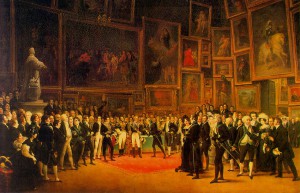
As surrounding B was more standard in the few centuries before that. Then the exhibition space was the salon, a dark space so filled with works that it was difficult to see the beautiful, detailed paintings.

surrounding A

surrounding B

The importance of space can be found in different forms. Also in writing it plays a crucial roll in getting the message across, in other words: reading. In his book ‘ The stroke of the pen’ Gerrit Noordzij emphasise how the space in and around letters can make or brake the word and therefore the text.This space has to be put in rhythm. He writes: “The rhythmic connection of the white shapes in the word is the condition of the rhythm of the black shapes and vice versa.”

So this rhythm can be seen only in combination of letters. If a letter and subsequently a word doesn’t have its own space in and around it, then the white cube that belongs to the letter is impaired. As a result the word becomes just like an image hanging in saloon from 18 century.

Trying to understand this theory is like learning to read and write all over again. That opens a new perception on all written letters and words, how are they made and how they come across. Always look around and you’ll might see things in a new way…

Letters


Friday, March 4, 2011

Letters


Wednesday, March 2, 2011


Log in
subscribe