Skip to Content Skip to Search Go to Top Navigation Go to Side Menu


"Subjective library 4" Project


Lady´s in a car?


Thursday, December 6, 2018

I don´t know why I pick the book in the first place. Sometimes I just take a book without reading the title or the writher. It was standing somewhere in the middle, normal thickness and normal height. Nothing special on the spine, it was just black.

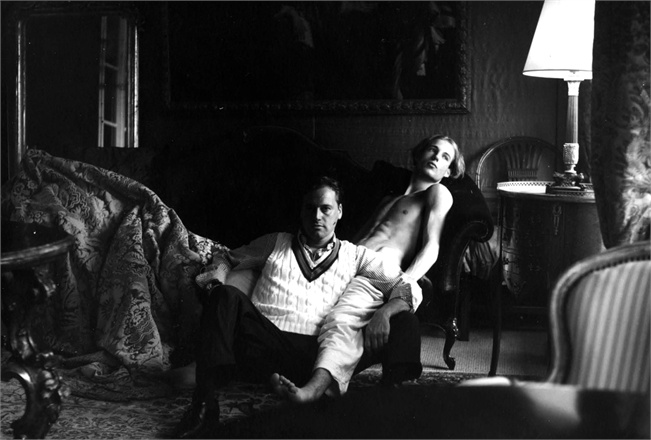
But when I took this book I saw that it was a good choose. There were two lady´s on the cover. I´m actually not sure if it are lady´s or man who are dress like lady´s. The make-up is so heavy that its looks they are covering something up. So they caught my attention. And the longer I looked the more questions came in my head. They are sitting in a car and it looks like a car from someone else. The weather is shitty and their makeup is not so perfect anymore. I think they are in a different country. They are looking a bit lost. But they don’t care so much. The cover of the book is also not so pretty as it used to be. in the corner it’s a bit ripped. At first, I thought that it was the print on the cover itself. In the inside you can see that someone repaired it with adhesive tape. It fits perfectly by the style of the book. Today I don’t feel perfect either. I can imagine that I have the same impression of the `girls´. I had a massage from my friend Nina who is also having a winter depression. But it always starts before the winter even begins. The picture is not filling the whole page. The rest is just black. Only the two people have colour. Outside of the car it is grey except for some yellow. The yellow reminds me of a taxi. It gives the impression of a big crowded city.

*15086*

Iuvenis


Thursday, December 6, 2018

It drawn me to it. The cobalt blue colour emphasised the youthfulness of the imagery. The face was almost life sized, as if it wanted me to adore it and venerate the look in the eyes that told an enigmatic, coming to age story. A portrait of a working class, white, young man was gazing at me with his presumably blue eyes, covering almost the entire cover of the magazine. The image was beautifully screen printed with a raster. In a very strong looking font ‘’WERKER’’ was written above the flat cap of the lad. Immediately my mind started working – adolescent, masculine, boyish, Adonis. It was a very obvious attraction for me, as if the cover invited the spectator to get this aroused feeling of the sexualisation of a worker class lad.
As I’m browsing through the pages, the the layout comes across very nineties. It has a playful way of displaying titles, articles, text and images. But above all, it is a very smart moves that lies immediately the focus of the context of the magazine: young man. The structural slogans that are prominently coming back in the magazine, combined with the grainy images of young men and their body parts it gives the layout a feel of protest, anarchy but also youthfulness that keeps coming back as a theme. This combination is of the archiving layout and the strong images that are yet quite sexually intended are making everything stronger. It captures the underlying beauty of vital lads back in the day. It also reminds the spectator, by pulling the archiving trick, that now we can see them as more than just the middle class. It let my mind fantasize about these adolescent boys in a non embarrassing way. The mystery and subtle beauty, packed in something strong and masculine, let my eyes legitimize the scanning and the browsing at the photos. I wish I had a worker class boy by my side.


Indulgence at the beach


Thursday, December 6, 2018

Keeping my keywords in mind I drifted around during two afternoons, allowed myself to get a bit more ’lost’ in the library.

This book was squeezed in tight between other books on the shelf, but that only made it stand out more. I noticed its crooked pages seen from the top, making an interesting pattern.

I recognize the look of those pages. I feel like I know them well.
It is clear that this book at some point have been soaked completely wet in the top. And after the drying the pages now take on this beautiful soft curve, reminding me instantly of rivers. Somehow once material have been soaked it always leave a trace of water.

Clear nostalgia, I have tried it myself. Being caught in the rain with school books, drying them in frantic desperation on radiators and in front of the fireplace.
By instinct I smelled the book. Not took bad for being drenched! I only got a fragile musky scent from its pages.

I almost laughed out loud when I finally saw the books cover in all its glory: A tilted shoot; blue skies over a crystal blue ocean, a wave spilling over perfect white sand. In the sand a heart is drawn, and the flamboyant bold letters “LIQUID LOVE” is plastered in the middle.
Incredibly kitsch and yet irresistibly charming. –I both love and hate it.
I mean – who came up with that idea? For what reason? Amazing, I was stunned in full five minutes taking in the glory of the scenery.
It is clearly a book with personality.

Scenes like this are quite ionic. The island ‘paradise’. Blue skies, ocean, alone on a welcoming beach. The heart is really what makes this over the top – a sign of silly, clumsy first love. Desperate to prove itself and has to take form as initials carved into trees and hearts traces in the sand. And then you can watch as the ocean swallows it.

Then title in itself is quite spectacular “LIQUID LOVE”. The ultimate seduction, dripping from the title with desire. A love that is liquid, able to sneak in anywhere, binding, making you captured in its grasp.

By making this third choice I reveal my own fascinations. When choosing a books; wear, fragility and imperfections intrigues my curiosity and help me create a personality in which I can indulge.


This book can be found at: 305.9 bau 1.

Reality Machine


Thursday, December 6, 2018

  When I saw Eliasson’s book in the library, I was really surprised by how emotional I still get just by looking at the name of him. The feeling of vomiting when I saw his exhibition last time in Beijing came back to me quietly yet so familiarly.
  And on the way back carrying this book to upstairs, I met a few friends smoking at the gate, they asked:“Oh, do you like his work?” I laughed and said “I kind of vomit last time at his exhibition, but yet I chose him to write an essay, I really can’t answer this question so frivolously now. 

  Maybe that’s exactly why I chose his book, I want to discuss this complicated emotion in the form of language. Yes, language, by creating another kind of “reality” on the base of concept to connect with the “reality” he tries to present in his work.

  What can I remember about his last work? I remember the crowded crowd in the orange light which made them look like pale zombie , and everyone was either taking picture or standing there for minutes without moving — taking selfies. Kids were jumping and shouting, having so much wild fun. And the air conditioner is working so good, maybe too good, maybe that’s part of reason I wanted to vomit, my stomach always react really strongly to cold air. 

  Why? I could’t stop asking myself at the exhibition, why I (and so many people) spent at least an hour on cars —it was a quite remote museum, to come here, to experience this kind of, what he called “Reality”. When we can see the real rain, the real sunset, is this kind of imitation “reality” of the nature, somehow touches us more than the real “reality”?

  It is very beautiful, I was thinking, it’s almost like the beauty like when I see the real rainbow, then I thought about isn’t the vulnerable and unpredictable character makes rainbow so strikingly impressive? Then what is this ? You drive an hour and paid something like 20 euros, to go into this huge artificial box, which is so cold that makes you wanna vomit in the hot summer, and in this totally dark space when outside is so sun shining , you saw the beauty of nature, and you praised, “Ah, what a sublime scene of this blue planet that we call home.”


Book Info ?Olafur Eliasson Reality Machine

eila 11

blank spaces


Thursday, December 6, 2018

At first, I wanted to find something by using the catalogue, but It wasn’t very long until I realized that it wasn’t relevant knowing that the tags were only subjective,

How could it work without generating something too literal?

At least, this process of research wasn’t the right one with the tags that I chose.

For this book, it took me less than one hour to pick it, as each time I wasn’t able to select a piece without already having a specific idea of what I wanted in my mind.

But still, I felt frustrated

Frustrated by the impossibility, or more precisely the struggle of being opened,

Being able to see, to take the time to observe the books that were surrounding me.

There were so many information and possibilities around that I wasn’t able to decide or to think about what I wanted or at least to consider those things.

I think that, in a way, that book happened to me because of this frustration.

I see this choice as the translation of my state of mind at this precise moment.

Fortunately, this book might have been what I was searching for, I just saw this thin white line between all those imposing and colorful editions.

I needed something simple, purified, that’s precisely, in my view, what I found.


All those blank spaces, accentuated by those vibrant black lines

Those micro architectures, in the form of sketches.

I was struck by a drawing when I opened this book, it is a drawing of the sun.

That reminds me of le Corbusier’s sketches concerning the housing units of Marseille and the principle of the sunshade.

I like this simplicity and this clarity

I also see those lines which I like a lot, thin, imperfect, instinctive.

Sun Bathing Serifs


Thursday, December 6, 2018

The boring becoming bold, the extravagant turning average. The library’s context has the power to change the appearance of each individual book. 

My last tag word ‘seduction’ resulted in the “The Pleasure of the Text”. A rather thin book, with the linking tag word as its main subject. And to admit, this is the most seducing copies I have seen during my Quest so far. Its beige cover contains the names of the author, title and translator. Each name centrally positioned and written in classical typeface. I remember talking about this daring design approach in Art Theory class; the rigorous use of classicism in an age of uncentered cacophony.

The title and author’s name are written on the spine, covering the top two thirds of its space. It looks like the book’s designer respectfully left enough space for a library-sticker to be added on its lower third part. The letters give a sense of monumentalism, probably because they’re all written in capital letters. This book is small, has only 67 pages, but seems to express importance and something all-compassing. Is if it contains words of the Bible, or the Tao Te Ching.

To me, the feeling of seduction grows out of its minimal means: the simple action of printing ink on paper, black on white. Simple rules created by human beings offering millions of possibilities and meanings. 

While in search for this book, I initially looked up its cover online before picking it up at the library. Just so I would maybe recognize it faster inside the library. It looked different online. The original title “Le Plaisir du Texte” was written in a smaller typeface. Also, the name of the translator was missing (because obsolete). This created a sense of generosity by the amount of extra empty space surrounding each word. They were given more focus and therefore value.

The letters of the current book I have in front of me are more frivolous, and seem to almost touch each other. The ‘h’s’, ’T’s and ‘l’s’ seem to tickle the lines above and below. The text pleasures itself.

Because of aging and exposure to light, the cover’s background color turned from white to beige. I imagine this book is left in the sun often by its temporary owners – I imagine them taking a break from the pleasure the words give them during their holidays on the beach. Absorbing the sun like they absorbed the text.


803.1 bar 1


The third book search…


Wednesday, December 5, 2018

The third week of searching… This week I was unable to attend class as I had to take my Tyler Durden of a cat to the vet to remove stitches from his head. I have become out of touch with the assignment (it was confusing to start with so I’m completely in limbo). This week I chose from my own library. The book had to be out of the parameters of “design”, it had to be something else. As someone who is predominantly invested in design this left me with little choice. I chose the book “tricks” by Bart Julius Peters. This book has given me many hours of entertainment as well as many inspirational moments. This book is comprised mainly of pictures with small texts, some I english, dutch and some in Italian. This book spoke to me as it has a non-binding, the pages are loose and can be taken out. I find this fascinating as from an early age I have been obsessed with organisation, I find it fascinating that is one desired they could simply let the pages fall out and thus be jumbled up and if the reader has not paid attention the original order could be lost forever. The book features pictures of details in wildlife but also classical sculpture. As a happy accident this book does match my original tree tags which where “spine, monochrome, pictures”.

“Essi offrivano lo spettacolo più che patetico ballano ai ogni insieme, aiuo, ciechi quen

di due giovanissimi innamorati ammonimenti del destino, illusi che ai difetti reciproci, sordi agli liscio come il pavimento del salone, tutto il cammino della vita sarà la parte di Giulietta e quella attori ignari cui un regista fa recitare di già previsti nel

di Romeo nascondendo la cripta e il veleno, calcoli, copione. Né l’uno né l’altra erano buoni, ciascuno cari e pieno commoventi di

gonfio di mire segrete; ma entrambi erano

mentre le loro non limpide ma ingenue ambizioni erano obliterate dalle parole di giocosa tenerezza che lui le mormorava all’orecchio, loro dal profumo dei capelli di lei, dalla reciproca stretta di quei

corpi destinati a morire.”

Giuseppe Tomasi di Lampedusa, Il Gattopardo,

Feltrinelli Editore, Milano 1958

The second search…


Wednesday, December 5, 2018

This week 3 words define our search. Mine are “spine, monochrome, image” A spine I find unusual and interesting, a book with only monochrome pictures and text, a book which is mostly comprised of images. As I search for the book which will meet all my categories I am struggling to find one which is convincing me. I find many books which apply to a single word, many books which apply to two of them but the real search for the ultimate match has just begun. As I notice how silent the library is I whisper to class mates who have made their decision and discuss their decision and the lack of mine. I travel back and forth deliberating and deciding. As I travel I think to myself that this is an impossible task and I will need to change my words. Alas I am stuck in the library again. As I look through the collection of books I start to notice how many of them look so similar both in regards to their spine but also layout. This task seems to be a tedious one. I travel upstairs in the hope that the perfect book will present itself. As i walk along the grid and glide through the books on the shelf an unsuspecting book presents itself to me. Like a beam of light in the darkness, like a light at the end of the tunnel, like a candle in the dark. This book is called “nobody suspected there would be much discussion about it”, quite appropriate in my opinion. the book has a cover which folds out to be a poster and the binding is satisfyingly odd. The entire book documents the works of designers working for Estoplast in the soviet union. The entire book is comprised of mostly pictures which are monochrome, three birds with one stone!

The first search…


Wednesday, December 5, 2018

Looking across the spines, looking for something that will excite my eyes and brain. looking for something I will like, that will make me feel something. So many titles of enticement. The search started with colour. What is the best scheme? The text doesn’t appeal but the colours do and vice versa. The high contrast of complementary colours creates a vibrant look especially when used at full saturation. The colour scheme must be managed well so it is not jarring. Many books later I start to think of harmonies, they usually match well and create serene and comfortable designs. Analogous colour schemes are often found in nature and are harmonious and pleasing to the eye. I have stumbled upon a trove of material. The search has been narrowed and now the idea of colour appeal does not suffice. The search then narrows to binding technique. The differences stand out. I try to purely focus on the physical aesthetics of the book. Focusing on what I like and what appeals to my eyes. As i blouse I seem to stumble upon more and more books which could be candidates. The diversity is wide and intimidating, many thousands of books stand in front of me, decisions need to be made. My choices have been narrowed down to mostly graphic design books. As I conduct the final steps of the test; browsing through the books. I judge purely on my own likes and dislikes. I am not satisfied with my final books so I go back to the search. Suddenly a book stands out to me, the binding is complex yet satisfyingly simple and minimalist. I pick up the book titled “restless typographer”.  I sit down at the table and start to flick through the  book and my mind is made up. This is the book I must choose. It spoke to me and I listened.


aerial forms


Wednesday, December 5, 2018

I firstly liked this book because of its simplicity
I was mostly attracted by the cover, a roll hanging on by a thread attached to a thin layer slightly curved. It could have been a jewel or an installation, all I could see was the beauty of the gesture.
It took me some time to find a book, I was going through the library and the bookshelves but I think I already saw this book once or twice, I was still, unable to see it.
I was despite me, looking for something specific, Something more colorful, more filled Something that could strike me instantly. I was really frustrated, I decided to leave the library and come again the next day when eventually I could be more open minded, then I found it.
The book in its shape and its composition gets me back to the finesse of the glass and its conception. Composition of thin intersected lines initiating a meditative relationship,
The grain of the image becomes part of the aerial forms.
The space remains, allow the eyes to contemplate the shapes.
The blank spaces on the pages exist as much, to me than those structures; that’s one of the main things that I like about this piece, including a space through the page.
It brings me back to the work of the Japanese architect Junya Ishigami and the plans he realized for Church of the valley, through his drawing you can find similar ideas;
Inscription in the landscape
Inclusion of the earth
Dialogue with nature
There is also something happening in terms of managing the materials between
Raw material, minimalism and delicacy of the glass
I see the transformation through the pages,
The light is perceptible,
The shapes merges together,
Intermingle,
To create architectural shapes
Superposition of thin layers on off white paper


.

All events are even.


Tuesday, December 4, 2018

For my third book search I was trying to focus on the keyword ‘minimal’. I went to the art bookshelf and totally forgot about my word. I was so much enjoying all the different books from all these different artists. I just wanted to pick one which had nothing to do with any of my keywords. But then the teacher came and saw me struggling with making a choice. He kindly reminded me of my keywords so that made it much more easy for me to make up my mind. I only had to look for the most minimalistic book I could find. 

‘ALL EVENTS ARE EVEN’ from MARK BORTHWICK – PURPLE BOOKS is the name of the book. Which was another reason for me to choose this book because of my second word ‘Network’. 

The book is so minimalistic as a white A5 paper with only a few black letters on it. While looking at the inside of the book, I only saw black and white pictures of people dressing up and posing for the camera, smiling. I thought the book was very boring. I never would have even come across this book if it wasn’t for this assignment. But because it was fitting so well with my keywords and also becáuse I would never have taken it, it was perfect. 

Writing about a book that you don’t know or don’t need to know is difficult. But searching for a book in an art library that you never would have seen is super interesting. From now on I will only let my subjective opinion choose a book. Not only the content matters. But also the design. 


Bort 1

NEW BOOK NEW ME


Monday, December 3, 2018

Is incomprehensiveness  my biggest criteria when I chose a book? I tend to always go for the books with a cover that leaves you clueless. I guess that summarizes what I find interesting in life ( especially art) very well.  Preferably a title you cannot really read. The last book I chose had a title which you after a while could read; “BART VAN DER LECK”. The typo of the title kind of reminded me of braille, which was something I liked about the other book I chose last time. The idea of incorporating braille as a typo for those who can see really intrigued me eastaticly, and I guess that affected me when I chose this book.


Compared to the previous books I have chosen, this one actually has a few geometric figures of colors on its cover (wow?). I am currently in a state of mind when I question the aesthetics I usually opt for, which affects my choice of clothes, music and in this case books. The book is still very simple and black and white, but the few colors makes it stand out a bit to the other books I have chosen so far. I guess I am taking small steps at the time in order to explore the new me. To be continued…The small geometric shapes reminds me of playful blocks, which gives a naive, yet sophisticated and graphic impression. I feel delighted when I look at the cover, but not too delighted. A perfect in the middle for someone like me.

Anonymity was extra present in the cover of this book. It didn’t really say so much about the man Bart Van Der Leck. Usually I think that anonymity and mysteriousity can tell me more about something than when you make a clear statement, but this time the anonymity just made me feel blank. I’m not really sure why since the book look very much alike my previous choices. Maybe my current confusing state of mind just feel tired of all this mysteriousity I have surrounded myself with.

Leck 5


More fear and loathing in the library


Monday, December 3, 2018

An overwhelming neutrality swept over me as I entered the Library that dry early winter afternoon.
My brow, void of perspiration and still furrowed from the hours of tedious busy-work that preceded my breaching the  threshold of the Athenaeum.
I looked around at the people sitting and noticed that most of them were not reading, but rather working on their computers. One girl was reading but I knew that she went to a different school, so I will relieve her of any narrative relevancy. Having been given the task of retrieving a book related to the subjects of historical or contemporary typography, I searched through the many rows of graphic design and typographical content; stopping only to dispose of excess mucous secretion that had been accumulating in my upper respiratory tract.
My digits were cold, having remained nearly motionless during the previous class but were slowly regaining their warmth and supple qualities.
My eye caught a black book, titled in small, unassuming characters: Typography : Quand Qui Comment / Typography : When Who How / Typography : Wann Wer Wie.
Upon further inspection, I noticed that the cover was in fact dark blue, which stood in contrast to the playful colors used as backdrops for the letters of the word TYPO. A cathartic feeling was induced by the inherent beauty of the cover alone and I was excited to see its content.
A wide array of depictions of book designs and graphic posters presented themselves upon my opening the cover. Some dated back to ancient times, while some represented the collected works of contemporary designers. I closed the book after inspecting it for about five minutes and walked to the checkout desk to acquire permission of appropriation from the librarian.

* Book no. 757.3-fri-1

Tribal Writing


Sunday, December 2, 2018

It’s funny how quickly people can learn something. Maybe learning isn’t the correctly chosen word in this case, perhaps it should be adjusting, or ‘changing’ or maybe even unlearning.

I say this because i noticed how the third time in the library my way of searching a new book in the way that is expected of us, was easier then the times before. Of course the day, the other influences in life itself has a big influence on the way you search and look for a book in an objective way, but it did feel like the new ‘insight’ was there a bit.

I noticed it by the feeling I had. Being sure of my choice, during the whole process. Walking in to the library, taking my time to stroll along the books, not being impatient or unsure about the choice I will make.

Looking at the backsizes of the books instead of the cover. The two previous books I had were both a bit odd in terms of size. The first one was longer then a4, but thinner, the second book was longer then a4 if you had it in a landscape position. So I decided that for the third book I wanted an ‘off’ size as well. This made is efficiently easier. With a filter I walked around, feeling like I had a direction I knew I had to follow. Starting in the lower part of the library, flipping through some books, not finding the right one, then, after quite a while I decided to walk up the stairs. Starting in the corner where I had found my first book, about textiles, I spelt made my way to the right, and saw a yellow cover. I had touched this book before. I had seen it, flipped through it already, I realised as I was holding the square book with a yellow coloured cover I didn’t like. But even though i enjoyed the book. The simplistic tattoo designs fitted well together with the square simplistic pages. I didn’t read the small sentences that were written down. Although I didn’t read it, I did notice how contradictory the font fitted with the designs. Simply by the round lettertype and the sharp drawings.

What links this third search to the others (especially the first book) is the instinctive search and the listening to what felt right. Besides this, the contradictory of the outside and the inside of the book was very present, just like the other books I had chosen.

908.9-din-1

Black.


Saturday, December 1, 2018

Part 3

The book I chose this time is fairly different from the last two.

I think the reason why is because I added the tag : “Oma” which gave it a different spin.

Pink wasn’t relevant anymore and now I was looking for something more “serieus “ ( in my eyes ).

Something that would interest my grandma ; culture, black , photography ; in particular portraits.

It was hard since we could not choose from the design section this time and my grandma owns a few Asian artworks that are considered design; things such as old Asian jewellery.

The way I had searched for a book was by looking for books with the colour pink but now pink wasn’t anything near my grandma.

So the next step was to find something that had to do with photography ; but the books were not placed on subject but on name and god o god o god I had no clue.

Since my gran loves the colour black; clothing, furniture , nail polish, makeup etc, I started looking at books with a black cover.

Then I found the right book, it was not at all something I could find in my grandma’s house but still something that reminded me of my gran.

Black, cultured, portraits and photographs.

But most important, it interested me a lot.

Now I’ve borrowed this book from the library and read it from the beginning until the end and from the end until the beginning I can conclude that I’m a little conflicted whether this book connects to the others at all.

I’ll take it step by step.

  1. Fashionable: Yes, I think it’s fashionable since the people and the way they dress inspires me a lot and in a way they are fashionable, so I do believe this is the case.
  2. Difference: No, at first I thought ok this is different; it shows the differences between the people who are portraited in the book. But when I was done “reading” it I found out that they have more in common than they have in difference. I had this feeling of solidarity when I was done. So I think I’ll change that tag to solidarity instead of difference.
  3. Oma: Yes this book reminds me very much of my grandma, I already explained why so there’s no need to repeat myself.

But the thing is that I find it more emotionally loaded than fashionable. So I’ll change that too.

I think I’ve might done everything too much in a hurry.

Or I just connect books way to easily to some other things.

Might just be that.


Anyways.

Hereby: in common, emotionally loaded and oma.


Dionysus in the contemporary dance


Saturday, December 1, 2018

These violent delights have violent ends

And in their triumph die, like fire and powder,

Which as they kiss consume.

-William Shakespeare,Romeo and Juliet


   Dionysus was never out of our flesh and bones, even under the brightest sun shine, this irresistible longing for self-destructive euphoria.The establishment of self-identity always comes with the feeling of isolation, when I know I am myself, then I will know, the rest of the world is the other, or it is the other way around, we can say it is exactly by kicking out the part we think is not “me”, by defining the other, we started to build out this boundary of self identity.

  How do we solve this?

  By destroying “ourselves”, in the act and scene which can make you forget who you are, we unite with the whole world, with other people again.Forget who I am, forget how is beneficial for “me”.

  That’s how these pictures of dance attracted me, I saw those indistinct shapes that my eyes can not find one spot to focus, then the line between reality and delusion started becoming blurred. I looked at these pictures in right in front of me, but strangely enough, I can only see the images once appeared in my dreams. A tide of emotion rose and clouded my rational judgment, I’d rather give up analyzing the process of my captivation and enrapturement for this moment of pure extasy.

  What can we really capture by photography? All the story happening in the moment, the mixed fluid emotions, can we really pass these to the viewer of our book? How much can we really even understand ourselves, and then not losing in the process of passing? I think this book is giving me the answer for these questions in a metaphoric way. 

Book info? Pina Bausch  791.4

same attitude


Thursday, November 29, 2018

I needed to choose a book on the tree keywords that I had with the first book that I choose only on subjective raisons. One of them was my keyword `Nina´. Nina is a good friend of mine how is traveling at the moment. She will come back this week so that’s also the raison that she is more in my mined. She likes a lot of thinks and her room is full with all kinds of different stuff. A lot of thinks are reminding me of here. She likes attention and takes good care of herself. She loves to changes here clothes an do here makeup. She is the only friend of my that is using make-up. Her attitude remind me of the figure on the front of the book. Not so serious and little rebellion. She is doing here makeup. It’s a Japanese prints. Something that Nina loves a lot. She has a tree of them in here room. She likes a lot of differed cultures. the Japanese woman doesn’t have female hands. The fingers are a bit weird. I like it when thinks are not perfect. Nina doesn’t have female hands ether. There fingers are a bit bigger. What she would also like about the woman is the thing in here hair. It’s a stick that holds her hair together.  Nina is making them herself. The other sides of the book are not so interesting. There is not much to see, and I found I a bit boring. I think it was getting my attention because of the book in front of I that I took. I think its not necessary so have more on the outside of the book. The attention goes more to the inside, and there is much to see.

On the inside of the book you see a lot of Japanese prints where the leaves are falling of the trees. With a lot of well chosen yellow, brow and orang colours. Its looks like the people on the prints like the autumn and that they are sitting at a place where they can see the seasons chancing. They look so peaceful and careless. There are also prints with only landscapes. Sometimes you see a person wondering to the nature. The landscapes are very different form each other. It looks like pictures that I would make when I´m traveling. But still they are made in the same way with the same technic. So you see the different county’s through the eyes of the Japanese culture.

*753.1ill1*


Log in
subscribe