Walking into an environment filled up with design items is interesting and tough at the same time. It is interesting to see how the items communicate with their surroundings especially because they were never meant to stand next to each other. Of the many design pieces i liked there was only one which both attracted my attention as well as my imagination.
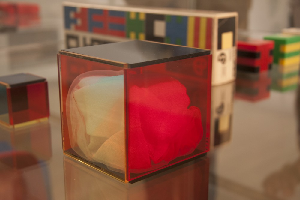
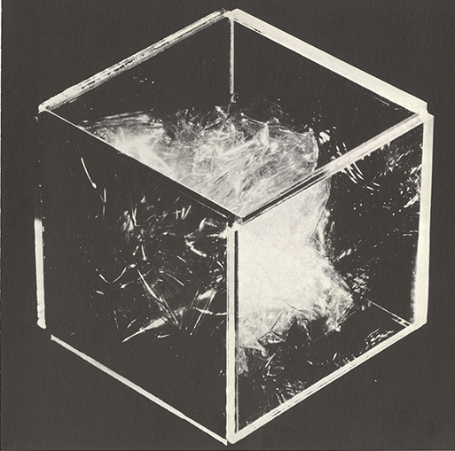
A piece that is part of the cubic structure collection from 1964 by Jan Slothouber and William Graatsma.
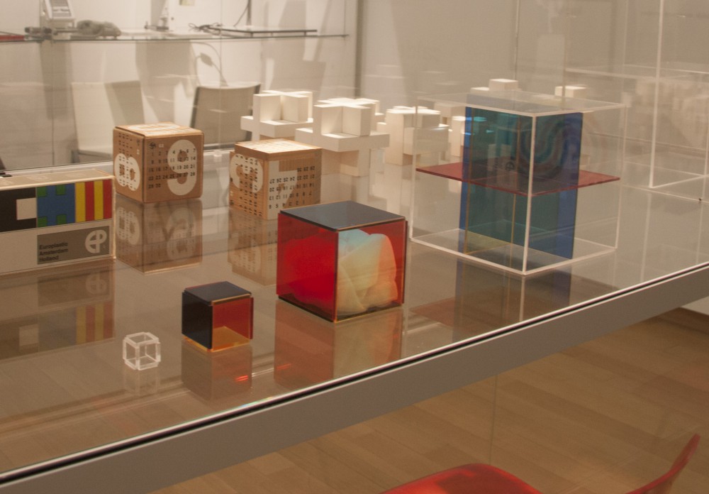
Because the plastic material is transparent, the colours are being mixed on the white textile. For a moment i could not recognize if the textile was dyed or not. It was a sort of visual illusion and in the meantime i asked my self why is this soft and kind material locked into a hard plastic box? Is it design or is it art?
William Graatsma together with Jan Slothouber began to work for the Dutch State Mines (DSM) in the beginning of the 1950’s. Their job was to create and develop packaging, product applications, advertisements and exhibitions, thereby establishing DSM’s corporate image.

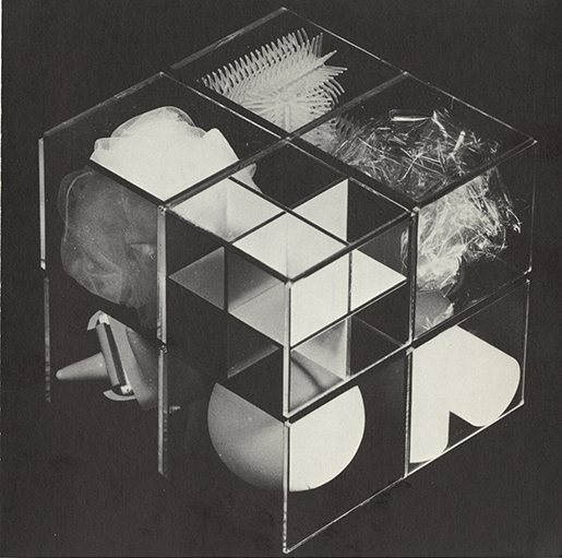
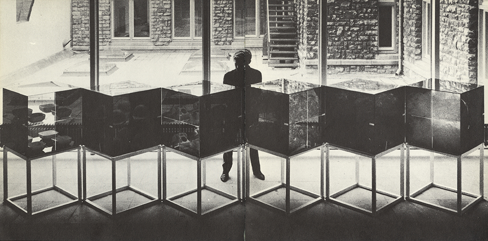
They experimented with cubic constructions, developing them for applications in exhibition design such as the 1958 World Exhibition in Brussels. They limited themselves and decided to use almost only the cube as form or starting point, thus they tried to determine the principle of cubic constructions.
Jan Slothouber was opposed to individualistic movements such as the painters of Cobra, and preferred a more ‘democratic’ artistic form, whereby the cube was the universal shape that everybody could understand and use. In fact he was an architect, he believed and practiced what Louis Sullivan [x] said in an article in 1896; “form ever follows function“.
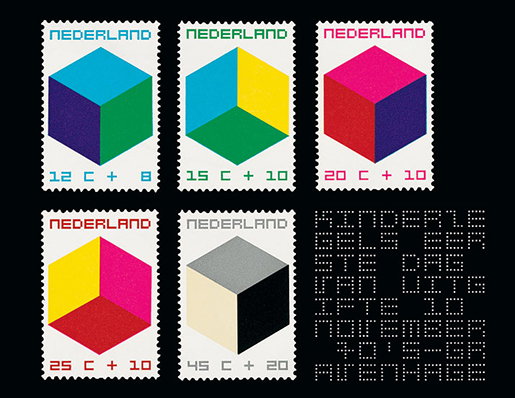
Slothouber and Graatsma went on to found the Centre for Cubic Constructions (CCC). In 1966, CCC won the Sikkens Prize (jointly with Peter Struycken [x] and Johannes Itten [x]), for their innovative contributions to art and design. Their approach to commercial exhibition design earned for Slothouber and Graatsma an exhibition in the Stedelijk Museum in 1967. Design, dimensions and experiments in colour and lettering, all in relation to the cube, were being displayed under the title ‘Four Sides: Size, Shape, Colour, Letter’ (Vierkanten: maat, vorm, kleur, letter). Three years later, they represented the Netherlands with their Cubic Constructions at the Venice Biennale in 1970 (GRA • Library).

After all this success, they were known by the public as artists instead of architects or designers. This became very visible when they were asked to design the post stamps for the former PTT in 1970. The profit from selling the stamps went to a charity for children. During that time, the PTT had a lot of critique for choosing such an “avant-garde artists”. The charity was afraid that the designs were to abstract for the bigger public and the stamps would not have been sold.
After his carreer at the DSM, in 1970, Eindhoven’s Technische Hogeschool invited Jan Slothouber to set up a Faculty of Form Theory in the new architectural engineering department. Together with his students, he developed ‘new cubic constructions’ (nieuwe kubiese konstrukties).
As professor of the new faculty he gave several lectures on a regular base. In 1971 one of his public lectures was “The form of our surroundings“, where he explains that our surrounding is built up by creatures, objects and happenings, and they are visible because of their shape. Our surrounding exist, because we see, experience, think or execute it, but everybody experiences it differently, because everybody’s awareness of the surrounding is different.
Therefor we are unable to talk about it as something common, it is only an apparent similarity because we perceive these shapes the same way, but it doesn’t mean we experience them on the same way. Sensory observations like sight is measurable, but our personal emotions change the result. Our feeling can influence our perception of the surrounding and that is why our surrounding can occur differently for everybody. The emotional perception is highly underestimated in architectural design, only invisible form aspects can be experienced. But for pleasure both (visible and invisible) form aspects are important.
Furthermore he explains the importance of the usefulness in our surrounding, whereby he mentions that the architect has to distance himself from artistic ambitions. These ambitions make the livability dissimilar for every levels of society. The best thing to do is to create an understandable form language, a base for our communication with the constructed surrounding. Human perception should be the priority of design. To achieve this, we need to cooperate with science, technology and art.
The object i have chosen was a result of a series packaging whereby he experimented with different materials inside the cube. The relation between the materials and the transparent, sometimes colored, plastic cube. His research has been shown in the Stedelijk Museum and the Venice Biennale, so what is this object? Art or design? Is it important?
Slothouber has done a lot of different things in the past so it is difficult to say where this object could be categorized. His design research has been shown on art exhibitions and his designs has been criticized as too ‘avant-garde’ art. He is erasing boundaries between design, architecture and art. The object I have chosen, the object where my all research started, is not just design, architecture or an artwork. it all comes together in that piece.
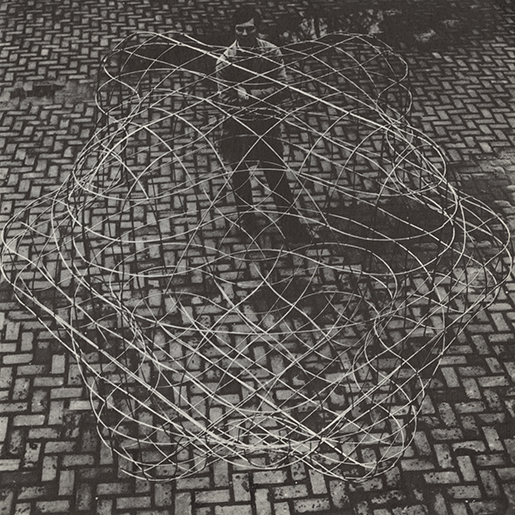
Jan Slothouber was an admired teacher, although it wasn’t always clear for his students if he was totally crazy or a genius. One of his students was John Körmeling. In his work the influence of Slothouber is highly visible. They both share the similarity of outlook on the erasure of boundaries between design, architecture and art.
video of the rotating house in Tilburg by John Kormeling
”
everything is relative,
even cubic regularity.
many things are true
and few are certain.
form is only a means,
just like cubic construction.
important is the aim
that finds expression by it.
an idea can be made visible
by the shape of a construction.
reconstruction of the idea however
is often a difficult task.
we beg your pardon
for our cloudiness.
we hope you will discover yet
the aim of cubic constructions.
”
– a cubic construction compendium, 1970