Skip to Content Skip to Search Go to Top Navigation Go to Side Menu


"contemporary" Tag


Ignaz Schiffermüller’s Color System


Thursday, March 29, 2018

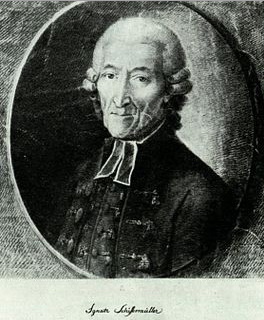
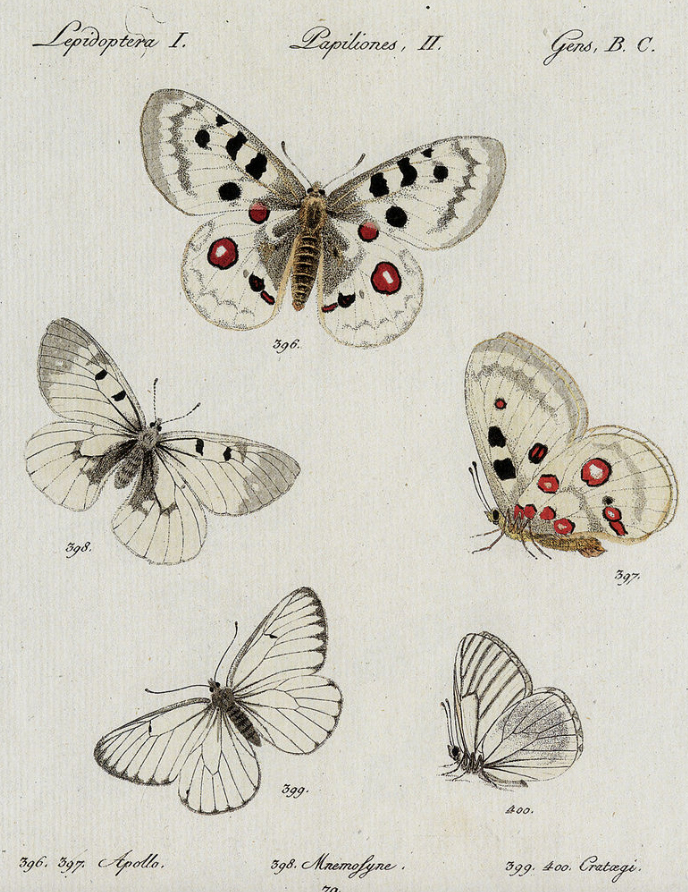
Ignaz Schiffermüller (1727-1806) was an Austrian naturalist mainly interested in insects, specially butterflies. He was a teacher at the Theresianum College in Vienna. Schiffermüller is also recognized for his work in optics and colour theory. He developed scientifically based colour nomenclature to describe the countless tones of nature.

ignazschmetterlink

In 1772 his work “Versuch eines Farbensystems” was published . It contained an attractive full-page engraving with a colour circle, inspired by the optical theory of French Jesuit Louis Bertrand Castel(1688–1757) and hand-tinted with twelve colours continuously shading into one another. He developed it based on natural samples of colour and colour charts where he compared the tones. The circumference of Schiffermüller’s circle is filled with twelve colours to which he has given some very fanciful names: blue, sea-green, green, olive-green, yellow, orange-yellow, fire-red, red, crimson, violet-red, violet-blue and fire-blue. The three primary colours of blue, yellow and red are not placed at equal distances from each other; between them come three kinds of green, two kinds of orange and four variations of violet (excluding the secondary colour violet). Schiffermüller selects a total of 12 colours like Father Castel who linked his system to music — more specifically, the twelve semi-tones of the musical scale.


book2_corr

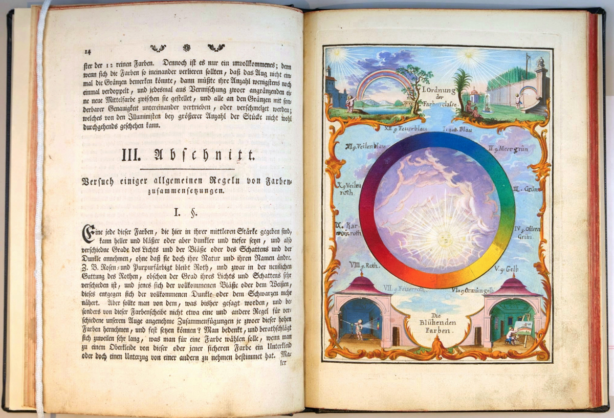
Ignaz Schiffermuller’s system served to illustrate Newton’s discovery that the pure colours could be arranged in a circle. He was one of the first to arrange the complementary colours opposite one another: blue opposite orange; yellow opposite violet; red opposite sea green. Schiffermüller also placed a sun (only suggested here) inside his colour circle in order to emphasize that all colours are produced by nature.

Circle Drawing with the Sun

What all three scholars had in common aside from naturalistic origins of their studies is how tones of colours and shading is crucial for development of each colour. The gradual change in colour’s intensity is visually representing the natural unstability of colours and how we perceive them. Because of that we can consider Schriffermuller’s work as a contemporary study of colour.

The X-Factor: Interior Edition


Sunday, May 12, 2013

Even though the title of the book that I will discuss here sounds like a cheap television-show, I am forced to be objective today. Therefore I would like to mention that the title of the book is, in fact, both good and bad. I’m totally neutral about it, really.

Xtreme Interiors – Courtenay Smith + Annette Ferrara;
is what the cover screams (the ‘X’ in ‘Xtreme’ covers most of the cover, printed in pink).
You might wonder why I am discussing the book with this particular cover at all. Well, dearest reader, with the three old keywords from a previous article (the keywords being: Bauhaus, contemporary, decoration) I have written for this site, I had to choose a book from the Art section in the Rietveld Library. As you may expect, the Art section in the Rietveld Library covers more than just one shelf. I even am under the impression that the Rietveld Library is an art-minded library rather than a usual library. Anyway, the three keywords in combination with the Art section of the Rietveld Library brought me to this book; since it’s full with contemporary architecture that does use decorations a lot.

The cover turns out to be very straightforward about its content: it’s a simple book filled with pictures of extreme interiors. Unlike the previous book, this book does look a lot like an art book: every two-pager has at least one image; every image is supported by some text. The book supports a wide range of architectural interests: it shows images from renowned architects to companies like IKEA, it shows interiors from all over the world and from many different movements/years – although it does not show any interiors from before the 20th century.
I think this book is more a fun-to-have, a visual page-turner to inspire your architectural designs once you found out that your designs are just as boring as the ones of most modern architects.

Rietveld Library cat.nr: 14564

Self-expression, constructed in mathematics


Friday, May 3, 2013

With three keywords in the back of my head, I had to search for another book in the Rietveldian Library.
I had chosen a book I new that I would hate – a book about modern architecture.

The keywords ‘Bauhaus’, ‘Contemporary’ and ‘Decoration’ had to give me a clue what to choose. Yet this time, I had to be objective. Ah well, when I saw the book entitled ‘Postmodern Urbanism (Revised Edition)’ it was easy to choose without judging. It was clearly the best book to choose for me, since Postmodern Urbanism is extremely contemporary, Bauhaus-influenced and therefore a-decorative (relating to ‘decoration’ as a keyword).

The first thing one could notice about the book, is that it feels a lot like a modern building itself. The book is solid, practical, safe, strong, linear in design, no decorations (except for the cover, however, the decoration is rather mathematical than baroque-like) and unpersonal. I estimate there are about 15 pictures in the book that counts almost 400 pages. This is definitely remarkable for a book about art, where the visual aspect is usually so important. It feels like a book written by a philosopher rather than an artist; rather focused on the inside visuals of one’s mind than the outside visuals of the physical world, in which all contemporary postmodern buildings are standing after all (if we forget about the people that say that what is in their brains is reality too, which of course is debatable).

Upon studying the book a little bit longer, one could notice it’s full of footnotes. The book really looks a lot like a scientific paper, it does not look like an art book at all. I feel the urge to complain about modern architecture again, how it is so different, so ancient, so non evolved compared to other forms of modern art, but let’s keep it objective here, hey!

Rietveld Library cat.nr: 14749

The personal problem of contemporary architecture


Thursday, April 11, 2013

This building is one out of a million examples of problematic contemporary architecture. A grey building in a grey country, no exciting materials used, no decoration, not any different from the next building, no ambiance created, no emotion left behind, no warmth expressed, no nothing.

When I took a glance at the design books, my choice was clear rather soon; ‘Contemporary Architecture’. Admittedly, the contemporary architecture shown in in this particular book, which has an incredibly creative title for a book about contemporary architecture, is much better than the regular architecture you can see around you. Yet it will never change my opinion that Bauhaus has stopped any evolution in the artistic field of architecture.

How is it possible that in all fields of art, the artistic styles change so rapidly, while architecture looks almost the same for several decades?
You can’t compare films from the sixties with contemporary movies.
You can’t compare early photography with contemporary photography.
You can easily compare architecture of the 1920s with contemporary architecture.

Why oh why with our modern tools do we still worship the rules of Bauhaus?
Why do we fear decoration? Why do we need to make our homes so practical that we forget its real use: to feel home. Let’s face it; we are not living in a country where it’s a luxury to have a home at all, the use of homes in ‘our world’ is to feel at home. But no, we have to keep it gray, un personal, zero decoration.

Do I have such an untrained eye or do all products of architects look the same indeed?
Is it just what I see or are architects really so conservative? I’d just love to see architecture that acknowledges that a home is more than a frame. Let’s just make our homes our homes again, let’s stop those grey ‘machines for living’, those brick houses with their built-in BBQs, those average-man gardens with one tree surrounded by high anti-neighbour fences.

Ah well, I could probably have approached this subject in a more sensible way, with better arguments and all that, but hey, I am here to write a subjective article about the book that caught my eye – I can’t make it any more subjective than this.

It’s time for a revolution though. Dear architects, grow some balls and be creative, not practical.

Rietveld Library cat.nr: 13053

Stedelijk Design Show 2012 /Future Highlights


Tuesday, November 27, 2012

17 Rietveld's Foundation Year students visited the "Stedelijk Collection Higlights /Design" in the newly opened Stedelijk Museum. Marveling at some masterpieces of Interbellum design or surprised –a little further– by the Scandinavian design some of us know so well from our grandparents homes, we arrived at the last part of this "Depot Salon" wondering what a 2012 selection of Design could be.
Researching contemporary design we composed the "2012 Supplementary" which we present in this post. From the exhibit "Stedelijk Collection Higlights /Design" we all selected a personal best and made it the focus of the researches published as part of the project "Design-in-the-Stedelijk"


Blue pinocchio and his fairy go to Istanbul


Tuesday, December 8, 2009

I was looking in the art department of the library and found a book about folk art of Istanbul, in the time of the rising of the Ottoman Empire. When I looked through the pages I found that it was about getting a glimpse of the lives people (read, the sultan and rich people) lived in those days by showing the art, and the artifacts the people used. You can very well see the style of the period in the statues and the paintings and also in the cups, they drank out of, the rugs they walked on,the plates they ate from and the many other furniture and things they used. In short, for me this book shows the way the world looked in that period. In the same way that for us Pinocchio is a well known item now. He would look very strange and out of place in the world of Constantinople, especially if he was blue. To me this is a good link with design and art for both reflect the mentality of the times we live in.

703.6 -cat-1


Log in
subscribe