I wrote the first part of this assignment in Dutch because I can express myself way better in my mother tongue than in a language I’ve mostly learned from the webs.
And I have to be honest with you; I’m terrible at grammar.
Anyways.
Here’s the deal.
The assignment was to find a book that covered all the tags (preferably) from the previous book we choose from the library.
Easy peasy lemon squeezy.
Well, for me it was an easy one man’s one minds one seconds job.
My tags from the previous book were; pink, fashionable and difference.
Since the last book caught my attention by its colour; pink. Had me at the fashion and identity and since it was a timeline to show the difference between the different years I choose difference.
Which are, of course subjective tags since they have something to do with my opinion.
To get back to the way it worked out for me; I immediately figured that the most fashionable things are to be found in the fashion section.
It can differ from person to person but for me it’s fashion that’s fashionable.
I choose the same strategy: keep your eyes open for the colour pink and then I wanted something that had difference in it, keep in mind: I was not looking for a timeline.
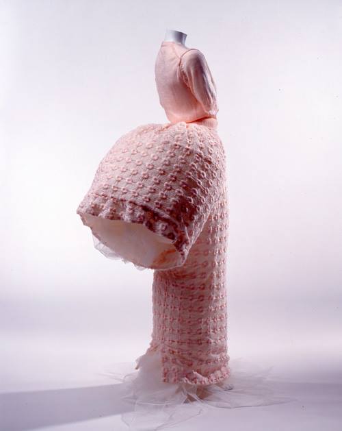
My eyes caught a book that contained some pink spots and a pink brand name; now I did not know what was written about the subject precisely, but I knew Barbie.
The book I choose almost in a split second is a book about Barbie in different time areas and different clothing styles and I could not Imagine a book that would fit better than this one.
This is a book too that concerns my heart and reminds me of my grandma big time.
She collects old barbie dolls and makes them clothes, I once got a vintage barbie myself and a book about 50 years of barbie.
Plus; I played a lot with the barbies when I was younger. Maybe these factors effected my brain a little.
But I’ve got to say this;
I’m happy that my mind leads me to what I like (which is not weird at all and very logical). I forgot that your brain is an unconscious piece of mush hand that’s great.
Thursday, November 22, 2018
Last week we had to look for a book for our design project. I had to look for a book related to design, but here was the catch. I was not allowed to look at the information in the book just its exterior, i had to find a book that attracted ore displeased me only on subjective grounds.
While I was walking through the brand-new library of the Rietveld academy I was primarily buzzy with looking at the library itself. The nice plants they put to the sides and how well put and nice the place looked. In my head a school library is supposed to look old fashioned and dusty not a nice looking clean place like this. Then again, I did not have that much experience with library’s. This was not because I do not enjoy reading. On the contrary I enjoy it to much, so much so that every book I end up liking I want to have as my one. This is why you will not find me in a library but more in a bookstore.
While my head was wandering about like that my eyes fell upon a rather shabby looking book in compere’s ant to all the other rather fancy looking books in the shelfs, the book did not have a title and instead had a cover of what seemed a group of friends siting tighter naked with a dog. The picture did not shook me or anything instead it made me instantly curios what it could be about. For me (someone who is very new to the concept of design) this seemed like a very odd picture to put on the front of a design book. But then again, my idea of design is much more of that of a very clean and tight looking piece than what I was holding. Halve confused and curios I went to the man behind the desk who was the head of the library and asked if this book was also part of the design departed ant and to my surprise it was. This book that seemed to be hand bind with the group of naked friends on the cover of witch in my eyes it looked more like a fine arts project was an actual design book, well…. That made it clear I had made a decision
book 779 -won- 1
For many people colours have stark connotations related to their moods. Think of sayings like “feeling blue”, “being green with envy”, “seeing red” or think about mood-rings that supposedly change colour every time your mood changes. Undoubtedly moods and colours are intertwined in one way or another.
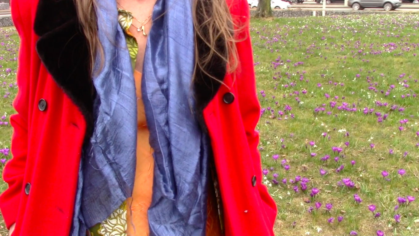
Thinking of mood swings related to colour makes me think of my mother, who has bipolar disorder. Bipolar disorder causes swings in mood, energy, and the ability to function throughout the day. It is known for alternating periods of depression and mania that can last from days to months. Thus she has experienced extreme mood swings. How does she relate her moods to colour? She personally doesn’t clearly remember what happened during her manic episodes, I however do and noticed how her mania and depression greatly influence her way of dressing. She has a wardrobe filled with exotic clothes in all colours of the rainbow and lot’s of different prints and styles. When being manic she dresses herself as an artwork before going outside, making heads turn wherever she goes. When being depressed she doesn’t really dresses herself, but instead stays in her grey pajamas’s at home all day. I think that a lot of people might experience that they wear more colourful clothes when feeling happy and wearing more neutral toned clothes when feeling sad. I decided to create a colour system based on my mothers way of dressing, and not on people’s way of dressing in general or on people with bipolar disorder’s way of dressing. I thought it would be generalizing people’s experiences too much and I think that especially dealing with people who have a condition like bipolar disorder one must avoid that to avoid stigmatizing the disorder. Not every person with bipolar disorder has the same behaviour towards their wardrobe, or the same experiences in general.
After having decided to make a colour system based on my mother’s way of dressing, I read a lot of general information about bipolar disorder, which didn’t bring me any further in the development of my project. I could also hardly ask my mother any questions about it, as she doesn’t remember how she was when being manic. I later found an interesting article written by someone who also has been diagnosed with bipolar disorder, about what having this disorder means for their gender identity. The writer of the article identifies as a non-binary person, and thus I shall refer to them as “their” and “they”. They experience that when being manic they feel more feminine, and when being depressed they feel more masculine. This shows itself in many ways, one of them being the way they dress. When feeling manic, they will wear a dress, when feeling depressed, they will wear baggy clothes. This made me realize how my mother’s way of dressing doesn’t only change in colour when her mood does, but also in how traditionally feminine versus masculine her clothes would be. When being manic it wouldn’t be a bright yellow sweatpants she would put on, but a bright yellow dress. When being depressed she wouldn’t put on a grey miniskirt, but grey oversized sweatpants instead. This was something to keep in mind in the development of my colour system.
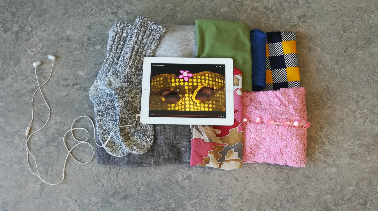
After researching I figured it was time to start working hands on. I collected all the traditionally feminine colourful clothes and the traditionally masculine baggy neutral toned clothes from my own wardrobe. I realized that I order my clothes by colour in my wardrobe, in some way I was thus already working on this project of making a colour system before it even started. With the clothes I tried making a small installation without damaging the clothes, this was very frustrating. Somehow nothing I tried seemed to work for me and I soon decided to quit trying. I felt like the best ways of displaying clothes without damaging them already existed and happens all the time and everywhere, which is putting them on mannequins, on hangers or folding them neatly. I didn’t feel like playing clothing store, so this was not the way to go. I took a step back from the whole process, let some time pass to then later come with new insights again. I concluded that the colour system I was trying to create already existed and just needed to be documented. I decided to make a video with my mother, of her wearing two bipolar outfits.
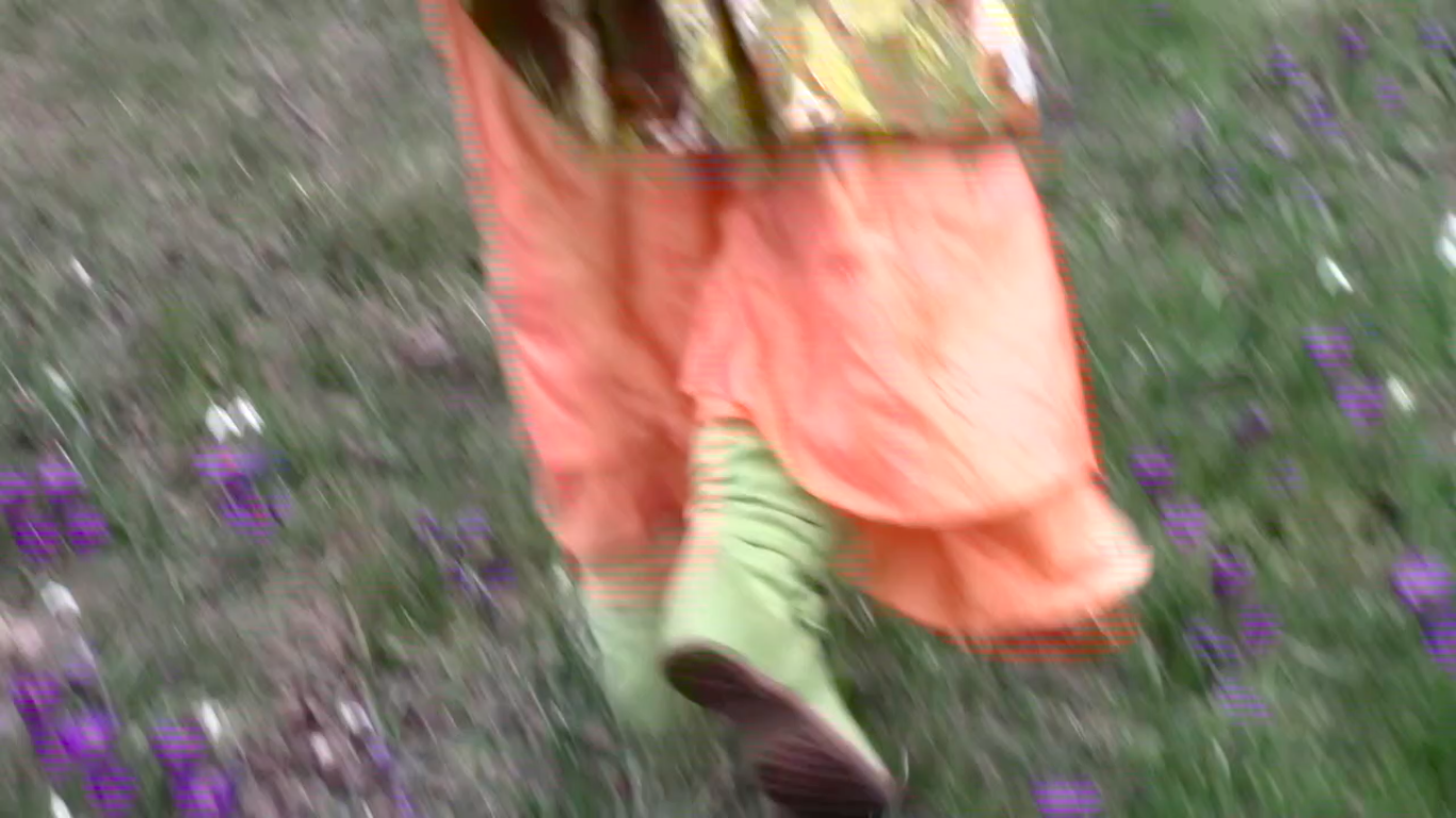
The filming went very smoothly, my mother and I enjoyed putting the outfits together and enjoyed spending time together, which to me makes the video feel genuine too. We tried to make the contrast between her two outfits/moods very clear, but still true to reality. This lead to us filming her depressed outfit inside on the couch, and her manic outfit outside in a field of flowers with more movement. I later also edited the video to be slowed down when her depressed outfit was shown, and sped up the video when her manic outfit was portrayed. When presenting the video, I went back to trying to make an installation using my own clothes but now including the video shown on a tablet. I felt like just showing the video on a big screen would not fit how personal and tangible someone’s clothes, and thus my colour system, are. To make it even more personal/intimate, the viewer of the work needs to wear headphones to hear the sound of the video.
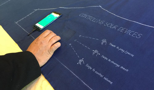
Our clothes are probably some of the most tactile and flexible objects surrounding us – touching our bodies at all times. This is probably also why it has been such a hard job for designers and researchers to combine it with the stiff mechanics of technology. The term used when these fields are combined is Wearable Technology. Something that fashion designer Pauline van Dongen has been known internationally for exploring. But while Pauline van Dongens works primarily exist in the span of the human body interacting with its physical surroundings, I find it more interesting to research how technology can elevate our identity through clothing.
We use technology to perform our identities online.
We use fashion to perform our identities through garments.
Why not try to physically combine technology with clothes as a way of enhancing how we showcase our individuality and uniqueness.
“For wearable technologies to become truly integrated with fashion we have to bridge the divide between aesthetics and how we understand technology’s usefulness.” – Pauline van Dongen
FASHIONABLE TECHNOLOGY
It is obvious that clothes functions as a protective extension of the skin, but it is just as important that they help us form our individual identities. Our identities are ‘wearable’ and changeable through fashion, and have been so for a long time now. The new aspect of adding technology to this equation will hopefully be able to offer alternative and new ways of transforming our identities.
At the moment, there is already a lot of researching going on and a lot of solutions being proposed as to how wearable technology can change our current view of fashion. This research does not only include experiments like Pauline van Dongen’s, regarding the practical usefulness of technology in fashion, but can also have a more conceptual or aesthetic focus point. These projects become interesting since this is where a lot of the ‘identity-making’ in fashion occurs.
Ying Gao is another fashion designer dealing with the concept of technology intertwining with her designs. But in comparison to Pauline van Dongen she uses technology primarily for conceptual and aesthetic reasons. However, this still interacts between the human body and its surroundings, but does not allow the wearer itself to manipulate his/her clothing. Something I think that would be a logical next step with wearable technology.
Other research exemplifies how this self-initiated interaction might become possible. Dr. Sabine Seymour, who is the director of the Fashionable Technology Lab at Parsons The New School for Design in New York, has even written a book with this exact title, Fashionable Technology, that researches the intersection of design, fashion, science and technology. On top of that, several companies are working on inventions involving textile – such as touch-screen fabric. I find this study interesting because it is the steppingstone for making fashion truly customizable at any time. And not only by the external domain of a phone or computer, but by actual interaction with the textiles you put on your body. This idea of technology leading to a more tactile and touchable communication with your clothes – instead of it being dematerialized in a device – also takes technology in a totally new direction.
INDIVIDUAL TECHNOLOGY
Of course there is plenty of ways to approach linking the gap between aesthetics and the functionality of technology. Personally, I am curious about a solution where that link would manifest new ways of projecting my personal identity. Combining the idea of a, supposedly soon-to-be, future where textiles can act as touch-screens, I have tried to conceptualize how technology can have an effect on fashion and its personal value.
There is no doubt that technological innovations will have a deep impact on the meaning and communication of fashion and thereby identity.
“[…] we have now entered an age in which technology is not only a bodily extension, but also a physical improvement, enhancement andexpression.”
Throughout your life your identity is constantly changing, so it seems only logical to design new types of clothing that can follow your personal development. As my video suggests, this would be possible if clothing became truly obedient to your personal wishes and could be customized with your own hands. You could then at any given moment change the appearance of your clothing – and your identity. A more analogue example of this is the Color-In Dress, made as a cooperation between Berber Soepboer (fashion designer) and Michiel Schuurman (graphic designer). Although my experiment is limited to colors and patterns, you could imagine that even shape or texture could be transformable too, with the rate technology is developing.
Indeed, this way of customizing your style is already possible, but at the expense of a fast, unsustainable and trend-driven industry. If my (suggestive) model of wearable technology [x] is realized, I believe that this would establish an intimate dialogue between body, mind and fabric – making fashion more valuable to the wearer. It is the relationship you have with your clothes and how it mirrors your personality and emotions, I find interesting to develop further with technology.
Pauline van Dongen’s vision is based on the belief that technology can add new value and meaning to fashion. She does this while focusing on the human body and an interactive relation to its surroundings. I believe, that it is just as important how wearable technology can add an interactive level to our projection of ourselves, and change our relationship with fashion on a very personal level.
Vetements: pronounced vet-MAHN is French and simply translated as “clothes.”
Unquestionably there is something fundamentally wrong with the fashion industry and it appears that Vetements is challenging these tiresome conventions. The Design collective brings to light the lack of imagination and consciousness, utter egoism and instant gratification present in the fashion industry today. I have a deeply rooted love hate relationship for this industry and this is why I wanted to understand if Vetements really is challenging these problems.
Since its debut in 2014 Vetements has harshly divided opinions and been at the center of controversy. Everything Demna Gvasalia has done with Vetements has been provocative in a high-fashion sense — rejecting the traditional fashion calendar, casting people on the street, letting them style themselves. The Parisian design collective was founded by eight designers seven of whom remain anonymous, except head designer and public face 34-year-old Demma Gvasalia. Gvasalia’s professional background includes senior design roles at Louis Vuitton and Maison Margiela and now also works as creative director of Balenciaga.
Fashion is no longer driven by creativity but instead by corporate leaders. It’s stale, we repeatedly see the same garments paraded on the catwalks each season, altered by their colour or fabric choice. To many, particularly to those connected to the industry, Vetements represents a refreshing turning point – yet I remain sceptical. It is hard for the brand to have conviction when its leading figure is also involved with one of the longest standing fashion houses – Balenciaga.
Vetement’s low-brow aesthetic and extravagant price point makes it an easy target for skeptics. Whilst it is intended to look so incredibly blasé, so effortlessly cool, I believe it can be regarded as the exact opposite. Most famously they’ve used brands such as DHL to create T-shirt which retailed at a price tag of £185 whilst an identical T-shirt for £4.50 could be bought directly from the DHL Website. These T-shirts resemble something your dad was given as a freebie but now might only wear around the house. It is clear that they haven’t picked brand at random, instead they’ve carefully thought about something to evoke a feeling of ironic indifference.
It would appear the logo mania trend of the naughtiest is back. Yet whilst the earlier exclusive trend became a mechanism to denote prosperity and statues, it soon became an aesthetic trope in itself. It appears Vetements is redefining luxury with its attention-grabbing visual statement. Unlike the ostentatious symbolism used by brands before Vetements injects humour- a relatively unknown concept to fashion.
DHL’s bold yellow and red branding is recognized globally and has the grit of a working uniform. They have subverted something incredibly ordinary and given it and extraordinary twist. But Perhaps the ultimate irony is that there is almost no twist at all. The brand has done little to differentiate the original T-shirt from their own. I see it as a validation where the price tag seemingly justifies the garment. These garments are embraced and accepted which affirms the brands ideas of individuality and inclusivity. This raises an important issue for me that we depend on the industry elite to dictate to us what is ‘in.’
Vetements appears to opt for forced ugliness Gvasalia Has also said: “It’s ugly, that’s why we like it.” This aesthetic is very anti-fashion and seemingly sets itself apart from the crowd. It relies on repulsing mainstream tastes to create a feeling of exclusivity, an illusion that ordinary people “don’t get it.” I don’t believe it can be rewarded with the hype surrounding it. It’s not avant-garde, because it reactionary and contrarian and ultimately defined by the mainstream.
It is nothing out of the ordinary for fashion to not conform to conventional ideals of what clothing should look like yet with Vetements it raises interesting questions about their intent as they evoke a feeling of inclusivity representing the broad spectrum of sub-cultures appropriating their style yet selling it for astronomical prices. This is nothing new to fashion Vetements can be seemingly challenging and rejecting traditional standards of beauty.
This idea of incorporating logos into their work is nothing new. Pop Artists such as Andy Warhol used pop culture symbols in his paintings. Vetements is not doing anything radically new. The use of brand usually has a strong anti-corporate rebellion but DHL seems far too ordinary. Yet perhaps this is the statement they are trying to make, the ultimate portrayal of the ordinary challenges the unattainable glamour imposed by the traditional haute couture houses. I think the hype surrounding Vetements speaks more about how dull the industry is right now than the brand itself. But I think it’s such a cheap-and-easy grab for attention with grotesquely over the top clothing. It seems that they’re all novelty no substance.
Ultimately what makes the collective both interesting and infuriating is that it says something we already know— that the most exciting fashion is created by everyday people, on the street, being themselves. And then it takes that sentiment and distorts it with eccentric colours, crazy poses and absurd shapes, which makes it high-fashion again and this is nothing new to high-fashion. Yet I do think it communicates something very crucial about social identity and excepting everyone in society.
One thing that is overlooked at Vetements is the technical complexity that goes into their garments. Many of their garments are up cycled vintage garments which I think should earn them a lot more praise. For example their reconstructed Levi Jeans were made with two separate pairs which have been offset at the hem to give the illusion that they are sliding away. Other garments like the shirts that have been stitched together back-to-back are equally as impressive.
To conclude it is hard to see that Vetements are challenging the transient faddishness – the fixation of disposable novelty. Is it changing the game or is it just the latest fad? There is a relentless desire for the new and next and I believe this is fundamental what’s wrong with fashion. It’s infuriating and ultimately fashion industry really needs to slow down.
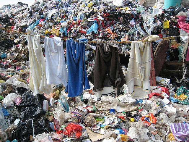
It was probably about a year ago that I passed by my friend while she was making a rug out of old clothes, when I asked her why, she explained to me that there is an overabundance of textiles in the world. She told me about how this is actually starting to become a problem, so she was trying to find a new purpose for left over textiles or old clothes. (Re-purposing textiles is an old technique but maybe growing into necessity.) The overabundance of textiles was an issue that never really occurred to me before but immediately caught my attention because it’s so obvious if you think about it.
The attitude that people have towards clothing has changed, fashion trends move quick, every year there are new collections from every brand, stores are filled monthly, or even weekly and we all buy into it. The average person buys 60% more garments that last half a year compared to fifteen years ago. The way of production has changed as well, the materials are cheaper and made not to last very long. Next to that the production has inflated massively, according to Greenpeace the production has doubled from the year 2000 to 2014 and the number of garments exceeded 100 billion by 2014. A lot of clothes that are being made don’t even make it to the shops, they were made to have enough in stock even though the shops are often overstocked already. The clothes that don’t sell fast go into sale, but 4,2% stays behind after the sale. That doesn’t sound like much but we’re talking about 21,5 million new pieces of clothing, from which 12,3 million pieces get destroyed. They get burned in ovens or shredded because the clothing companies don’t want these clothes to be used or resold.
Next to the overproduction of the fashion industry, we have our fair share of throwing away textiles as well, the average person throws away about thirty kilos of clothing per year, this is roughly eight trash bags a year, even though 95% of the clothes we chug away is still reusable. Not only the clothes that get thrown away cause problems but donation in some cases as well. The clothes that are donated to charity and can’t get sold in charity shops are shipped off to third world countries. In some of those countries, here it gets sold for so cheap that the local tailors can’t compete anymore and have to go out of business
The waste that the left over and thrown away textile produce is polluting the environment and is practically toxic waste. Since the clothes are produced so cheaply the fabrics are often synthetic and the dyes are toxic. The clothes that get burned release a lot of chemicals in the air. The clothes that get thrown away often end up in landfills. Since they’re not biodegradable they just keep staggering up, causing an environmental hazard. The textiles chemicals and toxins get absorbed by the soil, polluting both the surface and the ground water. It also releases methane into the air which contributes to global warming.
So now what do we do? What can we do about this? There might be a few options. One of them is instead of throwing away the old clothes that we’re sick of, or never wear anymore, remake them into something new. This is what for example Viktor and Rolf did for the Boulevard of Broken Dreams collection of 2017. They used pieces and materials of left over material, pieces and damaged items of previous collections. Italian company Marchi & Fildi turns old fabrics, in this case pre-dyed cotton textile scraps that are left over in the fashion companies to make a new recycled yarn, Ecotech. But also the company Evrnu found a way to turn cotton waste into a new fiber, by first turning it into a pulp. With these approaches cotton waste is being saved and a new durable material is created for fashion designers to work with.
I noticed that after doing more research on how polluting the fashion industry actually is, it changed the way I look at certain things, I started experimenting with making new clothes out of the ones I didn’t want anymore and working with the small pieces that get leftover in the process (inspired by for example the Japanese Boro technique). It saves quite some money to buy less and think responsibly about the clothes you don’t want. Instead of just throwing it in the bin, bringing it to secondhand shops or even selling it is way more profitable for yourself and the environment. This problem is so severe and almost everyone contributes to it without even thinking. The fashion industry is now the second most polluting industry in the world, right after the oil industry. So I hope you will remember this information the next time you’re doubting whether or not to buy that shirt so we can all take small steps towards a solution for this waste of fashion.
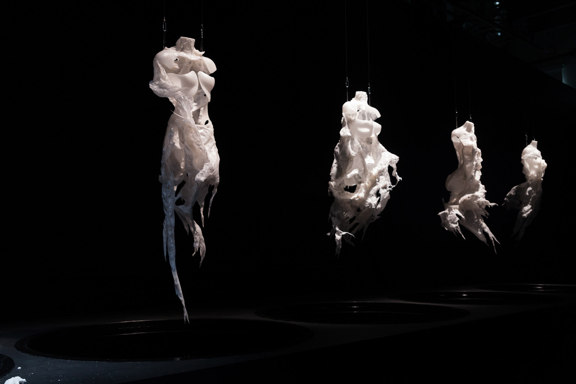
The first time I saw 3D Prints I was fascinated by the complexity it allows to generate, where your imagination is the only limit to create any shape. I wondered what the future of the way we make things would look like and how would that affect our lives. What kind of products will we produce?
I was intrigued by the shapes of the dresses exhibited at “Change the System”, and found out that Iris made an entire collection using mainly umbrellas sticks, and that she uses a lot of 3D Prints and laser cut fabrics in her collections. She spends a lot of time experimenting and researching new materials before start making, combining craftsmanship with the use of new technologies. She also collaborates with many people from other disciplines and incorporates new inputs, which I think is essential to develop new ways of making.
I question to myself what are the possibilities of fashion in between the arise of new technology and old craftsmanship. Materiality is changing as we develop new tools and materials, and so is the way we produce. If we change the way we produce then we will change our relationship with our possessions.
FAST FASHION
Fast fashion allows people to buy fashionable outfits inspired by the latest trends in the runway and get them for a very low price. Mainstream consumers are now able now to afford new things that will last for a very short time. Fast fashion is unsustainable (fast discard, waste of manufacture and after consumption), unethical and unoriginal.
Consumption has clearly a very deep influence in our society, and buying clothes now responds to a wish more than a need: we no longer buy because we really need it, but because we desire them. “(…) the consumption of symbolic meaning, particularly through the use of advertising as a cultural commodity, provides the individual with the opportunity to construct, maintain and communicate identity and social meanings” (Elliot, “Existential consumption and irrational desire”, 1997 [x]), and marketing plays a “key role in giving meaning to life through consumption” (van Raaij, 1993 [x]).
We are involved in a cycle where trends go faster than ever, and are hard to keep up: what matters is not the quality, but how fast it gets to the shop and how cheap it is.The process of obsolescence of the garments is already planned from the beginning: it’s meant to replace the old season and attract new purchases. We throw away and buy a new one.
Fast fashion becomes the opposite of creative and original pieces. In a way is about copying what is analysed as trendy, producing it as fast as possible to replace the previous trend. We don’t have any attachments to our possessions, no story behind them: we discard them once they are out of trend.
One of the biggest problems of fast fashion is that produces enormous amount of waste we don’t know how to deal with, as well of an increasingly overconsumption of low quality products that are made to be thrown away soon.
SWEATSHOPS
Retailers sell products that are being manufactured in undeveloped countries, where the labour cost is very low. The globalization of the free trade world market enables “race to the bottom” situations and sweatshops are the best example .
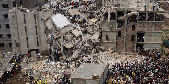
The catastrophe in Bangladesh, 2013 is the most horrible example: an eighth floor garment factory building collapses killing massive amounts of people. It was the deadliest garment-factory incident in history. The conditions under which they were working were so immensely deplorable that it had to get to this catastrophic point to raise awareness.
The large retailers but they are competing for lower production costs, and implementing unethical measures to keep the low prices at store.
SLOW FASHION ///
TECHNOLOGY AND SUSTAINABILITY
We are starting to become aware about what we are consuming. Where, how and by whom was produced is becoming more and more relevant. I strongly believe that is of mayor importance to ask that question and try to understand the mechanism of the chain production and global economy dynamics. I see an urge to create new, sustainable and better quality products.
Slow fashion is a movement that stands for long lasting high quality products, where the production process is transparent. They make garments reducing waste as much as possible, socially and environmentally ethical. They make sure the fabrics are Eco-conscious, the garments are produced locally and with less waste possible.
Changing the way people make their own garments and making accessible and easy to do, will also change the way they relate to their clothing. There will be more appreciation and another type of value to our possessions. It will also allow us to express our own identity through original and valuable pieces. We won’t look for images to buy, it will come from our imagination and more honest desires. It is also about generating an emotional and personal value with our possessions.
I think 3D print and other technologies will disrupt the production chain in a positive way. This way the consumer will be more involved with the idea and the production process of the piece that what she/he wants to wear, maybe even print our own garments at home or small objects.
Iris has an urge to change fashion industry. Innovation is also who to collaborate with to create a groundbreaking garment, avoiding waste and incorporating new technologies.
What if we could bring technologies and slow fashion together? Which materials and tools can we bring into fashion that would change the way we produce and consume? What will technology allow us? It is interesting to think how the future of fashion will look like, but fundamental to bring resources to local communities and development of conscious business, local development of ideas and conscious entrepreneurs.
Frankly, when I read through the book-list, I could not find a book which made me feel interested just by the title. So I decide to walk through the library and choose.
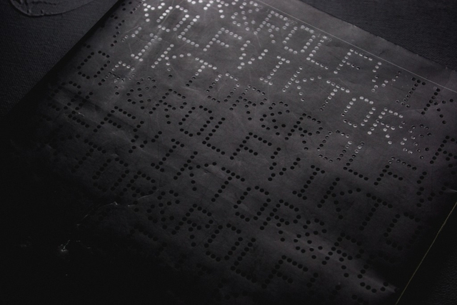
The reason why I chose this specific book was its black smooth color cover with the dots typo, braille lookalike. It has caught my eye and wanted me to see and analyze its content. Page after page I began to realize there was a type of system that the designers, Armand Mevis and Linda van Deursen carried out. A designer makes choices. When it comes to book design, he or she is likely to decide on redaction, typography, grid system, editing, binding, format, print technique, paper quality and so on. The sum of these choices create a unified expression that tells us something. It can be a parallel language to that of the content of the book and it can be more or less emphasized and thought-out. Some would say it could even be devious in its intentions.
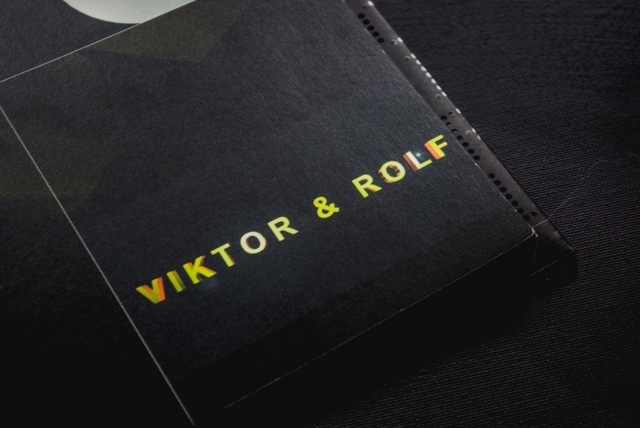
This is an exploration of a book of Viktor & Rolf, from a design perspective.
The cover consists of mat black thin board with the title in what looks like braille typography with dots which looks like sewing. The black cover folds in to almost full width of the very first and last page. I learn from the designer that this is a technical solution to add steadiness to the book.
It was published by Artimo in connection to Viktor and Rolf exhibition ANDAM. It is designed by the design office Mevis & Van Deursen. I interviewed Linda Van Deursen in connection to this essay to get further insights in the design choices and the conditions from which the book came to be.
There’s an intriguing black colour inside the book in every page. This feature clearly communicates that it is a book mainly concerned with visual language or images. It resembles a visual preface or introduction to the book. The book has it owns signature, which is a brilliant manifestation of overlapping functions of the grid lines in the publication, categorizing the content by dots. Most of the paper types only occur in one single signature, this gives us a clue about the parallel function of the book.
I learn from that the book is a sort of material archive or assortment of papers of a specific kind. A rule that she set up for the book was that only two sided paper (meaning the paper has a different appearance on each side) of the type used in posters and envelopes (because they can’t be see through) were to be used. Not only does this create an intriguing visual and physical experience but it serves as a kind of metronome or conductor where the different surfaces of the paper are altered rhythmically but not predictably (you learn the rhythm and then it alters). This feature creates a playful element to the structure of the book. In addition to this, all rules seem to be broken at least a couple of times in the book which is a testimony to the sure instinct and playfulness of the designer.
I find out in every other pages, codes and images. This book doesn’t contain much text, except the references in the end of the book. cause there’s no text I started to take another good look at the repeating dot lines, placement and spacing of the images, composition and sizes of the images. I found out that any other collection has it’s own lay-out.
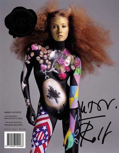
Viktor & Rolf seal, designed by Mevis and van Deursen
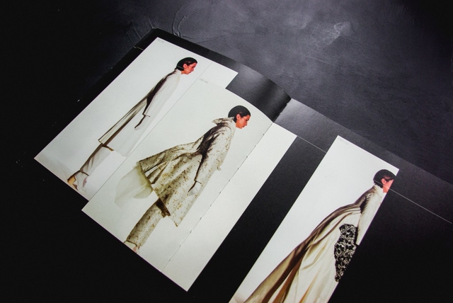
For example the second collection in the book is mostly big pictures, mostly layered, the white dotted lines mostly separate the photo’s, but are black when most of the line is over another photo (with white collection photo’s). The fourth collection is only shown on all the right pages, left ones left black. The seventh has one big image per page, combined with a few miniatures. And so on. The repeating white lines always go together with the codes along side of them. There’s a code for every image on the page, therefore it’s always easy to look up what you’re looking at. It really feels like you have to follow this actual ‘timeline’ through the whole book. De pages with collection photos on them have a ‘C’-code, which stands for collection.
The rest of the images are pronounced with ‘NC’ which – duh – stands for ‘no collection’. These NC-works are basically all the other things they did, such as installations, perfumes and the photos they commercially used for promotion back in the days. All these NC pages have their own different lay-out too. When you go through the book at first, it may look really chaotic. If you slowly go through it from front to back, the way you are suppose to read it (timeline) it makes a lot more sense, because the changes in layout fit the changes in style and time of the collections.
One other publication Mevis & van Deursen designed for Viktor & Rolf is the No.E Magazine as catalogue of Premiere Décenne at the Museé de la Mode et du Textile in Paris 2003/04 [x]. A publication reproducing all fashion magazine pages on V&R published to that date.
Around that same time (2005) Mevis & van Deursen published their own studio publication “Recollected Work” [x].
Viktor & Rolf : 1993, 1994, 1995, 1996, 1997, 1998, 1999. /Rietveld library catalogue no : 907.8 vik 1
In ‘Dream Out Loud’ in Stedelijk Museum Amsterdam Bart Hess exhibited a range of wax molds, looking like dresses, that were made around a female model titled ‘Digital Artifacts’. His concept being that everyone can print their own reusable ‘second skin’, a garment fitted exactly to an individual body. If everyone would be able to print their own so called ‘personal uniform’ (a set of clothing that is to be worn daily) it would result in a decrease of the production process of garments in countries like China and Bangladesh, “saving” the people involved from their horrible working conditions. The problem here is that, for one, not many people own a 3D printer and that, in this time of resource scarceness, virgin material would still need to be used (for the making of 3D printers and for new printing material).
For an interview with Bart Hess about other works click here.
‘Digital Artifacts’ by Bart Hess for the ‘Dream Out Loud’ exhibition in het Stedelijk Museum Amsterdam.
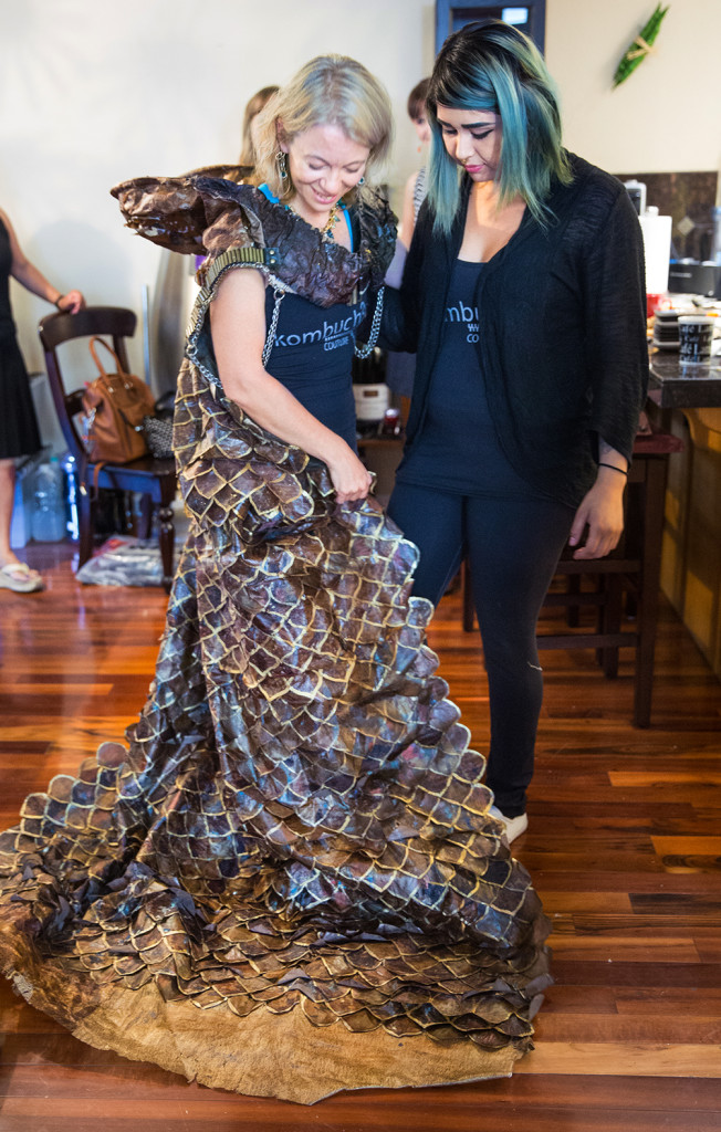
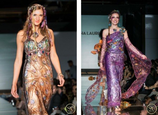
Although Bart Hess’ idea of the personal uniform is durable, the (re)printing of it is not. As a more eco-friendly alternative, new developments are arising in the world of textiles; bacterial fabric, which enables us to grow clothing from bacteria and fungi. Another name for it, founded by Sacha Laurin, is ‘Kombucha Couture‘, referring to the Kombucha fermented green tea that is used in the process. Kombucha mixed with sugar and SCOBY (Symbiotic Colony Of Bacteria and Yeast), left inside a container in a warm, dark room will feed the yeast and bacteria. This can be done by anyone from home (see the previous link). These will grow threads of cellulose, which will layer and eventually form a watery consistency which then needs to be dried out. What is left in the end is a fabric like structure and that can be sown into garments and jewellery. As shown below Sacha Laurin has mastered the element, making beautifully coloured, natural and durable garments.
For more information on biomaterial and a done home experiment see Jana’s blogpost titled Material Alchemy.
Pieces of ‘Kombucha Couture’ by Sacha Laurin.
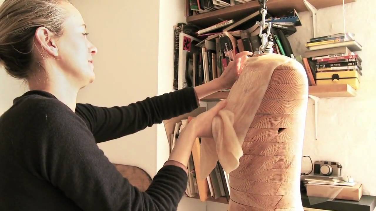
Suzanne Lee of BioCouture is another fashion designer who is working with bacterial fabrics. In various TED-talks she she explains her process and further developments she has made regarding the colouring of the fabric. She for instance found out that due to the matter’s high level of water absorbancy the bacterial fabric does not need more than one dip in indigo to make it blue, whereas cotton needs several, making it much more durable. It can also be coloured with natural materials such fruit and vegetable pulp, turmeric and others like metal (which will turn it black). Another thing is that if the fabric is placed around an object or body while it is still wet it will dry conform to the corresponding forms and shapes, creating a second skin.
Left: Growth of cellulose with Kombucha.
Right: Wet Kombucha cellulose left to dry.
Left: Suzanne Lee draping the wet Kombucha cellulose onto a mannequin.
Right: The dried garment made out of bacterial cellulose.
Biker jacket made out of Kombucha fabric and iron nails, which turns the material black naturally.
https://www.youtube.com/watch?v=UQBhwVD5rAE
Another way of using microbes to create fabric-like materials is the process of fermentation. This process is found in the making of wine and beer and it can be used to make biofabrics by letting the microbes grow a layer of cellulose on top of the wine or beer. This is part of the research that is being done for the ‘Bioalloy‘ project by of the University of Western Australia since 2005 until today.
Fermented dresses made out of beer (left); “The Beer Dress”, and wine (middle and right); “Micro’be“ by Donna Franklin and Gary Cass for Bioalloy.
The problem Bart Hess encountered in his search for a second skin can be solved with bio fabric. His problem being that none of the materials he tried (such as wax, latex and foam) would let the skin breathe enough for it to be bearable to wear for a long time. Coming from a breathing organism itself the bacterial fabric will let the skin breathe and will act in a more similar way than plastics and other synthetic materials will. This fact brings it closer to being a second skin. Besides, everyone growing their own clothes would be much more environmentally friendly than everyone printing their own clothes, which would mean that everyone would have to own a 3D printer. Firstly, because bacterial fabric is biodegradable waste material made by bacteria/fungi whereas plastics are not biodegradable. Secondly, because the 3D-printing would require the use of new materials and electricity, which bacterial fabric does not necessarily.
However, a big problem with bacterial fabric is that it is highly water absorbent. Once it comes in contact with rain or sweat the fabric will start to swell, making it unpleasantly slimy to carry on your body. More and more research is being done on the front of bacterial/fungal fabrics, by Stichting Mediamatic in Amsterdam for example (you can read their articles on fermented fashion and bio-couture). They have an aim to find consistencies that would be usable as textiles for fashion, it should not be too difficult or time-consuming to find a way to make bacterial fabric water resistant and/or repellent. All the research being done also means that the concept of everyone growing their own clothes is realizable in the not so distant future.
Patterns made out of Kombucha fabric.
A different development by MIT (Massachusetts Institute of Technology) is the adaption of a Japanese cooking bacteria, the so called Baccilus Subtilis, to react in size to moisture and humidity levels. When they are sown into garments and strategically placed on the body in flaps they will open and close depending on the heat and amount of sweat the body radiates, allowing the skin to ventilate. This development comes one step closer to finding the second skin (and the personal uniform) that Bart Hess is looking for. It could provide us all with a personal uniform, starting a movement of slow fashion and fighting crises such as overproduction, environmental waste and resource scarceness.
The bacterial flaps by MIT sown into a garment.
So, in conclusion, I will state that bio fashion, more specifically; bacterial fashion, is the future of all fashion. The production level of garments is higher than ever due to the speed in which trends nowadays come and go. At the same time, the earth’s resources are being drained and it’s surfaces polluted, human population is rising and life expectancy is increasing. As you can hopefully see, this is not a durable combination and something has to change in the way we produce and consume. Thus, we have to slow down the unsustainable rhythm of fast fashion that we are in and we can do that with the help of microorganisms, now.
Oh, it was such a glorious day. A new assignment, a new struggle. Exciting, i’d say.
I couldn’t imagine who to pick.
See, we had to choose one very special person to use as a subject or better said, starting point, for this project.
“D E S I G N A H E A D D R E S S”,
A sentence said a bit too much during the last few weeks. However i was motivated. So motivated that i started collecting materials, before even knowing who to pick as a subject. Who the hell would be good enough for me? What about some current and past obsessions? Radiohead’s Thom Yorke? My favorite artist, Anish Kapoor? I could’ve taken quite a leap, by using a fictional character. Rocky Horror Picture Show had a lot of great characters to base something on. How about Frank-N-Furter?
Nothing was interesting enough for me and nothing really sticked to me.
After doubting for quite some time, i made my decision. Olof Dreijer!
For readers who don’t know who that is; Olof Dreijer is one halve of the Knife. A Swedish electronic duo, consisting of siblings.
I’ve been listening to them for quite a while now and they became one of my most favorite musical acts and after seeing them live on the 6th of may, back in 2013, i became obsessed. I have all their mp3’s, almost all of their records on vinyl and even listen to Karin Dreijer’s (Olof Dreijer’s sister) 90’s band “Honey is Cool” .
I A M G E T T I N G O F F T R A C K
After deciding whom to pick, i did some spherical research. Collecting images of landscapes, materials and weird textures that i thought would be inspiring for and to me, regarding the project.
The collected images are based and connected to the different almost completely unnatural sounds, used in the Knife’s and Olof Dreijer’s other projects’ songs.
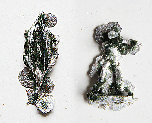
What really sticked to me was the amount of metal and plastic imagery between the collected images. Noticing this, i disregarded my former material choices and decided to use something more rich. I ordered 5KG tin/lead and started playing around with it.
First i made molds of objects (toy-soldiers, plants, self-made statuettes) using polyurethane foam, floral foam, clay and plaster and of course dripping tin into the earlier said molds. The results were surprising and inspiring, but didn’t really fit to what i wanted to succeed.
I A M G E T T I N G E X C I T E D
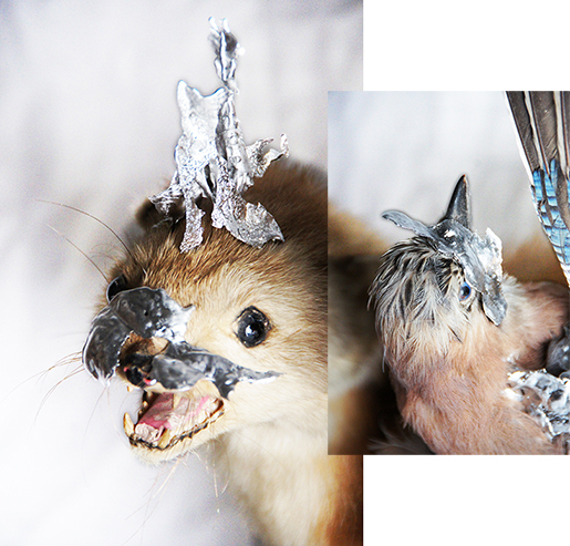
I know now and i knew back then, that i like(d) being unorthodox. Thus I wanted to make headdresses for the dead, AKA taxidermy’d animals. Still having most of the earlier made abstract tin shapes, i started putting them to use. Even though it looked quite good, I found out that this wasn’t the way to go. In this case it was all about aesthetics and not so much about Olof Dreijer. This is something i could use in a future project, but it was very disconnected from the wanted atmosphere.
I A M M O V I N G O N
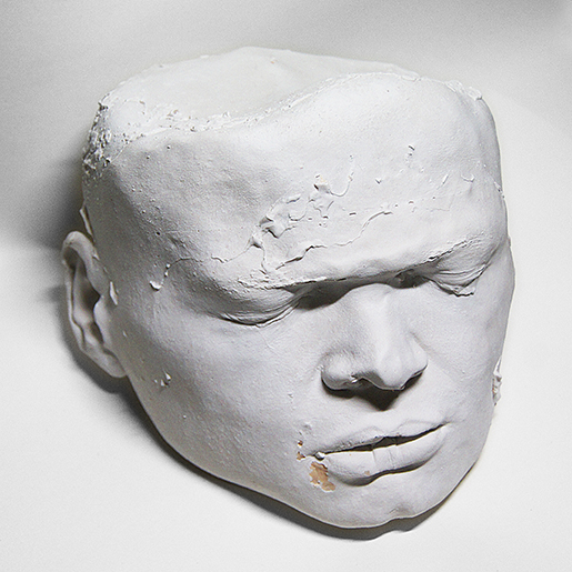
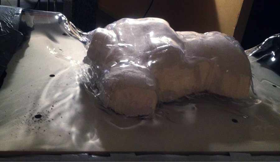
Most of my end-products came from improvisation and experimentation and even though i can be a wild card at times, I did know I wanted to base the mask on my own face. This was logical, to me, as i was the one who’d wear it to feel / be like Olof Dreijer.
I made a mold of my face and afterwards poured some porcelain plaster into the mold, with amazing help of a peer (I am in doubt if i should name her by her name or not). Having a lot of trouble with keeping the mold completely in shape, the plaster cast turned out a bit misshapen and crooked. However in the end i was satisfied with the result, as it was inspiring to see how it turned out and i am inspired to do more. I want to make plaster casts of everything.
I A M H A P P Y
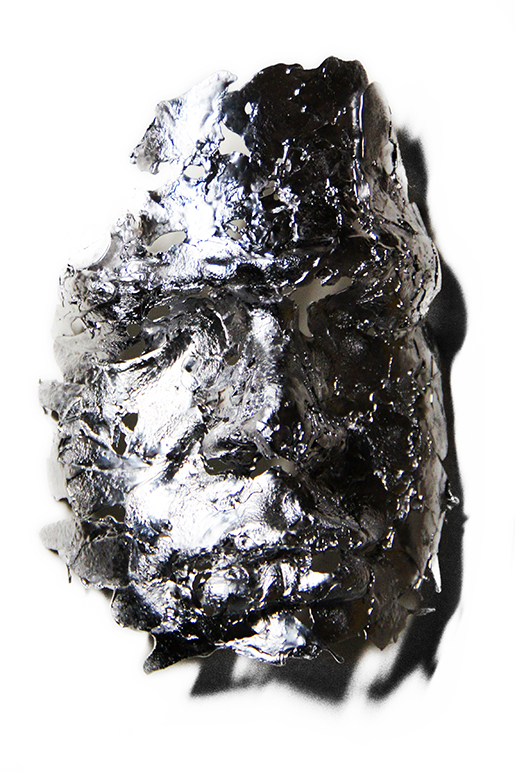
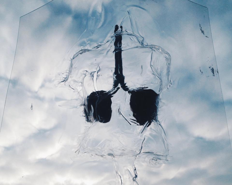
After making a plaster cast of my face, i wanted to go trough several other proci, before deciding that i was finished with the project. The first one being, making another mold of the cast, using silicon. When it was completely dry, i took it of the plaster and the result was as magnificent as I hoped for. Not having to0 much time to waste, I went on to the next step. Dripping tin into the latest silicon mold, resulting in several masks of my face.
This being a step and not a result, i started playing around with plastic rope, whilst burning the skin off my fingers by attaching the pieces in this manner. I created a grid-mask, using my head as a base and painted it yellow (making a low-key reference to the Knife’s first album’s cover) and when it was dry, i attached two of the tin-faces to the grid using copper-tread.
I B E C A M E D I S S A T I S F I E D
Soon after finishing the headdress, i wanted to make a sweater to go with it. Using the same grid in the same dimensions and painting it in the same color, it became a unity. It became a whole. The sweater is a bit of a hassle though. It’s quite sharp and i had to accept it hurting me constantly, when wearing it. And thinking about pain and pain-relief, i knew this was still not enough.
I A M B L I N D
Using clay to make a mold of old sunglasses, i started experimenting with the same dripping techniques to make the wanted shape for my soon to be glasses. Also i decided to use glass that was in my own eye-strength, so i’d be the only one that’d be able to see through them.
I AM S A T ISF IED
This was it and it still is. I presented them, in a very non-humble way, as it is! A peer wearing the headdress and myself wearing the sweater and glasses.
I got good feedback and i am very grateful for this project and how it turned out
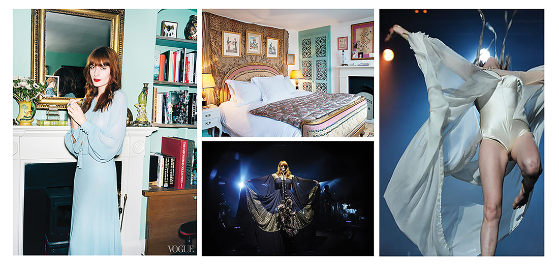
De enige persoon waar ik steeds opnieuw een gat in de lucht voor spring als ik haar live kan zien is Florence Welch van Florence and the machine. Niet alleen omdat haar muziek mijn hart doet smelten, ook haar extravagante uiterlijk tovert een glimlach op mijn gezicht. Florence haar hele leven, muziek en stijl is opgebouwd uit een intrigerende combinatie van het goede en het kwade. De onderwerpen in het leven die haar inspireren zijn altijd twee contrasten, gebaseerd op de renaissance, die samen hand in hand gaan. Voorbeelden hiervan zijn liefde en dood, tijd en pijn, hemel en hel.
Haar bijna over romantische ziel is niet te scheiden van haar melancholische kant. Ik kan me hier zelf enorm in terugvinden in mijn melodramatische sprookjeswereld. Al vanaf haar kindertijd zong ze vol liefde en overgave op uitvaarten. Een roze kanten sluierjurk gecombineerd met een doornkrans is een voorbeeld van hoe ze dit nu in haar stijl laat terug komen, maar ook tekstueel komt dit terug in haar muziek. Dit steeds op een metaforische wijze:
“The stars, the moon, they have all been blown out
You left me in the dark
No dawn, no day, I’m always in this twilight
In the shadow of your heart
I took the stars from my eyes, and then I made a map
And knew that somehow I could find my way back
Then I heard your heart beating, you were in the darkness too
So I stayed in the darkness with you”
Na heel wat research kwam ik er op uit dat ik een soort sluier wou gaan creëren. Waarom een sluier? Omdat een sluier zowel bij een bruiloft als een begrafenis gedragen wordt. Het onderscheid hierin is terug te vinden in de kleur en vorm. Om hier een middenweg in te kunnen vinden ben ik met deze 2 elementen in mijn achterhoofd beginnen schetsen. Omdat Florence zo een extravagant persoon is ging ik nogal snel over te top met mijn ontwerpen en werden deze veel te bombastisch. Om deze reden heb ik er voor gekozen om mijn startpunt te veranderen en niet naar de vorm te kijken, maar te gaan experimenteren met het materiaal.
Florence hele leven, stijl en muziek is opgebouwd uit lagen, zowel letterlijk als figuurlijk. Haar leven en de inhoud van haar nummers schommelen op en neer tussen drama en vreugde. In haar kleding is dit figuurlijk terug te vinden door de metaforische elementen alsook letterlijk door een gelaagdheid te creëren met stof.
Dit is daarom dan ook mijn uitgangspunt geworden. Op vlak van materiaalkeuze heb ik deze dualiteit weergegeven. Enerzijds is de romantische kant terug te zien. binnen het kleurenschema bestaande uit goud, pastelblauw en vurig oranje. Voor het materiaal heb ik gekozen voor liefelijke stoffen zoals tule, kant, paillettenstof en extra fournituren: kralen en franjes. Anderzijds is de melancholische kant weergegeven met zware zwarte stoffen, latex en rubber.
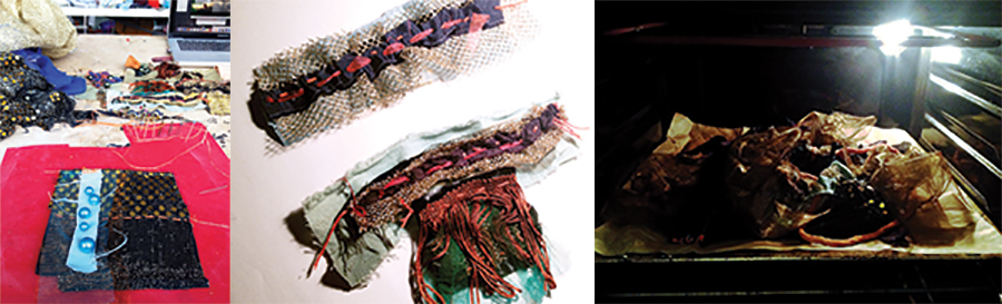
Deze twee voorgaande elementen vertalen zich in mijn project ook aan de hand van mijn werkwijze. Ik ben begonnen met het liefdevol, zorgvuldig en handmatig samen naaien van de verschillende materialen, laag op laag op laag. Op deze manier heb ik tientallen kleine lapjes gemaakt. Stuk voor stuk heb ik deze lapjes voor 5 à 10 minuten in een zeer warme oven gelegd. De verwarming door de hoge temperaturen zorgden voor een agressieve reactie op de bewust uitgekozen, synthetische stoffen. Kleuren zijn vervaagd, randen zijn verbrand en omgekruld. Maar, het belangrijkste van alles is dat alle lagen weer zijn omgevormd tot 1 laag, een nieuw stuk textiel, een textielsoort waar alle elementen zich hebben samengevoegd.
Binnen dit project heb ik zoveel mogelijk geluisterd naar het materiaal zelf. Om hier naar te kúnnen luisteren moest ik mezelf eerst heel wat vragen stellen. Welke stoffen zullen verschrompelen? Welke stoffen hebben hogere temperaturen nodig dan anderen? Wat is de reactie op de kleur? Gaat er wel iets gebeuren met de kralen of pailletten? Welke laag bevestig ik het beste vanonder? Welke dan weer het beste vanboven? Dit waren vragen die ik alleen kon beantwoorden door het daadwerkelijk te testen.
In deze experimenten heb ik ontdekkingen gedaan die veel anders uitpakte dan ik had verwacht. Soms was dit bijzonder positief. Zo had ik nooit verwacht dat mijn goedkope gouden paillettenstof wat zo uit een carnavalswinkel lijkt te komen zou veranderen in een luxueus uitziende stof die lijkt bezet te zijn met gouden kralen. Een andere fantastische reactie was wanneer een stukje badmat zo extreem heet werd dat deze samen vloeide met het zwarte latex en zo terug samen 1 materiaal vormden. Soms waren deze resultaten ook iets minder positief. Zo veranderde mijn goud-zwarte fijne tule in harde zwarte draden en smolt mijn blauwe fleece vast in plastieken klonters.
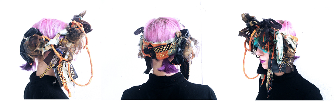
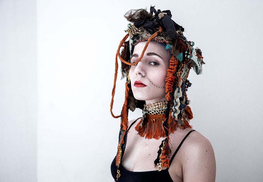
Met mijn nieuwe gelaagde textiel wou ik opnieuw lagen creëren om uiteindelijk mijn headpiece in elkaar te zetten. De moeilijkheid hierin was dat ik geen enkel startpunt had voor de vorm. Ik had duidelijke ideeën over hoe ik de vorm voor mij zag, maar het visuele beeld wat ik mij in mijn hoofd gevormd had sloot niet aan met het materiaal dat ik gemaakt had. Daarom wist ik dat ik terug opnieuw naar mijn materiaal ging moeten luisteren, wou ik hier iets moois uit kunnen maken. De headpiece is een puzzel geworden van alle stukken stof die ik gemaakt heb. Ik ben gestart met een basis waarvan de vorm te vergelijken valt met een doornkrans. Vanaf deze krans ben ik naar beneden beginnen te werken. Omdat logischerwijs stof altijd naar beneden hangt en gesmolten objecten ook naar beneden druipen was het voor mij ook vanzelfsprekend om het van boven naar beneden te laten lopen als een waterval. De kleine lapjes vloeien in elkaar over of overlappen elkaar en vormen samen met de krans zo terug 1 geheel, een headpiece gebaseerd op mijn inspiratiebron, Florence Welch.
Wanneer het hoofdstuk gedragen wordt voel je je iemand met een hogere status, iemand met een wilskracht. De vorm van de headpiece stuurt het lichaam ook automatisch in een zelfverzekerde houding. Als ik naar het eindresultaat kijk zie ik een mengeling van de renaissance, een hoofdstuk dat Cleopatra zou dragen en een traditionele Indische bruid. Ik vind het ergens vreemd je je zo fabuleus gaat voelen bij het dragen van iets dat als een soort beschermende helm je hoofd bedekt. Maar, aan de andere kant ook erg kwetsbaar. Je voelt bij iedere beweging hoe delicaat en fragiel het materiaal en de constructie is. Ik heb een kledingstuk gecreëerd waar je met liefde mee om moet gaan, net zoveel liefde als ik er in gestoken heb om het te verwezenlijken.
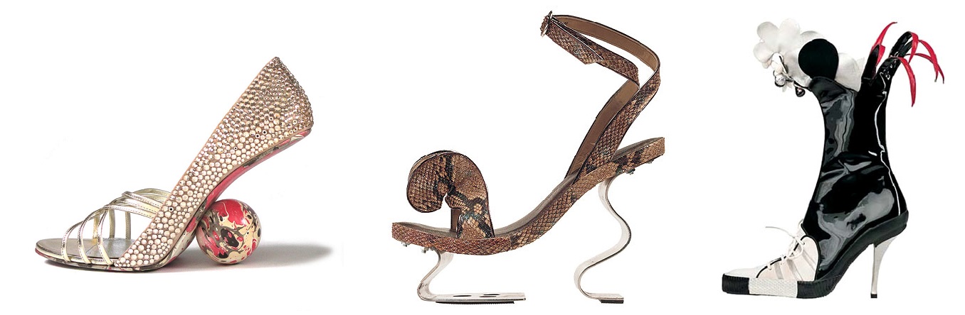
The Design Derby exhibition in Rotterdam is a friendly (or not) competition between Dutch and Belgian designs. It is presented as a playful and colorful route where, in chronological order, designed items are paired up for the viewer to compare the contrast between them. Some of them are not iconic (one of the works exhibited is even a student work from 2014) but I chose a rather famous pair (or pairs). I chose to write about the famous (or infamous) hoof-Tabi shoes by Belgian designer Martin Margiela and the Iron Lady shoes by Dutch designer and shoemaker Jan Jansen.
subscription
I have chosen these pairs of shoes because they stood out to me as interesting takes on what is beautiful, what to wear. They both have unusual and innovative designs with a strong vision. They have visual, emotional and conceptual impact, but they are also quite different.
Martin Margiela (born 1957 in Genk, Belgium) studied in the Royal Academy of Fine Arts in Antwerp and graduated in 1979. He is known for his avant-garde designs that break rules of aesthetics and are often with extreme proportions and deconstructed appearances. He has worked for luxury fashion houses such as Jean Paul Gaultier and Hermes before opening his own brand.
Margiela is continuing the work of Japanese avangardists such as Rei Kawakubo (Comme Des Garcons) which was started in 1980. This movement rebels against the luxury fashion world with it’s unusual designs who challenge viewers to reconsider their ideas on clothing and beauty among others. Margiela often makes use of the post modern architectural concept of deconstruction. Deconstruction is characterized by fragmentation and distorted sharp shapes. It displays interest in manipulating the surface of the structure. Visually, these structures are characterized by unpredictability and a sense of “controlled chaos”.
subscription
He has maintained a low personal profile and was rarely photographed, staying behind the scenes of his fashion shows. Perhaps due to the hectic nature of the fashion industry, he has resigned in 2009.
His creation from 1989, the Tabi shoes, were inspired by the Japanese shoes of the same name that have a characteristic appearance similar to cattle feet. They are almost anti-aesthetic and opposite to traditional femininity. Although they are sometimes heeled, they can be quite repulsive at first glance. The first thought of visually pleasing high heels are not of ones that are completely closed off, with bulging seams and a shape similar to a camel’s hoof. The silhouette has become a classic for the Margiela brand and it has been reconstructed and revamped many times. The designs are often gritty and minimalistic, the most radical example is perhaps the version of the Tabis that is sold only as a sole and includes clear masking tape to connect it to the foot. The design is aligned with Margiela’s asexual and deconstructed esthetic.
Martin Magiela • Tabis Shoe
Jan Jansen is a Dutch shoe designer and maker, born 1941 in Nijmegen. He has been fascinated with shoe making from a young age, as his father was manager of the children’s shoe factory Nimco. He interned in a shoe factory in Brabant and took evening drawing lessons in the art academy of Eindhoven. Jansen studied shoe making further in Waalwijk and Rome. He has several shops in the Netherlands, including one on Rokin street in Amsterdam. His designs are extravagant and colorful, but maintain a certain classic appeal. Jansen says he’s not concerned with trends and market forces, and he mostly makes what he thinks himself beautiful.
subscription
Unlike Margiela’s Tabis, The Iron Lady shoes are extravagant. They are propelled by an exaggerated heel made of bent metal at the back and a pedestal-like piece of metal in front that seems to leave the wearer in mid-air. Two intertwined prominent straps connect it to the foot in a compelling illustrative way. The classic femme fatale red is on display, with a suggestive upside down heart shape in the front. Perhaps Jansen inspiration, his wife, and his love of timeless classic design which focuses on beauty contribute to his design aesthetic which is often colourful and full of lyrical and aesthetically pleasing organic shapes. They have an abundance of detail that keeps the viewer looking. While Margiela’s shoes and general design esthetic is a commentary on the high fashion luxury world that he perhaps reluctantly belongs to, Jansen’s design are not interested in trends. Not many people would wear them, but they are purely esthetic.
I don’t know what these two particular designers say about their respective nationalities, and do they fit the bill of Dutch and Belgian design. I’m not sure people’s esthetic and artistic integrity can be narrowed down in that way, especially in our time when each artist wishes to express him or herself and create something completely new. But it is definitely interesting to look at these two completely different takes on wearable art.
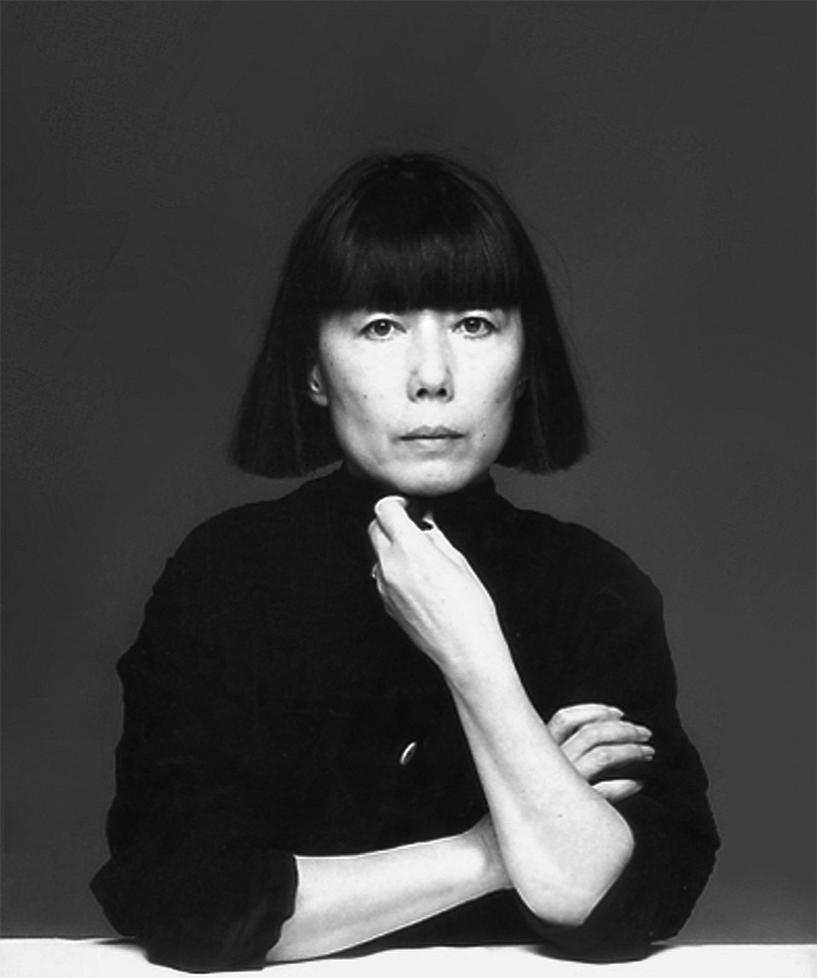
Rei Kawakubo is a Japanese fashion designer. She first studied fine arts and literature at Keio university but then later thaught herself how to design and started making clothes under the label Comme des Garcons. In 1973 she incorporated it as a company. Soon Comme des Garcons became a label preferred by the Avant-garde. Kawakubo designes clothes with a modus operandi more familiar to conceptual art than to fashion.
Rei Kawakubo
and Yohji Yamamoto,
1983
During the 1980s, her garments were primarily in black, dark grey or white but later more colors were added. The materials were often draped around the body and featured frayed, unfinished edges along with holes and a general asymmetrical shapes. Comme des Garcons is often referred as anti-fashion with their austere, deconstructed garments and the focus is more on the three-dimensionality of shapes and not so much on the surface and finish. By all these means Kawakubos designs challenges the traditional notions of beauty in fashion.
Rei Kawabuko, 1997
In 1997 the spring/summer collection was an ironic commentary on female vanity and advertisements for cleavage enhancing bras and figure sculpting thights. These designs suggest that the mind no longer need to submit itself to the dictates of conventional notions of beauty, but it is free to find it where it will. Also that beauty may not reside in the places what our culture suggests but more in our own imagination.
What is beautiful doesn’t have to be pretty
– Rei Kawakubo
Working together with other professionals like photographers and architects their approach in fashion is very collective. Kawakubo wants to be involved in all aspects of her business like photography, graphic design etc.
Ensemble
Rai Kawabuko
1997
Ensemble is a top and a skirt from collection Body Meets Dress, Dress Meets Body. It is made of cheesecloth stapled together in layers of pattern sections. The sculptural silhouette and the complex piling reflects Japanese ideas about the garment, which is seen as a construction in space. Here the garment is an autonomous sculptural object and it is no longer dependent on the shape of the human body.
This garment was part of a exhibition in Booijmans museum under a theme: Tabula Rasa. I think Kawakubos design fits quite well to the theme because she has been quite groundbreaking in her field by challenging the traditional idea of beauty in fashion.
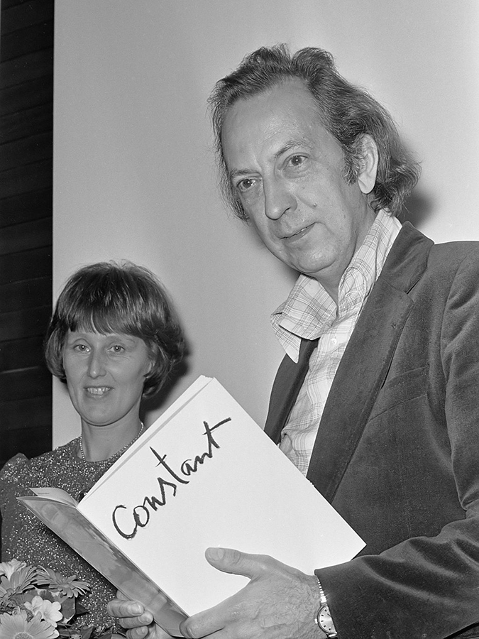
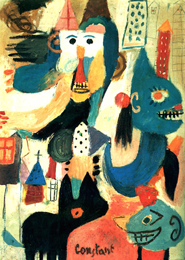
2. Constant Nieuwenhuys
Constant Nieuwenhuys (1920 Amsterdam – 2005 Utrecht), also known as Constant is dutch. He is a painter but he touched other fields such as sculpture, music and, what interests us, theory and architecture.
His brother Jan Nieuwenhuys, who was born a year after him also became
an artist and their paths are closely related as they founded together with Corneille, Asger Jorn, Karel Appel and others the Experimentele Groep in Holland in 1948. It is important to mention that all those people then took part to the CoBrA movement which we all know and which was a period when Constant painted a lot and a lot of beautiful paintings.
Constant took part to the theorizing of CoBrA. In Wikipedia I found his theory resumed to six points, I translate it here.
– Realism is the negation of reality
– Who denies hapiness on Earth denies Art
– No good painting without great pleasure
– Civilization admits the beautiful to excuse the ugly
– The best painting is the one reason cannot admit
– Imagination is the way to know reality
After CoBrA, he briefly joined the revolutionary Art movement International Situationist (from 1958 to 1960), led by Guy Debord, between others. Asger Jorn was there as well. This part of his life is really important to understand his work New Babylone.
The International Situationists were influenced by Marxist thinking and wanted to end the class society and the merchandise dictatorship. Their thinking is well explained in the book Society of Spectacle Guy Debord wrote in 1967. Guy Debord is an important character to understand New Babylon because in 1956, he theorizes the Derive in his text La theorie de la derive.
One or several people experiencing the Derive are renouncing, for a laps of time more or less important, to the reasons to move and to act they generally know…
– Guy Debord, Theorie de la derive, 1956
Image used for the cover of one of Society of Spectacle editions
New Babylone was supposed to be called Deriville. It is a utopian city in which the defaults of capitalism (and of society of spectacle) does not exist anymore. In this sens, it fits very well in the Tabula Rasa theme.
Constant NieuwenhuysNew Babylone 1966
3. Tabula Rasa
Even though the history and works of Constant and Kawakubo aren’t similar, they work in different fields, different puposes and connections are hard to find, we see that in those both particular works, some interesting aspects can be joined.
The first aspect is the use of architecture thinking for works that are not only architectural. Kawakubo, in Ensemble, thinks the garment as a construction in space, which means that she works with the object but also with the void it creates. Ensemble is a garment created using architecture.
Constant tries to build an utopian city, he has no choice but using architecture (he also made some beautiful models of New Baby- lone). The sketch we are talking about can also be seen as a piece of Art because the city was never built, it was only a big project that, I think, even Constant himself did not think he would see become real. New Babylon is a piece of Art using architecture.
The second aspect is related to the idea of Tabula Rasa. As we saw, Constant relation to it is quite obvious, he wants to built a new city for a new kind of human. In other words start everything again.
Kawakubo, in her garment, tries to challenge our traditionnal idea of beauty and to find new aesthetic values. We saw in Ensemble that the garment becomes autonomous from the body form an can be seen as a sculpture too.
we have certain outlines and we have to fill the ´surface´
and then he said a lot of other thing, too
and made me pay for his coffee
and then, biking through Albert Cuypstraat, I was thinking of the colouring books
and about what it is, that we are filing the given shape with
finding:
Yamaha
Pepsi
24
N-power
Avis
I love sport
Fedex
Virgin
Bronx NYC crew
Alpinestar
nike just do it
WELLA PROFESSIONALS
keep calm and swag
avatar
dr.Oetker
clothing is a billboard
I understood
a display which is touching every single corner of our lives except the shower corner
and then I thought further what makes us want to proudly wear a company logo on our chests and how could we make a use of this display that we are constantly wearing
and then I did not know what to do for a while
and then I knew again
I made a plan to make a comfortable universal sweatshirt which will have a displaying function beside the warm keeping, protecting and covering one
what would I fill the surface with?
what surface?
I wondered
and so I bought a surface
blank, grey sweatshirt
I decided to make a use of the existing shape of the sweatshirt and challenge the idea of temporary and replaceable advertisement on it
but how?
I thought
Removable sleeves?
but how?
adding a zipper?
or a velcro?
zipper
and so I added a zipper on the sleeves and by doing so, I allowed the printed advertisement/ promotional element to be easily removed or replaced by another one
I made a list of small businesses that I really truly want to support and promote
I gathered the logos of all of them
the print will come on the sleeves
I made another decision
but how?
screen print?
okay
the screen print studio works on the base of appointments
you must discuss your idea with the screen print assistant first
then an appointment is made
attention: it sometimes lasts over two weeks
you start printing with the assistant
hopefully you can work independent later
costs
yes costs…
no
I am not going to screen print my logos
what else can I do?
transfer print it
of course
I printed my logos onto a specially coated transfer paper
then they were applied onto textile under the heat press
and there it was
logos on my sleeves
I looked at the sweatshirt in my hands
I wanted to wear it immediately
and I did
and it felt good
but it did not feel good enough
so I took it off and looked again
and after some time I wrote down
70cm metal zipper standard + another sleeves + velcro pocket question mark
and then I went to Jan
and made another pair of sleeves
black
I put transparent, removable pockets on them
and I like them a lot
and then I looked again
they told me I have to look and reflect on my work during my process
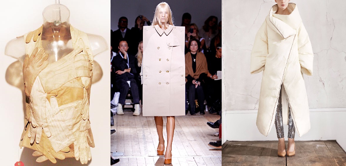
The exhibition The Future of Fashion Is Now [museum Boymans van Beuningen until January 2015] showed us an inspiring assortment of progressive designers with their newest techniques.
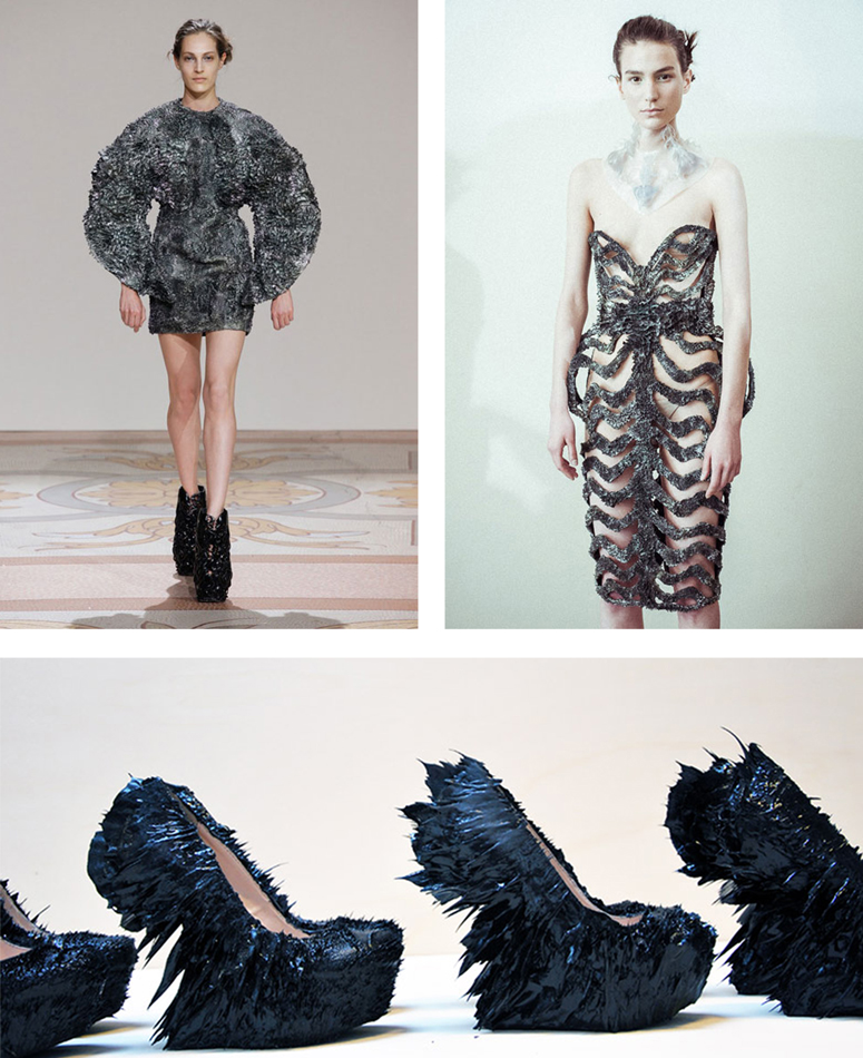
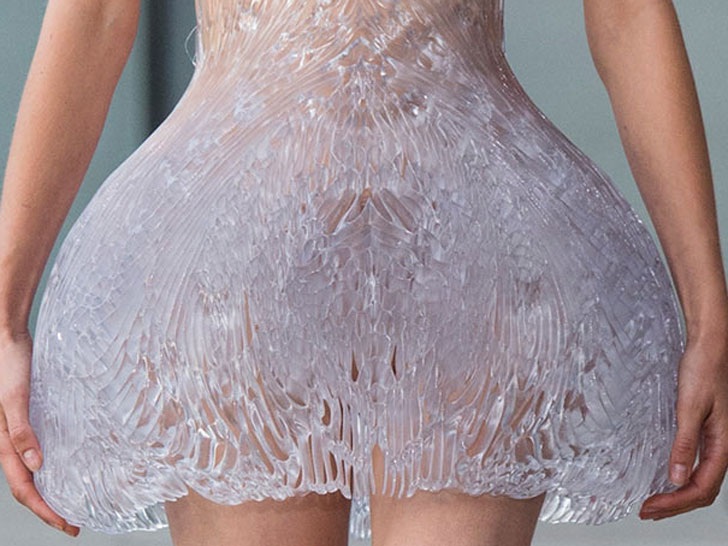
One of the many designers who participated in this exhibition was Iris van Herpen, who graduated at the Hogeschool voor de Kunsten Artez in Arnhem, the Netherlands. During her study she did an internship at Alexander McQueen in London and Claudy Jongstra in Amsterdam. Later, she began designing shoes for United Nude. An intriguing aspect is that she sees herself as a combination of a fashion designer and designer.
Iris van Herpen describes her own work as fashion where norms have no value and are being discarded. For her, fashion is a combination of craftsmanship and innovative techniques. It’s those techniques that really fascinate me in her work. Personally, I got really intrigued by the unique combination of materials and the technique with magnets she used to create the metal dress with, in collaboration with Jolan Van der Wiel.
On the other hand, the idea of using unusual materials such as wood and synthetics for 3D printing and laser cutting which eventually can be transformed into –wearable or non wearable– fashion, was a true eye opener for me.
Inspired by this project, I have pictured my own body in a plastic vacuum. Since this wasn’t possible with the vacuum machine that is available in school because of its size, I did thorough research on the internet in order to be able to build my own vacuum machine with the help of my father. Firstly, I made a mold out of plaster so that I could ‘pull’ vacuum from a see-through body. The heat got spread by a heater. In this way, only a small surface could be heated and I had no control of how the pvc plate would react to this. The consequence was that the pvc was about to burst or left air bubbles behind.
In the beginning I was quite disappointed because it didn’t go the way I expected it to. On the other hand, these little imperfections in the body actually do give some added value to the work. Having control over your material can be handy, but as soon as you lose this, interesting and unique things can happen. This reminded me of the magnets that have a will of their own in the project of Iris van Herpen en Jolan van der Wiel.
Her growing metal dress from immediately had an impact on me when I saw it from a small distance. The dress presented in the museum was one of her latest experiments. The 3D printed dress lay in a bath and grows with the help of fluoride liquid and magnets. To develop this dress she asked Jolan van der Wiel, a product designer, for help. Because of her urge to constantly apply new techniques, she frequently works together with other artists who specialize in the handling of these certain techniques. Jolan tries to forget the mundane things in his studio and to trust and make use of his imagination. Just like Iris van Herpen, he is fascinated by the working of different instruments that offer him a platform to his fantasy.
One of the instruments he uses are magnets. He creates a mixture of synthetic and metal that transforms by the help of magnets in order to create his own, unique chairs. The magnet grabbed Iris van Herpen’s attention, what resulted in a collaboration. Together, they developed a way to transform metal by using magnets so shoes and garments could be made from this. They used the same technique as Johan van der Wiel (graduated from Rietveld Academy’s
Designlab in 2011) did to design his chairs [x]. They made a basis mold, the form of the dress or shoe, and ornamented this with the synthetic magnet mixture. Subsequently, when the mold is solid, the magnets continue to do their job. They determine how the form eventually will look like. The attracted force designs the shape and after that the plastic hardens whereby the form stays permanent. In this way, thousands of divergent forms can originate and every product has a truly unique aspect.
They practiced this technique in real life situation in the Boijmans museum. Underneath the 3D printed dress, different magnets are hidden. Above the dress, the fluoride liquid drops down, falling on the dress. Through the magnets, the liquid sticks which makes the dress grow layer by layer. Therefore the name ‘growing dress’.
Furthermore, without the fluoride liquid, the dress is made out of synthetic that is 3D printed. This is a technique that we continually see coming back in her designs. A 3D printer is a device that creates arbitrary three-dimensional objects based on digital drawings. The material that is used builds up layer per layer, such as the Ferro fluid process. With this technique, Iris van Herpen is able to accomplish sculptures that are impossible to make by hand.
Next to the 3D printer she also makes use of a lasercut machine. This machine makes it possible to cut or engrave different patterns out of different materials. These patterns are being outlined on a computer program like Illustrator and Autocat. I recently used this technique as well. The only thing is that you need to have good knowledge of material. Is the material elastic, is it going to melt because of the heat?
The laser cut literally cuts the pattern or the figures with a cropped laser. On the basis of the material you coordinate the data for the machine. How deep does the radius have to go? How fast? Is it supposed to go slower somewhere, for example in turns? I personally experienced this when doing material research for the making of my bodysuits. Some materials work a lot better than expected, others are being destroyed completely by the heat. Now I know that table foil is a perfect material to cut and ribbed cardboard is completely useless, while I expected the opposite.
Iris van Herpen and Rem D. Koolhaas, the face behind United Nude, both agree that the border between fashion and design is tremendously vague. Together, they try to make the impossible possible as not everything has to be easy. One of the first shoes they developed together is the ‘Iris van Herpen x United Nude 2.0’, a limited edition made out of patent leather. The big secret of the weirdly formed shoe is the balance between the heel that is curved to the front and the gravity. This shoe was a big challenge for the both of them, but also for the wearer. United Nude was founded with the idea of breaking the conventional rules of designing shoes. The rules don’t have to be broken, they just tried to simply ignore the rules. The higher the heel, the bigger the challenge.
Speaking of challenges, Iris doesn’t only pushes boundaries in the shoe world but also in the fashion world. Here, we also see that she applies techniques that are being used in the design world. She wants to experiment with material and shapes.
This is something I also try to do myself, processing unusual materials while keeping the pure visible. In photography, I try to apply as few Photoshop techniques as possible. In my opinion, Photoshop is only there to corrugate, like for example the contrast, a disrupting line or adapting a color. Thus, I made a triptych in which material is central. In front of the camera, someone held table foil, which actually did all the work for the photo. I could have Photoshopped a nice little effect, but for me it’s all about experimenting with different materials.
Iris van Herpen doesn’t like following the rules blindly and decently too, that’s why she doesn’t think wearability is important for fashion. Because of this reason, she is able to use materials like synthetic, metal and wood, that can be transformed and cut through the help of her favorite techniques, namely 3D printing and laser cutting.
/
Just like Iris, I like working with unusual materials, and that’s why her work has a definite impact on me. She inspired me to dare to use different materials and techniques and made me step out of my comfort zone. So the main difference between all the other shown designer pieces is that the Ferrofluiddress is not at all a static object but it is a growing piece of art. Iris isn’t only a traditional designer who only works in fashion, but an artist who converts her experimentation into wearable sculptures.
“I find beauty in the continual shaping of chaos, which clearly embodies the primordial power of nature’s performance”
–Iris van Herpen–
During the visit at the Boijmans Van Beuningen’s, between all the dresses who can melt and the one who construct themselves there where an UFO. Three little canvas on the wall of a red room , hidden by a giant costume referencing to the solar system. These three pictures were the work of Phyllis Galembo, the sample of an all life research about the ritual costumes and masks in Africa and the African Diaspora. This work was specially interesting not by the subject or the strong visual effect who drop out of these images but because it’s presented in the exhibition -The future of fashion is now- How can we related the future of fashion and a research about traditional costumes in Africa, who exist from centuries? We can relate this question with the work of Pablo Picasso who has been influenced with the first exhibition of african’s sculptures and masks in France and revolution the art history, but now is it still accurate? What is interesting about these traditional costumes is that they construct a bridge through the past and the future, pieces of art who travel between the ages, but the future of our own civilization is to look back in the past of other’s one or to build our own, now.
Phyllis Galembo is an American artist, fine art photographer. Her work is now related from more than twenty-five years at the African masquerade and ritual clothing. her first travel to africa was in Nigeria in 1985 since she travel through the west and central africa and regularly to Haiti. She document with simple and sober portraits these ritual clothing/art pieces without adding any meanings, keeping them in there own environment. This is a really important part of her work because these costumes are already meaningful in a lot of different themes (religious ceremonies, secret society, rituals, spiritual meanings…) An other big part of her work is to create a relation with the members of the different tribes and then be able to be in contact with these sacred objects. Here we find another interesting relation with the exhibition at the Boijmans Van Beuningen’s. The relation between the creation of a new area for the fashion designer’s and the work of Phyllis, who don’t create a new idea of fashion but put in the podium an ancestral art. The attention of the spectator is fixed on the clothing on the pictures relate to the meaning of the exhibition and not the pictures themselves who are the work of the artist. The projector should’t be pointed on the creator of these art pieces, or is it the collaboration with the photographer who make them important for this theme -The future of fashion is now-
These pictures were presented in the section “The (re)definition of the human figure”. It was the topic who interested me the most in the exhibition and also the one that disappointed me the most. The theme is so large and for me unxploited at all. Only the work of Pyuupiru (Tokio) “Mercurius” and the “Akata Masquerade” from the american photographer was relevant, even if my only wants was to see in real the costumes on the pictures.
The african traditional masquerade costumes are for me a door for a mystical world and also a question about the definition of the human being. These costumes are more than a redefinition of the human figure but a way to escape totally this human aspect, physically and spiritually. And maybe lead us to this question, why i was interested by this part of the exhibition, What is it to be human, Just a concept, are we just animals or is it something spiritual that we should be aware of, or search for?
From my visit to the exhibition ‘The Future of Fashion is now’ at Boijmans the installation from the artist CC stays strongest in my mind. It was a large installation where the main part was a wooden structure that reached the ceiling. The structure formed few shelves that were full of multicolored sculptural mountains. For me it clearly stood out from the tailor dummies and hanging cloths that were around. On one side of the structure were hanging four lighted-up squares that showed a man’s face, hands and feet.
When I started to research CC as an artist I found out that he is formerly a hat designer. Known as Christophe Coppens or The Mad Hatter from the Country of Surreal Art and Comic Books, Belgium. CC is now living and working in Los Angeles.
His career as a hat designer started when he was only 21 years old. In May 2012 he decided to make an end to that career, he closed his business and became a full time artist after 21 years of designing. He had been producing art work together with the designing but came to the conclusion that he could no longer combine the two. As he said:
“You can’t be a good artist with the mentality of a fashion designer. And I didn’t succeed at being a part-time artist.”[x]
It was surely a hard decision for him but an important one as he didn’t want to get lost in the design world where he had to distinguish between how things should be and how they have to be. Staying there he couldn’t be himself and use all the creativity he bears.
Coppens started making the mountain sculptures one week before closing his business. The first mountain developed during a lesson he took from the ceramic artist Mister Hugo Meert. Soon he made another one and then more and more. Perhaps the mountain shape was natural for him when working with the ceramic after all these years of hat designing. Considering the shape of hats may often be compered to mountains. As he moved to Los Angeles all the mountains around the city and the different shades of colours during different day light had an effect on him. He could surely relate that beauty to his work.
The first mountains were made out of ceramic. Later he started using his old clothes to make the mountains after noticing that all his clothes were linked to the person he was before becoming a full-time artist. The clothes were literally costumes for the outwards person he showed in interviews as a hat designer. It wasn’t Christophe Coppens himself. It didn’t fit him anymore he said, figuratively speaking. He also used some of his old furniture for the sculptural mountains. It became some kind of capsule of his past.
His first exhibition after becoming ‘fulltime artist’ showed his mountain sculptures and was called Everything Is Local, Landscape part 1. It was exhibited in Boijmans Museum in Rotterdam [x]. It was an emotional landscape that kept a hold on to the past at the same time as it looked at the future with joy.
The exhibition immediately attracted a lot of attention, especially in his home country’s press. The Belgian magazine Standaard gave him three stars of five and published an article with the title: Hoedje af voor Coppens (Hats off for Coppens).
Later he made and showed the work called The Hills Are Alive: Landscape part 2. It was exhibited in Tokyo and was livelier than his first one. Full of mountains each with it’s own personality he related Landscape part 2 to the shops he used to have full of hats [x].
His installation for the exhibition ‘The Future of Fashion is now’ at Boijmans Museum in Rotterdam is a collection from both Landscape part 1 and Landscape part 2. There he puts together mountains from the two exhibitions making up the current exhibition that he calls Landscape part 3.
It’s interesting how the mountains are mounted on wooden stands that may be references to theater stages. I get the feeling that the stands help the mountains to reach higher and then not only physically but also mentally. It becomes more of a showpiece then something that could be practical, just as his hats.
All these years of hat designing might have been necessary for the work CC is making today. Now as he is using materials from his past and the memory of who he was before, recycling it to make new art. These are memories that he is ready to put aside but at the same time still wants to enjoy and keep in reach. Probably the lighted-up squares from Landscape Part 3 demonstrate this closure or some kind of a burial of his former carrier. The location of the squares indicates that the man is being crucified and the man is believably his own former identity. It therefore seems that CC is finally ready to say goodbye to his former identity as a hat designer, or what? Will we maybe see his resurrection in his next exhibition?
Tips from CC: Enjoy the present and wear sun screen [x],