Skip to Content Skip to Search Go to Top Navigation Go to Side Menu


"choices" Tag


way back to past


Friday, May 24, 2019

you can see the full video here

Living in the 21st-century ‘internet‘ has become a big part of life where it is inevitable. With the help of the internet, humans were able to achieve a lot of accomplishments. Looking at the experiences that I personally use the internet so-called ‘surfing’, I encounter with so many random information, and the randomness that leads to different randomness gives surprises and joy of knowing and not knowing at the same time. There are many choices that we can make and at the same time even with definite choices on the internet you never know what you bump into. Just like the times we spend on google or youtube. It goes similar to the design blog, there are archives of the basic year students and Rietveld academie with a lot of projects and archives from 2007.

In the blog itself, there are so many clicks or icons that lead you to so many different destinations. The changes in the cursor and the icon changes may distract you or guide you to almost infinite time and loop in the designblog itself. When everything is a possibility and knowing the fact of encountering different experiences and the randomness, having a perspective may give you slight changes in the times on the blog. Like the internet that we use and the deep web, they both exist but it’s just the way we approach the internet.


When spending time on clicking and facing different pages on the web, you will notice that the links provided on the blog may not always lead you to the web you imagine. Some may be missing the links and the websites may have changed over time and won’t lead to the exact place as the writer of the post.

First posts starting from 2007, I thought it would be interesting to see how the web would be like, and look at the posts from the exact time when the posts were published. Just like a ‘time-machine’ what was it like in the past? The web and the internet changes a lot and we only face the recent and modified versions, the majority of the websites are updated to the latest version. Thus, we only see the brand new versions and changes. However, with the help of the internet archive service website called ‘wayback machine‘ you can go back into the times where the posts were first published and can see how the blog was like back in the past. The experience of wayback machine web to the past and browsing through the blog gives you a totally different time. The websites leading out of the blog has a different design and directs you to the exact place the links were first made to. The service guides you to the past to see the old versions of the blog and fixes most of the missing links.

The experience with the wayback machine was like looking at books in the library. For example at a library when you choose a book and read, the design, context, and the information are the same as the date when it was first published. Thus, looking at a book can be seen as taking a time machine and experiencing the past. On the other hand, the Internet gives creators the ability to change and update information directly and instantly, and thus it’s hard for the users to notice or remember how the web was like in the past. The web pages are always changed and updated to something new. Since the design blog functions as an archive of the rietveld students like a library, the use of the wayback machine can make you feel the experiences you have at a library, by positioning yourself back to the time the post was published and see how what it was actually like.

Even with the same act of browsing the same website, a slight twist in looking from the past can give a whole new experience and the way of seeing things, like the game spot the differences.
V&R … M&vD


Sunday, February 5, 2017

Frankly, when I read through the book-list, I could not find a book which made me feel interested just by the title. So I decide to walk through the library and choose.

IMGP0759-1024x685_Easy-Resize.com

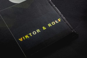
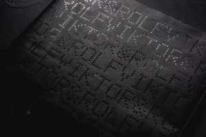
The reason why I chose this specific book was its black smooth color cover with the dots typo, braille lookalike. It has caught my eye and wanted me to see and analyze its content. Page after page I began to realize there was a type of system that the designers, Armand Mevis and Linda van Deursen carried out. A designer makes choices. When it comes to book design, he or she is likely to decide on redaction, typography, grid system, editing, binding, format, print technique, paper quality and so on. The sum of these choices create a unified expression that tells us something. It can be a parallel language to that of the content of the book and it can be more or less emphasized and thought-out. Some would say it could even be devious in its intentions.

This is an exploration of a book of Viktor & Rolf, from a design perspective.

IMGP0760-1024x685_Easy-Resize.com

The cover consists of mat black thin board with the title in what looks like braille typography with dots which looks like sewing. The black cover folds in to almost full width of the very first and last page. I learn from the designer that this is a technical solution to add steadiness to the book.

It was published by Artimo in connection to Viktor and Rolf exhibition ANDAM. It is designed by the design office Mevis & Van Deursen. I interviewed Linda Van Deursen in connection to this essay to get further insights in the design choices and the conditions from which the book came to be.

IMGP0770-1024x685_Easy-Resize.com IMGP0765-1024x685_Easy-Resize.com

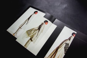
There’s an intriguing black colour inside the book in every page. This feature clearly communicates that it is a book mainly concerned with visual language or images. It resembles a visual preface or introduction to the book. The book has it owns signature, which is a brilliant manifestation of overlapping functions of the grid lines in the publication, categorizing the content by dots. Most of the paper types only occur in one single signature, this gives us a clue about the parallel function of the book.

I learn from that the book is a sort of material archive or assortment of papers of a specific kind. A rule that she set up for the book was that only two sided paper (meaning the paper has a different appearance on each side) of the type used in posters and envelopes (because they can’t be see through) were to be used. Not only does this create an intriguing visual and physical experience but it serves as a kind of metronome or conductor where the different surfaces of the paper are altered rhythmically but not predictably (you learn the rhythm and then it alters). This feature creates a playful element to the structure of the book. In addition to this, all rules seem to be broken at least a couple of times in the book which is a testimony to the sure instinct and playfulness of the designer.
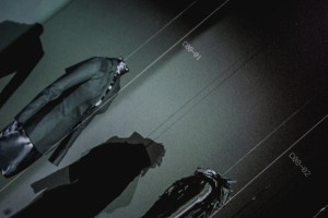
I find out in every other pages, codes and images. This book doesn’t contain much text, except the references in the end of the book. cause there’s no text I started to take another good look at the repeating dot lines, placement and spacing of the images, composition and sizes of the images. I found out that any other collection has it’s own lay-out.

viktor-rolf-brand-profile-logo

Viktor & Rolf seal, designed by Mevis and van Deursen

For example the second collection in the book is mostly big pictures, mostly layered, the white dotted lines mostly separate the photo’s, but are black when most of the line is over another photo (with white collection photo’s). The fourth collection is only shown on all the right pages, left ones left black. The seventh has one big image per page, combined with a few miniatures. And so on. The repeating white lines always go together with the codes along side of them. There’s a code for every image on the page, therefore it’s always easy to look up what you’re looking at. It really feels like you have to follow this actual ‘timeline’ through the whole book. De pages with collection photos on them have a ‘C’-code, which stands for collection.

The rest of the images are pronounced with ‘NC’ which – duh – stands for ‘no collection’. These NC-works are basically all the other things they did, such as installations, perfumes and the photos they commercially used for promotion back in the days. All these NC pages have their own different lay-out too. When you go through the book at first, it may look really chaotic. If you slowly go through it from front to back, the way you are suppose to read it (timeline) it makes a lot more sense, because the changes in layout fit the changes in style and time of the collections.

9ca56d7e0772c9ef8a5cf7f235713378 E-Magazine-V&R

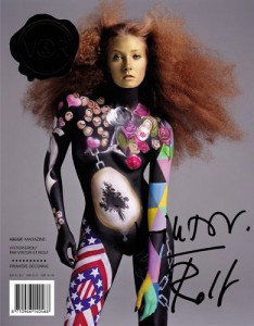
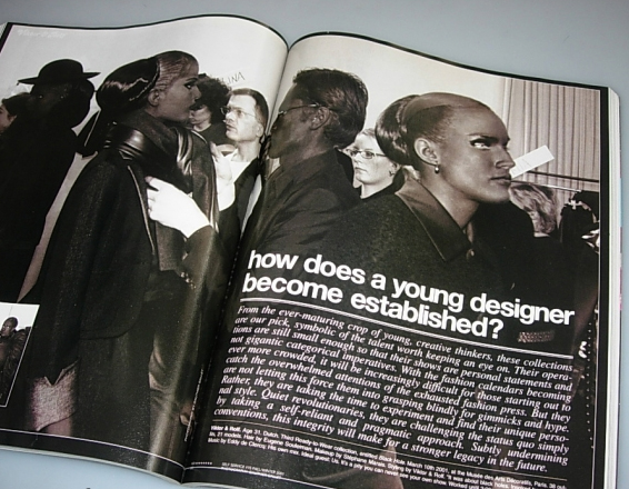
One other publication Mevis & van Deursen designed for Viktor & Rolf is the No.E Magazine as catalogue of Premiere Décenne at the Museé de la Mode et du Textile in Paris 2003/04 [x]. A publication reproducing all fashion magazine pages on V&R published to that date.
Around that same time (2005) Mevis & van Deursen published their own studio publication “Recollected Work” [x].

thisiswhatyouneed-892x1024_Easy-Resize.com


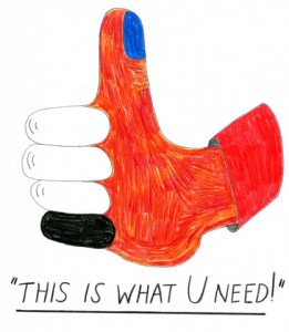
Viktor & Rolf : 1993, 1994, 1995, 1996, 1997, 1998, 1999. /Rietveld library catalogue no : 907.8 vik 1

Weaving through the paradoxes and dilemmas in protesting


Wednesday, April 9, 2014

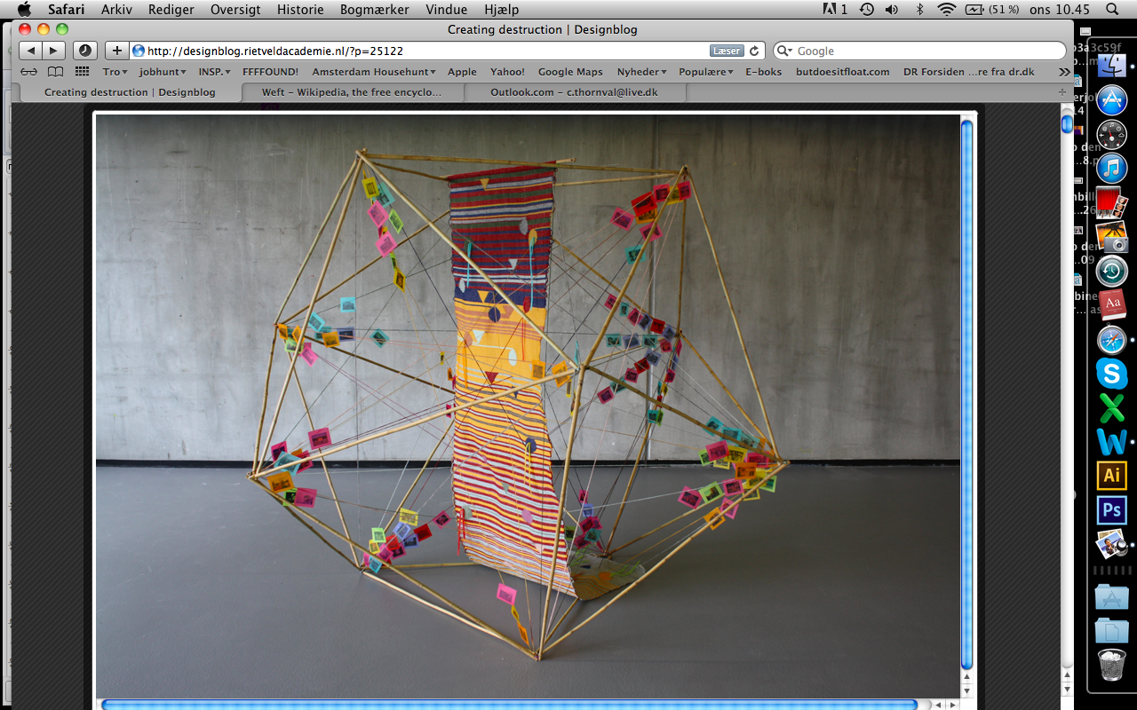
After clicking around this Designblog, I came across the post about Caroline Lindo’s thesis work ”The Surface of Protest”. The post is called ”Creating Destruction” which i find quite an intriguing contradiction. In her thesis project Caroline Lindo is investigating the meaning of protesting, different ways of doing so and which meaning they each imply. She essentially aims at answering the question: ”What is the most efficient – yet morally just – way of protesting?”

I would indeed like to know the answer to this question.

Lindo is directly relating the rules and structures of society and economics to the craft of weaving which apparently is also quit a rigid system (written in the attached PDF). Lindo tells us of have the warp (the amount of lengthwise yarns, that are held in tension within a frame, for threads to go under and over), within the art of weaving, has symbolized the basic structure of living which humans have to accept. The weft (the thread or yarn pulled through the warp) represents all the choices and decisions humans make for themselves in life.


Skærmbillede 2014-04-09 kl. 10.45.10


I find this symbolism quite moving.

To me it seems that with this as the background, Lindo is reconsidering which weft to take, instead of using the one given to her by society. Can you even make a protest using the ”weft” given to you by society or do you have to cut all of these threads and come up with new ones yourself? Will anything constructive aspire from this? Is it hypocrisy to use the tread – the means, structure, environment given by society – in making protest? Or is it not? These are all questions she is investigating  throughout her thesis.

As a research field she attended Occupy Amsterdam, which went worldwide in 2008 as a reaction on the financial crisis. She is studying the way of protesting through the tent-cities, which occurred during the same events. I always find it quite striking whenever someone manages to making such an abstract theme tangible, as Lindo does.


The ideas & steps behind making ‘Haphazard’.


Sunday, December 8, 2013

Analyze a book which is interesting because of its design.
So the book needs to be interesting, apart from the content. I discovered that it is almost impossible just to take a book because of adesign however interesting it may be. The content and design are often so closely connected to each other.

With this book it was different.

The first reason why I took it: the cover.

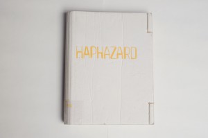
I had really no idea what the book was all about and I also didn't understand the title. No, I just took this book because of the cover. Between all these 'regular' books, there was this one book with a cover made of cardboard. Cardboard? That seems interesting to me.

René Put [x], the graphic designer of Haphazard, told me that you can not ignore the cover.

‘When you see a book, it starts with the cover.’

‘As a graphic designer, you have to deal with a lot of choices by designing a book. The content and form are in my opinion connected with each other. The content always plays a role. Which material is used by the artist? Which ideas the artist wants to tell with the book?’

cover Haphazard

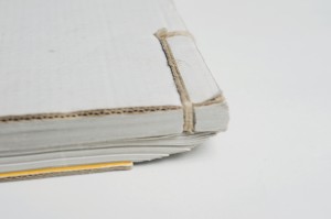
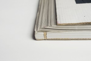
The manner of binding confused me when I opened the book. The way it is bound, on the right side, gives you the idea that half of the book doesn't need to be seen. That it is a secret, hidden.

‘As a designer I’m always looking for inspiration. Once I had seen an Indian account book, this is a long flat book. The idea of having this pile of papers, folding it into a new object, fitted well with the work of Ellert. Ellert is always looking for the border between 2D and 3D objects.’

‘Someone in Den Haag bounded the book. He made four dummy’s for us. We were really content with the last one, the one as it is now.’

‘They call this a Japanese way of binding. But actually a Japanese binding is different because there are more whole in the cover. There are just two holes in this book cover. Afterwards the book is bound by hand in a system which keeps the pages all together.’

‘This is maybe a funny fact to know. The whole research for the book cover, took the most time but cost also the most money because bookbinding is a handicraft.’

binding Haphazard

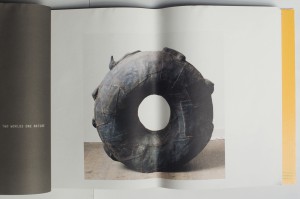
I have the idea that there's a link between the paper which is chosen and the work of the artist. The artist, Ellert Haitjema, is working with natural materials and material he has found in the streets. This paper looks like recycled paper. Not glossy, it has a more natural look.

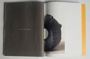
‘It’s always a search to find the right paper. Here we’ve chosen for uncoated paper. In this case it was necessary because not all the pictures were in a good quality. To compensate this problem, it’s always a good idea to use this paper because the effect of the bad quality is less. The pictures become also more an unity when they are from different sizes/qualities, all printed on the same soft paper.’

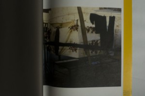
Haphardize_0034

‘This quality of this picture was not really well. That’s why I doubted to publish this one. In the end, we changed it a lot to get it how it is now. There were to many good arguments to place the photo.’


Isn't it a pity that some pictures on the middle of the page, are folded?

‘The pages are turned and that’s also why they get folded. In this example you can see why, on purpose, we’ve placed some photos in the middle of the page. By folding there will be another image then by seeing the photo on the whole page.’

Band 2 Haphazard band 1 Haphazard

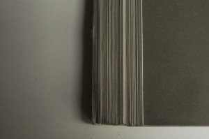
‘The cover and the papers inside the book are folded. What we wanted to create when the book is lying on the table, is that the cardboard will end on the first page inside the book. By folding the book, the paper will move, by moving the paper you get a nice cutting edge.’

snede achterkant Haphazard

‘At the last moment I thought of adding something to the cutting edge, it needed to become an experience in itself for the book. We decided to add five colors of grey, so called PMS colors or Pantone colors. These five different colors are printed on the back of the papers inside the book. Now you can see a nice variation of colors in different grey tones which are an experience for the book in itself.’

grijs verloop achterkant Haphazard

‘This book needed to be an object in itself. Just as the objects which are shown within the book.’

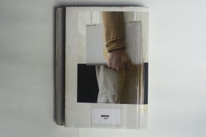
‘The good thing about the picture on the back of the book cover is that it shows how the function of this book changed by using it to carry a plate of glass.’

‘The idea for a photo like this (on the back of the book) occurred while we were designing the book: the book needs to be shown as an object itself. This photo for the cover was a bright idea, thereby the whole book design was completed.’

achterkant Haphazard

What I wondered about, when I took this book out of all the other 'normal' books, was; how is someone making a book like this?

For instance, when you're a graphic designer, what kind of steps do you make during the process of designing such a special book. At first, I thought there was no direct link between the design and content of the book because from the design you couldn't get an idea of the content.

In the end, I know better. When you take a closer look, you see that there's a link, off course, but a subtile one. Graphic Designer René Put let me see what is all necessary by making a book. Which choices need to be taken and which ideas are behind all these steps.

‘In my opinion, you can always go back to the book when it is a good book.’


Rietveld library catalog no: hai 4

Eye-catching choices


Thursday, December 3, 2009

The intuitive search mixed with subjective yet logical decisions has now became my little tradition. This time, my decision is to find a book concerning New Media. This is my a priori statement:

THE ‘NEW’ TAG + ART = VIDEO

I devote myself to the act of searching.

My eye is now attracted by another eye, stearing at me from the close up picture on the cover of the book. Its grainy texture seem to have a hidden message of not being the normal photo but the film still from the video. The Fast forward title can be associated only with this particular medium ( the era of fast forwarding audio tapes must have been long forgotten by such a contemporary looking eye from the cover). I’ve found the right book. Now, how can I connect it with DESIGN?

1. Subjectively:

• The ‘NEW’ TAG IS A BRIDGE – I like to look for new trends both in art and design.
• My choices are made through the VISUAL ‘ATTRACTION’

2. Objectively:

• The book was intentionally DESIGNED to make the VISUAL ‘ATTRACTION’ even stronger.

Every random opening of the book will attack my eyes with a great number of film images, shoot after the shoot. I’m totally amused. Nothing more exists except for me, the images and the big eye watching me from the cover.

Rietveld Library Code: 708-4 urb1


Log in
subscribe