Skip to Content Skip to Search Go to Top Navigation Go to Side Menu


"building" Tag


Everything is One: Building


Sunday, April 21, 2019

The Bauhaus manifesto published in 1919 outlines basic traits of the school. Headed with the Lyonel Feininger Cathedral (Kathedrale), the reader faces three stars shining above the turrets of the fictional basilica.

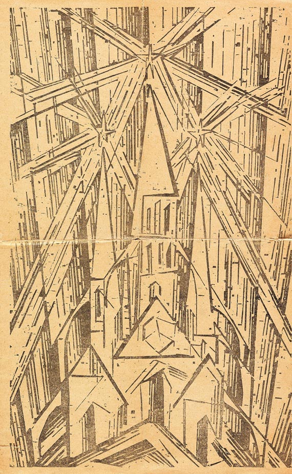
Lionel Feininger, Kathedrale, 1919, Cover of the Bauhaus Manifesto.
Programme of the Bauhaus. 

The three stars are said to represent the main three elements of painting, architecture and sculpture. All of which fall under the main concept of ‘building’. The Bauhaus was dreamt up upon a basis of creatives coming together, in alliance. To build work in an evolving space, a cathedral of mucky boldness, master among student, declaring craftsmanship and building as the basis of all learning.

Bauhaus itself is a blend of the word ‘to build’ and ‘house’. It takes semantic place as a ‘building house’. Now we can see the offspring of the school stretching from Berlin to Chicago, Pittsburgh and the Netherlands. Amsterdam is home to the Gerrit Rietveld Academie, which too was birthed from the wave of Bauhausian teachers and students left itching to scatter and inform after the original disbanded.

The school, mostly founded on modernist[1] design still has it’s reverberations. Is it just names that live on? Is the branding of Gerrit Rietveld, the only thing that links us to it’s educational model origins? Or is there still a cry of modernist education professing ‘building and making’ over all students?

It occurs that in the postmodern[2] world, the act of ‘building’ is seemingly scattered. Questioned theoretically. Few are painters, sculptors or architects now. Monogamous artists are perhaps becoming a thing of the past, steadily becoming toast along with craft in art. Perhaps we aren’t building physical practices anymore – emerging in the form of degree courses like ‘Autonomous Sculpture’ surfacing at the Rietveld, a subject so loose – almost transient. The focus here is on concept, as opposed to physicality.

The original Bauhaus manifesto is not something that presents a package of transience, but one of definitive action – “Architects, sculptors, painters—we must all turn to the crafts. … The artist is an exalted artisan.” The stress is on doing. Less on thinking.

The question I would like to pose is ‘what really happened during this rework?’ In the move from modernity to postmodernity, the focus has changed. Does this mean compromise? The change has happened in many forms, yet using the policy and attitudes towards ‘building’ in the two schools, we can evaluate them on a level playing field.

In my personal day to day experiences of the school, I have never been encouraged to ‘build something’. However, I have been encouraged to think reflectively, as if constructing something from thought. Within Itten’s original preliminary base course structure, the idea of elementarization[3] of basic artistic means plays a large part. I question wether this is still relevant with postmodernity. Elementarization was a method of finding the core of things. That could be related to shape, colour, and formal elements much better than thoughts, concept or theories. Deconstruction of colour, according to Itten’s book ‘The Elements of Colour’, allows you to provide “general rules and laws of colour, yet also relate it to subjective opinion”. Elementarization is a bid to find the root of something, the truth in which the experience lies. However, within a postmodern (Rietveld) structure, ‘truth’ itself is something shied away from. Instead of trying to find ‘the truth about colour (or making)’, we are left trying to find ‘the truth about thinking’, left ‘thinking about thinking’.

It is important to mention that even just through the existence of the Basic Year, and the formation of classes, teachers and subjects, it is apparent that the Rietveld does honour the idea of a ‘good education’, over a ‘bad one’. They have, after all  applied this structure to the course based on reason and pedagogy[4] study (or so I would assume). Thus, the structure must be based on certain means that deem it useful or good to us as students. This leads me to believe that there is indeed a right and a wrong way to educate young artists. In other words, there is a true art education to be obtained. In the Gropius manifesto of 1919, ‘What is Architecture’, this truth lies in “architecture, painting and sculpture”. But the world today demands a wider spectrum of conversation. I personally think that it is more than okay to dedicate oneself to finding a real trade, or becoming the master of something, as opposed to a jack of all trades.

I can see both sides of the story in so much that The Rietveld has to keep up to date with the process’ of the current art world, but coming from a somewhat dated model. When beginning this essay, I was under the impression that the school was undergoing some kind of identity crisis. Attempting to link themselves to their withering ancestral roots in Bauhaus. I would argue that the link is indeed withering. That can be seen in their policies on ‘making’. It is perhaps more of a historical connection now. In truth, if I wanted to become a master woodworker, I could. But it wouldn’t line up with the philosophy of the school. I have personally received criticism for dedicating myself towards attempting to become a kind of master in one material.

In conclusion, Gropius himself would suggest that the Rietveld needs a re-work if we are to base our education on a Bauhausian model. I think he would suggest that there are no ‘master craftspeople’ being raised up.

The Rietveld Academie has not explicitly chosen to follow the Bauhaus manifesto like some kind of Bible, so, from the perspective of a student studying here now, the school is allowed to deviate from the original blueprints due to societal changes. I personally think it’s great that we aren’t all sold into unpaid labour making zig-zag chairs. Yet, the school should probably analyse its withering links to the past. Just like inevitably a grandson will probably have different interests to his Grandfather. The Rietveld is not in an identity crisis, but slowly developing the ability to keep proud the family name, yet not live in the shadow of it’s ancestry. There will probably be a time, when the Rietveld’s education model will bear no similarity at all with that of the Bauhaus.


[1] Modernism(ism) – Modernism refers to a global movement in society and culture that from the early decades of the twentieth century sought a new alignment with the experience and values of modern industrial life. These were often utopian, and modernism was in general associated with ideal visions of human life and society and a belief in progress.

[2] Postmodern(ism) -Postmodernism was a reaction against modernism. While modernism was based on idealism and reason, postmodernism was born of scepticism and a suspicion of reason. It challenged the notion that there are universal certainties or truths.

[3] Elementarization – The reduction of artistic elements to their most basic or original form.

[4] Pedagogy – The method and practice of teaching, especially as an academic subject or theoretical concept.

  1. Johannes Itten, The Elements of Color, John Wiley and Sons Inc, Hoboken, 1970
  2. CityLab. (2019). Western Pennsylvania’s Bauhaus Town. [online] Available at: https://www.citylab.com/design/2019/03/bauhaus-pennsylvania-gropius-breuer-aluminum-city-terrace/584485/ [Accessed 20 May 2019].
  3. Moss, C. (2019). 100 years of Bauhaus: Berlin and beyond. [online] the Guardian. Available at: https://www.theguardian.com/travel/2019/mar/16/100-years-bauhaus-germany-berlin-weimar-dessau [Accessed 20 May 2019].
  4. The New Bauhaus. (2019). The New Bauhaus. [online] Available at: https://www.thenewbauhaus.com/ [Accessed 20 May 2019].
  5. Gropius, W. (1919). Walter Gropius, Bauhaus Manifesto (1919). [online] Adepratt.weebly.com. Available at: https://adepratt.weebly.com/uploads/3/7/7/1/37716215/bauhaus_-_manifesto__program_statement.pdf [Accessed 20 May 2019]
  6. Bauhaus-imaginista.org. (2019). The Bauhaus Manifesto – Articles – bauhaus imaginista. [online] Available at: http://www.bauhaus-imaginista.org/articles/1771/bauhaus-manifesto-re-cap [Accessed 21 Apr. 2019]
  7. Danchev, D., 2011. 100 Artists’ Manifestos: From the Futurists to the Stuckists. (s.n.). p159-p161 (M33 Walter Gropius – What is Architecture? 1919)
  8. Gerrit Rietveld Academie. (2019). Home. [online] Available at: https://rietveldacademie.nl/ [Accessed 20 May 2019]
Nicholas van Pelt

MVRDV Buildings


Tuesday, October 28, 2014

9789462080126_mvrdv_buildings_500

The reason why I chose this specific book was its colour and image placed next and on top of each other. It has caught my eye and wanted me to read and analyze its content. Page after page I began to realize there was a type of system that the designer, Joost Grootens carried out.

MVRDV Buildings, published by 010 Publishers, is a complete overview of MVRDV’s architectural practice over a total of 20 years. To me, this has been a positive discovery while analyzing the book. It was a very good surprise. I am very much interested in architecture. The way I have understood it was that the designer has deliberately chosen and created a way of method to display and present this portfolio of this architect firm. My impression was that this “method” is a way of telling a nice story or even a nice joke. A way to share important information with people. (click on the title page image and browse the 11 consecutive images)

Screen Shot 2014-10-06 at 21.51.42 Screen Shot 2014-10-06 at 21.51.33 MVRDV Buildings Screen Shot 2014-10-06 at 21.52.11 Screen Shot 2014-10-06 at 21.52.16 Screen Shot 2014-10-06 at 21.52.24 Screen Shot 2014-10-06 at 21.52.30 Screen Shot 2014-10-06 at 21.52.38 Screen Shot 2014-10-06 at 21.52.41 Screen Shot 2014-10-06 at 21.53.14 Screen Shot 2014-10-06 at 21.53.59  Screen Shot 2014-10-06 at 21.54.32


Another consequence was that I got to explore Joost Grootens own book. The book called I swear I use no art all, has been written by the designer and summarizes 100 books, 18788 pages of his book designs throughout 10 years in that field. The interesting part is to see how, the originally architectural-designer became a graphic information-designer. The book describes his relation to publishers, supporters, authors, collaborators, printers, workplaces and studios. A very personal way to present the changes and development that his own working field. It has made me realize how nice it is to make a summary of your own development. Even though I can not yet make a summary and create a descriptive portfolio of the last 10 years of my work-field I have already imagined creating the mapping of my family or origin.

(click on the cover and browse the 2 consecutive images)

I-Swear_bookcover

I-Swear_spread2 I-Swear_spread1

A part which describes the beginning in a overview, showing how one project led to another by encounters or collaborations and led into a new project, caught my interest. The designer has focused on presenting how non-book projects evolved into book projects. This made me think about my own encounters I had in my life that has influenced some decisions made later. Furthermore, allowed me to think in a non project based way. It also made me think of the origin and allow me to imagine the beginning.

As a personal mapping I was first interested in looking online for my origin in order to see routes and possibilities to reach Santiago, the origin of my father, and Budapest, the origin of my mother. I have also looked for the distance between Amsterdam and Budapest. Nowadays, it is very easy to travel between my hometown and Amsterdam which is the city I have chosen and encountered on my own. I had first visited and met this country at the age of 16 and already new that one day it would be my home. Due to the fact that I can not connect to my origin nor to my parents because of their divorce I currently have to focus on the present and the decisions I have to make every day. Choosing to study but first of all choosing to apply to the Gerrit Rietveld Academie has happened by chance. Through the Academy I have also encountered the Design Academy in Eindhoven. These two Academies are important in this case because interestingly Joost Grootens who graduated from the Gerrit Rietveld Academie is now a teacher in the Design Academy.

At this point I have immediately remembered my past with both academy’s. At one point in the last two years I have met students in Eindhoven who have shared a lot about their work process and further information of their studies. This also made me consider to apply to that school. Although I have never succeeded to enter the Design Academy I have, as a result, got to know the Rietveld more.
Once again, choosing >MVRDV Buildings< still proves how interested I am in design, how fascinated I am about architecture.

I knew I had a good feeling about the book’s black cover.

(click on the map and browse the 2 consecutive images)

Screen Shot 2014-10-28 at 20.02.39

Screen Shot 2014-10-28 at 20.02.53 Screen Shot 2014-10-28 at 20.05.11

To conclude; black to me is a colour. It is a comfort zone and also a strong feeling I have towards it. Black to me is the house I wanted to have and the friends I wanted to play with as a child. Black is also the material I preferably wear during my daily life and it is the ink I like to draw with. Black will never leave me and will always be part of my decisions in the future.

Talks about Money: Rietveld library catalog no : 716.9 rub 1

Rietveld versus Calatrava


Saturday, October 30, 2010

Exploring Valencia (Spain) as a prologue to Manifesta8, most students of the Basic Year visited "The City of Arts & Sciences" designed by Santiago Calatrava. As inhabitants of The Gerrit Rietveld Academie designed by, and named after Gerrit Rietveld himself, a comparison became inevitable. What follows are their comments and images.

[comment by Alexandra Karpilovski]

Calatrava feels like something not for you and not for me, but for someone whom we do not see. It makes me feel small, but also nothing.
It makes me think of a monument over the times that has passed, something sculptural and grand and made to impress but fails in that and becomes something static and untouchable. That a buildng that takes up so much space is mostly used to see and not to be touched.
The difference between Calatrava and Rietveld is like comparing two different worlds. For me Rietveld represents a calm structure, everything fits effortless and live in symbiosis with each other, the whole mind behind the building is put into place, on the exact spot where they should be, the body of the houses is on the inside, while Calatrava on the other hand just goes manic and drags different forms into space, just to make it look interesting.
Calatrava makes me feel that someone is trying to say something, but of course I don´t understand, it is to big for me.

[comment by Michael Hautmulle]
Both Calatrava and Rietveld are known for the details in their work, and it shows in both their work. The way in which they both apply it is very different however, where Rietveld has designed beautiful buildings, they are beautifull because of their practicality, so that every detail is constructed to make the use of the building more clear and make the life and function of the occupant more clear. Calatrava has a very different approach, he uses details purely on an esthetic basis, his building may not be very practical, I do not say whether or not they are beautiful, that is an individual matter, but every centimeter has been specifically designed to create the image that he desires. Again I do not wish to say much on the matter of esthetics, but I do believe that the most beautiful design is that which serves a purpose, not for idle beauty but as an object, or building, that fulfills its purpose well. That is the most beautiful of all.

[comment by Titia Hoogendoorn]

While Calatrava’s architecture could be seen as a sculpture and sometimes almost as decoration for the surroundings, Rietveld’s buildings are anti-decorative and more an expression of architecture. They both include the environment in their works. One by fitting in (Calatrava) and the other by adding (Rietveld). The shapes and colours of Calatrava's buildings are flowing along with nature (blue and white/sea and air) in comparison to Rietveld who devides space accentuated by primary colours. The architectonic skeleton of his buildings coincide with the construction while the skeletons of Calatrava seem an effort to make them visible on the outside.

[comment by Anna Kinderman]


Inspired by organic beings Calatrava forms futuristic, abstract entities, which he covers with diverse details and additional figures. Many details are purely visual and omit practical ulterior motives. However, he is limiting to discreet colors like white, blue and azure. Inspirations: torso, bull ribs, foliage, wings. His buildings are more like sculptures than functional buildings.
In contrast Rietveld is interested in function. He was inspired directly by the materials and dealt with the use of the building. With the reduction of coloring to the primary
colors like red, yellow, blue, black and grey he wanted to emphasize the different layers/planes. His strict geometry and minimalistic tendency distinguishes him from Calatrava like black from white.

[comment by Lovie Peoples]

Rietveld and Calatrava are two totally different architectures to me, both in the way their buildings look and the feeling they mediate.


Calatravas buildings are like sculpture houses and bridges. Fixed artworks that was created to demonstrate what he wishes to show. His imaginations illustrated on the ground in a space. To me it doesn’t leave that much to my imagination you are in his world. Either you like it or you don’t.
Rietveld houses have an obvious presence, melting in to their environment instead of creating an environment totally in them self. Which makes them a part of it and lifts them up. They make a dialoged to the space around it and invite me to feel at ease with my own thoughts and feelings in them. A meeting point in what he has left as a building and the person in them. An open dialogue with the viewer.

[comment by Molnar Tamas]

The two architects represent opposite design philosophies and approaches to man and its created environment. While Rietveld takes man and its size as starting point and adjust details to this, Calatrava creates vast spaces and buildings to impress the viewer, making man’s size unimportant. The Spanish exaggerated “machosim” meets the cool and minimalist Dutch world. Experience vs. functionality.

However, both of them are lacking in cosiness, Rietveld’s sharp edges and grey colours are rather cold and not welcoming. Calatrava uses the huge size of his buildings to alienate the spectators, making them feel being in a church or at some futuristic place. His typical white colour also contributes to the sacred, church-like sensation, where one should feel devotion and its own littleness. The usage of forms is also different. Rietveld introduces forms derived from the cube, the “box”, making and industrial and artificial look. Calatrava prefers the organic shapes, however, those are clearly computer generated “natural” forms put in order which finally results in the experience of an artificial environment just like in the case of Rietveld.

[comment by Pieter Tensen]

Calatrava designs buildings you can hardly call buildings. They are more like sculptures you can visit.  This is something you really notice from the outside and is a major point where Calatrava confronts Rietveld in his designs. Rietveld cared about the outside of a building too, how it looks, but it appears obvious in that way.

In Rietveld’s buildings everything is build up out of 90 degrees corners. This was his main trademark. Natural shapes and the human body, on the other hand, inspires Calatrava. They have one major thing in comment. They both care a lot about details. Although the buildings they designed we’re big and impressive sometimes, the eye for detail is very specific for both.

[comment by Stefan Voets]

“Rietveld adored light and bright spaces without too much detail. This is why most of his buildings are made of primary colours and forms (squares, rectangles). According to Rietveld, a building has to be functional too (functionality is extremely present in his architecture). Calatrava’s work is differently shaped, because of the massive surfaces and the lesser subtility. The material is heavy-looking.”


Log in
subscribe