Skip to Content Skip to Search Go to Top Navigation Go to Side Menu


"experiments" Tag


BE VISUAL


Sunday, February 21, 2016


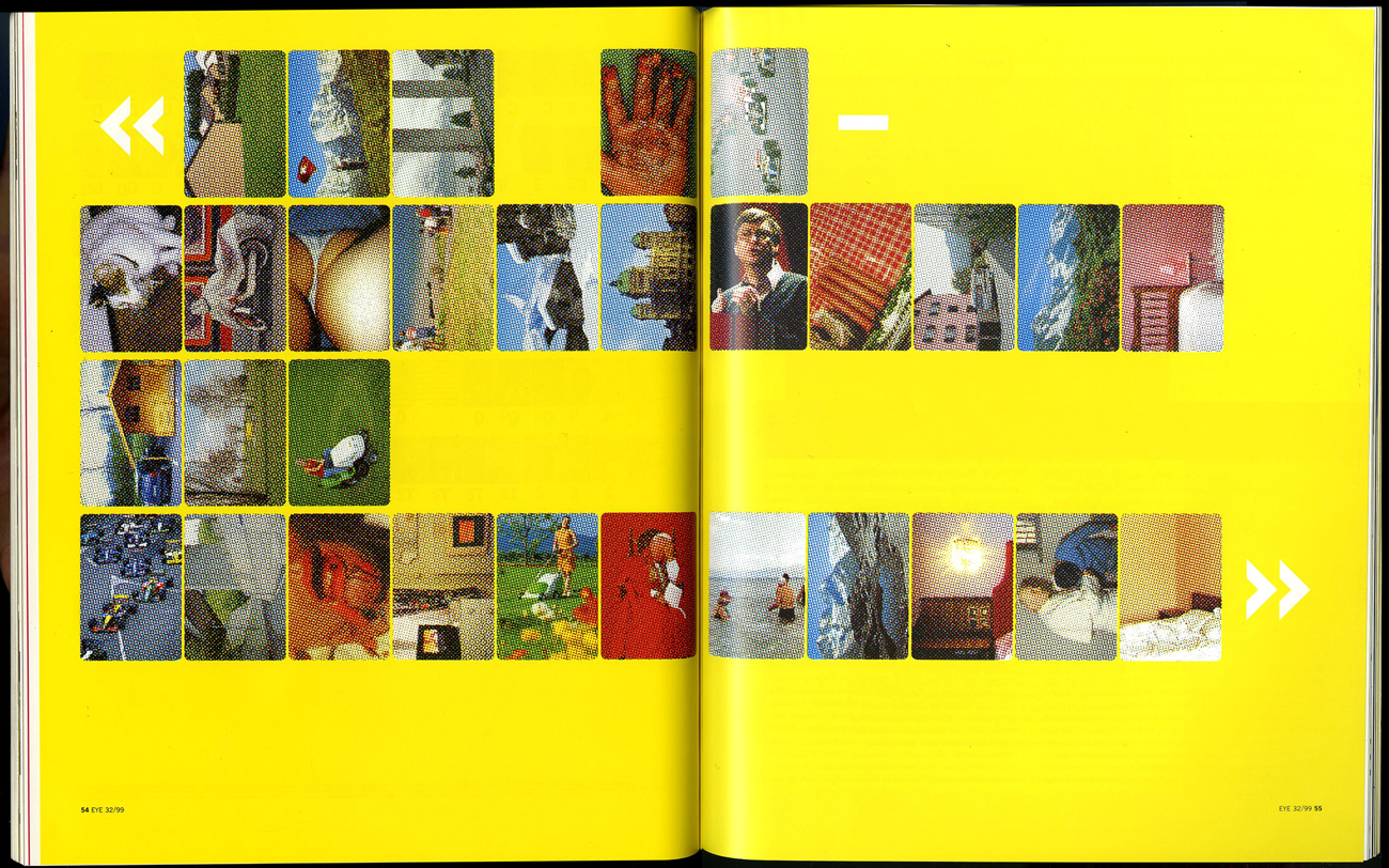
To share and receive, to express an idea or a feeling; that is what communication is to me. It can be transferred in various ways; through verbal and nonverbal communication. In the Arts, communication can be interpreted in a different way.  On this essay the main focus is image and communication. How images are understood as means of communication? As a starting point, the ‘visual essay’ of Beat Müller and Wendelin Hess called ‘The Impossibility of Neutrality” gives a view on the perception of communication. The impact globalization has in culture and economy, questioning how “neutral” a design could be? This ‘visual essay’ consists of images from various sources; from the Swiss Alps, from sports, the pope on tour to hooligans in Basel. From the founder of the Microsoft software Bill Gates to luxurious chalets, contrasting with pornography, war and violence. A visual combination arranged in a certain way, each image elaborating harmonious with one another forming a pictorial alphabet and text.


Impossibility-Neutrality_2_1300

Müller & Hess, The Impossibility of Neutrality, Eye #32, 1999


A similar approach as Müller and Hess has the London based artist and designer Paul Elliman with the “Untitled” (September magazine) 2013. The publication consists of an enormous private collection by the artists himself, of found images, reaching around 500 pages, a compilation of different sources from the world of fashion and photography to pornography. Paul Elliman modified every image by adjusting and cropping; by “zooming” into details. as a focus on the human body, emphasizing in such a way, physical gestures, such as the human hands for instance. A publication of powerful figures creating a variety of shapes and patterns. Without any further explanation of a written text; only the act of hands; a distinctively particular way of communication, in contrast of vivid colours. A synthesis of dynamic images capturing semi-nude and nude areas of the ergogenic parts, such as the chest and limbs of the human body. Gestures can be powerful, they are a form of information; a message that has been made by the sender towards the receiver.


elliman

Paul Elliman – “Untitled” 2013


Another project called by Elliman is called “The Alphabet” ’92 [x] in collaboration with 26 students of the London University. New ways and possibilities of opening up a communication were created. The result was an interactive piece or work that denies any stereotypes of the spoken language by making a new kind of alphabet by using objects and the human body to create letters. Image is the main element of it, structured by the human body. A unity of photographs decoding the language by giving it literal form and/or subjective expression. Shot inside a photo booth, students were deliberated to be themselves and interpret each letter of the alphabet by using only themselves.  By using only a few “ingredients” for instance; movement and the human body. The result is exciting and highly creative; could be a proposal which suggests to be open and think different regarding the process of ; reading and understanding.
 

“Language moves between us and the world on patterns of repetition and variation, and a mimetic example of this might be something like an alphabet” – Paul Elliman


As mentioned above the artist Paul Elliman and his projects “Untitled” 2013 and the “Alphabet” 1992, suggested a new way of communication which I would like to follow up to with an interesting example that can be found in the book of Hans Ulrich Obrist and Hans-Peter Feldmann  called “Interview” 2009.  They use a cryptic way of communicating, consisting of questions that have been posed by Obrist, to which Feldmann gives an image as the answer. A game between words and visual language, projecting social issues in combination with humor. The reader is allowed to make his own “translation” on every image as the possibilities of an answer are endless.


VT2A3857

Hans Ulrich Obrist and Hans-Peter Feldmann – “Interview” 2009


Moving on to one of the founders of the New Realism movement [x], Daniel Spoerri and his book “Coincidence as a Master” 2003. The Romanian-born, Swiss artist and writer have been collecting actual items such as; plates and cutlery for years. Creating himself the term “Tableau Piège” (snare-pictures) around 1960, which stands for; “objects, which are found in randomly orderly or disorderly situations, are mounted on whatever they are found on (table, box, drawer, etc.) in the exact constellation they are found in(…). By declaring the result to be a tableau, the horizontal becomes vertical”. What can be seen in this publication is a synthesis of found objects which each one has a story to tell. Taken from a “bird’s eye” point of view, of tables, frozen in time, captured in a certain moment. Remains of meals fixed on the table, an attempt of reviving a particular event. His own approach of expressing a story through fixed scenery of objects; a momentary need.


variant-spoerri

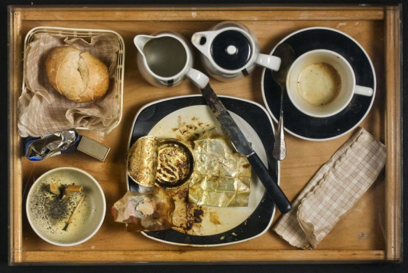
Daniel Spoerri  – “Coincidence as a Master” 2003


A similar approach as Daniel Spoerri has Uta Eisenreich as seen in her “A Not B” 2010 book designed by Julia Born. A mixture of colourful and playful photos, consisting still life images of objects like matches, balls, fruits and scissors. Rearranged in such an order which creates an optical illusion and language, where you might also come across with “spot-the-difference” mind game; experimenting between the thin line of common and uncommon sense. Eisenreich was inspired by scientific experiments, nursery rhyme poems and the “non-verbal IQ tests” for children,. The work contains of a variety of domestic objects directly connected with our everyday lifestyle. Questioning the possibility of placing in order items that has no function together although create a serene atmosphere. An exploration of structures between objects and space; “A Not B” takes us along into a playground of constructions of forms, the power of symbolism and youthful tendencies.


uta_346

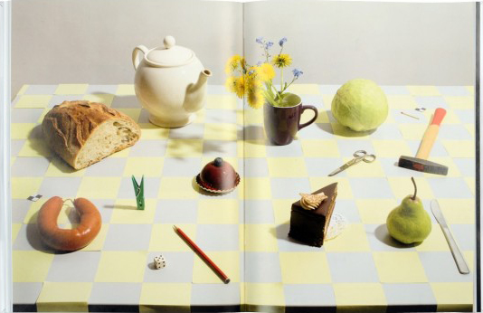
Uta Eisenreich – “A Not B” 2010


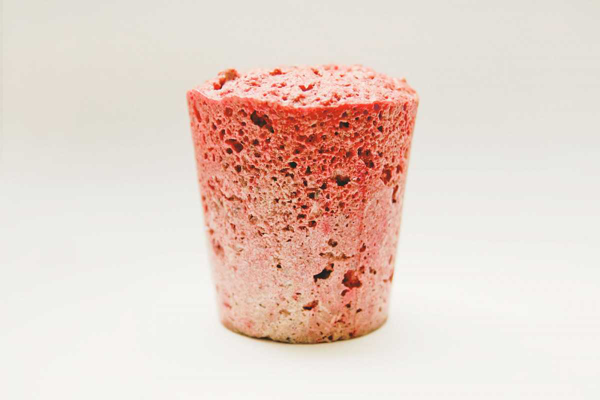
Objects surrounds us, usually designed to fulfill every human need. Although, from another perspective objects can be used for another purpose. Through them we can create a whole new reality, new experiences which opens up possibilities. It is all about perception, how we see the world around us, how do you see it?  Eventually, everything is changing and new things are born. For instance, the collaboration between the “creative agency Forsman & Bodenfors, stylist Evelina Bratell and photographer Carl Kleiner” publishing the “Homemade is Best” 2010 cookbook for Ikea.  It consists of one hundred and forty pages of ingredients placed in such order of creating geometrical patterns.  A wide range of baking recipes motivating the reader to take action. Suggesting an alternative approach of reading a recipe; by looking the images of the ingredients, guides you to the recipe instead of reading a text of each step that has to be made. As a result focusing only on the ingredients that are needed. While you turn the page you can as well see the result of each recipe.


Language is not dependent on writing” – Ferdinand de Saussure


In conclusion as the examples of the artists mentioned above, communication can be understood without the use of words; the power of the image can be stronger. In depth, photographs can express an emotion and interact with its audience. Words can be unnecessary; the use of the body or an object can create another medium of communication.
 

Made Trough Material Research


Sunday, March 29, 2015

I was thinking, writing about a chair can be really interesting but for me it had to be more than only writing about a chair.

Waste, material, life, renovation, structure, experimenting, design.

A few of the words that were coming up in my mind when I saw and started to research this chair, so I thought this will be a perfect chair and designer to write about. To find out how deep this designer can go into material research, waste and renewable energy. Marjan Van Aubel is one of the designers who stimulates this.

table-17


Marjan van Aubel is a designer that makes everyday objects in new innovative ways. She is trying to make people aware of the fact that renewable energy is everywhere. Normally there will be a waste of 50/80% during normal manufacture.  Van Aubel and James Shaw found a way how to use and incorporate that wastage during the manufacture.

When I saw “the well-proven chair” for the first time it looked like a normal chair because of the simple legs of the chair but when you see the back it becomes a object. For me it was hard to understand the material. I didn’t know where the chair was made of. The nice structure camouflages the fact that it is actually made out of  shavings and sawdust.The sitting part is beautiful and smooth, making this chair nice to sit on and really nice to look at. It’s good that the legs are simple so the focus stays on the sit area. With her designs she try’s to combine design and technology. She strives for a more renewable life

Well-proven chairJamesShaw+MarjanvanAubel

For me this was a really interesting topic because i didn’t know a lot about this kind of experimenting with material. There are so designers working with this way of designing. They are busy with making new materials to make life more renewable. I think these new materials are needed because our resources are running out.

As an artist/designer Marjan van Aubel always was interested in how things are made, a reason why i feel related to her. I always want to figure out how ‘it’ is put together.

She was also intrigued by solar panels and why they are so ugly and why they can ruin the face of a building. Why are the panels not integrated in the tiles? I really agree with her. That is why she started at her collage time a research about energy. Now not only design was important also science. She graduated with “The Energy Collections” a set of solar glassware that discharges through a matching bookshelf, which serves as a rather large battery. This kind of thinking can make our life a lot more easy an conscious. Like I said we are running out of material so this kind of design thinking can improve this.

I have a lot of interest in nature.  For me that makes her work really interesting, because she interacts nature with design. I have a few works i made a few years a go which are also related to this.
I investigated how nature and mathematics have a lot of comparisons. Like the golden ratio and Fibonacci. You can see it in a lot of plants, a lot of leaves  grow in a spiral around the branch to get enough sunlight and rain. It is also in our human body. For me structure in  nature is an important way for making a work. It is really nice that nature can help us to make products. I think it’s also good that new young designers/artists also use this opportunity to invent new products and make use of our nature. Like her latest project  “The Current Table‘ which was also able to generate energy. This project she made in response to “the energy collection”.


Current-Table

The market for these well made products is getting bigger and bigger.  People are more concerned with a healthy and a conscious way of life and designers will react on that.

This movie from 2012 shows how a lot of designers are busy with the meaning of material.

https://www.youtube.com/watch?v=9-GofyAQK6Y


It’s fascinates me a lot how this young designer are making al these new innovative products. I found a movie on this page and it shows how scientists are combining non-living chemicals to create materials with the properties of living organisms.

Now you can see how new materials, new invented but also already existing materials but used in an other way will blow your mind. For me their is still a lot to discover about al this material researches and the meaning of material. This research showed me a lot new ways of seeing waste and make new material with it. So we al can be more conscious and re-use waste to make something new.


Links:

http://www.marjanvanaubel.com/

http://wellprovenchair.com/

http://www.dezeen.com/

http://www.rennyramakers.com/


Mess and experiments


Monday, November 14, 2011

Punk subculture emerged in mid 1970’s in the north eastern United States. Later it formed in United Kingdom and Australia. Firstly, it was a lot about music and expressing ideologies through it. Punk related ideologies are mostly concerned with individual freedom and anti- establishment views like not selling out, anti- authoritarianism, DIY ethic (do it yourself), nonconformity. Politic views include anarchism, nihilism, socialism, anti- militarism, anti- capitalism, anti- racism, anti- sexism, anti- nationalism, anti- homophobia, environmentalism, vegetarianism, veganism and animal rights. To sum up, it is evident that it is basically being against mainstream, boredom, general rules and some bad effects in our society.

Therefore, punks were trying to draw attention in many ways: using music, attitude, DIY, zines , design and fashion. (Some interviews with zine-sters – The Paper Trail Interview Series) The easiest and most visible way to express yourself and show your individuality in thinking is using your appearance. In this case Punk is not difficult to recognize. (at least it was in in early 80’s). Punk seeks to outrage others with highly theatrical, anti-materialistic use of clothing, hairstyles, cosmetics, tattoos, jewelry and body modification. Today everyone knows what Punk fashion is, but in 1970 it didn’t exist so, it is quite interesting how things like that are being formed.
Look at this film Death Is Their Destiny (1978) by amateur filmmaker Phil Munnoch, aka ‘Captain Zip

Punk youth took old clothing and deconstructed them into new forms, destroyed fabrics, made new outfits to attract attention. They often torn fabrics, frayed the edges made prints which are now normal,but in the 1970s it shocked many people. Safety pins and chains held bits of fabric together. Neck chains were made from padlocks and chain and even razor blades were seed as pendants. They often even did not wash their clothing until it was impossible to wear them.

Furthermore, Punk hair. They spiked it as high as possible into a Mohican hairstyle by a variety of means including sugar and water solutions, soaping gelatin, pva glue, hair sprays, hair gel, egg whites. Often colored in intensive colors like green, blue, red, pink… It intended to attract attention and shock people. They were shaving areas of the scalp. Both sexes did this. They also,tend to have body piercings in at that time not common places.

Me_Punk

I was thinking how I could relate myself with Punk. I remember when I was a young teenager I used to listen to some of the Punk music and wear punkish clothing together with face piercing which I even did myself. Moreover, I was vegetarian and I had been trying to get deeper into some ideologies, but I just stopped at a time and of course, now I’m not like that although, I feel that some ideas stayed with me. It was just trying to find out who I am. When I think about this now, it seems quite silly, but fun. I could claim that many teenagers now or before tried to be a ‘Punk’ even though they don’t really get what it was all about. For them it is more about appearance which I consider a normal thing.
Accordingly, I’ve decided to try how it feels to wear a Punk ‘Mohawk’ hairstyle which today entered mainstream fashion, but still for me is quite extreme. However, the Mohawk tribe never actually wore the Mohawk hairstyle traditionally.The association with the so-called “Mohawk” hairstyle and the Mohawk tribe came from Hollywood and more specifically from the 1936 movie, “Drums Along The Mohawk”. So, I decided not to shave the sides of my scalp, but only to try to do my hair up with egg as I found this recipe while doing my research.

First, I combed my hair and when decided to put on some hair wax. Secondly, I beat two eggs and applied them to the hair. Later, I put my head on the cardboard and formed the style. I used some strong hair fixing spray and the hair dryer. So, I lied on that cardboard for quite a while waiting for everything to dry. Unfortunately, when I decided to stand up ,I felt that my crest is falling down. I did not even get a chance to do the same procedure with the other side of my head. The most exciting thing is that you can see how the hair changes you although, it could be more fun if I had used some colors also. So, in conclusion, my experiment wasn’t very successful, but now I know how difficult it is to make such thing and what kind of strong products you have to use which are definitely not good for your hair and for the environment?!

In my opinion, Punk clothing and hairstyles really make you feel more powerful, rebel and free. Although, I think you can easily hide yourself in it and loose a bit of individuality if you seek the same style of clothing, same details and same set ideologies. It might sometimes confront with the inner person. Of course, some other slightly different Punk directions emerged later with different ideas…

Something which was rare, different and strange later always becomes something acceptable, normal or even fashionable. Punk fashion was really commercialized and many well-established fashion designers like Vivienne Westwood and Jean Paul Gaultier have used Punk elements in their production. Although, Punk clothing was initially hand made it became mass produced. I see that it happens in every aspect of life. Therefore, Punk movement gave a lot to our society. It made many people broaden their minds, let some of them feel more independent which I think, created some good ideas and it had a good influence in developing our society and art while making an inspiring mess.


Log in
subscribe