Skip to Content Skip to Search Go to Top Navigation Go to Side Menu


"performance" Category


Another 21st Century Ballet


Friday, April 26, 2019

In Oscar Schlemmer’s ‘Triadic Ballet’ we are presented with a plethora of colours and shapes that touch the imagination as if being in another universe. The opening scene starts with two ‘living puppets’ standing in a yellow room. Their costumes resemble harnesses from some other age in another space with primary shapes that limits their movements incredulously. With a staccato walk they move around each other, surrendering to the costume that hides the true identity behind these puppets. As the performance proceeds, and yellow changes to pink and pink changes to black, the dancers appear in various costumes that share the same alien ‘harness’ look and all seem to be made to make movement impossible. With these minimalist movements, Schlemmer seems to be commenting on the position of the individual within the roaring Interbellum: the performers were reduced to puppets that were meant to blend into the colourful decorum.

The ‘Triadic Ballet’ is an important manifestation of the aim for interdisciplinarity that characterizes the legacy of the Bauhaus academy that was founded in 1919 in Weimar, Germany. Schlemmer, who was originally schooled as a painter, turned sculptor, turned decorist, turned choreographer, subsequently found himself at ease within several disciplines. And so did many of his colleagues: painters became designers and drawers became weavers. The true modernity of this Bauhausian aim for the integration of disciplines might have only become clear much later in the 20th century with the rise of Postmodernism. As to this day artists and scientists altogether seem to become increasingly convinced of the benefits that arise when two or more disciplines are being combined. [The appeal for interdisciplinary practice is also very apparent in the educational system of the Rietveld academy in the present day.] It is argued that, within the realm of an educational system it might be beneficial to learn through several disciplines in order to deepen the learning experience, to connect with your subject on many levels as opposed to just one. This also touches on the theory of constructivism, which suggests that people create their own understanding and knowledge of the world through experiences and reflection on those experiences. In other words: a plurality in narratives calls for a plurality in educational journeys (and results in a plurality of learning outcomes).

To me it seems that in my generation (y) a common awareness towards this plurality in narratives is manifested more clearly than ever as we have been exposed to so many through both mass media and personalised media. And yet again, just like in the Interbellum, the position of the individual within this digital era is being discussed. This made me wonder: what would a triadic ballet look like if it was recreated to-day?

I therefore set out to research and create a choreography that would share a minimalist approach with Schlemmer’s ballet, but simultaneously touches on contemporary culture. Evidently enough there are many possible ways to represent the novelties of postmodern civilization within this historical context, so I made the choice to focus on the subjects of digitalisation and individuality. I discovered that these two themes are apparent in our lives not only through visual experiences, textual communication or metaphysical perception, but also through bodily adaptation. With this term I refer to the different adjustments modern humans allow their bodies to make in order to make use of digital devices and/or media. This bodily adaptation displays a process where an individual’s reality-identity somehow seems to have merged with their digital-identity. Inspired by Anne Teresa de Keersemaeker, who often attempts to create dance forms out of daily movements, I tried to work out different movements that I found to be exemplifying for these bodily adaptations: people crouching over their phones on trains, people shifting their view to and from their screen.


With these movements mimicking digitally-driven bodily adaptations I made a short movie showing a 21st century ballet in 21st century costume. Unlike in Schlemmer’s ballet music and sound has been left yet-to-compose in order to limit the scope of this research. A next step would definitely be to experiment with audio in order to create a complete experience. An important notion must be taken in the fact that this outcome is highly context specific (and therefore quite postmodern for that matter) as it is a result of my interpretation of what a 21st century ballet should look like carried out through my body.
 

Triadisches Klassisches Ballett


Friday, April 26, 2019

The choreography, the costumes, the music and the decor that Schlemmer uses in his Triadisches Ballett were in my eyes the complete opposite of the classical ballet performances, for example The Swan Lake.

After further research, I actually came to the conclusion that it is difficult to compare, since his approach has had nothing to do with the telling of a story. Schlemmer’s ballet is based on three basic forms: square, circle and triangle and the various postures of the human body: standing, sitting, lying. These combined add up to an infinite number of variations and possibilities of interaction of the human body with space. In this approach, the choreography, the costumes, the music and the decor are all the same. The ballet is the result of the relationship and interaction of these four elements.

Even though Schlemmer’s choreography of the ballet was only a style element, equal to the costumes, the music and the decor, I consider it as the most crucial aspect of the ballet. Therefore, I asked myself: Can it be elevated to classical ballet if you omit the music, the costumes and the environment, and thus only focus on dance technique and choreography?

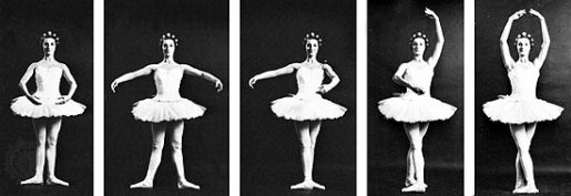
Ballet technique is the basic principle of exercise and form used in ballet. Within classical ballet there are some elements that distinguish it from other dance forms, such as the five basic positions, the turnout, balloon and the ‘pointe’ technique. The turnout is a rotation of the leg at the hips, causing the feet and knees to turn outwards, away from the front of the body. This rotation ensures a greater elongation of the leg, especially when tilting up and back. Balloon is an aesthetic in ballet and other dance genres, which makes it seem as if a dancer is effortlessly floating in the air, floating in the air and landing softly. The pointe technique is the part of the ballet technique that concerns pointe work, where a ballet dancer supports all body weight on the tops of fully extended feet and wears pointe shoes.

ballet pink

To answer my research question, I gave myself the task to learn ballet, to learn two dances. I did this to see if –when I do the dances without the costumes and surroundings in which the dance originally took place– it is rather seen as a classical ballet.

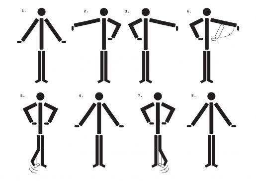
The start of this journey was a big failure, I started to reenact parts of the Triadisches Ballett. Almost immediately afterwards it dawned that it would be a lot harder than I had expected. A friend of my mom, who practices classical ballet, suggested that I sketch out every movement and position.

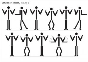
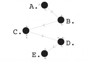
The first dance, yellow part, was way more easy to sketch out that the other one, the pink part had a lot of movement and positions switches really quickly, so I tried to make it as visible as possible.

While learning the Triadisches Ballett, I started researching classical ballet, so I also started to learn the five positions of classical ballet. I wanted to see if I could apply these five positions when learning the Triadisches Ballett.

Learning the movements and positions of my body progressed more and more, until the moment that I started to dance along with the original. I was very slow and took quite a long time to keep up with the rhythm. With the yellow part that went well quickly, even though my leg and arm coordination is not too good. The pink part lasted much longer, the combination of positions very quickly after each other and the twist with the leg going back and forth has been a long struggle and that includes most of the exercise.

While learning both the Triadisches Ballet, the classical positions and continuing to watch the ballet, I reached a conclusion. I have noticed that Schlemmer’s ballet has certainly included some positions of the classical ballet in his dance, not so much in the two that I have learned. In the very first dance section of yellow and pink, the woman dances with the pointe technique and combines it with the arm positions of all positions of classical ballet.

I have also noticed that throughout the Triadisches Ballet use is made of the ‘turnout’, not the feet entirely from the side, a milder version of the classic turnout. The ballet takes elements of classical ballet and applies these, but in addition to that Schlemmer does create many more elements in this dance that do deviate from the classical. For example, there are the more angular movements and the way of walking or running, which I would not call classical. They are a good reflection of the Bauhaus in ballet. The ballet takes classic elements and applies them,  yet there are more non-classical movements and positions than classical, hence my conclusion.

A Spectacular Manifesto


Tuesday, April 23, 2019

The ultimate goal of all art is the spectacle! The ancient drama was once the main purpose of the visual arts, and it was institutionalized as an indispensable part of life. Today, it exists in complacent isolation, from which it can only be salvaged by the purposeful and cooperative endeavors of all artists. Architects, painters and sculptors, designers, writers and potters must learn a new way of seeing and understanding the composite character of the theater, both as a totality and in terms of its parts. Their work will then re-imbue itself with the spirit of the spectacle, which it lost being caged in a white cube.

The art schools of old were incapable of producing this unity—and how could they, for art may not be taught. They must return to the performative, to the spectacle, the theater. They must get back up on the stage. This world of mere conceptual products must at long last become a world of performers. When a young person who senses within them-self a love for creative endeavor begins their career, the context of the theater will give them unrestrained freedom to achieve excellence in their practice of art, as well on stage as behind the scenes.

Architects, sculptors, painters, photographers, weavers and dressmakers—we all must return to the collective spectacle! For there is no such thing as “art by profession”. There is no essential difference between an artist and an actor. The artist is an exalted performer. Merciful heaven, in rare moments of illumination beyond man’s will, may allow art to blossom from the work of his hand, but the foundations of proficiency are indispensable to every artist. This is the original source of creative design.
So let us therefore create a new ensemble of actors, free of the divisive class pretensions that endeavored to raise a prideful barrier between actors and artists! Let us strive for, conceive and create the new theater of the future that will unite every discipline, architecture and sculpture and painting, video and glassblowing and jewellery which will one day rise heavenwards from the million hands of artists as a clear symbol of a new spectacle to come.

If you know your Bauhaus well, you may recognize this text as it is a rewritten version of the Bauhaus Manifesto. When Walter Gropius wrote the original manifesto back in April 1919 he wanted to unify ”architects, painters and sculptors” by going back to the crafts and combine it with fine arts. When I’m rewriting it now, to the month exactly 100 years later, I’m also aiming to unify not only architects, painters and sculptors, but all artistic disciplines, through a revival of, and return to, the performative arts within the Gerrit Rietveld Academie.

We are always told to get out of our comfort zone, to aim for the impossible, the fantastic, to let us be carried away and explore our dreams. Where else better to do all that than in the context of the theater? It has room for, and it needs, everybody’s interests and practices! Apart from performers it needs just as many writers, sculptors, painters, musicians, designers, costume makers – you name it. Furthermore, there is nothing you can’t do on stage; if you want to fly, then you fly! This limitless space of imagination and exploration is something that should be available and encouraged for everyone, performer or not. With calling it ”theater” rather than ”performative arts” we can also emphasize on this collaboration and intertwining of knowledge and different practices which is absolutely essential.

”But you can already do this, you can do (almost) all you want at the academy!” some might say, and while that sure is true, the space and importance given to performative arts in this school is very limited compared to it’s precursor. Yes, there is a small group of teachers and students engaged with it within the academy (basically restricted to the Fine arts and VAV departments), and yes there used to be a theater department back in the days. But why isn’t it a natural part of the education for all of us, and not only for students in a certain department?

Reading Human – space – machine: stage experiments at the Bauhaus by Torsten Blume and Christian Hiller (Spector, Leipzig, 2014) it becomes clear that movement classes of different sorts were an important part of the Bauhaus’ Vorlehre – the equivalent of the Rietveld’s Basisjaar. During Johannes Itten’s years the focus was a “therapeutically motivated balance of body and soul” while later on, under Lászlo Moholy-Nagy’s and Josef Albers’ board, the physical exercise became more “businesslike and functional”. No matter the purpose, in both of the above mentioned cases the physical movement of the body was natural elements of the teaching that we are now missing but that could easily be brought back to life in the form of performative arts.

I say:

Let’s have theater class once a week in Basic Year!

Let’s build a proper stage with opportunities to experiment with light, sound, scenography and spatial design!

Let’s all and everyone, from our different practices and fields of interests, unite and collaborate in this machinery that is the Theater!

In the spirit of Oskar Schlemmer, I wish for us a rich and alive theater as the most central and unifying element of the Gerrit Rietveld Academie.

Let’s make a spectacle!

Abeceda NOW


Monday, May 21, 2018


ABECEDA 1926


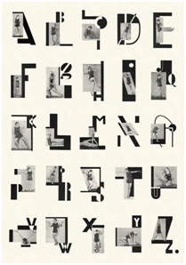
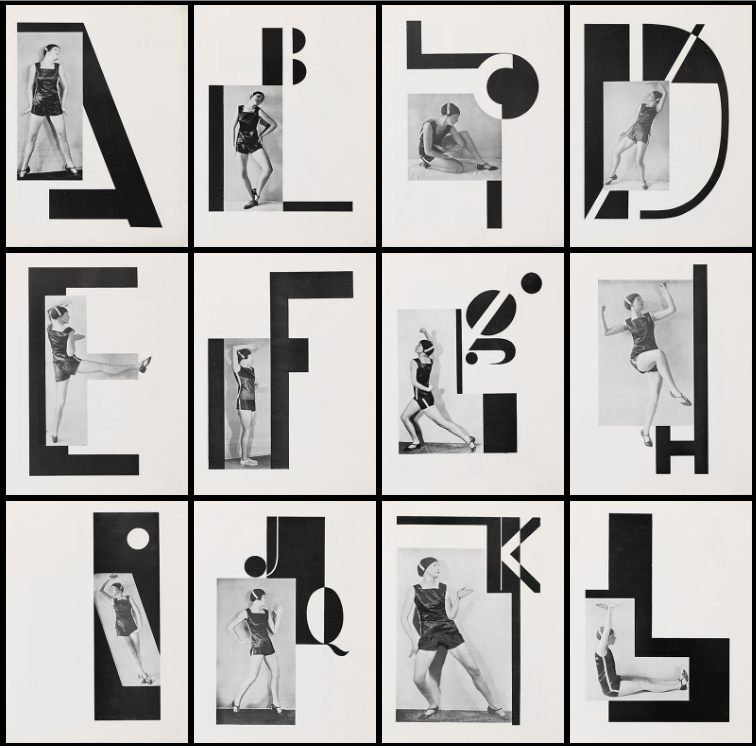
 In 1926, the Czech dancer Milca Mayerova choreographed the alphabet as a photo-ballet.

Each move in the dance is made to the visual counterpoint of Karel Teige’s typographic music.

Teige was a constructivist and a surrealist, a poet, collagist, photographer, typographer and architectural theorist, and his 1926 photomontage designs for the alphabet are a uniquely elegant and witty invention, and one of the enduring masterpieces of Czech modernism.


Abeceda


In the graphic design world, movement refers to the path of a viewer’s eyes as he or she looks at your work. Since movement can add such a large sense of unity in design, it plays a significant role in the ceration process. By tying the different elements of a design together in a specific way, you can control the movement of your viewer’s eyes throughout the medium. As a different media, body does the same thing in ABECEDA 1926 photo-ballet. There is the different movement which is more analog, natural and already exist but still a path of a viewer’s eyes as he or she looks at the work, using the body and an action as a method of design. Despite the fact that the terms action and surface are disconnected even opposite things.


Letters get created

by movements > Movements who

literally give the sound exhaling.

abc

In our case of the Abeced Alphabet an example

with the first letter of the alphabet, the letter ‘A’.

The body language of reaching towards the sky asking an ‘A’. 

But expressing ‘Aas confidence standing tall, putting your hands in your wrist, chin up.

So one single letter can have a wider scala of meaning.

A aa

A letter without  a sound of the voice, a movement of the hand can be like an incomplete inform. Just an ”A” on a paper.


Body language which is connected to words is a missing factor in language these days. Digitization is transforming things into less natural outcomes. Which is interesting is relating those two opposite sides; the digitized, formulized and made as a stabilized, structured letters out of the natural, smooth, changing, body movement. Even we can find some elements from both sides in all the sides, still the texting, mailing and internet talk has no presence of body and sound which is ironic because we generally attend to imitate the existing features that we know, take them as a starting point or repeat them.


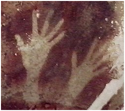
We can see the first examples of this attend in the ”Cave Paintings”. Cave paintings are also known as “parietal art”. They are painted drawings on cave walls or ceilings, mainly of prehistoric origin, dated to some 40,000 years ago (around 38,000 BCE) in Eurasia. The exact purpose of the Paleolithic cave paintings is not known. Evidence suggests that they were not merely decorations of living areas since the caves in which they have been found do not have signs of ongoing habitation. They are also often located in areas of caves that are not easily accessible. The paintings are remarkably similar around the world, with animals being common subjects that give the most impressive images. Humans mainly appear as images of hands, mostly hand stencils made by blowing pigment on a hand held to the wall.

Some theories hold that cave paintings may have been a way of communicating with others.


33132479_2159603404055339_7157237393018322944_n


The body and other elements are using for communication in a way with ”movement/action of the body and also in a way with ”captured frames such as; paintings, photographs, and even typography as visuals. So we can really understand the idea of connecting body language with the captured, reflected typography together.


designtheory5


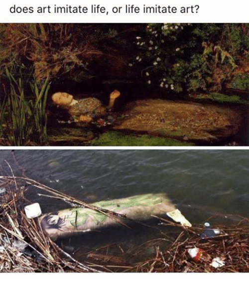
According to that point and various examples, we can tell that art may imitate life. The movement, the performance reflected and created an alphabet. But could it possibly be possible to create an alphabet without any reflections from life?


Thoughts on Lucy + Jorge Orta


Friday, November 21, 2014

image_107_image1

Nexus Architecture

3020760-inline-i-1-human-centipede-ad-agency-part-2

The Human Centipede (2)


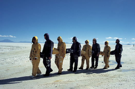
At the Boijmans Van Beuningen’s The Future of Fashion is Now (Fashion, Activism, Community and Politics), Lucy + Jorge Orta showed their work Nexus Architecture x 25 – Nexus Type Opera.tion. In Nexus Architecture (2001) they zip together the clothes of a group of volunteers. The idea is to depict the loss of individuality in a cluster of social relationships. We are all connected; “Each individual keeps an eye on, and protects, the other. One individual’s life depends on the life of the other. The warmth of one gives warmth to the other. The physical link weaves a social link.” I refer Nexus Architecture to the horror film The Human Centipede by Tom Six. ‘’A mad scientist kidnaps and mutilates a group of people in order to reassemble them into a human centipede, created by stitching their mouths to each others’ rectums.’’ The victims basically have to wear each other to survive, of course an extreme version of “Each individual keeps an eye on, and protects, the other. One individual’s life depends on the life of the other. The warmth of one gives warmth to the other. The physical link weaves a social link’’.


Screen Shot 2014-12-08 at 20.43.57Screen Shot 2014-12-08 at 20.46.44Screen Shot 2014-12-08 at 20.44.17Screen Shot 2014-12-08 at 20.44.30


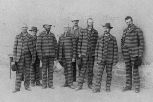
Nexus (which means link or tie) Architecture is a symbolic work which I find to be a shame as there are examples of functioning clothes which actually do realize bond and equality, for example school uniforms. I wore a school uniform as a child and my experience was that wearing a uniform built team spirit and unified. Also prevented the pressure of having to have status symbols such as branded clothes and thereby made the economical differences less visible in school. However I did feel a lack of freedom to express myself. Other areas where uniforms are used is for example in the military, prison, finance and sports. The idea is that if you are wearing the same uniform you are friends and you help each other. But even if we wear the same fabric and colors we are not always friends and we do not always help each other. To tell how the world works Orta metaphorically connected the uniforms physically (what happens to me will happen to you) which automatically also becomes literal. The work is executed in a bold and direct way which I do admire. The doubts I have about the work not being applied to people in a direct (functioning) way may depend on the way it is presented…


At Boijmans Van Beuningen’s Nexus Architecture was presented as an installation. But during performances, Orta gives the participants commands, setting the whole group in motion, ‘’emphasizing the loss of humanity within the collective’’. Depending on the participants engagement in following the task it can either be or not be a working organism. I believe that Orta is not making a political statement but rather questioning the political ideology of today and the future. Maybe the importance of both communism and capitalism, the group and the individual.


In general I was fascinated by the room of Activism, Community and Politics in the The Future of Fashion is Now exhibition because I respect artists like Orta who try to break down and deal with these large and relevant questions. I have to make 10 designs on the subject Ebola for design class which is a subject far from my control, and to me it is a motivation to see how Orta can manage similar matters. Orta has an optimistic approach in both content and aesthetic. But I can not help but question if the work of Orta maybe is too playful? I feel slightly split about the fact that world issues are ”anesthetized” when artists take them on. As the beauty overshadows the message but at the same time maybe this is necessary when wanting to communicate to the western world. It is a paradox. In any case I think that it is couregous to deal with such serious matters. Later on one can argue if a work is successful or not, if the artist does harm or good. I may be cynical but it is hard for me to understand the motive of why Orta has cared for the complex of global problems such as the ecological environment/global warming, sexism, refuge and immigration policy, the hostility towards the Romani people, the biomedical ethics of organ donation and homelessness as these subjects differ so much from each other. But then again it is arguable that a team of two artists do not share the same mind and therefore bring different issues to the table. Anyway Orta has surely succeeded in raising some of  the spectators awareness or opinion as I have just written a text about this.

ON MATERIALIZING EXPERIENCE


Tuesday, April 1, 2014


Pierre Niviere and Lisa van der Breggen* talking together on the subject of materializing experience

'Think Inside My Box' movie


Each project that students initiate, makes them into temporary experts on given topics. Art & Design schools then become knowledge hubs where different expertise cross fertilize. By looking at what types of research students engage in, Designresearch and UnBornLab organized a 'workshop' to investigate design matters from a students' perspective.

Through a series of short video's students from both the Foundation Year and the DesignLab department share ideas, focusing on the temporary expertise gained as part of their projects, rather than the outcome. The workshop was articulated around one of their given assignments. Students were asked to develop a specific object or context to help focus or explain content.

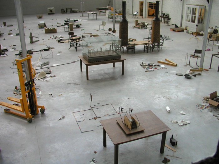
The format is clear: two persons, discussions, filmed from above.
the space is : two stools and a table.

* Foundation Year


An other approach to design


Tuesday, October 30, 2012

Jürg Lehni is an independent designer, developer and artist, who got well known for his diploma project, to graduate ÉCAL in 2002, called „Hektor“.

Typical for his work is the different approach to tools, computers and technology in relation to now-a-days common design. In the last few years, all of his Projects relied on those facts. Often he collaborates with other Artists of different fields. I want to concentrate on a few projects, which really impressed me and provide you a small insight into Jürg Lehnis Work.

Hektor 2002

Jürg Lehni & Uli Franke
(Rita and Viktor)
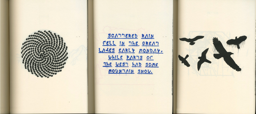
Hektor is a portable spray paint output device for Laptops, that could be compared to a common printer. The principle is quite simple. Hektor consists of two light and fragile motors, toothed belts and a normal spray can holder. The can is moved along drawing paths just like common hand drawings or old Plotters. The software to create the drawing paths is called Scriptographer, which was also developed by Jürg Lehni. It is a scripting plug-in for Adobe Illustrator.

Similar to Hektor are Rita and Viktor. Both of them are as well mechanical drawing devices, guided by Scriptographer drawing paths. But Viktor is working with chalk and Rita with markers.

Hektor consists of design, high-tech programming and low tech tools. In a time were nearly everything can be perfectly done with computer programs, often even too perfect, Hektor is going back to an analogue way with a digital starting point.

Its a call to all the designers and artists to innovate new styles and ways of working and thinking. It’s a call against the now-a-days aesthetics which are predicted by computer programs and are therefore often too predictable. It is a call to the designers to not just work with common methods but experiment and by doing so innovate, achieve a wider variation and implement new methods for the everyday work.

Because of the above mentioned reasons Scriptographer and Hektor are free to use for other Artists, so that they can experiment with it as well.

With this thought I see a relation to the principal of Sol Lewitts wall drawings. Sol Lewitt states that people can carry out his wall drawings following his instructions leaving it his work of art, as long as they don’t change it on purpose. While Sol Lewitt provides the concept Leni provides the medium.

Hektor is an interaction between the user and the technology with a creative input made by a technical medium.


Emptywords 2005

Jürg Lehni & Jonathan Hares

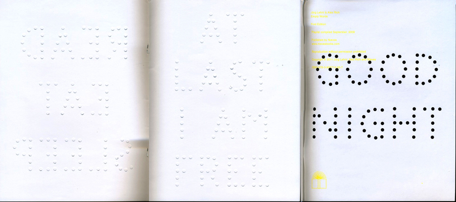
Emptywords consists of a plotter which punches holes into paper guided by an interface software. The holes are creating a font with which you can write short expressions. This tool is a medium to express short messages by the artists or the spectator.

Just like Hektor Emptywords also plays and experiments with the unpredicted and oppositional aesthetics to common design.  It is playing with the nothing, in form of the holes, which are creating the font. The font is displaying ironic sentences, which adds to this work a playful, light and alternating meaning as well.


News 2009

Jürg Lehni & Alex Rich

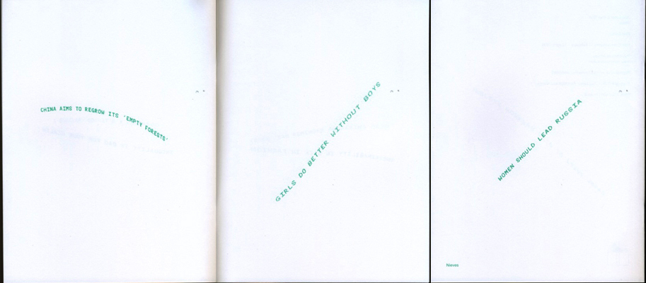
News was developed while thinking of what to do with the speed i-jet printer developed by Reiner.  This mobile pen printer is able to save 30 signs, and print them by sliding the pen over a sheet of paper. Newspaper headlines  were programmed into the pen so that the spectators were able to print those ambivalent headlines per-programmed by the artists.

News shows some similaritys to the other two works too. You can see the same ironic playful thoughts behind the work. Its about doing something unexpected with simple things.


Paper.js

Jürg Lehni & Jonathan Puckey
This is the last project I want to tell you about. But i’m not going to write about it, as I want you to explore it for yourself by clicking on the title.


For me it was really hard to find a way into Lehnis work because I never really was obsessed with computer/programming art and I don’t have the knowledge to understand it that easily . When I was reading stuff about Lehni it really fascinated me, even though I had to read it a few times in a row to understand it.

It was my first “getting in touch” with that technical or programmed way of art. Now, after having had this research in the back of my head for a few weeks, I have another attitude to this theme. I think it is really interesting to cope with those digital themes in our time. Especially because I have the feeling that my generation is the last generation that can still remember how it was without cellphones, hyper fast internet and all the other inventions which have had huge impact on our society and our development.


Lehnis is playing with this theme with a charming lightness that attracts, but also animates to think. I enjoyed exploring his world and he invited me to this contemporary theme, so that I am now looking forward to see more of his work or other artists who are coping with similar themes. This Research inspired me aswell to cope more with the theme of Programming, I want to learn now how to edit things with the html code and java script, and if I am succesful with this you could perhaps see soon a headline banner for this research that I edited myself with those from Lehni provided Tools.

“Prenez soin de vous”


Monday, March 15, 2010

For the first time in fifteen years an overview exhibition on the work of the French artist Sophie Calle is organize in The Netherlands. Central work in this exhibit is “Prenez soin de vous” (Take care of yourself), in which Calle invites 107 women from a ballerina to a lawyer to use their professional skills to interpret an email in which her partner breaks up with her.

Sophie Calle is part of the April 1st BasicYear Design Trip
look for more on Sophie Calle
newspaper article NRC  9/5/2008 (dutch) pdf

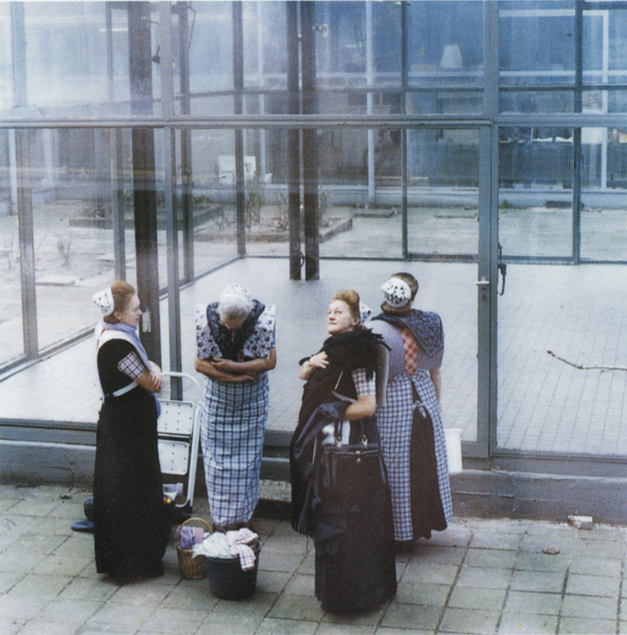
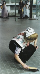
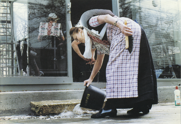
the cleaning of the Rietveld pavilion


Monday, November 16, 2009

At March 16th 1992, Cornelia, Jane, Greetje, en Weimpje Koelewijn Vermeer cleaned the pavilion of the Gerrit Rietveld Academie.

the soberness and functionality of Rietveld

the neatness and the costume of the women from Spakenburg

respect

space – light – color.

a women that cleans will not lose her morality.

Job Koelewijn, Winner of the Dr A.H. Heineken Prize for Art (2006) talks.
photo’s by Erik van de Boom, reprinted from Rietveld Publication no 76

Imaginary Museum


Monday, November 16, 2009

Amsterdam based Visual artist and archivist Tjebbe van Tijen (1944) works since 1988 under the name Imaginary Museum Projects consisting of regular lectures, performances and publications on subjects like social memory, psycho-geography, media history, mapping of human violence and visual language. Especially interesting in this project are the “Museums in our Minds Scrolls” that he is making. To view the strips of images, he build a special wooden viewing device with handles that one had to turn to scroll through the strips, a manual scroll-bar really.
link to the Imaginary Museum Homepage, or read the interview that Geert Lovink had with him in 2004
In his celebrated book “Le Musée Imaginaire”, Andre Malraux (1901) developped the idea that the world of reproductions forms a “museum without walls a museum in your head. A virtual museum read more:


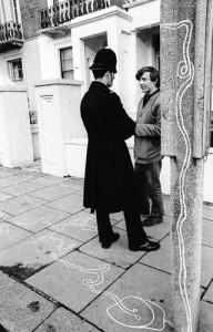
Continuous Drawing by Tjebbe van Tijen. Photographs with permission of Pieter Boersma. Coll. H. Groenendijk

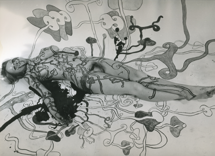
One of Tjebbe van Tijen first “actions” was “the continuous drawing” organized by him and students of the London ‘Sigma Centre’ in 1967. The “continuous drawing” came out of a Londen sewer and travelled to The Netherlands. Two parallel lines, continuously branching and looping creating organic forms. True streets, onto cabs,in the airplane and thrue Schiphol Airport, over the streets, into the Stedelijkmuseum where it continuous on the stairs, to the terras, covering visitors and statues until it ends as a projection in a smoke filled dome, as if desolving in smoke. This project was initiated by the City of Amsterdam Municipality, Tourist Promotion and various Art Foundations in A’dam and R’dam. Other participants were a.o. Willem Breuker (musician), Theo Botschuijver (industrial designer), Graham Stevens (architect), Pieter Boersma (photographer). His took the initiative for a documentation center on art, technology and society at the Sigma Center and Stedelijk Museum (1967-1969) and was later founder and curator of the Documentation Center of Modern Social Movements at the University Library and International Institute for Social History in Amsterdam

sources: “Actie, werkelijkheid en fictie in de kunst van de jaren ’60 in Nederland” (Action, Reality and Fiction in the art of the sixties)©’79, Mediametic, Gandalf #19 ©’79. imaginary Museum

reading the library


Monday, November 9, 2009

“reading the library” is a project by tristan schmitz & namik schwarz. the aim was to “index the library” by arbitrarily reading out authors and book titles in a library corridor. the reader uses the architectural circumstances to walk through the bookshelves. each author or title leaves a hint about the literary genre and subject. “brahms” or “mozart” are connected with music, so the library must include media about music in the broadest sense.

Get the Flash Player to see this content.

we developped project at the ArtEZ Arnhem this year with paul gangloff.
if you want to see the whole final result of that project go here

if you are interested in the subject, her are some more links 1 2 3 4

blossoming garment


Thursday, October 15, 2009

The Dutch duo fashion designers Niels Klavers and Astrid van Engelen, founders of Klavers van Engelen, have been known for transforming really abstract and conceptual ideas or inspirations into practical, perfectly wearable and at the same time glamorous garments on the runway. What most of the people do not know of, however, is that their side projects in collaboration with different artists or museums are also as inspiring and pleasant to simply just watch, if not more exciting.

When being asked to participate in an exhibition, K.v.E always transformed their runway clothes into a bigger installation involving movement, which in a way emphasizes the relationship between the audience and clothes and also between the clothes and (their) existing environment as Niels Klavers mentions in one of his interviews with DazedDigital.com

“…we want people to actively interact with our garments while looking at them. We want people to be able to see every part of the clothes and grasp the idea or the concept we had in mind in the atmosphere that surrounds the exhibited designs.”  -Niels Klavers

This research therefore tries to explore the even more experimental aspects of K.v.E’s work in terms of how fashion can be bended and mixed with other media and ways of communication and representation (i.e. the performance “Show Me Your Second Face.”)

Klaver_van_Engelen

slowLinking: tagging slow design part 3


Monday, May 4, 2009

Welcome to part 3 of : tagging slow design. This is a worksheet on which all the link-topics and post-it tags collected on the “slowWall” are listed in relation to the research subjects as components of the ‘slow design project’. (researches can be downloaded as .pdf’s).

link topics.

Performance links the Morgan O’Hara research to the one on Julia Mandle. The Julia Mandle research links to the one on Richard Long on the topic street /nature & art, by slow movement to the Kunsthalle Bern exhibit and by sensibility & violence to the Psychogeography research. Psychogeography has the link topic urban life with the Karmen Franinovic research, consumption /destruction /life style with Futurisme, against and pro community with Wim Wenders, evolution of everyday life to Downshifting, and a anonimous link to Maria Blaisse. This anonimous link is not the only one linking Marie Blaisse. Link topics like art and left over, connect this research to Uta Barth. Karmen Franinovic links to Christian Nold by means of the topic mapping, and to Psychogeography by urban life, to Futurisme by life is getting faster & people are getting a social, to Julia Mandle by just stop & think and to Richard Long by the link a way to see. Richard Long links to many other researches: to Sophie Calle by self related art, to Christian Nold through a line made by walking, to Karmen Franinovic linked by the topic a way to see, to Downshifting by choosing slowness. Downshifting links back to Julia Mendle by the link topic us and them, to Psychogeography by revolution of everyday life, to Futurisme tagging the link with designed lifestyle, to Marie Blaisse by us and them, and to the Kunsthalle Bern exhibit by reflect /a closer look. The research on Futurism has some remaining links to Julia Mandle through the topic exploring / explosive / sculptural. Following links from Wim Wenders to Uta Barth is made possible by the topic notice the small things in life, to Christian Nold by moving /memories. Mapping links Christian Nold to the Ambient/Brain Eno research while that last one makes a link back to the Kunsthalle “The Half and the Whole” exhibit creating a take time to cook link.

Reading all the researches the links will surely start to make sense, as will their variety shed light on the specific nature of many of them. Some research subject however did not create any link at all, like in the case of Maison Martin Margiela. And it was 0nly after some discusion that the performance link was created between Sophie Calle and Karmen Franinovic. Uta Barth was anonimously linked to Richard Long which might have been an intuitively act

Post-it tags.

No links did not mean no tags. Time, Maison Martin Margiela for example was closely read and tagged with post-it. This created tags like memories, replica, time(less), can’t relate to it, time, physical picture of memory and the photographical tag to a picture by Mark Manders. Wim Wenders (present in our research list because of his beautifull documentary “Notebook on Cities & Clothes” about fashion designer Yohji Yamamoto) generated also many tags like sublime, I finally found time, hillbilly, surreal, the truth, place, moving. Sophie Calle tagged by the moderator with authorship, generated: life=art, stories, documenting life. Uta Barth looking was tagged: rainy day with half closed eyes, in between places, no left over, sunday. Ambient the research connected to Brian Eno tagged as big here long now was retagged as live the moment, loosing yourself, don’t think, sound. Christian Nold place-ness got tagged with keywords like biomapping, google earth, links, remapping memories. Linked to many, tagged by few. Julian Mandle pause, was tagged with pause from urban flow only. Morgan O’Hara gestures was tagged with trans, transforming, concert-art, transmission, energy of moments, reaction. Maria Blaisse architecture by border between self and not self. Futurism with fast life, life style, save time? Downshifting was tagged with life style too and change assumption. Richard Long tagged as a subject with landscape was enriched with the two tags: exploring fast and slow and perception of space, time and personal potency. Psychogeography with destruction of community, philosophy, socialism, anarchisme and urban live. Finally Karmen Franinovic subtraction, served as a hub for the tags: observe, spontaneous landscape, discover a realy nice place that never be online, easy fast, MTV generation, reflect, and observe. Some researches like Conditional Design re-mapping did not make “the slowWall” and were concequently not linked

added tags from the slow design lecture.

scale, gestures, measurements, relations, sustainability, evolving, creative activism, reveal, expanding awareness, reflect, engage, participal, deceleration, fresh connections, rhythm, probing, (im)materiality, metabolism, reflective consumption, live span, memories, community, record, tracing, (human) body, break (take a break), nothingness, inclusive, transparent, re-mapping, connection to scale

read also: >tagging slowdesign part 1


Log in
subscribe