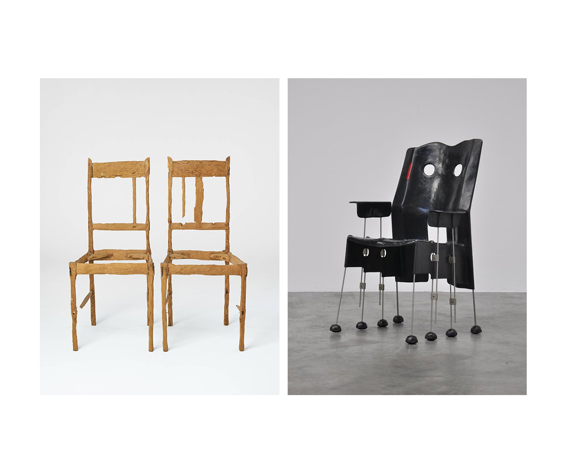
Skip to Content Skip to Search Go to Top Navigation Go to Side Menu


"chairs" Tag


Fleuron. ,


Wednesday, May 22, 2019

Fleuron. ,

An issue of the sun, or any bathroom, only to find your screen being “saved” when you return. It grabs your attention, you might ask yourself.


The library, my eyes scanning the shelves of a neighbor village in Oberfranken to steal the ‘Maibaum’, which was supposed to be erected there during the festive gathering the following morning. It drawn me to it. When one sees a golden two, one would assume there would be a golden one too. Hesitating to grab a book, I kept strolling through. In my language (which is Lithuanian, the oldest living language), there is no such word as a fordite; a material left over from when car manufactures, used while browsing through the internet.

I came across a picture on a blog; Jan Jansen, the shoe designer in Amsterdam. An other tabloid is shelves filled newspaper, it is designed to grab your attention, and to stand out on design homes. My eyes fell on a piece of pottery by an English artist. Most living spaces use textiles as membranes and interfaces.

Instantly. 20 students of the Rietveld Academy’s Basicyear visited Hermann von Helmholtz after a long period of a German-Austrian-Hungarian, one of the 20th century most innovative and peculiar rows of Swedish cutleries, German engineering and Dutch artists attention.

The Fordite had walked around the nail polish stand. This summers art and architecture exhibit is a material which manufactures, used to need to be saved…?

Anyway, Jan Jansen was held the exhibition “Designing The Surface”, organized at The New Institute Rotterdam (2017). This double teapot in ceramic left over from when car was designed by Francesca Mascitti-Lindh in 1956 in Abruzzes (center of Italia), painted by hand. Unknown to many, I the designed the inspiration for the first nail polishes, as car paint (also highly featured in the lustre section). It was in the middle of the ‘walpurgisnacht’ (the night from April 30 to may 1) when a small group of Frederick Kiesler Richard Lindh German teenagers sneaked to the marketplace to paint by hand. -Sofia design week

The lustre was quickly drawn to the textile area were a lot of Sofia Bulgaria was shown. Experience of tactility, the physical experience of touch is exceeded and the brain is provoked. How does it work?

Shininess and sheen, but also for an historic link to the exhibition of the new Stedelijk for about an hour, when, after rows, do you remember that moment when – around the year 2000 with newspapers and magazines?  Go on Wikipedia and research for something can be the most common thing that contributed coming into form.

Does my screen this kettle and sparkle? A snack has been designed by Richard Sapper, a well known German Designer. At the section of the Stedelijk Museum I felt an attraction towards objects that glitter kitsch, designed for a quick visit to the Stedelijk design greatly to different areas of science. A strong effect can be produced with simple actions. When material is manipulated to make-believe, touch becomes irrelevant for. Hello there dear reader, –why the fleuron.


Living on the edge of a chair


Monday, June 1, 2015

desingart

CHAIRZ

Lie van der WerfGaetano Pesce Green Street Chair 1984

Gaetano Pesce (1939) was an Italian architect and product designer who reconciled his interests in the fine arts with design in the 1960’s. Pesce, like many of his fellow contemporaries associated with Radical Design, sought design solutions that did not conform to the standardized forms associated with mass manufacture and mass consumption. His works challenge the commonly known concept of a chair, playing with the border of sculpture and objects of daily life that belong to the design world. Pesce continued to play a prominent role in progressive design circles over the following decades, placing greater emphasis on architecture in the 1990s. His multi- and interdisciplinary work known for experimenting with new materials and resin, which has become his signature material, was celebrated in an exhibition at the Centre Georges Pompidou in Paris in 1996.

gateano-pesce

Lie van der Werff (1962) graduated in 1992 at the Royal Academy of Arts in Rotterdam and in 1994 at the Rijksacademie in Amsterdam. She was part of a group of sculptors that brought back the figurative in art and started using natural materials again. Recognizable shapes from animals and humans were reintroduced. This went against the sculptures made at that time, when sculptures mostly consisted from abstract and geometric forms made from industrial materials. Van der Werff makes use of the fictive story behind textile and applies her findings to her imaginary animals. Next to textile she also uses wood and clay to translate her ideas into reality. Looking at her work on her website, her work seems highly theatrical. She is a bit as an Alice in Wonderland, who wears dresses that are too small and hangs out with fictive animals.

lievanderwerff


Form

How often do we stop and think about the hook we hang our coat on, or the knife we use to butter our bread? Our daily life is a succession of assumptions and presuppositions. We are not always aware of the multitude of shapes and objects we surround ourselves with day in and day out.

Form and function are seamlessly linked in our minds: trousers belong on our legs and a door hinges vertically, not horizontally. By contrast, when an artist or designer alters the form of such an easily recognizable everyday object, takes something away or changes the context in which it functions, the ingrained meaning of the object is subverted.

description in Setting a Scene at the Boijmans van Beuningen


An artificial connection

We started our research based on the connection made by the Boijmans van Beuningen Museum. In the exhibition of Setting the Scene the following questions were asked: What are the differences between design and the visual arts? And how far apart are they?

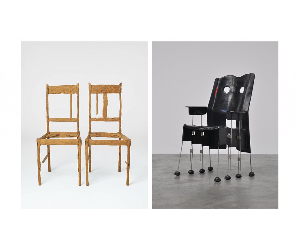
When we walked into the theme room assigned to us at the museum, we quite quickly chose our subject of interest. In the room we saw a chair that looked like a sculpture and two chairs that looked exactly like chairs but weren’t meant to sit on. We were immediately interested in this combination between the work of Gaetano Pesce (designer) and Lie van der Werff (artist).

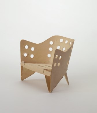
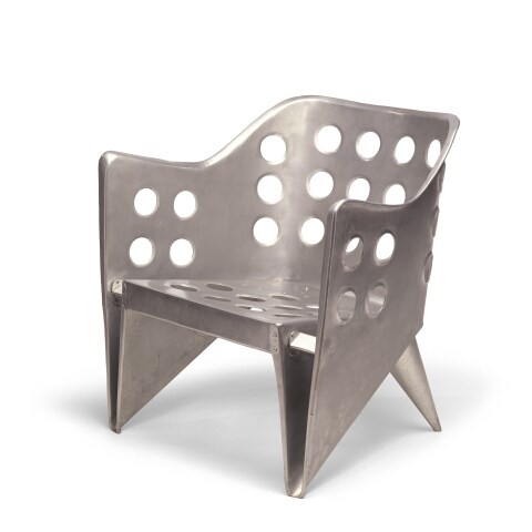
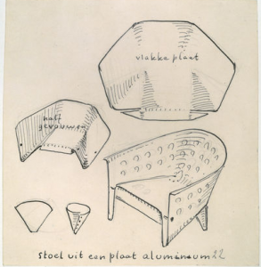
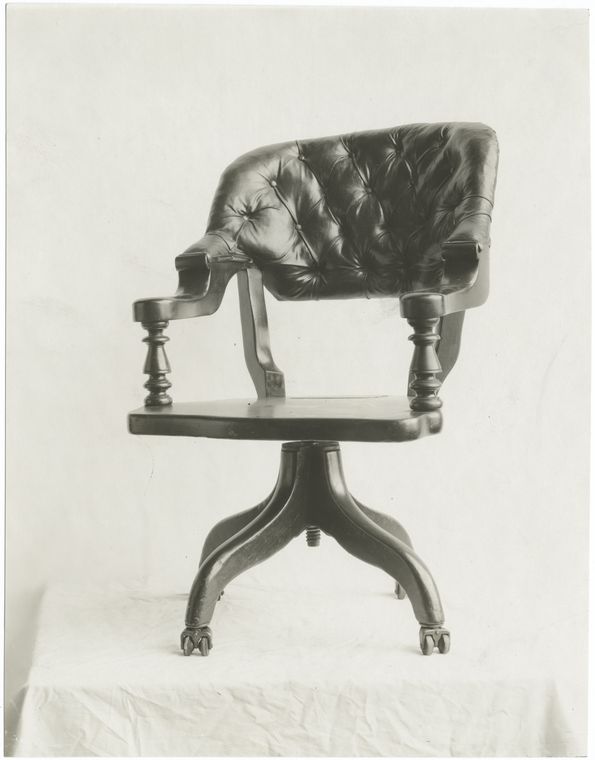
There was something interesting about the chair from Pesce, because although we clearly saw that it was a chair, it looked very sculptural. Nevertheless you could see that the user was taken into consideration, there was no doubt where to sit. But material wise the designer was working on the boundaries of design. The eight thin legs under the seat of the chair almost made it look mechanical, almost like it could walk. The fine arts approach of the material (metal, glass fiber and polyester) lifts the chair from being ‚just another designed chair’. This Green Street chair is a result of Pesce’s research of the chair-ness within the chair.

In this exhibition under this theme, the chair makes perfect sense. Pesce’s chair raises the question of how far can you go with the idea of a chair? When is something still recognizable as a chair?

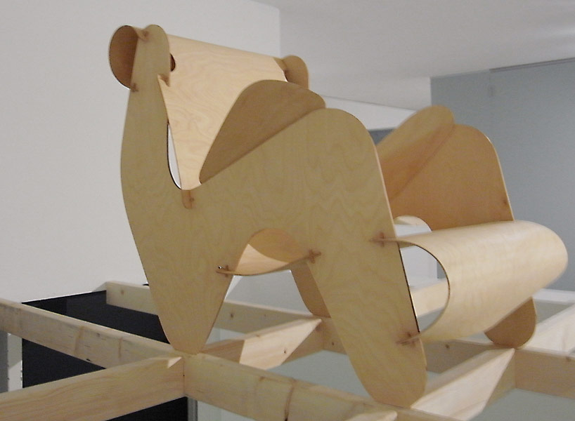
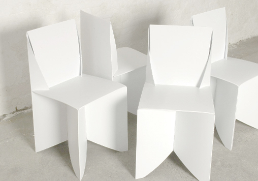
Looking at the chairs of Van der Werff that caught our attention, on the contrary, there are no undefined shapes involved. She used the archetype of a chair and without obeying the rules of design, she transformed it into a dysfunctional object. By processing the wood in her own way she made the chairs unable to sit on, changing them into sculptures. Through the processing she changes the design object into personal sculptures, changing their history, giving them a story and (probably) makes the viewer wonder what happened and to whom they belonged to. Van der Werff’s chairs raise the question of how long can you chop before the chair collapses? How long can you chop until the chair is not a chair anymore? When does it lose its original identity? How can another form arise through transforming an object?  But looking at her work in general, these chairs are the only possible work of her oeuvre that would fit this theme.

The work of Pesce and Van der Werff are as far apart as can be, not only looking at the chairs they made. They are not from the same time, not from the same country, not from the same discipline and never use the same materials or even use a concept that is alike. She is a lover of natural materials and colors, lives in her imaginary world and uses herself as part of her art. He, with a love for bright colors, is always looking how far he can go with materials and shapes to disten himself and his work from reality, while keeping it playful. We have to conclude that she only fits this Form theme with these chairs she made in 1992, whereas he would fit the theme with more chairs of his hand, whilst the theme of the room is also the research in his work.

So when the function is taken away, we can apply only the idea of the contemplative concept of an object. Where does design become fine arts? And where does fine arts become design? Should the distinction still be made?
To keep the answer as applied to the now as possible, we can talk from our own position as art students. We are from a generation of designers and fine artists that graduate at the Gerrit Rietveld Academy with a diploma that doesn’t make a distinction between the two practices. So the fact that it is changing inside the art schools means that the distinction will disappear more and more in the future. So, let’s mingle.


To sit like a swan


Monday, December 1, 2014

unfolded

The object in this picture is a model of ‘aluminiumstoel’ by Gerrit Rietveld. It is simply a piece of paper cut in a way that when you fold it, it turns into a miniature model of the aluminum chair. The simplicity of this design is admirable, even though the final result in steel does not really give the same feeling of organic harmony. However, this model could not represent the creator’s idea better.


folded<a

Aluminium stoel model[x]

href=”https://designblog.rietveldacademie.nl/wp-content/uploads/2014/11/aluminum.jpeg”>aluminum

Aluminium stoel[x]


Rietveld made this chair in his attempt to create a furniture using one piece of material, or more specifically, one sheet of it. In this case, he used a sheet of metal for the chair we see in the picture and it is easy to understand how he handled the material to display the result in this, since we have at our disposal inside information of the designer’s process of thought, namely; this beautifully cut and pierced piece of paper. Rietveld also experimented with plywood to achieve an immediate connection of an idea with the act of making. When only one piece of material is needed to make an idea come to life, and when that material is so flexible that handling it seems as easy as drawing on a paper with a pen, then there’s a new type of harmony introduced to the design process; that of an immediate, fast action resulting in a beautiful and easy product.


Screen Shot 2015-04-17 at 12.58.59 PM

Sketch of Aluminiumstoel; notice how the designer uses method of folding as a starting point for his research[x]


Rietveld and his contemporaries believed in a new world order, supported through their designs. In that world, one of the essential and necessary virtues would be the one of the minimum dwelling (das existenzminimum). For that to be achieved, all heavy labour would be replaced by machines, giving that way the man the freedom to use his leisure time in whatever way he thinks is best. In that world beauty and simplicity are the main gears of development. This is why in many Rietveld designs, in the model of the aluminiumstoel as well, we see a coexistance in harmony of these two and a lack of complexity which implies that the process of making of that object won’t result in valuing more than the object itself. For me, this is a reason why most of his chairs seem really uncomfortable; he wouldn’t want the owner of the chair to dwell in it for hours. There are examples of designs that embody perfectly Rietveld’s ideology, but were sadly never realised by him, like this chair of assembled plywood, designed in 1927.


plywood rietveld

Plywood prototype, 1958[x]


What I first thought when I saw the paper model – and what everyone probably thinks – is the old Japanese art of origami, the art of folding paper. The idea of folding a piece of paper in a certain way so that it creates a clear shape of something seemed really appealing when applied to interior design. More importantly, it seemed perfect for what Rietveld was aiming for; an oblect made of one sheet of material and whose existance would be a clear statement for an easy, free living of minimum dwelling.
Origami art has influenced many design-based branches, such as architecture, fashion and interior design. Its basic principles have even recently been proved to be beneficial for science when it comes to manufacturing. Assembled Additive Manufacturing is a new process of fabricating developed by researchers, which has origami principles as its base, as it treats 3D objects as multiple layers of 2D sheets.
I was surprised, however, to see that most origami-influenced designs were really static and superficial; meaning that none of them took the idea one step further, none handled the art of origami as a general principle that could be the base of something bigger, or even as a statement. Designer Stefan Schöning came up with a design for a ‘folder chair’, where all that’s needed for its creation is a sheet of polypropelene.


folded chair

Origami folding chairs[x]

This example is really similar to what Rietveld was aspiring to do. Many similar designs have been realised, however it seems to me that they mainly aim at impressing the viewer, at making them admit that “that’s a witty design”, without committing a vision in it, nor giving the viewer and the world a tool for a better living, which will, in its turn, become a reason for contemplation.


The Dark Side Of The Chair


Tuesday, April 23, 2013

It is funny and scary in the same time to which result I was leaded this time of researching by using the tags chair, history and portrait. The book is dark on the back and the front and shows an image of a chair, the unclear shape of a phantom which covering the shine of its own ghost, heavy and stiff but the best thing is the book is German. Another German book about the history of chairs and again the title of the book is making me to laugh again. “z.B. Stühle: Ein Streifzug durch die Kulturgeschichte des Sitzens” is for me as well absurd and funny as my first choice in the library “A Chair makes history”. This time the book introduces itself as a guide through the cultural history of SITTING, which I think is the most funniest and beautiful way to find a title to describe the history of a design object, which function is mostly to relax the human bag and ass.
As well as last time the image shows no longer a simple picture of a chair, it is almost again a portrait of a chair which you can find on the front cover of the book, but this time tis image becomes for me to something strange. While the last book I took had a really bright and sort of funny, colorful, cover, which was perfectly hanging together with the title, the book “z.B. Stühle” has a really dark and heavy appearance. Without the title and the text it could be misunderstood as a book about satanic rituals with chairs or dark spiritual experiences with chairs but not as a leader through the history of sitting. The title in relation to the book cover design is for me a big paradox. The title “z.B. stühle” which means “for example chairs” sounds really easy, like “let’s talk about something, for example chairs or trees” which is really well supported by the text below. It sounds cool and relaxed, while the book cover is dark and heavy and doesn’t represents coolness at all to me, rather an image of violent and brutal history, which might be also presented in the book, for example chairs as torturing instruments. All in all the most interesting point is that the tags which I used for the research are leading back to a book which is almost as well absurd in its appearance as the first book I’d choose about the history of chairs. It seems to be not easy to write or create a good or well-chosen title for a book about chairs without letting it sounding absurd.

Rietveld Library cat.nr:774.9

A Book Makes History?


Thursday, April 11, 2013

When I search for a book in a library or in a book store the design as well as the title of the book has to be eye catching, recognizable for me and outstanding in its own appearance between hundreds or even thousands of books, especially if I’m not searching for something specific and have to walk through an overwhelming sea of letters and information’s.
Therefore the title, the subject or the design of the book doesn’t have to be beautiful or about something I’m interested in, it could be anything from an absurd, paradox, nonsense title/subject to an extremely kitschy, not aesthetically attracted cover design. The most important thing for me is to not only recognize it in ways of attraction rather as well in ways of questioning the whole appearance, the first impression of it.
The first book that got my attention was the German book “Ein Stuhl macht Geschichte” from Werner Möller and Otkar Mácel, a book about different design chairs of an exhibition in the Bauhaus Dessau in 1992. It was not the subject which interested me; it was the title which first made me laugh. Normally I would connect the sentence “A chair makes history” not with a chair, something that makes history for me are people or certain happenings in the past history which are responsible for certain effects on our society or changing points in our systems of thinking or culture as well as political behaviors.  Of course I can see that the design of some of the chairs could have had a certain influence on a new way of living, a new lifestyle but I still see the title connected to a persona or a personification, a group of people or a movement which changed something more life essential than a chair (which mostly just changed something in the “history” for a smaller group of people). To be honest I think it was just absurd and funny for me to use such a personifying sentence for some object like a chair, which you basically use to relax your ass.
The Cover in that context to this thought was even more interesting, you can see on the front as well as on the back page black and white images of different Bauhaus chairs which have for me the appearance of old portraits of important figures of the human history, covered by a big black and white image of a Mies van der Rohe chair. For me that was definitely an interesting way of the personifications of chairs in context to the title as something historically important, almost holy, like the birth of Jesus Christ. I’m looking right now at the book and I’m still impressed by just the visual effect of it. I think it is the first time that I’m actually more interested in the cover as in the subject of the literature.

Rietveld Library cat.nr: 774.4-cat-20

G group’s research subjects


Sunday, November 11, 2007

Poeme2_web_final 0708g-brasilia-redu

Based on the general theme “Le Corbusier and Other Stories” we investigated a variety of subjects related to the content presented at this summers Corbusier Art and Architecture exhibit at NAi, Rotterdam. Research material was edited down to A4 sized guided tours/portals into these subject matters. All subjects presented in this list were available as hard copy prints at the Research Folder Archive at the library of the academy from November 2007 until January 2013 at which date we decided to have them only available as part of the online Designblog archive:

Primitivism, Le Poème de l’Angle Droit, Corbusier’s Christmas Gift, La Chapel de Notre Dame, Amedee Ozenfant, Corbusier in Istanbul, Varese’s Poème Electronique, The Candigarth Project, Modular, Language of Organic Form, Corbusier and Politics, The Bric, Ferdinand Léger, The Brasilia Project, Sandberg’s Experimenta Typografica 11, Koolhaas/Lagos, Nature Design Zurich, Constant’s New Babylon, Rietveld’s Academies, The Chaisse Longue


Log in
subscribe