Skip to Content Skip to Search Go to Top Navigation Go to Side Menu


"painting" Tag


Hidden treasures


Monday, February 27, 2017


Mondrian Secret
Mondrian secrets by Miguel-Ángel Cárdenas


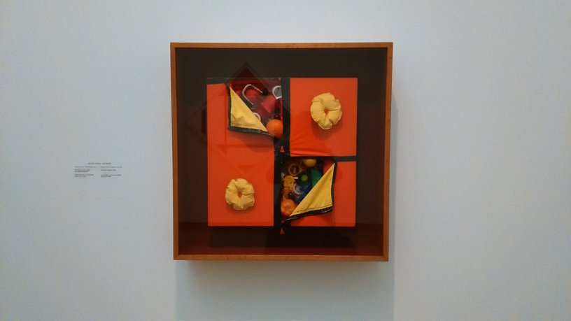
I felt a sudden burst of nostalgia when this work first caught my eye. It is pretty clear why; this assemblage piece is mainly made out of toys, which are easily connected to the idea of childhood. The work is very colourful, but all the colours are slightly faded. I do not know if this is because of the age of the work, or if he used these slightly faded colours on purpose. Maybe it was the light of the museum.

The work consists of tiny plastic objects, which are partly covered by an orange layer of more plastic material. Two donut-shaped objects are attached to the orange layer. The orange layer reminds me a lot of a life vest. This life vest association gives this layer another layer of (probably unintentional) meaning. The whole assemblage is attached to a piece of wood, which makes it look more like a painting then like an installation. The Stedelijk museum apparently thinks the same, because the work is classified as a painting.

The toys are put in order by their colour, which makes the work almost satisfactory to look at. I start to wonder what kind of objects are hidden underneath the parts that are covered. Where did the artist get these objects from and why did he choose these specific objects? The work reminds me a lot of a dream I used to have as a child; a swimming pool completely filled with toys. I realize that this is the main reason why the work is interesting for me, and why it made me feel nostalgic.

After making up all these associations I looked at the name of the piece. The piece is called Mondrian Secret. And suddenly, the whole work changed. The orange layer is representing the painting, and the toys are the secret insides of a Mondrian painting. The painting is faux, because it hides the true nature of the work.

The creator of this piece is Michael-Angel Cárdenas, a Colombian-Dutch artist. The media he uses varies a lot, from drawings and paintings to video installations and assemblages. He is the most well known for his video work. When he came to the Netherlands in the early sixties, he brought with him a lot of new developments in arts. Art movements like New Realism and Pop Art where not really active in the Netherlands. Important themes in his work are sexuality and his Colombian background. If you want to read and see more of the artist, read this article or watch this catalogue.

Earlier, I wrote a post about Ron Arad’s Concrete Stereo. A similarity between Mondrian Secret and Concrete Stereo is the way the surface is approached; both are covered up or hidden by a different material than the core of the work. In Concrete Stereo, the fragile sound system is hidden by a thick layer of rough concrete, giving the work another meaning and feeling by adding a layer. In the case of Mondrian Secret, the playful toys get hidden away by a layer, that is representing a painting that already exists. In the case of this work, the meaning of the actual Mondrian work its referring to changes.

We associate Mondrian’s work with mathematical precision. Cárdenas’ interpretation hides a layer of playful, colourful plastic toys.  The surface of the painting is supposed to represent something that hides the “true nature” of the painting.  A bunch of toys and plastic objects, organized in order of the rainbow colours. Put together with the same precision as Mondrian painted.

The picture (frame); one and two things


Monday, May 27, 2013

The 18th century picture (frame) with a frame in a few sentences.

The 18th century (picture) frame without a picture In just a few sentences.

The 19th and early 20th century picture (frame) with(out) a frame in just a few sentences.

The late 20th century (picture)(frame) (with)(out) a (picture)(frame) (with)(out) a (frame) in just a few sentences.

The late 20th century discourse of talking about the late 20th century (picture)(frame) (with)(out) a (picture)(frame) (with)(out) a (frame), and why we apparently are not capable anymore to talk about the 18th century picture (frame) in just a few sentences.

Some stuff about the discourse of the late 20th century (picture)(frame) (with)(out) a (picture)(frame) (with)(out) a (frame) and the seperation of the (picture)(frame)’s (picture)frame.

Philipp Otto Runge’s colour sphere & the three-dimensionality of colour


Thursday, November 29, 2012

Philipp Otto Runge (1777 -1810) was a romantic painter. He’s considered to be one of the best of his time. His interest in colour was the natural result of his profession as a painter. He invented a colour theory which he eventually published, encouraged by his friends, in 1808 in the form of a manuscript. He was pen pals with Goethe and they exchanged their ideas on colour. Goethe also featured him in one of his books.  Sadly he died young and his efforts where soon overshadowed by others.

His goal was to establish the complete world of colours resulting from mixtures of the three, among themselves, and together with white and black. He presented this in the form of a colour sphere, shown below.

Featured are the primary colours red, yellow and blue. They have the same distance to each other. The secondary colours orange, purple and green also have the same distance. The upper part of the sphere is white; the colours become lighter. The lowest part of the sphere is black; The colours become darker.  Red, blue yellow, black and white have the same distance from each other.

The colours shown on the outer layer of the sphere are the most pure. You could, for instance, also cut the sphere. In the middle of the sphere you could see a muddy colour (grey/brown). It’s every colour together so it doesn’t have any characteristics.

—————————————————————–

For my own project I took the idea of three-dimensional color. It’s already there in the original drawings from Runge, as shown above. This idea of three-dimensional color and the way Runge has dealt with showing this already offers some nice problems which I used as a starting point.

For instance:

-You can’t (to a certain extent) show three-dimensional colour in a two-dimensional way, in other words you can’t show the three-dimensionality of the color sphere by making a drawing of it.

– The only thing that works like the colour sphere is the colour sphere itself. For example; if you take the fruit ”mango” you will see random spots of red and green on the outside and yellow on the inside, there’s no order, like with the sphere. There are no logical transitions and grades. From red to yellow is logical. From red to green not.

-The colour sphere cannot be a colour triangle or colour square. It only works as a globe.

I started investigating these thoughts; The problem of three-dimensionality, the problem of the colour itself and the problem of shape.


With this in mind I started investigating different ways of showing color. On different surfaces; paper, textile. With different materials, paint etc. I started looking for objects, things and even animals which I thought could be interesting colour-wise. Taking them apart to see the colour inside. Decomposing and analyzing.

In the end I took an onion. The advantage is it’s simple shape, round, and the way it’s already layered. It has different layers of colour, ready to be peeled off.

Philip Otto Runge was of course a painter. To stay close to those roots I used actual paint to get the right colours of the onion. I painted on the onion itself to see if the colours where alike and for me it was a big part of the project; it’s quite hard to get the exact colors. As Runge used his colour sphere to discover and examine the colour of paint, and how to effectively use it, it was a nice experience to work with this material myself in such a way.


Now I had the colours ready; I could start thinking about the shape, or the application of these colours. I thought about applying the colour to various things, for instance; architecture. In the illustration I made below one can see how this could be done. There are seven rooms that fit into each other. I took them apart and spread them out in the illustration in different layers. The last ”room” is actually a pillar. You can’t go any further.


I silkscreened this colour. It reminded me of the light of the sun at the beginning & end of the day, when it only touches the top part of houses, trees, clouds. A gold, deep and warm yellow with a little bit of mustard. One of Runge’s works, ”morning”, inspired me to choose this colour.


/In progress/

Experiments With Truth


Wednesday, January 18, 2012


Experiments with Truth: An encyclopedia of the modern art.


By experimenting in diversity within styles, themes and waves, we are able to see beyond the frame within several art movements.

This encyclopedia is build up out of several factors which are based on retrospectives of “modern art” (paintings, sculptures and architecture).

Different aspects of these movements are interesting throughout time. From the past till the present we are able to calculate at least 200 different waves/movements fixated within the modern and authentic art scale.


For instance:

Avant Garde – Impressionism – Neo Impressionism – Art-Nouveau – Symbolism – Post Impressionism – Jugendstill – Fauvism – Expressionism and so on


Faking of paintings is a quite interesting theory, and we have to be carefully by finding a truly result. A lot of works can be seen as an original, but this isn’t the actual case.

The famous faker: Elmyr de Hory (A Hungarian painter and art forger that claimed to be the one that sold over thousand works to support art galleries all over the world) is one of the persons that can be seen as a truly highlighted subject throughout the history!


In this book 200 paintings are not only the fixation point of art waves and movements, but also the experimenting point of view is important throughout the works of art, because the real question will always be: are they fake or are they real?


An amount of works are categorized in a chronological alphabet, nearly fully focused on paintings, sculptures and architecture from the modern time.

Theories are also involved in the book. From Fakers like Elmyr to a painter-movement like Der Blaue Reiter.


From 1860 till the year 2012 we are still busy with theories about artists and fixation on the main essences.


In the book there is also a formulation about important collections from the artist, also published several book titles, revealing name of the author, title and date, that are categorized within the movement. Also quotes written by an artists that was connected to the mentioned wave/movement. Some quotes are written by “Situationists” like: Guy Debord and Isidore Isou. Also different manifesto’s are mentioned from for instance: Hugo Ball (Dadaist) and Luigi Russolo (Futurist).


In short: Interesting views on the visualized and textual context of the art-world!

this post is part of he subjective library project "Unopened Book"
the book can be found at the Rietveld library : catalog no : 705.8-doc-11 IV

Paintings in Wendingen magazine


Friday, November 25, 2011

In my research project I became very interested in some paintings that I found in one of the Wendingen magazine I researched. It was very strange to see some issues about Pyke Koch or Klimt because Wendingen was a monthly publication aimed at architecture and interior design. I am wondering why the chief editor who was the architect H. Th. Wijdeveld decided to publish some issues about paintings in this magazine which appeared from 1918 to 1932!

After the First World War in Europe it was a difficult and depressing period. For the young hoping for careers in architecture, painting, sculpture or interior design the prospects were bleak, with preference inevitably going to older and more experienced exponents with establish reputations, the fact of being young meant a disadvantage. Even the older generation with a record of solid achievement reaching back perhaps to the days before the Great War found it hard to make ends meet in the drab years of the Depression and anyone fortunate enough to be in safe and congenial employment took care to hold on to his position at any cost. It was quite hard for painters to alone sell of their works and many artists started to paint decorative elements screens for interior decorators or to design china or textiles. It presented good opportunities to earn some money. On top of all that, a new movement – Art deco started to come in use.

Art Deco took place in various subjects including architecture.

Frank Lloyd Wright was at  the end of the nineteenth and beginning of the twentieth century the American architect credited with the invention of the skyscraper. Wright was instrumental in fashioning a specific American Tradition of modern decoration upon which American Art Deco was built. This is particularly true of the horizontal style of domestic architecture. The best example is ,,The Robie House’’.  Inside of the building you can find a lot of decorative elements. On the wall you can see long, black stripe, on the windows arty stain glass, which bright designs. All these Art Deco elements were influence by a number of other art movements. For instance, Edward Wadsworth was one of the main figures in the Vorticism movement. If you look at “The Robie House” walls and ,,Liverpool shipping’’ you can see that Wright using the same concept of a vortex as Edward.

 Liverpool shipping

You can find the same examples with Art Deco style and Expressionism(forms derived from nature are distorted or exaggerated and colors are intensified for emotive or expressive purposes), Futurism (forms derived chiefly from Cubism were used to represent rapid movements and dynamic motion; showing hostility to traditional forms of expression), Cubism (the reduction of natural forms to their geometrical equivalents).

In Amsterdam you can find Art Deco style in Architecture too. One of the most famous building is ,, American Hotel’’. It was built in 1900. In American Hotel there are many features which are typical of the Art Deco style period, such as the stained-glass windows. Also you can see some paintings which are placed inside. The café American has beautiful interior which reminded me some of Klimt works. Ornaments on furniture (especially on chairs) and colour palette are quite similar like The Café American.

Moreover, one of the Dutch artist- Pyke Koch was interested not just in painting and drawing but in interior design too. He created and also made interior designer for the van Dam van Isselt house in Utrecht. Pyke Koch painted on the marble table, garden doors and painted dolphins on the floor.

Wendingen magazine was published in 1918 almost in the same period when Art Deco movement started. I think this style was very important in a lot of art fields and it was relevant with architecture and interior design. It can be a reason why in Wendingen magazine you can find some information about artists who was the most concentrate in paintings.


EXCAVATION (part 3)


Thursday, April 2, 2009

Our sculpture teacher gave us an assignment this monday: To make a sculpture based on a painting by Philip Guston. He had also brought a book. I looked at it, and to my great surprise I had found a third pyramid. The painting on the cover is called “Pyramid and shoe”.

Guston, who first was an abstract expressionist, begun painting cartoonesque images of his everyday life and looking at them is like taking part of it.

About the painting pyramid and shoe:

“In pyramid and shoe (1977) the two objects named meet litteraly on an equal footing. The latter being no  less rooted in place than the former, it represents the individual and the ephemeral confronting the anonumous , the collective and the eternal”.

cat. nr: GUS 3

keyword: pyramid


Log in
subscribe