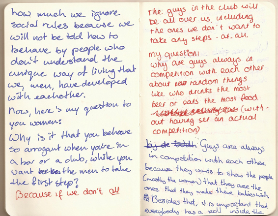
Idealistic intentions
All over the world idealistic ideas about ecological, peaceful communities and city’s rise up with the intention to create a new world and to design a new society and mentality that would chance the world. Nature supporting architecture, religious like rituals, education, economic and social structures are developed to amplify the realization of this new and “better” world. In every such project that was developed until now, cultures come together in a fusion of art, education, rituals and tradition. It is clear that a lot of people have the desire of a new structured, new spiritual and in every aspect more organic and ecological world. One that gives us the peace of mind that we will not use up our energy sources, that we will not exterminate our nature and therefor importantly to most humans ourselves! Every kind of media is trying to inform us to be aware for the need of change throughout the hole world. To raise the question of awareness, in what way do we go on manipulating the world, in what way can we change our living conditions. It is even a big inspiration for the art world, television series that create science fiction out of it, writhers, designers, architects etc…
Utopia’s
Some reactions to all of this have bin the design and building of Utopia’s. Still up until today non of these “Utopia” projects seem to really succeed. It is an interesting question to why these projects fail time after time and still why so many projects are rising up. It is a question that I will give my own perspective on. I will take two cities as an example for the experiment for the improvement of a better quality of live.
Auroville
“Auroville wants to be a universal township where men and women of all countries are able to live in peace and progressive harmony above all creeds, all politics and all nationalities. The purpose of Auroville is to realize human unity”. In there philosophy they try to wave cultures and societies together with traditional and modern lifestyles. In that way Auroville has become a playground in many area’s such as architecture. Not only does Auroville have an interesting architecture it has it’s own economical structure, a research area for renewable energy and recyclable energy and elements, it’s own social structures and developed education.


The sketch of Auroville ‘1965’ begun with Mirra Alfassa (who was collectively called “The Mother”) she laid down the basic concept for the town. Here first sketches are called “The Galaxy” in witch she tries to lay down all the important activity areas that would fulfill the vision of making it a universal township. It was to be a city that would totally intergrade and be submissive to nature. Then in 1970 Mirra Alfassa asked Roger Anger to begin with the design of the center “Matrimandir” the hart of Auroville. This is the most and very important building of Auroville. It is called the “soul of the city” and is situated in a large open space much like an arena called “Peace”. Inside the building there are 4 pedestals that all belong to a wind-region North-East-South-West and symbolize characters. And also a mediation hall, this contains the largest glass globe in the world. Above it is a hole in the roof so that the sunlight shine’s s straight line into the globe by daylight. Witch gives it a extraordinary glow and light spectacle.


Every building has a symbolic meaning. The city exists out of 4 zones (cultural, international, industrial, residential) and a green belt. The movement of the city became to be intergraded in the nature it was build in. Around it other communities came into existence. Thus a kind of double city gradually developed. Auroville starts weaving into a structure of it’s evolution and become one pattern. The city has relied on the possibilities that nature trees and plants gave room for to build, and because of that a very natural shape became to be, almost tornado like, if it was made and shaped by nature itself.


This all came to be in the order of a charter of rules that where developed to the being of the City. Some of the architectural rules:
- Not to Harm nature or its existing habitants in the build of the city
- Eco Friendly Architecture
- Climate responsive architecture
- Architecture integration with natural surroundings
The following link is to the architectural aspect of Auroville: http://www.auroville.org/thecity/architecture.htm
Chandrigarh
Here I want to make a bridge to Chandrigarh another city that was build in India. This city came to existence because in 1947 Punjab was divided into a Pakistani and Indian part the new Indian state therefor needed a new capital city. The architect is Le Cobustier who also created the Modular formula and his own charter’s of rules for architectural constructions.
Some of Le Cobusier values:
- Architecture that has a moving relation with light, shadow and space.
- Provide of cheap and high quality buildings
- To contribute to a more comfortable and easy lifestyle
- To connect people by the use of elements and natural senses
These formula’s had everything to do with the natural elements.Le Corbusier had an aversion for industrial like cities, he thought it led to crowing, dirtiness and lack of moral landscape. He tried to intergrade a way of architecture that suggest and encourage people to have a certain lifestyle. He was also very concerned with the human body responding to its architecture. Also the feel and touch of materials and shapes, color, space, sounds, light where all even as important. The city Chandigarh pronounces itself as a city where modernization coexists with nature’s preservation. Tree and plants are as much a part of the construction plans as the buildings an the roads. And he city is surrounded by a green belt.


The most important and symbolic monument is an metal 85 feet hight open hand that rotates in the direction of the wind and carries out the message of peace and unity “open to give and open to receive”. Much like the symbolic meaning of the centre building “Matrimandir” in Auroville. Also Chandrigarh is divided into different area’s witch are self-sufficient neighborhoods, that are linked to each other by roads and path networks. The zones are numbered from 1 to 47, with the exception of 13 (since it is considered unlucky). The shape of the city is much like a patchwork blanked. It is clear that the city, roads and networks are organized and designed for practical use and comfort.


Failure and Succes
Both cities show in some way’s a lot of resemblance to each other but are also very opposite to each other in a lot of way’s. Both city are divided in sectors that have there own function, witch is also very important to both city’s is the richness of nature. In both city’s the architecture is build with a very friendly approach to the human body and environment. And both cities contain symbolic elements. But where Auroville wants to be a total new economic, ecological and self sufficient city and break loos of commercial and mass production companies, Chandigarh has companies like Mc Donalds etc… The mentality and philosophy differs in a economical, spiritual and educational way. Auroville tries to contribute to a solution for our problems of pollution of our environment, our energy sources and the quality of our mental and physical health. Chandrigarh tries to have a quality of living environment but does not in the hole try to change the use of economical and commercial consumers with the outcome of a more nurturing use of our environment. Still Auroville has not provide a solution and is now surviving on neighbor-villages. If you look at the world as a symbiotic organism it is clear that one can not survive without the other, everything is linked to each other. Even within the smallest organic cels and atoms there is linkage to everything around us. We humans have designed and created a world full of problems that are totally linked and symbiotic to each other. If we take one of them away the survival of function as we created it is in danger. In order for a concept like Auroville to work there has to be a chain reaction throughout the hole world to maintain that symbiotic relationship that we have with the world in order to survive.
It is very clear now in the scientific world, the spiritual world, the business and economic world, that a change and chain reaction like that is very necessary for our survival. Money became digital and lost its value and creditability. Banks are falling, oil one of our biggest sources of energy is running out. There is a big hole in the ozone-lear that damages our bio culturals. We have to find a way to make a solution possible. And finding this way is very inspirational for designers all over the world!


