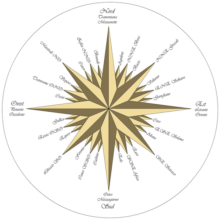
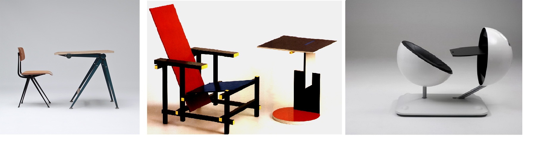
Gothic Fraktur is a typeface that has been used in many different contexts ever since it arose in the early 16th century. Fraktur loans its name from its broken up characteristic. Compared to the smooth curves of other calligraphic typefaces, the Fraktur has many angles and letters stand more independently in relation to others around them.
What intrigues us about the typeface is that it has been picked up by various social groups with contrary beliefs, that have used the typeface as part of their identity; which can be quite confusing, two opposite groups with different values and focusses using the same typeface for expressing themselves. We were wondering in what ways the identity of objects and public spaces surrounding us would be affected by incorporating the gothic fraktur typeface in and on them.
Everything around us is focussed on being modern and looking towards the future, and the fraktur typeface is one that represents craft and passed times. On the other hand something we have observed in our surroundings, is that people have an interest in more traditional artisanal products and have a new found appreciation for the past. We see this coming up in brand design of products but also the interest in vintage design. To us it makes sense that this is an aftereffect of living in a fast paced society that is always living in the tomorrow, and artisanal design and craft give people a nostalgia that they may never have experienced.
Typeface design and identity plays with references as certain forms can relate to modernity, the past, technology or artisan and by using a typography you can direct a product or public space into certain contexts containing certain associations.
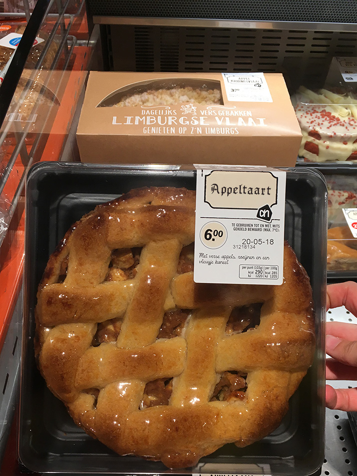
Appeltaart
This apple pie may not be artisanal and fresh, however after changing the title by using the Fraktur, the pie seems a bit nicer to me. I would expect this pie to be made with fresh creamy butter and a lot of cinnamon, whereas before I saw it as a pie that would taste a bit artificial maybe, due to its shiny coating.
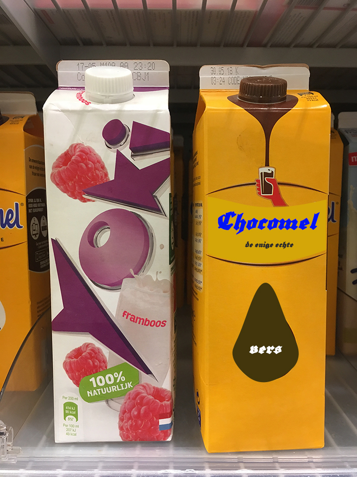
Chocomel, de enige echte
I usually like drinking chocolate drinks in the winter, because they have more calories than petrol. My depiction of a chocolate drink is chilling outside in the cold, in the winter, or inside, watching a 1960’s cartoon, and therefore it accepts Gothic Fraktur very well, and what I also liked is the fact that the Fraktur worked well with colors in this case, which is something I didn’t quite expect.
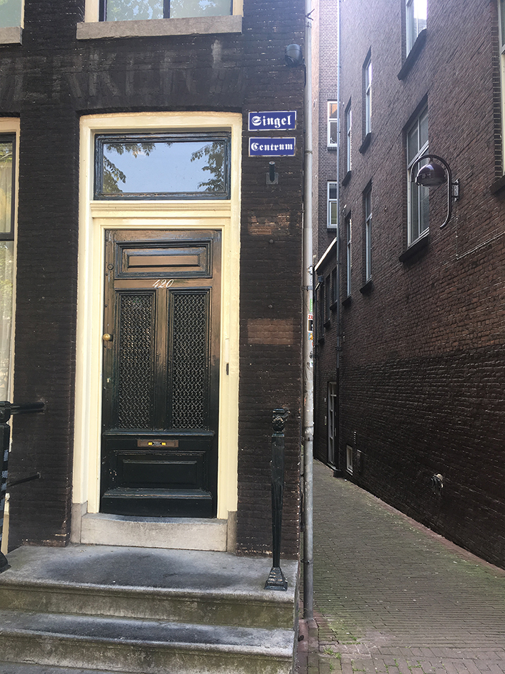
Singel street sign in the Centre of Amsterdam
The Fraktur typeface looks quite good on the street signs of Amsterdam, especially the signs in the center that are a bit older. I think if I would have seen this picture, I might not have noticed it wasn’t the actual typeface of the sign. On a closer look, this typeface would never be used in Amsterdam. Being a country that has been shaped quite strongly by modernist design, you wouldn’t see a Gothic typeface being implemented as a design decision in any public sphere.
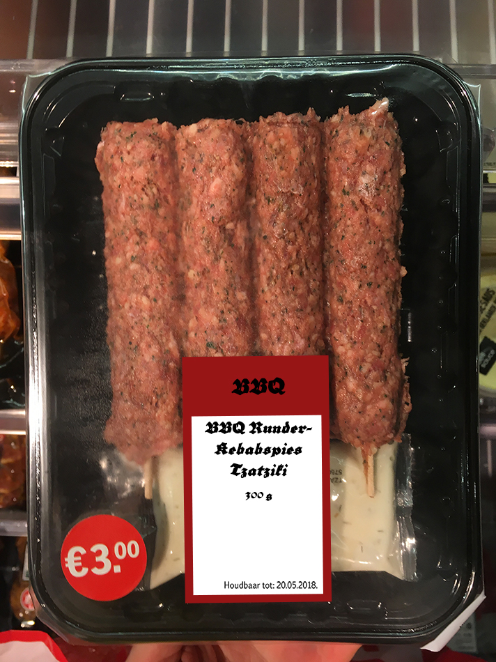
BBQ Runder Kebabspiesjes
The barbeque kebab worked to the extend that it is meat, but to me it doesn’t look like very high quality meat, yet packaging design can bring a change, but people will feel like they have been lied to, since they expect the packaging design to follow the quality, and therefore typeface is also a very important player, since it gives a reference, besides the very packaging.
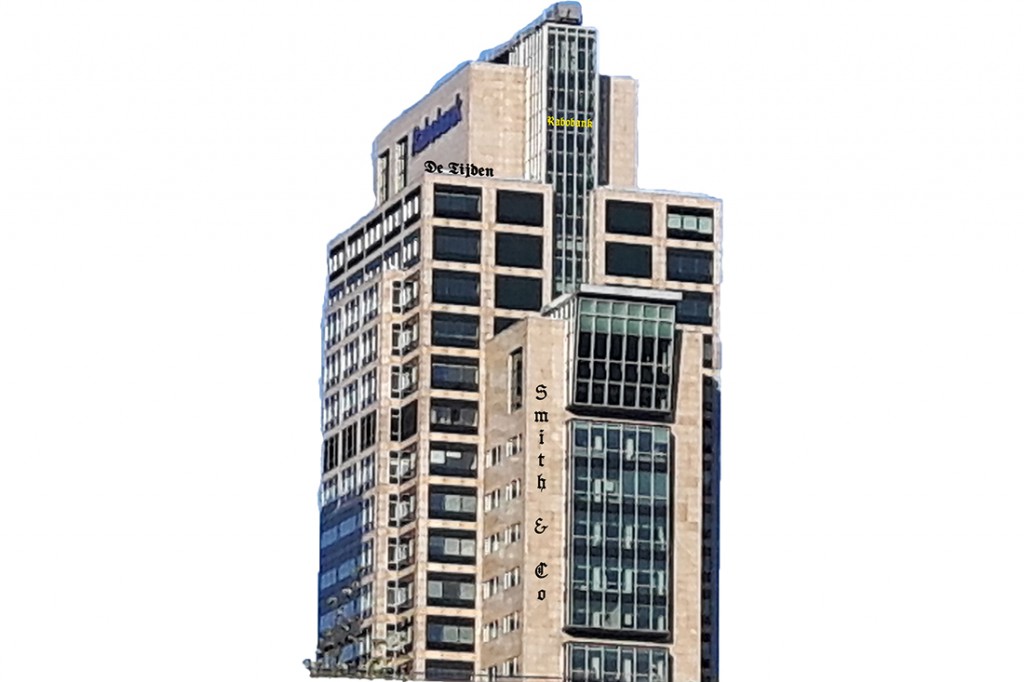
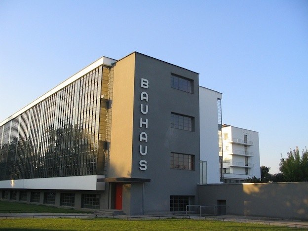
Delta Loyd Building in Amsterdam
For some reason, the postmodernist buildings accept typefaces pretty well, at least in my opinion. Maybe the building accepted it so well, because there is no frame, and the building’s facade is a background of the logo which is made out of typefaces, instead of the logo having a background, which is then put on the background which is the building itself. Therefore, if I had a 3D option, I think I would have been able to give a much better impression of what I wanted to do.
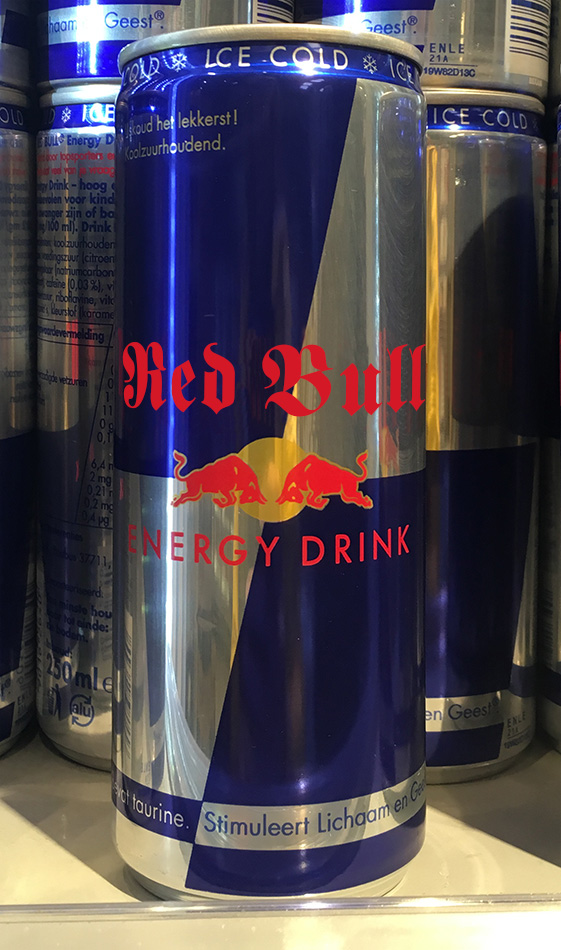
Redbull
I was quite curious if the type would work on a can of Redbull, I could see certain teenagers who would wear hoodies with text in Gothic typefaces also drinking Redbull. It works quite okay, it isn’t the best choice for a drink that promotes itself as an energy booster, however I expected it to not work at all. I think this typography is quite versatile, it can get away with being used for so many different purposes without immediately questioning the identity of the product or context.
In practice, we can choose any typeface for anything, but in our minds it wouldn’t always make sense. Typography and logo design speak, and they are something that give us a bigger picture of the meaning of a logo through references and comparison. A logo can consist of forms, but also of typefaces, where the letters are the carriers of the form, design and message. Some newspapers have very little colour which cause them to lean more towards the content. Meanwhile, Newspapers can also be in colour and they are usually combined with explosive designs where the image is a more relevant factor in reporting. Of course, there still are newspapers with Gothic Fraktur typography that try to show more research oriented journalism, where the text is of main importance.
Thus here we come to a conclusion that a typeface in combination with colours can change the meaning of words and how you perceive something, for example the logos of brands of water depending of its typeface, it will tell you what they’re trying to sell you and what you want to buy. The same way you want beer to be written in the way you will think: This is it.
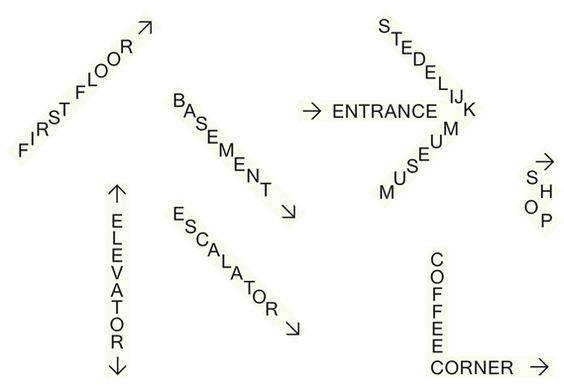
The public space usually accepts it pretty well. In smaller sizes, but also on bigger, on all heights, and on different heights it had a different effect. Also, to me the angle and the place influence the choice of the colors. I think it works well on 1890s Amsterdam architecture, but then everything would look very neat, but I think that the city has a very neat design, and an element as a different era typeface can bring a change in the space and break the feeling of only one correct answer.
Sometimes more practical ways for doing things are found, but the practicality would not be compatible with what is trying to be advertised to us.


 This is honey.
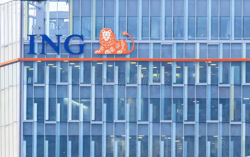


