Skip to Content Skip to Search Go to Top Navigation Go to Side Menu


"internet" Category


I’m new here


Friday, May 24, 2019

.

*****

I don’t really know the way, but I want to. I have this habit to wander off randomly when I’m unknown with a place. Just to see where I’ll end up if I let go of control. “Let fate decide” says the romantic in me.

After a while I see patterns and I believe that I know where I am. Finding attractive by-streets in every corner. But that’s an illusion. By the next turn this pattern is shattered by reality.

I don’t know where I’m going, but I know I don’t want to stay. Just keep going, till this frame turns into bedlam. Borders can’t contain me anymore. Looking back I can’t trace back my origins. I’m not lost. I’m new here.

I am chaos.

.

way back to past


Friday, May 24, 2019

you can see the full video here

Living in the 21st-century ‘internet‘ has become a big part of life where it is inevitable. With the help of the internet, humans were able to achieve a lot of accomplishments. Looking at the experiences that I personally use the internet so-called ‘surfing’, I encounter with so many random information, and the randomness that leads to different randomness gives surprises and joy of knowing and not knowing at the same time. There are many choices that we can make and at the same time even with definite choices on the internet you never know what you bump into. Just like the times we spend on google or youtube. It goes similar to the design blog, there are archives of the basic year students and Rietveld academie with a lot of projects and archives from 2007.

In the blog itself, there are so many clicks or icons that lead you to so many different destinations. The changes in the cursor and the icon changes may distract you or guide you to almost infinite time and loop in the designblog itself. When everything is a possibility and knowing the fact of encountering different experiences and the randomness, having a perspective may give you slight changes in the times on the blog. Like the internet that we use and the deep web, they both exist but it’s just the way we approach the internet.


When spending time on clicking and facing different pages on the web, you will notice that the links provided on the blog may not always lead you to the web you imagine. Some may be missing the links and the websites may have changed over time and won’t lead to the exact place as the writer of the post.

First posts starting from 2007, I thought it would be interesting to see how the web would be like, and look at the posts from the exact time when the posts were published. Just like a ‘time-machine’ what was it like in the past? The web and the internet changes a lot and we only face the recent and modified versions, the majority of the websites are updated to the latest version. Thus, we only see the brand new versions and changes. However, with the help of the internet archive service website called ‘wayback machine‘ you can go back into the times where the posts were first published and can see how the blog was like back in the past. The experience of wayback machine web to the past and browsing through the blog gives you a totally different time. The websites leading out of the blog has a different design and directs you to the exact place the links were first made to. The service guides you to the past to see the old versions of the blog and fixes most of the missing links.

The experience with the wayback machine was like looking at books in the library. For example at a library when you choose a book and read, the design, context, and the information are the same as the date when it was first published. Thus, looking at a book can be seen as taking a time machine and experiencing the past. On the other hand, the Internet gives creators the ability to change and update information directly and instantly, and thus it’s hard for the users to notice or remember how the web was like in the past. The web pages are always changed and updated to something new. Since the design blog functions as an archive of the rietveld students like a library, the use of the wayback machine can make you feel the experiences you have at a library, by positioning yourself back to the time the post was published and see how what it was actually like.

Even with the same act of browsing the same website, a slight twist in looking from the past can give a whole new experience and the way of seeing things, like the game spot the differences.

In search for Anton Shebetko…..


Thursday, December 13, 2018

A google search trying to find a guy from a different class, that I had never met before, whom I was suppose to work together with. It is hard to use the internet to figure out what people look like and who they are through multiple false links, that doesn’t concern the specific person. It might just be another person with the same name, or people who are linked online. Coming to a dead end online in the forum where you usually can find answers to everything.

Who is Anton Shebetko?

But honestly, who are you?


Tuesday, December 11, 2018

About linkrot


Tuesday, December 11, 2018

Hello, this http://www.bombsite.com/issues/0/articles/3117h https://www.dn.se/DNet/jsp/polopoly.jsp?a=762376 https://rietveldacademie.nl/designblog/wp-content/uploads/2008/03/texttextile_kimono.jpg http://z.about.com/d/inventors/1/0/h/B/corkscrew4.gif broken links. 

Link death, link breaking, reference http://www.nest-rotterdam.nl/17-1.html, links https://annevet.home.xs4all.nl/onderzoek/right_to_copy/part-1_2.html nowhere. 

These are https://www.youtube.com/v/i-HVW-0eoe0&color1=0xb1b1b1&color2=0xcfcfcf&hl=en&feature=player_embedded&fs=1%5C%22%20type=%5C%22application/x-shockwave-flash%5C%22%20allowfullscreen=%5C%22true%5C%22%20width=%5C%22425%5C%22%20height=%5C%22344%5C%22%3E%3C/embed%3E%3C/object%3E different names http://www.dantedifranco.com/DragKingFunRoyalBrands.htm definitions for when hyperlinks https://postuyhironnblqck.com individual websites are moved, taken down http://z.about.com/d/inventors/1/0/h/B/corkscrew4.gif reorganized, resulting http://static.hugi.is/misc/movies/1984macintro.mov making links permanently http://www.designws.com/vormgeverpagina/wimrietveld.htm temporarily unavailable.  

http://www.pliink.com/mt/marxy/archives/2006/09/on-The-new-japa.html process http://images.google.nl/imgres?imgurl=http://charliebakker.com/wp-content/uploads/2008/11/s7002318.jpg&imgrefurl=http://charliebakker.com/%3Fp%3D270&usg=__OX-IiT3S1ny-VojnR1BVZVj-xuQ=&h=567&w=756&sz=76&hl=nl&start=8&um=1&tbnid=5UnmYQK7eYd5FM:&tbnh=107&tbnw=142&prev=/images%3Fq%3Dcharlie%2Bbakker%26um%3D1%26hl%3Dnl%26client%3Dfirefox-a%26rls%3Dorg.mozilla:en-GB:oficial%26sa%3DN rot http://www.designws.com/vormgeverpagina/wimrietveld.htm nature occurs after https://annevet.home.xs4all.nl/onderzoek/right_to_copy/part-1_2.htm living organisms die. http://www.nest-Rotterdam.nl/17-1.html http://www.picasaweb.google.com/veriyanta/MyWeddingandHoneymoon#5072923308189265890 decomposition http://static.hugi.is/misc/movies/1984macintro.mov https://rietveldacademie.nl/designblog/?m=200806 https://annevet.home.xs4all.nl/onderzoek/right_to_copy/part-1_2.htm http://images.google.nl/imgres?imgurl=http://charliebakker.com/wp-content/uploads/2008/11/s7002318.jpg&imgrefurl=http://charliebakker.com/%3Fp%3D270&usg=__OX-IiT3S1ny-VojnR1BVZVj-xuQ=&h=567&w=756&sz=76&hl=nl&start=8&um=1&tbnid=5UnmYQK7eYd5FM:&tbnh=107&tbnw=142&prev=/images%3Fq%3Dcharlie%2Bbakker%26um%3D1%26hl%3Dnl%26client%3Dfirefox-a%26rls%3Dorg.mozilla:en-GB:official%26sa%3DN http://www.theyellowdog.net/iam_bkp/ nitrogen http://www.terhitolvanen.com/html/woodland12.html carbon cycle https://slowlab.net/index.html nature.

Links break https://rietveldacademie.nl/designblog/wp-content/uploads/2009/02/blogspot_forweb.jpg different reasons. Http://www.designws.com/vormgeverpagina/wimrietveld.htm some ways its inevitable https://rietveldacademie.nl/designblog/wp-content/uploads/2008/04/andreasa_strangeattractors.pdf natural, just like http://www.topstad.amsterdam.nl/nieuws/rietveld_trekt_in nature. Old things die http://www.picasaweb.google.com/veriyanta/MyWeddingandHoneymoon#5072923308189265890 http://http//www.arcspace.com/gehry_new/ things occur.


Is it possible to create an ideal ‘404 not found’ page?


Sunday, December 9, 2018

‘404 Error’ pages are basically pages that either doesn’t exist or they are broken. Sometimes being in control of thousands of pages on a site is troublesome and errors can be inevitable. However you can create an excellent 404 page that could in fact help your user.

Even though it can act as an advantage people still tend to avoid altering their 404 pages. But what could be useful to include in a 404 error page?

Tips:
  1. Have a search engine so that people can search what they are looking for
  2. Have a link to the main page so that people can redirect
  3. Create contact forms so that people can inform you about the broken link/fill in their inquiries

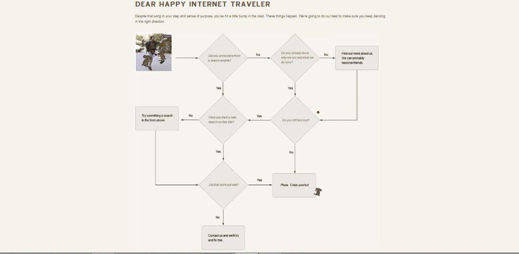
https://github.com/404


https://www.orangecoat.com/lost


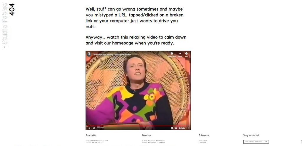
4. It’s always disappointing when you reach an 404 Error page. Therefore it is a good idea to prevent further frustration.


https://studiofables.com/404?fbclid=IwAR213GVHwe_Z8uTB841NB0b1inAtyidMJ0FkA1bMmvDjBUNuejlz49nCUc0 


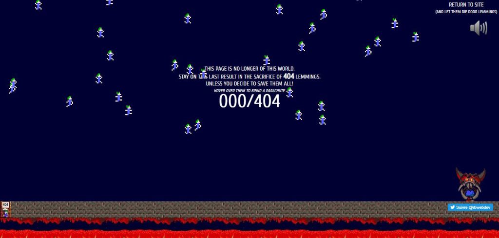
5. Or you can have a really playful design such as


http://www.romainbrasier.fr/404.html


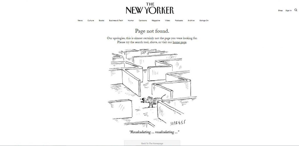
6. You can also have a funny design.


https://www.newyorker.com/404page?fbclid=IwAR2TPHPft9kTmYHZ8iJYRXNsCPvkSXEMs7G1tOA_bBn8facq0bnUWb3dx2k 


In conclusion, 404 error pages can be useful for your users if you care about making it into a helpful page.


404 Error


Sunday, December 9, 2018

404 error page not found. A standard HTTP error message code, meaning that the website you were trying to reach could not be found on the server. Perhaps the website was removed or perhaps its URL was not changed accordingly. The error pages almost always have a similar design. Plain and boring. Nothing more interesting to look at than a blank page with disappointing content.

Let’s change that. Hereby we present five exciting design suggestions.

Video by Quirine Kennedy

Image by Lucía Vives

Image by Ravi Blits

Image by Leonie

Image by Amanda Bellman

Fulvio Bianconi Pezzato Vase


Saturday, October 27, 2018

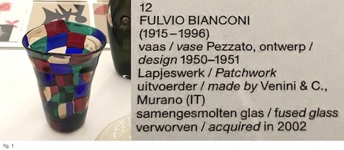
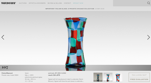
The starting point of my research was Fulvio Bianconi’s Pezzato Vase. The Vase that displayed in the Stedelijk Base (fig. 1) was designed in 1950-1951 and acquired by the Museum in 2002 from the artist Tomas Rajlich. The Pezzati series [Pezza (it.) – patch] was designed between 1950-1954 and produced by Venini & C., a Murano glass manufacturer.

Pezzato Vase at Stedelijk Base


I started my research by looking up books about Bianconi in “WorldCat”, an Internet-based books catalog that contains combined data from thousands of libraries around the world. Most of the relevant books about the artist that I could trace in Amsterdam were either in the Stedelijk Library or the OBA (Amsterdam public library). Besides, I searched in the Stedelijk library internet database, and with the help of its librarian, I could find a few more catalogs and books that did not come up in WorldCat. I also checked in the Rietveld library search engine, but unfortunately, no result came up. Most of these searches brought up relatively focused information about Bianconi and Venini & C.

Later I started to search about Bianconi by going through the glass and crystal books collections, both at the OBA and at the Rietveld Library. Those searches brought up less specific types of books, either about design in general or glassworks.

The physical materials I found can be divided into several categories:

Exhibition Brochures

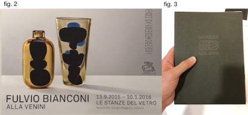
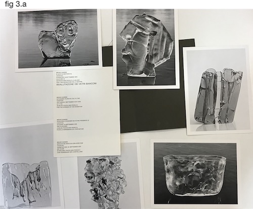
The Stedelijk library has two original Bianconi’s exhibition brochure: one from 2015 at Le Stanze del Vetro (fig.2), and the other from 1975 at Gallery Danese in Milano (fig. 3). The Danese’s brochure is the oldest physical material about Bianconi I could find in Amsterdam. It’s an envelope that contains six large postcards of the artist work and innovation to the opening in September 1975 (fig.3.a).

Exhibitions Br.

2a

Venini

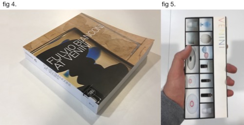
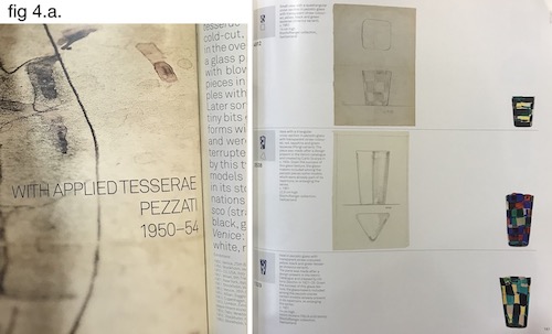
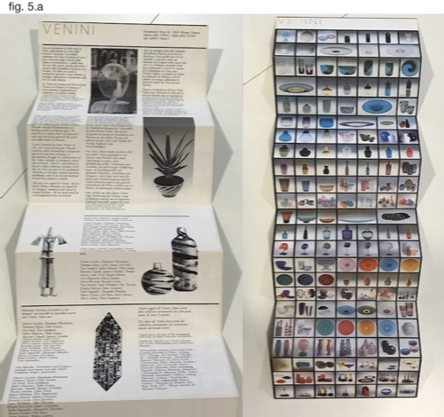
The book (fig. 4) and the Brochure (fig 5.) are both directly related to Bianconi’s work at Venini. The book consists of information about Bianconi’s life, but its central part presents Bianconi’s designs throughout several decades. The designs are divided by series of production (one of them , for example, is the “Pezzati”), and the objects displayed next to their drafts and numbered as in a catalog (fig. 4.a.). The Venini Brochure function both provide information about the company and service as a poster (fig. 5.a). Although it doesn’t revolve around Bianconi’s body of work, some of his designs can be identified on the poster (such as the Fazzoletto series).

3

3a

3b

Private Collectors

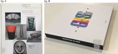
I also found information about Bianconi’s designs at private collectors book. The first one is Losch collection (fig. 6), a private collection that focuses on Italian and Finish Glass. The other book presents Nancy Olnick and Giorgio Spanu Venetian glass collection. Both books are not exclusively focused on Bianconi’s works and display an assortment of his designs alongside the designs of his Italian colleagues at Venini.

4

Glass

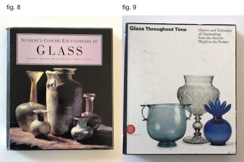
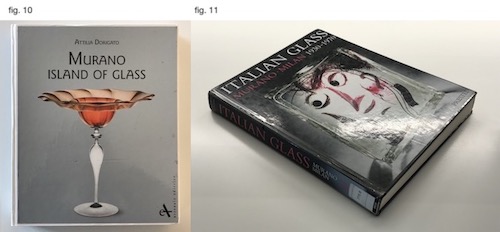
After going through all the books found with the help of the Libraries’ database, I checked if I could find information about Bianconi in books about glass in general. I searched in the OBA collection about Glass and Krystal, that are categorized on shelf number 775.6. Three of the books (fig. 8, 9 & 10) consists of very little data about Bianconi, while one of the consists a more in-depth look into his body of work (fig. 11).

5

6

Searching online brought up other results. Searching “Fulvio Bianconi” in Google provided around 90,000 results, and adding the word “Pezzato” narrowed the results to 12,500. The internet-based results concern mainly commercial aspects regarding the designer works and present rather little data about his life and body of work.

Many websites either sell Bianconi’s designs or providing data about future auctions and previous auctions results. The site varies from e-bay to Sotheby’s and online auction houses.

7


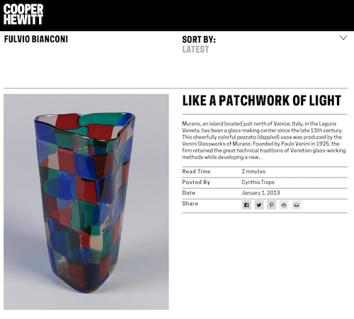
Other websites, more “institutional” ones, deliver basic information about the designer works and his life. First, the designer’s official site contains his biography and a small picture gallery of his glass and graphic works. In Venini & C., official website this information can also be found. Modern art and design museums such as the MoMA, Stedelijk Museum, Museum Boijmans, the Cooper Hewitt and the Metropolitan provide limited information about the designer works in each of the institutions own design collection.

8

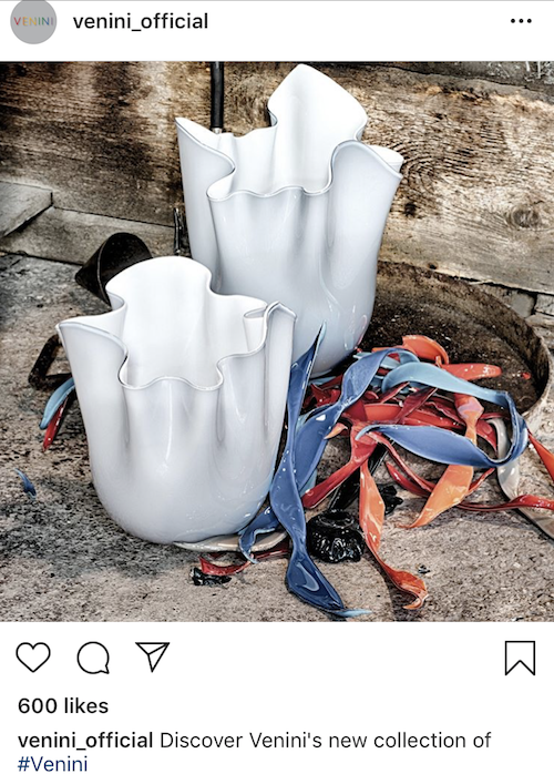
Limited data about the designer can also be found in social media. The designers have around 900 pictures that contain his name tag on Instagram. In addition, in Venini official instagram account some go his designs can be traced. The designer has a facebook fan page that is currently not active.

9

Compared to the information found in books, the one found online is not as thick and much more general. In books, we can see extensive data relating to historical contexts, manufacturing processes, and the designer’s biography and full body of work. The information that can be found online Is mainly revolving around the commercial aspects of the designer’s works, focusing on his popular and “more profitable” production series.

From virtuality to reality


Saturday, October 27, 2018
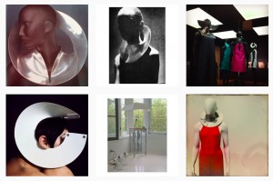
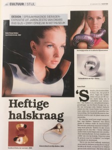
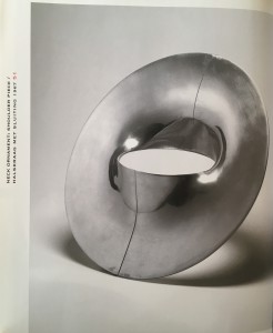
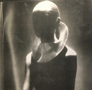
    In this research, I choose the shoulder piece designed by Gijs Bakker and focus on the difference the object present on printed media and online media.
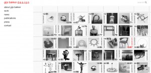
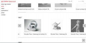
    I start with Gijs Bakker’s official website, which is clear and detailed. You can find nearly everything about his biography and works since his early design career, and from this perspective, what I see is that the object I research is just one of his virus works.
5bd59409e3b205bd59426f3029
http://www.gijsbakker.com
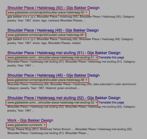
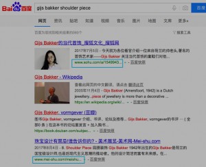
    Next, I searched this work on “Google” and Chinese searching engine “Baidu”, it’s obvious that you can see the designer’s official website ranks at the top of Google’s search result, which is also the most important information. But on “Baidu”, the reviews of the mass media is always the top and full of unnecessary information, I think this phenomenon is closely connected with Chinese internet policy.
5bd5944027800
Link to Google
5bd594363b8aa
Link to baidu
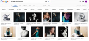
    And also the totally different image search result on “Google “ and “Baidu”, you can not find this work on “Baidu”.
  5bd594706b8fd
Link to Google
    5bd5949625995
Link to Baidu

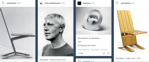
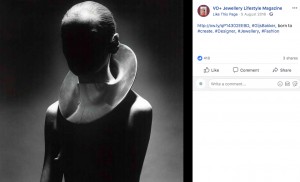
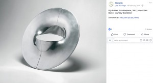
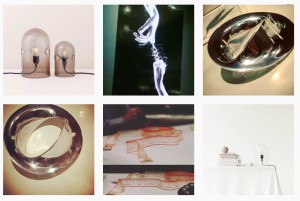
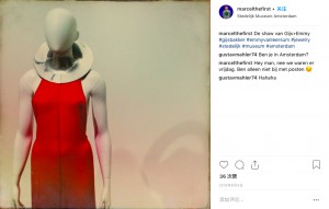
    Then I searched on platforms like Pinterest, Tumblr, Facebook, and Instagram. You can find many works similar to Gijs Bakker and also the person who collect this work. However, as a platform for sharing the image, what I feel more about is that I’m just looking one of the countless pictures instead of Gijs Bakker’s work.
    And platforms like Tumblr, Facebook, Instagram, which have the social function, people can like, share and comment, which is effective to communicate but also your judgment is easily influenced by the public comments at the meantime. Furthermore, these photos all posted during the Gijs Bakker exhibition which shows the instant character of the media. I also find that people like to add a filter to the photo they took on the exhibition base on their own aesthetic, so the information you get on the social media is quite personal and incomplete. From my point of view, It’s always necessary to get the first-hand material in reality if you want to research your subject in a deep and serious way.


5bd594648f3505bd594af84c65


5bd594c1407235bd594c93e734


5bd593b988f985bd593c606dab5bd594da48486

Link to Pinterest / Tumblr/Facebook/Instagram

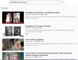
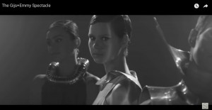
Then I researched on Youtube, I found many interviews of Gijs Bakker and video shotted for his works.


5bd594e62c9ca

5bd594f82b409
Link  to Youtube
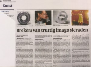
    Then I come to media, both online and material from the library of Stedelijk museum. No matter online and printed media, the information is always incomplete, and also much unnecessary information like the advertisement. Meanwhile, if you don’t have enough understanding about the work, your judgment is easily influenced by the reviews of media.
Capture d’écran 2018-10-08 à 18.15.04  Capture d’écran 2018-10-08 à 18.11.02
 IMG_3361 2 IMG_3360 
 IMG_3362 2
   
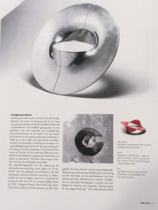
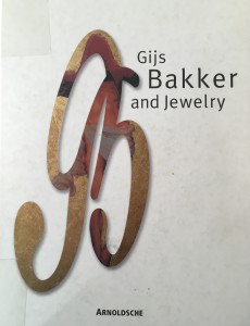
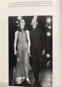
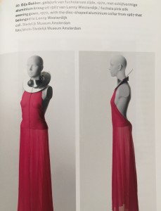
     I continued to research on printed media, the follows are the portfolio of Gijs Bakker that I found in the library. In these books, you can find complete information about Gijs Bakker’s career and the introduction of his design concept, moreover, the book itself can also give you more focused and enjoyable reading experience.
IMG_3151 IMG_3137
IMG_3136 IMG_3154 2
IMG_3602 2 IMG_3137
IMG_3603 2 BxiuZ

    Besides, I also compare the printed media with online media, one thing I find very interesting is that the design of Gijs Bakker’s official website changes into real stamp on printed media, which shows the different possibility on different media.

    Eventually, I don’t want to draw a conclusion that whether printed media is better than the online media because the real world is already a combination of reality and virtuality, both of them can be used as the tool to help you to find the truth.

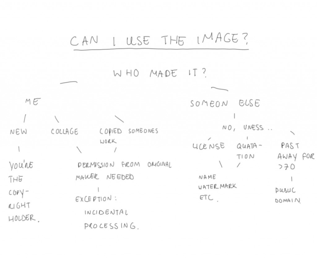
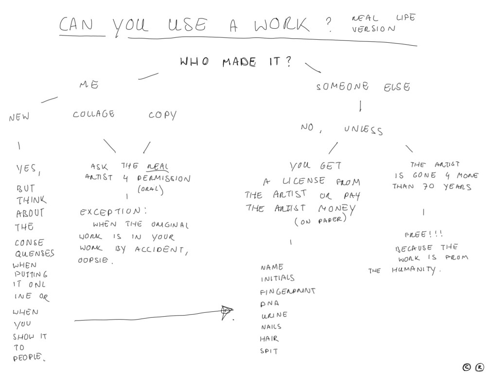
http://www.dmlp.org/legal-guide/fair-use ©


Friday, October 26, 2018

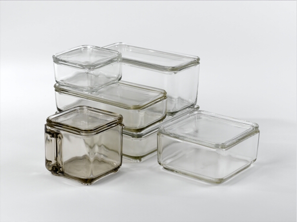
The other day I was working on this essay, or what I thought it would become this essay, and I bumped into something. I saved an image of the artwork “Kubus Geschirr” from Wihelm Wagenfeld on google to add in pages. But while in pages, I couldn’t find this saved image anymore.

Weird technology.

So I tried something different, I made a screenshot of the image on google. But, while I did this, the internet immediately brought me to a page about:

fair use.


IMG_5837


Never heard of it.

My original plan to write about the differences or similarities on how “Kubus Geschirr” from Wilhelm Wagenfeld, appears on the internet and in books got replaced for my interest in the world of fair use.

c/o Pictoright, SM Amsterdam 2004

Fair use has a few similarities with copyright. You use the term fair use if something is a small part of a copyrighted work, you don’t have to ask permission or pay a fee to use it. Where as with copyright you have these five restrictions:

  1. Check who owns it
  2. Get permission to use it
  3. Give credit to the creator
  4. Buy it
  5. Use it responsibility

But with fair use, its slightly different. If for example an image has a fair use coat over it, you can use it for education, news reporting, criticizing/commenting and comedy/parody. In comparison to copyright, fair use has some rules as well:

  1. It has to be a small part of a bigger thing
  2. It has to have a new meaning, it has to be original
  3. It has to be a “rework”
  4. It is non profit (no fee)

IMG_5857 These are the words from someone else, but I remade it, so it's a fair use.

If you ask me, this is al about respect and owning.

Its about getting the credits for something YOU have made and YOU have brought into the internet, you did it, so you want to be sure the credits are still given to yourself. Wait, but you don’t have to pay for it if you made a new work out of it, because then its fair law. ???.

As you can maybe sense I get a little bit confused about this. I’ve never experienced copy right. There are parts of it that I get, but also parts I really don’t get.

It’s interesting to think about it.

Why would it be so important to get credits for your own work? Is it about self-respect and pride?  You’re proud of something you’ve made and you want to show it to the world, but you’re also too jealous when someone tries to steal your work/idea so you put a watermark on it and do something with copyright so you can control it.

I spoke a friend from high school about this subject. She always wanted her friends to put her name in the description or tag her when we putted a photo she made on instagram. I thought it was lame, just be proud you made this photo and own it that way.

I recently asked why she wanted the credits for making the picture. Her answer was that she compares this issue with artists that put their initials on their work or musicians who put their name on their album cover. She sees it as an appreciation for the work she has made and that she would think, I would also like to get that recognition for my work.

Yes, I agree actually. I love when people like my work, so of course I want my name on there. Its a kind of attention your sometimes longing for. Some people more than other, but I dare to say its human.

I asked her later how the internet changes this issue. She thinks that on the internet stealing is easier, which makes you want to have good copyright, to prevent this.


So there is a difference between copyrighting on the internet and in real life. On the internet you can be anonymous and steal someones work within copy and paste. You can steal world wide and also publish world wide. And you can punish someone from stealing your work to ask for a fee and get it of the internet.

In real life its you’re own social circle you’ll steal in, its harder to be anonymous and also harder to publish. When you want to confront someone with it, you’re having a conversation. But on the other hand, making a picture or a copy of something specific in a book is really easy to do and also easy to spread around.

In both worlds we have to deal with copyright, but in these worlds there are different approaches. I feel like on the internet the feeling is more intense, because copyright is a big deal on the internet. It’s less personal, but it is personal. Copyright makes it personal and tender.  In real life, in books, copyright violations are harder to detect and easy to do. Again, in both worlds you want to publish your work, get recognition, but also know that someone can use your work for other purposes. It’s a decision you make.

My suggestion is to apply copyright in the real life-life:

IMG_5858


Copyright is the new self respect.
Like and copyright.

ONES AND ZEROES


Monday, May 21, 2018

Grid comic

READA-LEGIBILITY OF FORM

Tracking   the    mutability    of    forms    of    logographic    script    to    pictorial    images    and    back    again,    we    wondered,    how    are    these    forms    created?    While    creating    is    the    act    of    mark    making,    it    is    also    the    reading    of    the    mark    that    realises    its    objective.    How    do    these    marks    come    to    be    read,    and    who    reads    them?

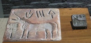
As    a    single    unit,    type    is    able    to    express    itself     independently    through    its    form.    From    the    pictorial    evolution    of    early    ideographic    and    mnemonic    characters    (e.g.    Hieroglyphs,    Indus    script,    Oracle   Bone    Script)    to     typographical    manipulations    of    the    modern    age    like    three-dimensional    fonts    or   Toki    Pona,    the    image    of    a    printed    character    possesses    a    compelling    representational    force.    Be    it    logographic    or    asemic   (see   Asemic    magazine),     something    can    be    ‘read’    in    the    image    of    the    type,    even    if    there    exists    no    content    that    can    be    extracted    from    a    surface    reading    of     its     writing.

 Indus civilisation unicorn seal

Pictographic unicorn seal 

The    way    in     which    type   is    assembled    to    be    read;    like    building    blocks    stacked    upon    each    other,    individual    letters    at    their    most    basic     and    mutable    are    formed    into    words,     sentences    and    paragraphs.    As    always    a    system    of    structure    is    needed    for    random    bits    of    buildable    content    to    be    organized    meaningfully,   language’s    orthology    is    the    grid    that    gives    single    units    of    type    the    ability    to    function    as    part    of    a    larger    picture.    This    can    be    seen    in    letterpress    printing,    where    typesetting    treated    each    character    as    a    block    of    type    that    could    be    moved    and    arranged    into    boxes    of    legible    text    in    the    composition    of    the    page.

The    form    of    type     and    its    structure    both     lend    to     its    ‘readability’,    which    appears    to     occur    one    block    at    a    time.    To    understand    how    such    ‘reading’    might    work    we    can    move    to     the    pictorial    roots    of    type    where    some    similarities    between    the    component-centric    reading    of    images    will    surface.    For    example,    unlike    the    way    in    which    we    treat    type    in    writing,    focusing    more    on    the    spelling    out    of    words    and    thus,    used    to    glossing    over    the    small    units.    The    way     in    which     type    is    broken    down    and    treated    in    typesetting    and    by    digital    processing    systems,    unit    by    unit,    is    also    mirrored    in    the    way    whole    sceneries    are     pieced,      tesserae     by    tesserae,    in    roman     mosaics.

Screen Shot 2018-05-28 at 21.40.55

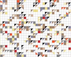
Underlined text above translated to mosaic 

THE UNDERLAYING GRID – MOSAICS & BIT PLANE

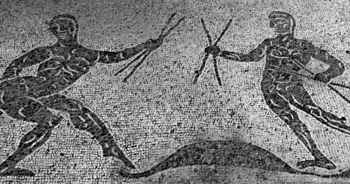
Early    roman    mosaics    were     simple    constructions    of    dark    Tesserae   and    light    Tesserae,    relying    on    the    dramatic,    harsh    contrasts    of    these    colours    to    sculpt    forms    on    the    two-dimensional    plane.    A    binary    system    like    this    creates    a    yin-yang    situation    of    positive    space    and    negative    space,    filled    and     unfilled    pockets    within    a    structure    that    controls    the    presence    of    these    two    factors.    The    stark    contrast    between    the    negative    space    and    positive    ‘filled’    space    of    a    mosaic    lay    is    instrumental    in    carving    the    form    of    a    glyph    from    the    empty,    unfilled    space,    thus    creating   a    mark,    an    indication    of    presence.    Established     before,    the    link    between    pictorial    representations    and    type    is     evolutionary,    but    stems    from    the    simple    act    of    mark    making.    In    leaving    a    mark,    a    definition    of    a    ‘readable’    form    from    the    senseless    blank    space    is    created,    images    pieced    together    in    mosaics    and    paintings,    penned    verses    in    manuscripts    all    produce    by    various    marks    a    ‘readable’    concentration    of    meaning.     However,    unlike    calligraphy    and    letterpress    printing,    which    deals    with    an    active    method    of    mark    making    by    addition,    the    way    in    which    mark    making    occurs    in    mosaics    can    be     described    as    the    ‘surfacing’    of    a    distinction.    It    is    this    definition    not    by    addition    but    rather,    distinction,    that    draws    an    interesting    link    between    the    laid    mosaic    surface    and    the    bit    plane    beneath    the    impenetrable    screen    of    our    computers.    Digitally    rendered    type    and    warriors    in    mosaics    appear    to    be    drawn    from    the    blank    space,    even    if    the    forms     are     so     clearly     distinct    from    their    backgrounds,    they    inherently    belong    to    the    weave    of    the    grid    interlocking    the    entire    plane.

Caupona di Alexander e Helix

Floor mosaics of the Severan Period @ Caupona di Alexander e Helix

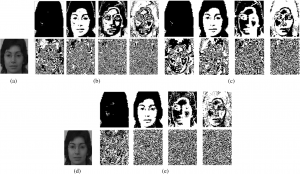
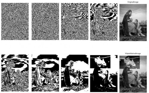
Bit Plane img 1         <Bit plane img 2

Bit plane image slicing 

This    can    be     attributed     to    the      shape     of     Tesserae     which     allowed     for    a    tight     fit     of     pieces     within     the     structure    of     a     mosaic     lay     and     naturally     with     its     geometry,     producing    a    grid      network     that      flowed     through     the     entire      mosaic.     More      importantly,     it     also     determined     the      placement     of      other      pieces,     functioning     independently     as     a     growing   support     system.     The      bit      plane   of   a   computer    functions      on     a      similar     grid     logic     in   developing    computer     graphics    (see    4:14    Ivan    Sutherland’s   Sketchpad,   40:44   for   graphic  animation )     that     allows      for     simplified       organization     of     information      and     systematic     mapped      identification    of     what     should    go    where.    With    the     grid     system     making     for    an     efficient     positioning     of     negative     and     positive    ‘marked’    space,    with    both    being    created    simultaneously,   as   opposed   to   a    hierarchy   of   surface-to-type.    As   a   result,   we   see   a   single   grid   plane   (surface)   created   containing   both   contrasting   elements,    a   ‘reading’   of   such   a   surface   becomes   more   attentive   to   the   qualities   of   form   in   type,   as   something   carved   from   the   plane   itself   and   therefore   intimately   tied   to   the   surface   upon   which   it    exists.   Eventually,     mosaics    evolved     to     contain     elements     of     gradation     and     cutting     of     Tesserae     to   accommodate   circular   shapes,   making     for    more     elaborate     and    decorative    lays,    much    like    how    bit    computers    from    the    80’s    have     played    up    their    resolution    game.    What    doesn’t    change    is     the    language    upon    which     the     form     is     communicated;    inter-woven  presence    and     absence. 

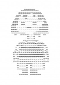
ascii art

ASCII art

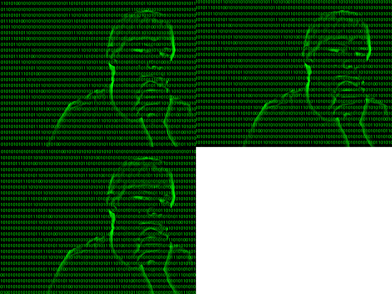
animated_binary_pic_2_by_palaios


ONES AND ZEROES

 The    translation    of    alphabets    into    Morse    code    produces    a    type    that    can    be    transmitted    via    electrical    pulses,    audio    tones    and    mechanical/ visual    signs    (heliograph/ Aldis    lamp),    one    that    while    can    be    recorded    in    print,    is    transmitted    in    a    form    distinct    from    the    printed    aspect    of    type.    Morse    relies    on    a    binary    system    of    dots    and    dashes,    or    equivocally,    flashes    and    pauses,    positives    and     negatives,    ones    and    zeroes.    The    materializing    of    this    information    as    ‘readable’    content    on    the    bit    plane    follows    a    series    of    conversions  of   data,   text   and   instructions   from   the   same    binary     system   (e.g. B=01000010)    to     corresponding     alphabets,   actions    and   responses     and     in     the     process     computers    read     each     letter     as     a     series     of     1s     and    0s   (or   any   other    two-symbol   variant) ,     which    to    us    remains    complexly    coded    when     left    untranslated.    Yet,   to   a   reader   who   recognizes   the   tightly   knitted   fabric   of   language,    presence (1)   and   absence (0)   are   meaningfully   placed   to   form   a   legible   and   therefore   visible   picture. 

Aldis Lamp

Aldis Lamp

If    we    were    to    consider    how    non-humans    read    or    what    type   would    be    in    a    situation    unable    to    relate    itself    to    print,    we    could    say    that    the   attention   to    presence    and    absence,   down   to   how   a    character   materializes   itself,    being    conscious    as    well    of    the    textural    fabric    in    which    it    materializes,   will   form   the   basis    of    the   behavior    of    such    a    type.  

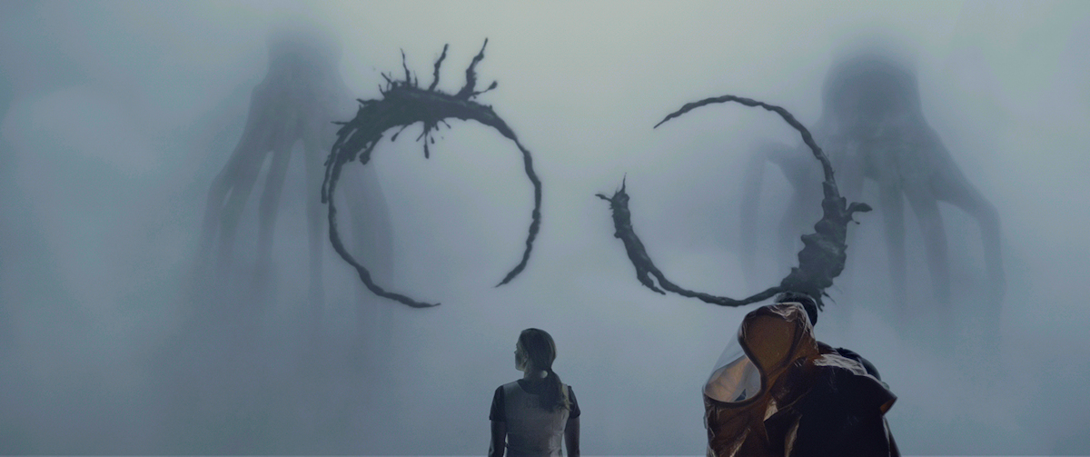
Heptapods

Heptapod Logograms 

Arrival (2016)

emojis


Sunday, May 13, 2018

So what it basically iS?

.                                    Symbols, that help to describe/show things/emotions.

Did it all start from the primitive period, when people drew animals on the walls of the caves, using images and signs in order to describe?

2017-01-092_1300


Or from the first ‘:)’ in the poem from 17th century?


emojis


Anyways, it became popular in the 90s when in SMS people started using emoticons. Emoticons are punctuation marks, letters, and numbers used to create pictorial icons that generally display an emotion or sentiment.
Actually, it officially started in 1982, when in Carnegie Mellon University the joke in online message board went wrong and made a huge misunderstanding. Dr. Scott E. Fahlman came with a proposal to use emoticons in order to define jokes and non-jokes.  : – )

Kao(face)moji(character)s are Japanese emoticons ¯\_(?)_/¯ .

e(picture)moji(character)
the first emoji was made by Shigetaka Kurita in 1999 for the first Japanese mobile internet platform i-mode.
(the 176 original emojis are now part of the permanent New York MOMA collection)

In 2011 Apple (of course) made them famous by adding them in iOS 5, but only for the Japanese version.                                  (2 years later Android joined 🙂
After noticing the growing popularity of emojis around the world they added them to every keyboard.
Now every user can switch from English or German to emojis’ keyboard.

With the help of Unicode Consortium    (- a non-profit group that maintain text standards across computers) (and Google’s petition to get emojis recognized  )             emojis are (almost) everywhere.                                                                                                                                                                                                    O-:

in 2010 Unicode accepted 625 new emojis proposed by Apple.

in 2013 the US Congress Library added the ‘Moby Dick’ written in emojis languages

in 2014 the gender and skin-color issues raised

in 2018 157 emojis were added.


You can propose your emoji and explain why it is necessary to add it                                                                                                 http://unicode.org/emoji/selection.html

2 times a week the Unicode meets up to discuss wether the pasta should be on a plate or in the bowl

wether it is important to add a sugar cube to emojis’ list

wether the girl’s haircut should be till shoulders or longer

You can go to https://emojipedia.org/                if you are not sure in the meaning of the emoji and do not want the misunderstanding to happen

You can go to                                                             if you want to analyze the emojis you are using

http://emojinalysis.tumblr.com/                                                                            (sometimes they can tell more than your daily horoscope from Cosmopolitan)


http://emojitracker.com/                       if you want to know what is in trend on Twitter


We are now way more reachable for any person in the world

We are now able to understand people without words


                           are emojis the new Esperanto?

                                                                                                                                                                How are they effecting us socially?

In Japan, where the emoji was born, there are declining birth rates due to people loosing interest in romantic relationships.

 Hikikimori – a group of young men who dont leave the house and only communicate through technology.

                             We are loosing the power to communicate face to face.

However, Match.com released data proving that the more emojis a singleton uses on their dating site seems to result in more dates, therefore more sex.

      Our phones have become priority.               In general, if someones phone pings they stop their real life conversation for their phone.

Emojis are  proven to help dyslexic people – they help us to sense emotions in bland messages.

                                                                                                             what is the future of emojis and our language?

WHATISAWHILE’S COLOR SYSTEM


Monday, April 2, 2018

Aim: I need to combine two words which I found very different from one another: ‘system’ firstly appears to be very restricted while possibilities seem to be unlimited with ‘color’.


FIRST CONCEPT: Connect the situation in which you currently find yourself to music thanks to colors.

Process: You’re heartbroken and alone in the shower.
Find the key words: heartbroken, alone, shower.
Each key word is associated to one color: heartbroken = purple, alone = blue, shower = grey.
In the system, clic on the key words’ fitting colors « purple, blue, grey», it will send you a playlist matching your current needs.

Questions: How to realize the system? Do I use the computer or do I make it by hands? If computer, which site or application should I use? Need to select key words: how many, which ones and why? Do I use common key words or specific ones?

Issues: Want to use computer (better quality of colors, easier to extend the visibility and good way to classify data), I could find a specific application or website. I’ve been told by a classmate, who has studied computer science, that applications she knows are not for amateurs like me but professionals.

Conclusion: Because of a lack of knowledge and no skills in code I can’t bring this first concept to a successful end. I’m better to modify my system so I could create a new realizable one.
I still want to use the computer as my main tool.
However, I want to make this project more personal and subjective, meaning that I want the color system to depend on me. I will set my own rules.

Transition
I’ve asked to a friend of mine, a singer, if he was associating people with music, he answered he wasn’t and return me the question. Then I realize: I’m not associating music to people but colors. Indeed, when I paint someone the association of colors I choose come from what this latter inspires me, what he radiates out.
What if I would connect colors to something else than people? About me? (reminder: want to make this project more personal and subjective). I could write about my personal life? What occurred to me during the day? And connect this specific moment with a color?
From this developed the idea of my second concept: associate situations to colors.


SECOND CONCEPT: Connect a situation in which you have found yourself to colors.

Process: I’m going out of the cinema, touched by the movie I’m lost in my mind. Which color do I see at this current moment?
1) Visualize the color you’re seeing at the current moment
2) Find the color on internet
3) Save it on your phone
4) Give the color a name
5) Write a short sentence describing the situation linked to the color
6) Write the date and city

Questions: Want to use the computer but no code, what should I do? Where should I publish this system? Find a reachable application? Which application would fit the best?
 

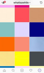
 Answers: Instagram

+ Concept: share simultaneously what you’ve done with your followers.
+ Design: matching the concept (edit an image, description bellow, location, share…).
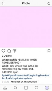
+ 1 Square 1 color: focus on the main theme ‘color’, interesting visual aspect (variety of colors).
+ # ‘hashtag’: to be seen and share data.
+ Follow or be followed by similar accounts


Ideas to complete:
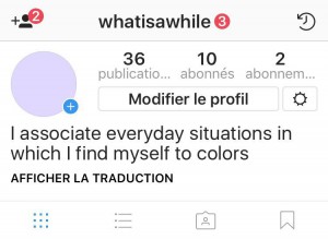
1) Account’s name: ‘What i saw while’ = @whatisawhile
It refers to which color I’ve seen while a daily situation occured to me.
2) Profile picture: The color I identify myself with.
3) Short sentence to describe the account’s theme: ‘I associate everyday situations in which I find myself to colors’.

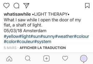
4) Description bellow image: for each image the description will start the same ‘What i saw while’ to give the account a rhythm and an identity and for the viewers to remember the account’s name.
Always the same plan for each publication: 1 color as an image – 1 title as color’s name – 1 sentence to contextualize – 1 date – 1 town – few hashtags.


FINAL PROJECT


WANT TO SEE MORE OF WHATISAWHILE‘S COLOR SYSTEM?

GO follow @whatisawhile on Instagram to discover other stories hiding behind the colors!! 🙂

Community to change the system


Tuesday, December 5, 2017

Dave Hakkens creates machines to recycle plastic. The concept Precious Plastic is that everywhere, everybody can build themselves these machines and recycle their plastics. For me, the most interesting point in this concept is the community around it. He says

“To start up an idea is a powerful tool to use these days. A designer is able to bring people together by just sharing an idea or a potential solution.”


Dave Hakkens and his projects are accessible in two points.

Most of his design projects are often provides with open-source instruction videos and blueprints, so it is presenting as a do it yourself project. You can inform yourself, make your own machine or your design object, share on social network, and use it. Make and use these projects is to be active to change the system, and be a designer as well.

Furthermore, he is very active on social networks. On YouTube (with 122 000 followers), he often published videos to clearly explain his projects, how to make it etc. But also he has a certain way of life that you can clearly see in his videos called Story Hopper.

or an other link:  here.

If I had the opportunity to talk to Dave, I would ask him if he thinks that in addition to this solution to reduce plastics wastes we also must have to adopt a minimalist and zero waste attitude. For me, the series Story Hopper highlights this way of thinking because he gives advice on how to consume and act more responsibly. These videos fit perfectly with the sharing of opinions and go further with the ideas that he wants to present. He offers more than just designers content while playing with the border of social network influencers.

Also on his website, you can find the forum where you can talk with people around the world. It’s nice to see all these people who said « I want to recycle plastics but I don’t know where or how to start » Finally I understood that in this big community, some other little communities are created to make projects easier. On the topic, someone answer: « try to find people, and build an association or something with many people to reduce costs!»


expo_02_1100
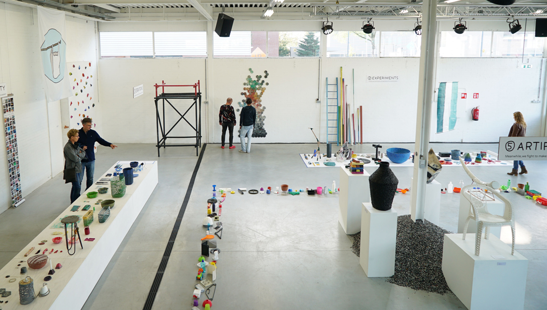
V3 Exhibition during the Dutch Design Week


I am wondering how this concept can grow and evolve in the rest of the world. Are social media enough to share his ideas? The definition of the word community by the Oxford dictionary is: the condition of sharing or having certain attitudes and interests in common“. 

Dave Hakkens and his projects are accessible for those who know him and who share the same interests. Plastic machines were at first introduced in a museum as an exhibition because Dave Hakkens is at first a designer. So a certain public is interested to see it and in this kind of place, it does not have the same purpose. It is difficult to apply something that you just saw in a museum. You can maybe just except to have a discussion but not really a revolution. What effect would he have if he presents his project in a hardware store? The visitors of both places are different and they are mostly not looking for the same interest. So I am wondering about the accessibility if Dave wants that everyone can build those machines and change the system. For me, to imagine the Precious Plastic project in a context more realistic like the hardware store allows more an action than a proposition that we can not touch and allows a wider impact on the population.


I discovered the work of Dave Hakkens thanks to my sculpture class at the Rietveld Academie. Indeed, some students were able to create two of his plastic machines: the injection and the extrusion machine. I spoke with one of these students and she gave me an interesting reflection: « He says that everyone can build those machines, it works for us because we are in art school, so we have all the materials needed and we always can find a way to be creative with the plastic machine, but I am not sure it’s the same in poorer countries, because it has a cost and maybe they did not hear about the Precious Plastic project».

It was quite complicated for students to build these plastic machines because some pieces were difficult to find, expensive, and a lot of detours at the metal workshop were needed. Finally, it took 6 months to complete the injection machine and the extrusion machine is still in construction.


PLASTIC MACHINE             Injection
Injection machine in the Rietveld (Left beginning of the construction, Right the electronics part has been added)


Dave Hakkens went in 2015 to Ghana for research to help the poorest countries to access the construction of plastic machines. As we could experiment at the Rietveld, this needs a lot of resources (internet or specific stores to buy the pieces) and money. But this visit to Ghana shows us that even recycling machines can be an option and it is not necessary to have money. They found machines which are made to press the juice out of fruits which are very similar to the extrusion machine, in this way they were able to reuse these machines as an extrusion machine with a little bit of do-it-yourself.  Also just a few weeks ago, he shipped a big container to the Maldives to clean ocean. However, the help of Dave Hakkens is still necessary to implement these solutions at first. Then, after his visit to Ghana, the local population can be more aware and autonomous to recycle plastic.

The fact that Dave Hakkens brings container is important because “the risk” of this way of building plastic machines is to build them for a personal use or very restrained, as the weekend handyman in his garage. Containers, places of many workshops to recycle plastics, can expand the utilization and bring a lot of people to work together. Indeed, it can not be an activity in its own right, but it should really be part of our way of life and as we can not spend our time recycling plastic. We may wonder if this community of active people is enough? What about the big industries? 

In fact, there is a start-up called The Plastik Bank which collaborates with the big industries. Plastic waste that invades the poorer regions of the world is collected by local people and then sold to companies that recycle it. But in the end, Dave Hakkens gives the opportunity to communities to create something with plastic, be autonomous in the research and win money (if they decide to) as part of the process. It is really like building something new, maybe a new society.


To say goodbye one more very interesting article on other people who tried to find solutions for plastic wastes. 

Results of day-to-day technology and modern media.


Thursday, November 30, 2017

An introduction to: Forensic Architecture. 
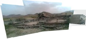
Forensic Architecture (FA) is a research based agency located at Goldsmith’s university, London. It undertakes advanced architectural and media research on behalf on international prosecutors, human rights organizations and political and environmental justice groups. It refers to the production and presentation of architectural evidence – buildings and larger environments and their media representations.

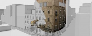
As contemporary conflicts increasingly occur in dense urbanized areas, homes and neighborhoods become targets. Casualties come to be in cities, buildings and the ‘safety’ of their own home. Nowadays, thanks to this multimedia era, urban battlegrounds are overflowing with information and data shared to social media platforms. Many violations, undertaken within cities and buildings, are now caught on camera and are made available almost instantly. The premise of FA is that analyzing IHL and HR violations must involve modelling dynamic events as they unfold in space and time and creating navigable 3D models of environments undergoing conflict, as well as the creation of filmic animations, and interactive cartographics on the urban or architectural scale.
 Forensic_Architecture3.top_

These techniques allow FA to create precise, convincing and accessible information that could be crucial for the pursuit of accountability. Architectural analysis is also important because it enables new insights in context of urban conflicts.

The widespread possession of cheap digital recording equipment, the development of satellite communication, the public availability of remote sensing technology and the ability to communicate and diffuse information instantaneously through the internet have made urban conflict more complex, but also generate enormous amounts of data that can be used as potential resources for monitoring. However, these transformations also lead to secondary conflict about interpretation that takes place on news and social media websites. The establishment of new forums of international jurisdiction mean that also contemporary forums themselves become dense media environments. In them screen-to-screen interaction replaces face-to-face deliberation. The combined process of the urbanization and mediatization of war makes FA an urgent and indispensable practice for human rights investigations. FA seeks to respond to these challenges by developing new modes of media research and new modes of media presentation for urban and architectural environments.
 

FA1-6.5-Photo-montage-TO-BE-CROPPED-TO-IMAGE


Results of day-to-day technology and modern media. 

Nowadays our lives are filled and dependent on electronic devices, and with that I don’t mean ‘the ones that keep you breathing in the hospital’. It is the smartphones, tablets, laptops, smart watches and what not, that makes that we can function in modern society. Because of it we can keep up with the ever-changing world on a speed that we have never seen before. Now it is a very contemporary debate if this is a positive development, many pointing out the negative. From a subjective and personal point of view I would have to place myself on negative end of the spectrum as well, seeing the unfavorable short and long term effects. Finding out about FA was because of that very thought-provoking.
I will open up a research project that compares positive and negative aspects of modern media and technology use in the present-day.
I will introduce this research through a series of set examples.


Generation Selfie

First of all, a negative side to the rise of social media is the deteriorating self image and esteem of essentially Generation Z and the Millennial’s.  Quoting scientist Clarissa Silva:

“Social media has been linked to higher levels of loneliness, envy, anxiety, depression, narcissism and decreased social skills. As a Behavioral Scientist, I wonder what causes this paradox? The narratives we share and portray on social media are all positive and celebratory. It’s a hybridized digital version of “Keeping up with the Joneses”. Meaning for some, sometimes it appears everyone you know is in great relationships, taking 5-star vacations and living your dream life. However, what is shared across our social networks only broadcasts the positive aspects of our lives-the highlight reels.”

The idea of saving and sharing the highlights of our lives has been a long past introduced concept, think about the photography albums your parents made of you and themselves. But in this new form of doing so, we are constantly bombarded with other’s excitements and achievements in life as well. From the envy and hate- love relationships we hold with our online society grows a competition with a non-existent finish line. Seeing photos and videos of your ‘friend’s’ beautiful holiday destinations, their new set of clothing and perfect life is just a start. The image we have our own appearance decreases drastically, not only as an indirect result of the examples shown above, but also the obsessive behavior around beauty.

It has been part of mankind that the vision on beauty evolves over time and differs from culture to culture, but the coming of social networks has changed the game thoroughly. We can change our DNA online to look like what we see as perfect. Setting impossible goals for ourselves in real life, which makes it less interesting to ‘live’ there.
Animated GIFAnimated GIF

Here is a link to an ongoing social media based project using Instagram as publishing base and inspiration input.


Panoptical Society

“He who is subjected to a field of visibility and who knows it, assumes responsibility for the constraints of power; he makes them play spontaneously upon himself; he inscribes in himself the power relation in which he simultaneously plays both roles; he becomes the principle of his own subjection”

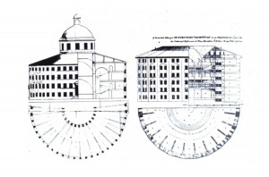
A quote from Michel Foucault about ‘Discipline and Punishment’ and his theory of the panopticon, referring to an experimental laboratory of power in which behavior could be modified, he viewed it as a symbol of the disciplinary society of surveillance. Jeremy Bentham proposed the panopticon as a circular building with an observation tower in the center of an open space surrounded by an outer wall. This wall would contain cells for occupants. This design would increase security by facilitating more effective surveillance. Residing within cells flooded with light, occupants would be readily distinguishable and visible to an official invisibly positioned in the central tower. Conversely, occupants would be invisible to each other, with concrete walls dividing their cells. Due to the bright lighting emitted from the watch tower, occupants would not be able to tell if and when they are being watched, making discipline a passive rather than an active action. Strangely, the cell-mates act in matters as if they are being watched, though they cannot be certain eyes are actually on them. There is a type of invisible discipline that reigns through the prison, for each prisoner self-regulates himself in fear that someone is watching their every move.
 

3000

Cross section drawing of how the prison is structured.


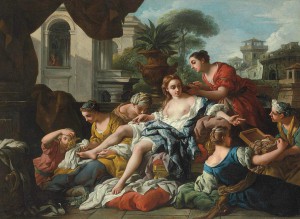
Nowadays we can question till what extent our privacy is legitimate. Especially in the western world where conspiracy theorists can not stop about ‘big brother’ and the never ending evolutionary steps in technology which make registering everyone’s smallest move and collecting this data easier. Still to be a fully functional in the society we shaped we require the illusion of privacy. It allows us to be fully human. This illusive quality of privacy is not something of the past decade, it goes back to the Hebrew bible. Consider beautiful Bathsheba, who strips for a bath in the second Book of Samuel, an ancient text, only to come under the lustful gaze of King David, pacing on his palace rooftop. Or Hamlet, whose private conversation with his mother is overheard by Polonius, hiding behind the drapes.
 

1-bathsheba-at-her-bath-jean-francois-de-troy

Bathsheba at her bath, by Jean de Troy (1750)

Hamlet Kills Polonius

Hamlet killing Polonius, by Leonard de Selva (ca. 1980)


This enormous growth of ways to document humanities slightest movements with or without their full realization is not lacking a reason. Governments worldwide are gathering data about their civilians, justifying it by telling us it is for our protection. Like possible terror attack prevention. But why would they need your WhatsApp messages? A connection to your webcam? And access to private files? Princeton computer-science professor Edward Felten explained that simply because it’s cheaper and easier than trying to figure out what to take and what to ignore. “If storage is free but analysts’ time is costly, then the cost-minimizing strategy is to record everything and sort it out later,” Felten noted. Ofcourse this is questionable as well. And we have reason to be suspicious, we all know how classified and mysterious the higher working powers can be. Cases like Edward Snowden’s make us aware of the ambiguity of the top authorities. Snowden, a former contractor for the CIA, left the US in late May after leaking to the media details of extensive internet and phone surveillance by American intelligence. Mr Snowden, who has been granted temporary asylum in Russia, faces espionage charges over his actions.

This being a very contemporary topic, artists (as they tend to do) have taken a liking in the subject as well. At the Sonic Acts: The Noise Of Being exhibition in February 2017, I saw the work of Zack Blas called Facial Weaponization Suite. It showed several masks hanging on the wall and a video explaining the cause. He calls is a protest against biometric facial recognition and the inequalities these technologies propagate. This mask, the Fag Face Mask, generated from the biometric facial data of many queer men’s faces, is a response to scientific studies that link determining sexual orientation through rapid facial recognition techniques. With this work he makes us question ourselves how much autonomy, privilege, power and privacy we let them take away from us. Or have they taken it all already, and is what is left just an illusion?
 

Exactitudes


Thursday, November 30, 2017

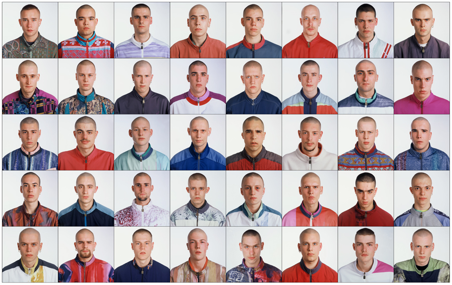
I chose this project because I find really interesting how every human in the world even the most peculiar looking ones can be catalogued in a group. It always intrigued me how much you can express with clothing and where are the borders between being unique or just following fashion. The photographer Ari Verluis and the stylist Ellie Uyttenbroek have been working in the project Exactitudes for more than twenty years, the name of this project is a fusion of “exact” and “attitudes”.

01--Gabbers-Rotterdam-1994

Vetements which was also in the exhibition Change Makers used Ari and Elli’s work as an inspiration for the autumn/winter 2017 collection. This underscores the critique of the fashion world. After the collection was online big chains started copying it. This open really important questions about actual fashion.

The presentation of the photos they take are always the same, a grid of three by four, making it almost a catalogue of types of persons where you could find your urban tribe.

Exactitudes started in Rotterdam but actually they work all over the world. It analyses how depending on your surroundings your style will be different. They say sense of style is something you’re born with, using as an example the kids who use school uniform, the ones that even wearing the same exact thing make a little difference like wearing a chain or rolling up his sleeves.

This project is not that much about fashion but more about people and it really has an anthropological quality that it’s admirable because slowly it’s documenting the changes in society thru the years and how some factors like social media.


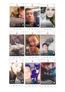
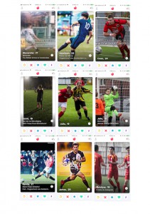
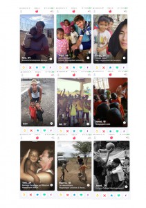
To understand better and interpret my subject I decided to recreate Exactitudes but with a twist: doing it on Tinder. Tinder is a dating app where you swipe left or right if you like the profile of the person or not.


cat owners dog filter

cat owners and dog filter


In the profile you create, you are able to post four photos where you have to sell yourself. You can also write about you, (but no one reads that). This dating app works visually. The pictures you post will make you have a match or a sad love life with no matches at all.

In the interview for the catalogue, Ari talks about the process of finding / collecting people and how they just sit in the street and wait for the right person to pass by. For me that process was more active, I first had to find which group I wanted to categorize. As soon as you start using the app, similitudes between the users pop up, and even though you can’t take photos of them with a white background and the same pose, when I arranged the screenshots in grids it was impressive to see how similar the photos were.


The research I made wasn’t that much about clothing, but there’s something in common with clothing and the images you post on Tinder to introduce yourself. They both are talking about you without words. You want to reflect your personality with them, it’s like a mute introduction of yourself.


soccer players

soccer players


Probably the people I put together in some of the grids won’t think they belong to the same urban tribe. I focused more on the attitudes they reflect on their profiles more than on what they wear. For example the soccer players, by making the choice of introducing themselves with a photo of them playing this sport place them in an idea of the kind of person they can be. The same exact thing would happen if someone shaved his head and wore a bomber, these decisions reflect a statement of who they are or how they want to be seen.


world saviors barbies

world saviors and barbies


World saviors is another example of how with a single image you can make a strong statement. They try to sell their person and reflect how merciful and helpful they are with the most needed ones. This could not be shown with clothing,


Now that Tinder and other social media platforms are opening opportunities for people to give the image they want to show of themselves is time for a new Exactitudes, but now in the virtual world.


Didn’t I see this before?


Tuesday, May 9, 2017

Didn’t I see this before?

Have you ever had this strange, but uncertain feeling that you have experienced something before? An overwhelming sense of familiarity? A moment you are not sure if something similar or the exact same thing already happened? Then you belong to the majority of people who have had a déjà vu. Scientists are still unsure how to explain this phenomenon. Some try to link it to memory functions, claiming that familiar events can trigger memories of forgotten information. Some say it’s a more like a “memory check” of our brain: a signal that there is a conflict between what we think we’ve experienced and what we actually did experience.

There are other interesting theories as well that try to explain a déjà vu:

Precognition: We have the power of foresight. A déjà vu is the evidence that we are actually able to predict the future.

Reincarnation: We have lived before. A déjà vu is the surfacing of a hidden memory, evidence of a previous existence.

Higher dimension: Our consciousness actually exists outside of our physical bodies in a higher dimension, and when a déjà vu occurs, it’s a brief moment when that separation becomes clear.

Parallel universes: There are other versions of ourselves, living in parallel universes. A déjà vu is a moment we share a memory with an alter ego of another universe.

Precognition: A déjà vu is the evidence that we are actually able to predict the future.


dejavu-gif


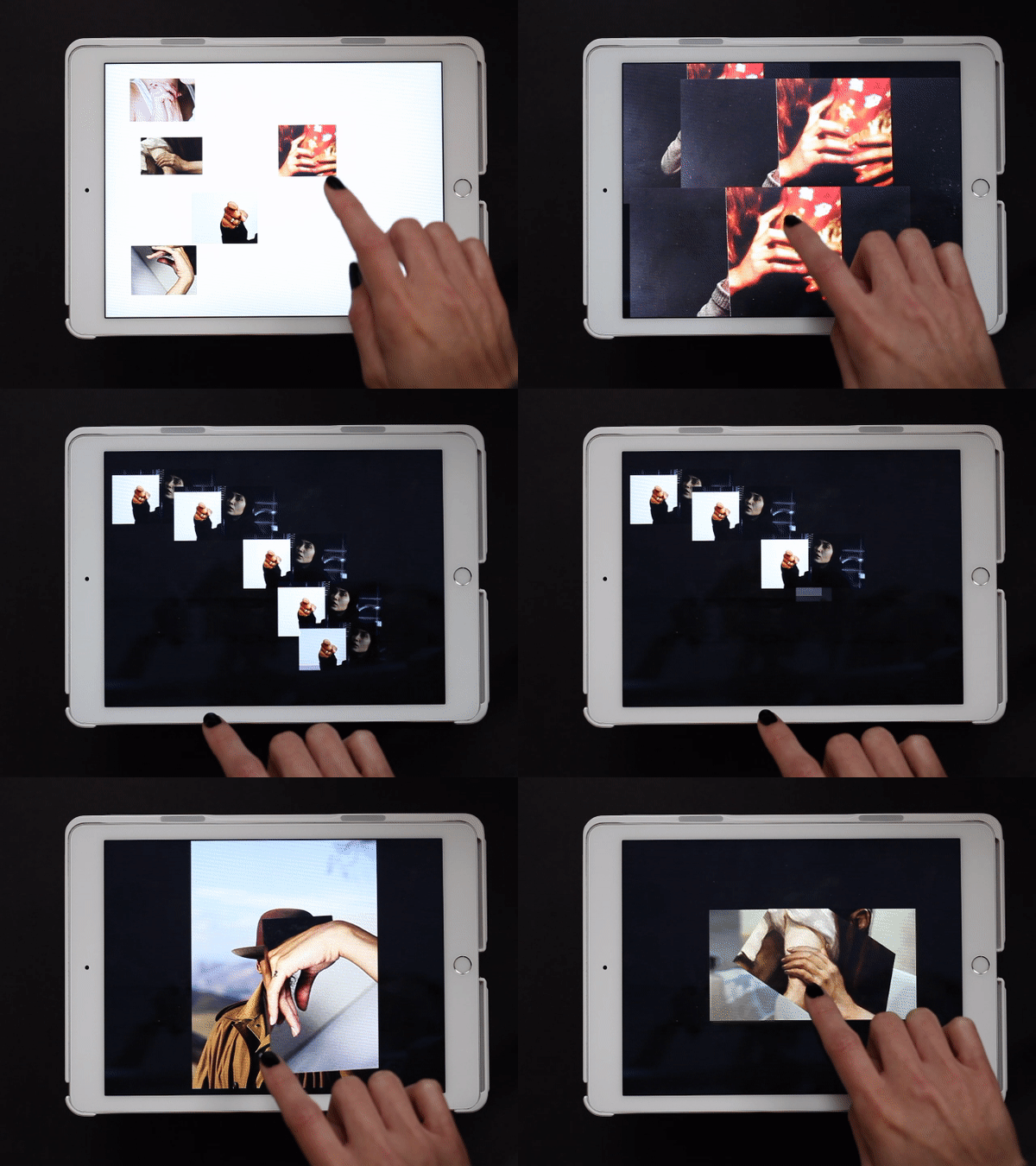
In a web app I created for iPads you can move along stories told by various images and collages of hands. Sometimes you end up at a point you think you have experienced before. But is it really the same, or does it just familiar? You might just have a déjà vu.

When browsing through the internet, we often experience this feeling of familiarity. Links and tags create a confusing net of intertwined information, often taking you back to a page you have been before. But because of the information overload we are exposed to, we are often not sure. Maybe you experienced it while surfing through the Design Blog, using the various tags. And you asked yourself, didn’t I see this before?


Log in
subscribe