Skip to Content Skip to Search Go to Top Navigation Go to Side Menu


"spine" Tag


PANAMARENKO – WORKSTATION BIEKORFSTRAAT.


Sunday, March 10, 2019

It is said that you can’t judge a book by its cover. Can you, then, judge a book by its spine

Without even reading what was actually written on its spine, my attention was already drawn to the book “Panamarenko: Workstation Biekorfstraat” through the way it was presented to me; acting as a successful gateway to everything that it had to offer in terms of material. As a piece that was advocated for and supported by the Museum of Contemporary Art Antwerp, the designers, the duo Van Looveren & Princen, no doubt had a great responsibility on them when tasked to design the book. This becomes evident by looking at even the connective piece between the cover and back-cover that stuck out of the bookshelf, ready to be chosen.

An olive-green, textured fabric, wrapped and spanning from part of the front cover to part of the back cover, with the two separate pieces of text coming together to form the greater title. The two texts are as similar as they are different; One is presented in a care-free and playful manner through its stylized font, as if handwritten, whereas the other gives of a much more stern vibe as if passing an ode to the typewriting system with its more ridged typeface. However they find common ground and confide in each other in the manner that they seamlessly contrast the fabric on top of which they are placed by being left blank in regards to their colour. The use of a more casual and characteristic typeface for the first part of the title of the book presented me with a very personal impression of the contents that the pages would contain, almost intimate; almost as if the artist himself entered the room and wrote his name on top of the spine (Despite this, this does not relate to Panamarenko’s signature). This is then contrasted by the continuation of the book title which is shown in a much more organized in presence, which made it a lot more clear upon even the first glance that everything that was to be presented inside would be done so with an approach aimed to provide a sort of guidance and structure.

In fact, the book does exactly so with its material – providing a very extensive list of everything the artist contained in his house in an, at times, almost satirical catalogue-like manner. This plays well into the duo’s style of work, which tends to present a plethora of objects in a very efficient and condensed style, as can be noticed by some of their other works. The book itself focuses on the preservation of the entirety of the artist’s workspace, which acted as a his hub for creativity from 1970-2002, acting as a means of casting light on the creative process of the artist’s works; Most of which noteworthy for their sciencefiction inspired, machine like structures. The title, as such, give off a strong idea of what was to be shown, by presenting the actual street address >Biekorfstraat< in which the house was situated, in addition to providing the purpose of the house as a workstation.

Despite looking through the book prior to taking it up to the librarian to have it chosen, the simple yet effective presentation of the spine drew me to it as though it exposed the entirety of its contents to me all at once, and opened the world of Panamarenko to me. It was not just the textured fabric, only the typefaces and simply the contrast that drew me to choosing the book, but a combination of all three, indicating that the spine of the book was not a quick idea thought up by Van Looveren and Princen, but rather an important aspect of the book which was deeply thought of before being put into final production.

Willemse, Hans; Baere, Bart De; Coulon, Didier; Deleu, Luc; Willemse, Hans: Panamarenko, Workstation Biekorfstraat. design by Van Looveren & Princen, Rietveld library number: pan 9

The third book search…


Wednesday, December 5, 2018

The third week of searching… This week I was unable to attend class as I had to take my Tyler Durden of a cat to the vet to remove stitches from his head. I have become out of touch with the assignment (it was confusing to start with so I’m completely in limbo). This week I chose from my own library. The book had to be out of the parameters of “design”, it had to be something else. As someone who is predominantly invested in design this left me with little choice. I chose the book “tricks” by Bart Julius Peters. This book has given me many hours of entertainment as well as many inspirational moments. This book is comprised mainly of pictures with small texts, some I english, dutch and some in Italian. This book spoke to me as it has a non-binding, the pages are loose and can be taken out. I find this fascinating as from an early age I have been obsessed with organisation, I find it fascinating that is one desired they could simply let the pages fall out and thus be jumbled up and if the reader has not paid attention the original order could be lost forever. The book features pictures of details in wildlife but also classical sculpture. As a happy accident this book does match my original tree tags which where “spine, monochrome, pictures”.

“Essi offrivano lo spettacolo più che patetico ballano ai ogni insieme, aiuo, ciechi quen

di due giovanissimi innamorati ammonimenti del destino, illusi che ai difetti reciproci, sordi agli liscio come il pavimento del salone, tutto il cammino della vita sarà la parte di Giulietta e quella attori ignari cui un regista fa recitare di già previsti nel

di Romeo nascondendo la cripta e il veleno, calcoli, copione. Né l’uno né l’altra erano buoni, ciascuno cari e pieno commoventi di

gonfio di mire segrete; ma entrambi erano

mentre le loro non limpide ma ingenue ambizioni erano obliterate dalle parole di giocosa tenerezza che lui le mormorava all’orecchio, loro dal profumo dei capelli di lei, dalla reciproca stretta di quei

corpi destinati a morire.”

Giuseppe Tomasi di Lampedusa, Il Gattopardo,

Feltrinelli Editore, Milano 1958

The second search…


Wednesday, December 5, 2018

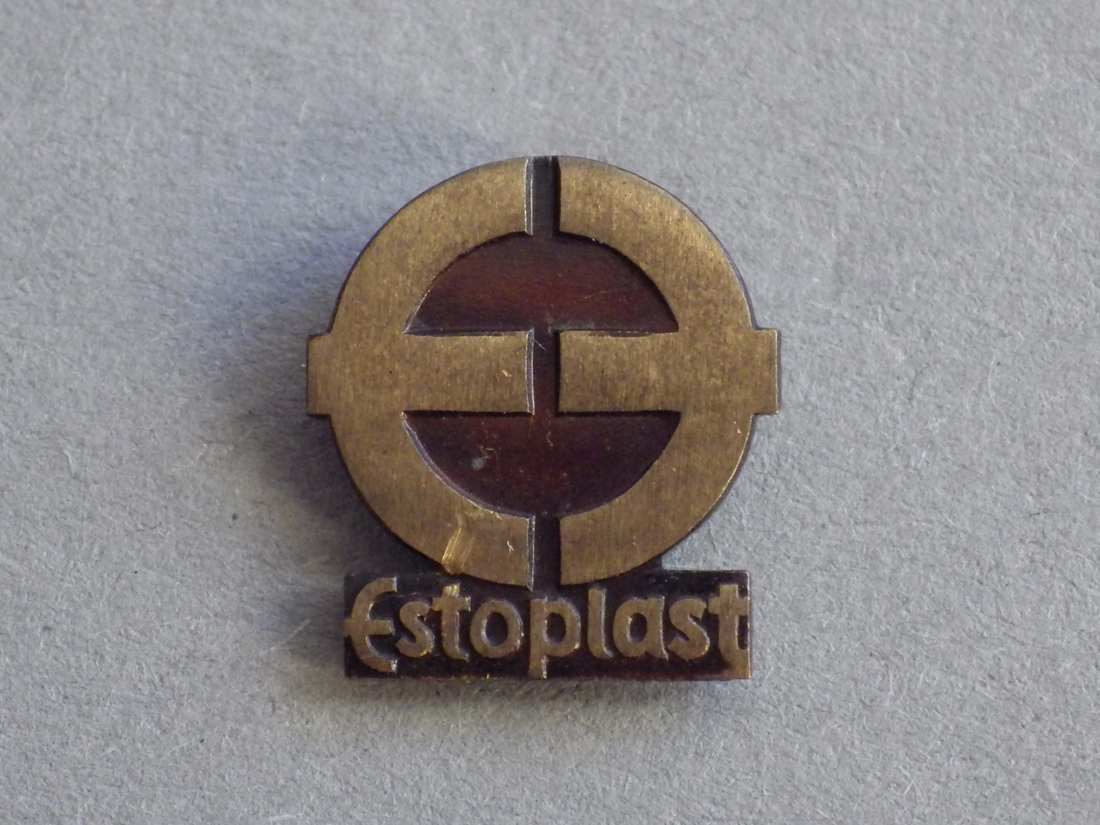
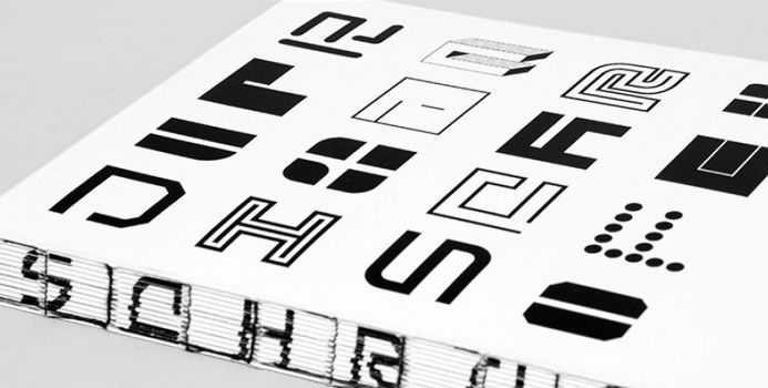
This week 3 words define our search. Mine are “spine, monochrome, image” A spine I find unusual and interesting, a book with only monochrome pictures and text, a book which is mostly comprised of images. As I search for the book which will meet all my categories I am struggling to find one which is convincing me. I find many books which apply to a single word, many books which apply to two of them but the real search for the ultimate match has just begun. As I notice how silent the library is I whisper to class mates who have made their decision and discuss their decision and the lack of mine. I travel back and forth deliberating and deciding. As I travel I think to myself that this is an impossible task and I will need to change my words. Alas I am stuck in the library again. As I look through the collection of books I start to notice how many of them look so similar both in regards to their spine but also layout. This task seems to be a tedious one. I travel upstairs in the hope that the perfect book will present itself. As i walk along the grid and glide through the books on the shelf an unsuspecting book presents itself to me. Like a beam of light in the darkness, like a light at the end of the tunnel, like a candle in the dark. This book is called “nobody suspected there would be much discussion about it”, quite appropriate in my opinion. the book has a cover which folds out to be a poster and the binding is satisfyingly odd. The entire book documents the works of designers working for Estoplast in the soviet union. The entire book is comprised of mostly pictures which are monochrome, three birds with one stone!

The first search…


Wednesday, December 5, 2018

Looking across the spines, looking for something that will excite my eyes and brain. looking for something I will like, that will make me feel something. So many titles of enticement. The search started with colour. What is the best scheme? The text doesn’t appeal but the colours do and vice versa. The high contrast of complementary colours creates a vibrant look especially when used at full saturation. The colour scheme must be managed well so it is not jarring. Many books later I start to think of harmonies, they usually match well and create serene and comfortable designs. Analogous colour schemes are often found in nature and are harmonious and pleasing to the eye. I have stumbled upon a trove of material. The search has been narrowed and now the idea of colour appeal does not suffice. The search then narrows to binding technique. The differences stand out. I try to purely focus on the physical aesthetics of the book. Focusing on what I like and what appeals to my eyes. As i blouse I seem to stumble upon more and more books which could be candidates. The diversity is wide and intimidating, many thousands of books stand in front of me, decisions need to be made. My choices have been narrowed down to mostly graphic design books. As I conduct the final steps of the test; browsing through the books. I judge purely on my own likes and dislikes. I am not satisfied with my final books so I go back to the search. Suddenly a book stands out to me, the binding is complex yet satisfyingly simple and minimalist. I pick up the book titled “restless typographer”.  I sit down at the table and start to flick through the  book and my mind is made up. This is the book I must choose. It spoke to me and I listened.


Log in
subscribe