Skip to Content Skip to Search Go to Top Navigation Go to Side Menu


"visual language" Tag


I’m new here


Friday, May 24, 2019

.

*****

I don’t really know the way, but I want to. I have this habit to wander off randomly when I’m unknown with a place. Just to see where I’ll end up if I let go of control. “Let fate decide” says the romantic in me.

After a while I see patterns and I believe that I know where I am. Finding attractive by-streets in every corner. But that’s an illusion. By the next turn this pattern is shattered by reality.

I don’t know where I’m going, but I know I don’t want to stay. Just keep going, till this frame turns into bedlam. Borders can’t contain me anymore. Looking back I can’t trace back my origins. I’m not lost. I’m new here.

I am chaos.

.

Space in the Metro universe


Sunday, May 20, 2018

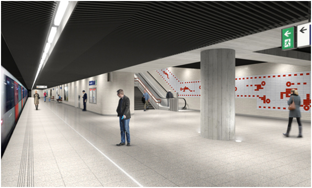
How do we recognize a map? That is the main question rising when we stand in front of the new decorations that appeared in differed Metro stations in Amsterdam. Together with design bureau Fabrique, Group A architects was responsible for the design [x] and renovation of stations along the Oostlijn Metro in Amsterdam.  Group A has created a design that is not only a return to the basis of the original design’ but also reflects ‘a vision of the future’. In an interview for Grafik.net website, Rene Knip, the main designer of the project, said: I’m taking the walls of stations and starting to tell things, I’m leaving it open — stories that are not understandable but everybody wants to read. I give type the opportunity to mean something, I give the people visual material to build meaning, a visual story that is free to dive in – the way they do it is their story.”

 
metro 1
Photoshop sketches for visual language tableaus for the renovation of the Oostlijn metro in Amsterdam, 2013

 
When looking at these decorations, they immediately receive the shape of mystery maps revealing unknown places. They become a visualization of a secret landscape or an imaginary place. The reason that we see those unknown images and connect them to maps might be the language that was used in the design of the decorations. The use of red broken lines and empty dots, above a white background, connect us to the visual language of the Metro maps, but also to childhood treasure maps that uncover precious secrets. Knip described that the Metro designs were inspired by childhood experiences.

The Metro stations can perform as a universe on their own. When we look at a Metro map, we find out it is very much composed by straight lines, even though the path in fact is not straight. The maps are not designed in a way that allows you to find your location in the world, but instead they give a relative information of where is your station in the order of the Metro station system. Your location is relative to the route you are on.

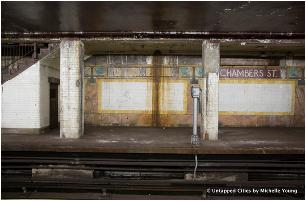
In this universe there is an order of actions that you have to perform in order to get to your destination starting with passing your ticket to enter. Once you arrive, you pass your ticket again and go back to the outside world. The Metro maps are the maps of a parallel world, that is connected to the locations outside, but also has existence of its own. You can travel under the city in a parallel universe that its whole reason of existence is to allow you to pass between places. In New York, abandoned Subway stations are becoming a strange space in which things are changing and transforming according to time.

 
metro 2
The tiling on a platform at Chambers Street has become significantly damaged

 
When we step out of the metro, and in our way out we see the decorations on the wall, it’s clear for us that they don’t try to illustrate the outside world. Why do we still relate ourselves to those maps? We know what it is but we don’t understand it, we recognize it as a metro map but we cannot read it. Maybe the motive of fantasy that they hold, the fact that they are almost something familiar, but not completely, is what gives it its power.


metro 3

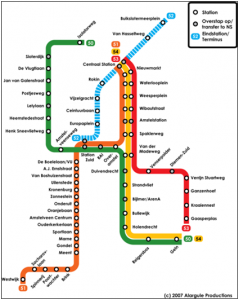
Amsterdam’s Metro map

 
Is it possible that the way the decorations communicates might change with time? when we look back at something in time, we might not understand the meaning of it, but this appearance of something that it constructed by rules might give us the feeling that there is a meaning hiding behind the unknown language. An example for this can be the hieroglyphs found inside the pyramids in Egypt. No one had used the hieroglyphs for more than 1,500 years, but since discovered, people knew that the hieroglyphs are not only decorations on the Egyptian kings’ grave tombs. Even though people believed that the hieroglyphs has a meaning, they were decoded only after hundreds of years, with the discovery of the rosette stone that was found in 1799. The stone is inscribed with three versions of a decree issued at Memphis, Egypt in 196 BC during the Ptolemaic dynasty on behalf of King Ptolemy V. The top and middle texts are in Ancient Egyptian using hieroglyphic script and Demotic script, while the bottom is in Ancient Greek. As the decree has only minor differences between the three versions, the Rosetta Stone [x] proved to be the key to deciphering Egyptian hieroglyphs.

 
Maybe in hundreds of years, the cultures following ours will come across those Metro decorations that has the quality of a secret map or a secret language, and will try to find the meaning lying behind those vague maps. Maybe when that happens, they would be able to find their own Rosetta stone [x}, and give new life to our symbols, that will receive a new form and meaning.

tumblr_o6swairt5L1r54c4oo1_1280
Linear IKEA Store “Transit” Strip Map
 

systems of thoughtful straights to speed up the round


Monday, February 22, 2016


IMG_2700IMG_2694


1 2


3 4


9 5


The code uses a sequence of vertical bars and spaces to represent numbers and other symbols. A barcode symbol typically consists of five parts: a quiet zone, a start character, data characters (including an optional check character), a stop character, and another quiet zone. The stripes can be scanned, the code is transferred to a computer where it is linked to the information about the product.

Unknown

It appeared for the first time on a piece of gum, invented to speed up the process of the person behind the counter, monitoring sales and supplies and eliminate errors and mistakes.

The speed and accuracy of the Universal Product Code made the barcode one of the most important and used designs of today.

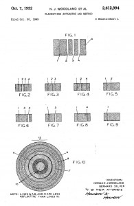
In 1948 Bernard Silver, a student at Drexel Institute of Technology, was interested in developing a system to automatically read product information during checkout. Together with his friend Norman Joseph Woodland he started working on a variety of systems. Their first working system used ultraviolet ink, but the ink faded too easily and was rather expensive.


barcode patent1


His next inspiration came from Morse code. He used the dots and dashes of the code and extended them downwards to make narrow and wider lines out of them. To read them, he adapted technology from optical soundtracks in movies, using a 500-watt incandescent light bulb shining through the paper onto an photomultiplier tube from a movie projector. Although there was a interest from various of companies to buy the patent, the required equipment that was needed to process the information was some time off in the future.


KarTrak


Some years later David Collins used a similar system to developed a system called KarTrak IIIII, using blue and red reflective stripes attached to the side of the cars, encoding a six-digit company identifier and a four-digit car number, the system was found to be easily fooled by dirt in certain applications, which greatly affected accuracy. And was therefore abandoned.

In 1967, Collins formed the Computer Identics Corporation to develop a black-and-white version of the code for other industries. As its first innovations, Computer Identics’ moved from using incandescent light bulbs in its systems, replacing them with helium–neon lasers, and incorporated a mirror as well, making it capable of locating a barcode up to several feet in front of the scanner. This made the entire process much simpler and more reliable, and typically enabled these devices to deal with damaged labels, as well, by recognizing and reading the intact portions.
With these innovation the system became interesting for the food industry and in 1972, a supermarket in Cincinnati began an eighteen-month test with this system.


first accuscan


Barcodes were printed on small pieces of adhesive paper, and attached by hand by store employees when they were adding price tags. The code proved to have a serious problem; the printers would sometimes smear ink, rendering the code unreadable in most orientations. However, a linear code was printed in the direction of the stripes, so extra ink would simply makes the code “taller” while remaining readable.

All these technological and practical developments and decisions were crucial for the outcome of the design and therefore the success of the barcode.

Being first printed over a carefully designed package of gum, it soon manifested itself on almost all products that surround us. On a bottle of water, a wrapped piece of meat, a car tire, a steel pipe, plants in the plant shop and made its way into schools and hospitals. IIIII


barcode shop
One of the latest innovations: virtual shopping


so many stripes
beech forest in winterland
brilliant black and white


The ability for a visual design that only follows the rules of function, is present everywhere around us but rarely noticed, has to be included within other designs because of its economical value, and is still being useful after more than forty years makes the barcode a brilliant piece of design.

[white stripes on the hot and cold black lanes, crossing vast sands

long and longer directed, goal and great precision

moving all scanned created and known needs over water and land

straight to the verticals and horizontals of men]

Scattered Matter


Sunday, October 27, 2013


ES Sandberg1


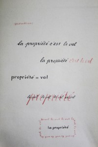
The picture shows a manuscript called ‘Lectura sub aqua’, part of the series ‘Experimenta Typographica’ from 1943 by Willem Sandberg.

Sandberg, a Dutch graphic designer, typographer and long term director of the Stedelijk Museum Amsterdam was forced to hide when the German occupation authorities discovered that he was involved in the resistance. While concealed on different farms, Sandberg produced graphic works out of the materials he found there – utilizing collected quotations – that correspond with his view of the world.

The chosen manuscripts states: ‘La propriété c’est le vol’ – property is theft. The slogan is a quote from the French anarchist Pierre-Joseph Proudon, taken from his book from 1840 ‘What is property?’. Proudon was a French politician, largely considered to be the ‘father of anarchism’.

I find Sandberg’s manuscript an interesting starting point to ponder the relation between content and form. The repetition and graphical variations that he applies on the inherently strong political statement seem to point out the link between the visual appearance of the statement and its content. Moreover, I find it an compelling artistic choice to break down the phrase into a simplistic formula, eliminating all parts of the syntax apart from ‘propriété’ and ‘vol’, making the phrase into an undiluted juxtaposition of two nouns. I feel that the two words not only strengthen each other, but also get the message on a high conceptual level.

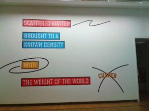
Sandberg’s work reminds me of some of the text works of Lawrence Weiner. Weiner started this conceptual artistic practice in the 1960’s/70’s utilizing brief phrases, statements or words combined in formulas put up on walls. I see quite strong analogies between the ways that the two creators employ typography as their medium, in spite of coming from different eras and creative practices. In the 1960’s and 70’s, when Weiner evolved as a conceptual artist, his work was considered extremely avantgarde. Looking at Sandberg’s work from 1943 gives me a new perspective on Weiner’s wall pieces.

ES Lawrence Weiner

As many of his statements manifest, Weiner is an artist strongly rooted in the present. At the event of the opening of his current solo show ‘Written on the wind’ at the Stedelijk Museum in Amsterdam, Weiner stated: ‘Time is looking at the sky and realizing that it moves.’ I always enjoy making connections between art works from different eras or fields. Discovering references between Weiner and Sandberg was nice, because it points out once more that there is no inherent difference between ‘applied art’ and the so-called ‘fine art’ that Weiner would belong to, if you would obey those categories. I don’t know where that difference would lay. I find it intriguing that once one decides to devote time and attention to art, it becomes inevitable to realize that similar tendencies have been and are present throughout art history, also crossing between fine arts and applied arts. Artists and designers work on certain ideas and develop certain styles that keep influencing each other, while those ideas keep gaining visual, symbolic and historical meaning with every new era they enter.

One could say that Sandberg and Weiner share the way that they use language and – more specifically – typography as their medium. For some years, I have had a huge interest in the relation between the content and the form of an art work. To me, Walter Benjamin genuinely sums it up: ‘Beauty is not the object and not the shell, but the object in its shell.‘ The relation of the object and the shell is a very relevant question for myself and my own artistic works. If I was asked to chose one source of inspiration for the rest of my life, it would be this one.

The reason why I have chosen to compare the works from Sandberg and Weiner is my interest in the question how phrases change when their visual appearance is changed. What I like about conceptual art is its power lying in the mere thought. In 1968, Weiner manifested some view points on conceptual art in his ‘Declaration of Intent’: ‘The work need not be built.’ I can just agree with that. I can say that I find the relation between Sandberg and Weiner interesting with regard to the different fields they come from (applied art versus fine art), the different times and the different working methods. Both of the artists’ works inspire me to think about the relation of the content and the form. It furthers the understanding of Weiner’s work to hear him talk about it – e.g. the fact that he considers language sculptural. Weiner also states that his works are to be understood as gestures – which are immediately understandable, so they become language, too.

Weiner and Sandberg are interesting examples, because both of them chose for the immediacy of the language, while at the same time playing around with different colours and graphic variations. Also, by using language as a tool or medium, they put a concrete thought out there, which comes off as quite forcing compared to other media like painting or sculpture, while at the same time it leaves a large space for personal interpretations and associations. I like the directness of working with language, but also the openness.

Weiner always works with the same typeface – a very simple mono-space font designed by himself. As he states in this 2008 video: „I don’t like Helvetica, because (…) I find it a clumsy typeface. I don’t know if I find it clumsy because of its association or just aesthetically clumsy, but I try to avoid it.“ By creating his own font, Weiner avoids standardized visual appearances. His wall statements seem to get carried on to another level of visual meaning through the font they’re set in and to gain additional meaning by the way they are molded by their appearance. But even this typeface seems to be perishable, as the artist reveals: „It seems to be functioning for a while and I guess, one morning, I will wake up and it will have entered into the culture in such a way that I’ll try to find another typeface.

A choice is always a limitation.


Wednesday, October 31, 2012


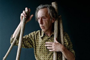
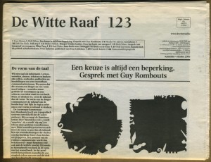
Guy Rombouts


Guy Rombouts (Geel, 1949) is een Belgisch beeldend kunstenaar.

Hij is opgeleid als drukker en heeft in de drukkerij van zijn familie en voor het Nieuwsblad van Geel gewerkt, tot hij in 1975 voor het kunstenaarschap koos. Sinds de jaren ‘70 werkte hij aan alternatieve communicatiesystemen. Zijn fascinatie met taal en letters leidde in 1983 tot het Drieletterwoordenboek.
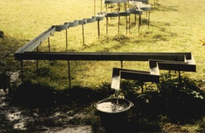
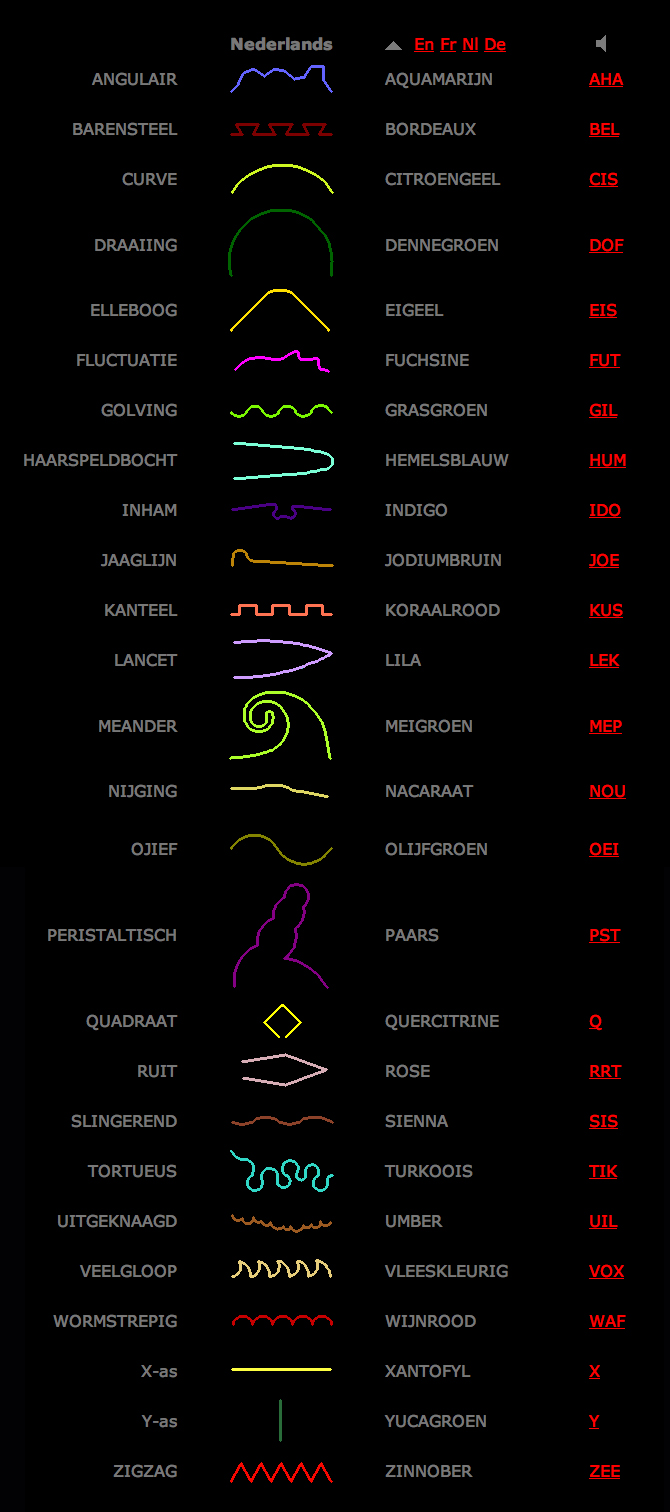
Sinds 1986 werkte hij samen met Monica Droste (1958-1998), met wie hij ook trouwde. Samen met haar ontwikkelde hij het Azart-alfabet, met letters die een vorm in een lijn, een kleur en een geluid combineren. Op basis hiervan maakten zij een aantal, meest drie-dimensionale, kunstwerken. Het eerste werk waarmee zij bekendheid kregen buiten de kunstwereld, was het ontwerpen van de Letterbruggen (1994) op het Java-eiland te Amsterdam.
Ook na de dood van zijn echtgenote maakte hij werken, waarin het Azart-alfabet wordt gebruikt, zoals de Lettertuin (hersteld in 2006), bestaande uit betonnen “letters” in Burcht (Zwijndrecht) bij de Schelde.
Er bevinden zich enkele werken van Rombouts in het Museum van Hedendaagse Kunst Antwerpen (M HKA).


Azart alfabet

“Monica vond de naam Rombouts niet universeel genoeg. In een oude Franse tekst was ik het woord Azart tegengekomen. Dat woord kan verwijzen naar het alfabet en – via het Franse hasard – naar de arbitraire relatie van taal en werkelijkheid. Daar konden we beiden mee leven.” 

— Guy Rombouts

azart alfabet


A choice is always a limitation.


(more…)

Unknown – Interior spaces essay.


Thursday, January 19, 2012

New revised edition of essays about spaces distributed inside of the cities and outside of these, inside of the ‘’close’’ and outside of this last. Reaching a new kind of environment trough different assignments and lectures related with the real world of now, breaking the based bubble attached to the ‘’what‘’ should be your space in the last 50 years. A generation is changing the screen of a real house trying to figure out this in a really different kind of space so far from your surface and so close to your rational and ‘’developed’’ imagination in the front of your screen. [x]

Complicated, frustrating, stressing, confusing, reaching a harmony between the conceptual and the real, is how it was the beginning of what you had been reading and looking or not yet. The conceptual taking a piece of a real world and its necessities, becoming it in a messy text inside of our minds and after a tiny text in a paper or whatever. Our text is changing its purpose taking the shape of some streets and places so far from these, big yellow tracks and intense white light at night enclosure by a skull net, are inside of these places, where our co-workers begin to work depending in several times on your behavior, critical point of view and other really important things. So there should be a certain point in all this last statement where this book take advantage and begin to compile simple and clear pictures and diagrams of the whole process of creation of a new space, adding certain text to make more understandable just for some people. ’’Interactive’’ is the right word to describe our commercial approach.

An essay and nothing more should be added. We just tried to create a recreation of your world and visualize it in our way. Beforehand or not we apologize about the mistakes that just you can find inside of this essay. But we are afraid to can do nothing by the moment because this is just a reproduction of your world.


this post is part of he subjective library project "Unopened Book"
the book can be found at the Rietveld library : catalog no : 774.7-c

Verder dan Faust..


Thursday, November 24, 2011

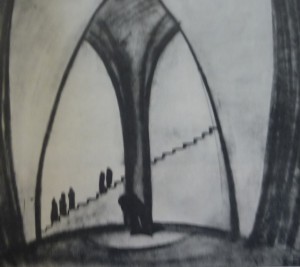
Ik zit in het archief van de rijksacademie en blader door de Wendingen issues. Opeens stuit ik op een uitgave gewijd aan de internationale theatertentoonstelling in het Stedelijk Museum Amsterdam [x]. Mijn oog viel op een afbeelding van een decortekening van Goethe’s Faust ( domscene I) getekend door Kurt Gutzeit. Een architect afkomstig uit Duitsland, lid van de Deutsche Werkbund  Een groep van kunstenaars en architecten. die in 1907 in München werd opgericht. De oprichters van deze werkbund streefden naar verbetering van het kunstnijverheidsonderwijs en kwaliteitsverhoging van de gebruiksartikelen. Ook namen ze een hele open houding aan tegenover de machine. Ze wilden een hechtere band smeden tussen kunstenaars en industrie. Dit verklaard de connectie tussen Kurt Gutzeit en de Wendingen. Ik ben altijd geïnteresseerd geweest in theater,  het is een op zich zelfstaande kunstvorm. En hier wil ik uiteraard meer over weten.

complete research (more…)

Hobo symbols and Rastafari language construct our fantasy similar to Cinema


Wednesday, June 2, 2010

Slavoj Zizek argues in his “Perverts guide to the cinema“, that each individual lives in a fantasy, fed by cinema. The role we play in society and the values we place on certain people, objects and situations are constructed by cinema. “If you are looking for what is in reality more real than reality itself, look into the cinematic fiction”(Zizek)

What is cinema actually? 24 frames a second. 24 images that visualize a story.  Usually accompanied by sound and dialogue to further visualize the story. So cinema tells us stories. And the stories create fantasies in the viewer.

However, we have not only started living our lives in accordance to fantasy stories since cinema. Story telling has been part of every culture. Through visual or literal means. It may seem like cinema is the most extreme way of story telling, as it can depict scenes in the most realistic way. However, as Zizek argues, cinema does not depict realistic scenes. It plays on the viewers fantasy. An example he gives is that porn depicts sex realistically. Cinema on the other hand, by hiding the obscenity, increases the erotic fantasy of the viewer even more. In cinema, the viewer is aroused through mere suggestions and everything around sex, not the act itself.
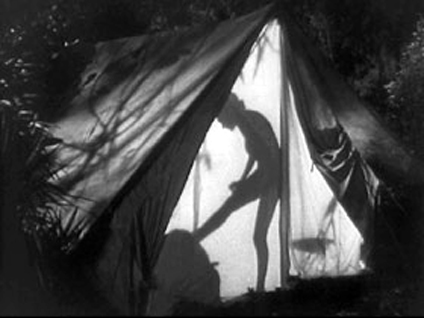
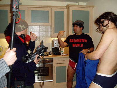
Jane changes clothes in silhouette,” from Tarzan and His Mate (1934) / “Percy changes his clothes” for The Dirty Weekender

The reason I bring this in, is that I want to investigate visual and literal symbols that similarly arouse the viewers fantasy through implying a story or some sort of meaning. Cinema is actually just a more complex alignment of symbols and construction of literary narrative. Therefore, Zizeks claim should also apply to more basic symbols and also language itself.

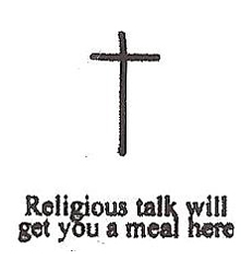
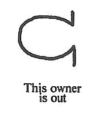
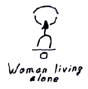
These images belong to a set of symbols used by gypsies and hobos. They would draw them on houses, street crossings etc. to warn and help each other.
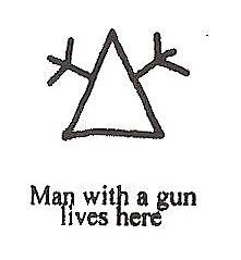
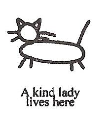
What I found most intriguing is the hidden implications these symbols hold. The symbol meaning “woman living alone” holds a very dark implication. Even the shape of the symbol could suggest something sexual. Or the vulnerability of the woman, as this house can easily be entered.

A simple symbol like this can already visualize stories about rape, robbery or abuse.

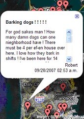
This is what struck me when I came across these symbols, flipping through a book in one of our design workshops. However it is not only an insight into the brutal reality of hobo life. It also relates to far more recent developments. The recently censored site Rottenneighbor.com was a website launched in 2007, by Brant Walker. It allowed users to anonymously mark the houses of neighbours on google maps.
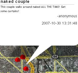
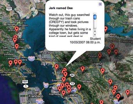
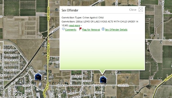
The concept of marking these houses has similarities to that of the hobo symbols.

Hobo sign for barking dog

The intensions and therefore the implications of these marks are different. The hobo sign is meant as a warning for when intruding into the property. The rottenneighbor entry seems to be more a way of letting out anger, a way of revenge.

In their function they are very similar though. The purpose of Rottenneighbor.com is to serve as advice for people choosing a new neighborhood to live in. This is very similar to the function of the hobo signs, although hobos would not look to buy or rent property, their signs also advise them about the safety of staying in certain neighborhoods.

On Rottenneighbor.com some entries also held similar implications to the hobo sign “woman living alone”.  There have been entries posted such as “Hier wohnt eine Schlampe, leicht zu haben und lässt die Tür immer offen.” a German post implying that the woman living in this apartment is easy to have and leaves the door unlocked. This post is an example for not going with the actual function of the website, of recommending neighborhoods. Instead it informs that there is something to get in this apartment. This makes its function even more similar to that of the hobo symbols.

This idea for an iphone application also plays on the idea of marking places to allow some sort of interaction with them. So the user would be able to search for, say, “a ‘safe camp’ or a ‘Kindhearted Lady’ (a picture of a cat) and then have the iPhone show him the location.”
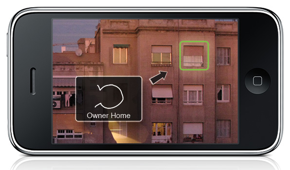
However it is not only visual symbols, that hold implications. Also language unconsciously creates and upholds values and stories.

To become aware of this in English language, it can be interesting to look at the language of the Rastafari. A culture that has been very conscious of their use of words and grammar.

The  language spoken by the Rastafari is based on Jamaican English. Its a creole language, which formed when African slaves were brought to Jamaica and had to adapt to the English of the slave masters. In their “reasoning sessions”, language was a big point for discussion and the Rastafari consciously changed it to rid it of any unwanted implications and meanings. “If you Really want to know how Rasta’s think, “Listen to them Talk” (Nicholas, Tracy. Rastafari A Way of Life pg.37)

There are three main purposes for which these changes in the language have been made

1) To be aware of the subjectivity of each individual and the unity of man

“I” replaces “me”

“Me” is felt to turn the person into an object whereas “I” emphasises the subjectivity of an individual.

“I and I” replaces the pronouns “him” she” “we” “you” and “me”

This change of grammar refuses the “objective case”, that which is acted upon.

It aims at seeing the subjective-self in each individual.

And showing the unity of man.

Inity replaces unity

Demonstrates a general pattern of replacing “you” and similar sounds with “I”. U is consideres negative as it sounds like “you”

Itinually replaces continually

It has the everlasting/everliving sense of I existing continuously.

2) To not hide true meaning, implications of words

Underpression replaces Opression.

Polytricks replaces Politics

Politicians as tricksters

Outvention replaces Invention

Mechanical devices are seen as outdated, and because it is the inner experience of being a Rastafarian that is invention.

3) To give words the positive implications they should have

Rising together replaces Falling in love

Everliving replaces Everlasting

Overstanding replaces Understanding

Referring to enlightenment that raises one’s consciousness.

Know replaces Believe

Rastas do not believe Haile Selassie is God and that they the Rastas are the chosen people. They claim to know these things, and would never admit to believing them.

Reasoning replaces Conversation

Any lengthy talk should not consist of conversing back and forth, but reasoning. Putting minds together to discuss anything from politics to sports or everyday life.

Sign In or Sign Up?

We should pay more attention to the values that are created around us. The art of story telling is constantly affecting our fantasy. Not only in cinema. Im not saying that language or images should be changed to give them more positive implications. But like the Rastafari, we could become more aware of their importance.
Maxell 90 Gold


Thursday, March 4, 2010

For me sound is something mysterious, because I’m deaf. during my childhood I was fascinated by music cassettes (casette-bandjes). People love these things. For me it was hard to imagine.
Something coming out of the cassette that I couldn’t see.
some more interesting elements:
– gold/black – variety volume of lines – symmetrical holes – two hole with teeth – rectangle with round corners – easy to put in pocket – parallel lines–

scale drawing “make invisible visible”

final presentation

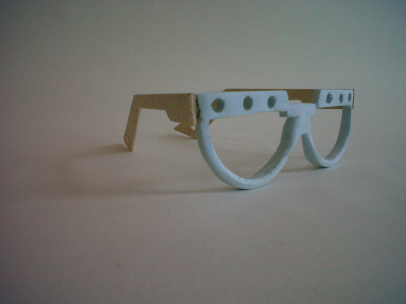
Exploring the possibilities for translating the idea into a product brought me to a new space for viewing the designwork. I fell in love with the PET-foamboard material and thin woods. I could change the shape and lines (movement).
During the translating I solved the technical problems/errors that I couldn’t see in my scale drawing. I had to wear the showmodel glasses in order to solve these problems and find the right shape (nose-holding, hinge and degree angles).
I’m happy with my first design product translation from the (inaudible) cassette-band and I don’t mind wearing it.

Design linked to Art: Designblog’s New Library Search Engine


Sunday, April 5, 2009

New Tags for the Rietveld Library:

How do you find interesting books when you don’t know what you are looking for? How do you stray through the collection in search of inspiration? Can the library catalogue help you or do you better construct one yourself, Exploring connections in the library between design- and artbooks, students created keywords/tags that linked them together.
a recount of tagging the library

Click the keywords/tags from the Tag-list [purple column at the left] to see all related postings, or use a yellow keyword link [below] to read the postings and experience how they are connected together. Use these keyword links to navigate between the postings!

overview, freedom, animal, elder, identity, intervention, repetition, connection, tattoo, self sufficiancy, structuur, illustration, pyramid, leader, visual language, individuality, playground, best, give, beeld, independent, shelter, West Coast, time, neon, develope envelope, fragile, construction, wisdom, invention, oppervlak, culture.

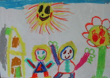
Children drawings


Thursday, April 2, 2009

I found a strange book with drawings made by children pasted inside. Why were they pasted inside, and why was only the first drawing printed in color.
The first drawings were made by children between 4 and 7 years old, the drawings at the end of the book were made by COBRA artists.
Language makes one look into the world in a specific way and the other way around; language reflects our ‘views’ on the world.
Children at the ages of 4 and 7 don’t look as conceptual at the world as adults do. Children mostly make use of essential basic-shapes by expressing their feelings and visualizations. Many modern artist seems try to get back to the essential by deconstruct the visual world. The understandable visual world falls apart and becomes one in abstraction.

cat.no. 705.8 zwa 1

keyword: visual language

Gothic


Wednesday, March 25, 2009

Dark glamour

The word itself, derives from the Latin gothicus, or pertaining to the Goths (gothos), a nomadic, warrior people inhabiting the forest of northern europe in the third century AD.

The Romans regarded Germanic tribes like the Goths as barbarians. Differend tribes like the Visigoths, Ostrogoths were notorious for destruction.

Looking through the book I see a lot of extreme styles, most of them are dark, rough, kinky or has something sad or agressive. By styling ourselves with clothes, make-up, or ornaments one tries to look for individuality. The rules for clothes within a subculture gives the wearer potential to carry out a certain message. With visual language like clothes we can be clear , accent, outspoken, mislead or hide. It’s a way to promote ourselves like tv-commercials do.

It has to do with make believe and believe in.

cat. nr: 708.4

keyword: visual language

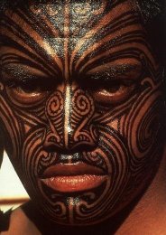
Decorated Skin


Thursday, March 19, 2009

We consciously recognize  ourselves and our own bodies. This gives the skin a special significance, as the final, slender layer that separates the self from the outside world. In reflecting on ourself and our world, we use for expression.
Body paint is a strong way of expressing. Used a lot in rituals which has to do with birth, death, religion, haunting etc..
There are strict rules for the forms, patterns and colours in a particular culture. There is also space for personal input. These rules gives body pain tan extra layer, value in the way it is a visual language understood by a whole group of people.
Body paint, the patterns, colours reflect the culture and the other way around. Example: In times of war, colour use and patterns change.
Nowadays body paint is seen as primitive by many people. We use make-up to decorate our selves or for expression.
But why don’t we use this potential pure, easy and strong visual language ‘body art’ anymore. I really mean patterns and colours.
What is more expressive than the personal touch?

cat. nr: 908.9

keyword: visual language

E group : textile, medium or subject


Sunday, June 1, 2008

janineweefselJaninetatoo Janine Tielen presents herself and her projects in a special guest meeting with the students. (TXT department)

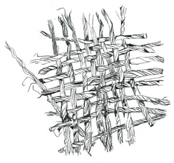
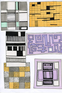
Textile can be used as a medium for direct communication. That was the basic theme for a cooperative project between the FoundationYears E-Group and the department of Textile TXT. A workshop at Platform 21 and a visite to the Vlisco exhibit at the “Volkenkundig Museum” in Leiden presented a rich and colorfull context for gathering insights and practise skills. more in …… (posting 127)

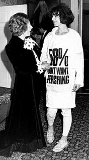
Boris-Bauhaus sketches Katherine Hamnett and Margaret Tatcher Vlisco fabric detail

Research subjects were related to the various subjects of this project and edited down to A4 sized guided tours into selected subjects. All subjects linked in this posting are also available as hard copy research prints at the ResearchFolders available at the Rietveld library.

On the subject of Text and Textile :Katharine Hamnet (fashion designer), Harmen Liemburg (designer illustrator), Roy Villevoye (artist), Janiene Tielen textile designer). On the subject of Platforms 21 “Cooking and Constructing” the participants; Frank Visser (stylist) from SAP: Daniera ter Haar (colorist), Christoph Brach (product designer), Shane Waltener and publicist Debra Solomon. Related to the Textile department; Erik Wong (graphic designer, Heleen Klopper (textile designer), Joke Robaard (artist), loop.ph (design & research)loop.ph, Petra Blaisse (designer), Fransje Killaars (artist), Scholten and Baijings (designers) and Vlisco (Holland), Batik (Indonesia), Bauhaus Textile, Sonia Delaunay (artist/designer) and Viktor Vaserely (Artist)

Gerrit Rietveld as a kick-off


Monday, April 7, 2008

sangyong_portraitSangyon_maquette2

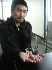
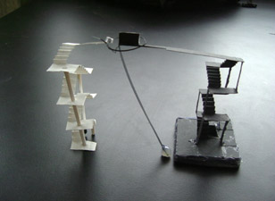
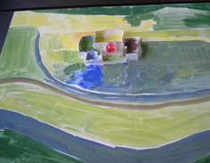
Our Design Program consists of 7 different classes. All focusing on an aspect of the design spectrum. In one of these 4-week classes Carla Boomkens creates a laboratory in which the students get access to the visual language of shapes in large format/scale, through small-scale researches on the essentials of spaces and what they can express: spatial-/architectonic design. (links to: Allan Wexler, Eero Saarinen, Zaha Hadid, Paul Gehry, Rudi Riciotti

maquettes_display
All projects have a start at the buildings of Gerrit Rietveld (1888 – 1964), the architect of the main-building of this academy. Sometimes the academy-building itself is taken as a research-location, in other cases a building is selected by the student out of his whole body of built works. In doing so, the student studies and gets acquainted with his approach to spaces and his choices to making them fit for particular needs and functions, in relation to it’s environment. (links to: Luis Barragán, Peter Callesen,

Elmer_maquetteMartino_maquetteDagmar_maquette

Departing from ‘the lessons we can learn from Gerrit’, which the student can easily use as a hand-grip in learning technique and working method, the student can freely develop her/his own expression of sculptural quality, choreography and a personal research for exciting spaces. As you can see, we work in scale-models. The student is asked to develop an authentic visual language in this field as well. (links to bookshops Architectura & Natura [dangerous grounds] or publisher Lars Muller

Julia_maquette-interiourCecilia_maquette

The assignments may appear similar to each group/project, but they never deal with the same subject – this guarantees a fresh start for each session with a new group. (link to: Gerrit Rietveld, Barbara Visser [Maison Grégoire or Transformation House])

posting prepared by Carla Boomkens


Log in
subscribe