Skip to Content Skip to Search Go to Top Navigation Go to Side Menu


"documentary" Category


Photography: A Reproduction


Wednesday, October 25, 2017

Photography: A Reproduction
Johannes Schwartz’ exhibition Blue, Turning Grey Over You at the Annet Gelink Gallery [x] shows photographs of photographs that Piet Mondrian took from his paintings. In other words, Schwartz’ works are ‘reproductions’ of reproductions. Nevertheless, one should note that Schwartz’ intention goes beyond documenting or copying art works. While Mondrian argues that photography is mainly suitable to imitate art works rather than to be an art form itself, Schwartz proves otherwise by depicting Mondrian’s reproductions, address book and records in photographs exhibited as autonomous art works. Hereby, Schwartz positions himself in a greater debate in the history of photography. The tension between photography as document and personal expressiveness has been the core discussion concerning the status of photography as art.

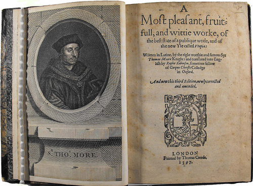
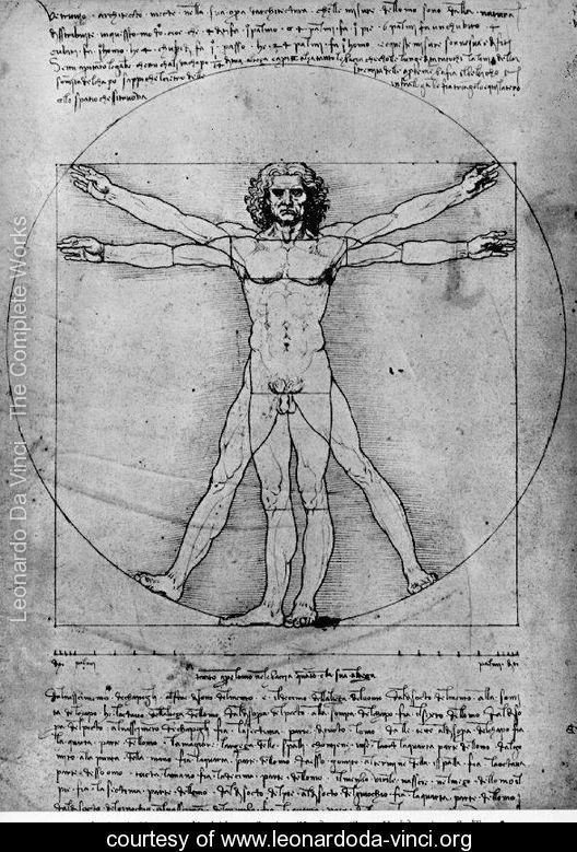
Nowadays it seems self-evident that photography is seen as art form. This, however, has not always been the case. There was already disagreement on the artistic potential of photography in the 19th century, when the medium was introduced. Nevertheless, it had by far the same recognition as painting. Moreover, photography was often considered a mechanical – rather than an artistic – practice. A century later the distinction between technology and art was put in question. The Bauhaus artists had a multi-disciplinary approach and aimed to integrate design, art and modern daily life. This questioned the position of photography and lead, particularly in Germany, to a highly topical debate during the 1920s. The Bauhaus artists considered photography, as product of modernity, suitable to depict this Modern Era. This was also stressed out in the article “Painting and Photography” (1927) by Ernst Kállai, editor of the Bauhaus Journal i10. Even though Kállai admitted that painting was a higher form of art, the Bauhaus’ approach on photography was still quiet controversial at the time. The Frankfurter School theorist, Walter Benjamin, claimed that art works have a certain authenticity or aura which photographs –whether a mechanical reproduction of a landscape or an artwork – do not have (1935). Mondrian wrote a few lines about photography that comment on and contradict Kállai’s article (1927)[x]. He considers the medium, as Benjamin, a mechanical practice suitable to imitate or reproduce objectivity. He did not value the creative or artistic potential of photography. Mondrian made reproductions for albums that enable him to show and explain his paintings. After that it was no longer necessary to explain the development of his work in his studio. This allowed him to show only his latest painting. Hence, photography was not used as an artistic expression, but as a tool to establish himself as an artist. Interesting is to add that there were only black and white photography at the time, which forced Mondrian to describe the colour composition of his work in the albums as well.

johannesschwartz2017_1100

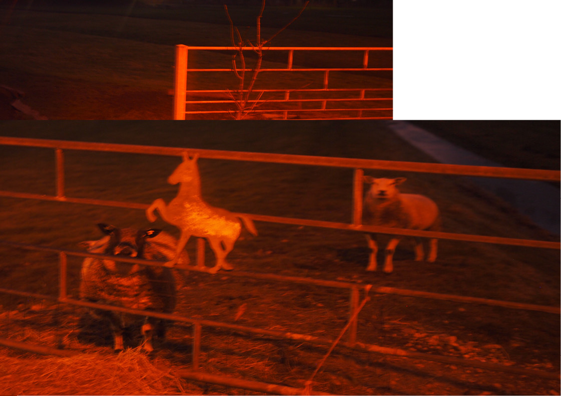
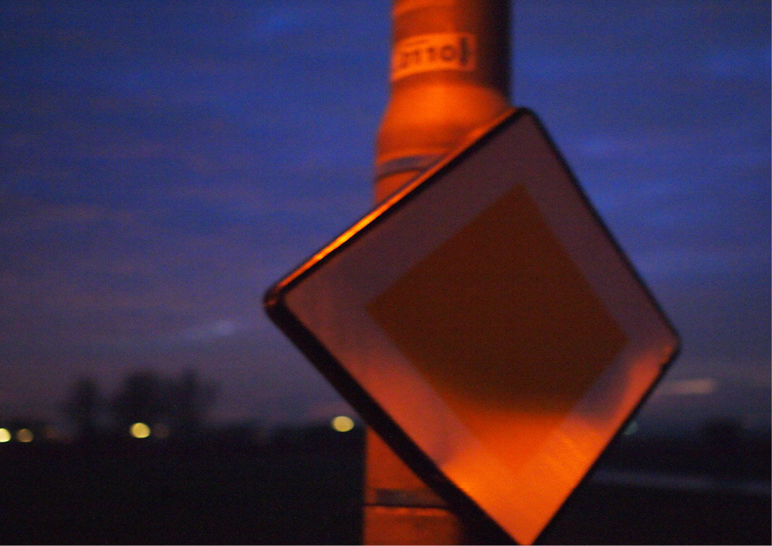
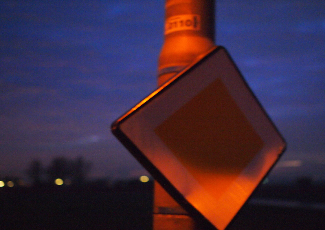
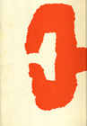
Johannes Schwartz PM #2, 2017


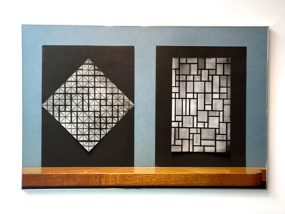
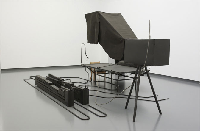
Johannes Schwartz saw Mondrian’s albums along with other personal belongings at the Netherlands Institute for Art History (RDK), when he was asked to document them for a magazine. This gave him the opportunity to see objects that are normally are not publicly accessible. Schwartz was particularly fascinated by the albums, which demonstrated the motivation and working drive of the artist. Mondrian took great effort in making high quality reproductions and describing the paintings carefully. The limitations of the medium at the time – e.g. being in black and white – did not seem to bother him and instead he found ways to overcome them. Schwartz got interested in creating a possibility in which more people would see Mondrian’s work attitude. However, his goal goes beyond documenting the objects for an exhibition. Instead, he plays with the (re)presentation of them. Mondrian’s reproductions, for instance, are photographed in colour and put on a wooden shelf with a blue-grey wall in the background. In one work different ‘reproductions’ are grouped in one line, noticeably build up from different pictures photoshopped next to each other. All these characteristics remind the viewer that the photographer took different decisions and actions in the making process. The latter raises questions that refer back to the central debate. It also doubts Mondrian’s position [x]… Do reproductions have the capacity to imitate or reproduce objectivity? Can photography in itself be objective or do the choices of the photographer inevitably evoke subjectivity? Does the intention of the photographer decide whether it is a document or an artwork? These questions, from the many one could ask, put the earlier mentioned discussion in a contemporary context. The visual aspects of the photographs add a conceptual level to the works, which differentiates them from reproductions that are merely meant as a copy. His work aims to intellectually activate the viewer and invite him/her to make associations, reflect and take a position in the debate. One can also go a step further and state that the works themselves provide an attitude towards photography. The exhibition shows that throughout the centuries, photography has developed to be part of the visual arts and that a conceptual level allows reproductions of reproductions to be autonomous works of art.

Get the Flash Player to see this content.


A video reproduction of reproductions of reproductions
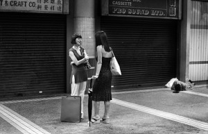
When visiting the exhibition, I started to think about the role of photography in general and the fact that the medium has never been as accessible as it is today. Everyone can take pictures and videos with their phones and share them globally. This consequently raises new questions about the relation between photography and art. In this train of thought, I filmed my gallery visit on my Iphone. The voice-over is a fragmented reproduction of a conversation I had with Johannes Schwartz about this exhibition.

What about Midden-Delfland ?


Tuesday, February 7, 2017

The photograph of a detail.
The remains of a campfire.
In the right-top-corner an other one:
children making a campfire.

The two images communicate.

Two photographs cut out and put together create a panorama.

Every chapter is an other story.

It’s an artist book.
It intrigues me.
Honesty emanates from it.
It’s pure.
It has this uniqueness that makes you fell in love.

From time to time,
there is a little bit of fragility.

The writings are wobbly.
Pictures are cut here and there they go on top of the other one.
Typewritten text strip are highlighting us.

The book has this very personal attitude. It’s hand made.
It has been made a while ago.
In the 1980’.

I’m a viewer.
I’m entering someone else world.

The title is written by hand.
I cannot read it.

It intrigues me.

I figure it out after a while:
« Midden-Delfland ».

I need to know who did it.

The name of the author is not written anywhere.
Everything is in dutch. I don’t understand.
I decide to go back to where I’ve found it.
The man who works here, in the library is a real passionate.
Of course he knows the artist:

Midden-Delfland_cover Krijn Giezen:
an important early eco-artist from the Netherlands (1939-2011). He started as Assemblage artist in the 60-ties and played an important role in the development of Land-art and Conceptual-art in the 70-ties. Other Eco-artists were Sjoerd Buisman, Herman de Vries, Hans de Vries and Waldo Bien. Eco-art is a collective term for art in which our relationship with the natural world is the main subject. Eco-art is not bound to materials and disciplines, but is bound by the integrity of its message: Eco intends to improve our relationship with the natural world.

Did he also design it ? We don’t know.
He may have collaborated with Hans de Vries.
They did few books together.

The internet is not helping.
Midden-Delfland  is a place in the Netherlands, all the pages are related to the place and not the book.

If I want to know more about this book I will have to contact the artists.

Krijn Giezen died some years ago and Hans de Vries is a common name in the Netherlands, also in the artistic field.
I cannot contact them.

Mmmh…
I start to feel the need and the urge to discover more about this book.

Midden-Delfland…Krijn Giezen…Hans de Vries
Midden-Delfland…

I should go there !
I should do a trip to Midden-Delfland !

Tuesday i will go to Midden-Delfland,
find more about the place and take some pictures of it.

I woke up too late.
I left the house at 1pm.

My trip to Midden-Delfland is now starting.
I take the tram. Oops. It’s the wrong one. I jump out of the tram.
I see the number 12 (right tram), I run to catch it, take a seat and start reading peacefully.
I’ve got time. I’m supposed to get out at the terminus.
The journey is taking quite a while though. As I decide to find out where I am, I recognize my neighborhood. I had passed the terminus a while ago and was now going in the opposite direction.

I finally arrive at Sloterdijk to catch my train to Delft.
There I will eventually find the bus number 33 that will take me to Midden-Delfland.
I wait.
The bus 33 is the only one which runs every half hour.
It’s now 4:45pm.
The sun will disappear any minute now, but I won’t photograph until I reach Midden-Delfland. ?I will manage with the light there.
As I’m in the bus I see the night slowly arriving.

Never mind if it’s not the right stop, I jump out.
I’m in the countryside. The landscapes are the same all around me.
I’m now walking. I want to discover more.
I have to take a few pictures while I can.
It’s just been 5 minutes that I’ve been walking but the light is now gone, it gave place to the darkness.
I don’t have a flash on my camera.
I’m tracking the streetlights.

This place is scary.
It’s been 15 minutes now and I’m still walking on that same road.

I’m not satisfied by the pictures I’ve been taking so far, they’re boring.
There, I see a church. It’s surrounded by street lights.

I walk in that direction. It’s too dark there, nothing interesting is happening.
That’s it, I’m going home.

I’m thinking “I should have woken up earlier”.

The bus is coming in 2 minutes. I feel lucky.
I’m freezing to death here.
I check in. It sounds like my OV chip-card doesn’t work.
I’m surprised, I’ve just recharge it in Delft station.
I try again.
It doesn’t work.
I don’t have any cash to pay the 5 euros the driver is now asking me for.
He doesn’t accept my Credit Card, I ask him where can I go withdraw.
The bus driver says he is not from here. He doesn’t know where I can withdraw.
He’s now asking me to leave the bus so he can continue his journey.
I leave the bus.

What an asshole !
The next bus is in an hour. In a fucking hour !
I’m freezing.
I’m not going to stay there, static, dying.
I walk, following the road I came from.

Everything is dark around me.
The only houses I see are very far.
Everything is just fields and ships.
I can’t believe the guy left me.
I’m shocked.
I’m thinking “And what if I get raped ?”
A human is passing by.
Hallelujah.
He looks at me like I’m crazy when I tell him I want to walk to Delft.
That city is 10 kilometers away.
The bus stop is just near.
I didn’t see it because it’s just a pole.
The next bus is coming in 45 minutes. ?
This time I will get in and won’t get out before Delft.
I wait.
I’m standing.
I hate to wait standing.
I start to sing, and dance to get warmer.
It’s so cold out there.
I’ve just been waiting 5 minutes; but I can’t. I can’t wait anymore.
I’m hitchhiking.
I raise my thumb.

People are looking at me weird.
It’s been 10 minutes that my thumb is raised.
Nobody has stopped.
I’m starting to think I’m going to die here.

Maybe it’s because of the cap.
Or maybe it’s the big scarf that I’m wearing around my head.
I decide to let go of the cap.

Even without it no one is stopping.

I’m still singing and dancing but now some tears of despair are running down my cheeks.

Oh my god, Oh my god !
Yes !

Someone stopped !
He doesn’t look creepy at all !
I’m so happy right now.
The guy is even going to Delft !
I’m so happy right now !

We start a small talk.
He is quite surprised that I come from France so I tell him the story about me studying at Gerrit Rietveld Academie and my project about Midden-Delfland.
He understands better now.

He grew up here, in Midden-Delflandd.
Today he was visiting his parents.
He had never heard of Krijn Giezen nor Hans de Vries.
I ask him a bit about this place where he grew up.
What was it like to be a kid in Midden Delfland in the 90’s ?

First I learn that Midden-Delfland is a commune composed of three villages.
There are three schools.
Everyone knows each other.
It’s a quite safe place to live in.
He tells me that it’s a privilege to be raised and/or live there:
It’s close to the beach (45 minutes biking),
It’s close to the city ((Delft) if you don’t miss the bus!)
The guy really seemed to have enjoyed his childhood.
While he keeps telling me about the joy of living in a village I was just thinking “HELL NO!”
I couldn’t picture myself living there.

And here we were: Delft’s train station.
I was released.
In 1 hour and 37 minutes I will be back at my place.

I made a book about Midden-Delfland.

MIDDENDEFFLANDMIDDENDEFFLAND3

MIDDENDEFFLAND8 MIDDENDEFFLAND9

MIDDENDEFFLAND10 MIDDENDEFFLAND11

MIDDENDEFFLAND12 MIDDENDEFFLAND13

MIDDENDEFFLAND14 MIDDENDEFFLAND15

MIDDENDEFFLAND16 MIDDENDEFFLAND17

MIDDENDEFFLAND18 MIDDENDEFFLAND19

MIDDENDEFFLAND20 MIDDENDEFFLAND21

MIDDENDEFFLAND22 MIDDENDEFFLAND23

MIDDENDEFFLAND24 MIDDENDEFFLAND25

MIDDENDEFFLAND26 MIDDENDEFFLAND27

MIDDENDEFFLAND28 MIDDENDEFFLAND29

MIDDENDEFFLAND30MIDDENDEFFLAND31

MIDDENDEFFLAND32 MIDDENDEFFLAND33

MIDDENDEFFLAND34 MIDDENDEFFLAND35

MIDDENDEFFLAND36 MIDDENDEFFLAND37

MIDDENDEFFLAND38 MIDDENDEFFLAND39

MIDDENDEFFLAND40 MIDDENDEFFLAND41


Landschap : een impressie van het landschap Midden-Delfland winter 1983-84 door Krijn Giezen: wonen werken en rekreëren. /Rietveld library catalogue no : giez 2

The island of Utopia


Tuesday, October 25, 2016

A page of the 3rd publication from the first english version of Utopia, made in 1597 by Raphe Robinson

A page of the 3rd publication from the first english version of Utopia, made in 1597 by Raphe Robinson


The book Utopia was published in 1516 by Thomas More. The word itself means “nowhere”, from the ancient Greek language. As it is said, it was written to give an example of a better society rather than the one of  Europe in the sixteenth century could be like.

As I started reading it there was just one question that kept arousing into my mind: how could the Utopians be so willing to obey the rules? Was More making use of his famous black sense of humor when he designed them?

The Utopians are a group of devoted, placid people; they all dress with the same garments and eat in big cantines. Their sense of community is greatly strong. They agree with all the rules. But that sounds so atypical. More, as many other utopians have done, created a little society where human feelings as fear, hate, jealousy and rage almost didn’t exist.

In fact, many utopic authors created a world in which these feelings didn’t exist either. Like the dystopian work of Aldous Huxley, “A Brave New World”, in which humans take pills to be constantly happy. Most utopias are made to terminate all bad feelings. But why not learn to control them and coexist with them? The deeper the pain, the deeper the joy. A world without these feelings would be a passive world. And in a passive world, there’s little space for big strokes of imagination and self-thinking. How boring would that be…
 

An example of how the island of Utopia could have looked like Isola_di_Utopia_Moro
An example of how the island of Utopia could have looked ~ how it was illustrated in the first edition

 
That lead me to think that most utopias are dangerous. As they represent the most ideally perfect aspects of society/mankind, and perfection is a subjective concept, they are very susceptible to not to fit the personal needs of every human being. So they can easily set apart any person who doesn’t correspond the same ideal, and put her in a cage.

Hitler almost realized his own utopia, and drove many people to serve him in this savagery. Maybe the others could sympathize with him because they saw, too, the heaven in Hitler’s mind. However after the discovery of the Holocaust, utopias could never be the same.

I’m not sure if I could, as many people do, relate that much Thomas More to the humanists of the 15th century. They put for the first time men before God, seeked the ability of the human being to think by itself and break with traditions, and supported more the science rather than the superstition. Thomas More was a deeply religious person, and he even stated being God’s servant when he was executed. However, his book Utopia pursues the finest achievement of a human community in what regards society organization, behaviour and education. So to have gone gone so deep into the matter, shouldn’t More have had a real passion for humanism?

More’s book is not easy to read. Used as we are, “free” educated thinkers from the 21rst century, to judge and compare everything with our current times, I think it’s difficult to put yourself into the mindset of the 15th century. I believe it’s a truly visionary book to be written back in that time, when religion had a considerable place in the european population, taking big imporance in every act.
 
atenas Renaissance artists from the 15th century seeked, too, to find perfection and utopy in the human body

Renaissance artists from the 15th century seeked, too, to find perfection and utopy in the human body

And exactly 440 years after Utopia was published, Constant Nieuwenhuys started working in New Babylon. His structures were motivated by the devastated cities he saw after World War II; he started thinking about how architecture influences daily life, and how it creates a specific environment depending on its shape and interior organization. When I thought about Constant and More together, I couldn’t imagine such differents idealists. But as soon as I started going deeper into his ideals, and tried to understand them, I could see some resemblances. On one hand, I think they were united by the fact that they both had a fascination for anthropology. Constant and More put a great effort into imagining, each one their own way, ways to enhance culture and society. What would have happened if we combined the community of More with Constant’s architecture? Perhaps it would have been a total failure, as it is like combining two opposite worlds that scream for way divergent paragons of life. Constant architecture was made to play, whereas iddleness was totally forbidden in More’s book.


An example of one of Constant's scale models for New Babylon

I can also imagine that some art tendencies would have been banned in Utopia. As they hide, as well, butcher houses because it stimulates human violence, they would have probably limited art to just beautifully looking things that appeal to “nice acts”.

But what More, with his deeply religious faith (which maybe nowadays would have been translated into a deep love for mankind) would have designed for nowadays? Aren’t we almost living in a utopia right now, isn’t Amsterdam some sort of bubble? How would he would have felt in our current capitalist world? He was not an artist but I believe he had a deep love and understanding for humanity. Which doesn’t take him that far from art..


To find expression


Tuesday, November 27, 2012


What are colours and where do they come from?


Isaac Newton


Isaac Newton was born in 1642 in England and was amongst others a physicist and mathematician. He began exploring what colours were and where they came from in his twenties. With the help of a prism that he put in front of a ray of sunlight Newton could project a rainbow spectrum. To be certain that it was not the glas colouring the light he then added a 2nd prism into the path of the spectrum to see wether the colours would change.

This led him to the understanding that light alone is responsible for colour. He discovered that colours are light of different wavelengths and that white light is a mix of all colours in the rainbow spectrum.


He also invented the colour wheel by taking the colours refracted from the prism and placed them in a circle based on the mathematical calculations of their wavelengths. This made the primary colours to be arranged opposite their complementary colours, for example yellow opposite violet. This made the complementary colours enchant the opposing colour through optical contrast.

The circular diagram became the model for many colour systems and his research was the beginning of what we know of light today.


My interpretation of the project was to get a better understanding of light and also therefore the lack of light. I wanted to have an experience only for me instead of doing a work that would tell something to others. So I decided to do an experiment where I would instead of using the light use the lack of light and try my living as a blind person for a day.

How I came to this conclusion is because of Isaac Newton and his thirst for knowledge. I could not stop thinking about how he had been in his room, doing experiments. If everyone would do that, what would happen then? What would I like to try, to find out?

When I decided this is what I want to do, I tried on a scarf to cover my eyes with, found a long enough stick to walk with and then when it was time I took the items and used them to partly disable- partly help me. My work ended up being me walking blind to school, sitting in the classroom on presentation day and just listening to everyone, taking pictures of everything with my camera and finding my way to the toilet, which was the hardest part. After class my friend Susanna led me to an empty room where she filmed me talking and also when I took my blindfold off. The film I will show you is the part when I take the blindfold off. It was a very hurtful experience for the first couple of minutes.

Hurtful in the way that you could not focus on anything other than yourself and the pain. At the same time you appreciate what you have so much more. To be in a state where you are robbed of something, of one of your senses, is an awakening as much as it is a new beginning. My day as a blind person was a day of anger, chock, surprises, frustration and appreciation.

Get the Flash Player to see this content.

I think that my way of working with this project was very fruitful for me and also opened my eyes for a new way of thinking. I have realised that my works do not need to be telling for anyone else other than me. If they do it is just an bonus. I also liked the exploring of my emotions in regard to what I am doing and also try to just “be” in the state you put yourself in and to experience it fully. It can also be a product of importance.

The Silkscreen print I did was Blood red and it relates to my project in the sense that they

both were an act of me corresponding with myself mostly. The day we got the assignment of the Silkscreen print I decided I would do the colour of menstruation blood.

I really liked this assignment and the fact that we had a long time to work on it. The fact that we got to discuss our works also adds as talking is a just as important part as working, a lot of the time. If you are afraid to say something I think often it is because you are afraid that what you are doing is wrong. What you need to know is that nothing is wrong instead what you are doing is right, and that your friend that is doing the exact opposite of you is also right. When you speak up you get a chance to grow and see your work in a new light and maybe then the work can also better from it.


Eat sleep create?


Thursday, May 27, 2010

Detail from the flee
Detail of the Bayeux Tapestry,c.1066. People eat, sleep, breed and create.

In this post I will quickly address to a specific example and a specific theory that goes into this subject. Even though we do not see art as a necessity to life, as long as we life there tends to be creativity. Apparently they go together, they feed each other. How are they linked? Besides sleeping, eating and breeding, do we need culture? If it does not contribute to surviving, why is it there? Man has been carving in caves, painting in sand and weaving threads to tell stories that will survive us. You could say this is a pattern in human existence. If storytelling or archiving in either books or objects is a pattern, is creation equal to basic need? Researching this subject I found the Bayeux Tapestry to be a nice study case. Tapestry’s made at the time of the Bayeux Tapestry are often described as folk art. Folk art, a concept that is very well explained by Jean Dubuffet, typically embodies traditional forms and social values. It originally suggested crafts and decorative skills associated with peasant communities in Europe – though presumably it could equally apply to any indigenous culture. It has broadened to include any product of practical craftsmanship and decorative skill. Folk art has also a utilitarian characteristic to it. Utilitarian because it displays the life events of a collective, rather than an individual experience. This social or collective aspect of it makes it interesting to research in association to social behavior. When looking at cultural history there are bluntly put two ways to look at the history: through folklore culture and through ‘elite’ art culture.
Art in the 14th century was a male dominated field. Artists worked a lot for commissions, and painting can be seen as the biggest medium. It represents an elite culture because the elite financed most paintings. On the opposite the folklore culture deals with a great collective history. Woman, left on the shores while their man went out for wars or exploration, stood together and shared their lives in many ways. It is no wonder then, that most of the folklore art, made by these women in particularly, is usually subject to a specific event in their lives. The documentation we know nowadays, is the same as the folk art way of storytelling of these long last centuries.


Greec Vase 570 BC, Trajan Column Rome, Captain America vs the Axis of Evil, a message from the Minestry of Homeland Security.

Although you could argue that the Bayeux Tapestry is not an example of folk art, I would say it is. It is true that the tapestry was made as a commission and the ‘team’ of people who made it where highly classified workers who were selected to work for the state of England. But think about it. It is not about who made it that much, it is about the specific choice for this medium. Each medium talks and feeds our minds differently, not only visually. So the English King and Queen wanted to document this period of Great War. They could also have chosen any other medium besides tapestry. They could get a painter to make a huge war scene; they could pick a hero from the battlefield and give him a statue. But they chose for the medium of textiles. And there is a reason for this choice. The Bayeux Tapestry is made in this form so that the people could relate to it. It is made as a form of propaganda to underline connections between the English crown and the bishop at the time in England. Also there are small references to the Normandy regime, undermining their power and choosing a more heroic English version of the battlefield. The Bayeux Tapestry, or actually the real technique is embroidery, is like a modern propaganda youTube movie. Looking at it shows no difference to ‘real’ amature paste-up movies. In this case there is surely a strategy behind it. I do not want to go into this too much, or make it a conspiracy story, but it seems not more than logical to me that a mass medium is not always just directing the masses of the people. It can also be used to address the elite, because it appeals so much to the mass. Susan Sontag already wrote it in on photography. Amateur pictures and art photography are different. They talk different. But this difference is a strength you can use.

So from which desire does folk art come? In researching the essence of why we create the basic question first is what is there to create from? Philosophers have written many theories about how we perceive the world. Choosing one of the many, I focus on the theory of Lacan. It describes three ways in which the world is ordered. It is interesting because it suggests that the way we life, think, and create are prior to eating, sleeping and breading. This all comes from Lacan’s theory on the three world orders, being the real, the symbolic and the imaginary.

Lacan’s order of the Real finds a lot of similarities with the well known philosophical term ‘die welt an sich’. The real order is the objective outside world, known as a whole, without any conceptual boundaries set by language. This order always remains invisible for the subject, never to grasp. The symbolic order is the world the way we experience it through language, image, story, and so on. Every conceptual possibility in words is used to give form to the imaginary order. That imaginary order is the world of desire and fantasy. It is not only desire and fantasy as we know it in de Freudian way.
In Lacan’s theory the imaginary refers to every single subjective experience through the real. In the three orders it is clear that the imaginary order is something that is fundamental to our being. We think, or at least we would like to believe so. Every thought, desire, fantasy or whatever you experience non-materialistically fits into this order. But it did not come there by a gift of god. Like I said above, the three orders feed each other. Our experience comes from the real world, but what we notice of this is depending on the symbolic order. In a way the symbolic order determines what we explore of this real order. Then again, the imaginary takes all these concepts deriving from the symbolic order into consideration and is able to give some output.
This output needs a concept, definition, or even materialization to be noticed and to be justified. And this is the point were culture comes in. From this I understand that culture is like a snowball. It takes along things that stick, it leaves out things that don’t.  It starts small but picks up along the way and grows and grows and grows. When accepting this theory it is very logically that creation is a fundamental part of our existence, because we need concepts and objects to think. Without thinking we cannot react.
What for example the Bayeux Tapestry is showing us, is in a way nothing new to what we already know: we shape and create our own existence. This does not come after the first basic surviving needs of eating sleeping breading etc; it goes parallel next to it.

All about people


Monday, November 9, 2009
  • The first reason I chose the book New York nomadic design, was its title. Recently I visited New York and I thought that the book could complement the information about US design and art that I had gained from the recent trip. The book is the size of an average magazine, and is not too thick either. The cover has a metallic grey cover with a map of New York printed all over the cover. In addition there are four small images that are very different from each other. After a couple of introductory pages, I found that every single page contains three or four pictures with very little text. Those pages as well as on the cover show extremely different things, from a tent made on the street by homeless people to glossy slick furniture. I can appreciate the approach taken by the writer which is giving a real feel for the city.

Rietveld Academie Library No:9788425216213

take care of myself


Thursday, April 2, 2009

And again repetition. It’s also ironic, to repeat a search for repetition. But this time it’s different:
this time it’s art;
this time it’s pink;
this time it’s really big;
this time it’s Sophie Calle.
But still it’s repetition

A letter, over and over again, but the same letter. 30 women from different ages, professions, layers read it, interpretate it into what they think is the content. Now suddenly it seems not to be about the same letter anymore, but it is!
Repetition in language apparently is different than repetition in forms and shapes.
Language has a personality to it that by the slightest (miss) interpretation or (miss) understanding, the content seems to change. So now it’s not a repetition of the same letter 30 times, it’s about 30 different letters.
I get confused now, because I seemed to think that our interpretation of forms, prints and products would be more alike for everybody. Because a form is a form and a product is a product. Because we learned a cup is to drink from, we see a cup to drink from.

We also learned the meaning of words, but somewhere through life these meanings seem to form itself into (slightly) different ones.
Our idea about forms and products are also changing through life, but it somehow seems to me that there is more of a conventional thing to it, or al least a less personal one. At least the function.

cat.no. -call-2

keyword: repetition

things as they are and things as they were


Wednesday, April 1, 2009

“things as they are” is a book reflecting photojournalism of the last 50 years.
it is a documentary about the development and change in this specific genre, but also very useful as an overview of of social, political and enviromental topics, concerning the media in this timeperiod.
Its definition as an artbook functions, because it is dealing with the medium photography itself, aesthetics, how they change, but also with the investigation of reality and how it is and has been shown to us.
It’s great flipping through it for the matter of inspiration, information, investigation, interest and the aestetical experience.

cat.no. 761.6-pan-

keyword: overview

Time identity in photography


Wednesday, April 1, 2009

While I was looking for the book, which could give me some materials about identity, I found, that there are not that many books about photography in our library. So, I decided to stop on this History book, which includes photos from 19th-20th century. I have chosen a portrait genre. But I found that it’s difficult to talk about this topic objectively, showing just a few examples. The idea was to show changes in society, that led to the changes in photography also. Not only technical innovations had influence on it. I can say that now we have a good material, good inheritance, that we can use in our work. And, of course, our present time has it’s own identity, interesting, what kind of changes it will leave after.

book no: 761-WAR-1

keyword: identity

Metal Balls


Tuesday, March 31, 2009

For this book, I need to cheat. I will add a tag to my previous entries. Maybe like every book, this one is also a time related book.
The images in this book are trying to give you a certain feeling of action and adventure in the 1970’s. You, standing in a bar, always playing with your metal balls. Sometimes you are a cowboy, killing Indians. Other times an astronaut looking for new worlds in outer space.
I didn’t read any text, but I think to people have really interesting stories to tell you about how it is in the pinball business.
You should read them.

Sharpe PINBALL! Hamilton
cat.no. hami 1

keyword: time

SIGN IDENTITY


Thursday, March 19, 2009

Some years ago I found in internet journey letters by a designer from Moscow, Artemiy Lebedev (www.tema.ru). There was one thing I was interested in a lot: road signs, street signs, signal lights that surround us everywhere we go, but with a national identity. So, last week I found in a library book, called 1000SIGNS, about same things, but with bigger collection of sign pictures from all over the world. I found it very positive and interesting, that, for example, toilet signs can look different and at the same time tells something special about the country or society they are coming from from. I can’t add any other comment, you have to see it.


And there are also some funny signs about dogs and…

cat. nr: 754.9-mus-1

keyword: identity

EXCAVATION (part 1)


Thursday, March 19, 2009

A pyramid

A book I found interresting is about pyramid design in ancient Egypt. The quality of the designs created by the ancients can be very inspiring tough it may seem a bit qliché, the mystery around the monumental pyramids as a timeless form are still facinating.

The book is an old and worn pocketsized relic it self. Its plastic wrapping that is protecting the cover almost falls off as you open it. It contains lots of illustrations and groundplan sketches of pyramidstructures, materials used, design methods and tools.

cat. nr: 712.5

keyword: pyramid

standing still


Wednesday, February 11, 2009

I will start with a beautifull sentence that has inspired me often. ”standing still for a moment, is actually a big step forward. So I stand still the whole day”. This sentence is a complete overview of what slowness is for me. But is this in connexion to any kind of design or art? For me in some cases this standing still adds a big layer in looking at things. By looking at objects and art for more than an hour and from the same perspective, it gives a new strength. But is there a way to make other people expierence this power of standing still. What could design/art add to this?

lines


Friday, January 30, 2009

how would it be to echo somebody?
how would it be to be echoed?
how does it feel, to be allowed to echo somebody?
how sensitive are you to get a good connection to his/her mind or presentation?
hoe does it feel to be echoed by somebody else?
is he/she sensible enough with your thoughts?
should everything be open, or is it better to hold something behind?
are there any rules or lines which should be followed?
i mean… is it really necessary to be always soft and sensible or what would change it, if you would cross the line?
about yourself, it is an easy question, i think you know your inner mine very well?
but how much do you know about the lines of the others?
or how easily can we meet in the middle of that line?

link: Osilloscope

D group /Type Design, from Experimental to Corporate


Tuesday, April 22, 2008

Helvetica is a feature-length independent film by Gary Hewitt, about typography, graphic design and global visual culture. It looks at the proliferation of one typeface (which is celebrating its 50th birthday this year) as part of a larger conversation about the way type affects our lives. (http://www.helveticafilm.com/) Helvetica introduces type as more than common. A specialized design discipline.

helvetica movie image1helvetica movie image2

A lecture by Henk Groenendijk on experiments in type design, related to ‘developping cultural and economical progress in the 1950-’70, gave more insight in the context that proved so fertile for Helvetica’s rise to stardom.

Indiana Number-paintingLogo’s from fiftiesSandberg Experimenta TypograficaModern Banking

Time and space is a given phenomenon in education at the Rietveld Academie, where things constantly present themselves in past and contemporary creative projects. As an almost casual gesture, some 2nd year students from the graphic design department dropped by to present their recent type designs in progress.

Student type design

Finally research material was edited down to A4 sized guided tours into selected subjects. All subjects presented in this list are also available as hard copy research prints at the ResearchFolders available at the Rietveld library.

As usual we selected subjects with a direct connection to the context of the presented material in this classbloc. In this case Helvetica the Movie” and its content, was researched through subjects like the Corporate Alphabet, Wim Crouwel, Laurenz Brunner, Experimental Jetset, Norm type design and their publication “TheThing” or Letterpress.

The lecture gave a much broader perspective from which researches like de Stijl fonts, Buro Destruct, Zaph Dingbats, the Univers Font, Systemfonts, Swiss Style/Modernisme, Guy Rombout‘s AZart and Edward Fella were initiated. Widening the discussion towards the Helvetica subject by adding links to the actuality, some more subjects were added, Jonathan Barnbrook. Richard Niessen, Type Radio, Emigre‘s Zuzana Licko, Jonathan Puckey‘s Type Tool, the mysterious typebased posters of Michel Schuurman and ultimately the concept of Dead Type by Hansjakob Fehr


Log in
subscribe