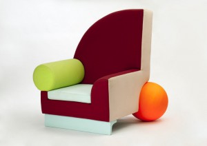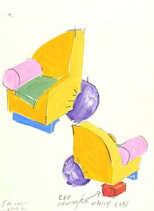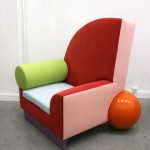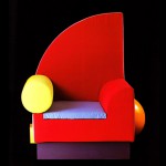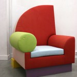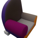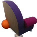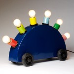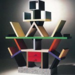

I think it’s pretty obvious why someone would want to write about this the iconic ‘Bel Air’ chair by Californian designer and ceramist Peter Shire. It’s simply not just another designer chair we see every day! “Quirky but sophisticated, playful but not over-the-top” was my first impression on this piece. There were also many questions that popped in my mind. The quarter circle backrest and the ball shaped “chair leg” for instance – why are they there? Why in such forms? And what about the rest of the design? It’s one of those designs that made me so curious, so now let’s get it started…
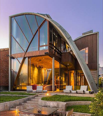
Born and raised in Los Angeles, Peter Shire’s often revealed traces of the surfing culture in his homeland through his work, always so full of colours and “cheerfulness” : I see the sharp line of the quarter circle which is in contrast with the round form of the elbow rest. The backrest is partly based on shark fins, and on the Stevens House by architect John Lautner (see below), located on the beach in Malibu.

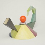
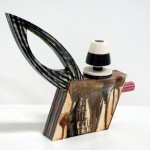
One thing interesting thing about Peter Shire is that, his design are very creative reinterpretations of normal forms. His work can be seen as art rather than solely functional designer objects (which he also explained in this interview). A good example would be the teapots he designed. Looking at how the teapots appear in various shapes and “movements”, I start to wonder if they are maybe 3D drawings rather than just real teapots (but can some of them really function properly as a teapot..?)


Some of the teapots by Peter Shire
Now back to the Bel Air chair – of course it does function perfectly as a chair (given it has all the essential elements of a chair: seat, back, legs..), but it can also easily fall into the category of ‘art work’. Take a look at the chair again, doesn’t it look like a giant sculpture composed of geometrical shapes, or something you can find in a kids playground?
And this is exactly the kind of playfulness and quirkiness that I like about the chair. This piece has so much to examine and look at. Everything changes when you look at it from different angles. Yet the elements come together very well, like a harmonious explosion of shapes and colours.


Now, the best part of the design has to be the bright orange plastic ball. I can totally imagine everyone looking at it twice, or more. No regular looking chair leg is found here, instead we only see this plastic ball giving a memorable twist to the piece of work, truly an uncommon but fun element to look at. It definitely brought the final result to a whole new level.
It didn’t surprise me a lot when I found out the super fun Bel Air chair was the most important contribution of Peter Shire to the Italian design group Memphis. Yes, the quite crazy and very much groundbreaking Memphis Italian group, always challenging the narrow constraints of traditional Italian furniture design. Peter Shire’s involvement in the Group came about after his ceramic work attracted the eye of Ettore Sottsass, one of the founders of Memphis. Sottsass found Shire’s ceramics “fresh, witty, and full of information for the future”. The group invited Shire to Milan to work with them.


The word “ordinary” just doesn’t exist in the dictionary of the Memphis…
As previously mentioned, the Memphis design held the intention to break away from the conventional and conversation sides of general retro classic Italian furniture design. So let’s recall a bit: traditional Italian furniture has been popular since renaissance periods and was used by the royalty. One can easily associate words like “classic”, “elegant”, “deluxe”, “expensive” with the style. Colours that are commonly used would be, let’s say, white, ivory, gold and brown etc.
On the contrary, the Memphis stroved to design products which were much more than just furniture—but also political statements, existential metaphors, and visual poetry. Everything. The Memphis were expert at communicating their ideas with colourful decoration and asymmetrical shapes. They have also been described as “bizarre”, “misunderstood”, “loathed”. It’s simply a collection with endless possibilities and surprise.
As for the style and works of Peter Shire, I can see that they do fit perfectly into the Memphis aesthetic.
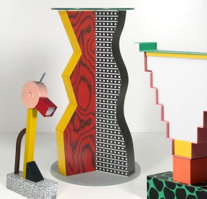
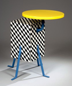
One nice comparison with the Bel Air Chair would be the Kristall pedestal table by DE LUCCHI Michele (see below). Initially we see colourful and eye-catching components in just one table: a bright yellow top, black and white body, and four blue-gray legs. It reminds me of the first time I laid my eyes on the Bel Air chair. So unique, so eccentric, so unforgettable. Just like the Bel Air chair, the structure of table looks rather simple. Yet there are so much to look at when the graphics come as a whole: the brights colours, forms, shapes, and the very much Pop Art inspired tone…

The Memphis just isn’t too Memphis without asymmetrical shapes. So here we see this table appears in such manner (It was in interpretation of the Apollo XI Space Mission, in case you wondered). The outwardly placed yellow top in the Kristall pedestal table gives a similar result as the bright orange plastic ball in the Bel Air Chair. They are not simply placed there to form a asymmetrical shape, I see them much more than that – the ultimate surprise and highlight of the work. Indeed, the table top and the chair leg both give a little “bizarre” and asymmetrical twist to the final look of the pieces of furniture, revolutionizing common objects, which is pretty much a very important part of the spirit and essence of the Memphis style.
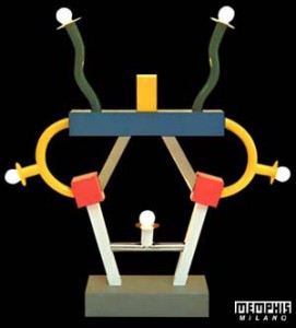 Ettore Sottsass (1917-2007) was a vivid rebel, a child with grown mans needs. He was disrupted by rules and clear ways, why do we (have to) live by rules? He wanted to play so he started a game of his own: The Memphis Group. A group of designers from around the world to fight against traditional functionalism with a postmodern touch and only one rule, there is no rule.