Every Thing Design is a book by Hatje Cantz which presents a large number (more than 700) of design works from the collection of Zurich Gestaltung Museum. It mainly shows prints and posters, but includes also a wide range of other objects from many famous designers. The book is, among books designed by Irma Boom (and some of her own library), on display at the Bijzondere Collecties Gallery, in Amsterdam.
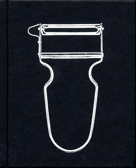
First of all the cover: it’s all black, with a white cheap potato peeler; visually it makes concrete what the title say: everything is design! Design is for everybody! The layout of the book presents the objects making interesting comparisons and associating them in couples which have a sort of connection. What’s interesting, in this couples, is that they do respond to a logic that can be less obvious than expected, as a time, place or artist order, but very explicit. Mainly, they are similar objects and visuals from very different periods and uses but with the same strength, the same conceptual value, the same way to visualize the zeitgeist of the period. So the cover of issue one of the magazine “Neue Grafik” (1958) showing the text perfectly insert into a square grid, is associated to a typeface from the early 20s’, the “new graphic” of the time. Two more recent comparison: the first shows the (famous) poster from Obey’s art for the electoral campaign of Obama in 2008 and the (as much) well known poster of Bob Dylan drawn during the 60’s by Milton Glaser, while the second present the famous Levi’s commercial with the Michelangelo’s David dressed up with Levi’s jeans short, with a more recent HnM’s poster of a beautiful and sensual girl wearing a tiny bikini. In the first couple is explicit the high moral value of the person represented, with the “Che Guevara alike” glance of Obama in the “hand-crafted”, old school appearance of the poster, and the streamy colorful hair of an outlined-comic looking Bob Dylan which transforms the pacifist songwriter into an icon. In the second there also is an iconic value which is a bit “debunk”, and while 30 years ago this value was embodied by a masterpiece of art, nowadays it is just the body of the women to be sold.
What i liked the most is the comparison that offers, which i think it’s a fundamental way of thinking in art and design, and the general look that encourages, contributing to shape better the word “design”, depicting the spirit of the time and taking it away from the idea of a competition between world known designers to create the most posh version of a lemon squeezer, and giving it the role of a discipline which applies to many levels and fields, a way to better resolve mankind problems. Design must be everything for everybody!

