In 1995, the graphic designer Zuzana Licko created the typeface
Modula Ribbed, a variation from the original Modula font :
Then Guy Williams, made an 3D virtual interpretation of it with the program Alias, called Polymorphous : (see Dimensional Typography [x], J.Abbott Miller, 1996)
An former student of basic year, Suzanne Jensen, realized a 3D printed version of this letter as part of this research program back in 2016
The original version of Zuzana Licko already shows an interest around a 3D perspective. Flat but already shaped; round, but with a sharp feeling. As if Licko already had in her mind the physical sensation of this letter in her hands. Considering this, we even could imagine this one as the shadow of Suzanne Jensen’s object, realized years after. Surprising how the shadow come first, before the object.
Simple, efficient, and very particular, Licko’s « f » gives a lot of inspiration for who’s interested in 3D environment.
Guy Williams obviously got inspired by those multiple peaks, and came naturally to this virtual 3D representation, which doesn’t surprise next to the original one.
S. Jensen challenged to finally give this « f » a physical form. The next step for her was to think about the materials and a technical realization : how to choose a material which gives the physical feeling expected through the previous examples, and how to realize it with a practical and efficient technique. The 3D printer was obviously the most clever solution, to get quickly if we can say, a first physical result.
On the basis of those 2D to 3D experiments, and the desire to give a physical touch to a letter, comes naturally a curiosity for the other way around. Observing our daily environment, well known from us as a 3D space where everything get a shape, a form, a touch. The thing is to get into the same processes as Licko, Williams and Jensen did : looking at the qualities given by the dimension we work on, to see how they can relate to another dimension. The idea isn’t really to get a space visually flat, to then guess typography on it, but to perceive letters as 3D objects. Doing so gives almost infinite possibilities, typography appears everywhere, as long as we make a visual effort and look through different points of view around a portion of a space.
In an apartment
As well as in nature
A skyline of colorful contrast talks in different shapes and by every millimeter i move my head a new letter appears by light incidence
A 2D surface already offers a lot of possibilities, considering that 3D got this 360° properties, we can imagine how far it can go. After looking around for some time, the viewer get quite used, and letters pop up naturally to the eyes. They start to get bigger and bigger, as we don’t look only at human sized space and elements, notion of close and far disappear: buildings, trees, highways, clouds, …
UNIVERS REVOLVED is a three-dimensional alphabet consisting of 26 letters. It was created by Korean artist Ji Lee as an attempt to challenge and question conventional reading methods. With the Latin alphabet as the starting point Lee revolves the existing letters around themselves in a 360 degree using a 3D modeling program until they become symmetrical ‘objects’ which the user can arrange to form words and sentences readable from left-to-right, right-to-left, top-to-bottom and bottom-to-top, as well as using them to build sculptures, buildings or furniture. His project ‘3-D Chess Board was created to “add an extra dimension of physicality to the game’s battle field.” Lee combines learning with play. On one hand he wants to challenge the linear way in which we perceive and on the other he seeks to add a playful perspective, turning two-dimensional letters into three-dimensional objects which you can build and create with. (More about the importance of play in learning and building is to be found in Johan Huizinga’s book Homo Ludens). Similar to Lee’s 3D alphabet, graphic designer and illustrator Karl Nawrot uses a playful approach too, where “geometrical forms don’t confine themselves to neither the constraints of two dimensional paper nor the responsibility of representing something else”. This can be seen in several of his works and typefaces including the Bauhaus Type 2012 , Ghost(s) Writer or Stencils etc.
Example of words written with the typeface Universe Revolved
Example of work by Karl Nawrot
Lee states that the linearity of reading, which we have adapted to as the reading standard, could be a possible limitation to extend our ability to perceive the world in different ways. While linearity offers a system to ease communication it also leaves out certain aspects for which our brains would be able to convey and interpret in their own ways. Linear means for something to be arranged in a straight, or nearly straight, line; a sequential progress of an order. An arrangement that provides the most ‘logical’ way to read, perceive and understand. Linear goes from A to B, B to C, C to D and so on. However there are plenty of examples of non-linear narratives as well. The early calligrams of Emil Bønnelycke and Guillaume Apollinaire, where written words are placed to form a visual image, to Tarantino movies where the scenes are jumping from one chapter to another and back again, almost resembling a circular structure. Although many mention-worthy novels, films and texts belongs in this category, it seems that linearity is reserved for formal matters whereas the non-linearity belongs to the narratives. And this exactly is what is so interesting about Lee’s Universe Revolved.
It could be that it’s either the linearity of which we learn or the mere lack of three dimensionality in most subjects such as literature, physics and mathematics that is the core problem. And if it’s applicable or not is hard to determine, as the linear methods do provide common ground for us to communicate and understand each other in the first place. Imagine if that was only the first step in the learning curve and that Lee and Huizinga’s ways of combining playing and learning was applied, not instead of, but in extend of this first step. Fora dyslexic or a person with dyscalculia it might be difficult to follow a course of which you have to make a logic sense out of a two-dimensional arrangement of letters or numbers, but if these subsets of alphanumeric had an actual, physical existence too, there would be a change for one to grasp, feel; sense these letters and numbers, not only for their logical purpose but for their potential as well. Take the Danish mega brand Lego for instance. The very name is a hybrid of the phrase ‘Leg Godt’ which translates to ‘Play Well’. The playfulness is incorporated in the very name, and though the various sizes and colors of the lego blocks don’t indicate a specific value, it’s possible for kids (and adults) to construct three-dimensional objects, letters, cities etc. in a way that makes sense for them.
For this research we have both made our separate attempts to interpret the Latin alphabet in a personal way. With tin foil and patience, WooRyun Song has created letters by grabbing and crumbling the foil into small, physical landscapes each one containing a different letter. Due to the chosen material it has reflective paths and shiny hills. When the letter A has been formed, you go to B, C, D until all letters has been given a physical existence. She then unfolded the roll of foil, stretching it slightly until it’s back to its two dimensional form. Using digital techniques, she made the last few steps to create a new font in this project called ‘From Plane to Line, From Line to Plane’, outlining the patterns and letter of the tin foil landscaped.
As for Sidsel Lehn Mehlsen, she used the video game Mine-craft (quite similar to the idea of Lego) to build sculptural letters in a virtual park. Inspired by Lee’s approach she revolved the letters around themselves, but unlike a full 360 degree the letters have only been extracted at 90 degrees angles, forming a cross when seen from above.
GENERAL INFORMATION ABOUT THE CREATORS OF AZART TYPEFACE:
Azart alphabet is designed by Guy Rombouts & Monica Droste
Guy Rombouts is trained as a printer-typographer. Since the seventies, he works on alternative communication systems. According to Rombouts, direct communication is not possible because some ‘feelings’ cannot be expressed through our language. This is the main cause why he is searching for a system where form and content might coexist. which is an almost impossible goal to reach since every language is subjective and languages are constantly changing. Guy Rombouts expands and questions what it means to communicate.
In 1984, an abstract alphabet called AZART was finalized by him and his companion Monica Droste. There are few references that term alludes to:
• AZ-Art, art from A to Z, art for art
• French word hazard that means the coincidence
• The Azart is Russian for inspiration or passion in the game
• The bridges: Idea, Word, and Conscience. (pictures will be bellow)
Each letter correlates to:
a line with the specific name,
the color that relates to the first letter of that color and sound
In Azart each letter is translated by a corresponding line, on the basis of the first letter of the word which describes the line.
A is angular, B is barred, C is curve, D is deviation and Z is a zigzag line.
AZART CHARACTERS & AZART COMPUTER PROGRAM
AZART alphabet is very much trying to make word physical or special. It combines letters into words as two-dimensional objects, instead of one-dimensional strings. According to Guy Rombouts, the use of color causes stronger affection between letters than in normal text. Just like in spoken language – where each sound influences the sounds preceding and following it – letters must adapt to their neighbors. This is way sentences appear as 3D characters. It creates an image in which each letter is replaced by a line. When the lines are linked together forms and word as images appear.
The Azart computer program was made after the alphabet’s completion. It visualizes the natural Azart writing activity and the method/principles how the words/sentences are communicated through Azart.
you can create your own Azart word with the image link above:
On this website you can see a number of bridges designed by Guy Rombouts and Monica Droste. The serpent figures in the bridge railings forms a word. Nine letter- or Word-bridges by artist couple, 1994. The Belgian artists designed a whole new alphabet, ‘ the regulation ‘, an image in which each letter Azart is replaced by a line. The squiggly figures in the bridge railings forms a Word. Bridges to a certain extend do refer to language they have same function – connection and comunication
Quotes from the interview of the witte Raaf (that in our opinion give some insight to approach that Rombouts has) :
‘De verwondering over het gewone; het feit dat wij het normale niet normaal vinden.’
‘The wonder of the ordinary; the fact that we normally do not find it normal. ‘
‘De alfabetische volgorde is een garantie voor neutraliteit, ze kent geen hiërarchie.’
‘The alphabetical order is a guarantee of neutrality, it has no hierarchy.’
‘Ik was gefascineerd door de spanning tussen woorden en dingen. Je hebt die strakke, lineaire lijst van 26 drieletterwoorden, die allemaal even lang zijn; maar de objecten zijn totaal verschillend.’
‘I was fascinated by the tension between words and things. You have that tight, linear list of 26 three-letter words, all of which are equally long; but the objects are completely different.’
‘Obsessies kunnen vervelend worden, vooral als je er niet zelf voor kiest. Als je zelf een obsessie kiest en daar tijdelijk inkruipt – als spel, ironie of knipoog – dan kan het heel ontspannend werken.’
‘Obsessions can become annoying, especially if you do not choose them yourself. If you choose an obsession yourself and temporarily sneak in – as a game, irony or wink – it can be very relaxing.’
‘Ik hou ervan dingen bijeen te brengen zonder ze vast te leggen. Dingen vastleggen is vreselijk. Ik probeer lijm te vermijden.’
‘I love to bring things together without recording them. Capturing things is terrible. I try to avoid glue.’
‘Er is niets zonder moeder. Zonder moeder bestaat niemand.’
‘There is nothing without a mother. No one exists without a mother.’
Pam: ‘I also composed a new alphabet with shapes that you can see above. I stood in the form of the letter that, in my opinion, represented the letter. After having been in this form I converted it to a computerized graphic letter. My alphabet is still from A-Z and you can read it in your own way. It was interesting to try out how I could use my body to create an alphabet and not to use the existing form.’
FOURFOLD Autonomous Scenography
Autonomous Scenography-project that started in 2014 by Meryem Bayram
Bayram’s artistic practice as visual artist and scenographyer explores the parallels between humans and their environment. Fourfold will be an interactive installation that challenges our conception of the known and the unknown, the rational and the irrational.
The project is a living encounter between Meryem and visual artist Guy Rombouts. In this work her proposition of a space will be given as a gift to the body of the fellow artist . Guy`s response to it, his “unpacking¨of Meryem`s spatial gift will generate a core of the “Fourfold” event. the communication between both artists extends the field of language+image and action. the ritual itself becomes a form of communicating. Language is not only sound that comes out of your mouth it is also an act.
During 3 weeks of design theory, we came across many different font types, some of which were far from understandable. Some of these abstract types surpassed the intelligible and had a whole coding system for themselves, in which every letter of the alphabet had a symbol of its own, which should be able to be coded and decoded in order to write and read text.
In it’s own special realm of this font families, there is a book that navigates the imaginary, it’s the Codex Seraphinianus.
text in the codex
It’s creator, Luigi Serafini , was an architect, designer and painter, who published the book in 1981. It took him around 30 months, between 1976 and 1978, in a single room apartment in Rome to create the 360 pages of this curious “encyclopedia”
The book describes almost scientifically a different and strange world, reminiscent of our own planet but equally strange and obscurely abstract and unfamiliar. It is composed by two parts, one which seems to be about human science and a second about general nature, society and ruling structures of this foreign world.
The piece stands for itself, it should be seen as an art book that does have an explanation; it is extremely fantastic and creative with wondrous drawings and ideas, which stimulate your fantasies, and invite you to dream along its colorful and psychedelic illustrations.
At a first glance you will be taken through constant confusion, where referencing what you see from what you know from the natural world leads nowhere. The feeling it creates could be described as the one of a child, scrolling through an encyclopedia, believing that what is written makes sense but is not able to verify if true or not. The pictures are all that is left to rely on and are the actual source of the story telling going on through our heads.
Ever since its publication, this book stayed as a mystery; intellectuals from all disciplines have tried to “understand” and “decode” it. Despite the familiar characteristics of language like rhythm, repetitiveness, paragraphs and even punctuation, there has been no success on making sense of this “text”. It simply can’t be figured out, but why should it? What would the decoding of this alternative encyclopedia bring and why are the efforts centered in doing so? Which interpretation would be the correct/truthful one?
COMPARING THE CODEX TO OTHER BOOKS
The Codex could be compared to the “Voynichmanuscript” (https://en.wikipedia.org/wiki/Voynich_manuscript), written around 1450-1520, which is also also written in a code impossible to decipher and is illustrated with bright colored images of a scientific nature, just as in the Codex Seraphinianus.
The feeling the codex creates could be compared to Aldous Huxleys “Brave New World” (https://en.wikipedia.org/wiki/Brave_New_World); a novel about an utopian or dystopian future where everything seems to be so great and neatly organized that it gets scary, and even though it is quite different from our world we see parallels that remind us on how easily our order can slip into the realms of suppression and absolute control, without us even noticing. The aesthetic of the world described in the Codex reminded me of this morbid perfection of the modern world.
In more general terms, the story of the interpretation, coding and decoding of the “Codex Seraphinianus” could maybe be compared as a more recent artistic Bible. “The Holy Book”, which sets a broad set of rules and explains stories through metaphors, could easily be compared since, for centuries, the scriptures have been read, analyzed, compared, re-written, interpreted and decoded by intellectuals and well as whole cultures and societies. But, which interpretation is the right one?
IN RELATION TO PHILOSOPHY
Interpretation is a key element to understanding, a fundamental capacity and force of the human essence. The reason for this need falls uncertain and as mysterious as the subject of this text, but somehow it’s force is so essential and true as any other basic necessity such as eating or reproducing, interpretation is key to learning, evolving, developing and creating, it is indeed inevitable and inescapable, nevertheless, when could we say an interpretation is true?
Plato, tried to explain the burdens/risks/nature of this issue, through what is probably the best known philosophical allegory. It’s the allegory of “The Cave”.
The Allegory of The Cave People have always lived in a cave and haven’t seen the outside world. There is no natural light, and all the inhabitants can see are the shadows on the wall projected by the light of a fire. They are fascinated by the reflections, moreover they believe those shadows are real and if you concentrate, look and study them, you will understand and succeed in life. They don’t realize that they are looking at mere phantoms.
One day by chance, someone discovers a way out of the cave. At first he is simply overwhelmed and dazzled by the sunshine in which everything is for the fist time properly illuminated, and once his eyes adjust to the light, he encounters the true forms of the shadows he had been seeing on the cave. Previously he had been looking merely at phantoms, but now, he is nearer to the true nature of being.
When the cave dweller crawls back into the cave, he is confused by the dark setting of his previously familiar space. Confused, he tries to explain his co-habitants about what he just saw and discovered, about the truth he had witnessed. At first, the other cave dwellers don’t understand his ideas, they believe he is being sarcastic and at some point, even plot to kill him.
This allegory is a symbolic explanation of philosophy and humanity; Cave dwellers are humans before philosophy, the sun the light of reason, and the messenger a philosopher (and what happens to the messenger, is what truth tellers can expect when they take their knowledge back to people).
This allegory is a warning as well as an explanation about the risks of pursuing the truth, of thinking and exploring, but, where does the force of wanting to understand, to think, to decode and understand come from? Science is maybe busy trying to find the truth of things, while art is maybe one of the fields looking to solve the bigger question, WHY?
MEANINGLESS ART, IS IT TRULY MEANINGLESS?
It is believed that the Codex Seraphinianus doesn’t have a purpose, but do purposeless things mean nothing? Is the same to make an incomprehensible statement than making no statement at all?
In art and out contemporary times this is a burning question looking for an answer. E.g. What is tho be expected from a stone carver artist today?
Stone Carver: I want people to see that I pushed the material as far as I can possibly go. I maybe want people to see themselves in it. Maybe that they wonder about my reasons for carving it. I want them to argue about why did I make it the way I did and maybe have different ideas of what the reason and its purpose is.
CONCLUSION
Philosophy as seen by Plato and many others, is a practice that will teach us to live and die well, some sort of therapy for the soul. Pieces like the Codex Seraphinianus, despite it’s attractive and superficial nonsense take a stand towards curiosity, imagination and discussion. It encourages doubt and reflection, study and analysis, key element to critical thinking and human/personal/intellectual development but most important, it encourages imagination.
The book gives us back that brave imagination of a child, that creates the story itself by looking at images and assuming what is written. The book is an invitation, to exercise our imagination again, another time, its another chance for the adult to go back to the golden age of childhood, before going to school.
Weather its real significance has, will or had ever existed shouldn’t be the main focus, instead, we should appreciate the process of adapting our eyes to the light and be courageous enough to be doubtful and think, go out of the cave even if what we see is confusing, truthful or not.
Before the beginning of everything, there was only the unity of nothing
Within this nothingness, everything was in its total infinite potential
Ancient beliefs say that …. Before the first day of this world The Oneness just was, eternal, immobile, perfect, silent and harmonious. In its timeless existence , the Oneness, to experience itself, in all its realms of possibilities, decided to manifest itself in this world of dualities . A dress for nothing that is everything. A universe of dividable appearances, that are manifestation of one indivisible essence.
These ancient beliefs tell that … before the beginning the holy Oneness , was meditating on how to begin .
as there was only one nothingness , in which everything was in its total infinite potential, also the letters were in there total spiritual infinite potential, and the unity of the alphabet, represented all the possible realms of
a possible everything.
During the creating process of a everything, all realms of possibilities, represented by the letters, would have become manifest, so before the first day of this world , all letters proposed them self to the Holy Oneness, as realm through which beginning the world.
Six letters were chosen, to compose the first word of the world
In the beginning
Bereishit
Bet
was chosen as first letter, of the first word of the world; the realm through which the world has been formed is : blessing.
Bet is the container for blessing.
It represents duality, a one that contains two things joined together,
-one capable of being revealed , one shrouded in mystery-
. One appearance and one essence, generated by one unity .
Bet is the essential structure of our world,
a world where all possibilities can be.
-Bet means dwelling place, house, home-
Bet is a house in which all dualities are at home, where the essence is manifest in all its possibilities , our world .
But Bet, can be fully understood , only through
Aleph
Aleph is the central letter of the first word of the world, and the first letter of the ancient alphabet.
The realm of Aleph is Oneness , the dimension of pure existence, of the goodliness, of eternal and perfect beauty.
-the pulsating unbridled force of the being of the Oneness-
Only through Aleph (the unity behind duality) , we can understand Bet ( the founding structure of our universe of dualities ) .
Only through being the unity, we can understand the duality of our existence.
It’s by being the essence, that we can fully be overwhelmed by the beauty of every manifestation of appearance.
Ancient beliefs, say that before the beginning of the world, there was one, perfect, silent, immobile nothingness.
then came the beginning
-the creating process, which always is, which always is beginning ,and always will be beginning, that began with –
Gothic Fraktur is a typeface that has been used in many different contexts ever since it arose in the early 16th century. Fraktur loans its name from its broken up characteristic. Compared to the smooth curves of other calligraphic typefaces, the Fraktur has many angles and letters stand more independently in relation to others around them.
What intrigues us about the typeface is that it has been picked up by various social groups with contrary beliefs, that have used the typeface as part of their identity; which can be quite confusing, two opposite groups with different values and focusses using the same typeface for expressing themselves. We were wondering in what ways the identity of objects and public spaces surrounding us would be affected by incorporating the gothic fraktur typeface in and on them.
Everything around us is focussed on being modern and looking towards the future, and the fraktur typeface is one that represents craft and passed times. On the other hand something we have observed in our surroundings, is that people have an interest in more traditional artisanal products and have a new found appreciation for the past. We see this coming up in brand design of products but also the interest in vintage design. To us it makes sense that this is an aftereffect of living in a fast paced society that is always living in the tomorrow, and artisanal design and craft give people a nostalgia that they may never have experienced.
Typeface design and identity plays with references as certain forms can relate to modernity, the past, technology or artisan and by using a typography you can direct a product or public space into certain contexts containing certain associations.
Appeltaart
This apple pie may not be artisanal and fresh, however after changing the title by using the Fraktur, the pie seems a bit nicer to me. I would expect this pie to be made with fresh creamy butter and a lot of cinnamon, whereas before I saw it as a pie that would taste a bit artificial maybe, due to its shiny coating.
Chocomel, de enige echte
I usually like drinking chocolate drinks in the winter, because they have more calories than petrol. My depiction of a chocolate drink is chilling outside in the cold, in the winter, or inside, watching a 1960’s cartoon, and therefore it accepts Gothic Fraktur very well, and what I also liked is the fact that the Fraktur worked well with colors in this case, which is something I didn’t quite expect.
Singel street sign in the Centre of Amsterdam
The Fraktur typeface looks quite good on the street signs of Amsterdam, especially the signs in the center that are a bit older. I think if I would have seen this picture, I might not have noticed it wasn’t the actual typeface of the sign. On a closer look, this typeface would never be used in Amsterdam. Being a country that has been shaped quite strongly by modernist design, you wouldn’t see a Gothic typeface being implemented as a design decision in any public sphere.
BBQ Runder Kebabspiesjes
The barbeque kebab worked to the extend that it is meat, but to me it doesn’t look like very high quality meat, yet packaging design can bring a change, but people will feel like they have been lied to, since they expect the packaging design to follow the quality, and therefore typeface is also a very important player, since it gives a reference, besides the very packaging.
Delta Loyd Building in Amsterdam
For some reason, the postmodernist buildings accept typefaces pretty well, at least in my opinion. Maybe the building accepted it so well, because there is no frame, and the building’s facade is a background of the logo which is made out of typefaces, instead of the logo having a background, which is then put on the background which is the building itself. Therefore, if I had a 3D option, I think I would have been able to give a much better impression of what I wanted to do.
Redbull
I was quite curious if the type would work on a can of Redbull, I could see certain teenagers who would wear hoodies with text in Gothic typefaces also drinking Redbull. It works quite okay, it isn’t the best choice for a drink that promotes itself as an energy booster, however I expected it to not work at all. I think this typography is quite versatile, it can get away with being used for so many different purposes without immediately questioning the identity of the product or context.
In practice, we can choose any typeface for anything, but in our minds it wouldn’t always make sense. Typography and logo design speak, and they are something that give us a bigger picture of the meaning of a logo through references and comparison. A logo can consist of forms, but also of typefaces, where the letters are the carriers of the form, design and message. Some newspapers have very little colour which cause them to lean more towards the content. Meanwhile, Newspapers can also be in colour and they are usually combined with explosive designs where the image is a more relevant factor in reporting. Of course, there still are newspapers with Gothic Fraktur typography that try to show more research oriented journalism, where the text is of main importance.
Thus here we come to a conclusion that a typeface in combination with colours can change the meaning of words and how you perceive something, for example the logos of brands of water depending of its typeface, it will tell you what they’re trying to sell you and what you want to buy. The same way you want beer to be written in the way you will think: This is it.
The public space usually accepts it pretty well. In smaller sizes, but also on bigger, on all heights, and on different heights it had a different effect. Also, to me the angle and the place influence the choice of the colors. I think it works well on 1890s Amsterdam architecture, but then everything would look very neat, but I think that the city has a very neat design, and an element as a different era typeface can bring a change in the space and break the feeling of only one correct answer.
Sometimes more practical ways for doing things are found, but the practicality would not be compatible with what is trying to be advertised to us.
When I see emoji I often think of hieroglyphs and wonder if and how there’s a connection. Why I make this connection is obviously not hard to imagine, since in both cases images are being used to communicate. But is this fact relevant, or is it a negligible similarity? In order to try to answer this question I will look at the most commonly known example of hieroglyphics: Egyptian hieroglyphs.
Egyptian hieroglyphs were the formal writing system used in Ancient Egypt. It combined logographic[1], syllabic[2] and alphabetic elements, with a total of around 1,000 distinct characters. Hieroglyphic characters can also have multiple meanings depending on how they are used. For example, the symbol for ‘house’, which was pronounced as pr, can also be used phonetically to represent the sound ‘pr’ in other words. Combinations of hieroglyphic characters could therefore be used to spell out larger words and composite phrases. Only a small percentage of Ancient Egyptians knew how to use hieroglyphs, such as priests, royals and civil officials.
Emoji however are ideograms[3] (or pictograms) and smileys[4] and can be used by anyone with a device that supports emoji. They are often used to signal a certain emotion or to shorten basic sentences by replacing text with image. Decorating and simple joy are in my opinion big reasons for its use as well. Once when I was at the airport to catch a flight, my mother send me a message saying: “Have a good flight! :airplane: ”. Here the airplane emoji really doesn’t add anything in terms of information, but it simply looks ‘nice’.
An important thing that distinguishes hieroglyphs from emoji, is that most emoji don’t have a clear meaning. A simple smiling smiley, for example, can be interpreted in a lot of differentways. This because of the context it is being used in, but also by everyone their personal association with that smiley. Some people believe it to be friendly, others get the idea the sender is being very sarcastic. It can even get so specific that the meaning of a certain emoji is only known by two individuals. Me and my best friend often use a specific emoji and we always know exactly what we mean by using it because we share a certain experience. This experience we share, created its meaning. If someone else sends me that same emoji I will never read the same meaning because it’s an entirely different context.
In essence, the use of emoji cannot be considered a language at all for there is no universal system that teaches us how to use them. One could attempt to write a very complex message with emoji, but it would simply turn into a riddle with a high probability of being misunderstood. This fact shows an interesting paradox, for the use of emoji can be considered very practical in certain situations, but its use quickly turns impractical when the amount of emoji used to communicate something increases.
With hieroglyphs, this is not the case. It allowed ancient Egyptians to compose a huge variety of texts from medical documents to poetry; texts that are significantly more advanced than what is possible to convey with emoji.
So, in the end the similarity mentioned in the introduction seems negligible, even barely existing. One could argue that emoji still holds potential for becoming a language, but it is nowhere near it now. And why should it? Looking at it from this perspective might be the wrong thing to do in the first place. Emoji much more seem to be about joy and intuition. It’s a way of communicating in a free and playful way, not designed to be eloquent at all.
[1] In written language, a logogram or logograph is a written character that represents a word or phrase.
[2] A syllabary is a set of written symbols that represent the syllables or (more frequently) moras which make up words.
[3] An ideogram is a graphic symbol that represents an idea or concept, independent of any particular language, and specific words or phrases.
[4] A smiley is a stylized representation of a (originally) smiling humanoid face that is a part of popular culture worldwide.
In 1926, the Czech dancer Milca Mayerova choreographed the alphabet as a photo-ballet.
Each move in the dance is made to the visual counterpoint of Karel Teige’s typographic music.
Teige was a constructivist and a surrealist, a poet, collagist, photographer, typographer and architectural theorist, and his 1926 photomontage designs for the alphabet are a uniquely elegant and witty invention, and one of the enduring masterpieces of Czech modernism.
In the graphic design world, movement refers to the path of a viewer’s eyes as he or she looks at your work. Since movement can add such a large sense of unity in design, it plays a significant role in the ceration process. By tying the different elements of a design together in a specific way, you can control the movement of your viewer’s eyes throughout the medium. As a different media, body does the same thing in ABECEDA 1926 photo-ballet. There is the different movement which is more analog, natural and already exist but still a path of a viewer’s eyes as he or she looks at the work, using the body and an action as a method of design. Despite the fact that the terms action and surface are disconnected even opposite things.
Letters get created
by movements > Movements who
literally give the sound exhaling.
In our case of the Abeceda Alphabet an example
with the first letter of the alphabet, the letter ‘A’.
The body language of reaching towards the sky asking an ‘A’.
But expressing ‘A’ as confidence standing tall, putting your hands in your wrist, chin up.
So one single letter can have a wider scala of meaning.
A letter without a sound of the voice, a movement of the hand can be like an incomplete inform. Just an ”A” on a paper.
Body language which is connected to words is a missing factor in language these days. Digitization is transforming things into less natural outcomes. Which is interesting is relating those two opposite sides; the digitized, formulized and made as a stabilized, structured letters out of the natural, smooth, changing, body movement. Even we can find some elements from both sides in all the sides, still the texting, mailing and internet talk has no presence of body and sound which is ironic because we generally attend to imitate the existing features that we know, take them as a starting point or repeat them.
We can see the first examples of this attend in the ”Cave Paintings”. Cave paintings are also known as “parietal art”. They are painted drawings on cave walls or ceilings, mainly of prehistoric origin, dated to some 40,000 years ago (around 38,000 BCE) in Eurasia. The exact purpose of the Paleolithic cave paintings is not known. Evidence suggests that they were not merely decorations of living areas since the caves in which they have been found do not have signs of ongoing habitation. They are also often located in areas of caves that are not easily accessible. The paintings are remarkably similar around the world, with animals being common subjects that give the most impressive images. Humans mainly appear as images of hands, mostly hand stencils made by blowing pigment on a hand held to the wall.
Some theories hold that cave paintings may have been a way of communicating with others.
The body and other elements are using for communication in a way with ”movement/action of the body and also in a way with ”captured frames such as; paintings, photographs, and even typography as visuals. So we can really understand the idea of connecting body language with the captured, reflected typography together.
According to that point and various examples, we can tell that art may imitate life. The movement, the performance reflected and created an alphabet. But could it possibly be possible to create an alphabet without any reflections from life?
Hi Luna,
So let’s make a resume of what has been discussed and where did the direction go.
We start by relating those two types of font for their quality of being created by one repetitive movement, one single infinite repeated shape. In the thread type, it’s the circle that you make to go through the fabric, while in the second font, the shape of an 8 or infinity is repeated in different sizes in order to fill up all the empty spaces that the letters left. Here are the pictures, the second one is done by Daniël Maarleveld.
What does differentiate that from classic handwriting? Well, because in handwriting, the constant of the shape is not equal: the movement of the line needs to change for creating different symbols and letters. So let’s take this as a focus of research: what are other systems of one movement fonts? How do they work and why did the designers decide to create it. Why would it be attractive to create these type of font? And how this repetition implies the body – after all, these repetitions of movements for making a font with a thread come from a body movement.
I found this guy on the internet yesterday, his name is Kosuke Takahashi, have a look at his twitter.
It’s a bit different from our first trough but in a way, his work is still around our question of movement and repetitive font. He’s trying to make a font relating Braille alphabet and “visual” alphabet (the international one and the Japanese one).
Tell me what you think about!
Love xxx
———————————————————–
Hey Agathe, I think its super interesting topic, I feel it’s a deconstruction of writing into a smaller concept, somehow like if the letter was an atom, and then we go from there to the electrons, I feel the construction of the atom by the constant movement of electrons resonates on the construction of a letter based on one repetitive movement. Kosuke Takahashi looks very amazing, a new idea of integrating both alphabets, finding the common link between them.
I also thought about the performative movement for language and got into morse code as a performative alphabet. It all is based on repeating one movement, constantly. Found out two Spanish cyborg artists, Moon Ribas and Neil Harbisson have done a performance with morse code, just speaking by biting. Both of them had a Bluetooth tooth, which vibrated on the other’s mouth. I find it pretty interesting how morse code could be taken to other levels of language nowadays. Also here you can find more information about their other cyborg art.
Not only with technologies but also in other artistic fields, I was investigating about graphic design and looks like there’s also a visual co-relation to the dashes and the dots of morse code when it comes to visual arts. There’s an alphabet that visually explains or adds morse to it, maybe it could be a way to represent morse code in a graphic design way.
L, L.
———————————————————–
Hello Luna,
I really like your comparison between Takahashi’s work and the formation of an atom. It also completely relates to Morse code,
see this panel: from hither to thither
So this tree explains the formation of the translation of a letter to morse code, constructed step by step from an element with another to articulate a sign, which will articulate a language with other signs. Like cells, let’s say? In the field of art, precisely in music, it reminds me of two things.
This first is a bit famous, Glenn Gould. He’s mostly known for his interpretations of J.S. Bach’s. Goldberg Variations. If some find his way to play piano extremely cold and mathematics, I actually found his play a clear way to “ear” a partition and understand the composition of the music. I don’t know so much about music, but he seems to me “cutting” the sound in different states that I can visualize better the written language the sounds come from.
For being honest, he’s the musician who made me understand music in general and appreciate contemporary electronic music. And probably not by accident : In contrary to most classic interpret at that time, he decided to work his play for the recording more than making concerts, implying on the fact that people who would listen to his music would need to manage their radio and sound at home, and in that way, his public would need to participate in the music to make it each time their own.
Another example is this partition for Jean-Philippe Rameau, La Poule (The Chicken). He’s a composer from the end of the 15th and beginning of the 16th century who made this research of repetition in music. As you can see the partition, the notes are constructed (as we said on the morse code and Braille alphabet) in a repetitive way while creating a system. Visually, it seems extremely repetitive, and quite modernist.
But the result is playful. Let’s say that creating an organized system of codification does not involve making something serious with it, haha. Here is a video of the performance by Grigory Sokolov, I really enjoy watching the movement of the body around this play.
Xx
———————————————————–
Hey.
In general, all these elements that are summed up here have in common the fact that they are all performative, or better said, all the research comes to a common field which is the performance. Not only is it about reading or writing anymore, but also about acting. The movement becomes an essential part of all of the elements. The typography is not anymore about reading/writing communication but also about expressing it with other parts of the body, some of them not vocal, or even with external elements.
the symbol of the Vesica Pisces holds a simple shape, but it’s so complex in concept.
It can be traces through many stories, depictions. Through history, science, mathematics and philosophy. When all the stories and origins are combined and stripped of their terms, there is a mysterious story left. A story of basic sacred geometry, but also the story of time and space itself.
In the beginning, there was the infinite void. At this point, there were no dimensions, no space, no time.
There were also two options available, remain in a state of static omni presence or begin creating. The void would begin creating eventually, but as there is no such thing as time it is irrelevant to ask how long it took before this beginning of creating reality began.
Before the process of creation could begin, there has to be space. The only way to do so is by creating dimensions. From a single point, there are lines made to the front, back, left, right, up and down in equal measure.
This of course does not change the fact the void is infinite. Therefore it does not matter how far these lines are drawn. Also, the structures that are created are not material in any form, they are imaginary lines. It is a mere concept. To continue, there could only be one next step, create boundaries. This is because the lines, such like the void are infinite, and so relative movement of other “things” remain impossible. To define boundaries, the end of every point needs to be connected to every other point.
The beauty of this, is that the entire process is perfect. It is simply impossible to make a mistake, which is how the actions of god are often described. When all points are connected, what is made is an octahedron.
Which when viewed from the correct perspective reveals a hexagram, also known as the star of David. Now that boundaries have been defined, relative movement becomes possible.
In the bible, Eve was supposedly created from Adams rib. This seems irrelevant to current reality, but when compared to the developing process of this story it might suggest the possibility of the layeredness of the Bible and its hidden features. The octahedron is made up of purely straight lines. In sacred geometry straight lines are considered to be male and curved lines female. What is at this point, is a male shape. This is why the free Masons consider the male to be the generating principle.
Next the octahedron is spun in one full rotation around each of the three axes made before. Again, no mistake can be made as it does not matter which direction it is spun or in what order the axes are chosen, the end result will always be a perfect sphere.
This sphere is a purely female shape, or otherwise described; Eve has been created from Adam.
This perfect spherical membrane has only two options available. It can either remain static, or it can repeat the process it was in. The only difference is that there is now a reference point, this spherical membrane, to repeat the process.
It does not matter where it begins the process on this sphere, since all points are identical to each other. Again, it cannot make a mistake. When duplicating this sphere, on any point of its radius, what is made is a vescica pisces.
This shape is referred to in many ancient texts as the beginning of life. An opening of the circle through which it is possible to create. It is often called the Great Mother Godess and is compared to the vagina, as it has the same shape and is the shape through which every human is created.
The vescica pisces is also essentially the eye of Horus, the ancient Egyptian god. It isn’t just a symbol, it is also seen through out nature, in plants and shells and also in aspects of nature that cannot be seen through the naked eye but only through a microscope or through calculations.
In medieval art this shape is sometimes portrayed as the aureole around Christ or the Virgin Mary.
Arguably the most common connection to the Vesica Pisces is its usage as a symbol of Jesus Christ himself.
This is because the shape was used by early Christians as a secret symbol to communicate with their fellow believers in a time when practicing Christianity was punishable.
It is said they came up with this symbol by taking each first letter of the title Jesus Christ of God Son Savior in ancient Greek which spelled the word “ichthus” and means “fish.”
Some say the entire concept of the Christ is taken from previous ancient beliefs about the essential shape of the Vesica Pisces and its name “Pisces” which also means “fish” in Latin.
Like the void in the beginning of time, and space, it is impossible to know which phenomenon came first. What is clear is that it comes from the same origin, the understanding of this geometrical pattern through which everything we know to be true has been created. The terminology might differ, but the core remains the same. Life started from a shape, whether your story begins from a woman’s body, Adam and Eve, or the pure creation of the universe itself, you are right.
Organizations and brands have logos and fonts to show their respective identities. This is called BI(Brand Identity) or CI(Corporate Identity). BI, CI give an easily identified image for an organization or company, and it can affect the perception of the entire country as well. It is because The country also functions as a brand.
Heraldry has been used in many countries as a symbol of countries. The national symbol as national CI is explained as an official sign that shows illustration, graphic letter, etc. in order to inform the existence of a nation in the international community.
The National CI contains the essential elements of national identity, such as values and beliefs that have arisen over many years. Many nations borrow their identity patterns, colors, etc., while simultaneously developing Nationality fonts to show their identity. Each country has a different cultural background. They apply different cultural differences and reflect them. Even on fonts.
We will research the Sweden-Sans and the Korean government official font as representative cases and examine the identity of each country reflected in typography.
Sweden Sans
Sweden Sans is a sans serif typeface that can be used in both analogue and digital formats. It’s developed by the Swedish design agencySöderhavet. Their starting point was the Swedish flag, the yellow Scandinavian cross against a blue background that has been used since the 1600. It is also inspired by signs from the 40s and 50s.
There is an expression in Swedish, lagom, which means ‘not too much and not too little’, something in the middle that means you’re satisfied. Swedes are very fond of this expression and use it a lot. This was also what Söderhavet aimed for with Sweden Sans they say.
When I read about this customized typeface on Sweden.se it says:
“Sweden Sans is a long-term choice of typeface; it has an unassuming character and fits well with a broad spectrum of other typefaces.”
This I find very interesting. On one hand I see a connection to the known political concept of the Swedish Folkhemmet. Which is in a poetic sense referring to the Swedish welfare state, and in a political sense referring to the lagom way between capitalism and socialism. Here I see a very clear connection between Sweden Sans and the Swedish history, culture and strong mind set around the word, lagom, which could be one argument to support why Sweden sans would be very suitable as a national typeface.
On the other hand I also see this thought of ‘one type fits all’ that they are trying to propose on the website explanation. I’m relating that to throughout the histories known open migration politics that has been strong in Sweden. But the nationalistic and far right-winged winds are blowing through Sweden as well as through the rest of Europe so how well does actually this adaptable typeface represent Sweden in a nationalistic sense? Is it Sweden that is adaptable or is it the Swedish people that should adapt to old Swedish ideas of being lagom?
To make a comparison with something else then a nation but with similar problematic I would like to bring up MoMA. When the MoMA design studio [x] chose to have the same typeface for most of their exhibition identities, curators and in-house designers were scared to loose their freedom of expression. But the MoMA design studio had good arguments for it. For example the designer/curator could focus more on their idea then on the millions of typefaces you can use. In this case having one type that fits all, works out as a facilitating tool. This might work out in a national context too, but I think its more complex. A national identity build up like that could work as an attempt to solidarity and standing together, or as a nationalistic striving to fit everyone into one lagom type, and therefore keep everyone who doesn’t fit out. I guess the question is more about if you see yourself fitting (liking) the national identity/font and then being satisfied, or not.
South Korean Official government font
The South Korean government announced a new national identity in 15th March, 2016. Ministry of Culture, Sports and Tourism has unified the design of the Republic of Korea government symbol for use in all departments. It is used by all 22 ministries and 51 central government agencies. It was the first time in 67 years that the nation has installed new identities.
A Korean official typeface inspired by the font used in the “Hunminjeongeum”, or “The Correct/Proper Sounds for the Instruction of the People” that was published in 1446, when King Sejong implemented a new written language called Hangul, Korean alphabet.(Reference Article via here)
They developed fonts based on Hunminjeongum, the origin of Hangul, to give them historical / cultural legitimacy. The font is designed the basic formative image and visual characteristics of the Hunminjeongeum and modernizes the first Hangul with the harmony of Hunminjeongeum and the modern Korean font, Dotum which is Korean generally uses a lot. It is in a way that can be adapted to modern media and images. And also It was designed to harmonize with Taegeuk, the pattern forming the center of the Korean national flag.
The official font of South Korea reflects the formative characteristics of the early Korean calligraphy in the system of modern font design and also consider of harmony with traditional symbol. Through this, Korea ‘s history and culture is put into each letter.
We tend to relate typography to alphabet, in fact, according to the definition of Wikipedia,
“typography is the art and technique of arranging type to make written language legible, readable, and appealing when displayed. The arrangement of type involves selecting typefaces, point sizes, line lengths, line-spacing, and letter-spacing, and adjusting the space between pairs of letters. The term typography is also applied to the style, arrangement, and appearance of the letters, numbers, and symbols created by the process.”
So typography can actually be more flexible than the letters we are used to.
Ghost(s) writer, 2013
This work is a work from Karl Nawrot, a French graphic designer who now works in Paris. He was inspired by three dimensional grids when he made Ghost(s) Writer, which is “an object dedicated to the act of sketching… It rejects the idea of a definitive form and its function is left to the user or the viewer and can be approached as a typewriter, a construction game or a sculpture.” The typographic work of Karl Nawrot expands past normative visions of what the alphabet is, into multi-dimensional visions of what it could be. Having trained as both an illustrator and a graphic designer, as well as having taught drawing at Gerrit Rieveld Academie, Nawrot is prolific in the way he combines narrative and storytelling, drawings, line, space and sculptural architectural forms with type design. The way he works with material is particularly innovative, often creating forms that resemble architectural models, which then become a basis for type. An example is a model that derived from Le Corbusier’s Domino House, where the staircase is translated into a cave-like form. Instead of looking at a lay-out, two-dimensional alphabet, static on a screen or paper, we are looking at a process, which is given much emphasis over outcome. Because for Nawrot, it is crucial he gives himself a physical narrative to work with, so that whatever the ‘final product’ is, it is linked to a fiction.
Similar to the Domino House model, Nawrot created the Breu for Marcel Breuer font by making plaster model interpretations of Breuers abandoned building, The Parador Ariston, where he saw the rooms as instead ‘nests and caves’, which forms were illustrated in the letters. This playful, almost childlike, but acutely refined, material approach to the alphabet is what makes Nawrot unprecedented in todays typographic realm.
The infinite potential of the tools and ways we use to communicate through words and letters is being pursued in a similar way by Guy Rombouts, who created the Azart programme.
Guy Rombouts’ work can be spoken about under the term of ‘visual arts’, however throughout the mid 20th century he worked as a graphic artist with an ongoing fascination for communication systems. He is principally known for his Azart alphabet, which questions the way we interact with letters by adding multiple dimensions to how we ‘read’ words and sentences. Perhaps this is what makes his sculpture work fascinating- Often Modern sculptures will be associated with ideas, feelings or explore pure materiality, yet Rombouts creates 3d forms which may appear abstract or indirect, but in fact according to Azart, directly communicate something. Also his ‘typographic’ sculptures have often been put into public spaces, for example the 9 foot and bike bridges on Java Island in Amsterdam. Just like language bridges the gap between people, Rombouts forms connect the land together. Language doesn’t just have to come from the mouth.
This new alphabet gives letters new and double meanings, related to objects and colour, which when strung together as words and then sentences, creates a loaded and complex shape of values and connotations. Like Nawrots process, Azart embeds narrative into characters, and new shape and more dimensions to letters. With this programme a user is put into a position of eradicating their memory of ‘normal’ character shapes, and take on a new vision where, like when we speak, each sounds from a letter is influenced by the one before and after it, thus the form of the word uses 3 dimensions to resemble this. We must question, is typing on an electronic document static or moveable, is it personal or objective? Just because we have fed a computer images into its memory does not mean it is fixed there. As important and useful as they are, in the age of computers, it is important to use creativity to expand and question what it means to communicate.
This leads us to discuss the work of Émilie Ferrat and François Girard-Meunier, who graduated from Graphic Design at the Rietveld academie with a collaborative ceramics project, ‘Ceramics with Émilie / Ceramics with François.’ They explored the way language can become material in an installation, in which there was a video where the two designers talked about some clay forms they had sculpted. In the videos, the idea of ‘meaning’ is broken down. They explore, in a new way, the on-going puzzling relationship between words and objects. How do they relate to each other? What do they mean? What is meaning? By translating the idea of a known object into another form and material, there are many questions to be asked, to which answers and messages can be found within the material. Hence, a form prompts a dialogue. You can find their work here https://designblog.rietveldacademie.nl/?p=47725
Suprisingly, we made a work which is closely connected to those ideas.
The work is inspired by the game kids use to play in order to learn alphabet. They have to associate a random letter with an object that begins with that letter.
Here’s an example with the letter C
The fact that we have learnt our whole life to associate specific words to specific objects can be very limited, that’s why our work is meant to show the variety of forms and shapes and stories you can give to typography.
We followed the same concept as the game for kids, but instead of focusing on the words, we focused on the objects.
We made a list of random words following the letters of the alphabet, and then sculpted abstract shapes out of it.
A=apple N=nose
B=bed O=olive
C=candy P=pickle
D=diamond Q=queen
E=egg R=rainbow
F=fish S=shell
G=glasses T=tree
H=hairdryer U=umbrella
I=icecream V=violin
J=jar W=window
K=keyboard X=xylophon
L=locker Y=yellow
M=moon Z=zucchini
Pickle
But of course you can go further with the idea and play with the words which surround us in our daily life. Here’s an example of how a character would look like with our system
With this system, you don’t visualize just one thing anymore. The first thing your brain wants you to think it is is a character, but by being more attentive you can see a whole set of signs, of objects within one object, words within one word. At the end it makes clear for us with this experience and Azart alphabet that typography can actually be seen from different perspectives. With the shapes that Guy Rombouts creates, he makes an assemblage which gives the word another way of seeing it. The shape Azart alphabet gave us with Millie’s name might look like a rabbit, and mine, well… It’s up to the viewer to decide what it can be. All those systems want us to think differently, there is still something hidden behind the shapes we see at first, there’s a meaning even if it might not be obvious. Another example of that can be calligrams, drawings made by handwriting. You can choose to relate the writing to the drawing, but it’s not a necessity. With our character, the idea was to see what else you can obtain by replacing the eyes by eggs, legs by lockers, arms by apples, etc. But maybe the clay objects could have communicate something ? As for the pickle example above. Maybe this system can be considered as a new way to communicate with your lover, while other people wouldn’t understand what you are trying to say.
The American-born French artist William Klein (1928) is a multifaceted photographer and filmmaker, known for an unconventional style of abstract photography and in the same media a revolutionary approach to fashion. This text, however, focuses on his series of photo books portraying the cities New York, Rome, and Moscow.
This research had its starting point in Klein’s posters for the magazine Domus; As elaborated later in the text, Klein experimented to a great extend with a sort of “trashy”, or maybe just honest, way of expressing “city life”. Domus began to publish Klein’s experimental graphics/photography as front covers for the magazine in 1952. Among the covers were a very rough way of handling photography and typography to be seen: William Klein would torn his own work apart and put the ripped parts back together in an uncouth order. As a visual language this lack of perfection and polished finish seems to find its inspiration in the actual torn posters one sees on walls in the streets of big cities. Having this style of “torn” magazine covers in mind, this research dives deeper into Klein’s visual language [x] describing the life of a city.
Klein studied painting and never received formal training in photography. One can argue that this “lack of technical education” made his experimental approach to the media possible. He would have to find his own way. This experimental and playful way of working with a medium is also present in Klein’s graphic work, as for instance seen in various posters, where Klein mixes photography, painting, collage, and typography.
His lack of academic photography training also showed itself as a virtue in his genre-defining photo books portraying cities that Klein visited. The first one, “New York” started as a photographic diary. When Klein came back to his hometown after six years of studying in Paris, he found momentum in this medium, that he had never really used before, and executed the extensive series in just 3 months. It was also a reflection of him returning to the streets he walked growing up and seeing new representations of people and situations he experienced there. The blurry, close up, in the actual photographs where not popular at the publishing houses but eventually broke through and had a huge influence on what we know as street photography. The next book, “Rome”, was made shortly after Klein moved there to be an assistant to Fellini.
Having two very separate relationships to the two cities must have affected the way Klein approached the photographic investigation. With this background in mind, you can distinguish some differences in these portraits. “New York” contains more pictures of children, a way for him as the protagonist to relate back to his past experiences in the space. He even says in an interview that he sees many “self-portraits” in the series. While “Rome” has similar stylistic features, you can glimpse more of an outside view, even in the way people look back at the camera.
One strong characteristic that separated William Klein from the start and became one of his signatures, was the use of motion and blur causing blur. This expression was developed in Paris when he was trying to document a mural he had painted. The wall consisted of a row of rotating panels, that when captured on an image created geometrical shapes with obscure lines. This discovery would be very crucial to several of the branching that his practice took, but would not be well received initially by traditionalists.
When Klein originally tried to publish ”New York” it was perceived as being ”too ugly, too seedy, too one-sided”. The publishers were used to, and wanted to, see the city portrayed in a romantic light. The high class, the architecture, the richness. Klein’s approach was instead semi-aggressive, unpretentious, focused on the people, and had no interest in being a promotional tool. This, for the time, controversial viewpoint would, however, be very welcome when he made the ”Moscow” book, the third in the series. The western/American picture of Russia was (and still is, but maybe even more extreme back then) extremely alienating and one-sided. His book depicts a lively and multifaceted Moscow and is considered to be the book in the city series where he comes closest to the subjects.
Sarah Boxer wrote a review in 2001 in New York Times [x] of two of his shows, where she brings up the notion that the authenticity in Klein’s pictures might be partially staged. Specifically, she talked about an exhibition where his contact sheets are being magnified and displayed. The contact sheets had notes in the shape of circles, arrows, and crosses, singling out the pictures that Klein had chosen to use when he originally developed the film. What made her questioning was the decoratively ”perfect” manner in which the lines were made. A lot can be said about this. Klein was originally a painter, so that could be an explanation for the way the motions of his hand could come of as decorative by default. Anyhow, it is interesting because much of his legacy, and the tradition of street photography in general, is built on the purity and honesty of the content. Though some of his works are known to be staged, it still has proved itself to be able to catch an essence in a community in a superior way.
A general problem in culture is the inevitable tendency for rebellion to become stagnant. As a direct consequence of success and the finding of a language that comes with age, groundbreaking eventually becomes mannerisms. Klein has been lucky to keep a youthfulness about his work, often by sporadically changing lanes and looking for limits to cross in another niche. This quality has made him a prominent figure in a variety of photographic disciplines and testifies the importance of diversity that the market often overlooks.
What is Gothic? Gothic was the culminating artistic expression of the middle ages, occurring roughly from 1200—1500. The term Gothic originated with the Italians who used it to refer to rude or barbaric cultures north of the Italian Alps.
According to Christopher Wren’s Saracen Theory, Gothic style had nothing to do with the Goths, rather it was a style influenced by a number of factors including Saracenic art —an Islamic influence from the Crusades.
Blackletter type is often misleadingly referred to as either Old English or Gothic, two terms that are only partially accurate.Blackletter is an all encompassing term used to describe the scripts of the Middle Ages in which the darkness of the characters overpowers the whiteness of the page. From Type and National Identity by Peter Bain and Paul Shaw.
Blackletter also known as Gothic script, Gothic minuscule, or Textura, was a script used throughout Western Europe from approximately 1150 to well into the 17th century. Was used in the Gutenberg Bible, one of the first books printed in Europe. This style of typeface is recognizable by its dramatic thin and thick strokes, and in some fonts, the elaborate swirls on the serifs. Blackletter typefaces are based on early manuscript lettering.
Gutenberg Bible First page of the first volume
It continued to be used for the Danish language until 1875,and for German until the 20th century. Fraktur is a notable script of this type, and sometimes the entire group of blackletter faces is incorrectly referred to as Fraktur. Blackletter is sometimes referred to as Old English, but it is not to be confused with the Old English (or Anglo-Saxon) language.
With Blackletter typeface’s has 4 important type of calligraphy can be identified as Textura , Rotunda , Schwabacher and Fraktur.
Gothic Fraktur typeface identified with “Latin alphabet” in northern european texts , which is called “ German alphabet “ part of typeface of “ Latin alphabet”.
The word “ Fraktur” or “Gothic” sometimes applied to all of the “Blackletter” typefaces.
The original word itself come from “Fractus” (broken) of Latin frangere ( to break ) the same root as the English word “ Fracture “.
Where Is It Coming From?
First appear of Fraktur typeface during 16th century , when Emperor Maximillian I commissioned the design of the “ Triumphal Arch” woodcut by Albert Dürer and a whole new typeface style created specifically for this purpose designed by Hieronymus Andreae.
Triumphal Arch, woodcut by Albrecht Durer in 1510
Fraktur typeface for printing matters created by the Augusburg publisher Johann Schönsperger at the series of Maximillian I’s works like prayer book or the illustrated Theuerdank poem (1517).
With time Fraktur become really popular and get used in German speaking world and areas under German influence (Scandinavia , The Baltic States , Central Europe) . In the 18th century the German Theuerdank Fraktur developed by Leipzig typographer Johann Gottlob Immanuel Breitkopf to create Breitkopf Fraktur.
Typeface Fraktur still in use German speaking areas and countries as well as Norway , Estonia , Latvia and small part of Sweden , Finland , Denmark.
In the late 18th century to the late 19th century, Fraktur was replaced by Antiqua as a way of showing the classicist age and emerging cosmopolitanism in most of the countries in Europe that had previously used Fraktur. This change was argued in Germany, where it was known as the Antiqua–Fraktur dispute. The shift affected mostly scientific writing in Germany, whereas literature and newspapers continued to be printed in broken fonts.
The Fraktur typefaces remained in use in Nazi Germany, when they were initially represented as true German script; official Nazi documents and letterheads employed the font, and the cover of Hitler’s Mein Kampf used a hand-drawn version of it.
However, more modernized typefaces of the “Gebrochene Grotesk” such as “Tannenberg” were actually the mainly popular typefaces in Nazi Germany, specially for running text as opposed to decorative uses such as in titles.
These typefaces were designed in the early 20th century, mostly the 1930s, for grotesque versions of blackletter typefaces. The Nazis mostly used these typefaces themselves, though the shift remained controversial and the press was at that times named for its frequent use of “Roman characters” under “Jewish influence” and German immigrants were urged to use only “German script”.
On January 3, 1941, the Nazi Party ended this argument in the modern day scripts including Antiqua. Martin Bormann issued a circular to all public offices which declared Fraktur (and its corollary, the Sütterlin-based handwriting) to be Judenlettern (Jewish letters) illegal for any way of using it. German historian Albert Kapr has said that the those times German Government had understood that Fraktur would inhibit communication in their lands occupied at World War II.
Fraktur or also known as Gothic script is a typeface that was and still is used in many different context. It starred around 1500 century the script is recognizable with his broken edges. Sometimes both terms are equated with each other; then all gothic letters are called “Fraktur”. The letters of the Fraktur seem broken, hence the name; in addition, they are high and narrow. the fraktur was dated in the frans gothic period first the hand writing scripts came and after that the print version. Besides the 26 of the modern Latin alphabet , Fraktur includes the B (Eszett) , vowels with umlauts and the ? (long s). Some fraktur typefaces also include a variant form of the letter “ r “ known as the “ r “ rotunda and many a variety of ligatures which are left over from cursive handwriting and have rules for their use. Make no distinction between the majuscules “ I “ and “ J” ( where the common shape is more suggestive of a “ J “ ) , even though the minuscules “ i “ and “ j “ are differentiated.
Use In Modern Age
Fraktur is today used mainly for decorative reasons: as an example we can look some of old German newspapers such as the Frankfurter Allgemeine, also the Norwegian Aftenposten, still print their name in Fraktur (also some newspapers in European countries and the U.S.) and it’s also very common for bars and restaurants signs. In today’s decorative way of using it, the traditional rules of Fraktur about the use of long s and short s and of ligatures are often don’t comply anymore.
Now and days the type phase gets used for differed things as products, Music bands and clothing brands. It’s mostly see as with heavy metal bands and black hoodies. But now more high fashion brands use the fraktur lettertype for there new collections.
Album Covers of Snoop Dogg and Motorhead
For example in 2016 Vetements made a collection and also Kanye West made a commercial products with in that year in conjunction with his new album release “The Life of Pablo”.
The Long Sleeves Kanye West designed for his album - Vetements 2016 collection
Today a lot of streetwear and other fashion brands use the gothic type phase different subcultures in the fashion industry pick up on the Fraktur font the street wear labels, Juicy haute couture for example this velour tracksuits it’s kind of girlish clothing brand and a particular group of people that wore that, but with this font on the back of the pant is pretty funny also the decorat with a lot of shiny things.
When we read, our eyes do not move left to right in straight steady lines; the eye goes back and forth. The movement is a combination of small rapid jerky movements, saccades and fixations, where our eyes actually stop.
When we read a text, our eyes do not move in a straight line across the page. They make skips from words to words call saccades. They also skip words, repeat words, and fixate on words.
In the image, the dots show the fixations.
The brain creates the illusion of smooth line and that we read every word. But the eyes fixates on only about 60% of the words we read. The eye will fixate on the less familiar words. The brain will complete, fill in the blanks.
The are three regions of perception:
the Foveal region takes up only 1 to 2% of your total vision, which is around 3 to 6 letters we can see very clear;
the Parafoveal region is around 24 to 30 letters which are not perceived very clearly;
the Peripheral region is everything else we perceive, such as gross shapes.
The page, the screen where the letters are written on, give us a frame in which our eye will stay in during the reading process. But what happens when this frame disappears?
Arktype Curtain and "Fire Basket"by René Knip
René Knip challenges this idea with his Curtain Arktype typeface. This typeface is meant to be hung up in a space. It is taken out of the paper into a 3D world even though the typeface itself stays flat. The work balances between the 2 and 3 dimensional. One could call it 2,5 dimensional. The white negative space of the paper around the letters does not apply to this typeface anymore, as so is the frame given by the paper or screen in which a text is normally written on/in. The negative space is the breathing room around the subject that determines how appealing it looks.
Now that it is hung in the air, you will have to determine the frame. You will perceive the surrounding and the text as a whole. The eye will change the way how it is perceiving the text. This is also due to the fact that the letters are connected vertically even though the words are placed horizontally, still, this will guide your eye in a different way.
An interesting thing happens to the text that has now lost it frame. It is no longer just the text that creates the visual narrative, since the text is immediately influenced by its surroundings. The two are inseparable. The Curtain Arktype makes the viewer experience reading of text in a different way. As said before, the eye does not pay equal attention to every part of a text or every letter. The eyes move around, locating interesting parts of a scene.
When reading a text created with René Knip’s 3D typeface, there is almost too much for the eye to focus on. The eyes of the beholder make jerky saccadic movements from the text to the background, finding interesting parts everywhere. The words become truly visual, where meaning is created not only by the meaning of the text, but also by their sight. Furthermore, negative space has become positive, as it has become defining creator of context.
The text and the surroundings become equally important and following that you will look to it more as a composition between the text and space. Your eye movement will be guided by the shapes around it, an eye movement which is closer to one looking at a painting, sculpture rather than one reading words.
Tracking the mutability of forms of logographic script to pictorial images and back again, we wondered, how are these forms created? While creating is the act of mark making, it is also the reading of the mark that realises its objective. How do these marks come to be read, and who reads them?
As a single unit, type is able to express itself independently through its form. From the pictorial evolution of early ideographic and mnemonic characters (e.g. Hieroglyphs, Indus script, Oracle Bone Script) to typographical manipulations of the modern age like three-dimensional fonts or TokiPona, the image of a printed character possesses a compelling representational force. Be it logographic or asemic (see Asemic magazine), something can be ‘read’ in the image of the type, even if there exists no content that can be extracted from a surface reading of its writing.
Pictographic unicorn seal
The way in which type is assembled to be read; like building blocks stacked upon each other, individual letters at their most basic and mutable are formed into words, sentences and paragraphs. As always a system of structure is needed for random bits of buildable content to be organized meaningfully, language’s orthology is the grid that gives single units of type the ability to function as part of a larger picture. This can be seen in letterpress printing, where typesetting treated each character as a block of type that could be moved and arranged into boxes of legible text in the composition of the page.
The form of type and its structure both lend to its ‘readability’, which appears to occur one block at a time. To understand how such ‘reading’ might work we can move to the pictorial roots of type where some similarities between the component-centric reading of images will surface. For example, unlike the way in which we treat type in writing, focusing more on the spelling out of words and thus, used to glossing over the small units. The way in which type is broken down and treated in typesetting and by digital processing systems, unit by unit, is also mirrored in the way whole sceneries are pieced, tesserae by tesserae, in roman mosaics.
Early roman mosaics were simple constructions of dark Tesserae and light Tesserae, relying on the dramatic, harsh contrasts of these colours to sculpt forms on the two-dimensional plane. A binary system like this creates a yin-yang situation of positive space and negative space, filled and unfilled pockets within a structure that controls the presence of these two factors. The stark contrast between the negative space and positive ‘filled’ space of a mosaic lay is instrumental in carving the form of a glyph from the empty, unfilled space, thus creating a mark, an indication of presence. Established before, the link between pictorial representations and type is evolutionary, but stems from the simple act of mark making. In leaving a mark, a definition of a ‘readable’ form from the senseless blank space is created, images pieced together in mosaics and paintings, penned verses in manuscripts all produce by various marks a ‘readable’ concentration of meaning. However, unlike calligraphy and letterpress printing, which deals with an active method of mark making by addition, the way in which mark making occurs in mosaics can be described as the ‘surfacing’ of a distinction. It is this definition not by addition but rather, distinction, that draws an interesting link between the laid mosaic surface and the bit plane beneath the impenetrable screen of our computers. Digitally rendered type and warriors in mosaics appear to be drawn from the blank space, even if the forms are so clearly distinct from their backgrounds, they inherently belong to the weave of the grid interlocking the entire plane.
Floor mosaics of the Severan Period @ Caupona di Alexander e Helix
<
Bit plane image slicing
This can be attributed to the shape of Tesserae which allowed for a tight fit of pieces within the structure of a mosaic lay and naturally with its geometry, producing a grid network that flowed through the entire mosaic. More importantly, it also determined the placement of other pieces, functioning independently as a growing support system. The bit plane of a computer functions on a similar grid logic in developing computer graphics (see 4:14 Ivan Sutherland’s Sketchpad, 40:44 for graphic animation ) that allows for simplified organization of information and systematic mapped identification of what should go where. With the grid system making for an efficient positioning of negative and positive ‘marked’ space, with both being created simultaneously, as opposed to a hierarchy of surface-to-type. As a result, we see a single grid plane (surface) created containing both contrasting elements, a ‘reading’ of such a surface becomes more attentive to the qualities of form in type, as something carved from the plane itself and therefore intimately tied to the surface upon which it exists. Eventually, mosaics evolved to contain elements of gradation and cutting of Tesserae to accommodate circular shapes, making for more elaborate and decorative lays, much like how bit computers from the 80’s have played up their resolution game. What doesn’t change is the language upon which the form is communicated; inter-woven presence and absence.
ASCII art
ONES AND ZEROES
The translation of alphabets into Morse code produces a type that can be transmitted via electrical pulses, audio tones and mechanical/ visual signs (heliograph/ Aldis lamp), one that while can be recorded in print, is transmitted in a form distinct from the printed aspect of type. Morse relies on a binary system of dots and dashes, or equivocally, flashes and pauses, positives and negatives, ones and zeroes. The materializing of this information as ‘readable’ content on the bit plane follows a series of conversions of data, text and instructions from the same binary system (e.g. B=01000010) to corresponding alphabets, actions and responses and in the process computers read each letter as a series of 1s and 0s (or any other two-symbol variant) , which to us remains complexly coded when left untranslated. Yet, to a reader who recognizes the tightly knitted fabric of language, presence (1) and absence (0) are meaningfully placed to form a legible and therefore visible picture.
Aldis Lamp
If we were to consider how non-humans read or what type would be in a situation unable to relate itself to print, we could say that the attention to presence and absence, down to how a character materializes itself, being conscious as well of the textural fabric in which it materializes, will form the basis of the behavior of such a type.
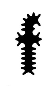
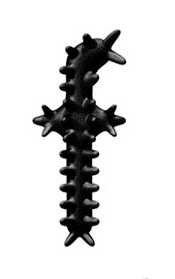
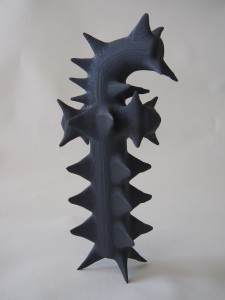
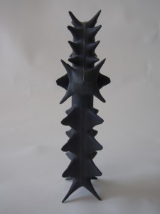
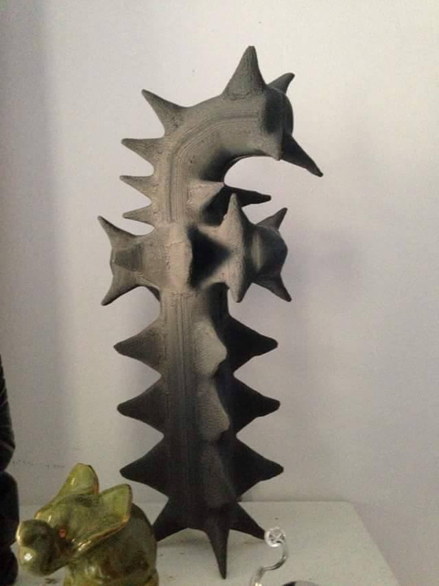
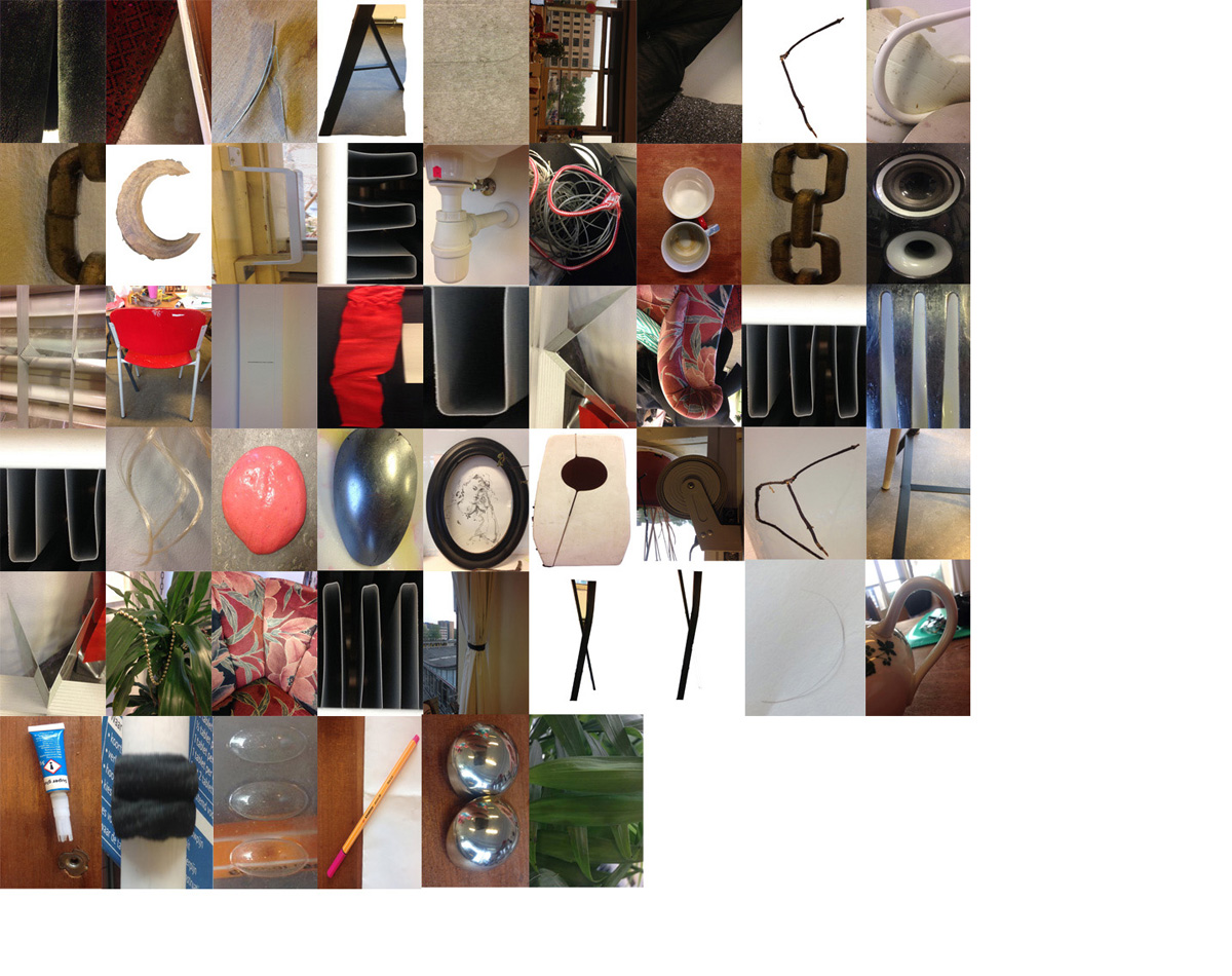
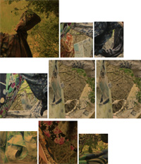
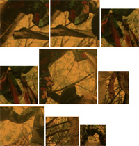

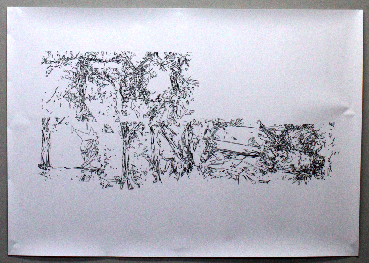
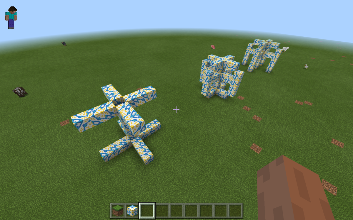
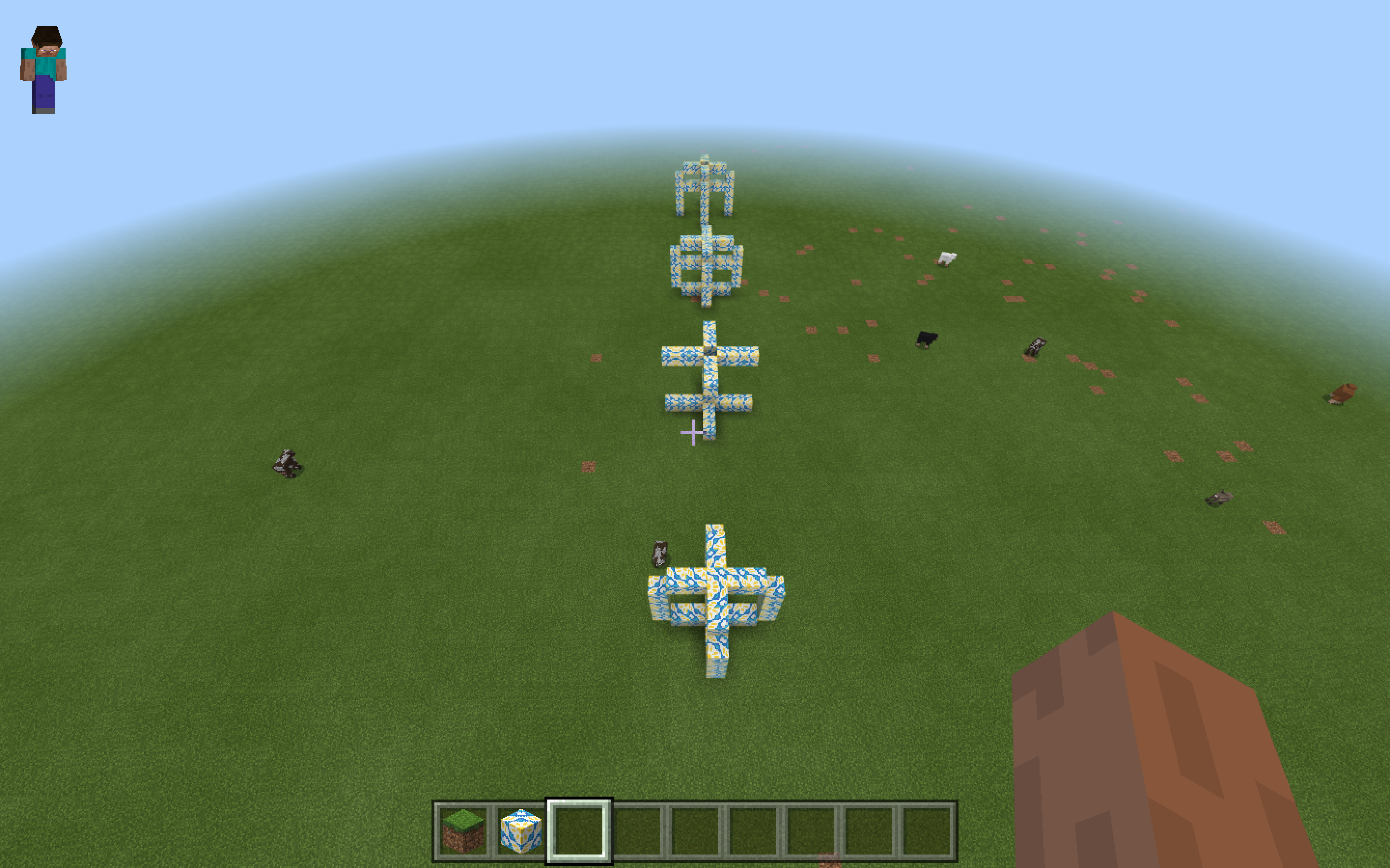
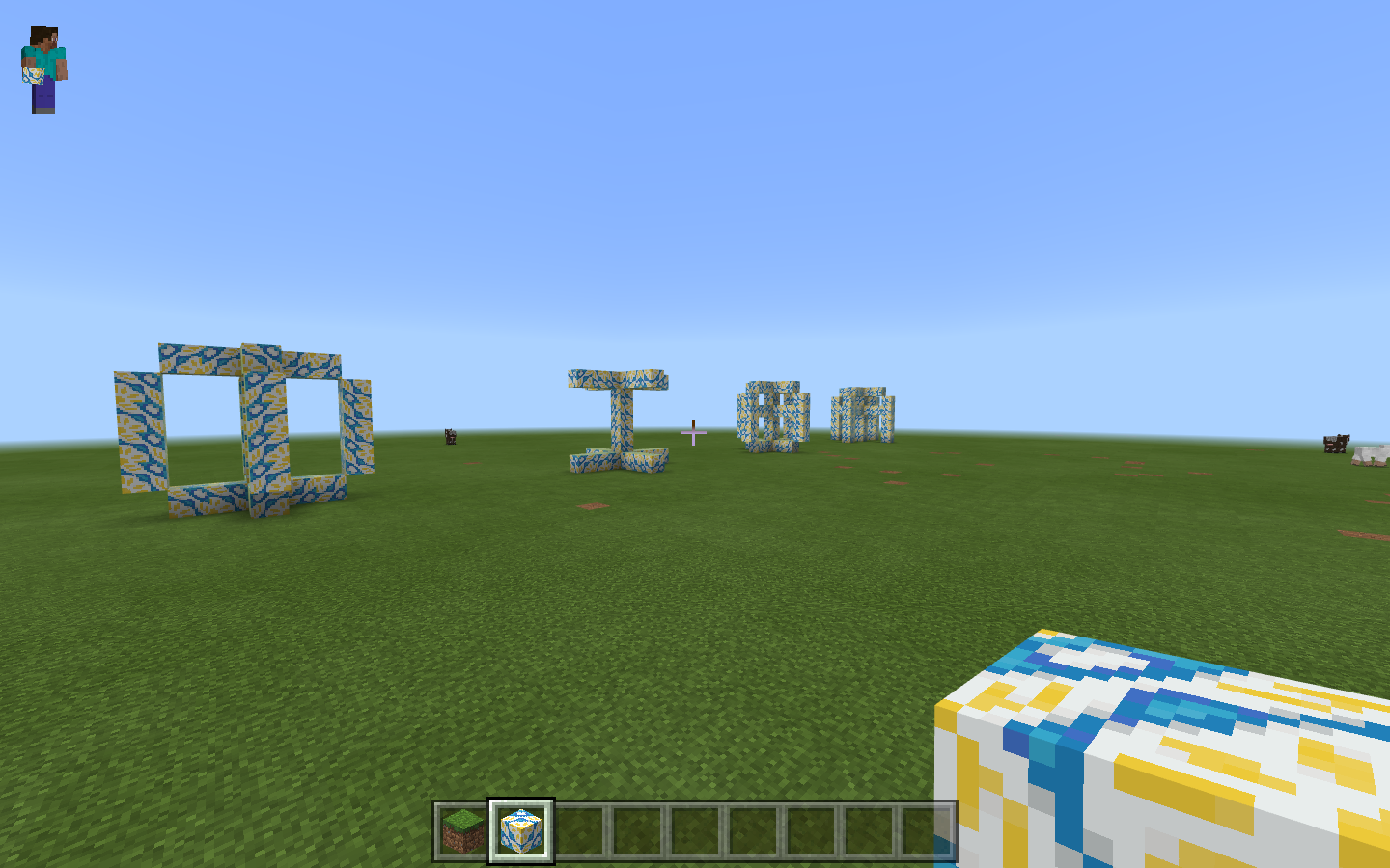
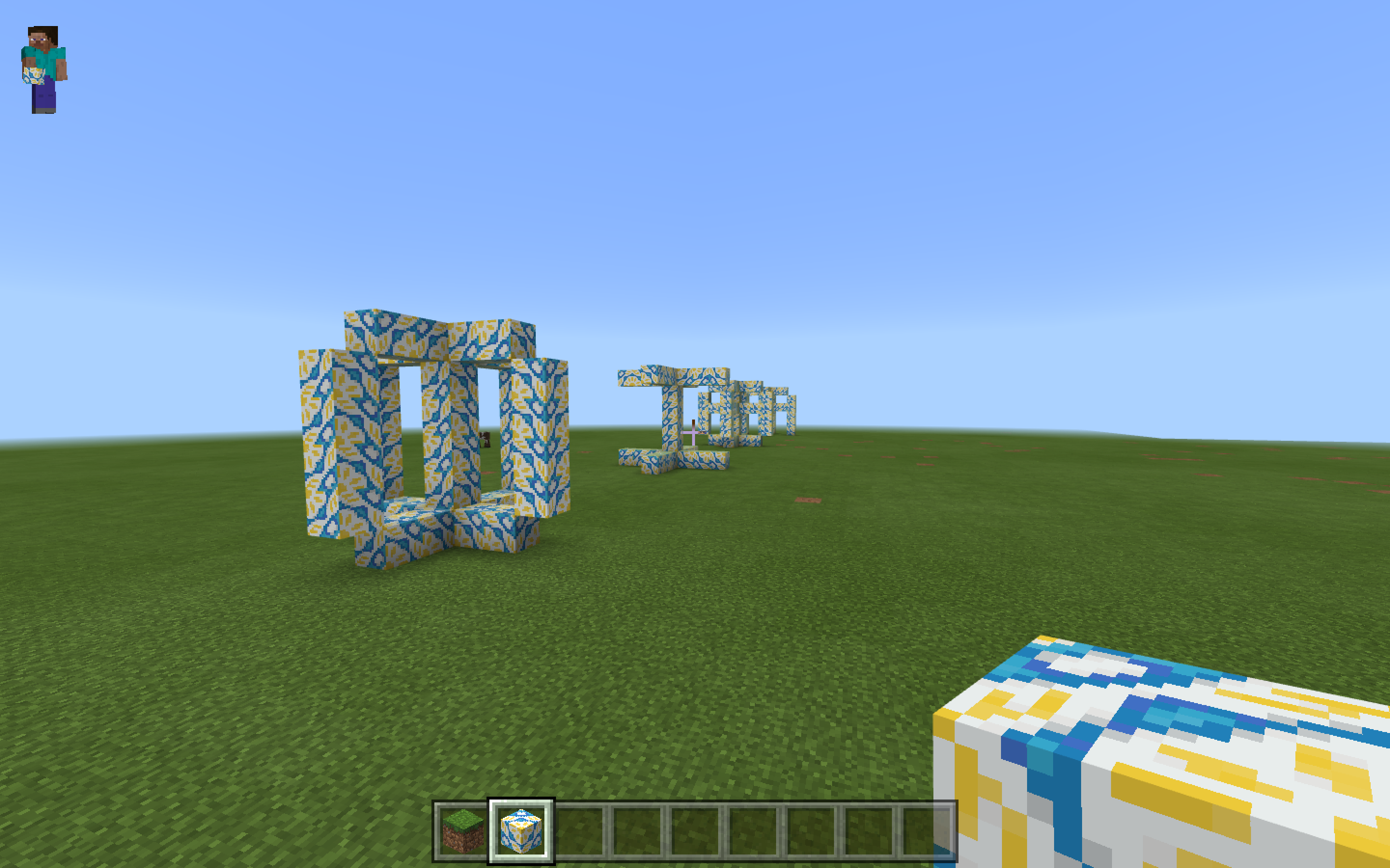

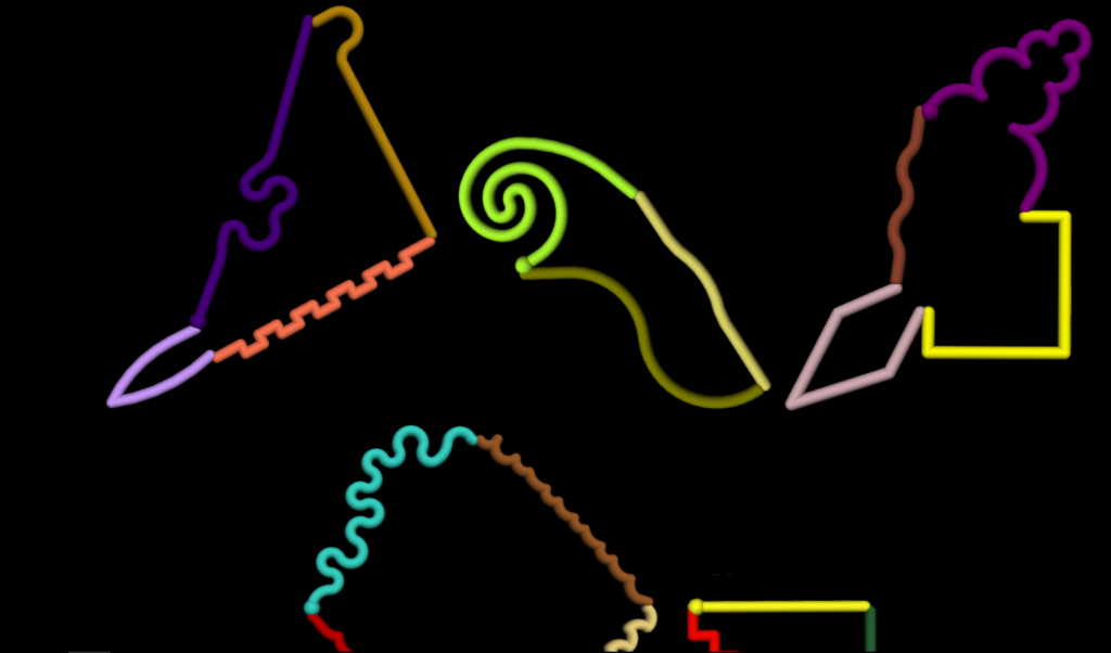
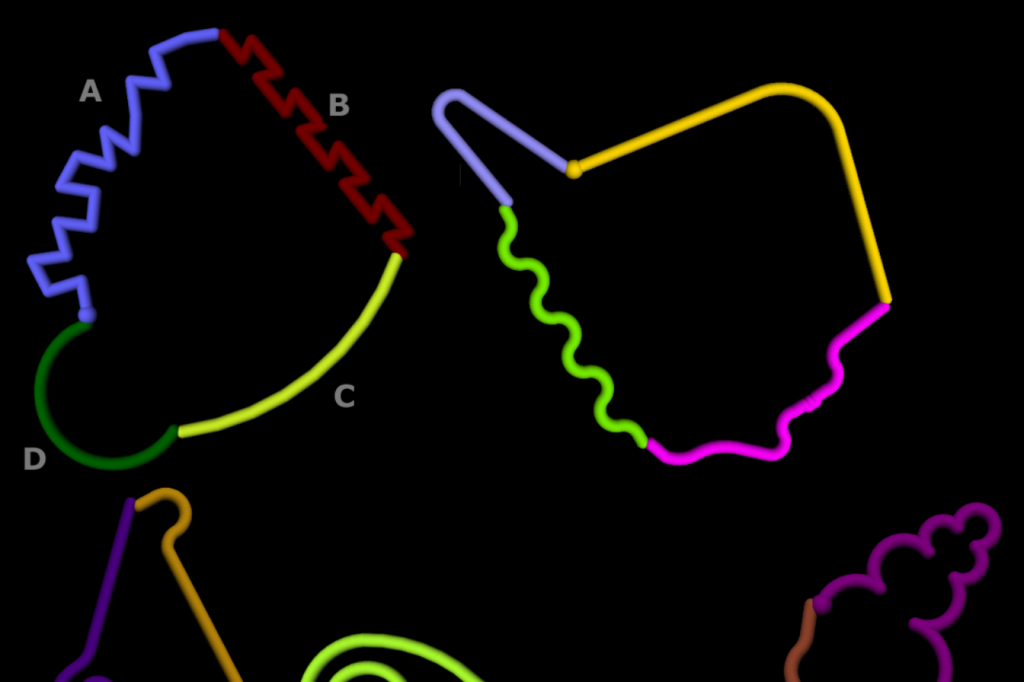
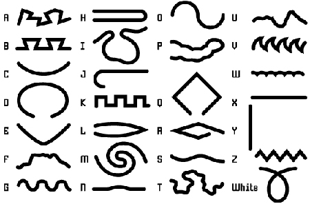
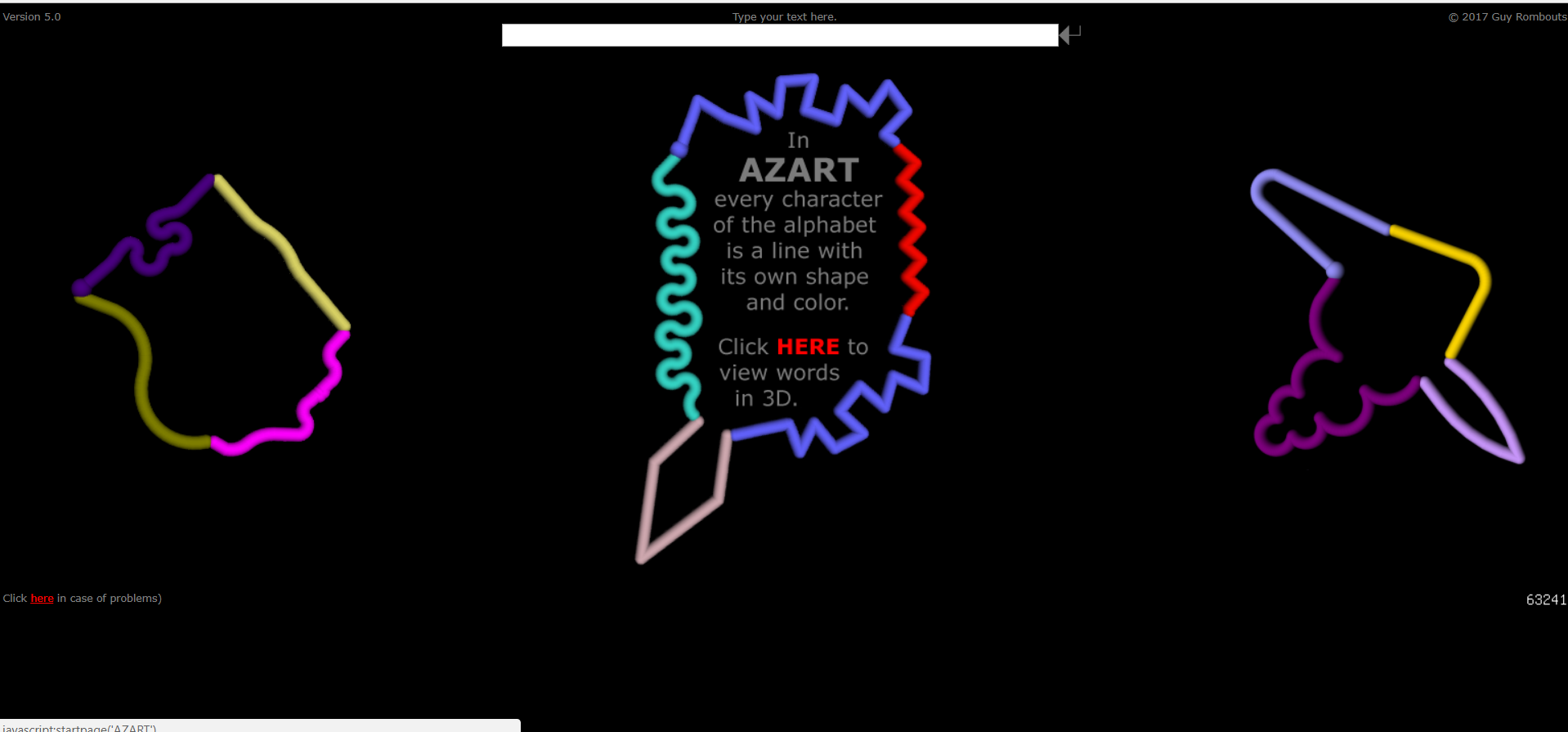
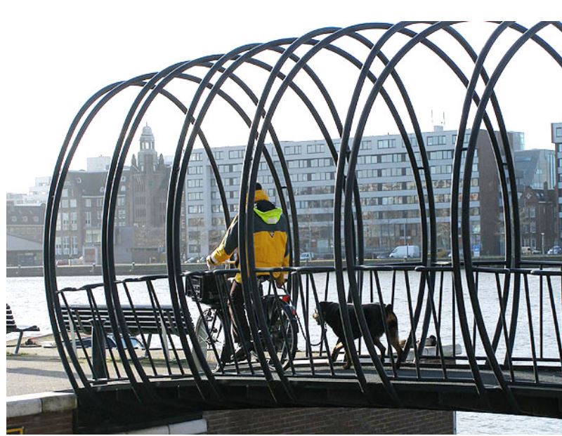
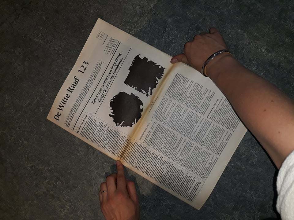
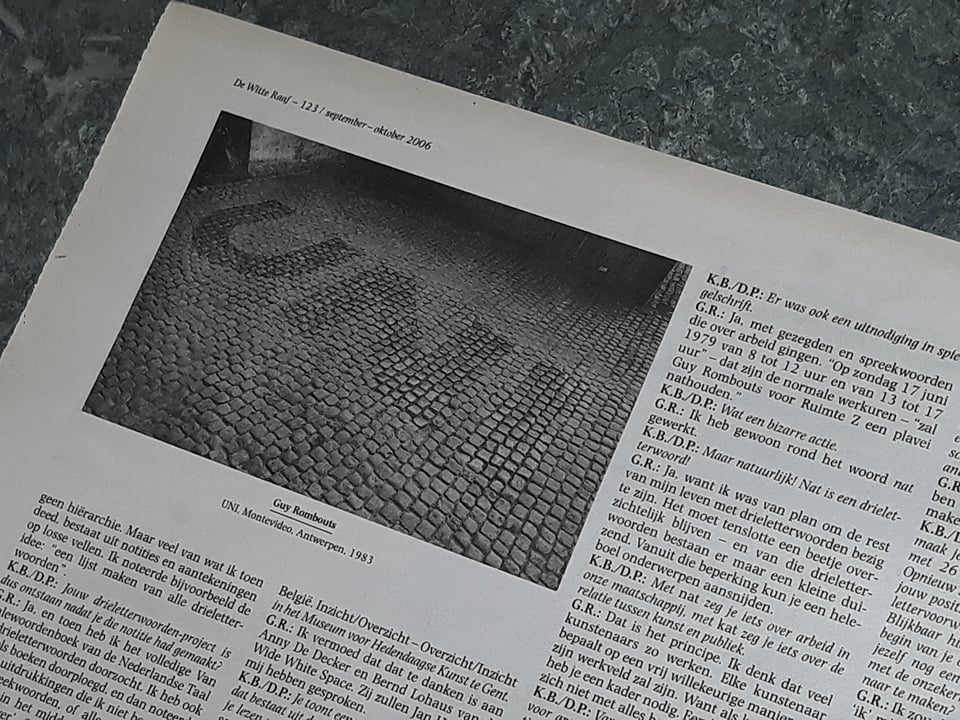
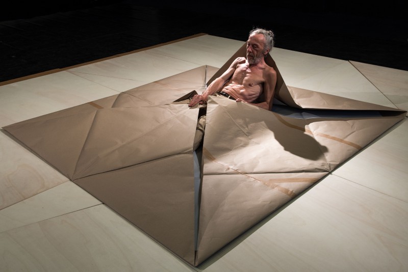
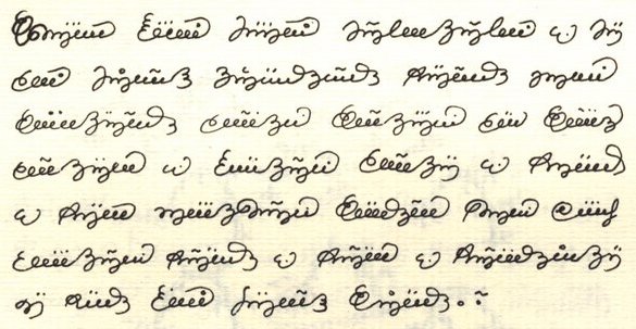
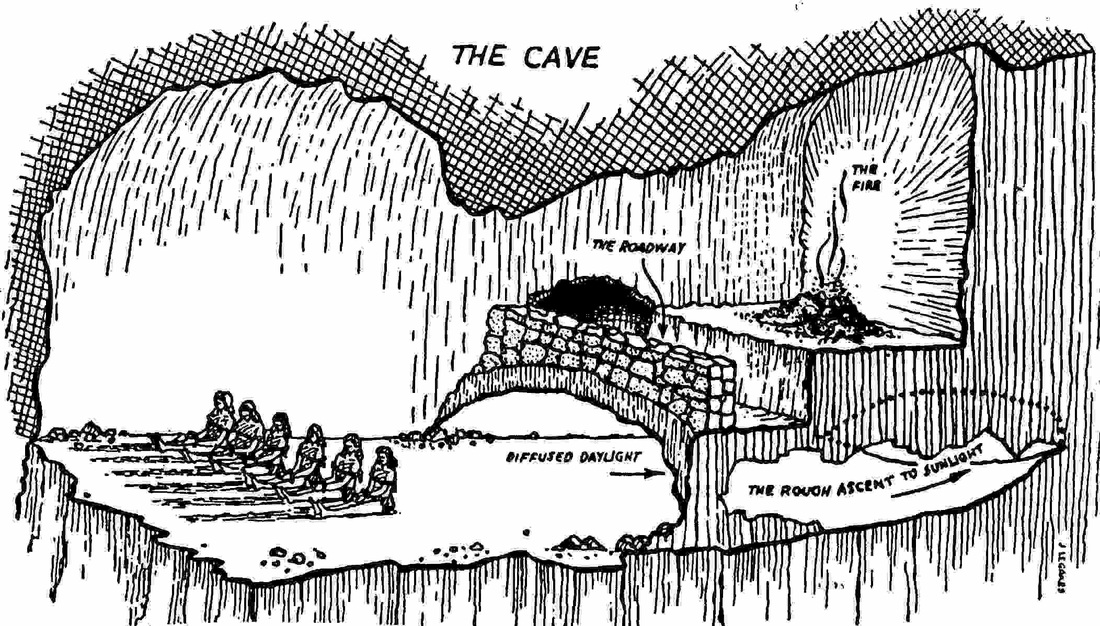


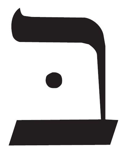
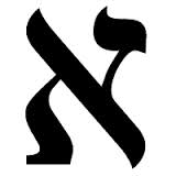
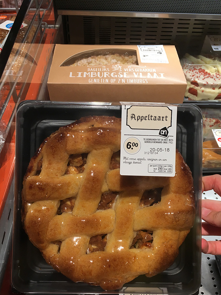
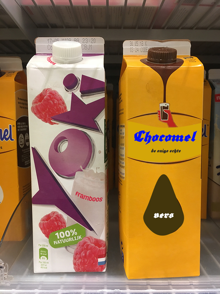
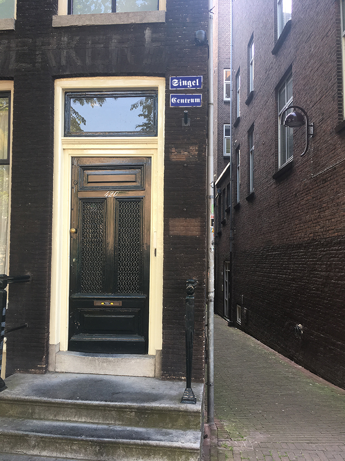
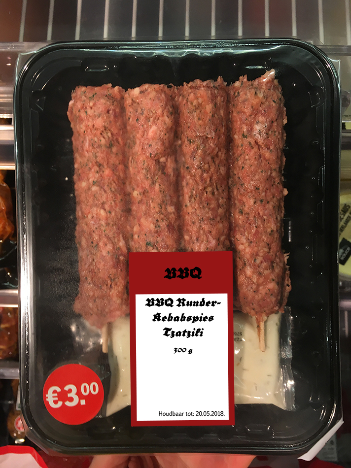
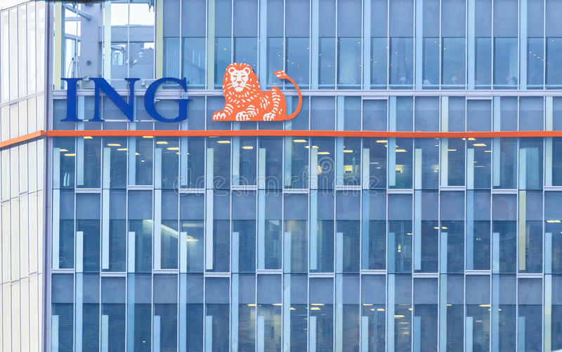
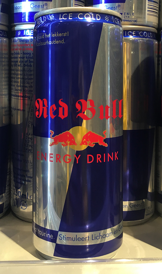
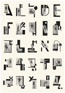
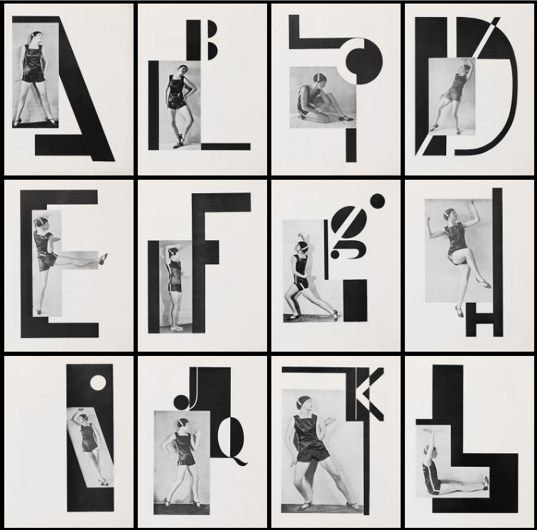
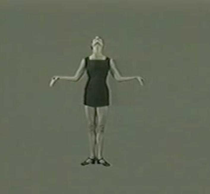
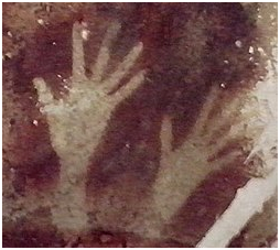
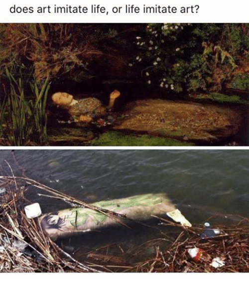
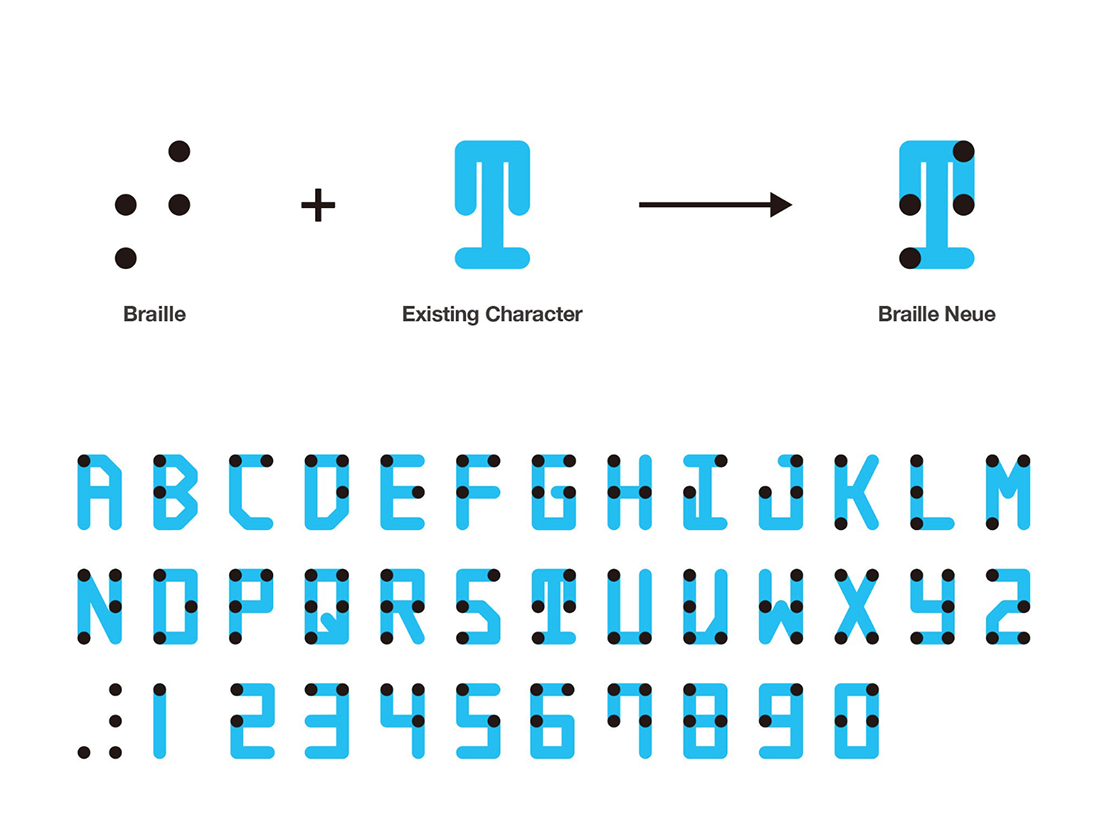

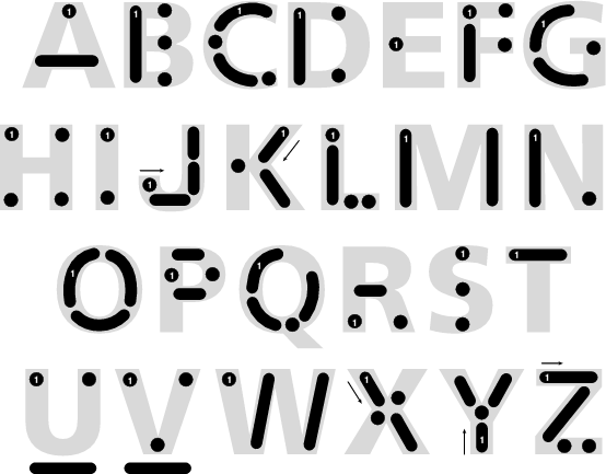
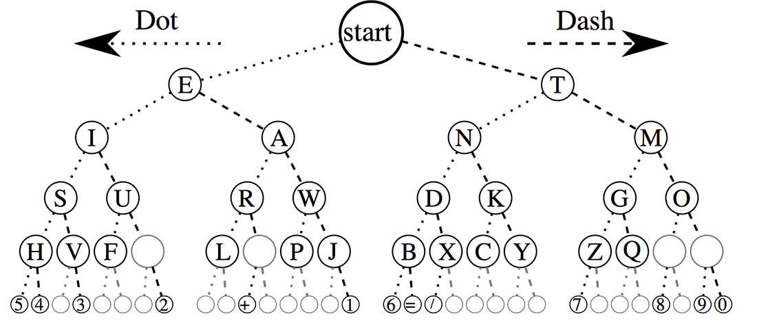
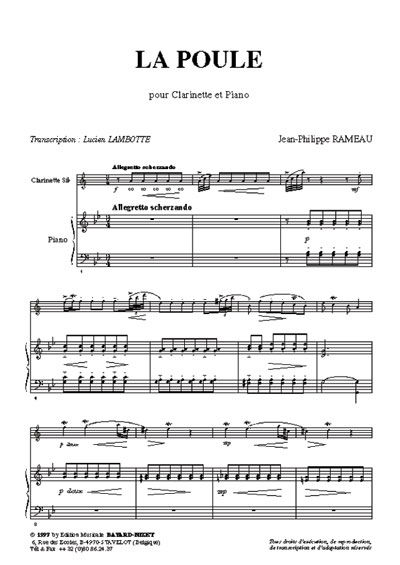

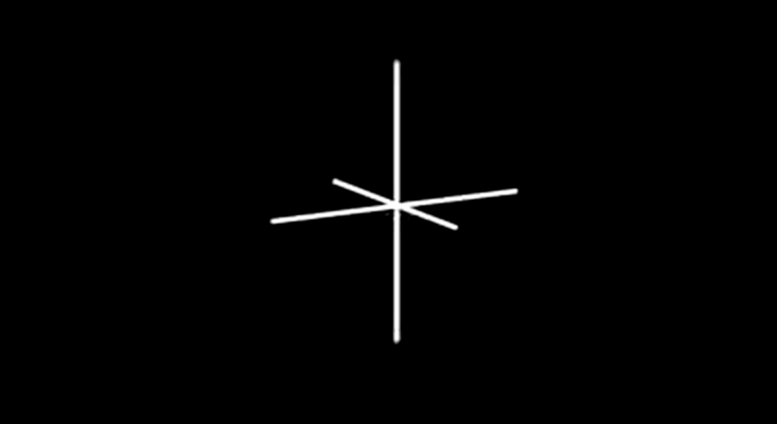
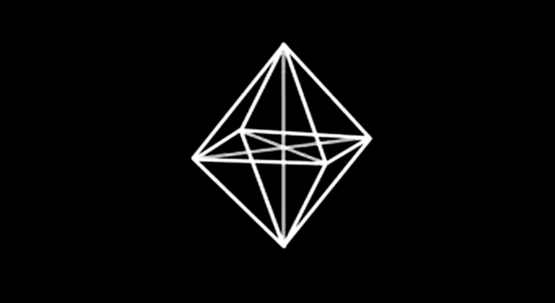
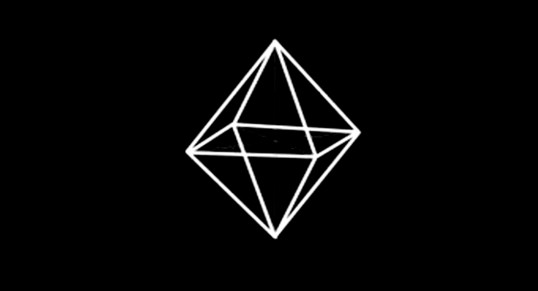
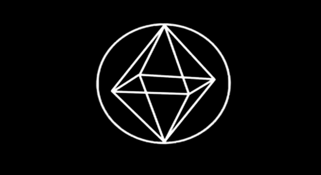
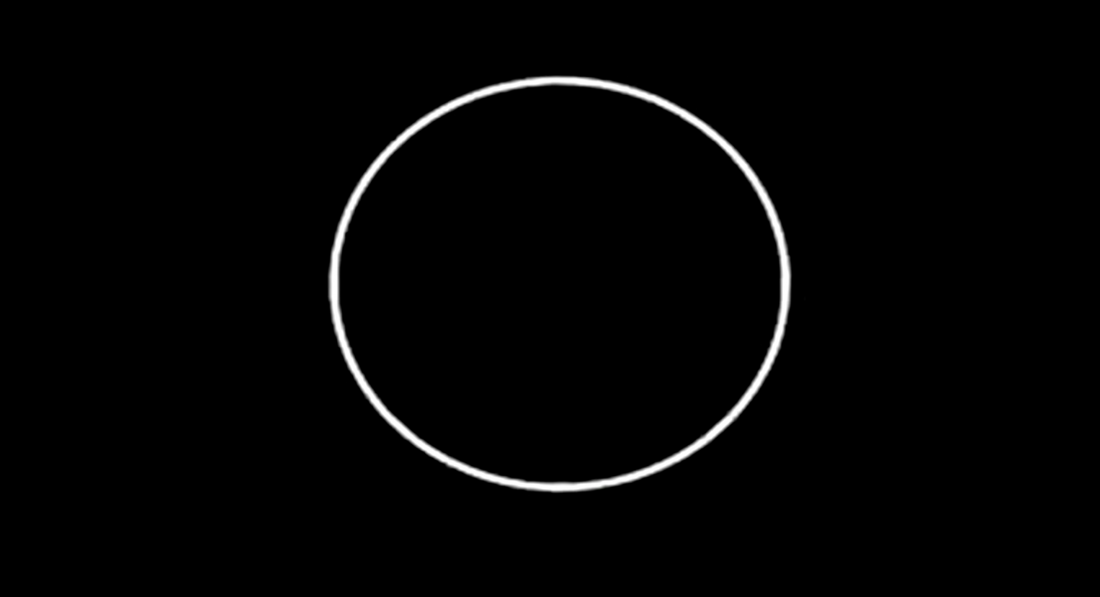
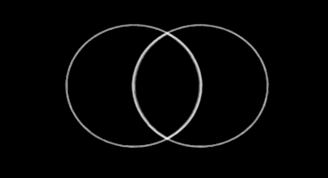
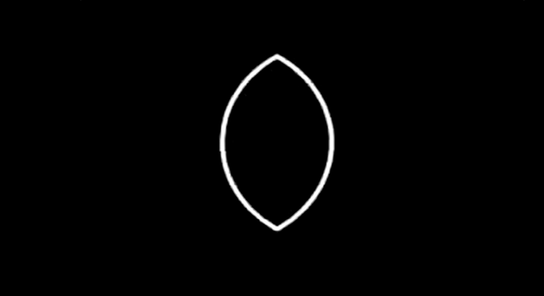

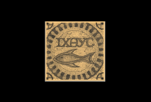
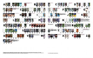
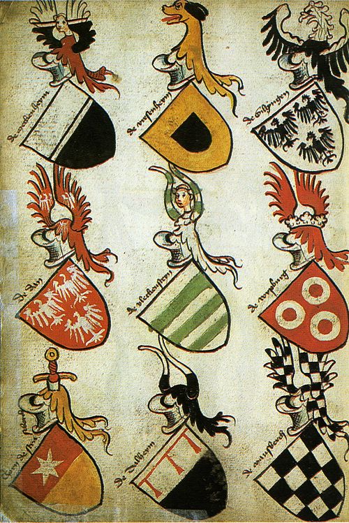
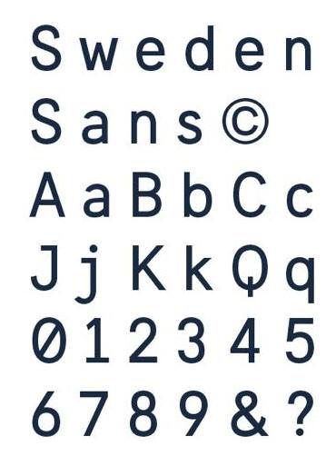
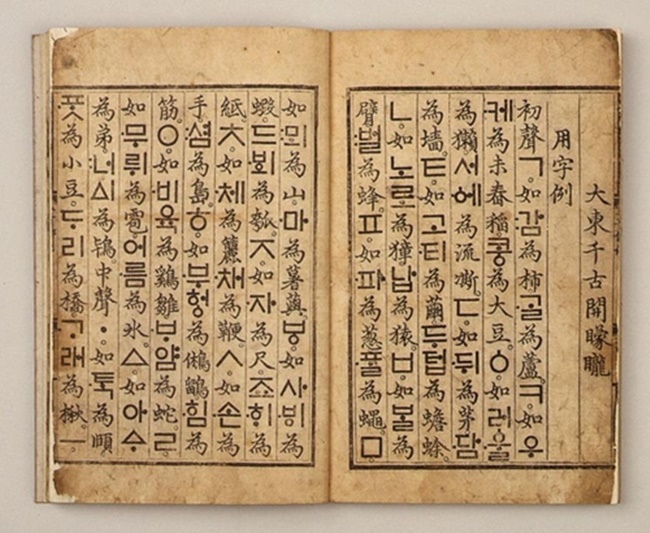
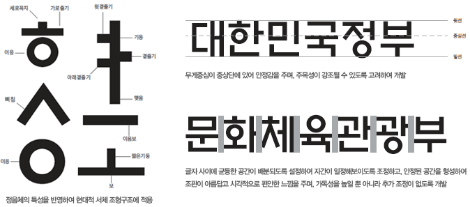

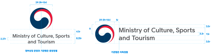
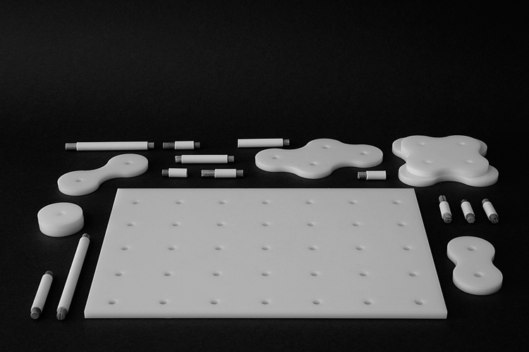

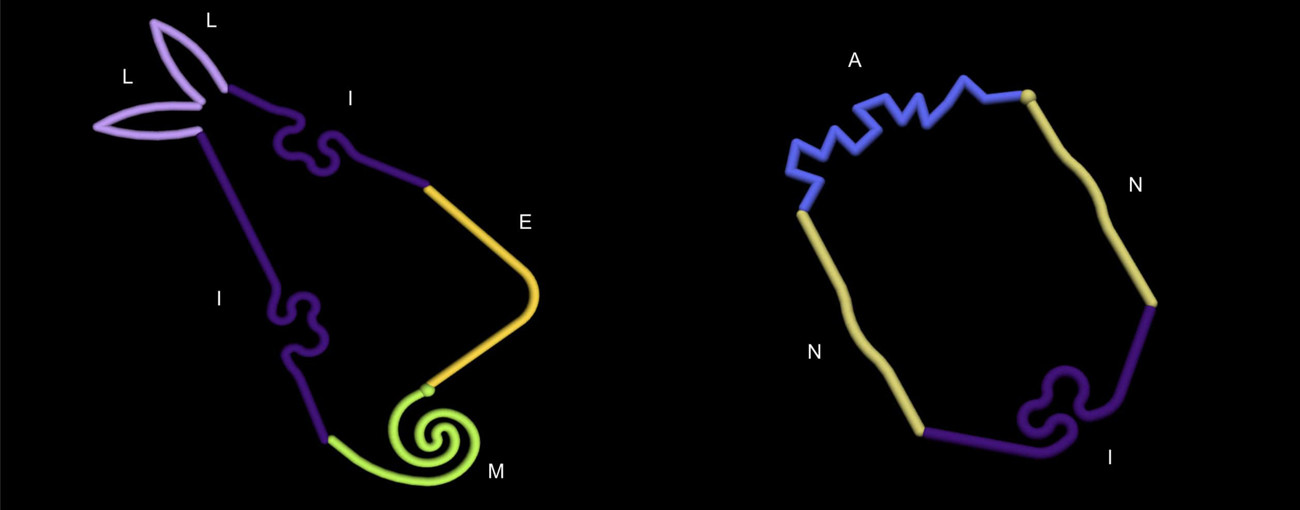
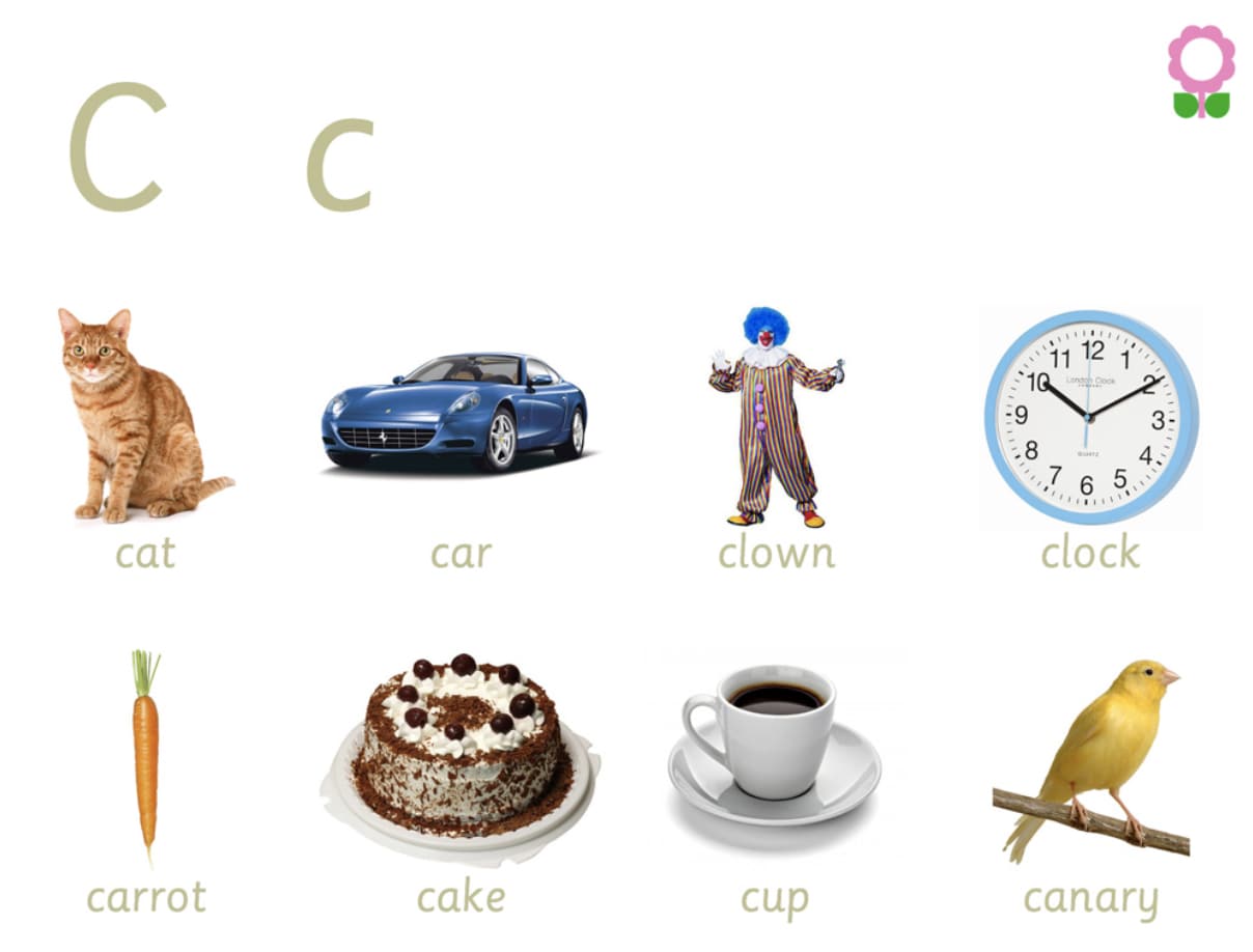

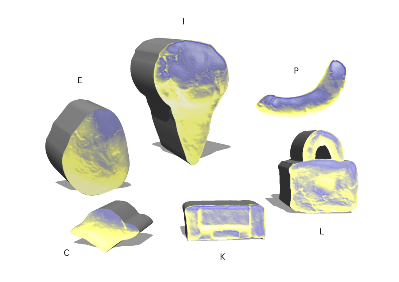


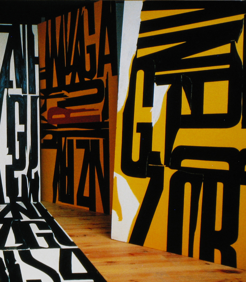
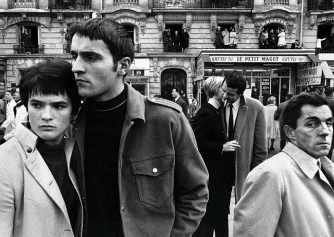
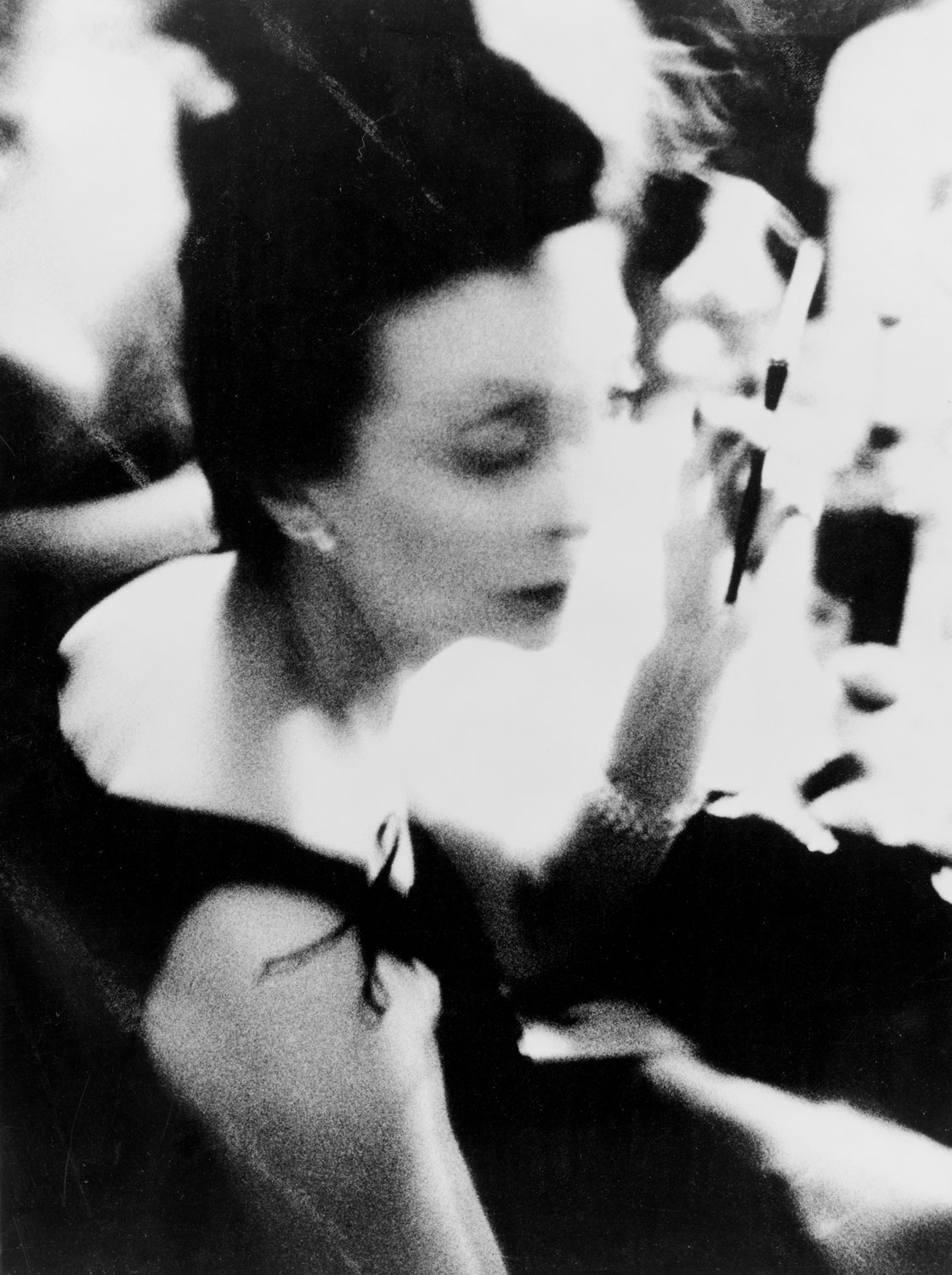


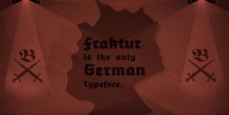
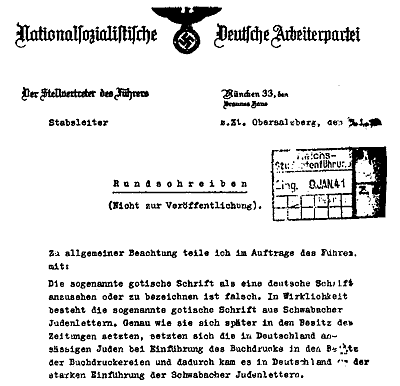
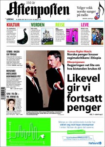
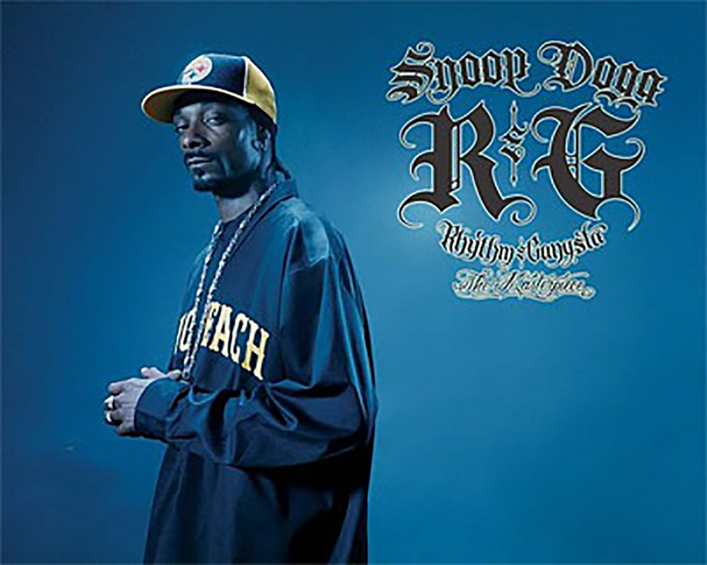

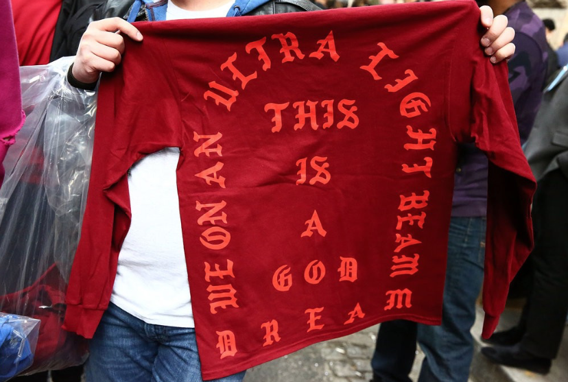
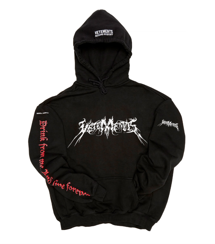
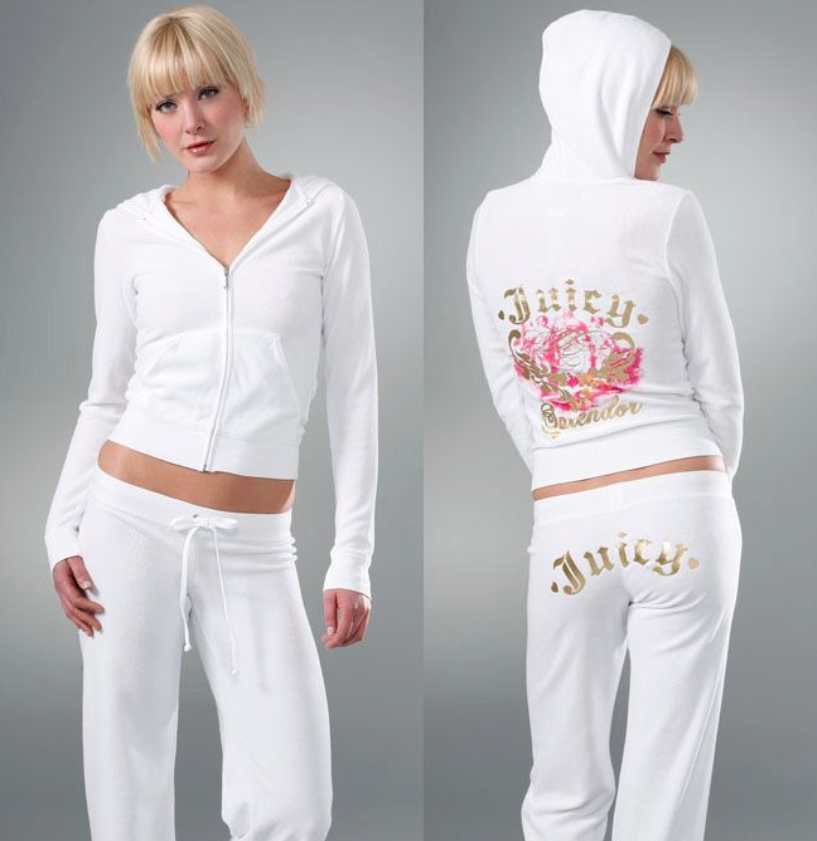
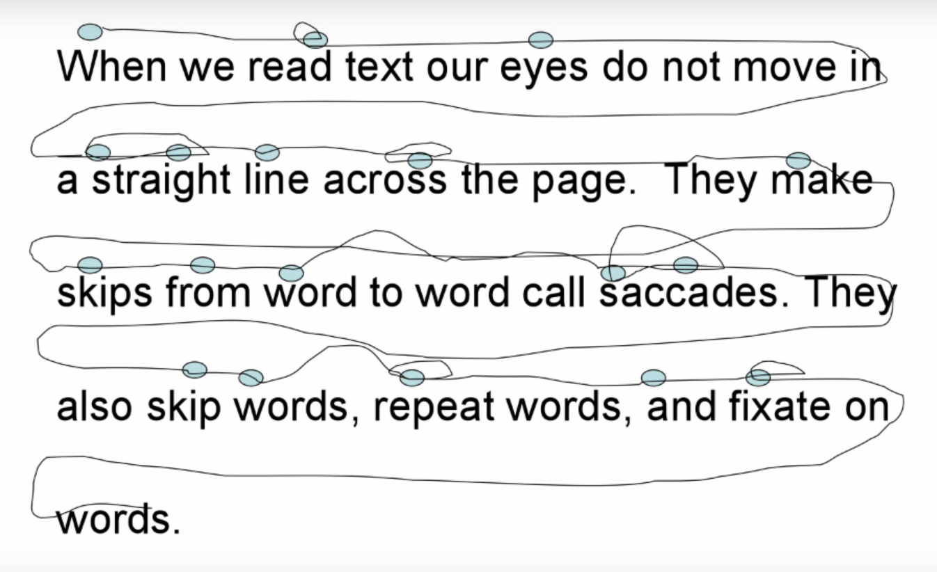
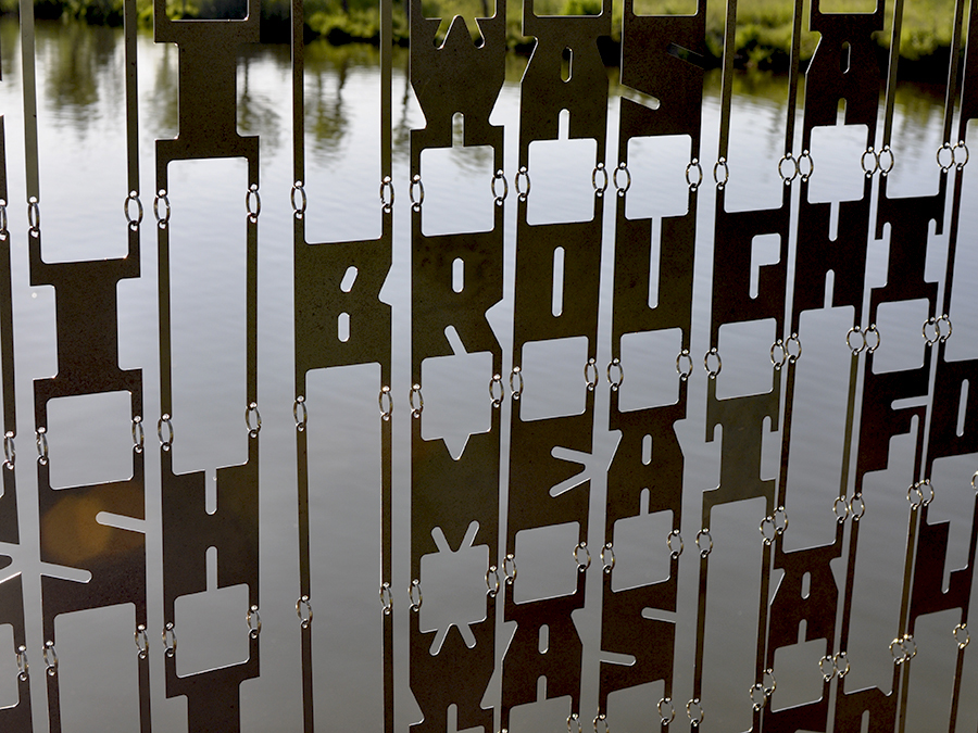
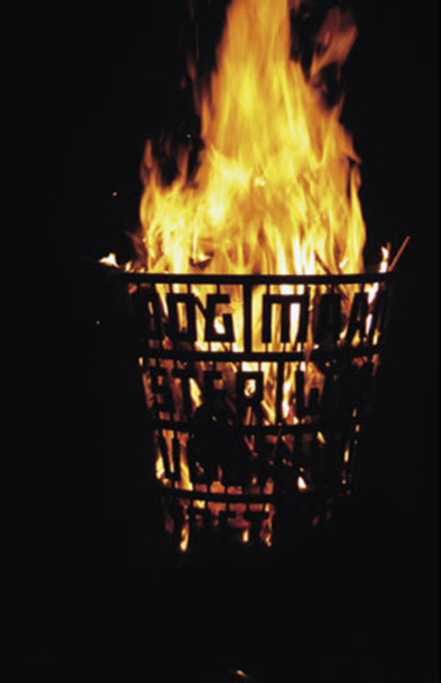


