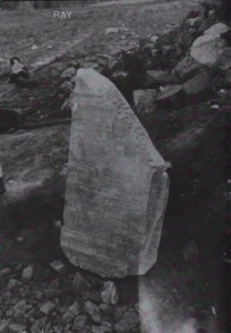
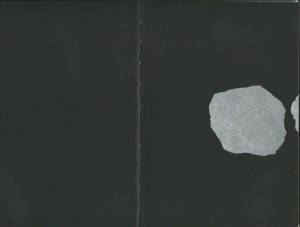
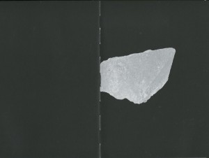
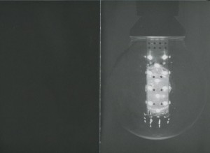
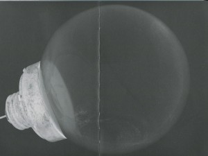
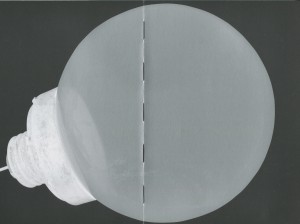
cover of Ray by Susanne Kriemann
What could ‘Ray’ be about I wonder? What kind of ray? Ray who? Stingrays? Electromagnetic radiation?
After holding this book for long enough to determine that it has nothing to do with any of these, the mystery of the content, for that moment, became irrelevant.
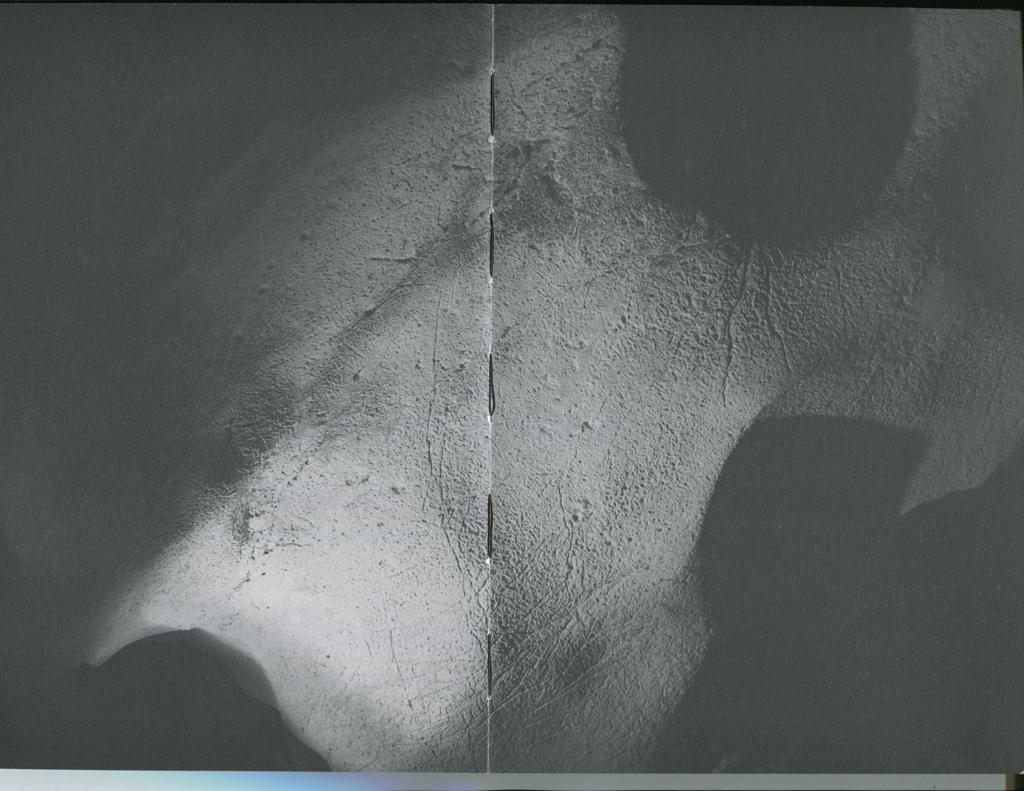
The matte, black and grey photograph of what seems to be a large rock amidst a rockier landscape provokes the question further, but this provocation is quickly smoothed out by the incredibly soft texture of the cover in which to run your hands across with pleasure.
Apologies Susanne Kriemann, for I am without doubt that this is an interesting book, but my other senses are currently occupied…
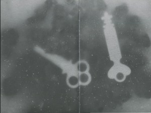
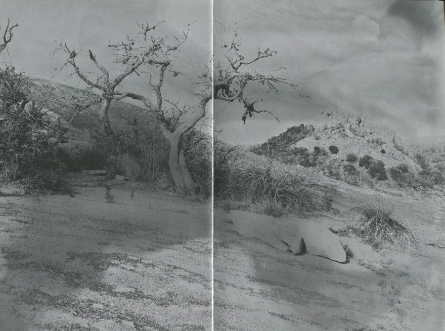
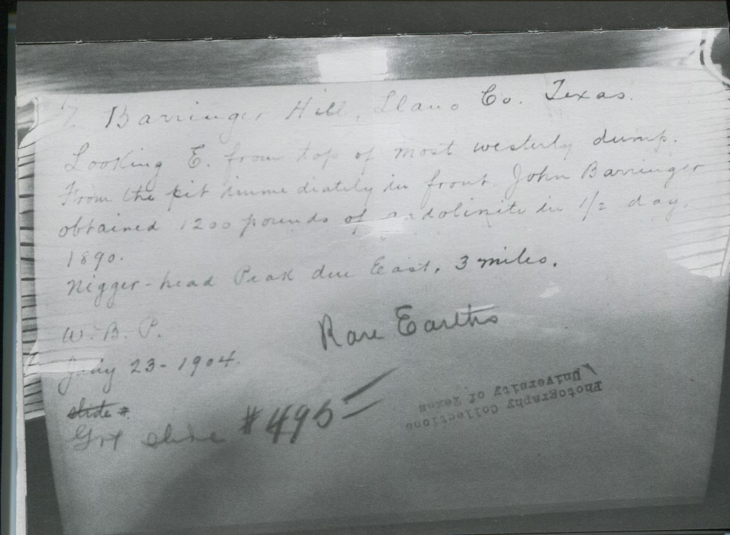
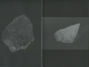
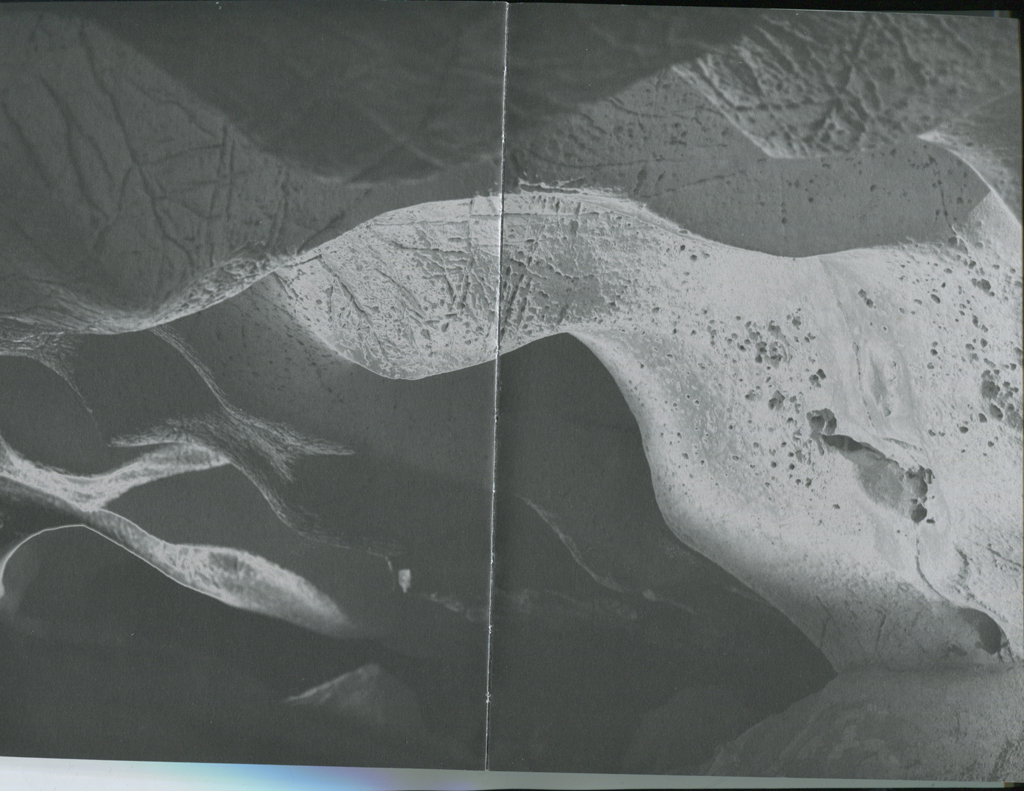
Opening the not-so-glossy, smooth publication that is creating such an aura of intrigue, is all the more satisfying. With black pages and a silver typeface to contrast, I am immediately drawn in by the first few images; a double page, inverted radiograph of two keys – unlocking this mystery at last perhaps – two saturated photographs of landscapes and hand written material.
By cleverly playing around with the orientation and size of photographs; some with an opposing black page, others wedged between boundaries of silver, is just one of the ways in which Radim Pesko, designer, creates more invitation to go deeper into this book.
The simplicity in using a plain Typeface (F Grotesk Light) can be overlooked, with text positioned only on the far left and right of the page, giving the centerfold its black depth.
This dark and light theme gracefully continues throughout the book, with a few pages of text, followed by changing and developing perspectives of more atmospheric images.
This layout has been well thought out, even down to the threaded binding, this book has a particular attraction about it.
Finding an instant connection with a publication is a rare and enjoyable experience.
Sacrificing myself to the curiosity that had built up, just by holding the book and skimming through the pages a few times, I decided to delve into the contents.
Obscurely at first; broaching a subject that we are so familiar with, and such an integral part of every crevice of our lives, yet we barely give it any thought. Written in such a way that doesn’t seem to want or need to give too much away, which matches the design impeccably.
When talking about light, to a photographer especially, the layers upon layers of this incredible source we take for granted becomes aparant, and goes deeper than expected.
Rooted in geology, rocks and the landscape; our connection and consciousness with the Earth, are essential in Kriemanns research. The birth of photography and introduction of electrical lighting, the minerals extracted, right down to the mine from whence it came; the corruption that followed blinded by human desire, to the growth into the world we live in now, with the glare of an LED screen ever present and almost impossible to escape.
A somewhat poetic approach, exemplifying more than just the artificial. As humans we are connected to the landscape and geology of the Earth, both physically and psychologically, as much as we continue on the unscrupulous path we tread.
An enticing read, with interesting extracts from contemporary writers and stories of the past, many angles are covered and stones unturned. This goes deeper than a photography publication, but more like an exploration into the process; the why, where and how we have reached the conditions we are in today…
This conceptualization must have also attracted Pesko to work on the design. For him, methods in working number 1: have an interest!
If you are not drawn in by the concept or idea, then you will not produce a successful outcome. With ‘Ray’, he brings forth an approachability to a book that I have not encountered before.
I could have returned ‘Ray’ to the library weeks ago, but I didn’t want to. It felt too nice and I had not finished reading it. But also the photographs, are wonderful, and mysteriously come together and take form as you read on. I want a copy of my own.
So how is he able to hit the mark? Well not only is a peak in Pesko’s interest essential, but also an element of humanitarianism; doing it for the people and the community.
After gaining plenty of knowledge studying at art academies in Prague and London, then completing a post-grad at ‘Werkplaats Typografie’ in Arnhem, he began designing for a magazine. The history of all typeface-design, and the idea that you could make a part of that history, was an interesting thought for Pesko, and when design became more serious a deepening interest and work on commissions helped to form his own preferences and continue to develop his skills.
Successful working method number 2: be comfortable with your own limitations. That’s when it got more interesting, as his style became more refined and he was easily able to pull together key elements.
Formerly based in Amsterdam and once a teacher at the Rietveld Academie, he now primarily works in London as an independent graphic designer. Whatever the project, I think Pesko has developed a good approach to his way of working.
Lesson 3: You begin with no material, until you start drawing, then allow your concept to grow. In each typeface created, he is also finding its own story, and history.
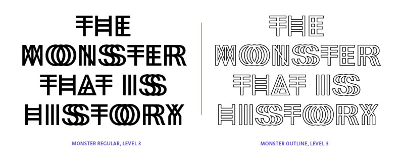
Playing with weights, styles, layers and colour, there are “endless combinations and infinitive variations”, which gives him a sense of freedom. A freedom that he also shares… At RP Digital Type Foundry established in 2009.
‘KILL YOUR TIMID NOTION”
is one of the many examples that have been used to preview his fonts. This information is automatically saved to his website. From Amsterdam Weather Forecast, BBC News and New York Times, to tv show The Wire and other websites and sources. Hundreds of these headlines are cataloged and published in the ever updating book ‘Specimen’, along with new and indicative fonts.
”DESIGN FICTION; GOLDEN ORB SPIDER FARM”
His distinctive family of fonts, whether in response to changing conditions in production or individually adjusted according to the space they occupy, are highly recognizable forms with the design remaining in the defined project.
Working method number 4: VISUAL is important.
Emphasized in personal projects such as the book ‘Informal Meetings’. A collection of photographs made during his travels to different places.
‘any part, any form’ is the follow up to this, and also the beginning and the end. No other text is included in this book. Discoveries of interesting encounters between space, architecture and water, each photograph seems to reference the other, forming a narrative and giving the images a natural flow, without the addition of text. A blue rectangle and textured red circles on the cover are all this book needs; relating to the title and content, everything makes so much sense, without giving it all away at first glance.
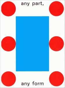
cover of 'Any Part, Any Form' by Radim Pesko [x]
Similarly in the design for Ray; the links form themselves. Ah so that is a Quartz Crystal on front cover… nice.
Teaching number 5: Let me take you on a journey, let me be your guide on this path of realization that you have already begun, you just don’t know it yet.
Okay, entice me a little more why don’t you, that is fine with me.
Rietveld library catalog no : kri-1
