Skip to Content Skip to Search Go to Top Navigation Go to Side Menu


"sound" Category


Who Is Rick Myers In A World Of Broken Music?


Tuesday, February 5, 2019


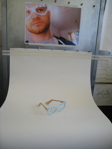
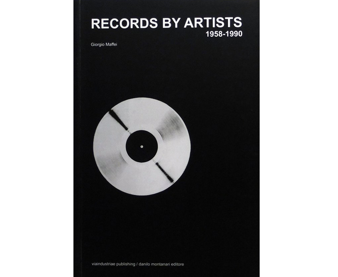
When I was in the library I noticed a pile of newly books stacked on a table. They looked completely fresh and untouched. I could look around the newly acquired books and quite quickly I came upon 2 books about music and art. 1: Records by artists & 2: Broken music. The first book on the left first pulled my attention cause I was interested in the topic. Which great artists also made music and how would it sound? But then i was drawn to the second cover by the misshapen LP and when I looked inside the second book I was immediately drawn in by the nice design. The design was quite straightforward in rows with alot of black and white but I liked that.

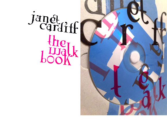
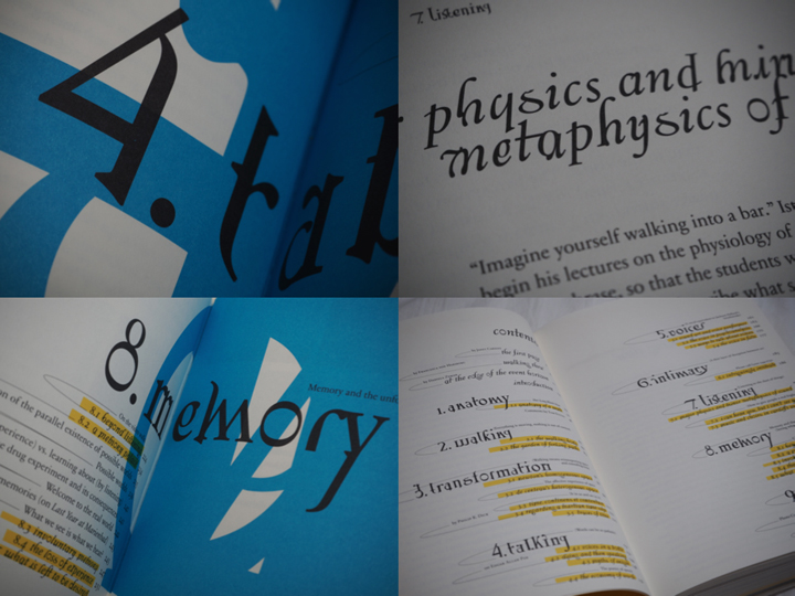
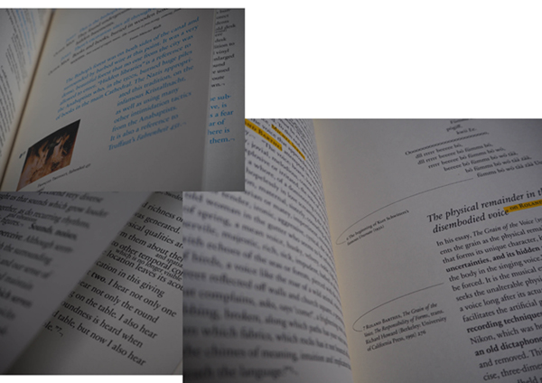
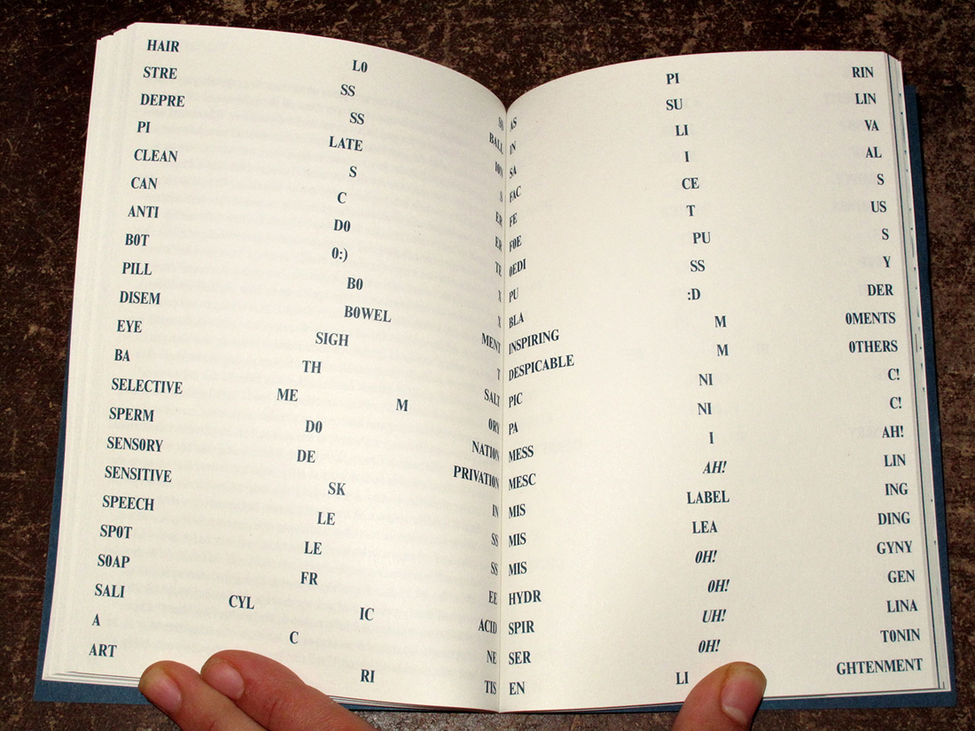
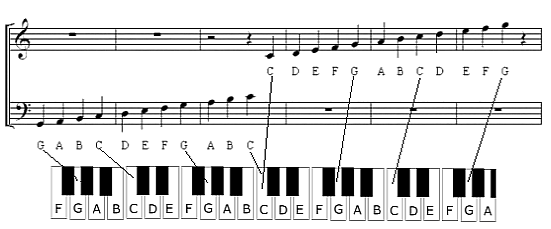
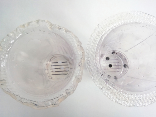
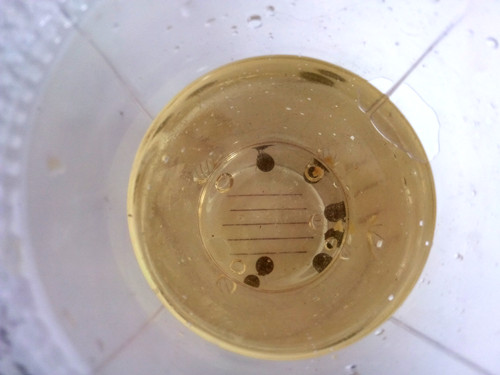
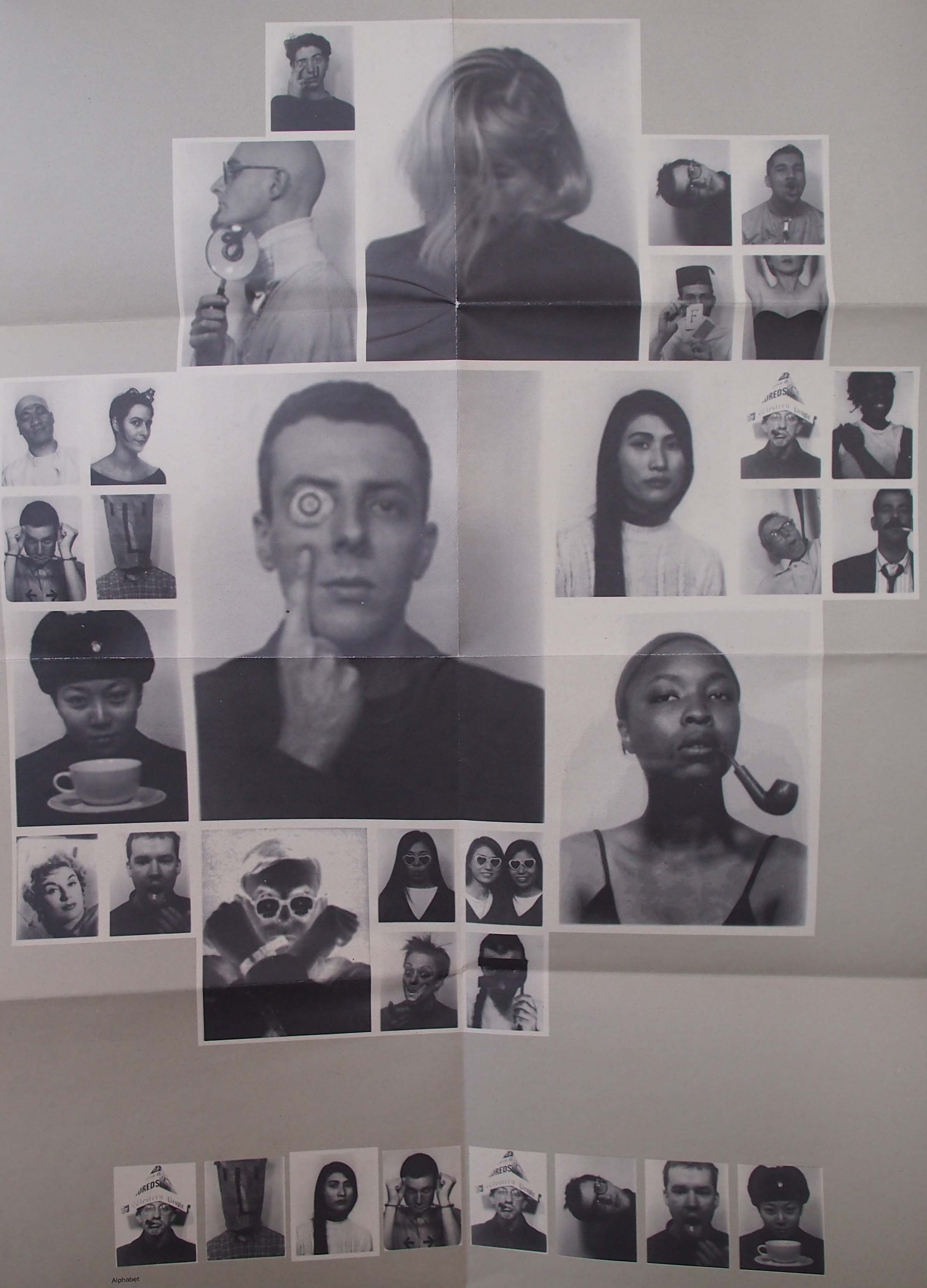
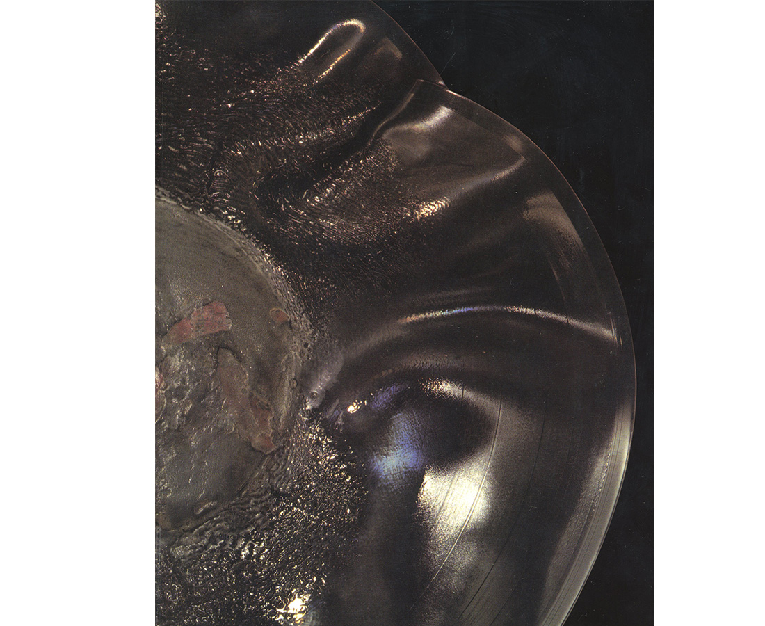
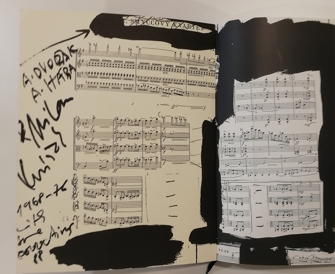
The cover of the book has no title on the cover which is something I still don’t really like. I don’t know if this is because I am used to books with the title on the front cover or that I just don’t like it and think that the book is laying with the wrong side on the table… Apart from the title, the cover has a nice image which is intriguing and brings questions. There is a little LP on the inside’s first pages which has some broken string music composed by Milan Knizak and played by the Arditti string quartet for the book (quite nice). The content of broken music has to do with music and artists. It’s a combination of records created by artists or covers designed by artists, books and publications containing music by artists and sound made by artists. In the design of the book the text is mostly normally arranged.

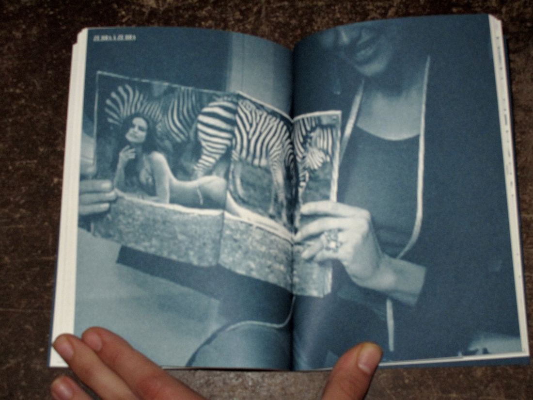
The way of using negative space and placing of larger objects is sometimes nicely done throughout the book.

This edition of Broken Music (2018) is a renewed edition of 1989. When I went through the book to find out what the designer Rick Myers changed I actually almost couldn’t find anything. On the second page the new edition 2018 said:

Sadly enough I couldn’t find out anything about Luzzi, who she was or how she was acquainted to anyone in the bookmaking process. This Luzzi was probably known to the designer Rick Myers but nothing can be sure and he also doesn’t respond to my emails.


When looking at the colour of the pictures there was a very small difference in the thickness and colour of the inside of the cover. The older edition had a sturdier cover and is 2 to 3 times thicker and had a yellow tint on the inside. The LP was missing but that was not because it wasn’t included in the original edition of 1989.

For the rest there was sometimes this slight difference in the colour of pictures inside.


The black white pictures were just a bit darker in the newer edition but the coloured pictures sometimes had a difference in colour which was quite noticeable.


When I digged in a bit deeper, I found out that he actually made a facsimile of the book ”Broken Music”. This completely explains why there almost are no differences to be found. He tried to make an exact copy of the older book. This was probably due to the great amount of request for the book still and it wasn’t being made anymore. He spent a pretty obscene number of hours on this project with absurd activities such as assessing the tonal values of Bernard Heidsieck’s trousers, checking the density of the shadow cast by Rose Sélavy’s hat or looking for clues in measurements concealed for 30 years prior, delving further into guillotine mis-cuts made in 1989 for the facsimile to sit quietly alongside the original.

So in this case Rick Myers role was to design this new book to be completely the same as the original. In the actual content and design of the layout he didn’t contribute anything (except for Luzzi maybe).

The designer Rick Myers is an designer as artist born in Manchester and working on text, video, installation, drawing and books and editions. He is the founder of Muta which is a publisher of artist books and poetry. Only when you go to their site it’s not that interesting. It seems that Muta is not really that active anymore. On their website you can see the work of 3 artists and that’s all. When you go to their Instagram you see their last post was in 2017.
Also, you can really see that the design of the website of Muta is corresponding to the design of Rick Myers own website. Very straight and everything in the middle but still it’s not really easy to navigate on his website.
In Amsterdam in the shop Boekie Woekie you can also find some books of him that he completely made himself. So apart from remaking the book broken music, he also makes alot of works himself and produces books with recollections of his own works.

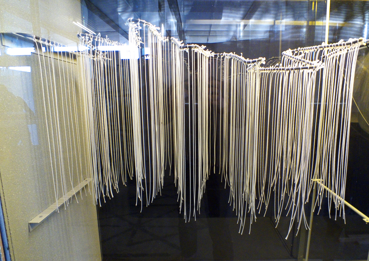
One of his works ”Before and after Death” Has an interesting idea in which he collected light bulbs made before 1908 that were over 100 years old and thereby contained a vacuum of a century.


He then made a print of these light bulbs by stamping them and made it into a book as seen in the picture. I’m curious to see if the whole book only has 1 image because on his website you see 3 times the same print next to each other. Everything here is black and white, he does that a lot but not always.

Another work from Rick Myers is An Excavation / A Reading (Before the Statue of Endymion). He used a technique in which a text is first readable and slowly over time is not readable anymore while an audio fragment is playing and reciting the text. There is a short video fragment of the work on his website.  Check it out, it’s definitely worth it!

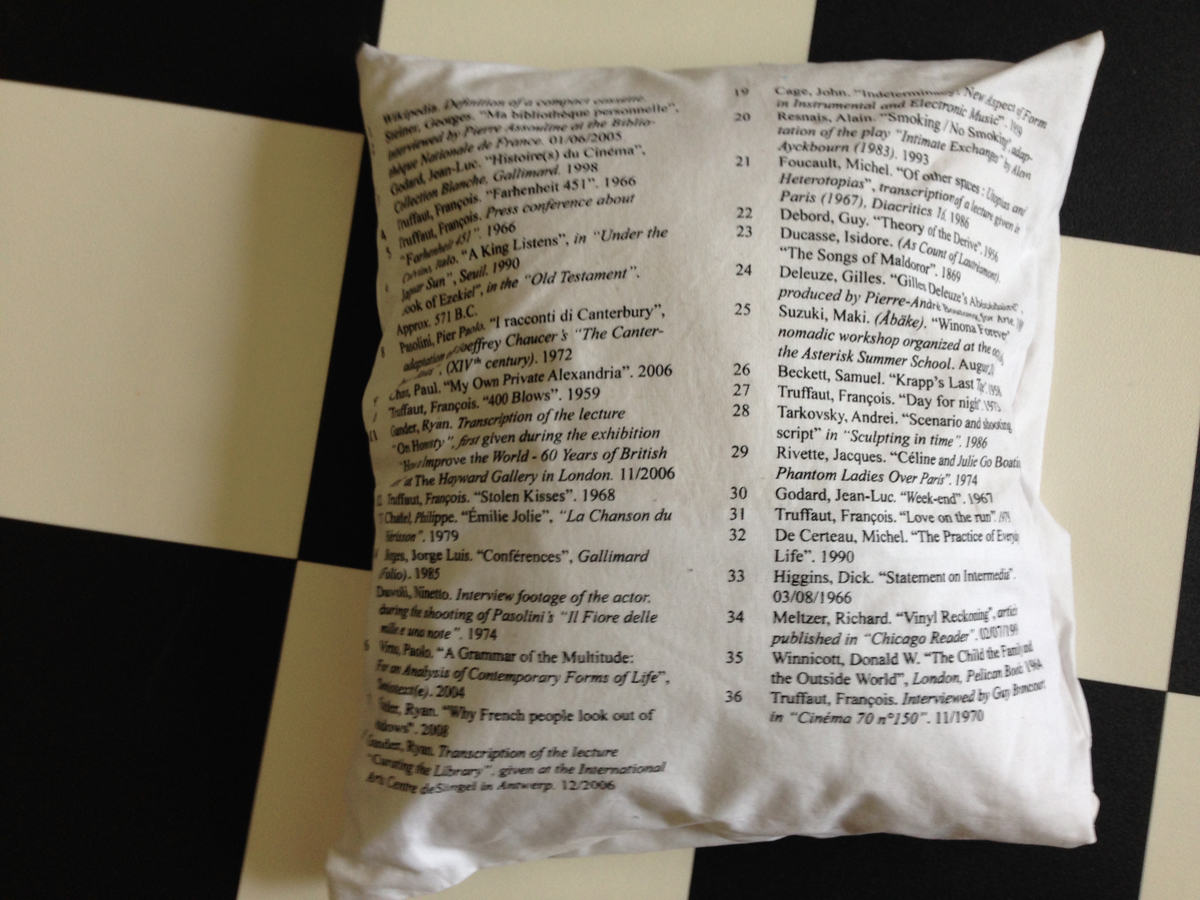
Ursula Block & Michael Glasmeer: Broken Music, artists' recordworks. designed by Rick Meyers, Rietveld library number: 708.4 rec 1

Dynamic pages


Saturday, February 4, 2017

As soon as I opened Janet Cardiff’s The Walk Book in the Rietveld library, I knew I had found the book I was going to make my research on. There was not a single page that didn’t awake my curiosity on how the design had evolved.

The reason for this was the very dynamic and multidisciplinary design. Distinctive colors, shapes and placement of the content creates a chaotic and playful impression. Although you suspect the organized work behind it. Those responsible for this are the two designers, Thees Dohrn and Philipp von Rohden who shared the design agency Zitromat in Berlin. The later of which I had a chance to interview on a few points. I will share this with you as the text develops.

Let’s begin where the journey of the actual The Walk Book begins. It was initiated by a proposal from the art collector Francesca von Habsburg  to the artist in the early 2000’s. The hopes of von Habsburg were to enlighten many others to “the magical world behind Janet Cardiff, her creative talent, and vivid imagination”. She also says “Hopefully, it will reveal how she works in a playful, yet extremely serious manner (…)”.

For those who aren’t yet acquainted with Cardiff, let me give you a short introduction.

As this book investigates, she has created several video and audio walks. These are extraordinary works that allows the participant to experience a dualistic moment through the act of walking and continuously listening to her narrative. The act of walking unfolds the space along with the process of narration which creates both a corporeal and a visceral form of knowledge, as two intertwined levels of consciousness.

In my interview with Philipp von Rohden he shares with me that from the start the plan was only to make something like a small catalogue on approximately 120 pages for one of the “walks”, but as the actual result now shows it turned into a 345 page book.

One of the additions to the production was the artist’s own suggestion to turn the book into a walk itself. This is the reason for the cd on the cover. This inventive design allows even the front of the book to be dynamic, as another aspect of this multi-layered book.

oooooooooooooooooooooooothewalkbookcover_janet

But it is not merely a cd that adds to the aesthetics of the book, the track-list introduces me, as the reader/walker to the book in a frisky way. It invites to a vivid insight into Cardiff’s work and welcomes you to approach the book in a non-linear fashion. The audio walk in itself makes the already expressive impression of the pages become even more alive. The book actually expands even outside the pages when brought along on a walk and your “real world” impressions become combined with the audio and the content of the book. Pictures appear almost animated and the content is even more appealing when you’re encouraged to dive into parts of the the material along with Cardiff herself. I start to detect the hidden codes for the different design layers. For example I notice differences in size and color of the text according to the different sounds or voices I hear.

oooooooooooooooooooooooooooooooooooooooooooooooooooooooooooooo

This brings me back to my research.

Perhaps it has already started to make more sense now that I’ve shared a little more on the actual subject of the book, and how she expresses herself. Fact is, that when I ask what is the organizational guideline behind this very expressive design I’m told that they based their inspiration on Cardiff’s own working process.

She works by collecting fragments and combining them to art pieces. Sounds, pictures, words. And this notion of collecting fragments is what initiated the design. A clear example is the special typeface used on the cover and also on titles inside the book. These characters were set up especially for this book and were created by finding typography elements and then combining them. Collecting fragments.

ooooooooooooooooooooooootypeface2

Another design element inspired by the work process of the subject herself are the yellow highlighted words continuously occurring in the text, smaller sized sentences in between the lines in the middle of a text and the little arrows leading the reader away from the columns to imbibe some extra information that could be useful for understanding the text.

These features are not just there by chance, they are inspired by Cardiff’s own notes, which are actually embedded in the book as well in their full pride on pages 54-61 for example.

notes

ooooooooooooooooooooooootexterna30_600

The result were these playful pages that by constant interruption prevent a traditional reading experience. Von Rohden comments on the way Cardiff highlights certain pieces of her notes, crosses out and adds words to the texts in between the lines, “is it just a comment? Is it important or not?” he asks rhetorically. This process is clearly applied to the design of the book and I think it’s fun to be invited to see the connection.

Further, I’m informed that they had 6 content layers when designing the book.

For example my suspicions when experiencing the walk are confirmed:

Cardiff’s voice is always blue,

and a little bit bigger

than the author Miriam Schaub’s texts that are black and seem regular sized in comparison. Another layer example are the pages in the back of the book that contains writings from exterior curators and are drained in a yellow color to divide them from the rest of the content.

yellow

Other genuine elements in this book that the artist herself is particularly happy about are the fold out pages to show the actual audio editing. Among other things, she also mentions the photos that are simply thrown into the book, detached so that you easily can hold them up in front of you when you experience the walk that’s included. I agree with her that these relatively rare book design elements definitely contribute to the exciting impression of this book.

The project went on for ca 2 years and the design process was short and difficult, described as a nightmare by von Rohden. But that doesn’t change the fact that he feels it was an honor to be a part of a project like this, and that it is rewarding to see that the book still seems to have some relevance after more than a decade.

I’m happy I got acquainted with this book, the artist and the design methods. Brought upon much inspiration for the future.

Thank you to Philipp von Rohden and Janet Cardiff for sharing your thoughts and knowledge about this book.


The Walk Book /Rietveld library catalogue no : card 1

NU- A N C – ES OF NO.


Sunday, January 29, 2017

giphy 2


The book design has a strange appeal;

boring Facebook blue and random pages in between. Unsettling uppercase letters of split up words all over one page, very prose looking straight aligned text on the other. A woman holding a picture of another woman lying naked under a zebra. Low resolution smiley face.


Nuances_of_no_5Nuances_of_no_4


Hanne Lippard graduated Rietveld as a graphic designer, but then carried her words from printed matter to sound files and live performance. ‘Nuances of No’ is her book, a collection of written work released in 2013. In making the book, she designs her own content, which allows her to create a similar voice to her sound work.

Visual information like spaces provoke silences in the readers head voice.

By the placement of the words on the page in relation to each other, or switching or removing letters and making slip of the tongues, she also plays with language, takes attention to sounds and stretches their meanings.

(variations)
[audio:https://designblog.rietveldacademie.nl/wp-content/uploads/2017/01/variations.mp3|titles=variations]

As your eye is guided through the page, text sounds like poetry.

(every word)
[audio:https://designblog.rietveldacademie.nl/wp-content/uploads/2017/01/every-woord.mp3|titles=every word]

The design of the word becomes the form of her voice.

In her spoken works she has a monotone, articulate, clean and soft tone which is robotic yet sounds as if it could be coming from somewhere inside your head.
This similar feeling is present in the book as well, this time through the colour of Facebook; trustworthy, artificial and sort of anonymous. Some pages in between have pixelated smiley faces and click button images taking the reader into a virtual world context, which adds to the atmosphere she creates.

(underscore)
[audio:https://designblog.rietveldacademie.nl/wp-content/uploads/2017/01/underscore.mp3|titles=underscore]

The design of Hanna Lippard [x] serves to vocalize her written thought in ‘nuances of no’; making the words surround the reader in the mind.

(echo)
[audio:https://designblog.rietveldacademie.nl/wp-content/uploads/2017/01/echo-she-wants.mp3|titles=echo]

One or two voices.

(goodbye)
[audio:https://designblog.rietveldacademie.nl/wp-content/uploads/2017/01/end-goodbyee.mp3|titles=goodbye]


*soundfiles are readings from the book in my voice. only (echo) is my words in my voice.


Nuances of no. /Rietveld library catalogue no : lippa 1

Hardly readable – A graphic translation, the sound as a last abstraction


Sunday, February 21, 2016


A translation of roman letters into graphics and a translation of these graphics into sound. What happens if a language is changed into a system that we all have to learn new? A system that defines roman letters in new ways. Therefore a first abstraction into graphics and a last abstraction from the graphics into sound. Both, the individual graphics as well as the sounds can be connected and therefore they can create words in the level of language. To what extent is that still readable? Is our visual dialect able to understand that? And if we are able to read the graphics as new letters, can we associate them with new sound that is creating a virtual language that is not spoken?


AZART


AZ-art is about the art from A to Z by belgian Guy Rombouts. It is an alphabet translated into graphics. Each letter gets a fixed graphic. If the letters create one word the graphics create one cloud. That means that there are certain combinations between the graphics that are approximately working in the same way as certain combinations between letters in a font (space, connection etc.). Instead of one-dimensional strings the alphabet combines words as two-dimensional objects. With the use of different colours for each graphic the combination appears much stronger than a written text. If there appears a space that separates two words in the graphic translation it appears a second layer and therefore it becomes a third dimension when words create a sentence. The words are translated into new associations.


Writing Down And Reading Aloud


Questioning the system of a new graphic language means to make a connection to our understanding. How do we perceive things? How do we actually start learning to understand what we perceive? Being alive with the knowledge of speaking and listening, we learn our visual dialect as a second language. This second language is learnt by translation: writing down what is spoken and reading aloud what is written. Our roman letters are carrying petrified leftovers of a long historical development – connected to pre-alphabetic times. Therefore many people are questioning them for an efficient design. Also Chinese politicians and teachers were trying to simplify the logographic of the Chinese alphabet. What is a graphic translation about? In “Phonographic Translation” by W Haas it is explained that a worker in Tientsin needed half a year for learning the Chinese characters and he still could not remember them. These three characters represented just three works that he had to use every day. Chinese pupils have to learn the first One-Thousand Characters in primary school. Basically a contemporary graphic translation of a language is about the simplification of a language.


The AZ-art is about the transformation in two directions: X axis and Y axis


Every graphic is defined by an individual shape and colour. My description of the colours of the graphic alphabet is based on Goethe’s colour theory. I used the definition of red, blue, green and yellow and brought them in connection with the RGB-Values of each graphic.


blog blog2


blog3 blog4


blog5 blog6


blog7


Goethe’s colour theory


|||||||||| Because of its high dignity is is sometimes called crimson (even if this is actually drawn into the blue). By increasing the two poles (yellow and blue) to red an association, tranquilizers or gratification takes place. It gives an impression of seriousness and dignity and also of kindness and grace. Through a crimson glass one sees a well-lit landscape in a terrible light.

|||||||||| It is the color of the dark. It is a color energy and the highest purity a lovely Nothing. It seems to recede (the distant mountains can be seen in blue). It is pleasant to look at, there is a feeling of cold and reminiscent of a shadow. Although Blue rooms seem far, but cold and empty. Blue light is changing your mood into sadness. If blue is touched on its plus side it is pleasant.

|||||||||| It is the colour that is nearest to light. It has a serene, cheerful, gentle property. As gold it has a splendid and noble effect. It makes a warm and comfortable impression and in Painting it is used to illuminate. Howerver yellow is very sensitive and gets an unpleasant effect when it is dirtied or pulled into minus. Then it becomes the colour of shame, disgust and displeasure.


The sound as a last abstraction


As an outgoing sound I decided for the Wobble Bass with a 25% Filter Reso. Each graphic is based on this sound and is transformed in its visual appearance. That means that e.g. letter X is not transformed because it is a linear graphic. In its tone middle e.g. the filter frequency of letter N is transformed (30-90 Hz). The filter frequency of letter C is transformed (30-155 Hz) from the beginning to the end of the tone. Letter B is showing the strongest hearable difference. Because of its graphic the transformation of the outgoing bass has 4 high distances and 4 low distances. That means that the Filter Reso is 4 times transformed to 70% and 4 times to 0%. The filter frequency is 30.

Next to these 4 letters I also translated the 3 AZART- Options of a black, grey and white environment into sound. My research is ending with a playlist that I uploaded on SoundCloud. There you can find the sound of 4 single letters, the 3 environments and the combination of the 4 letter with each environment. These sounds are produced in a collaboration with Alexander Köppel (Exchange Student GRA – Inter-Architecture).


On recordings (…)


Monday, February 1, 2016


henk2

listening to a 70’95’’ audiobook on a white cotton pillowcase

During the GRA Graduation Show 2015, the thesis “On recordings (…)” was displayed in the Graphic Design Department reading room as an audio piece. The different parts of the thesis have been recorded as separate mp3 files and reassembled together as a playlist. The text written by Émilie Ferrat is read by her, while her references are read by Ben Clark. The mp3 files were being played from an iPod, hidden in a white silkscreen pillow, displaying the title of the thesis and its references, which were printed at the back of it.
An extract of the first part, is available here.
Soundfile : “Memorizing litterature” (…)

[audio:https://designblog.rietveldacademie.nl/wp-content/uploads/2016/01/Hi-Mary_Celina-Yavelow.mp3|titles=perfect fifth] For any inquiries regarding the project, please contact: emilieferrat@gmail.com.
Pillow_backside-references

references on backside pillowcase


.Pdf-icon download this thesis “On recordings (…)”

Emilie Ferrat,
was also nominated for the GRA Awards 2015: Category Applied Arts in collaboration with François Girard-Meunier. To read more .... link


Harp of Pythagoras


Saturday, May 30, 2015

Why are things the way they are? That is a question I can never stop asking. Every day I find myself completely fascinated by things that other people seem to take for granted. I just cannot get used to the simple fact of existence.

One of my most recent questions: “Why do we always tune our instruments the same way?”  This is the question that sparked a whole design research of which the outcome was to be a mathematical music instrument.

At the start of my research, I decided to visit my old piano teacher. I asked if he had some time to think with me on the subject of musical tuning. When I met up with him though, it was quite evident that he was not a music theoretician. He did encourage me to find out by myself, so I headed his advice and did a lot of research.

The science behind the instrument: Pythagorean music theory

0501_gaffurio_pythagoras

When starting this project, I did not expect to develop such a great fascination for a man who has been dead for over 2500 years and would probably cringe at the mere thought of modern music. Pythagoras had some very interesting theories about harmony. He believed people could be healed spiritually by listening to harmonious tones. He developed a tuning system based on exact mathematical ratios to create perfect harmony. He used the most harmonious interval (3:2) the perfect fifth as his foundation.

Sound file: perfect fifth

[audio:https://designblog.rietveldacademie.nl/wp-content/uploads/2015/05/perfect-fifth.mp3|titles=perfect fifth]

By stacking fifths upon fifths he developed a 12 tone system. The framework of our modern 12 tone system called “equal temperament”.

mtp01

The 12 different tones in an octave as shown on a piano keyboard.


Mathematically Pythagorean tuning is perfect. It describes the almost exponential nature of sound exactly. This way he could play the musical equivalent of the golden spiral. Pythagoras saw truth in these harmonies. It was his way of communicating with the heavens.

The most fundamental difference between Pythagorean temperament and equal temperament is the difference between a circle and a spiral.

 41-43spiral

Pythagorean tuning shows the golden spiral of fifths. Because the spiral of fifths is a spiral shaped system based on stacked fifths, the fifth intervals are in perfect unison, but the octaves are in dissonance.

Sound file: wolftone

[audio:https://designblog.rietveldacademie.nl/wp-content/uploads/2015/05/wolftone.mp3|titles=wolftone]

This dissonance is also called a “wolf tone” because it resembles the howl of a wolf.

The wolf tone, is by no means the result of a faulty calculation. It does however create a problem for music playing. This problem is referred to as the Pythagorean comma. A quite ironic name seeing as Pythagoras did not believe in decimal numbers. The Pythagorean comma actually prevents you from playing more notes than the range of an octave because the 13th note will be slightly out of tune (though you could play perfect fifths into infinity). Pythagoras had a solution. He just did away with note 13 and upwards!

circle

Equal temperament avoided the problem caused by the Pythagoras comma, by converting the spiral into a circle. The comma is still there, only spread out between all the notes. Everything sounds kind of okay, because everything is out of tune in the exact same way except for the perfect octaves (which you can play into infinity). Now we can play music in every key, but there is little harmony left.

Can the comma be solved? No. It cannot be solved because it is a fact of nature. Perfect octaves and perfect fifths cannot co-exist. No power of 3:2 can ever be a power of 2:1. Pythagorean tuning sought to find truth and equal temperament standardised it for the sake of convenience.

I found this very interesting, I wanted to hear the perfect fifths, so I gave myself the task to design an instrument based entirely on Pythagorean tuning. Not only would it have to be tuned in the right way, I also wanted the design to reflect the tuning, so I could understand it better.

Creating the instrument

First I had to calculate the notes Pythagoras did not care about (note 13 and upwards), so I could make an instrument with more than 12 notes. That way I would be able to hear the perfect natural disharmony Pythagoras shied away from.

Luckily someone I know had already done the dirty work for me:

rsz_img_3861

Here is the chart I used to come up with the absolute frequencies of my instrument.

And here is the list of absolute frequencies:

rsz_scn_0006

It has 37 strings from C1 to C4 where A2= 432 Hz.

Sound file: Pythagorean tuning of my instrument and equal temperament

[audio:https://designblog.rietveldacademie.nl/wp-content/uploads/2015/05/Pythagorean-tuining-and-equal-temperament.mp3|titles=Pythagorean tuining and equal temperament]

Sound file: dissonance between Pythagorean tuning equal temperament

[audio:https://designblog.rietveldacademie.nl/wp-content/uploads/2015/05/Dissonance-between-Pythagorean-tuining-and-equal-temperament.mp3|titles=Dissonance between Pythagorean tuining and equal temperament]

I was struggling to think of a meaningful design for the instrument. Out of nowhere it hit me

 rsz_1rsz_1scn_0003rsz_1rsz_scn_0005

I drew the distribution of the frequencies of my instrument in these graphs and I realized the shape of the graph would be the perfect shape. It visualizes the exact near exponential nature of the tuning system. I even decided to place the strings at their corresponding spatial position on the instrument. From down to up, the strings grow increasingly farther apart from each other.

 rsz_img_3864 rsz_rsz_scn_0004-1 rsz_scn_0002


Final design and model

rsz_scn_0001 rsz_rsz_img_3410 rsz_1rsz_img_3409


Stages of building

rsz_img_3852 rsz_img_3854-2-1

The instrument is made from birch plywood. The inside is reinforced with massive wood to resist the tension of the strings.

Final outcome

rsz_img_4414

                                                                                                         rsz_img_4412 rsz_ca2_0060


Sound file: some sounds of the instrument (not tuned to pythagoras)

[audio:https://designblog.rietveldacademie.nl/wp-content/uploads/2015/08/HARP-.mp3|titles= some sounds of the instrument]

Math is nothing other than stating things as they are. I only realised this during my research. It is the very foundation whereon math is based. It is the thing whereon my instrument is based. It shows tuning systems as they are. It does not hide the perceived disharmony. Creating this instrument has truly showed me how bad our attempts are at grasping the nature of reality. We are trying to create harmony with notes that actually form dissonance. It’s complexly ridiculous.

As an art student I say I made an interesting discovery. As a musician I say I have created an incredibly ridiculous instrument and I am very happy with that.


Sound Sock


Saturday, May 16, 2015


Startingpoint

The startingpoint to my design project  was my interest in costumemaking and theatre. I arranged a meeting with the costumedepartment of the Nationale Opera & Ballet in Amsterdam. During my visit I gained insight into the process of costume making and was struck by the amount of detail, creativity and knowledge that goes into every piece.

What inspired me most was the fact that the goal is to create the perfect illusion, to make something look like the real thing in order to make a play, character or story believable.

First Tryouts

To kick off my research I applied the idea of creating the perfect illusion onto the example of a sock. The questions I asked myself were:


How is a sock constructed?

-What happens when commonly used materials are replaced?

-When is a sock a sock?


tryout2


When taking a closer look at my try-outs it was clear that replacing common materials with new ones not only affected my object’s appearance but could potentially change its function. All of a sudden that sock had turned into something more. I decided to investigate this aspect more closely by moving away from the idea of simply creating a visually authentic object, like it is mainly the case with costume making. Instead I tried to find a new or added function that would derive out of the use of a different material.

All the materials I had used so far in my research had/made very distinctive sounds. In the following steps I therefore narrowed my focus on 3 basic movements, 3 distinctive sounds and 3 different materials with the goal of making a sock that makes sound.


 Sound

When making music, people like to tap their feet. When I play the guitar myself the rhythms in my right foot can be reduced to these three movements:

kdungtaptick


*kdung*

*tap*

*tick*


After having limited and simplified the movements I chose three different materials that would fit each of them and represent them with a suitable sound, looking for a high pitch for the area below the big toe, a short tap for the footpad and a dull, low sound for the heel.

Metal (big toe), plastic (footpad), plaster (heel); shaped to match my own footprint as it taps the floor:

3materials


Final Object

To combine these three sound-elements into one wearable and therefore flexible and fitted object, I needed a third component. For that part of my final object a material research I had made earlier on during the process, a combination of jersey fabric and metallic isolation material, seemed to have all the needed qualities and even came with an additional effect: a rustling, swooshing sound as the foot is being bent, the final sound.


final


Playing the Sock

Trying to play with the sound-sock I noticed that it takes a quite some practice. Even though the number of different sounds is limited to three they can be used with a lot of diversity, combined, separated, fast and slow. The following video gives a brief idea of how the sock sounds and can be used:
 

Get the Flash Player to see this content.


Note cup for composers


Friday, May 15, 2015

I met my professional, Niek, a music student, for this cooperation design assignment. Since he is a composer, I am more interested in way how rhythm is made than the way how sound is made, which means that my direction is related to composing rather than instruments.
Niek told me how he usually makes music: when he has an idea he normally writes them (music notes) down on his notebook and then deals with it when he goes home. However sometimes he has no inspiration, especially when he wants to make something new. Then I found that I can make a tool that helps composers make new ideas in an extreme helpless environment. I went directly to the language of composers: staff (stave). Simply speaking, staff is the thing that tells musicians on which moment which tone should (or will) come out, the position of notes tells how high or low the tone is and different shapes of notes tells the length of the sound.
pianonotesdiagramsmaller

images_muzieksleutel

My idea was to create new pieces of staff as a starting point for composers. Once there is one good part of rhythm they can finish the rest. Since Niek and I made the conversation during drinking coffee, I found that a cup can be a good form for the tool — small and functional. The point was to produce new pieces of staff completely random and potential of unlimited results.
1st step:
Thinking to make a tea set with a transparent cup and a plate with five circles or arcs which represents the staff. When the composer spin the cup on the plate, from above he can see the handle of cup point out different notes. I studied a lot of round patterns but finally found out that it can’t work at all. The handle always points the same note or a same piece of music. Then I realized that the circle staff isn’t necessary.

Cirkles_1st-period2

2nd step:
I researched how notes can move at the bottom of the glass.

s1


3rd step:

I turned to make a transparent cup cover with traditional blank staff (five straight lines) and put five to seven flowing dots as note at the bottom of the cup.

s2s2-2


4th step:

Decided to let the cup itself carry all functions, which means that there’re no additional part for it, also simplify the shape of the cup. The black notes work better than white ones since they can be seen through tea or colored soft drinks.

s3-1_500s3-2_500s3

adjust

(this is a .gif, click to see the whole)

It is a pity that people from glass workshop told me that it is not so possible to make this cup precisely with glass because the whole process will be in a hot environment, the liquid and my hot glue notes won’t survive.  Despite that, I’m quite happy about the result, and the experiment is telling me that this cup really works.
Check it and you can ask me for that piece of ringtone ~

Get the Flash Player to see this content.


ON MATERIALIZING EXPERIENCE


Tuesday, April 1, 2014


Pierre Niviere and Lisa van der Breggen* talking together on the subject of materializing experience

'Think Inside My Box' movie


Each project that students initiate, makes them into temporary experts on given topics. Art & Design schools then become knowledge hubs where different expertise cross fertilize. By looking at what types of research students engage in, Designresearch and UnBornLab organized a 'workshop' to investigate design matters from a students' perspective.

Through a series of short video's students from both the Foundation Year and the DesignLab department share ideas, focusing on the temporary expertise gained as part of their projects, rather than the outcome. The workshop was articulated around one of their given assignments. Students were asked to develop a specific object or context to help focus or explain content.

The format is clear: two persons, discussions, filmed from above.
the space is : two stools and a table.

* Foundation Year


Newton colour system


Sunday, February 2, 2014

Isaac newton color system
Sir Isaac newton invented the color wheel, allthought i believe there were other color-wheels before, Isaac newton invented a few new aspects to the color wheel that were significant to our understanding of light and colors in the spectrum.

Color system picture:

wheen met kleuren

Newton made a box where daylight came in and through a prism divided in 7 colors, then he aims mirrors on this position to bring the colors back to white light again to prove his point. he figured out that al the colors have a different segment size on the spectrum. After Newton had used a prism to separate daylight and count seven individual colors, it appeared to him that, when considering color-hue, this was a closed system. By taking the violet end of the spectrum and linking it to the red start-point, he thus created a convincing circle of colors.

dark room

This happened in England 1704 and the system has the colors Red, orange, yellow, green, cyan blue, ultramarine blue, violet blue.

He also thought of colors like music, red as D orange as E f as yellow. G as green, A as blue, indigo as B and violet as C.

Newton created white from all colors again. From this idea he created a wheel that is used as kids toys today.
If you spin it really hard you would get white.

Color wheel:

objectcolorwheel


To start working with this system, i focused on light at first and try to experiment with light from the computer screen.

Get the Flash Player to see this content.

Get the Flash Player to see this content.

After that i focused on the music aspect. I tried to make a random song on an organ.

Then i made in after effects also a random shape that would move in a circular shape that would eventually turn into white. While i was working on it something went wrong with the audio and the tuning went up a few notes. This made it sound like an arcade game and without really much thinking a tried to do something with that but then i noticed that i was illustrating and moved on to the next step.

Here are some pictures of the movie:

film4 film2

film1 film3

first color system on sound:

Get the Flash Player to see this content.

In the end i was not happy with the piece, its song seemed a bit too finished or a pretty song and the shape of the circular movement also didn’t really make sense to me so i started over.

To keep it not to disconnected i recorded my voice when watching the previous made movie and try to react on it in a more primitive way. Then some notes came out, i tried to find the notes with a recorder/tuning device and timed there duration and see which color the notes have on the spectrum. Then i made a pallet and with this pallet in front of me i manually drew lines in after effects, since it’s actually a line that comes from the division of light into colors, but now interpreted trough a manually human action.

Later i reflected on why i choose for this manually drawing action and i figured it had something to do with me trying to visualize the joyful experience of newton being in this dark room with mirrors an prism and 2 way light from one end of the white light to the other end of the white light and standing in the middle of a space filled with colors mixed with the dancing happiness of finding this discovery, because if you see only the pallet spectrum image that i made then it is almost a computer like generated empty image, a data, a fact, a statistic from a to b. i choose to draw the lines vertically on the screen to give the impression that the circle of colors (and therefor light) is flat and moving in a circle which is including the space of the spectator and only documented on the computer screen.

New Color System:

Get the Flash Player to see this content.

It was pretty hard to get the timing right since i don’t know the program that well and while i was making it i didn’t know what i was making since the line disappears after letting go of the mouse-click but it is then recorded on the video. i had to cope with the limitations of the program or my knowledge of the technique and see what comes out in the end without being able to undo one step because then you had to redo the whole thing which i did several times. i thought that drawing color in terms of light had an importance to the piece since a computer screen is made of light but in the end i wonder if the limitations of the program really benefited my approach so next time or maybe the next step i will avoid using a program like this and explore a more manual and direct approach.

Signs and sounds – The way to communicate


Friday, October 26, 2012

If you talk about communication, you can not avoid Paul Elliman.

Paul Elliman is born in 1961 in the UK. He is a London based artist and designer, with works primarily focusing on communication and different ways of communication through language, sound and typefaces.

He is dealing with new looks and ways to use the written language. He has made a human alphabet, with people acting letters in a photo booth machine.


The original poster as Paul Elliman made it.

His work often involves collections of things. The largest project is his own font, “Found Font”, which is based on things from his everyday live. It is an ongoing project that already has been going for over 23 years.

(more…)

Multimediakunst


Thursday, January 19, 2012


Kunst, muziek en technologie smelten samen in installaties waarbij de interactie met andere elementen centraal staat.
Het geluid reageert op beweging en beeld reageert op geluid. Het begon allemaal in 1958 met de videopresentatie Poème Electronique van LeCorbusier, ook wel het eerste ‘multimedia-kunstwerk’ genoemd, met als doel te laten zien wat technologische vooruitgang de mensheid oplevert. Een klankgedicht waarin architectuur, geluid en beeld samen vloeien tot een geheel.
Vanaf dat moment ontwikkelen technieken zich verder en daarmee de mogelijkheden voor deze installaties.
Dit boek bevat een overzicht van een aantal kunstenaars die zich vanaf dat moment zijn gaan specificeren in deze ‘multimedia-kunstwerken’.


this post is part of he subjective library project "Unopened Book"
the book can be found at the Rietveld library : catalog no :

“Beethoven”


Tuesday, September 20, 2011

Simplicity, clarity, structure – to me, these words represent the core of Wim Crouwel’ style. In his works I find the intention of combining human emotionality with the precision of the machines. It is a systematic approach, a development towards digital forms

One of the design pieces in the exposition that I liked the most was the concert poster for the Zurich Tonhallen. It is made in a definitive and geometric, yet abstract style. It looks like Crouwel incorporated a mathematical method in organizing the spirals into a graphic work. It is the visual equivalent of music.

The poster portrays music through series of concentric curves. These incomplete closures focus our attention to the information on the poster, with no unnecessary ornamentation to distract us. There’s a certain strength in the simplicity and elegance of the forms, that makes it easy for the eye and brain to process the image in a single glance. Wim Crouwel also escapes the well-known combination of black-and-white by using beige instead. And he is bold, just like the music of the composer, but without the trick of eye-catching colors. Simply with the movement and structure of the lines.
What makes this poster memorable for me is the fact, that the first thing I thought when I looked at it was…..”This reminds me of sound-waves.” Only to find out afterwards it was really a poster for a concert.

Victory Boogie Woogie


Sunday, May 1, 2011

“Victory Boogie Woogie” is the last painting by the Dutch painter Piet Mondrian. It was made but not completed in 1944, the year that Mondrian died. Even though it is unfinished, the disposition of the image is still quite clear. It is a continuation of his last finished painting “Broadway Boogie Woogie”, which it has a distinct resemblance to, even though the canvas of the latter is a simple square, while “Victory Boogie Woogie” is lozenge-shaped and by this deals with space very differently. Still, both paintings consist of multicolored, different sized paint-, plastic- and paper squares, arranged in an asymmetrical pattern in horizontal and vertical lines on the canvas. They seem to be partly interwoven, or layered, which suggests an almost textile-ish feel of the surface, probably partly due to its unfinished state. For both painting Mondrian used only the primary colors and shades of grey. The yellow is much more dominant in the Broadway painting while blue and red are more prominent in the other one.

While it is implied, that “Broadway Boogie Woogie” represents the sparkling lights on Broadway, as well as the streets of New York, filled with the yellow taxis, “Victory” stands for the (New York) city life in general. The lights, the traffic, one might even see the grid of the cities map with its crowded streets and huge buildings. It is strange, since the painting is obviously not trying to portray the scenery realistically; it is more a capturing of an ambiance, the kind of mood you experience when you’re in the middle of a big city. Very intense and maybe even a little overwhelming, a lot of sounds, smells, images, multicolored stuff and people, vehicles etc. surrounding you like a cloud of a heavy metropolis-esque odor, making you a little bit dizzy and leaving you in a state of inexplicable physical fatigue. Especially in comparison with the Broadway Boogie Woogie it feels very crowded, maybe also connected to the shift of the canvas, since this way the squares don’t run parallel to the borders of the canvas.

The fading out of the squares towards the border of the “Victory” painting might be an indication for the non-finishedness, or just a contrast to the filled and almost hectic center. And really, the painting evokes a state of slight confusion, reminds of speed, circulation, movement in general. That is why it fits it’s title (which was not given by Mondrian himself, since he was already dead) quite perfectly, the boogie woogie, a subcategory of blues that came up and was popular in the 30’s and 40’s of the last century, was a piano based dance music, which was very up-beat and fast. Also a characteristic attribute is the frequently repeated leitmotiv, which is perfectly illustrated by the recurrence of the same colors and same shape all over the canvas.

Get the Flash Player to see this content.

This seems to be a bit dreary, it actually is exactly that to me, but I imagine that you can get pretty excited about it when you have the tendency to a passion for Mondrian, I just can’t really call myself a groupie. Yet I do admire the careful arrangement of colors and sizes, this is the most interesting part for me, not the connection to the city or explicitly New York, though I find it curious how Mondrian tries to capture it’s spirit in a completely abstract way. This might be an attempt to find a symbol for the city, valid not for the individual but in the “Universal Reality”. I think this is very nice, you do not have to see a  cab in every yellow square to feel the vibe that enfolds throughout the image. Mondrian sure knew what he was doing, everything is arranged and composed so pefectly that it feels like Mondrian in controlling the motion of our eyes with his Boogie Woogie Paintings. Concluding I would say that, because of my personal taste, I don’t think it’s a painting in front of which I would choose to contemplate a long period of time. But I consider it very interesting and important, since it manages well to transport the artists position towards the city. What is left is the strong impression that Mondrian was immensely infatuated with being infatuated with the Big Apple.

An Ornithological Recitation of Kurt Schwitters’ Ursonate


Tuesday, November 23, 2010

An Ornithological Recitation of Kurt Schwitters’Ursonate excerpt:

Get the Flash Player to see this content.

There has never been a full agreement as to what were the key influences on Kurt Schwitters when he was preparing the Ursonate. An interest in bird songs and calls is known to have provided a lasting inspiration for Schwitters. A later poem, called Super-Bird-Song, written in 1946, at least claims by its title a direct contact between the lyric and the sounds of birds. I gladly trust in this.

Whether or not I am merely continuing the myth myself, I would like to give the Ursonate back to the birds.

During my research I got in contact with Prof. Dr. Gerhard
Spitzer, an ornithologist based in Vienna. We met in his office, listened to parts of the Ursonate recited by Kurt Schwitters himself, read the text out loud and tried to find the resemblance of bird songs within the piece. Having Dr. Spitzers advice as the fundament of my research,
I now work with ornithological field guides and encyclopaedias. And try to recreate in this way the entire Ursonate sung by birds.

This work is not finished yet —
it may grow and expand.

Astrid Seme [x] graduated from the "Werkplaats Typography" (WT) master program of ArtEZ Institute of the Arts.[x]

for more information about a preliminary excerpt [2'55"] on CD

go to: www.markpezinger.de

Italian Music for Movies


Tuesday, June 1, 2010

- click on image to download this research pdf -


- also read 'There are rules behind complex and organic circumstances [x] -


Maxell 90 Gold


Thursday, March 4, 2010

For me sound is something mysterious, because I’m deaf. during my childhood I was fascinated by music cassettes (casette-bandjes). People love these things. For me it was hard to imagine.
Something coming out of the cassette that I couldn’t see.
some more interesting elements:
– gold/black – variety volume of lines – symmetrical holes – two hole with teeth – rectangle with round corners – easy to put in pocket – parallel lines–

scale drawing “make invisible visible”

final presentation

Exploring the possibilities for translating the idea into a product brought me to a new space for viewing the designwork. I fell in love with the PET-foamboard material and thin woods. I could change the shape and lines (movement).
During the translating I solved the technical problems/errors that I couldn’t see in my scale drawing. I had to wear the showmodel glasses in order to solve these problems and find the right shape (nose-holding, hinge and degree angles).
I’m happy with my first design product translation from the (inaudible) cassette-band and I don’t mind wearing it.


Log in
subscribe