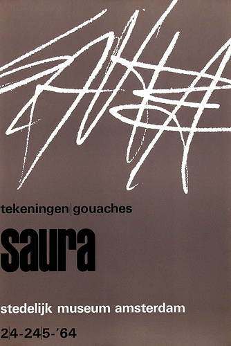
One poster stuck to my mind while visiting Crouwel’s exhibition in Stedelijk Museum. It caught my attention because it seemed a bit different from others- from really systematic and clear ones although, the letters still remained in the grid. The thick black graphical line covered white sheet of paper and red type announced the Bissiere’s exhibition in Stedelijk.
I was trying to figure out what that black dynamic line wants to say to me. It is obvious that it is something about Roger Bissier’s work. Bissiere was a french tachisme representative in whose paintings black outlines are quite a common thing. Therefore, I was wondering if the graphical part is an extract from the painting or engraving or it is Crowels personal interpretation about painter or maybe even something else. So, I kept thinking about Crowels way of dealing with the ideas, but still the main questions remain in my head: how Crouwel constructs the concepts-messages and how his work communicates with us?
I found it difficult to understand how the image represented the Bissiere’s exhibition as I relied on my small research about the painter. It seems that Crouwel was struggling with this poster. Maybe Bissieres work didn’t really appeal to the designer and he couldn’t deal with it in his usual way so, in the end the poster became different in the context of all Crouwels work. In the end I found out that he used a fragment from Bissiere’s autograph on the poster. Which just made my doubts about struggling grow stronger.
There is a great contrast between the work of Wim Crouwel and his own notes, as seen in the logbook of Total Design.
His handwriting looks chaotic, at least to an outsider, while in his work he strives for clear and honest communication, in a clean tight way.
At the start of perfect order, there is chaos, or more exactly: apparent chaos. True chaos is a myth, when you look more closely, you can see patterns, rhythm, structures and ideas, waiting to be discovered.
Creativity seeks order in seemingly randomness, extracts it and places it in a new context, space or system.
In a way the attempt of Wim Crouwel, to make communication universal understandable, is an attempt to make the world less exciting.
Creative opportunities disappear, being inventive is more difficult and there is nothing left to the imagination.
There is an understandable need for order.
Chaos can be poignant, one might be ashamed by his or her own disorderliness, but flawless order is a dull and static state.
Without chaos no creativity.
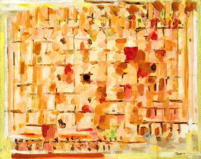
My mom turned off the light.It was the first night in my new yellow bed, my big, big yellow bed.I never expected that my parents would give me such a big present for my birthday.
I was trying to close my eyes but I could hear the metal mesh base of the bed.
And my mattress was too small so I could see the metal springs, in the springs was a big sign in black: AUPING.
I new this sign, it was from the Auping bed store not so far away from my house.After a while I got used to the sound and I fall asleep in my new bed.
I always thought that the sign illustrated a bed, and the big horizontal line was a mattress and the words underneath where the metal springs.
I’d never realised that the graphic designer Wim Crou
wel made this sign until I went to visit the Stedelijk Museum in Amsterdam.And there I also realised that this Auping factory was very close to my house where i used to live.
So I decided to go there again, and yes there it was the big sign in blue (not black) AUPING
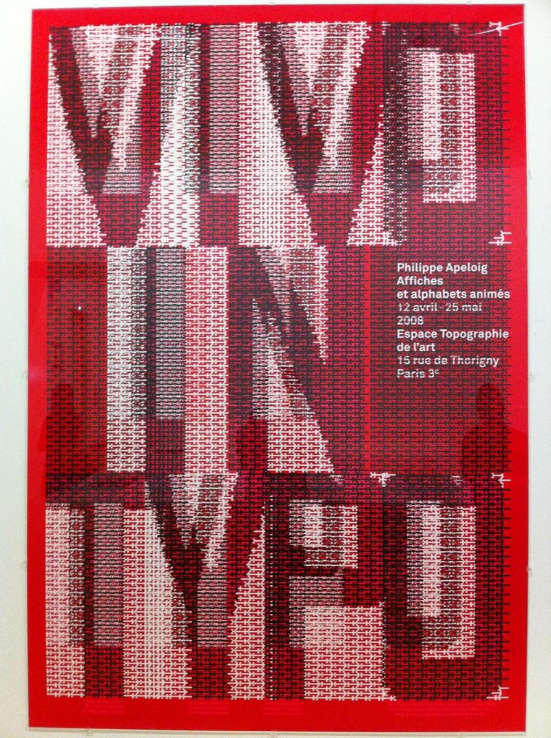
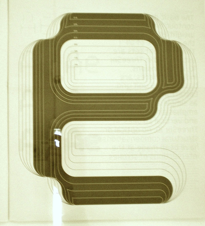
When I saw this poster from far, I thought it looked like a well-made textile (like a table cover) or graphic poster, made through usage of computer programming. Therefore, Its not a hand made textile.
Then Seeing it in detail, I found that there is small text in the big text, I can see the shade of letters. Black, red and white colors are being used. It also seems that a lot of layers have been used, even in small parts. Like a pastry.
It also looks like an exotic letter. These layers have each a repetitive form, different for each part. It seems like a letter or piece of textile, such a in mixed layer. Its an intentional item, but really unaffected. I think Its like an artwork, not a design poster.
artwork by Hyo Seop Kim
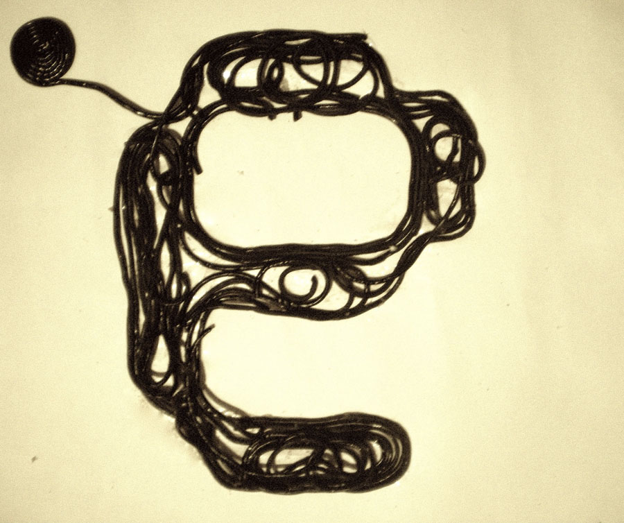
I thought about gravity during the drawing.
A book’s weight is about 500g. But books include different photos, with according happening take each date. I think it’s a huge mass, if it is in the size of the book. So I completed the painting, through finding of picture in the book that inspired to me. Perhaps, This poster is similar in the way how it is using layers to create its form, I Think its interesting.
Simplicity, clarity, structure – to me, these words represent the core of Wim Crouwel’ style. In his works I find the intention of combining human emotionality with the precision of the machines. It is a systematic approach, a development towards digital forms
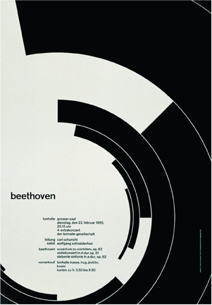
One of the design pieces in the exposition that I liked the most was the concert poster for the Zurich Tonhallen. It is made in a definitive and geometric, yet abstract style. It looks like Crouwel incorporated a mathematical method in organizing the spirals into a graphic work. It is the visual equivalent of music.
The poster portrays music through series of concentric curves. These incomplete closures focus our attention to the information on the poster, with no unnecessary ornamentation to distract us. There’s a certain strength in the simplicity and elegance of the forms, that makes it easy for the eye and brain to process the image in a single glance. Wim Crouwel also escapes the well-known combination of black-and-white by using beige instead. And he is bold, just like the music of the composer, but without the trick of eye-catching colors. Simply with the movement and structure of the lines.
What makes this poster memorable for me is the fact, that the first thing I thought when I looked at it was…..”This reminds me of sound-waves.” Only to find out afterwards it was really a poster for a concert.
The poster is red and have an eye in the middle, with two staggered lines curving over it, forming a bended piece of something flat.
The sclera is black/greyish (fear/the unknown) and the iris is red (danger/aggression), the lines going over the eye is foming a sort of path.
Some of the ’’path’’ is grey and some is white, the lines fade in and out as it goes over the eye.
I liked the image/poster because of the story its telling.
The expression in the eye and the lines going over it is giving the feeling of the things it has experienced in its life time, the colours in the two lines i would think to be the events its seen, going from white – innocent/purity to grey – sadness/fear.
The Expression of the eye somehow gives the feeling that its not good things it has seen/is seeing , the red colour emphasize that it could be something dangerous, yet its aware of the of the danger, its not scared of whats happening, as though it would have experienced it before.
Maybe its the one making it dangerous, doing hurtful things.
In the physical world absolutely all surfaces are transparent or opaque. For example a concrete wall — it is a completely opaque element. But with the help of different computer programs we can make even a concrete wall transparent and may apply transparent effect to a video.
I adore the “clean” design, where is only information and no superfluous elements. So, the chosen work does not fit my taste, but that kind of design always attracts my attention.
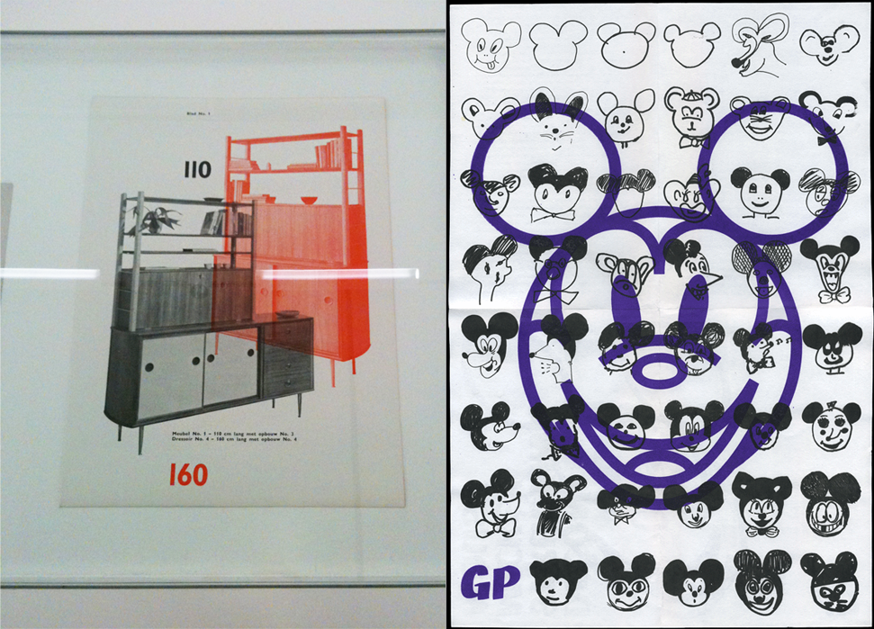
Another very good way to use a blend of transparent layers, when you need to show two (or more) elements at once and you haven’t much space on one page. Wim Crouwel did it as a professional, he gives us the opportunity to consider both of the cabinets and at the same time takes care of the volume of the catalog, which is also important.
For example, I chose another more cheerful work — it’s Dries Wiewauters‘s poster “Deconstructing Mickey Mouse”, again space is saved, and thus nothing is lost, but also something won.
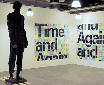
This is a work created by experimental jetset. I chose to write about this work because I find it very genious to make something like this. It really is a new way to make a print on an A0 size. It fits in the corporate identity they made for the Stedelijk Museum. They had to make this corporate identity in just a few months within an extremely tight budget. They had to be ingineous with the prints, beceause they didn’t have enough money to print lots of posters on A0. At the same time, this way to show large print works, is so easy you could do it yourself at home. They also used thin coloured paper to print some of the folders on, and found a way to fold the letters they send so you don’t need an enveloppe anymore. It all worked out very nice, and fitted in the budget. This A4 solution is cheaper, easier and economic, friendlier because it doesn’t need huge printers and big rolls of paper to achieve the same result.
The Design Museum London celebrated the prolific career of the Dutch graphic designer Wim Crouwel in this, his first UK retrospective, “Crouwel a Graphic Odyssey”. Regarded as one of the leading designers of the twentieth century, Crouwel embraced a new modernity to produce typographic designs that captured the essence of the emerging computer and space age of the early 1960s.
This 1:27:00 long interview and presentation of Wim Crouwel (graphic Designer) and Mel Crouwel (architect) was moderated by Rick Poynor (design journalist/writer) to celebrate that occasion spring 2011. Subsequently the exhibit was held in the Stedelijk Museum in Amsterdam which could be considered a home coming for the eminence grise of Dutch graphic design aswell as the Museum itself.
interview registration by Alice Masters. Exhibition catalog design by Spin.
more? check out this very personal and summarizing presentation of Crouwel putting the exhibition in context. By Crane.tv at the Design Museum, 29 March 2011.
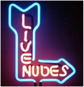
What I liked most about the collection of works belonging to Wim Crouwel was a set of posters, specifically one with neon pink stood out above the rest for me. I don’t know if it’s my endless fascination with neon strip-club signs or just the fact that it was so pink that my eyes were caught like a deer in the headlight of his age old enemy; a half-drunk trucker with nothing to loose.
The poster was so intense I didn’t even like it at first. My initial reaction was to cover my eyes, flinch, drop to the ground in fear of radiation poisoning.
The brightness and pinkness of it all was just too much.
But as one who stares at the sun and grows accustomed to the burn, so did I.
A brief description; rectangular, neon and a tear right across the half with what appears to be an E in between the pink and some other background color that I couldn’t really see because I was still a little blinded.
It could be that the poster attracted my attention because of this E, however this is not the time to go into my introduction on the meaning of letters and words.
That I will save for another time.
After my eyes could rest on this poster I wondered, since Mr. Crouwel worked so much with squares if he was one himself.
I remain neutral.
I believe (or at least hope) Wim and I share the fascination of late-night stops for scotch whiskey at the 24 store around the corner or of gentleman’s clubs, where one can ease into a more sophomoric bliss without the fear of a lawsuit.
Thank you Wim, for making me feel less alone in this world of men who wear business suits and women on heels while I walk around with holes in my shoes and dirty clothing.
But enough about me, let’s talk about Mr. Crouwel.
It appears he was really on to something (maybe on something too, but I leave that open for discussion), having invented the pixel and all, I’d say he was a real genius. An entrepreneur, as the Irish say.
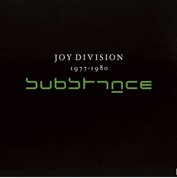
one of the most enjoyable jobs for a graphic designer into music is certanly the making of record sleeves. capture and synthetize the music and concept of the record in just one final visual/phisical product. after the record sleeve is set, both music and image are intertwined , giving one to the other a new shape , or, in the best case, exalting one another meanings and get to a new more complete concept-idea … usually is a personal overview /interpretation of the designer , but as well a clear and graphical unharmful attempt to translate/tale/interpretate the music work into “image”.
Never like in this case i found myself stunned-staring at the semplicity of the cover of Joy Division’s first official compilation album (released after 8 years from Ian Curtis’ death) while wondering about at this massive retrospective of one of the masters of dutch graphic design Wim Crouwel . The cover features the band name written in his original white font above the album title elsewritten using the New Alphabet typeface ( created by Crouwel in 1967 ) in neon green over a dead black background covering the rest of the sleeve… this indeed sounds pretty much like the music of joy division itself : dark, personal, experimental, progressive, jagged and sometimes difficult to “read” …
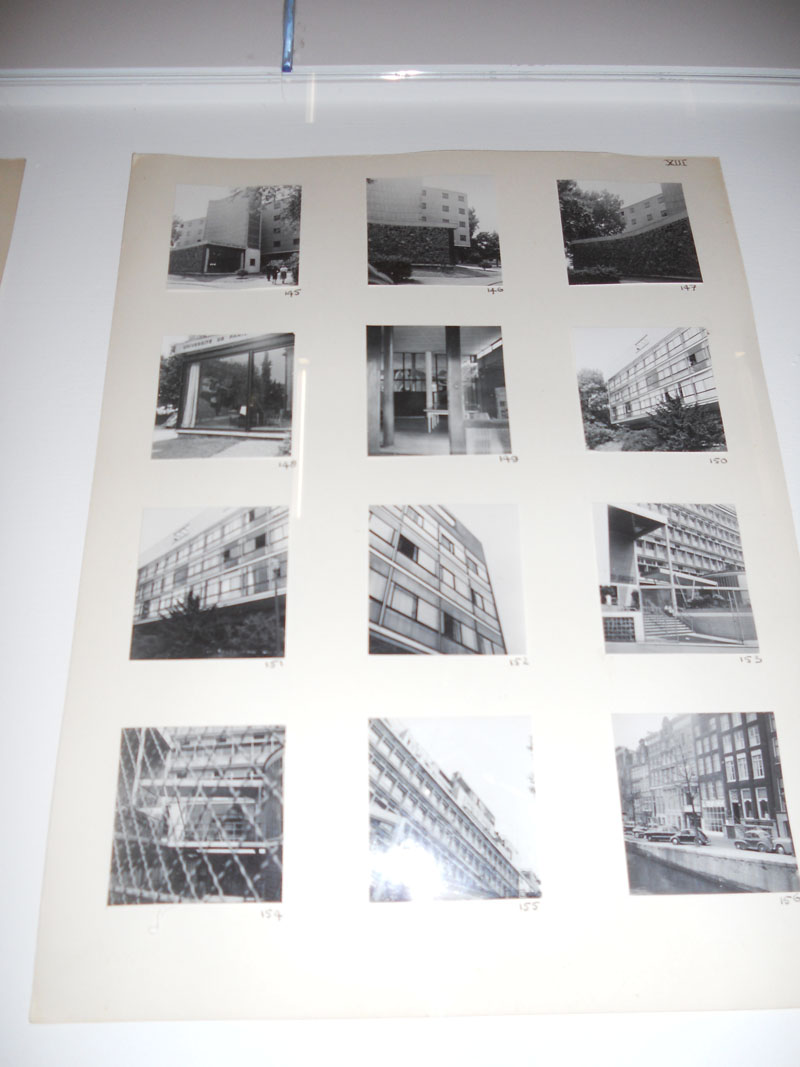
Sadly many people are under the impression that scrapbooks are only a twelve year old girls way of documenting her summer trip, using stickers and sparkling pens. This is a misunderstanding. Scrapbooks are a clever method of keeping track of memories, photographs and a certain way of thinking. By observing how a scrapbook is set up, what paper is used, what typography, and what kind of organizing system it is easy to see how a scrapbook obviously reflects upon ones personality. Wim Crouwel’s photography scrapbook was the first thing that caught my eye at the Stedelijk Museum, and after going through the entire exhibition my initial thoughts of the connection between a scrapbook and a personality were proven correct.
Crouwel’s clear passion for organization in his work can be seen by the way each page has a theme in the photographs. Whether it is a small photographic series of windows, store shelves, store boxes or still-lives all the photos belong together on the scrapbook page. Each and every photograph is the exact same size glued on the paper, 3 in a horizontal way and 4 in a vertical way. Nothing is written in Crouwel’s scrapbook, with the exception of a number he gave to every photo. The way the scrapbook was set up in the museum definitely played a part in why it appealed to me. Nine pages in a row, covered by glass, truly gave an idea of the repetition, seeing how each page looked the same, until you really started looking at the photographs.
The stamps Wim Crouwel designed for the Dutch postal service PTT were used for 25 years. The first thing that came to my mind after hearing this was the amount of tongues that must have licked these stamps. 25 years is a long time. Millions of letters were decorated by this sophisticated square. Figuratively speaking, it was the key to another persons mailbox.
When we look at the stamps we see a clear design, a distinct communication speaks from it. Stripped of any adornment it is a severe design to me. Extremely functional. Exactly what Crouwel was aiming for. Everything that cited emotion was left out. Functionality above all. It seems very contradictory to me that a design so rational was used for such an emotional communication process. I find this contrast very interesting. On the one hand there is Crouwel, driven by a concise aesthetic, succeeding in his job. On the other hand there are the sober Dutch people, whose eyes have looked at these stamps more than a billion times, yet most of them have not seen the aesthetic essence of it.
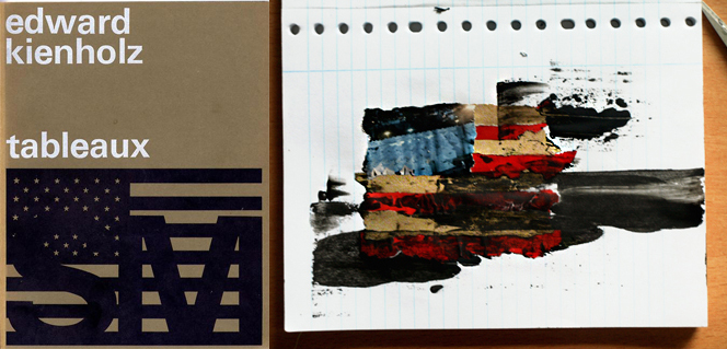
Remembering names is impossible for me – it has always been and probably always will be. That is why I was so thrilled about the poster-design for an exhibition about Edward Kienholz.
poster design by Wim Crouwel / art work by Florian Maurersberger
When I was walking through the rooms of the Stedelijk-Museum I was overwhelmed and not in a positive way. In There was such a similarity for me in everything that my eyes were jumping from one design to the next and they couldn’t rest because it was so simple that there was nothing I could get a grip on. That was the moment when I got my first doubts about the concept of Crouwel’s design. I wasn’t really sure if his minimized way of design is enough to translate to people what the text or exhibition is about.
But then I stood in front of the poster for Edward Kienholz. The name didn’t ring a bell in my head. Maybe there was a light glimmer that I heard this name before. But through the way Crouwel designed the poster I realized that I knew the artist. I went to an exhibition about his work in a Gallery in Berlin in 2009. A lot of his works are dealing about different social issues during the time that he was living in(1927-1991) but he also worked with problems that are still current for example the superficiality of the metropolitan society. What impressed me the most about him was how he emphasized his critical point of view just by showing different situations from your every-day-life and without pointing out the problem too obvious.
After seeing this poster from Wim Crouwel I had to admit that sometimes it just needs a dark colored scale and a very clear positioned American flag to give an impression what the artist is about.
So I had to let go of some of my doubts about his way of design.
There is something very appealing to a grid. It is a neutral base of regular units, and it invites you to create something within it. It’s a frame. it’s limited. But limitations can create freedom.
Graphic designer Wim Crouwel embraced the limitations of the cathode ray tube technology [x] when creating the type face “New Alphabet” in 1967. The type face only consisted of horizontal and vertical lines and drew, at it’s time, a lot of attention because of its modernity and radical difference from other type faces.
Seeing Crouwel’s sketches for New Alphabet, drawn on thin-gridded paper, evoked my autistic desire to get really really close to the paper and start filling in those tiny squares with a sharp edged pencil… There is a very comforting feeling in working within the linear walls. There is filled or empty, right and wrong.
In addition to the field of graphic design, grid-based systems are being used in numerous areas, in order to organize and visualize things. Looking closely to my laptop screen, I can see the grid, in which #000000 colored pixels form these letters…
My fixed information resource Google, tells me cartography is a significant area within the grid-world. I fall into tacky new age web sites and read with curious eyes, and a half open mind about alternative planetary grid systems, made throughout history. Critical of the conventional longitudinal/latitudinal geography. One of them is The Becker-Hagens Icosahdron Projection [x] (The name in it self is impressive). It’s a mapping of all the megalithic sites around the world. The results showed to form a pattern of an icosahedron [x]. I also came across an implied connection between UFO phenomenon and magnetic-vortex-gravity anomalies in the Grid(!) Even though this information is highly questionable, it is always good to put the existing order into question.
So, where is actually the Stedelijk Museum ? I don’t know Amsterdam very well. I live here for three weeks now and I’ve never been in this museum before. Also I had never heard of Wim Crouwel. When I was there in the museum, I was looking for something that I could recognize. Something that gives me a feeling of tranquillity. Something that makes me happy, inspires me. But It was more difficult than I had expected.
All of the works, all posters were so straight. Everything seemed so finished, so correct, so perfect. All straight lines and letters were at the right place. It scared me a little. I couldn’t look at it for a long time.
Right in the middle of all these posters on the wall, there was one that was different than the others. It gave me rest. The wild brushstrokes in between all these straight graphic lines. The straight lines which all fit in the same grid. But the wild lines gave me a feeling of recognition.
I stared at it for a long time. It was the signature of an artist [x]. I began to think. All posters at the exhibition were made by the same designer who used the same graphic grid. This posters must be made in the same grid too. But does the signature also fit in that model? Or was this an exception to the rule?
It’s a good thing for art or designwork to raise questions.

