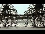
‘Strandbeest‘ by Theo Jansen
Large sculptures made out of plastic PVC tubes, able to move on their own. An animal like mechanisms that does not need food, but just the power of wind.
Theo Jansen, a genius that fusions art and engineering, is busy since 1990 with his project called Strandbeests (Beach animals): a new life form on earth, yet unknown for humankind.
A life form looking at another form of life : What it means to be alive.
I always wonder why is it so exciting for me to watch the Strandbeests moving? Perhaps because I can not define at what I am looking at, is it real?
How to define it?
When I look up the word alive in the dictionary, I came across the meaning existing.
But wait, everything has an existence in space and time, so how can you recognize a life form? People may think, the fact that something is not animating is a reason of a non-life form, somehow no definition feels right to me. There is much more to living than having a heartbeat. There is much more to life than breathing and the blood flowing through your veins. You might be living, but are you alive?
What if matter has a life on its own, able to learn, teach and to stretch its ‘lifespan’ beyond humankind? An alien matter that absorbs intelligence and reaches capacities that go far beyond our own.

Inspired, I went to Delft at Theo J. exhibition with the hope I could come across his path and there we go: I was able to talk to him. Unfortunately our meeting was so spontaneous, that I just got a few minutes. Nevertheless it felt like a miracle, he ended our conversation with the sentence man should get rid of its ego, then he will be able to see the real qualities in life.
I got fascinated by his way of being, how modest and grounded he was when we met. He is not an artist but rather a happy victim of his work which is pure functional. The tubes are the ones making the process beautiful.
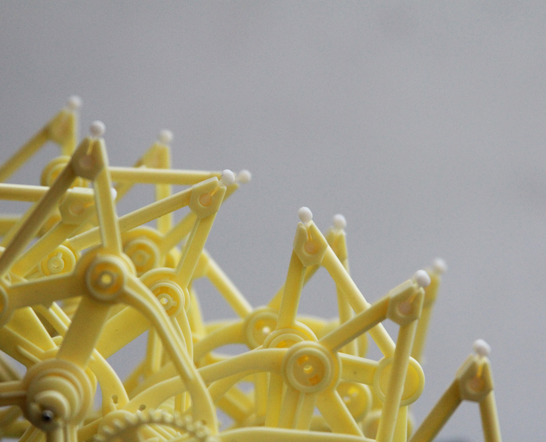
As miraculous life is, I decided to adopt a Strandbeest myself, the Animarus Ordis Parvus. First It needed to be born so I assembled 117 plastic pieces together. About an hour, the evolution was finished and I had my own beast at home.
During the process something weird happened to me, something I can not explain. It was like a virus in my head : the beast’s rubber feet.
I got inspired to work with Silicone. Why Silicone and not something else? Something that remains a mystery. What happened to me, at this moment? Perhaps it started to communicate with humans, perhaps it chose me.
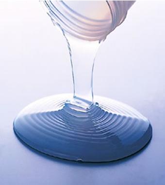
Silicone is a synthetic polymer made up of silicon, oxygen and other elements.It is generally liquid or flexible and the rubber like plastic has useful proprieties. From medicine to personal care items.
Sometimes there is a confusion between Silicon and Silicone. Silicon is a naturally occurring chemical, a key element in bricks, cement or glass. It is the second most abundant element in our earth crust, after oxygen. Whereas Silicone is a chemical substance that derives from Silicon.
Silicone often stands as a tool for the use of something else. Maybe it is living, maybe I should threat it as a oneself.
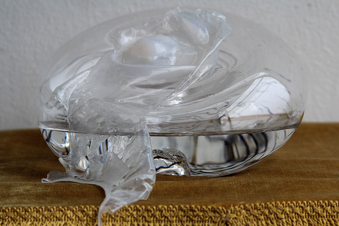
Exploring the matter
I started experimenting and researching on the structure, and I tried to find out some processing and proprieties of the material. I adapt myself to the matter, a constantly evolving process between human and material.
There are different kinds of Silicone and they all have different proprieties from each other. From sticky to stinky.
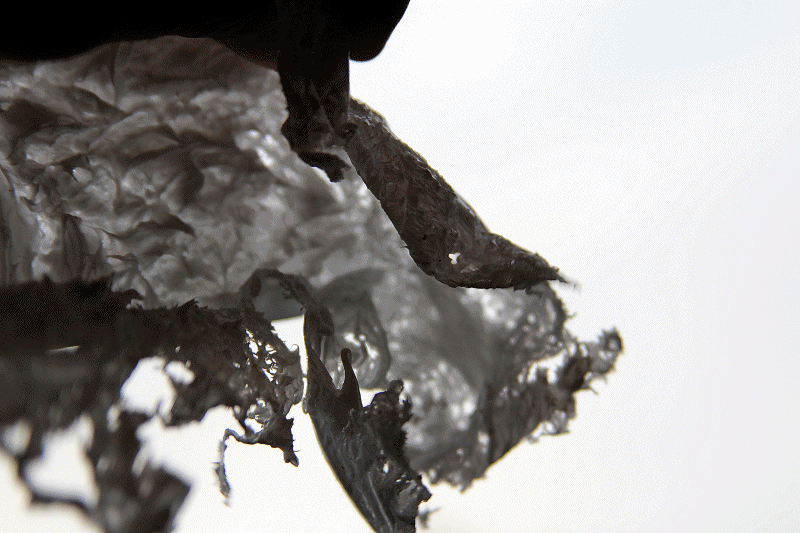
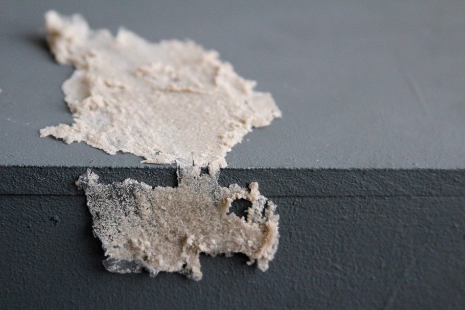
The Silicone from the hardware shop has never a clear structure, it is really hard to manipulate while it’s liquid. Impossible to work without mask, it almost intoxicates you.

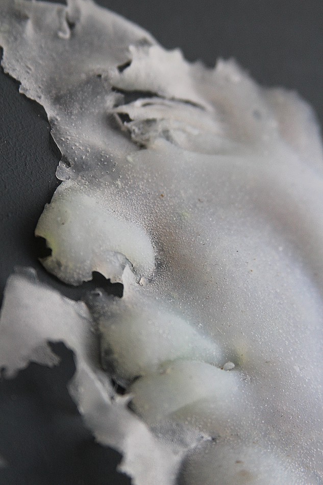
The splintered structure could almost be found in nature.
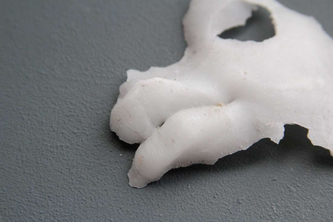
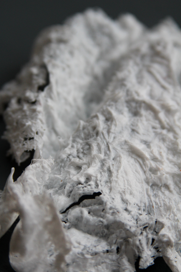
Birth of Silicone
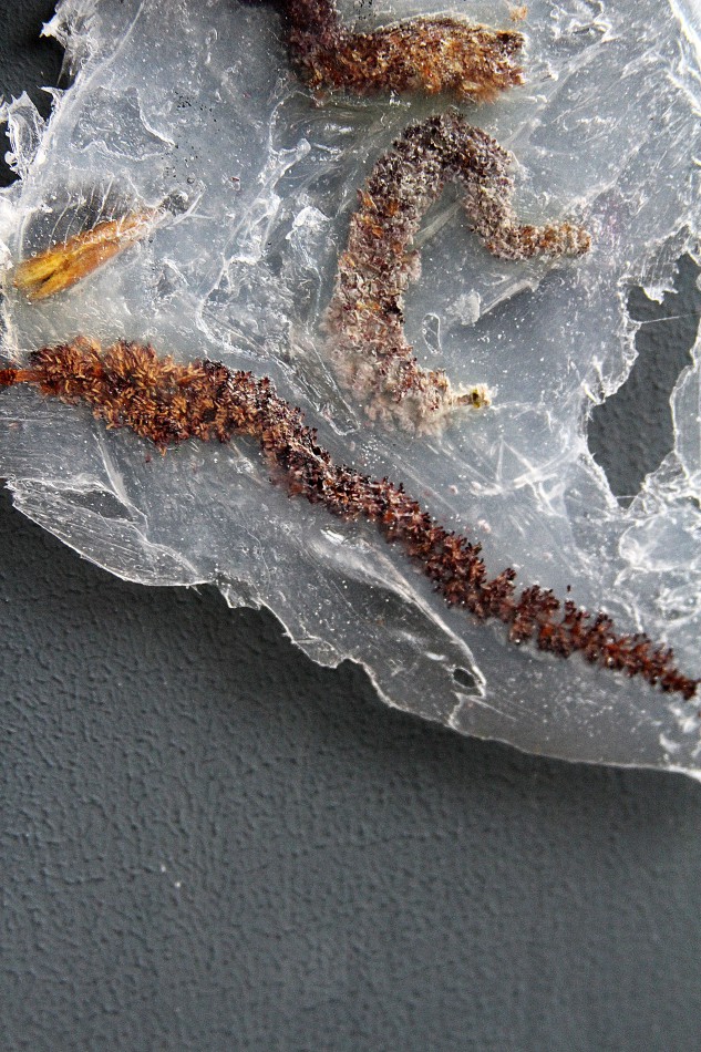
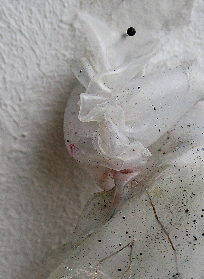
Silicone organ
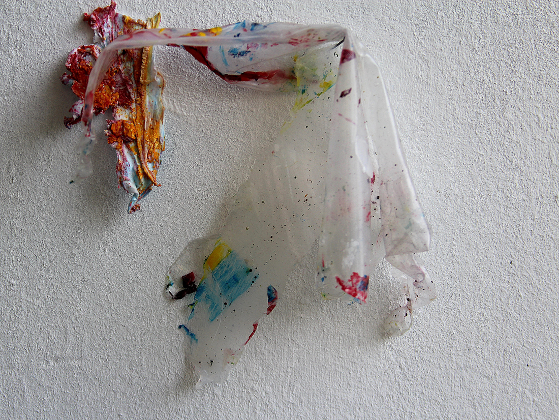
colour absorption
I experiment with different kinds of tools such as a pencil, a marker, watercolours , acrylic, ink.


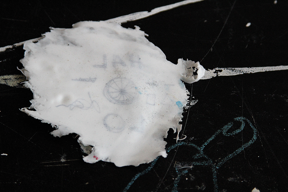
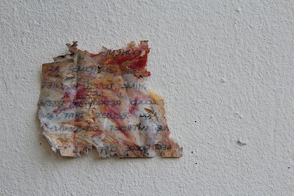
One ting that was completely new for me is that, Silicone can print.
This technique just works with Silicone from the hardware shop, because it is so sticky.
It absorbs the ink while drying and the text or image will appear reflected.
At the end, it is hard to discover something mind blowing in such a small period of time. Theo Jansen is still researching on the same material since 1990 and he thinks that there is a long path to be done.
In a constant flow of doing and learning, there were plenty of disappointments on the way. But on the few occasions that things worked out, being connected to matter is such an enriching experience.


