At the Bauhaus exhibition
I found two very intriguing works. I don’t know why I was attracted to them, but I had to force myself to look at them carefully. Since there was something exciting to see in those work, I am going to explain it a little bit here.
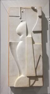
First one is [relief h] (1919) from Oskar Schlemmer.
The relief h is Oskar Schlemmer’s ideal form for developing human figure which he recognized as an all-encompassing reference system. He used to work on paintings before, but he expanded this work to 3D by using the relief. Although this example is made from plaster, he also worked with other material like bronze.
Each part has a different way of creating shape, and the way light and shadow appear is very beautiful. Roundness in relief, or that only the face has a different texture than the rest, every parts has its own feature , and still it harmonizes well as a whole.
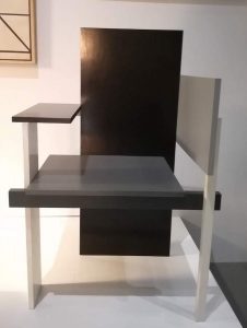
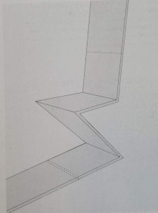
The other one is [the Berlin chair] (1923) made by Gerrit Rietveld.
This was his new furniture design with its asymmetry and flat panel construction,. It was specially designed for the exhibition he and Huzar had in Berlin in 1923, hence the name ‘Berlin chair’.
Simple yet daring, it makes me feel good to look at. It also tickles my fantasy and it is like a feeling of playing with the blocks somehow. Surprisingly the impression of the chair changes completely depending on the angle. I liked looking at it, from the front and to the right of it, toward the front.
Now I will take a look at their background.
Oskar Schlemmer (1888-1943)
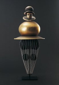
Oskar Schlemmer was a German stage-set designer, choreographer, and teacher. He was pursuing the relationship between figure and space. Actually he himself joined the [triadic ballet] (1922) as a dancer and deepened his understanding for interaction between figure and space. Specifically about this [relief h], it’s a development from his paintings on the relief. He reduced some factors such as colors and shapes, and used white plaster, resulted in 3 dimensional effect on 2D surface. His exploration had focus in simplicity, abstractness, and space. As he was working on this abstract shapes of the relief combined with the wall surface, he made a big step by haptically thematizing the link with architecture.
Gerrit Rietveld (1888-1964)
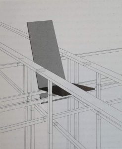
Gerrit Rietveld was a Dutch furniture designer and architect. He felt more freedom in the exploration of ideas when designing furniture. In some of his chair designs, he tried to deduct conventional chair factors and find the way to express the aesthetic with only simple structure and linear lines. In the apt language of Rietveld, “a chair should not be more complicated than a safety-pin.” Then dealing with the chair and space.
As you can see from the picture below, the forms are considered to be continued to the surrounding space. “Instead of a solitary finished angle that ends and close everything, smoothing away the construction by some degree of ornament, Rietveld has the lines and planes pass each other at nodal points.”
Also with playing the role of color, both room and furniture has dissolved into form and color, and their hierarchical relation has been eliminated.
From these two works, what I find interesting is that the object doesn’t complete within itself but unite with surroundings. It is connected. It completes with the space. Their approach to space, or their stance for challenge, I feel, is related to what I am looking for as a Rietveld Academie student.
As a premise, I want to explain what it indicates when I use the word “space” from now on. “Space” for me is not only the physicality of space, but it includes people inside, culture, common sense, habits and all to be space. In other words, environment. I feel these all things are as one space, and it influences on my mindset a lot. As a Rietveld student, I believe that the environment is suitable for exploration of space like these two designers. I couldn’t go further beyond my limitation due to my personality and environment. I wanted to go beyond those border, but didn’t know how, which means I was making the same movements within the space.
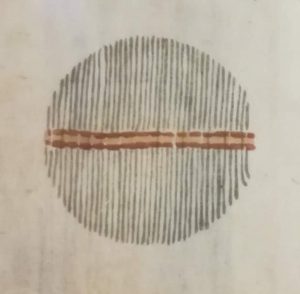
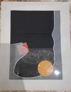
Let me put this into an image.
[left] image from the Japan folk crafts museum - [right] image of work from a foundation year student in Bauhaus
For the left one, the lines are organic texture and arranged in a way that the entire thing can be harmonized. It is hard to go out to the white empty space. On the other hand (in the one on the right), this line is drawn clearly and composed unsymmetrical. In addition, the end of line cannot be seen here and it continues outside the frame. It’s like intercepting the space boldly.
Suppose what is reflected on art works is how I see, think and understand things, then I see the possibility to explore my new way of living by breaking my convention through making art. The word “environment” is not enough to describe this concept. This physical part, tangible part of space seems to embody intangible parts. If it is connected, by pursuing things beyond my border in physical space, I can also explore the intangible part of feelings and reaction to society. Studying their attempts to interpret space will be the main motivation for my purpose in staying at the Rietveld Academie to search for my way of living.
