Skip to Content Skip to Search Go to Top Navigation Go to Side Menu


"forms" Tag


Don’t judge a book by its cover


Wednesday, October 29, 2014

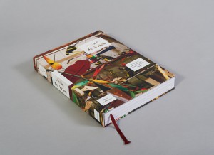
Esther de Vries is a graphic designer specialized in book design. Among many projects, she made two books on her father, the sculptor Auke de Vries. The two books, dealing with the same artist, are yet very different, the first one, Auke de Vries Photo Archives, being much more intimate than the second one, Auke de Vries: Sculptures, drawing and work in public space, which is more meant as an chronological overview on the evolution of the artistic career  of Auke de Vries. But what is surprising is that both books are very different from the first impression the reader can get just by watching the cover.


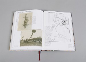
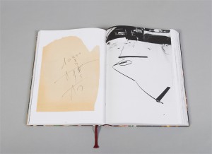
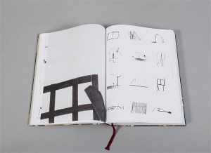
Indeed, at first sight and because of its very strong cover and size, the biggest book seems to be one of those very classical and sometimes deadly boring art books that present an exhaustive view of the work of an artist. But going into the design and the content of the volume you can experience it as an actual novel object. A lot of different materials are used in the book, making it exciting to go through, and a great importance is accorded to the process, thus gathering a collection of sketches, photographs and forms that helped or influenced the artist with his sculptures, and even pictures of the artist working in his studio. On all those pictures the text is set in an unquestionable playful way, sometimes even covering the images.


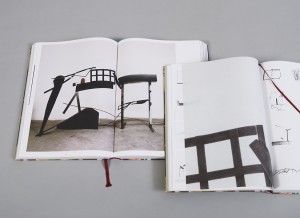
An other particularity that makes the book playful and thrilling is the use of very thin pages presenting a compilation of different forms, cut from a photograph of a work of the artist and magnified. Those pages refers to the collection of forms that the artist developed and used constantly in his work. Esther was keen to scatter that through the pages as, what she calls, an alphabet.


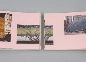
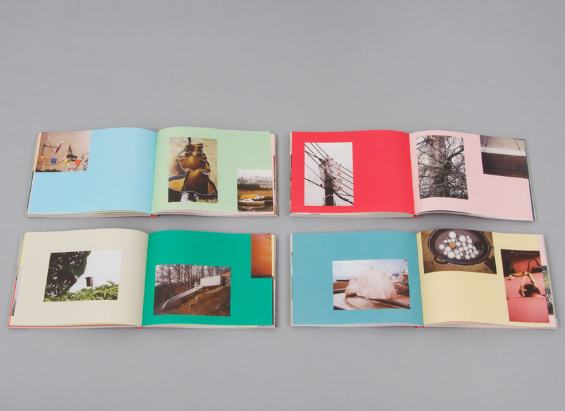
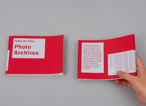
As for Photo Archives, the fabric and very simple cover makes it look at first glance as a secondary book, very small and discreet, soft, not meant to go through the years as the other one. But once more the design and content makes it very special, in a precious and sprightly way. While the other book is meant to present mainly the evolution of the artist’s works, this photography book shows through the collection of pictures the process that took place even before the artworks, as a wandering in the thoughts of the artist.


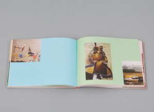
Here the relation to the reader is completely unusual, as there is no chronological order or reading direction. The reader, who is more a viewer since

there is no text, can open the book in the middle, at the end, or open the same page again and again, led to wander in the same way that the artist was wandering when he took those pictures.
 

archive_04


This is also a quite seducing book, designed between rule and coincidence with a set of colors and places for the pictures that are sometimes cut in two by the Japanese binding, leading the reader to focus on a particular shape that recalls Auke de Vries’ work. I noticed that the two books are very different from the first feeling you can get from them.


Yet, maybe Esther’s work, or at least these two books, deals a lot with feeling. That is to say the very strong feeling that the reader gets or is given in both cases of the close connection between the work of the artist and the design of the books. They pay homage to this work. It might has to do with the fact that both books where initiated by Esther herself, and not commisioned, hence the liberties in the design. This is also caused by the very long process that the designer went through while making those books, meticulously choosing each picture and composition, trying all the colors with each image again and again, changing direction until being fully satisfied, regardless of time.


All that makes both works very touching and the enthusiasm of the designer becomes very apparent, discovering a treasure made of all those pictures and willing to share it, making it as complete as possible to preserve the emotion aroused by the pictures themselves.

Rietveld library catalog no : Vrie 5 (

Rijksmuseum library catalog no : 832 E 13 (
A Completely New Shape


Thursday, September 26, 2013

Starting Point – Ted Noten “Chew your own Brooch”

Chew your own Brooch is a project by the Dutch designer Ted Noten, who is known for his jewellery and bag designs. It was started in the late 90‘s in the Boijmans van Beuningen Museum in Rotterdam, where visitors were asked to sculpt their own brooch with a piece of chewing gum which was afterwards cast in either gold or silver.

brooch

At first I could not see the connection between the golden shapes and the chewing gum above, still wrapped in its paper. The package was designed to resemble a regular chewing gum which seems to emphasise the close relationship between design and commerciality.

Having a concept for making own designs which is accessible to a wide range of people is a valuable thing. It enables somebody to adjust and shape a product instead of making use of a pre-designed model which may not be as suitable to an individual‘s needs but is more representing a general trend.

Even though mass-designs have their perks, people have always been striving for individuality – and they still struggle to find ways of expressing their ideas. Opportunities like Ted Noten‘s Chew your own Brooch are therefore a great enrichment to the world of design.

The beauty of this concept lies in the idea of creating completely new shapes by using everyday products. If the common purpose of an object is being put aside, new ways of applying its materiality and construction can be discovered.
To me looking at everyday objects without bias becomes more and more important since I realised that too many doors are being closed by focussing too much on what something already is instead of all the things it could be.

Taking this project as a starting point I want to investigate more on “new shapes”.


Experiment – Creating New Shapes

One way of creating a new shape is to exchange an objects material and see what it does to it‘s shape.


cup1 cup2 cup3 cup4

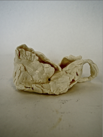
Ceramic to Chewinggum (aprox. 60 pieces) 

In this case what hapens is, that the reproduction does not want to stay in the original shape. The softness of the chewinggum allows the cup to collaps as time passes which leads to a unfunctional, and yet new shape.


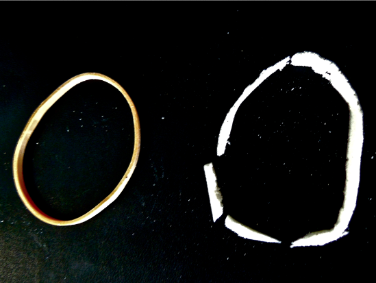
elastic

Elastic to Polyurethanium

Something very different happens if you replace a strechy material with a solid one: the reproduction breaks into sections, creating different pieces with individual shapes. It almost seems as if by changing the material, the object has been dissected and therefore can be looked at from new angles.


plastic

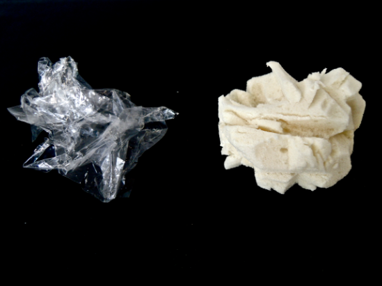
Plastic to Polyurethanium

The original shape is almost not visible in the reproduction which, with its massive and clumpy look, is quite the opposite of transparency and lightness.


Another way of making new shapes it to detach the process of creation from personal intentions or standardized movements that were learned before and to use the element of chance.

This has been done by many artists and also musicians (John Cage, “Number 14” and “Indeterminacy)

Simple elements could be the use of dice or outer influences like nature or spontaneous reactions of people.


What does a new Shape bring?

Art World

There are several examples from the Art World where the replacement of an object‘s material leads to a dysfunctional reproduction. In the case of Claes Oldenburg‘s Soft Toilet creating an „anti-sculpture“ or an „anti-object“ was the aim, functionality did not play a role. Also Ted Noten changed an everyday object like a bag into something which cannot be used in the classical sense but is being used as a transmitter of a message or opinion.


Nature

Shapes constantly change in nature, everything is shifting, adapting, evolving, it is all about survival and therefore must be functional.

In colder regions of the world, animals have a different surface-to-volume ratio than animals living in a warm climate, meaning that the size of their extremities and the compactness of their body depends on external influences. Compared to a regular Fox, a Fennec has extremely big ears which enlarge his body surface in order to lose more heat. Even though both animals derive from the same family, the shapes of their bodies changed due to different needs.


New Shapes as Solutions

In the end, whether it is making a statement, forwarding a message or personal view, adapting to new circumstances or improving a present situation, it is always about a problem that requires a solution which can be found in a different shape through evolution, reflection or experimenting.


Log in
subscribe