When I walked along the bookshelves, trying to find the most interesting book in the entire library (which is quite a task I have to say), the first thing I noticed that I was not able to read the title on the spine of one of the books I was passing. Usually I would just pass by the book, like people pass by signs written in a language they do not understand, besides, I am not interested in books which are not worth adding the title on the spine of the book. It is almost like the designer tries to tell you already that it is not worth it.
Though the title was on the spine of this book and it was in English.
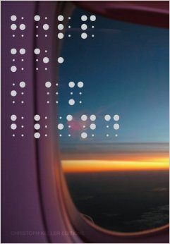
The reason why I could not read the title of the book is because the title is written in braille. Not in the way of feel-able braille but in big and small dots. The dots are printed in silver on purple, reflecting the light in the room which makes it even harder to ‘read’ or recognize the text.
So I decided half consciously, half unconsciously to take the book from the bookshelf to take a closer look at the cover. I reached out to the book and grabbed it from the shelf. Because I am right-handed the first thing of the book I see, when I pull it from between the other books, is the backside. (Provided that it was not placed upside-down or backwards on the bookshelf, which was not the case here.)
![Help me, I am blind - cover[3]](https://designblog.rietveldacademie.nl/wp-content/uploads/2013/12/Help-me-I-am-blind-cover3.jpg)
![]()
I now realize that it is a pity books are to be read from left to right. Since then the front of the book is on the left side of the cover. Because of this and the fact that the majority of the people is right-handed, you will always see the back of the book first when you get it off a bookshelf. Most books are designed with the thought that you will see the front of the book first and the back last. If you experience the book the other way around, you get answers before you even have questions, causing you not to be interested in looking any further.
So I grabbed the book from the bookshelf with my right hand. Unintentionally already reading the back of the book, which contained both the title, the writer and photographer of the book. So when I turned the book in my hands to the front it already was not a question anymore what this previously so intriguing text in dots on the front of the book meant. Though what I immediately noticed when turning the book in my hands was the nice manageability of it. It has the size of a small purse, a slightly bit smaller than A5 paper format, which makes it very hand-able.
I personally always appreciate this very much in a book. I do not like to read books which are so big you can barely hold them or so small you can not even hold the pages without covering at least a quarter of the page with your thumbs. In my opinion reading a book should be a pleasant and comfortable activity, independent of the content being pleasant or not. Unless, of course, it was the artists specific intention for the book to be not comfortable or pleasant in its physical appearance.
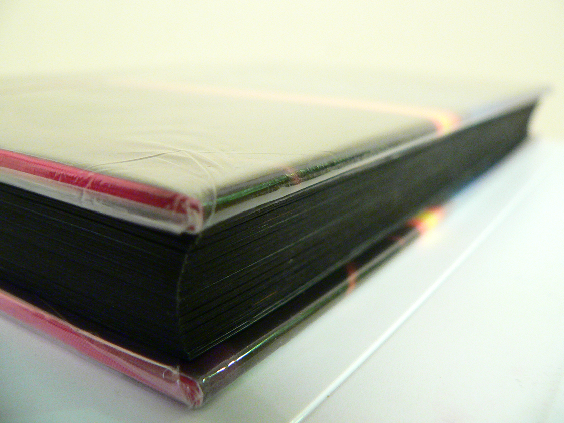
Another thing I noticed, when turning the book in my hands, was that the cover was filled with one big picture spread over both the front, spine and back, keeping the three connected as one. The picture slightly being out of focus suggests the view of a sunset with an object reminding me of a curtain partly covering the view. Also this raises questions, it being partly unclear about what you are seeing. You can quite clearly recognize the sunset though the object in front is raising questions as ‘what is this object?’ and ‘where are you when this object is in your view?’ The last thing I noticed before actually opening the book was that the sides of the papers were black, matching the dark design of the cover well. The black edges keeps the book together, prevent the book from splitting up in paper en cover.
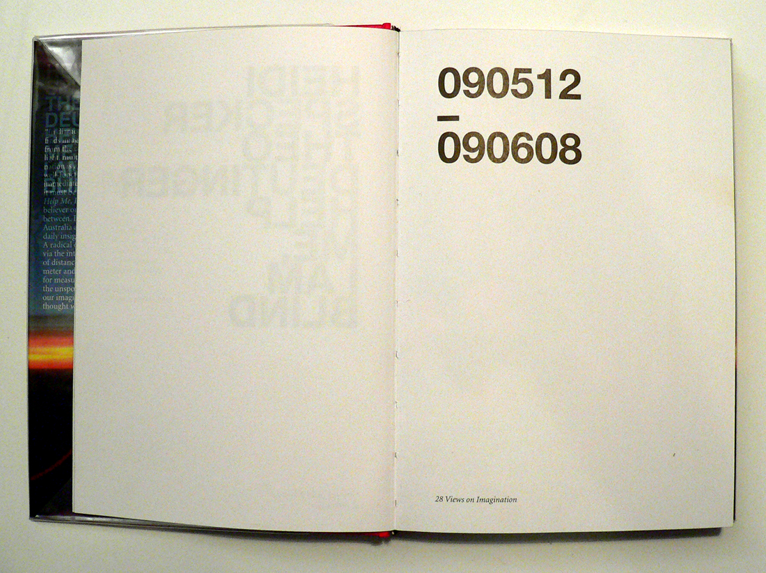
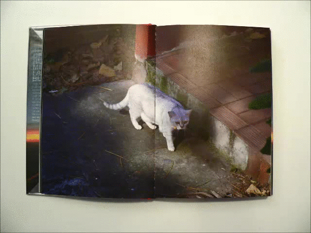
When I opened the book on the first page, I was confronted with two numbers divided by a short horizontal line. When taking a closer look I found out that those two numbers stand for the passing time in the book. The texts in the book start on 12/05/2009 and ends on 08/06/2009 covering 27 days of the southern hemispheres autumn and the northern hemispheres spring and summer. Every single day in that month is represented in the book. First by one or more pictures than by a text. These pictures (by Heidi Specker) from Australia are given another meaning through the texts (by Theo Deutinger) from Rotterdam.
The Book is build up in such a way that you are first confronted with one or more pictures, allowing you to find your own connection with and between those pictures. All these photos cover a spread, only allowing you to take in one photo at a time. While looking through these photos there is never one clear answer to the question what connects them. Is it a subject? An abstract keyword? Or just the day those pictures were taken?
The groups of pictures are followed by the texts, which always start with the date and the title on top of each other divided by a short horizontal line. All the texts start on the right page, leaving an empty white page on the left. This empty page is very pleasant when going through the book since it allows you a deep breath after those very informative photos. The content of the text seems to be based on the photos without any further knowledge gained from the photographer. They start right from what you see and develop into a more personal description from the writers perspective.
The book ends with the photo from the cover (which turns out to be an airplane window) and the text:
‘For a moment I totally forgot why I am on this Lufthansa flight heading to Frankfurt. Or isn’t it me who is flying? Suddenly I have the feeling that I have never been to Australia at all.’ – 090608, Evidence
In this way Christoph Keller both brings back and abandons the distance between Heidi Specker, the photographer, who was there to experience Australia through making photos and Theo Deutinger, the writer, who experienced Australia through the photos and his texts.
For more information on the designer Christopher Keller have a look at this: [link]
Rietveld library catalog no: spe 1