Skip to Content Skip to Search Go to Top Navigation Go to Side Menu


"role of designer" Tag


Wolfgang Tillmans : One’s Own Master


Monday, December 9, 2013

Wolfgang Tillmans, (born August 16th, 1968), is, perhaps, known today as one of the most renowned contemporary fine art photographers. He is known as the “documentarian of his generation”, and is much regarded among his peers and contemporaries.

If you have ever encountered Tillmans’ work, whether that might be a single photograph, a spread of his photographs published in a magazine, a book or an installation, the ‘taste’ and presence of the artist himself is inevitable.
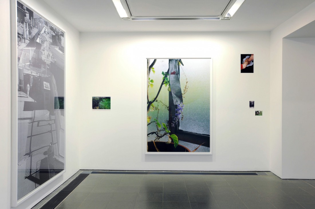
It is clear in the presentation of his work, that Tillmans ignores the traditional separation of art exhibited in a gallery from images and ideas conveyed through other forms of publication and presentation, and more importantly is giving equal weight to both.

wolfgang-tillmans-installation-view-serpentine-gallery-london-c

In an interview with Nathan Kernan, Tillmans is reported saying:

“I guess I could have an easier life if I didn’t care so much about all the different manifestations of an image, if I didn’t care about making the prints myself or in my studio, but somehow I see that as being part of my work, and the time spent dealing with a print is also time spent with the work. I understand my work better through this process.”

What stroke me at first as surprising and unusual, was that the artist is designing a book, or better to say is containing his own work, that at first might not have had the intention of being presented in that format. That is actually quite innate to Tillmans.
Through a more dedicated research and engagement with his work I have come to realize that it is quite natural for me to grasp that he, in fact, does design end edit his books himself.

1

1

Concretely, I have found myself acquainted with three of Tillman’s books: Burg, Truth Study Centre and Neue Welt. Burg being the first of the three was published in 1998, and Neue Welt the latest, published in 2012.
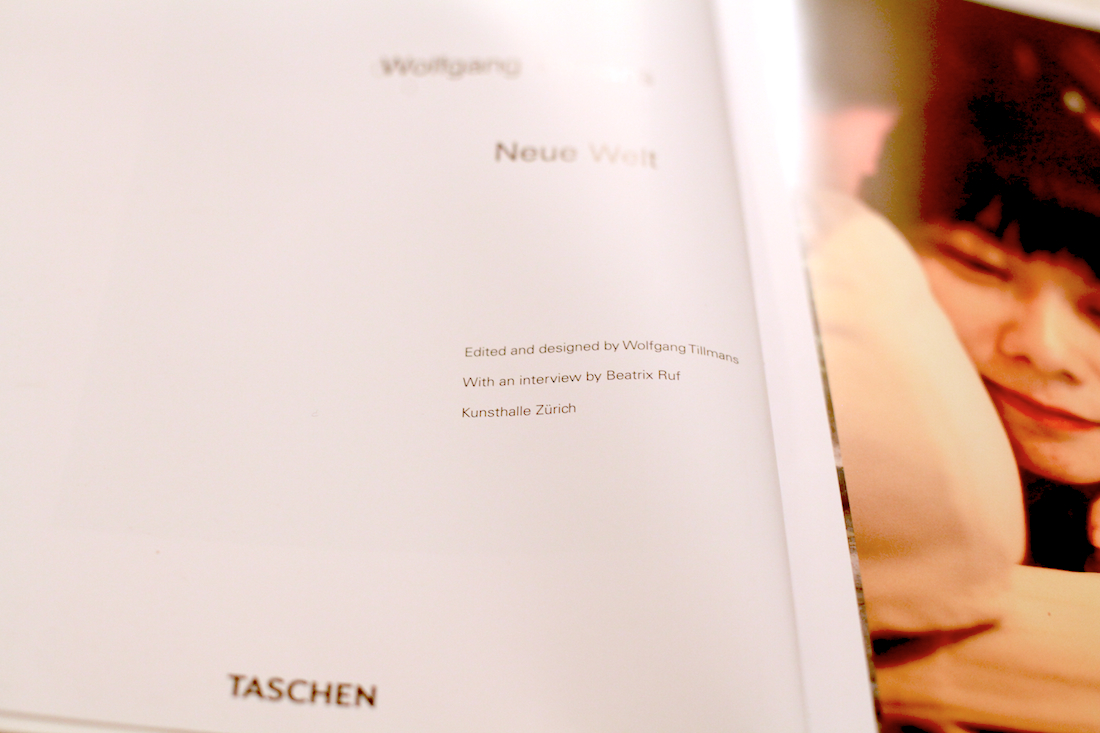
All of the three, were published by German publishing house TASCHEN.
Although one might think that having such a big house as TASCHEN publishing your work would almost completely strip you of your creative role in the design of a book, Tillmans stated in an interview [link to full interview], that on the contrary, he has full creative control over the design and content of his books.

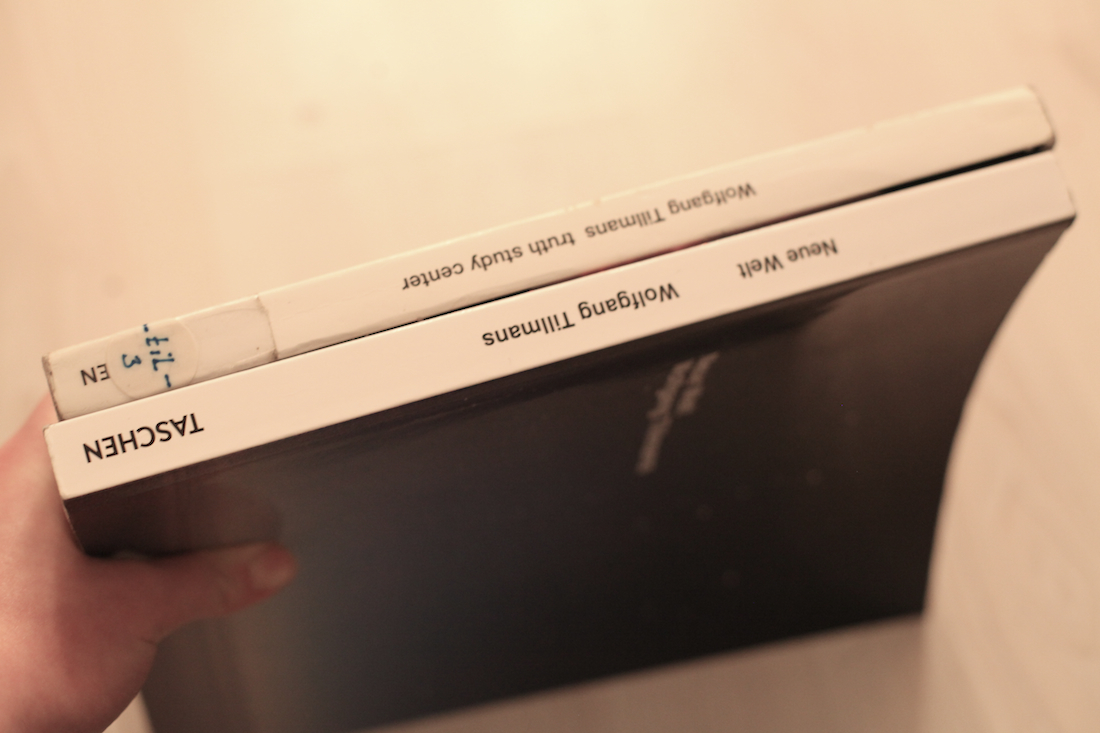
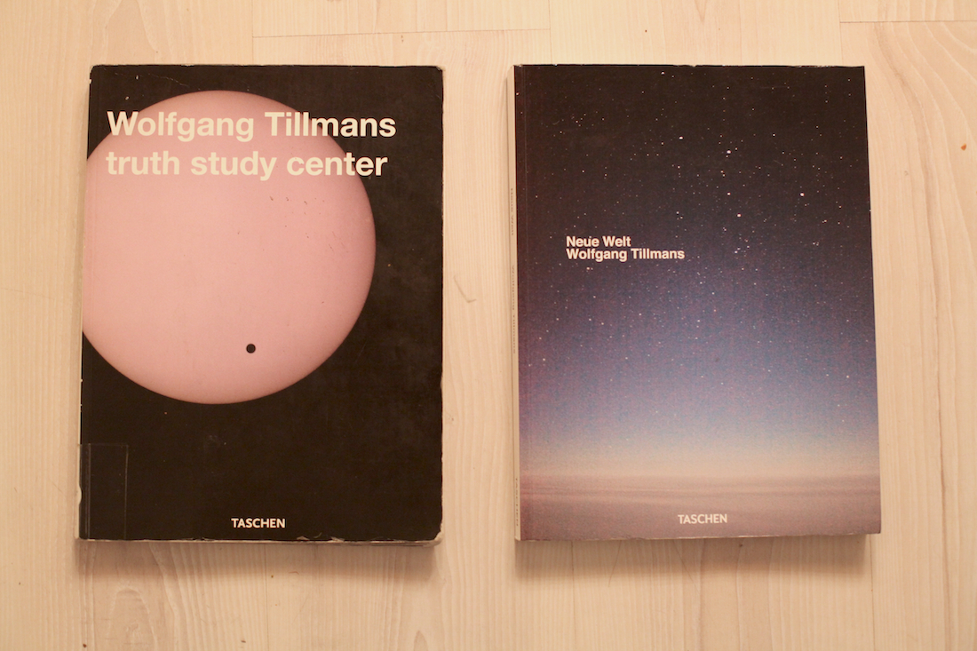
The a fore mentioned book, Burg, is a bit larger in format than the latter two, which, on the other hand, incidentally almost completely resemble each other. They were published with the gap of eight years, however if we judge purely by “outside” traits, Truth Study Center and Neue Welt are ‘fraternal’ twin sisters.
5
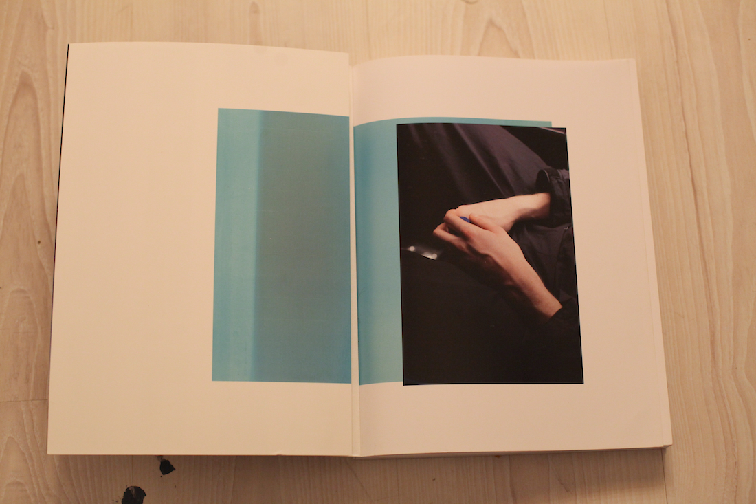
Unlike Burg, they are both soft-covered and their front cover is completely wrapped with a single photograph, and the author and the title are stated in the same white colored typeface, although the font size of the Truth Study Center is significantly bigger than that of Neue Welt. At the bottom center of the cover states TASCHEN, the publisher.

The spines of the books are, also, both white and use the same typeface, as that of the front cover.

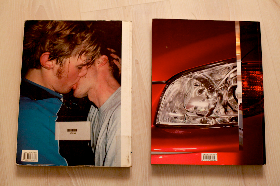
The back cover is, in both cases, a different photograph than that of the front cover.
4

8
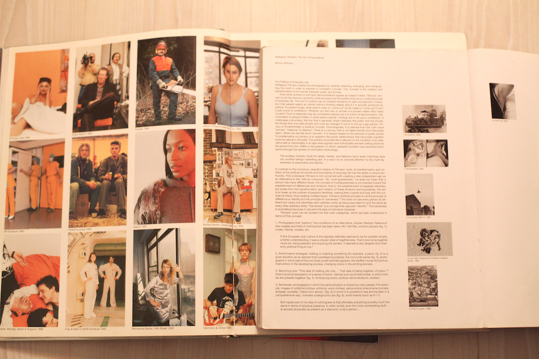
In spite of the slight differences, all of the afore mentioned books seem to share the same design principle. They either start or finish with an accompanying essay or an interview on Tillmans and his work, with the text pages being ‘interrupted’ or ‘accompanied’ with smaller scaled images of Tillmans’ work as if to kind of visually demonstrate the written content of the text, that being the case in Burg and Truth Study Center. The two mentioned, as well, end with listings of Tillmans’ biography and curriculum vitae, bibliography and words of acknowledgement and gratitude.
However, the newest of them, Neue Welt seems to have ‘cleaned out’ the ‘unnecessary’

9

information even more, as only the very last page contains publishing information.
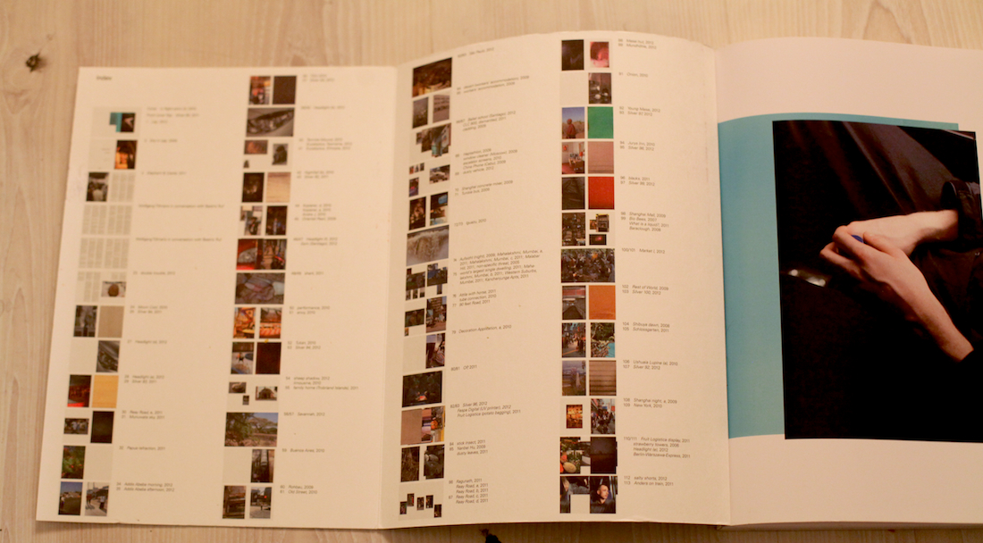
What is, also, unique to Neue Welt is that this book has both front and back cover flaps inside which is printed the index of all of the book pages. Except for the pages with the interview, in this book there is not one single spread that does not contain photographic image, from the front to back cover.

6

7
 

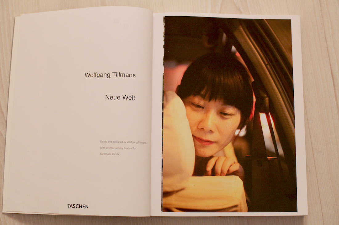
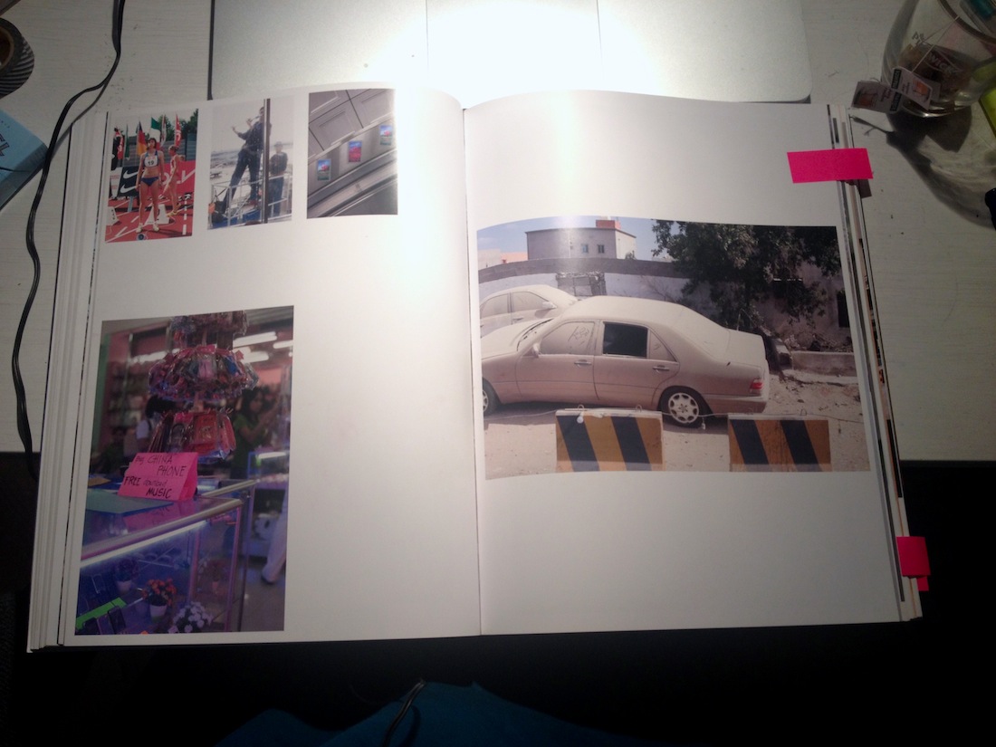
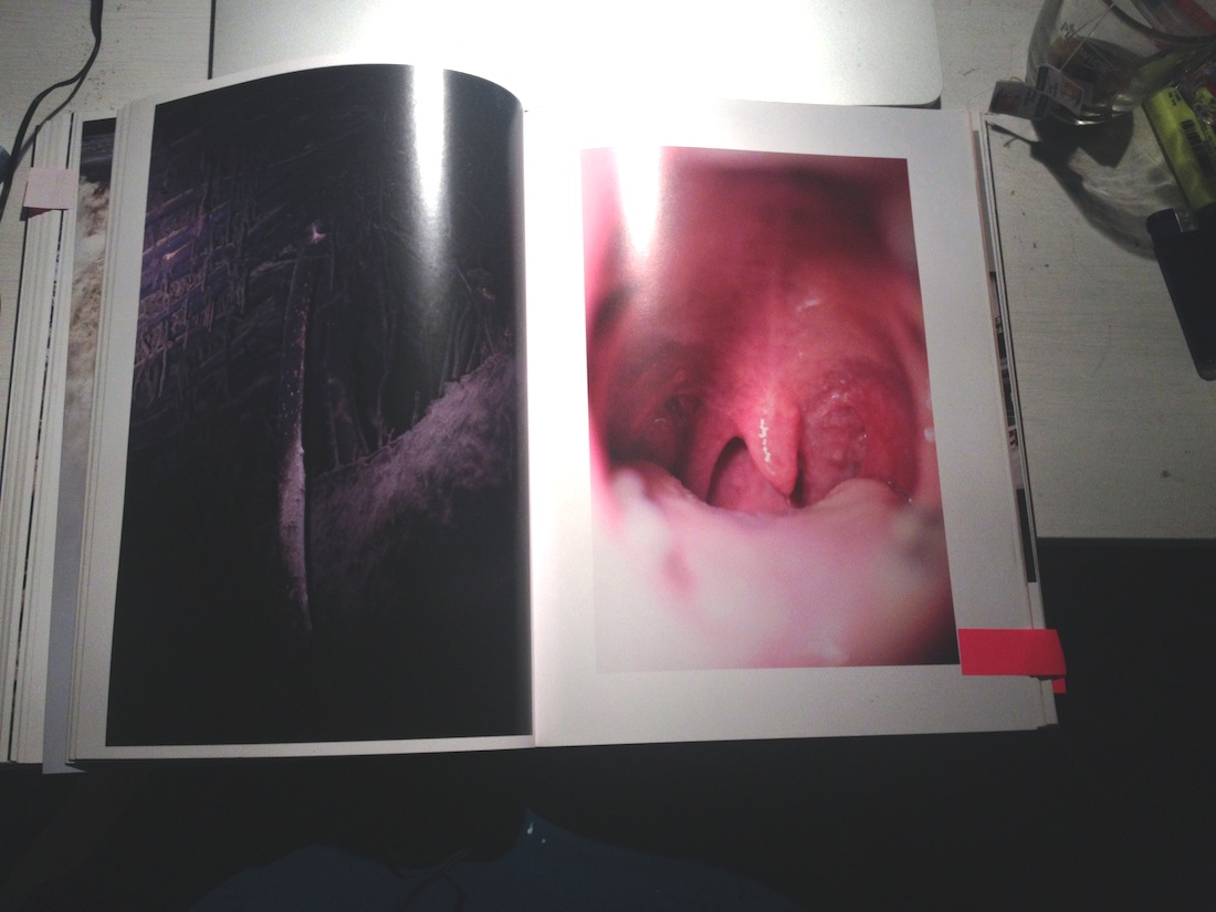
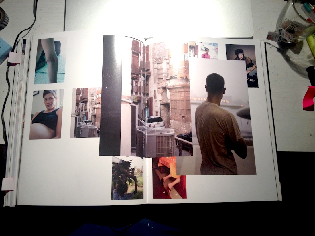
Tillmans does not view books as collections/ archives of his work but as exhibition space in themselves. Neue Welt is constructed and should be viewed more as an installation of Tillmans work than a regular book. Whilst browsing through the book (Neue Welt) the white space of the paper becomes equivalent to the white walls of a gallery/ museum. Tillmans designed the book in a same manner he would curate his exhibition. All of the photographs are carefully scaled and placed, not only to be true to the artists style but to give them proper space and interrelation to bring out the best of them and to create a strong work as a whole.

IMG_7458

Interacting with the Neue Welt the holder starts to relate to it and think of it as a sort of portable exhibition.

The way it is designed, the viewer is not only challenged to engage with each singular picture or a narrative that is usually expected in photo-books, but with the connections Tillmans creates between the photographs. Having that in mind, holding his book in your hands feels almost like a privilege. The same kind of privilege one feels when one sees an exhibition of an artist’s work.

IMG_7460

Engaging with these books, for me it was very interesting to see how they become a work of art in itself, through process of design. Although, as a viewer you have the liberty to observe every single image in depth, it is in a way impossible to ignore the whole structure and rhythm of a book as a whole. The artist’s language and modus operandi is inevitable. I ascribe this to the fact that it was the artist himself who designed his books.

IMG_7462

During my studies at the Rietveld Academie, I have myself had the chance to be a designer of my own books, and it was whilst working with the photographic content of my own that I learned how differently does this content work in the medium of a book. The format and structure of a book give the content a new meaning and experience than observing it as single, or even series of photographs printed and pasted on a wall.

I am of the opinion, that it is the artist personal involvement and connection to the content, while designing it that creates this special flavor of the book and it would be interesting to see the direction in which book design would go if more and more artists were designing books on their work themselves.

More on Wolfgang Tillmans and Neue Welt:

http://tillmans.co.uk/

http://www.americansuburbx.com/2013/01/review-wolfgang-tillmans-neue-welt-new-world-2012.html


Rietveld library catalog no: til 3 and til 1

Neue Welt has unfortunately not yet been acquired by the Rietveld Library, but is author's own.
The ideas & steps behind making ‘Haphazard’.


Sunday, December 8, 2013

Analyze a book which is interesting because of its design.
So the book needs to be interesting, apart from the content. I discovered that it is almost impossible just to take a book because of adesign however interesting it may be. The content and design are often so closely connected to each other.

With this book it was different.

The first reason why I took it: the cover.

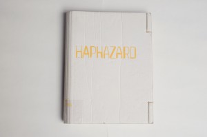
I had really no idea what the book was all about and I also didn't understand the title. No, I just took this book because of the cover. Between all these 'regular' books, there was this one book with a cover made of cardboard. Cardboard? That seems interesting to me.

René Put [x], the graphic designer of Haphazard, told me that you can not ignore the cover.

‘When you see a book, it starts with the cover.’

‘As a graphic designer, you have to deal with a lot of choices by designing a book. The content and form are in my opinion connected with each other. The content always plays a role. Which material is used by the artist? Which ideas the artist wants to tell with the book?’

cover Haphazard

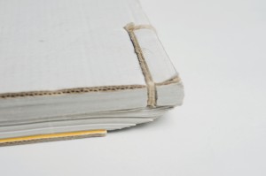
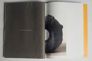
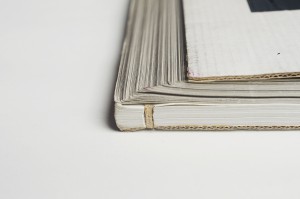
The manner of binding confused me when I opened the book. The way it is bound, on the right side, gives you the idea that half of the book doesn't need to be seen. That it is a secret, hidden.

‘As a designer I’m always looking for inspiration. Once I had seen an Indian account book, this is a long flat book. The idea of having this pile of papers, folding it into a new object, fitted well with the work of Ellert. Ellert is always looking for the border between 2D and 3D objects.’

‘Someone in Den Haag bounded the book. He made four dummy’s for us. We were really content with the last one, the one as it is now.’

‘They call this a Japanese way of binding. But actually a Japanese binding is different because there are more whole in the cover. There are just two holes in this book cover. Afterwards the book is bound by hand in a system which keeps the pages all together.’

‘This is maybe a funny fact to know. The whole research for the book cover, took the most time but cost also the most money because bookbinding is a handicraft.’

binding Haphazard

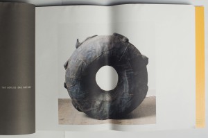
I have the idea that there's a link between the paper which is chosen and the work of the artist. The artist, Ellert Haitjema, is working with natural materials and material he has found in the streets. This paper looks like recycled paper. Not glossy, it has a more natural look.

‘It’s always a search to find the right paper. Here we’ve chosen for uncoated paper. In this case it was necessary because not all the pictures were in a good quality. To compensate this problem, it’s always a good idea to use this paper because the effect of the bad quality is less. The pictures become also more an unity when they are from different sizes/qualities, all printed on the same soft paper.’

Haphardize_0034

‘This quality of this picture was not really well. That’s why I doubted to publish this one. In the end, we changed it a lot to get it how it is now. There were to many good arguments to place the photo.’


Isn't it a pity that some pictures on the middle of the page, are folded?

‘The pages are turned and that’s also why they get folded. In this example you can see why, on purpose, we’ve placed some photos in the middle of the page. By folding there will be another image then by seeing the photo on the whole page.’

Band 2 Haphazard band 1 Haphazard

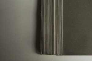
‘The cover and the papers inside the book are folded. What we wanted to create when the book is lying on the table, is that the cardboard will end on the first page inside the book. By folding the book, the paper will move, by moving the paper you get a nice cutting edge.’

snede achterkant Haphazard

‘At the last moment I thought of adding something to the cutting edge, it needed to become an experience in itself for the book. We decided to add five colors of grey, so called PMS colors or Pantone colors. These five different colors are printed on the back of the papers inside the book. Now you can see a nice variation of colors in different grey tones which are an experience for the book in itself.’

grijs verloop achterkant Haphazard

‘This book needed to be an object in itself. Just as the objects which are shown within the book.’

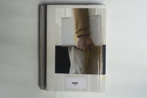
‘The good thing about the picture on the back of the book cover is that it shows how the function of this book changed by using it to carry a plate of glass.’

‘The idea for a photo like this (on the back of the book) occurred while we were designing the book: the book needs to be shown as an object itself. This photo for the cover was a bright idea, thereby the whole book design was completed.’

achterkant Haphazard

What I wondered about, when I took this book out of all the other 'normal' books, was; how is someone making a book like this?

For instance, when you're a graphic designer, what kind of steps do you make during the process of designing such a special book. At first, I thought there was no direct link between the design and content of the book because from the design you couldn't get an idea of the content.

In the end, I know better. When you take a closer look, you see that there's a link, off course, but a subtile one. Graphic Designer René Put let me see what is all necessary by making a book. Which choices need to be taken and which ideas are behind all these steps.

‘In my opinion, you can always go back to the book when it is a good book.’


Rietveld library catalog no: hai 4

Design’s Delight by Jan van Toorn


Sunday, December 8, 2013

Design’s delight is a book of which as well the content as the design are by Jan van Toorn, a dutch graphic designer. The aim of his book is to question and to comment the way designers work now. You can tell this by both the content and the way it is designed.

cover

The cover of the book is rather simple, but shows already some of the characteristics of the graphic designs of Jan van Toorn. Various thicknesses of letters have been used, to make distinctions between different sorts of text, the text in the top right corner, for example, is shown as well in English as in Dutch, but to divide these two the English part has been set in bold type.

Another characteristic of Jan van Toorns design is making a text that should incite the reader to “active reading”. He does this by putting the text on a page in different directions, you can see this at the bottom of the cover, where the text has been put upside down, but also at the sides of the cover, where the text has been turned. This stimulates the reader to read the book in an active way, by having to turn it around to read everything it says.

idea ideea

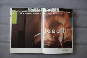
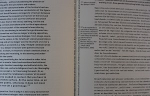
The first pages of the book are used to offer an introduction to the further part of the book. Different pages has been used to write the sentence “design is a good idea desperately seeking images and other forms of truth”, which actually is the core idea behind the book. By spreading the sentence over a few pages, more attention of the reader is asked to figure out exactly which point is made. With every page, a new word is added. Again the text is shown in both English and Dutch, and these two are again divided by setting them in different thickness and types.

essay essaycollage

After the introducing pages the book continues with an essay on ‘thinking the visual’, placed on the page in a simple, clear way, again both in English and Dutch in different typefaces. Still, in the essay, van Toorn keeps adding sentences that have been turned around in the middle of the pages, and the pages after the essay are filled with little pieces of text that have been placed in an almost collage-like way, spread out and turned around over the pages, sometimes even combined with images, encouraging the reader to turn the book around and play with the book in order to read what it says.

afbeldingen

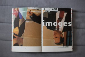
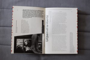
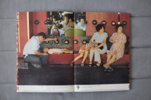
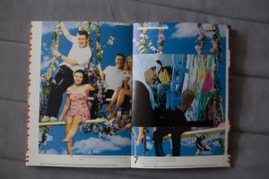
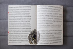
After this part, the biggest text part of the book, van Toorn starts working out the main idea of his book, showing it in a lot of pages filled with different images that have been taking from media like newspapers, television, magazines and various advertisements. Every single thing that is shown in these media has been given a form by a designer. The book is on the role of this designer, and the influence a designer has on the way information is given. In these pages, the most important part of the book, Jan van Toorn explores the opportunities of the role of a designer. He makes various juxtapositions of images from different media, and by doing this he adds a different meaning to them, encouraging the reader to think about these different meanings, and, indirectly, the role of the designer who puts these images together.

afbeeldignen

Most of the pages exist of one big image, shown as a spread, only leaving some white space at the bottom of the pages, where text is shown. Across most of the images other images have been places, but the design changes a lot, sometimes only 1 images are shown or images are placed next to each other in a row. The text below the images, again, has been placed upside down and turned around. Because the text is below the image you make, as a reader, a connection between the two, as if the text is a description of the image shown above. Which often is not the case, but the texts mostly illustrates the meaning of the juxtaposition of the images shown in the pages.

Also a number is shown in this white space, indicating the current chapter you are in, and the title of this chapter is always shown in the top left corner of the right page. At every first page of a new chapter the title of the chapter is also shown in handwritten letters, next to the number of the chapter. Because of this continuous showing of the chapter you are in, there is something that you can hold on to during the reading of the book, because of the chaos of the combination of all the different images, in which a lot happens and which contain a lot of colors, you would otherwise easily lose grip of what you’re reading.

eenalaatste

The next part of the book is again a small text part, on the method and means of dialogic practice. It is designed in a similar way as the essay at the beginning on the book, but now the English and Dutch part are not divided in two columns on the same page, but one page is filled with English and the other with Dutch. The same typefaces are used again to make the separation.

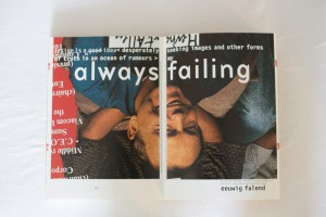
always failing

After this text part different pages are used to write one sentence, just as in the beginning of the book. The design is very similar, only the sentence and the images behind it are different, but as a reader you understand directly that it refers to the start of the book.

nawoord

The last part of the book is the afterword, which is designed the same as the preceding text part.

rug

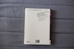
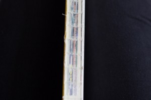
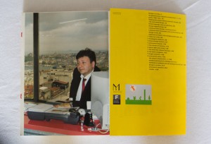
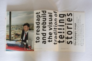
The book has a glue binding, and because the book contains a lot of images the spine of the book has a blend of all different kinds of colors, which kind of reminds you of newspapers and magazines, and it might as well be a reference to these media, where the images in the book are coming from. You can unfold a part of the back of the cover, which at the inside shows a poster-like design of a text in different sizes. At the outside of this part, the part that is the last page of the book when it isn’t unfold, the colophon and the contents of the book are shown.

achterflapdicht achterflap

All in all, I think the design of the book serves it’s content very well. The combinations of the images and text are very well done, they complement each other on every page. The basic design is very continuous throughout the book, which works very well because the chaos of the images keeps changing. Design’s delight by Jan van Toorn was an intriguing book to research, because of both its content as its design.


private collection


Log in
subscribe