Skip to Content Skip to Search Go to Top Navigation Go to Side Menu


"instalation" Category


Error or hyperlink?


Thursday, February 15, 2018


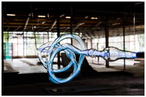
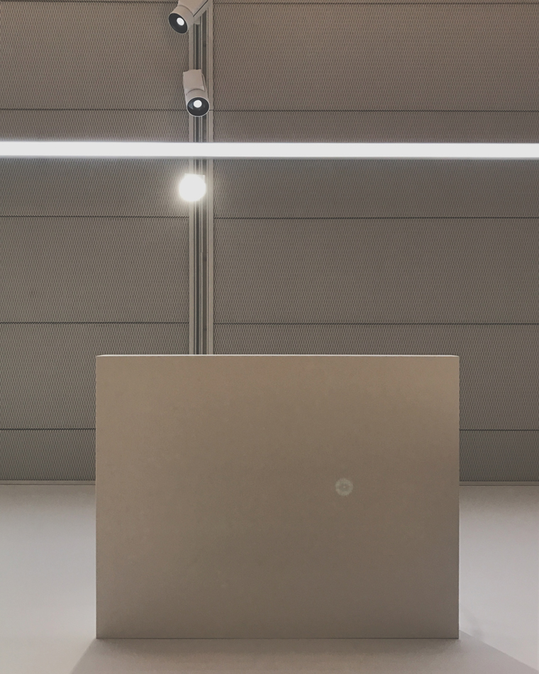
It is tricky to recognize when you are misplaced, it is even harder to respond to it right on the spot. You are supposed to serve your human, you are most and foremost functional and have sublime social purpose. Then your human drags you out of your context so inconsiderately that it leaves you nothing but to show your worn out bottom on the pedestal which supposed to elevate you. As I approach you, by climbing the stairs which is set up next to you, I have the chance to look at you horizontally. Although, a deep and artificial ravine appeared between us. The human expression provoked by your forced position urges me to interact with you but the circumstances leave me unsatisfied.


Mies-vd-Rohe-chair_950


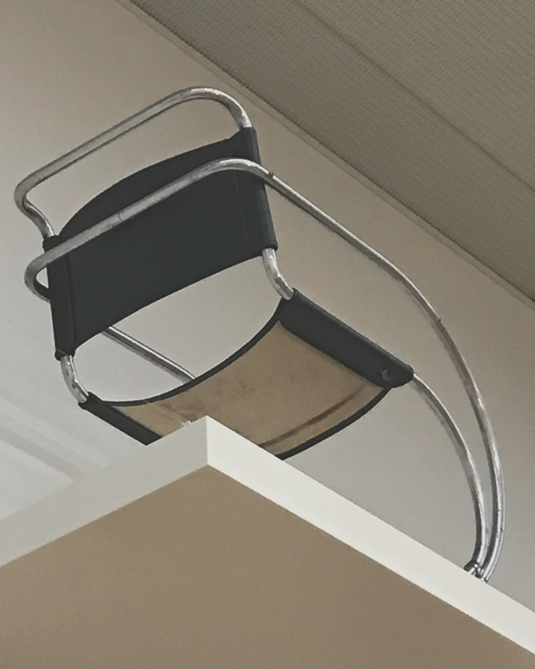
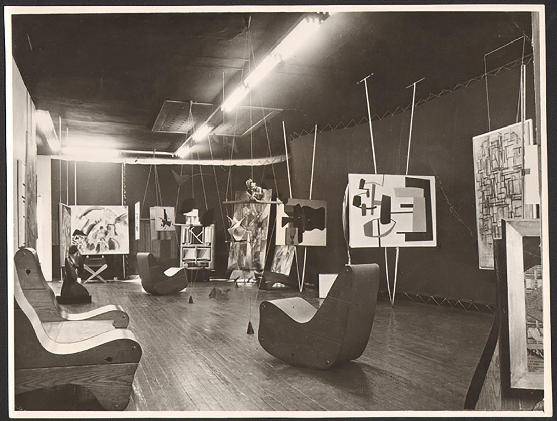
 Chair by Mies van der Rohe (but it doesn’t matter)


The chair was the first object at the exhibition which talked to me through the atypical situation that chance created. The situation was somehow absurd and opened to interpretation. Just as if Pawel Freisler, a Polish avant garde artist would had created it to dislocate my train of thoughts.

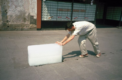
Freisler “was negating reality and its status quo by encouraging people to create alternative imaginary order. In his work a given subject or place served as a catalyst for creating an extraordinary social situation.

His actions in public space are a form of probing reality, to reveal its absurd dimension. (…) In 1971 he undertook his first work with a table and a chair. What mattered was the table’s status as a “basic idea”. He was attempting to arouse interest, to break routine, without giving observers any hints as to the real meaning of his activities”.

I found myself in the position of a pleased voyeur, which tickled both my curiosity and fantasy. I was busy with taking photos then I looked around with a sheepish grin. As if I was afraid of being caught on the street while taking sneaky pictures under a stranger’s skirt.


 freisler_6656354

freisler

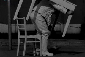
Pawel Freisler – Activities: Table and Chair


Self-realisation as a spectator helps to stay alerted and turn reflective. Gabriel Lester found another way to break habitual patterns down. He introduced a project (SEEN) in an arts centre where “projections suggested a look inside. The projected scenes are environments where groups of people observe something that is out of sight, hidden behind the wall. This juxtaposition – created by watching a projected environment inhabited by people who, in turn, appear to be watching something out of view – provokes the sensation of the observer being observed, and consequently a higher awareness of one’s active and inverted role as a spectator –

as though watching an image that is quite literally looking back at you.”

SeenF-1600x1027

SEEN (2006)


Standing and staring underneath the pedestal, the unusual imagery in my head widened my perspective as I was abducted of the traditional and passive spectator’s role that I usually undertake. I started to look at Stedelijk’s way of displaying more critically as their concept seemed to override the artworks so much that whole new stories were about to emerge. My story, and the museum’s story. But certainly not the chair’s.


The designers explained, they made the arrangement in order “to  reinforce cross-connections and shared narratives. The lay-out understands the collection as a network of relation rather than as a presentation of individual artworks. To capture these networks, very thin walls define an almost urban environment of free association and multiple relations.” 


How much freedom do I have while walking between the walls of the designers’ concept? How much space do the objects have to be explored from three meters high?


 Zofia Kulik and Przemyslav Kwiek were post war Polish artistic duo and uncompromising critics of their surroundings. They said once: “The world is half wonderful, half ugly. The humanistic and artistic theories are usually formed in the mood of the former half. This creates a false edifice of ideas and philosophies, especially a false concept of the artist, his mission and values, his false status.


IMG_9331_950

 Chair by Mies van der Rohe (exhibition design by Rem Koolhaas)


Real exchange with the chair could not happen. I could not find anything beyond the meanings that I gave to it. The revealing moment that I experienced did not say much about the object itself. It was about the gap between me and it, and all the uncanny thoughts I filled the gap up with. The chair appeared to be in the weird melting pot of the museum’s peculiar way of showcasing, chance, and my tyrannical associations, which made me unable to explore the chair’s real properties.

But still,

how handy errors can be?

.

.

Are they errors to be fixed or useful hyperlinks?

Frederick Kiesler’s correalism in contemporary art


Tuesday, October 17, 2017

Unknown to many, Austria-Hungarian Frederick Kiesler, was one of the 20th century most innovative and peculiar artists. After studying printmaking and painting in Vienna in his twenties his career surged when his controversial stage designs got acclaimed by the art world. In 1923 Kiesler was invited to join the dutch association de Stijl which made him the youngest member of the group. Three years later he and his wife emigrated to America where he amongst other things was chosen to design every aspects of Peggy Guggenheim’s Art of This Century Gallery in New York, 1942. He soon became an artist operating across the ”borders” of the art world, working with painting, architecture and sculpture, usually mixing them in the same project.


19_AbstractGallery2.jpg


During his years of practice Keisler developed his ideas into a philosophy, concerning his conviction that everything is connected and correlate to one and other. Kiesler called it ’correalism’ and defines it as ’the dynamics of continual interaction between people and their natural and technological environment’.  Correlations between objects, color, human experience, environment etc, he believed should be considered, since all these aspects and their relationship is part of a spiritual process which will lend meaning to life.


Original design fireside chair


As I understand the essence of Kiesler theory’s is to see the whole picture. When you make a sculpture, also consider where it will stand, in what environment. When you make a painting, imagine the whole room it will be hung in. When you design a house, think not only of the actual architectural features it will acquire but also color, furniture and other ornaments. The art should also be stimulated to connect with society, technology and human emotion.


mgb17_friedrich_kiesler_endless_house_new_york_1959_litebox


In the contemporary art scene I believe we now see traces of Kieslers ideas of art and design. Maybe not in their original form, but the essence of them; the fact that art should affect something inside of the viewer, in one way or another bring him or her closer to a more meaningful life. As I see it, contemporary installations which indulge the viewer to become a participant instead, have a tendency to bring that experience.

An excellent example of such an experience is provided by Tomas Saranceno’s immense wire-installation, In Orbit, at the top floor of the K21 museum in Düsseldorf. The visitors are invited to walk in a floating landscape of wires, above a three stories drop. The direct, intense feeling of vertigo from the potential drop, as well as the resilient surface the flexible wires supply, provides a breathtaking experience from the very first step.

TS_11K21_51706-1920x1280

The work itself correlate to your every move, by each step you take the ’ground’ shifts under your feet, but also forms a new connection between all the participants. The extreme situation strips you of all previous preconceptions and you are only aware of that very moment, which leads to a unity in the group of participants, since you all share the overwhelming sense of mixed wonder and fright. The sensations stays with you long after you have exited the work and you feel a connection with everyone who have ’felt’ the work.

Rottenberg_Rogge-2155

Another contemporary work which I also feel strongly relates to the theories Kiesler came up with is Mika Rottengberg’s combined installation and video-work for Münster Skulpturprojekte 2017. On a quite busy street in Münster lies an abandoned shop with a old yellow sign and at first you wonder if you even are in the right place since there is nothing else inviting you in. When you enter you realize the inside mirrors the exterior, the shop is deserted; on the shelves there are some left over articles, a fan i slowly moving in a corner and in a second room a couple of giant inflatable pineapple-rings. While you walk around in the shop a sensation of confusion and discomfort slowly creeps upon you, wondering where have you ended up. Then you find the video. In the furthest room a small cinema with about eight chairs is located and the work is screening on a wall.

2017-Rottenberg-filmstills-6-1

You get launched into a surreal universe with men in suits crawling through a system of pipes, a woman smashing light bulbs, shops filled to the brim with vegetables/lights/balloons, a woman managing a soups trolley as well as another woman working in a restaurant. After the 20 minutes long movie you realize your emotion have changed drastically and you now are in a comfortable space, physical but especially mentally. The weirdness of Rottengberg’s film leaves you with an urge to discuss what you have seen with other spectators which in turn creates a similar community amongst the group of participants as Saranceno’s installation.


There are numerous more examples of related works which all share the same core idea of bringing something else to the viewer than just a sight (which of course could be nice/radical/emotional etc.).

What the artist provide is a kind of parallel reality in which all aspects of the work have the same significance; the environmental setting, the colors chosen, the techniques and materials used. Which is the same ideas Kiesler wrote  about seventy years ago. I think it proves the statement that good ideas are timeless and always can be brought into new light in new times, not only by artists but also by designers, architects and other creative professions. Even though artist today might not think about Kieslers correalism when they work they somehow end up in the field anyway.


Transitions – from autonomous to applied arts


Sunday, January 29, 2017

A line, a letter, a page, a building, a photo, a book – separate stages that can either stand by themselves or remain transitioning points while executing somebody’s vision. It is common that an artist starts one’s creative process with making a sketch or writing down a sentence that popped out in the head, though, later on this idea might get a completely unexpected appearance. After the piece is created it will most likely be documented in a book, that sometimes serves as an autonomous work. Therefore, it is important to choose a right graphic designer to collaborate together for this process.


For my design research, I have decided to look into Alon Levin’s designed book ‘De Paviljoens: Journal of a Building 1992-2004’ that is a documentation of the former contemporary art pavilion in Almere.


7267-630-435


virselis

According to the Artistic Managing Director of the Museum De Paviljoens, Macha Roesink, the aim of this book was to expose the complexity of building such as De Paviljoens and document the history in a case study of the life of a building, in the form of a journal composed of accounts by many of the people who have been involved.


814-454-296

Museum De Paviljoens


The building is transportable, like the ultimate kit, but it is standardized to meet building regulations. Documenting it in a book clearly makes it even more handy. I think it was not accidental that Alon Levin was invited to design the book as he himself works transiting from fine arts to design. To understand the concept of his way of working, it is important to look at his other projects.


In A. Levin’s book ‘Things Contemporary’ published by Dexter Sinister & Alon Levin, 2009 he talks about his interest in man’s eternal pursuit of order; not the ideal of order, which renders things absolute, resolve and static, but in the actual process of organizing things, which inevitably falls short. Artist takes up forms such as the triumphal arch, the victorious podium, or the Ferris wheel, and translates them into model-like wooden constructions and plaster forms reminiscent of the model. It creates images for the ambiguity of success and failure, for the instability of ideological, economic and scientific systems. Analogous to the accumulation and formation of knowledge in the “free encyclopedia” Wikipedia also Levin prefers, when he reused, deconstructed or repeated individual elements of his own works. Data, buildings and documents appear as moving building blocks in a constantly transforming and updating view of the world. To process this information, he uses charts, diagrams and transforms his knowledge into abstract geometrical shapes that later become sculptures or installations. Space-grabbing constructions from simple materials available in the construction market are based on the exploration of the technical and architectural achievements of the Western world and their significance for contemporary society.


tc

tc2

Things Contemporary published by Dexter Sinister & Alon Levin, 2009
 

Even though, it seems Alon Levin himself does not see switching from graphic design to fine arts as transitioning, I was curious to find out when and how do these two spheres meet. His pieces and texts are based on invoke either the incalculably large or the immeasurably small, hence the mathematical sublime, the way in which they thematise structure and collapse points. Using the design made for ‘De Paviljoens: Journal of a Building 1992-2004’ and photos of various installations I tried to create some ‘systems’ that could represent their ‘shape’. I discovered he used three sizes for the font, therefore a zigzag in my drawings representing ‘text’ in the book is in three different sizes. Considering purified and structured shapes he applies into his pieces I decided to replicate both pages and 3D objects into slightly modified, geometricized shapes. At some point I realized a certain rhythm appears, which blurs the line between two subjects of my research.


1

2

3

Left – sketches of installations by Alon Levin, Right – schemes based on ‘De Paviljoens: Journal of a Building 1992-2004’


In fact, these two ‘sequences’ I made are just my interpretations of Levin’s creations. They might transit into something new and exciting at some point and that would probably be sort of an example the way the original author was building them. In ‘Things Contemporary’ he admitted that during his studies at Gerrit Rietveld Academie he wanted to understand the power of manipulating information: not just consume it, but to actually make it. To try and understand how all the information we ingest daily is organized and what the thoughts and structures behind it are. I think one of the best representations of this attitude is in his project ‘The Basics of Growth’ that dealt with similar ideas in botany as in economy, making some comparison through books that A. Levin had published himself. The content of these books was from Wiki that provides the material for the content of a book. He later on transits from the book into 3D structure based on the same subject, which in this case was a greenhouse on the rooftop of the office building.


53_DeVoeght_Levin

The Basics of Growth

I presume researching the history of the pavilions, he applied this same method in a reverse version – firstly, understanding the building with its context and then transmitting it into a book.

Throughout my research I learned that the endless cyclical game is the fundament of Levin’s work – a natural flow that drives him from one medium to another.


De Paviljoens : journal of a building, 1992-2004 /Rietveld library catalogue no : 700.4 pav 1

A visit in Pieke Bergmans studio


Saturday, December 10, 2016


At the moment you are exhibiting in the Stedelijk Museum in Amsterdam with your installation Phenomeneon. Now I am really excited being here in your studio in Amsterdam to talk about your projects and you as an artist.


piekebergmansstudio2


There is surprisingly much space in here. In what kind of room are we?

It is an old factory building. We actually just moved into this studio a few weeks ago. So we are still in progress about rearranging the space, like removing the ceiling and creating small office rooms. There are not a lot of my works here yet but I can show you around…


The Phenomeneon project gets a lot of admiration with its mesmerizing appearance. I am really interested in the production process and the applied techniques. Could you tell me more about it?

Yes, sure. Not everyone realizes that light in this case is gas. People think it is a really new technique, but it is actually an old one. I do like light a lot. It is a very beautiful material to work with and I discovered many different effects. People are getting so much information nowadays it is hard to get their attention. But in this case I think it is a perfect combination of technique and mystery.


Phenomeneon-Cloud-Pieke-Bergmans-2016-photo-Mirjam-Bleeker-12-400x600 Phenomeneon-Cloud-Pieke-Bergmans-2016-photo-Mirjam-Bleeker-1-900x600


When you mention the mystery it makes me think about the moment when walking closer to the installation and realizing that the neon light moves through the organically shaped glass. The light runs through it and you start to follow its way.

Exactly! That makes it feel alive.


Are the organic shapes made to play with the intensity of the light?

The intensity of the light is defined by the width and length of the glass. In the end it is just playing. Its like a three dimensional painting. Like when you have a brush and you choose the pressure of your brushstroke.


I can really see how playful you shaped the glass. Are there any other factors affecting the form?

Yes. The installation consists of seven separate parts. It was difficult to do because they are all handmade and quite big. The biggest one is almost six meters.


Phenomeneon-Cloud-Pieke-Bergmans-2016-photo-Mirjam-Bleeker-7-900x600 Phenomeneon-Cloud-Pieke-Bergmans-2016-photo-Mirjam-Bleeker-15-400x600


You cannot see where they are connected which gives the impression of one very long piece and makes me question the process.

It starts sometimes with a simple observation. I was questioning why neon light is always a straight tube. Most people saw the shape as a limitation, for me it is more a possibility. With the understanding of the technique I could have come up with so many ideas about the design. One reason for the process and especially the shapes of this project is that I am a person that is always interested in setting things free.


How is that combinable with your background as a product designer? I can imagine in this area the focus is more on creating something specific.

Yes. It is mostly about creating something perfect. I basically didn’t believe in that concept. That is why I turn nowadays much more to art. I try to stretch the borders within the functionality. But now I am also more free about creating something that has nothing to do with functionality even if I started from this ‘other world’.


Do you have an idea of an aesthetic that deeply touches you — an idea of personal beauty in ‘your world’?

Yes and that’s only for myself. I have no idea what the public thinks. I am not commercial in that sense. I don’t do works someone else wants. I think it is a power within the simplicity. Like this table over there. Its so simple but at the same time it is fragile and the surface a bit wobbly. You are wondering if it collapses or not. So it is also about the balance. I am looking for this tension. I like to use things that already exist in my environment and I take them out of their context. If I work with big companies then often lots of things are possible. All the equipment is available. It happens fast that things are getting too complex. Then it looses its quality. I am striving for purity and simplicity.


Do you think mass-produced objects have less individual quality?

Oh, I don’t think there is such thing in mass-production. Every object is exactly the same. The best design is multiplied: ‘the Golden Mean'[x]. I don’t want to judge mass production because its designed for optimal purpose. But if you study nature, then everything is unique. You can not find one olive tree that is the same. Not one animal or human. We are all different. Thats why I create production lines that produces unique objects. It would be great if people would spend a tiny little moment to witness these individual unique differences. It is hard to make people feel something or even make them wonder.

When I was studying I really admired a lot of designers or artists for their capability and their way of looking at things. I also really understood that it was not my way. But when you are young you are not really sure about your way. That is sometimes a bit confusing. So you have to find your own strength, your true fascination. And after some time by simply doing you feel more and more secure and comfortable in choosing what you want to do. At the end it is about experience I would say.


I read an article where you said you take already existing working processes and change them to give materials space to let them expand in their natural way. What is your fundamental inspiration concerning your working process?

If I compare my own mind to nature I am a bit disappointed. Because whatever nature is doing in terms of gravity or elasticity or any other effects basically — I could have never come up with this. The result is so much better than everything I could have ever designed. So I just started going into the direction of letting things happen. But of course in a quite distinguished research. I have to do it over and over again until I understand why and what happens when. And then I pick out something to focus on.


Do you have plans for further projects based on the idea of Phenomeneon?

Yes, for sure because now we developed the techniques and finally we can start to play. Basically I am looking forward to the opportunities in the future. To be able making more things happen within the world of Phenomeneon. If you discovered something you are really fascinated about, I think it is important that you spend some time in making more pieces because mostly they get better and better.


Check out Pieke Bergmans official website for more information.


Why Make Carpets?


Sunday, December 4, 2016


The designers Bob Waardenburg, Marcia Nolte, and artist Stijn van der Vleuten are the collective We Make Carpets, who are represented with the pieces Stirrer Carpet, Cocktail Carpet 2 and Umbrella Carpet 2 at Dream out Loud in the Stedelijk museum Amsterdam.

Umbrella Carpet 2, 2015

Umbrella Carpet 2, 2015


We Make Carpets create both big and small patterns from simple products, such as cocktail stirrers, paperclips, candy bars and spices. They manage to create these patterns and structures, that is not only pleasing to look at but they also question how we see these products, by finding the beauty and characteristics within each material.

In all their work there is a clear systematic process. It is important when selecting a material that it relates to the location where it will be exhibited. It has to suit the place and/or theme, since both the space and material will influence one another. Most of the time they won’t even manipulate the material at all.

Then comes the question how to place the material. I think it is important to remember that the qualities of the material will decide a big part of how the pattern is going to look like. For example in Straw Carpet (2014) where the straight shape of the straws guides the pattern from the center and outwards.


straw 1

Straw Carpet, 2014

Straw Carpet, 2014


Carpet Carpet, 2015

Carpet Carpet, 2015


In one of their later works (Carpet Carpet, 2015) for the carpet factory Ege the group used leftovers from the factory itself. They collected 3500 cutoffs from actual carpets to create a carpet that covers the floor and one of the walls in the exhibition space.
What makes this piece interesting is that all these cutoffs come from different carpets, which makes each piece to stand out in colour.
After counting, sorting and measuring the pieces, the group could eventually find a way to puzzle them together by making a pattern, divided by white carpet rolls, to avoid getting a blurry mess of colours.


They also experimented with other materials, like in the piece Forest Carpet (2009), where they bring in materials from the nature into an exhibition space.  This is actually their first carpet together.

They also experimented with other materials, like in the piece Forest Carpet (2009), where they bring in materials from the nature into an exhibition space.
This is actually their first carpet together.


Their 6th carpet, Brick Carpet (2011), was made from 40 000 bricks and measured 42 x 70 meters.

Their 6th carpet, Brick Carpet (2011), was made from 40 000 bricks and measured 42 x 70 meters.


Connecting these objects even more is that they are so useless most of the time. They are at the bottom of our consumption list. For instance, we only buy paperclips because we might need a few of them, and we don’t even notice how beautiful they really can be.

We Make Carpets really see the beauty in recycling, as shown in Bottle Carpet (2012), a project that appeared at Maroccos Taragalte Festival. The work is made entirely of empty plastic containers of various shapes and colours to comment on contemporary consumer aesthetics.


Bottle Carpet, 2012

Bottle Carpet, 2012

I find it really interesting that We Make Carpets are using different products/materials for nearly every carpet that they make, and yet they always end up with a great result. They seem to know what possibilities and limitations there is within each of the materials, and it makes me curious to study the material itself, since I think it’s obvious it can be of importance.

Though their systematic way of working, without manipulating the materials too much, does not fit me very well, I still like the idea to create new patterns like this and I would like to explore this method in my own way, to find out what I can learn from it.

I made a few tests with leaves, painted A4-papers and rubber bands, to try and find out what unique characteristics they have.

gummigummi cola

papperpapper 2

After I spent a little time with these few products, by collecting, sorting and observing, I definitely got a better understanding of the importance in both quality and quantity of each material.

löv 2löv

löv 4

The leaves even ended up as an additional element for another of my projects.

There are big ambitions in We Make Carpets work and they seem to have an optimistic view on the future. There is some kind of sarcastic feel within the materials, and how they use them, that tells me there is hope that everything will be environmental friendly and people will be healthy, with no littering, and that this can only be reached if we really start to look and question those products that we as consumers are purchasing.

Textile writer Tania Candiani


Tuesday, November 25, 2014


TaniaCandiani1


Tania Candiani, Woman, Mexican, 1974, Textile, Language, Artist …


Tania Candiani was part of the exhibition“ The future of fashion is now”, in Rotterdam. In this show, designers and artists try to show some different and new ways to see to the fashion world.

Tania Candiani exposes a big roll of fabric joined with some clothes and dresses. The finality of this work is an installation with fabrics, thread, metal hooks, sound and video. This work was showed almost at the end of the exhibition, a space that, according to me, didn’t support it as much as it could have. Therefore, all my attention wasn’t driven towards the installation as a whole, but only on this big role of fabric.

The title “ La Constancia Dormida “, which stands for Constancia Asleep, makes me think of the collections of stories, including Constancia, y otras novelas para vírgenes (1989; Constancia and Other Stories for Virgins) by the Mexican novelist and short story writer Carlos Fuentes. The theme of these stories, which is about the people and culture from Mexico City, is maybe a influence in Tania’s work.

The role of fabric, that I mentioned before, was exposed on a table and stitched with text. The language used was Spanish and it was about thoughts, feelings and stories of one certain group of people or community, that were influenced by their economic, political and social environment. This context situates her work in the last of the four themes which divided the exhibition: “Fashion Activism: Community and Politics”.

Being influenced by the reaction of these people, she used them as her subject for her story-telling. The textile is then used as a narrative tool as she explains it in one of her statement: “ My research processes take as starting point language, text, the political implications of the domestic, of what is public and private, and of “the others.”

“Translate strategies amongst systems –linguistic, visual, phonic– and practices, generates equivalences and associations (…) textiles have been present in my work as tailoring, as a narrative resource and as labor, socially embedded with meaning. Tailoring as design is a contact point with architecture, where the space distribution of the plans as sewing patterns re-signifying the idea of inhabited space or the utopia of an space that could be inhabited“.

nightmares_option_1

Tania Candiani – Artslant

4354648_1_l

Tania Candiani – Lot 88

I chose Tania’s work because I really like the simple and minimalist way she approaches two big ideas, in one hand the fashion world and in the other one, a more conceptual idea about community in a political and economical environment. Also, the way she uses textile and combines it with text gives me a big and strong feeling of nostalgia. The way she characterizes the political and human energy really fascinates me and awoke my curiosity. This feeling of nostalgia that is present in her work, makes me land back directly to my home country. This nostalgia and spirit of story telling is something that characterizes the Portuguese personality and community, bringing me even more closer to her work.

By listening to the people in different environments, Tania tries to save the stories and the atmosphere into the fabric by sewing it, and giving it an individual perspective. Through this act of sewing, I see Tania’s work as a memorial where she keeps all the moments and happenings, as a saving for the future, which for me is a really beautiful act. The act of sewing, reminds me of a scar or a tattoo that Tania is stitching in the fabric. By expressing these left marks, it connects us to our individual or common marks, which originates from situations and memories that we experienced. These marks which makes us the person or the people that we became. So it’s like creating and materializing all the spirit, thoughts and feelings from a specific and certain place, time and community.


This way of making art reminds me also of some works, for example, Louise Bourgeois, Tracey Emin and in the traditional bordering from Portugal.

tumblr_nd2py1rbml1rotipro1_1280

Louise Bourgeois

tracy-emin-blanket1

 Tracey Emin

mh-e603-02g

By having this in mind, I realize that textile can be really strong, powerful and expressive as a subject or a material. It was interesting to see how her work can become, in a way fashion but still textile with a sculptural character. It questioned the fashion world and trying to find or to create this small limit between fashion and textile, becoming in the end something else. Different than the world of fashion that we know now, but still an expressive future form of fashion. This makes her piece relevant, for me, in taking part of this exhibition “ The future of fashion is now “.


constancia6


Thoughts on Lucy + Jorge Orta


Friday, November 21, 2014

image_107_image1

Nexus Architecture

3020760-inline-i-1-human-centipede-ad-agency-part-2

The Human Centipede (2)


At the Boijmans Van Beuningen’s The Future of Fashion is Now (Fashion, Activism, Community and Politics), Lucy + Jorge Orta showed their work Nexus Architecture x 25 – Nexus Type Opera.tion. In Nexus Architecture (2001) they zip together the clothes of a group of volunteers. The idea is to depict the loss of individuality in a cluster of social relationships. We are all connected; “Each individual keeps an eye on, and protects, the other. One individual’s life depends on the life of the other. The warmth of one gives warmth to the other. The physical link weaves a social link.” I refer Nexus Architecture to the horror film The Human Centipede by Tom Six. ‘’A mad scientist kidnaps and mutilates a group of people in order to reassemble them into a human centipede, created by stitching their mouths to each others’ rectums.’’ The victims basically have to wear each other to survive, of course an extreme version of “Each individual keeps an eye on, and protects, the other. One individual’s life depends on the life of the other. The warmth of one gives warmth to the other. The physical link weaves a social link’’.


Screen Shot 2014-12-08 at 20.43.57Screen Shot 2014-12-08 at 20.46.44Screen Shot 2014-12-08 at 20.44.17Screen Shot 2014-12-08 at 20.44.30


Nexus (which means link or tie) Architecture is a symbolic work which I find to be a shame as there are examples of functioning clothes which actually do realize bond and equality, for example school uniforms. I wore a school uniform as a child and my experience was that wearing a uniform built team spirit and unified. Also prevented the pressure of having to have status symbols such as branded clothes and thereby made the economical differences less visible in school. However I did feel a lack of freedom to express myself. Other areas where uniforms are used is for example in the military, prison, finance and sports. The idea is that if you are wearing the same uniform you are friends and you help each other. But even if we wear the same fabric and colors we are not always friends and we do not always help each other. To tell how the world works Orta metaphorically connected the uniforms physically (what happens to me will happen to you) which automatically also becomes literal. The work is executed in a bold and direct way which I do admire. The doubts I have about the work not being applied to people in a direct (functioning) way may depend on the way it is presented…


At Boijmans Van Beuningen’s Nexus Architecture was presented as an installation. But during performances, Orta gives the participants commands, setting the whole group in motion, ‘’emphasizing the loss of humanity within the collective’’. Depending on the participants engagement in following the task it can either be or not be a working organism. I believe that Orta is not making a political statement but rather questioning the political ideology of today and the future. Maybe the importance of both communism and capitalism, the group and the individual.


In general I was fascinated by the room of Activism, Community and Politics in the The Future of Fashion is Now exhibition because I respect artists like Orta who try to break down and deal with these large and relevant questions. I have to make 10 designs on the subject Ebola for design class which is a subject far from my control, and to me it is a motivation to see how Orta can manage similar matters. Orta has an optimistic approach in both content and aesthetic. But I can not help but question if the work of Orta maybe is too playful? I feel slightly split about the fact that world issues are ”anesthetized” when artists take them on. As the beauty overshadows the message but at the same time maybe this is necessary when wanting to communicate to the western world. It is a paradox. In any case I think that it is couregous to deal with such serious matters. Later on one can argue if a work is successful or not, if the artist does harm or good. I may be cynical but it is hard for me to understand the motive of why Orta has cared for the complex of global problems such as the ecological environment/global warming, sexism, refuge and immigration policy, the hostility towards the Romani people, the biomedical ethics of organ donation and homelessness as these subjects differ so much from each other. But then again it is arguable that a team of two artists do not share the same mind and therefore bring different issues to the table. Anyway Orta has surely succeeded in raising some of  the spectators awareness or opinion as I have just written a text about this.

Stedelijk Design Show 2013 /Proposed Highlights


Monday, April 8, 2013

19 Rietveld Foundation Year students visited the "Stedelijk Collection Highlights /Design". Marveling at the many masterpieces, commenting on the applied or autonomous character of pieces in this highlight presentation, they arrived at the last part of this "depot salon", wondering what contemporary design would have in store for them and how it would look like. To their regret the presented selection faded out without any opinion on the latest developments in design; social engagement or neo crafts
Researching contemporary design we propose this "2013 Supplementary" as a possible continuation, an imaginary online next exhibition space.

click on images to visit the exhibit


selected designers are: Mark van der Gronden /site • Daan Roosegaarde /site • Tauba Auerbach /site • James Dyson /site • Ferruccio Laviani /site • Mediamatic /site • Leonid Tishkov /site • Jonathan Ive /site • Liliana Ovalle /site • People People /site • Nucleo /site • Faltazi Lab /site • Michelle Weinberg /site


“Time Writersz”


Saturday, January 28, 2012

Based on the idea of sustainability and especially the so called Slow Design I want to have a look at one of the works from  Eindhoven based design office EDHV, which were displayed in the Museum Boijman van Beuningen in Rotterdam. 

The work i want to talk about in this Essay is called „Time Writerz“, first exhibited at the Dutch Design Week 2010. It consists out of different plates of wood which have been hidden in the ground and sealed from air and erosion for more then six hundred years. By putting it back to the air the wood comes to life again. To show the ”growing” process there are pencils attached which are holding the wood and are „writing“, documenting  all the movement the wood is making.

EDHV is a creative office that was founded and based in Eindhoven in 2005 by Daan Melis who is a publisher and Remco van de Craats who take care of the design part. They are working in the field of product design, webdesign, motion design and architecture. As the title of the website already shows you „At EDHV, we don’t specialize in anything!“ and ” We can best be described as architects of identity. We work interdisciplinary so all aspects of identity can be fully integrated.“
One of many important things for EDHV is the sustainability of their work. Therefore the most important thing is to start every project with a proper research because this is important to create a sustainable concept or idea. To quote Remco van der Craats: 
”A shape without a foundation has no meaning“. Another key to a good result for him is trust and intensive collaboration between his office and the client.

Remco van de Craats on design


I choose the artwork „Time Writerz“ because it fascinated me for different reasons. For me this work from Edhv is a lot about making change through time visible and here I see the strong connection to a collaboration work I did myself for an exhibition in Munich in an temporary space in the summer of 2011. 

We decided to use very basic geometrical shapes and also keep the choice of colors really simple. It also should remind you of the wooden blocks you were playing with as a kid and also was a direct reference to a old mural that was painted  on the ceiling of the exhibition space. The mural shows silhouettes of houses painted out of the basic geometrical forms and colors. These basic forms were made out of colored wax. Over the sculpture we placed a lamp. The wax was slowly melting down during the time of the exhibition by the heat of the lamp hanging over it. Our goal was to work with the space and also showing the fact that the space, which we were using was temporary, by letting the artwork vanish during the show.
 

Another Artist that works with the same idea of making change visible is Belgian born artist Francis Alÿs. Educated as an architecture in Tournai and Venice, he move to Mexico City in 1986 and soon started to work as visual artist.


Melting wax sculpture

He mostly works with video and performance art. His performance „Paradox of Praxis 1 (Sometimes Making Something Leads to Nothing)done in 1996 in Mexico City is maybe the best example of how Alys worked with the topic of showing the change through time, by pushing a big squared formed ice block through the streets  of Mexico City.


Multimediakunst


Thursday, January 19, 2012


Kunst, muziek en technologie smelten samen in installaties waarbij de interactie met andere elementen centraal staat.
Het geluid reageert op beweging en beeld reageert op geluid. Het begon allemaal in 1958 met de videopresentatie Poème Electronique van LeCorbusier, ook wel het eerste ‘multimedia-kunstwerk’ genoemd, met als doel te laten zien wat technologische vooruitgang de mensheid oplevert. Een klankgedicht waarin architectuur, geluid en beeld samen vloeien tot een geheel.
Vanaf dat moment ontwikkelen technieken zich verder en daarmee de mogelijkheden voor deze installaties.
Dit boek bevat een overzicht van een aantal kunstenaars die zich vanaf dat moment zijn gaan specificeren in deze ‘multimedia-kunstwerken’.


this post is part of he subjective library project "Unopened Book"
the book can be found at the Rietveld library : catalog no :

Agitating emotional language


Tuesday, May 3, 2011

After years of war Russia had to recover itself. An intense artistic activity emerged mainly influenced by works of Kandinsky, Malevich and Tatlin, the fresh generation explored new ways of dealing with art.
Artists searched for a way to deliberately change people’s beliefs through a well-planned strategy of persuasion.

I think the secret of propaganda is more related with the psychological mass event that was happening and it’s still happening in some countries. When people get hectic and they constantly search for the truth Agitprop becomes a serious weapon for manipulating the brain by agitating common political issues and presenting them in such a way that a reaction to it will be born. This reaction to what we see, makes us perceive things differently.

This political propaganda is influencing opinions and convincing people by using an emotional language of problems present day by day in society or politics.
One important artist that I would like to mention in my research about agitprop is Liubov Popova. I personally don’t see Popova as an artist upset by that time limits or by this propaganda that was influencing eyes everywhere. I see her as a free spirit that developed as much as possible. She had quite a broad approach to her art. Works of Popova and Rodchenko were recently presented together in an exhibition, gathering together 350 paintings, models, posters, films, designs and other objects. Before she died she even worked in the theater industry designing sets costumes and creating textile patterns for the first state textile factory in Moscow.

Political theater dynamically involves the audience and it became truly important in that historical context. Popova’s project for Earth in Turmoil 1922-3, a theatrical collaboration with Meirkhol’d is quite impressive, with a montage of political quotations, party slogans and film excerpts providing an ideological commentary on the action. The production was truly equal with a propaganda poster, but it explained itself in a more relaxed and artistic approach. She also had a great  approach for Meyerhold’s production “The Magnanimous Cuckold” with her stage design. The result was a machine moving structure, a very dynamic and pulsating spectacle that succeeded to unite in an organic way the actor and the set, and bring the public closer to the work. Nowadays we may refer to those kind of works as installations.

Tatlin’s influences Popova in a very obvious way, since they we’re working together. In almost all her work she uses geometrical shapes to create the deep space feeling. Popova’s knowledge not even responds to Malevich’s ideas but it pushes them further. A dynamic sense of instability and movement is matched by her use of strong color.

Popova’s personal approach to the Agitprop movement becomes a dangerous technique for manipulating peoples view. I think agitprop is still commonly used as an aggressive way of dealing with community problems and as a way to keep us focused on one of our “group” problems.
Propaganda, is something that nowadays rules our lives with every step we take. When we see a poster or look at the news we should be aware of that  the information is given to us through a filter. This way the entire population can be upset or worried about something.

In my country most of the time those propaganda posters have really no sense of the viewer reaction or pleasure to interact with them. And maybe that’s a strong reason to say that I really like Popova’s work, because her work catches you in a very powerful way.

When you force things by using a really emotional language, then the result is obviously. Popova’s works are considered to be entirely abstract and yet

without any doubt she produced propaganda and educational posters among others. I don’t think the propaganda was more

aggressive in the communist times than it is nowadays, or at least this was my experience in Romania. Today political propaganda and suppression works at its very best. And for this I will present the following postcard image from our president’s party. They attack today

exactly  that segment of the population where they know it their propaganda will work. The uneducated, especially religious people without a broad view about political issues. In the communist times artist like Popova, Rodchenko or Lissitzky and others found great inspiration in this subject, and developed it with all their ideological creativity. Today the propaganda is used in a more aggressive way and sometimes it doesn’t even have an artistic approach to it.

The making of Medium Girl


Wednesday, November 18, 2009

When DHL delivered the package with the traditional Zeeuws costume to the Bristol Hotel in Athens, Greece, I immediately ripped it open, only to find a stack of different fabrics in various sizes, textures and colours.
I had no idea what to do with these mostly two-dimensional pieces of cloth, what was supposed to go where and how.
This knowledge-gap became the works’ major point: what is the perception of a traditional cultural expression by someone from another country (and in this case I regard the city of Amsterdam as another country in relation to Zeeland as well) grown up in an era where self-examination and focusing on the present and future prevailed over historical awareness and/ or cultural pride.

Get the Flash Player to see this content.

In short: a young Danish woman of gigantic proportions who happened to pass by on the streets of Athens was lured into the hotel room, to be dressed and undressed in different combinations by an innocent Greek woman, using the separate elements of the costume to create a whole new image of national identity.

Barbara Visser, Winner of the Dr A.H. Heineken Prize for Art (2008) check out her new website.

Medium Girl (1996)
video, 6 x 30′

The perfect workspace, does it work?


Thursday, October 15, 2009

I find it really interesting to visit an exhibition were artists are working. It gives you a look into the thoughts of these artists. You can see the process.

“Published Workspaces”, I called them in my research.

Published Workspaces make people think, they activate the people’s creative minds. And I think that is a good thing.

In these Workspaces you are often involved in the work process, sometimes you can even help the artist.

In my research I am wondering about the intention of these Published Workspaces, and if they achieve their goals.

Published_Workspaces

We are all constructs -made up of mythologies we build ourselfs


Thursday, October 15, 2009

The dutch company VLISCO is producing batik fabrics all of us immediately regard as authentic african. Researching on this one is forced to concern oneself with the peculiar situation of interweaved, imposed and inherited cultural identities.

How does it fit to our stereotype that this fabric, which became such a strong symbol for the celebration of postcolonial independency is actually designd by the dutch? The path opened by this little question leads far. Where do our strereotypes come from? To which extent is cultur original? What do we build our identities out of? What do we regard as typical african, what as european? How do we deal in the postcolonial age with our guilt for colonial crimes?

My research is in particular focusing on „the swing“ made by the british-nigerian artist Yinka Shonibare, who is using the dutch wax as a kind of trademark in his work and somehow seems to be related to all questions mentioned above.

yinka_shonibare

slowLinking: tagging slow design part 3


Monday, May 4, 2009

Welcome to part 3 of : tagging slow design. This is a worksheet on which all the link-topics and post-it tags collected on the “slowWall” are listed in relation to the research subjects as components of the ‘slow design project’. (researches can be downloaded as .pdf’s).

link topics.

Performance links the Morgan O’Hara research to the one on Julia Mandle. The Julia Mandle research links to the one on Richard Long on the topic street /nature & art, by slow movement to the Kunsthalle Bern exhibit and by sensibility & violence to the Psychogeography research. Psychogeography has the link topic urban life with the Karmen Franinovic research, consumption /destruction /life style with Futurisme, against and pro community with Wim Wenders, evolution of everyday life to Downshifting, and a anonimous link to Maria Blaisse. This anonimous link is not the only one linking Marie Blaisse. Link topics like art and left over, connect this research to Uta Barth. Karmen Franinovic links to Christian Nold by means of the topic mapping, and to Psychogeography by urban life, to Futurisme by life is getting faster & people are getting a social, to Julia Mandle by just stop & think and to Richard Long by the link a way to see. Richard Long links to many other researches: to Sophie Calle by self related art, to Christian Nold through a line made by walking, to Karmen Franinovic linked by the topic a way to see, to Downshifting by choosing slowness. Downshifting links back to Julia Mendle by the link topic us and them, to Psychogeography by revolution of everyday life, to Futurisme tagging the link with designed lifestyle, to Marie Blaisse by us and them, and to the Kunsthalle Bern exhibit by reflect /a closer look. The research on Futurism has some remaining links to Julia Mandle through the topic exploring / explosive / sculptural. Following links from Wim Wenders to Uta Barth is made possible by the topic notice the small things in life, to Christian Nold by moving /memories. Mapping links Christian Nold to the Ambient/Brain Eno research while that last one makes a link back to the Kunsthalle “The Half and the Whole” exhibit creating a take time to cook link.

Reading all the researches the links will surely start to make sense, as will their variety shed light on the specific nature of many of them. Some research subject however did not create any link at all, like in the case of Maison Martin Margiela. And it was 0nly after some discusion that the performance link was created between Sophie Calle and Karmen Franinovic. Uta Barth was anonimously linked to Richard Long which might have been an intuitively act

Post-it tags.

No links did not mean no tags. Time, Maison Martin Margiela for example was closely read and tagged with post-it. This created tags like memories, replica, time(less), can’t relate to it, time, physical picture of memory and the photographical tag to a picture by Mark Manders. Wim Wenders (present in our research list because of his beautifull documentary “Notebook on Cities & Clothes” about fashion designer Yohji Yamamoto) generated also many tags like sublime, I finally found time, hillbilly, surreal, the truth, place, moving. Sophie Calle tagged by the moderator with authorship, generated: life=art, stories, documenting life. Uta Barth looking was tagged: rainy day with half closed eyes, in between places, no left over, sunday. Ambient the research connected to Brian Eno tagged as big here long now was retagged as live the moment, loosing yourself, don’t think, sound. Christian Nold place-ness got tagged with keywords like biomapping, google earth, links, remapping memories. Linked to many, tagged by few. Julian Mandle pause, was tagged with pause from urban flow only. Morgan O’Hara gestures was tagged with trans, transforming, concert-art, transmission, energy of moments, reaction. Maria Blaisse architecture by border between self and not self. Futurism with fast life, life style, save time? Downshifting was tagged with life style too and change assumption. Richard Long tagged as a subject with landscape was enriched with the two tags: exploring fast and slow and perception of space, time and personal potency. Psychogeography with destruction of community, philosophy, socialism, anarchisme and urban live. Finally Karmen Franinovic subtraction, served as a hub for the tags: observe, spontaneous landscape, discover a realy nice place that never be online, easy fast, MTV generation, reflect, and observe. Some researches like Conditional Design re-mapping did not make “the slowWall” and were concequently not linked

added tags from the slow design lecture.

scale, gestures, measurements, relations, sustainability, evolving, creative activism, reveal, expanding awareness, reflect, engage, participal, deceleration, fresh connections, rhythm, probing, (im)materiality, metabolism, reflective consumption, live span, memories, community, record, tracing, (human) body, break (take a break), nothingness, inclusive, transparent, re-mapping, connection to scale

read also: >tagging slowdesign part 1

What’s In A Name: a Project for Gray Magazine


Saturday, April 18, 2009

On request of Gray Magazine #5 (yearly published on the occasion of Rietveld’s final exams show) 40 students of the Foundation Year, guided by Henk Groenendijk and Tine Melzer, unleashed a two day project to create a new context for a highly varied 20.000 slide images archive. André Klein, now chair of Fine Arts and Sandberg Applied Art Dept, compiled these slides over his 25 year long career of art history teaching.

We could only guess after the motives and meanings that bound these images together in a dynamic process of ever changing contexts and wonder what new context of relation they would have in the eyes and minds of the basicyear students. The uninhibited existence of a ‘democratically’ selected 1000 reproductions, registrations and images was given new meaning through a process of retagging with subjective keywords. In the 2 day process new contexts and connections were created, processes where discovered, and results presented in a physical display of image related tag-lists and monumental alphabetical (key)word lists. I am a kid
I burn
ice
ice cube
iceberg
ice cream
Iceland
ideal
IKEA
ill
illusion
Illustration
image
imagination
immigration
imitate
imitation
immaterial
impale
imperfection
impossible
impression
in scene
incest
inconvenient
increasing
identical
India
India
Indian
industrial
industry
infinity
influence
information
ink
inner space
innocence
inquiry
insane
insect
insecure
inside
insides
installation
institute
instruction
instruments
integrate
intellectual
intense
interaction
intercourse
interest
interference
intergalactic
interior
intertwine
intimacy
intruder
invasion
invention
invisible
invitation
irresponsible
island
isolation
it
Italy
itch

Awareness surfaced about the relation between content and image and word and form and content in the contexts of our own terms. Tagging images uncovered these relations

some of the question we asked ourselves were:

The mechanisms of images and imagination on one side and the mechanisms of names and naming on the other – where do they both meet?
What is the link between what we see and how we call it?
What is the process of agreement with the other(s) to find relevant and appropriate names?
Is tagging also a kind of ‘baptizing’? Or rather an act of memory and memorizing, how things are called?
What is the level of interpretation when we have to give an image a tag?
What is the relationship between tag and image, word and view?

:
  download Gray Magazine # 5 [this is a 44 MB document] :
For more information on this and other lecture projects based on the same archive, read Gray Magazine #5. Get your own hard copy from the Library

.

Bruce Nauman, but not on citizenship.


Wednesday, April 1, 2009

As a final post on flaneurship and neon lights in the city landscape, I chose to write about  Bruce Nauman. This might seem confusing, because his works are usually displayed in a gallery or a museum, quite isolated from the busy city environment that was my starting point for the first post.

Nauman made some installations with neon light, some containing text, others consist of images only. I chose these three examples from the mid-eighties (One Hundred Live and Die, 1984, Seven Figures, 1984, Mean Clown Welcome, 1985) for the more or less brutal messages they communicate.  I still don’t know what the medium neon in itself expresses. This needs a more elaborate research. I’ll try to give a short comparison between Nauman’s work and the neons in Vegas. Comparing these two types of neon signs arise questions about this romanticist (yet uncanny) idea of a flaneur who gets sucked into a dreamworld of lights in the city. The common divider between these works of Nauman and for instance the neon signs in Las Vegas is immediacy. Both types of signs are attacking the viewer, but the effects are parallel reversed to one another. Nauman plays with a system of repulsion, while in a competitive commercial context (such as Las Vegas), neon signs would rather be used to evoke attraction. Still, I think both have to do with desire.

cat.no. -naum-8

keyword: neon


Log in
subscribe