Skip to Content Skip to Search Go to Top Navigation Go to Side Menu


"Design in Stedelijk Base" Category


Interview to Mr. Martelli


Wednesday, February 21, 2018


A few weeks ago I had a really sensible idea. I would have a sit-down with one of architecture’s most progressive faces, ask my questions and occupy their precious time, all in the name of a little assignment. I sent this email out to some emails pulled from the internet:


“I know that Mr. Koolhaas and Mr.Martelli (as would be anyone at OMA reading this) must be supremely busy, what with a world filled with commitments, responsibilities and the occasional pause for breath, but I was hoping you could spare a few minutes to a young, art enthusiast with lofty expectations, and help me in contacting him.”


Several fumbling attempts at communications; email, Instagram, other emails; (and a flash sighting of him at a crowd at SM some weeks later): I had secured a meeting with Federico Martelli, a proper, nice lad, in Rotterdam the next day. That Sunday I was quite nervous, the interview seemed to have fallen through altogether and only materialised in the last 12 hours. Federico was scheduled to jet off somewhere exotic that day, and I had never conducted an interview. The anxiety gripped me, what to do? I got on a train before I knew where to go, cleared it up with Federico en route, and finally met him in person. I asked Federico Martelli if he was Italian, he said “No.”. Misleading names are a rare sign of genius. After formalities and inviting him to cake and coffee, we presumed to the interview.

Throughout, Federico would emphasise certain things that were of importance to him. Among them are some I would like to focus on: temporality, durability and that architecture makes up the foundation on which him and Rem Koolhaas designed Base °1 and °2.

Martelli explained me how He, Koolhaas and the Stedelijk curators approach the project since the beginning. The collections is recognised as one of the most important in Europe,

the walls are filled with the history of the Stedelijk’s past; more than a century of choices made by directors and curators. What has grown is a 90,000 piece archive to choose from, a supremely diverse catalogue of art reflecting the individuals who have shaped the museum’s existence. The new approach can properly adjust to this diversity as free-choice pathways do away with traditional ideas of how we are guided in our experience. It rids the audience of rooms that follow formulas, instead creates open mazes in which “each wall is a theme”. New meanings can be created by the visitor as two or more walls make relations. Clusters of relation can converge as themes relate to a multiplicity of closely placed others. To summarise: The collection is on display with purposively selected highlights and clusters created by the walls. Two or more walls implies spaces, so relations. These relations are not obligatory and the route around the space remain undetermined and personal.


AMO_concept_collage_02

diagram


Federico stresses this point, him and Rem are architects. They have designed and built “walls”, not free-standing art display cases, hangers or frames.

The walls are constructed to be solid, Federico and the team spent ages testing re-design to be durable and immutable. They are meant to look solid, some arch over unmoving, as free-standing extensions of the building’s skeleton. This perceived solidity for the audience is a reaction to a fragility in how artwork has been displayed in the past. Free-standing wall within museums, including ones used at the Stedelijk for decades, are seen as aesthetically temporary, provisional. They allow for flexible re-constructions for new exhibitions or for creative freedom in presentation. Bases °1 and °2 extend this trend of mobility and flexibility, yet attach a material solidity that optically asserts permanence. The new walls further allow for greater threshold of art to be displayed, being heavy enough to support differently weighted works. The team faced another challenge to its goal of perceived permanence in the bases’ lighting. Martelli tells of internal discussions with some offering critique of a lack of natural light, arguing that certain, special, artworks would suffer in a space without openings for natural light to filter through, thus being in constant exposure to artificial light. On the other hand, artificial lights if implemented smartly, were found to be able to highlight some works more efficiently, say a cold light that could expose a Mondrian’s vibrant colours. So while the base lacks the natural setting that windows and openings for light to filter through, it can control the direction of light completely thus maintaining the base in one state over time.

All that internal debate, discussions and the good amount of compromises the result of almost 2 years of work is clearly visible today inside Stedelijk.

At this point everything turns out to look like a confidential chat between friends in addition of some little secret funny stories that of course I am not gonna reveal and I will preserve together with the memories of my “official” first “serious interview” of my life

This experience teaches me how many factors are as important as the final result, how many things for the viewer are imperceptible in their individuality but essential to make the whole well balanced and produced by smart studied choices. I hope I successfully find out a bit more about this project and maybe  answer to some of your questions…


stay tuned for the next one

Selfie_Clementina-Martelli_950

Final Selfie with Mr. Martelli


Becoming an Utopian Dream


Wednesday, February 21, 2018


stoel 1

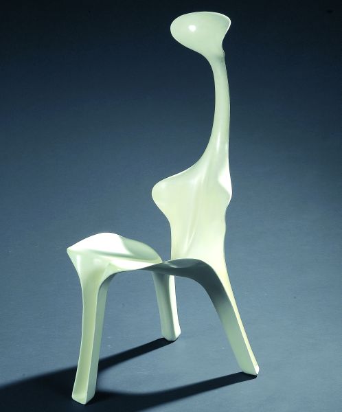
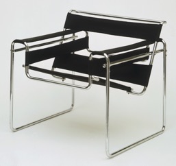
 Picture 1: The Wassily Chair (Model B3)


Marcel Breuer

Wassily Chair (Model B3)

1927 – 1928


Medium:

Chrome-plated tubular steel and canvas

Dimensions

28 1/4 x 30 3/4 x 28″ (71.8 x 78.1 x 71.1 cm)


I still remember when I was a child the furniture of my uncle was always in the way. I couldn’t play with my toys because of the strange shimmering steel frame that was blocking my way. As I grew bigger and bigger I found out that the frame was part of a chair, but not a very comfortable one. I climbed the chair, but my legs got stuck between the spaces of the frame. The only thing that went on in my mind was, why the hell would you buy a chair that’s not comfortable at all? Later I found out that the annoying thing that was blocking my playground was a part of the chair that I now recognize as the “Wassily Chair” made by Marcel Breuer in 1927. A chair that symbolizes modernist design.

stoel 2

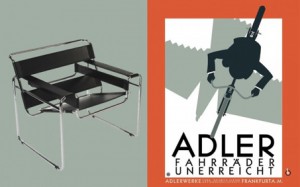
Picture 2: Reclameposter from the bicycle brand Adler, the brand from the bicycle on which the chair is inspired. 

 
The story goes that Breuer often rode a red bicycle and that this inspired him and led him make the most important innovation in furniture design: the use of tubular steel (Picture 3). Strong and lightweight. Perfect for mass-production. A model that is based on the traditional overstuffed club chair: but all that remains is mere the outline. In this way, an elegant composition of gleaming steel arises. The seat, back and arms seem to float in the air. An interesting tension between heavy and light is created.

stoel 3

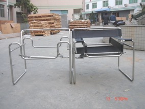
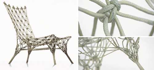
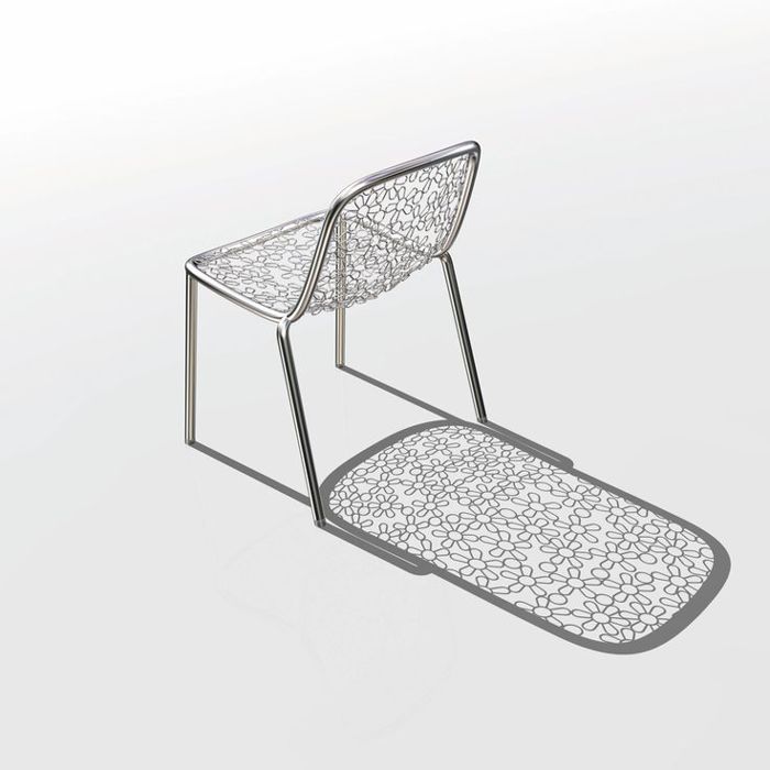
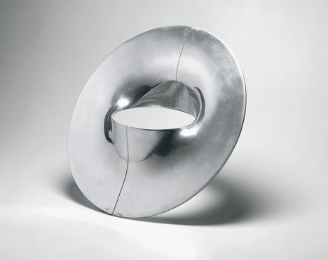
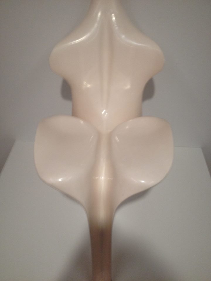
Picture 3: The “exposed” chair

By scrolling over the internet, I found a picture that really catches my eye. On this picture (Picture 3), an “exposed” version of the chair is showed. The photo makes me curious, I want to see and touch the steel and throw it and feel how heavy it is. See what happens if you turn the frame around, would it still be a chair? It looks a little bit ridiculous. In my head, it looks like a tool for a playground, or a tool to work-out with, no wonder that I got stuck. But at the same time, it looks fragile and light, and the shiny steel creates an effect of a mirror, it reflects the surroundings. All of this creates the feeling as if the completely chair doesn’t exist. The feeling that I had as a child, by almost disappearing in the chair pops up in my head. The feeling of exposure, getting stuck between a frame that is almost invisible, in other words a human trap.

Breuer himself spoke of the chair as “My most extreme work… the least artistic, the most logical, the least ‘cosy’ and the most mechanical.” And he was probably right.

stoel 4

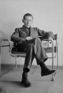
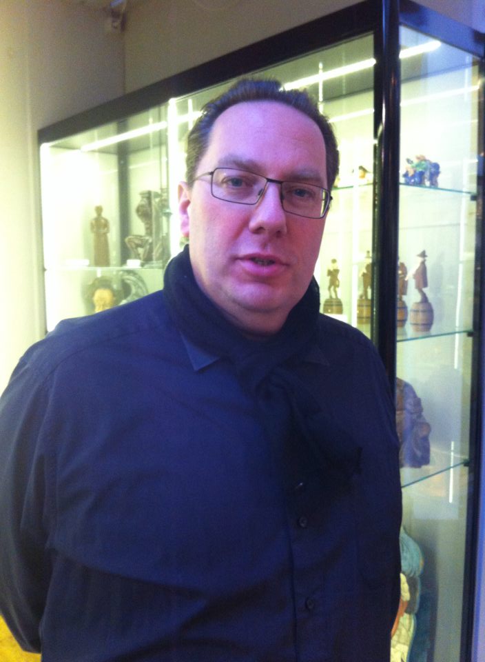
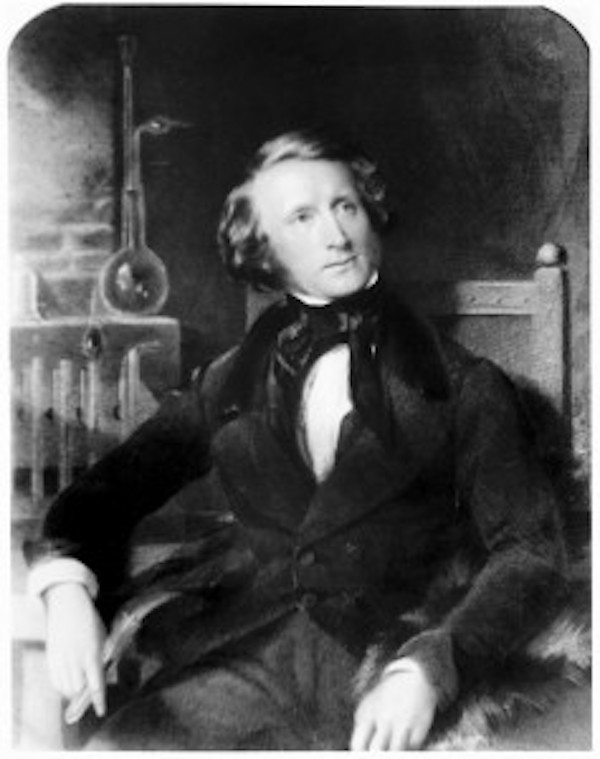
Picture 4: Marcel Breuer on his Wassily Chair

The chair is part of the style of Bauhaus. Which is part of the Modernism movement. Modernism is a term widely used, but rarely defined. We live in an era that still identifies itself in terms of Modernism. The buildings we inhabit, the chairs we sit on, the graphic design that surrounds us have mostly been created by the aesthetics and the ideology of Modernist design. The term refers to something that is characteristically modern, of its time. “The New”, “forward-looking”. In the designing world, it can be defined as: “Modernism is not a style, but loose collections of ideas.” It covered a range of styles, spread along different countries. But all those sites have in common that they were espousal for the new and mostly rejected history and tradition. An utopian desire to create a better world, to reinvent the world from scratch. Belief in the power and potential of the machine and industrial technology. Where there is a rejection of decoration and ornament. And a belief in the unity of all the arts. Most of the principles were frequently combined with social and political beliefs, which held that design and art could and should transform the society (Wilk, 2006), and by this raise the standards of living for all people [x].
It’s a global architecture and design movement emerged in the 1920 as a response to accelerated industrialization and social changes. By using new materials and advanced technology. It emphasized function, simplicity, rationality and created new forms of expression with a new aesthetic. Building and design can be recognized by use of clear lines, geometric shaped, cubic forms, windows, flat roofs and functional flexible spaces (Poursani, 2018).

The Bauhaus movement, started as a design school in 1919 by Walter Cropius, Mies and Marcel Breuer, Wassily Kandinsky and Paul Klee. They combined technology, crafts with industrial production to revitalize design for everyday life (Poursani, 2018). They thought that ‘new machine age’ demanded a new way of living and a new architecture with new materials as reinforced concrete, steel, and glass (Poursani, 2018). Their design principles, such as simplicity, rationality, functionality and universality, would change the world (Poursani, 2018). Their mission was to create a functional design with the principles of fine arts. Faith in new technology convenience and the promise of a better life. New materials brought new possibilities, break with the conventional forms, and use traditional and modern materials that show the possibilities of the modern industry. Functionalism is priority. Production for everybody a fact.

stoel 5

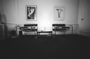
Picture 5: The Wassily chair in its “natural” habitat 

When I was able to climb the chair, I got stuck between the frame made out of steel. The space between the black leather and the frame was something where I got lost into, and my body didn’t know how to findrest in this chair.  The leather seat turned into a slide, and the chair became for me more an attraction then an object with the function of sitting. A labyrinth of body, steel and leather, or maybe a hybrid creature seen from far away. Where the object and the human became one, or where they are maybe to different.

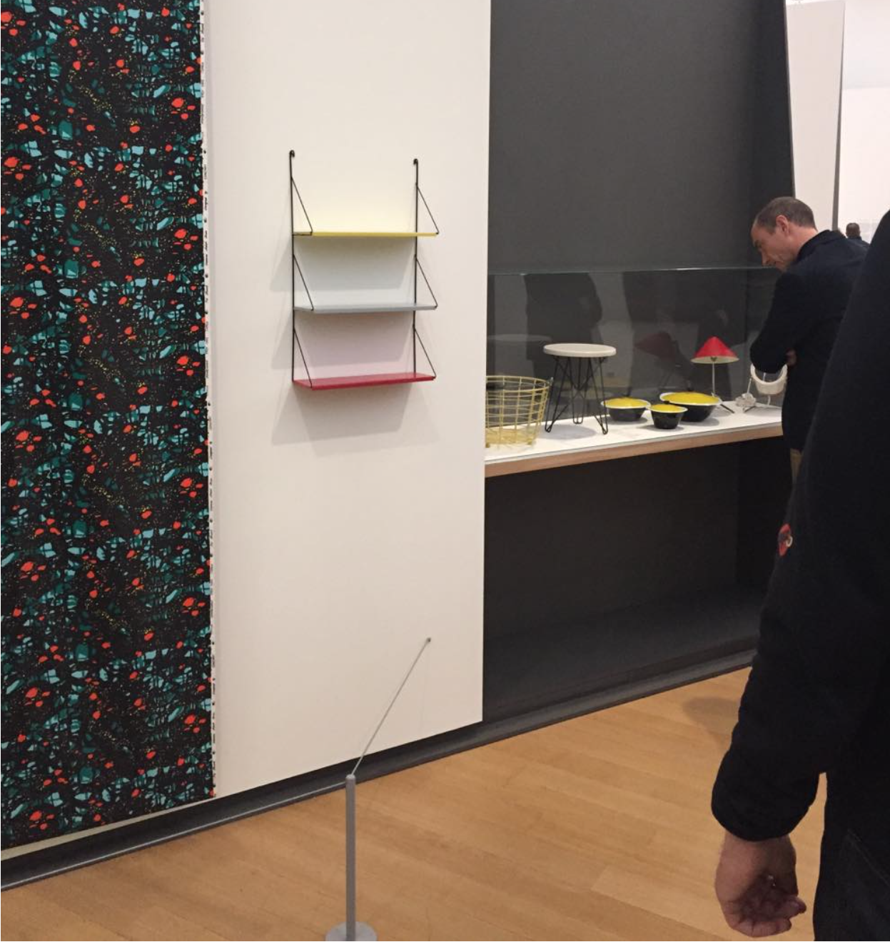
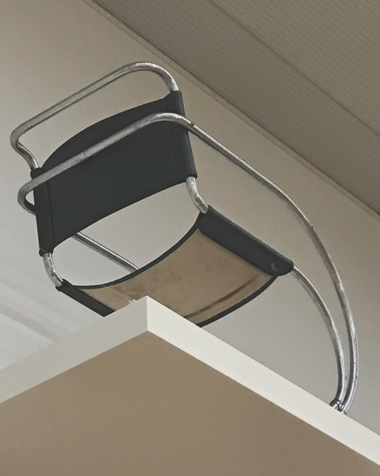
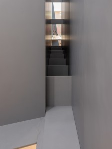
Seeing this chair in the Stedelijk, brings questions to the mind. For example, by placing the chair in the museum, its uniqueness is accentuated. But do cheap reproductions destroy this feeling of uniqueness again? Does the space where the chair is placed have influence on how we look at it? The function of the chair is faded, by placing it really high and not as how it should be (picture 6).

stoel 6

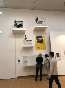
Picture 6: The floating chair

Could you speak of design for “everybody”, when the price of a “real” Wassily chair is “almost” unaffordable. Does the contrast between functionality and comfort, make the chair a utopian idea?

stoel 7

Picture 7: The Rising Star (prize wise)

By designing an object, such as a chair, the tension between the user and the object is important. There seems to be a confusion between things that are designed and who is going to use it. There is a risk that design can be over-determined and this creates not enough space for the user to act and improvise on the object. Knowledge about people, capabilities and needs and desires is required. It seems that there is a misunderstanding in the way that the intention seems to design the user experience, but this doesn’t make the user the subject of design. By the design of the Bauhaus form became subordinate to the function. Design became not only a matter of forming objects, but increasingly a matter of how ways of use and even ways of living can be designed and in this way, it turned into designing with a social agenda. This clearly state an ambition of social transformation. But by now we know that while the social aspects of the modernist project may have been ambitious, they did not necessarily succeed. Misfits between the intended and actual use, and the user’s understanding is something that exist, but this doesn’t need to mean that they are not necessary to have. Misfits can bring new knowledge on what can be improved. Also by designing you’re in a sort of way predicting how the object will be “used”. But this doesn’t mean that it will work out in this way. Communication between the user and the designed object is based on understanding and interpretation, misunderstanding can also be seen as a point of this. It’s in important to understand that people are active parts of the system and not only a “user” because they are turned into an object. By designing it’s not possible to making people fit into systems, societies and strategies. People are fluent and flexible, such as their taste, needs and desires.And besides that, people are moving creatures, changeable, and different. Creating something that fits all of them is a beautiful utopian idea (Redstrom, 2005).

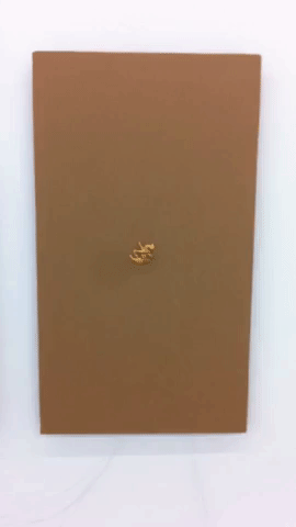
Back to the chair again, a couple years ago I found out that the chair from my uncle had disappeared from the room. The space of where the chair ones was located is filled with some new interior stuff. Something soft, more colourful and bigger. When I asked my uncle where the chair went he said that he had put it with the trash (picture 8). Not even tried to sell it, because according to him nobody would have been interested. Maybe this was something that should have happened. How my connection with the chair started as an annoying object turned into a fascination for the weird structure. But how the chair in the house of my uncle turned from something functional to something that was not interesting anymore.

stoel 10stoel 11

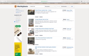
Picture 8: Life of the Wassily chair


Modernist had a Utopian desire to create a better world. This they frequently combined with left-leaning political and social beliefs that design and art had the power to transform society (Lodder, 2006). The word utopia is taken from the Greek and literally means both nowhere and a good place. An impractical scheme for social improvement, an imaginary and indefinitely remote place, an ideal place or state. Something that is described as perfect, but from what you know is not possible, it’s more like a beautiful dream (Collins, s.d). Nowhere and a good place is an interesting point, because in my eyes there are contradictions from each other. A good place can exist, but maybe it’s then subjective. For example, the house of my parents is a good place to me. But nowhere only seems to exist in words. It means to no place, the state of nonexistence. So actually, it’s not there, but a good place can be, can exist. The chair makes clear that the faith in new technology is a usable for creating new objects, and in this way the step to a better life is maybe made. But the chair makes also clear that the “right” object doesn’t exist. By making the chair, an idea, an ideal, a dream, (a good place), is created as an existing object. But because the chair doesn’t completely function as a chair for all the people, because of taste, price, function and discomfort, and new materials and development of technology. It makes clear that the perfect “chair” doesn’t exist (It’s nowhere). Time is a huge disturb transmitter. Technology and innovations are changeable. Besides that, humans and their needs and desires are not predictable, stable and universal, and this makes it impossible to create an object that suits all and is timeless. The chair is the symbol of modern design. Progress is the realization of Utopias, and by creating this chair at that time a little step towards a utopian dream was made. And a progress starts with a strong idea, that then is made in practice. So maybe the outwork and how it is used doesn’t need to be perfect, and we only need a Utopian dream to move forward in making new things.

It’s interesting to see how a chair can be placed in a museum, but at the same time can be sold on Marktplaats just for 100 euros (Picture 8). How easy it is to own an “extraordinary” piece. But also, how fast you don’t want to have it anymore. When I walked in the Stedelijk, the only thing that I thought was, why are those chairs so high, I want to sit in it and try them out. Untill I saw the Wassily chair, because it gave me so much memories of my childhood. Ofcourse the chair made me more curious to try out than any other, but at the same time the “special spot” in the Stedelijk is the “special spot” that the chair deserves. The untouching, unreaching of the chair, by placing it this high, reminds me of the fact that as a child I couldn’t climb the weird steel thing. And this “unreachable” value of the object as a child I now have when I walk into the museum and this is for me a beautiful annoying feeling.

A dream that started as a functional designed chair for everyone, made of new materials. Unity of all the arts, and principles combines with social and political beliefs and raise the standard of living for all people. A step to a utopian dream. Realized and made, fitted for a living room, but where slowly the function and the appreciation faded. Just as the visions that inspired the creative figures were dreams based on the technological potential and the social experiences of that time. Maybe the chair cannot be seen as a symbol of modern design, but as a symbol of the progress to realization of Utopian dreams.


References:

Collins Dictionary [Online] / aut. Collins // Definition of Utopia . – 17 02 2018. – https://www.collinsdictionary.com/dictionary/english/utopia.

Modernism in Architecture: Definiton and History [Online] / aut. Poursani Ela. – 10 02 2018. – 2018. – https://study.com/academy/lesson/modernism-in-architecture-definition-history.html.

Searching for Utopia [Sectie van boek] / aut. Lodder Christina // Modernism: designing for a new world / boekaut. Wilk Christopher. – Londen : V&A publications , 2006.

Towards user design? On the shift from object to user as the subject of design [Tijdschrift] / aut. Redstrom Johan. – Sweden : Elsevier, 2005.

What was Modernism? [Sectie van boek] / aut. Wilk Christopher // Modernism: Designing for a better world / boekaut. Wilk Christopher. – Londen : V&A publications , 2006.


From death to Life with Baas


Wednesday, February 21, 2018

I found « Clay furniture » by Maarten Baas really interesting as a design object.

Clay furniture chairs and table

First of all, I noticed the colors. Afterwards, the shapes.

My first impression of the piece was that it was more similar to a three dimensional drawing than to an object in space. It has very clear lines and really simple shapes. I like this work because, more than just being a practical, usable furniture, its unusual nature made it seem more like a work of art. Even if this artist is first of all a designer.

Maarten Baas tried to build (handmade) objects that remind of a part of the human body, I saw that when a man sits on a chair he becomes one with this chair. He was inspired by the human body to give a unique shape to his furniture. In this way they become like extended molds of the human body.

These chairs are not so different from classic ones (which the generic shape we would expect from a chair), although his purpose was not to recreate the classic chair.  He designs it spontaneously made of industrial clay.


Clay 3 furniture


The colors used aimed to give life to these objects. Maarten Baas changed the nature of a stool and a chair. It’s not just a chair or a table, but something we are going to live with.

 Quite ironically, Baas has tried to bring life by torturing.

SMOKE

Going from decomposing a ready made to creating an artwork in its whole, with his graduation project called « Smoke » at the Design Academy, metamorphosis remains the link to his works.

First he buys ready made furniture, which he destroys to create his own. From life, he uses death to give birth. Cutting, mutilating, burning, he ends with the suffocation of the object by applying varnish, letting the object remain what it has become.


maarten-baas-smoke


This graduation collection had real success when it was presented in a personal show in 2004 at the Moss gallery in New York, two years after his graduation in Eindhoven.

How successful, he continue his collection by showing it in an exhibition called « Where There’s Smoke… » where he had the defiance to present burning classics designed chairs like the one by Rietveld, Gaudi, Sottsass and others.


Baas Rietveld SmokeBaas Rietveld Smoke in fire


Uncertain, colorful shapes, simple and childish, Baas tenderizes us with his Clay furniture. The proximity with the human body surely does give us a sympathetic effect.

By using clay as his material of choice to create his furniture, it seemed to me that the designer was expressing fragility. The shapes that the clay creates (not straight or parallel lines), adds to this idea of being fragile. Again, I think this refers back to the human body and its own fragility (bones can brake).

I got the impression that the legs were almost moving. It isn’t a very solid shape, not fixed to the floor. It’s a very fluid shape.

small table clay


Torned feet, broken back, Baas plays with this uneven symmetry to destabilise us. Will they dare to?

Although seemingly nurturing with this simplistic and joyful harmony, I wonder if these works really are as sympathetic as they may let you believe. With these harsh, cold materials, what would our bum think when sitting on a chair made of clay with a metal carcass interior? Wouldn’t the fragility of our bones be going through hard times?

Fragility of the human body, fragility of clay. Have we ever wondered if a chair would be fighting our weight? Alike human legs, the chair’s feet seem uncertain. Homemade, this furniture takes a more artistic dimension than that of the classic ones. With these fine drawn lines, as I said above, the air runs through and gives to this chair, this table or this cupboard a lightness that reminds that of a three dimensional poetry. The softness of the paint recovered of varnish gives more comfort to the mind than to the body ; however aren’t they both as important?

This furniture becomes a real nice company. A touching fragility, friendly presence, comforting colors, amusing shapes, childish naivety.


fan clay


Baas works in harmony with space, and finds a way to link his works.

Starting with very gloomy, dusty works, darkness reigns over his graduation work.

Baas has produced a real contrast between his two works « Smoke » and « Clay Furniture ».

A real meltdown of materials, processing and concepts, Baas presents us two projects which have similar use but are visually opposite.


Where order is born is born wellbeing.


Tuesday, February 20, 2018

Alvar Aalto, one of Finland’s most famous people who reshaped architecture and furniture of public buildings on the basis of functionality and organic relationship between man, nature and buildings, is now called the “Father of Modernism” in Scandinavian countries.


He was born Hugo Alvar Henrik Aalto, on February 3, 1898, in Kuortane, Finland (at that time Finland was part of Russian Empire). He was the first of three children. His father, J. H. Aalto, was a government surveyor. His mother, Selma Hackestedt, was of Swedish ancestry, she died in 1903.

Hence, Hugo Alvar Henrik Aalto was educated a lot by his grandfathers. His grandfathers were both very close to nature, one of them was a forest guard. Alvar Aalto has a child use to play a lot in the forest. It was obviously through him that the outdoor world, particularly the forest became so important in Aalto work. The forest with his towering tree trunks and his various rock shapes is a world a constant changing forms which inspired Aalto a lot. Aalto probably found in nature the basic geometrics patterns for his architecture and furnitures.  The forest thought him also that nature is a sensitive ecological system in which men must find his place.

Aalto’s relationship is pretty clear according to the paintings he did as a child. He hesitated few years either to become a painter or an architect. According to his saying, he decided at the age of nine that he wanted to become an architect.

Aalto has been educated in the idea of National Romanticism, the Finnish version of Art Nouveau. Aalto rejected it, such as pretty much his whole generation. However he took one important feature from his predecessors : the idea that his creation should perfectly fit into nature.

Around 1920 a softer version of the strict modernist aesthetic emerged in Scandinavia, characterized by the use of (curved) wood in combination with shapes, colours, and decorations inspired by nature. The resulting furniture arose from the ambition that design should offer both beauty and functionality, and be affordable to everyone.

Aalto rejected a lot of furnitures of his time, he wanted to find a material that makes chairs pleasant to sit in. A lot of Aalto’s furnitures were also inspired by the shapes of nature. He often solved practical problems with abstract experimentation of forms with wood. Aalto experimented with bending a bunch of wood to create chairs.

Through experimentation with wood Aalto discovers specific properties which could be useful of men. For instance, in the interior of the Viipuri Library Aalto created rooms inspired by nature which specific functions. Such architectural solutions as a sunken reading-well, free-flowing ceilings and cylindrical skylights, first tested in Viipuri, would regularly appear in Aalto’s works. Aalto differed from the first generation of modernist architects (such as Walter Gropius and Le Corbusier) in his predilection for natural materials: in this design, « wood was first introduced into an otherwise modernist setting of concrete, white stucco, glass, and steel ».

Aalto’s work with wood, was obviously influenced by early Scandinavian architects; however, his experiments and departure from the norm brought attention to his ability to make wood do things not previously done. He was one of the first architect/designer to be able to find a way to bent wood in order to create theses beautiful organic shapes. Aalto studied architecture at Helsinki University of Technology, however during a large part of his career Aalto created a lot of furniture. Like Le Corbusier, Aalto considered that furnitures and architecture should be a collective and cohesive ensemble that creates order. His experimental method has been influenced by his meetings with various members of the Bauhaus design school.

After traveling through Europe, he was exposed to International Style and soon adopted the natural materials and organic forms of this approach into his aesthetic.

Putting a book on a bookcase


Tuesday, February 20, 2018

I decide to fracture the Stedelijk’s linear path of the new “Base” collection, on a personal/performative dérive, I notice an object, ‘Bookshelf – 1960 – Unknown’ it hangs politely and awkwardly in a small amount of white space in-between a series of wallpaper like paintings by the situationist artist Constant and a collection of Post-War Dutch Design by Jan Van Der Togt. From the bottom up, 3 different coloured rectangular shelves are spaced evenly and fitted onto a thin steel frame, the frame extends an extra 2-3 inches as it curves tightly around 2 nails that are protruding from the wall.The colours, pale reds and yellow and a light grey, a great post-modern colour strategy, they look like faded colours of a Mondriaan.

Screen-Shot-2018-02-19-at-21.00.23

The object was created by the Tomado Company. Tomado is a design company that was very popular in the Netherlands. It has now recently had a resurgence in popularity leading to a very sleek and minimal book being printed called “TOMADO – Van der Togt’s Mass articles Dordrecht 1923-1982” I was very eager to read this until I realised that it was only printed in dutch. The online space were I tried to find sources were also very barren, almost all of the pages where only hosted on Dutch domains that have to get translated via google once you loaded the web page. I didn’t want to struggle with some poorly translated foreign articles so I decided the only way I could get into true contact with this design was through…

1)The Museum – An easily accessible yet unreal space.

2) People – People have experienced real space, people are harder to access. People don’t have large doors where you can enter and exit.

I had heard from Dutch tutors and Dutch friends’ mothers about small experiences with Tomado and offcuts from its history, from what I patched together, Tomado created must have furniture in post-war dutch life because of how cheap it was to produce and purchase. With the popular flat pack system being championed by IKEA at the time, Tomado began to follow suit and made there furniture nomadic; it was easily transportable outside the house AND due to the design only requiring two nails, it became easy to transport in the inside spaces of the architecture. The Netherlands was also greatly improving it’s social housing meaning that instead of families living together in one room, the members of the family dispersed into the different rooms of the house. Children for the first time ever had their own rooms, and with that their first design objects, their first Tomado.

I wanted to see the object in a different space, I used the city for this. Armed only with a creased A4 photograph of the mystical bookshelf and the phrase “Ik spreekt Engels?” I started looking for Furniture stores. I spotted my first piece(s) of tomado furniture accidentally in the window of a coffee shop.

unnamed1

The whole inside wall was littered with the same tomado shelf, around 15 of them, they were hung in a way so that it emphasised the logo “DIGNITA” in thick two-line wall lettering. On the shelves there were bottles of prosecco and cacti that were way out of the reach of any human to grab. This reminded me a lot of how the Stedelijk had exhibited the furniture, it was devoid from any human interaction. I asked where they got the Tomado from and they gave me directions to Overtoom. Here I met a nice Dutch woman who said she does have Tomado objects in sometimes, but it usually goes within “seconds”. I asked her if she used to have any of the furniture when she was growing up and she replied “fuck no” and then said “I hated it, but if you didn’t have it you always knew someone who did”

I now find my self lost in a strange space, it’s a gallery. There is a lot of shitty materials lying on the floor and hung on the wall, curled up straws, large pieces of cardboard and a lot of plastic jelly. I become aware that everything moves in some way, either attached to pistons or to small motors. I go back to what I thought was just some cardboard and I see a small toy camel being spun 360 degrees by a motor. After staring it for around 1 minute I realize I am a camel. Like the camel has a dessert, I have a city, I have to go to different sources to pick up information which leads me to the next source. Through these sources I am given GPS coordinates that I must travel with. I am self sustainable as I access my pocket satellite which I can replenish at different Café’s, I pretend to be a customer and instead siphon their wifi, After I am quenched and have loaded the web page, I travel the city again.

giphy WillemPoos

Eventually I found an antique fair,  after showing my piece of paper and saying the magic word beginning with “T”. I was soon led to meet a man called Willem Poos,

Willem talks to me about how he likes to go to England to buy Tomado furniture and sell it in the Netherlands. He clearly has a passion for this stuff. He also had the bookcase when he was growing up and he said he remembered very clearly that he had a book called “Wim is Weg” translated as “Wim (short for Willem) has gone” I then had the idea of returning to the Stedelijk (the only place I knew the object was) and activate its function as a bookshelf.

I found that the only place selling it was in ‘De Bijenkorf’  an Expensive Dutch mall. The building looked different to how it did when I googled it, it was now encompassed in a outer layer of scaffolding, it wasn’t stable in the real world nor was it stable in my memory. I found the book inside and left for the Stedelijk.

Bijenkorf Wim is Weg

I returned to the fabled bookshelf and upon seeing it I realised this design was placed here because it wanted to be appreciated as a design, yet I found this hard to do as it had no function in the gallery context. It existed as how you would see a photograph of furniture in a catalogue, something that could fit into an empty hole (literally, as in a hole in your apartment) in your life. What I wanted to do was reinsert a personal experience ‘thing’ to make the bookshelf into a design object again. And then I put a book on a bookshelf it stuck out a funny angle with around 2 inches hanging off the edge.

shelve-with-book

it didn’t really fit.


Design and Pattern


Tuesday, February 20, 2018

Pattern, cell of design

Blog_MarcelWanders_Knotted

Living creatures have evolved as a result of adaptation to daily environment surrounding them. Creators are often inspired by those forms of nature, which is not only aesthetic but also functionally appropriate. So some design objects get to resemble living things. Looking into them deep, we can perhaps find that they both have a powerful element which does not appear on the outside at first glance but still has its influence on the overall appearances.

It is the cell that constitutes the whole body, which also can be called the pattern in design. The knotted chair of Marcel Wanders, made in 1995, shows good example of 3D pattern design. One unit that makes up the chair could have been no more than a twisted line, but it acquired more durability when several units are gathered and patterned under the certain and repetitive rule. (Of course, there was a process of hardening with thermosetting resin.)

It is also noteworthy that a cord, which is not very expected material for furniture, was used to make a chair which can withstand loads over 100 kg. Could this be possible if there wasn’t composed unit with consistent rule? Apart from this, how Teo Jansen could achieve to make kinetic sculpture that shows flexible movement with hard wood? I think a patterned design allow creator to be able to explore the materials and thereby can have its own texture. I would like to mention ‘knotted chair’ as one of the designs that can provide us with vision and tactile sense simultaneously on the basis of its pattern.

To continue with the research on connection between ‘design’ and ‘pattern’, I come to ask first,

“What is pattern?”

Then, look up the dictionary definition of the word-
Pattern is a particular way in which something is done, is organized, or happens; is any regularly repeated arrangement, especially a design made from repeated lines, shapes, or colors on a surface;

The word ‘pattern’ can be regarded as the particular way something is generated or as the regular arrangement that include continuous rules inside. What I can find from those selected meaning of the word is that; whatever we call as pattern has to have regular and repetitive factors, which makes it predictable, organized, and look stable.

So, what does pattern mean to art and design?

It could be one of the foundations that construct the way we see the image as well as deliver it. To explain this, let’s look at a few principles of design. The formative elements such as dot, line, surface, shape, matter can be said to be materials that is used to create image or object. Here, the ways we arranged those material- principles of design- are involving. Some of them are unity, repetition, harmony, rhythm, symmetry, balance, proportion and so on. Each of them, at some point, is related to allowing materials to look similar and coherent. We intentionally or intuitively use those principles for organizing a clear image to deliver our message efficiently. At the same time, our eyes receive those similarity, without even noticing it, and store it as groups in our mind. Therefore, we can realize that discovering the coherent image and patterning it is the basic method how we perceive visual information.

Pattern on 3-dimension

My research have had more focused on pattern in 3D design object than any other kinds of art pattern. It is not only because that the starting point was the knotted chair by Marcel Wanders, but also dealing the pattern in terms of its relation with object’s shape and texture are worth to watch. With the development of technology, more than any other times before, designer can now easily explore the new materials and create their very own way to use it.

Marcel Wander’s various way of using pattern are illustrated well with Knotted chair, Crochet chair, Flower chair, Cybrog chair and Cinderella broke A Leg bed.

821be91a43c3d0dc3e0ea27b8822ffdcefb3e95d-dbc1-4cbd-9a72-788286daacb1
Modern-Black-Bed-480x410Black-Beds

Earlier, Alessandro Mendini used his fabric pattern on the baroque style chair, Magis Proust. By seeing the pattern as ornament, he was marked as the one of those leading the postmodernism. In this case, ‘pattern’ became the mean to deliver the designer’s concept.

Cappellini-Proust-Geometrica-Armchair

Then, Zaha Hadid presented her colorful patterned furniture, Tide, at 2011 Milan Design Week. This work obviously shows the great promise of using pattern in design. The symmetric shelving module that one can create different compositions through rotations on itself allows individuals to build and rebuild the module to fit the space around them.

tide02

Last but not least, I would like to refer that 3D pattern is also opening the door from craft to industrial design. 2D pattern design can be easily processed and completed on the screen while 3D pattern still needs to be experimented by hands at the first stage, especially if it is for the furniture or architecture that should ensure the stability. For example, the Knotted chair of Marcel Wanders is actually known as a result of handwork knot. Creator, as a human, they also make mistakes, sometimes do fail but later approach the point where they can create the most safety and aesthetic cells. This process is happening with hands. So I can see that link between handwork and industrial design is generated if the design happens under the conditions that need to be experimented and proved before it is systematized to be a mass production.

So far I looked through the definition of pattern and the how important it is on the art and design field, especially with the context of design objects. Also I found that how differently each designer handle the concept of pattern. Some of them would use it as their identity, other see it as a way to express their design philosophy, and another can develop it to interact with users.

At the beginning of the post, I made a connection between ‘cell’ and ‘pattern’. Just as the cell breath, nourish and endure the living body, pattern also function as indispensable part of whole (design object). It can be always developing and has endless possibilities, because there are still numerous ways to make a new rules and compositions out of it.

Back to intimacy


Monday, February 19, 2018

When visiting a museum, it is often hard for me to decide what to find more intriguing: The exhibited artworks or the visitors walking carefully among them, observing them. Hardly ever do they physically touch, or if it happens, then in shyly hidden ways. Especially when it comes to everyday design objects, there seems to be a big gap in between the visitors and the exhibited pieces, which are locked away from their original function: to be touched and used. During my last visit at the Stedelijk Museum there was for instance a person standing for quite a long while infront of a vitrine where, in between other objects, Kaj Francks „Kilta Services“ was being exhibited.

Franck was one of the designers who developed the „Iittala philosophy“: creating design that is both beautiful and functional, and lasts a lifetime. „Does not ‘beautiful’ ultimately mean necessary, functional, justified, right?“ (Kaj Franck, 1978)

In the center: service „Kilta“, glazed ceramics, production in 1953 – 1975, designed by Kaj Franck

In the center: service „Kilta“, glazed ceramics, production in 1953 – 1975, designed by Kaj Franck

The person looked at the plates and cups inside, slightly leaning against the glass that was separating him from the objects. Why was he so attentively watching them? The longer I observed the visitor observing the tableware and the distant space between them, the more I started to think the glass vitrine away and imagined him having a real physical experience with one of the cups instead: the two being naturally rejoined, exchanging what is deep inside.

‘He holds the cup that is filled with tea, leads it towards his mouth and drinks from it. The content flows in one direction which is his interior. Luxoriously he sucks the liquid inside and the cup seems to be very willing to feed him.

“The cup is the drone of the ceramics world, perhaps the hardest working of vessels and the least appreciated. In the grandest of tea or coffee services, the cup is usually the most underdesigned object, playing the role of subservient pawn to the teapot’s queen.“ (Garth Clark, „The Book of Cups, Abbeville Publishing Group, New York, 1990, p. 17)

He drinks everything of it until it is empty. But it still contains the warmth of the hot drink, as he inserts his finger he can feel it. For a short moment they contain the same warmth, the cup and him: he contains the warm tea and the cup the rest of warmth of the tea.

„Close space! Close the kangaroo’s pouch! It’s warm in there.“ (Le Temps de la poésie, G.L.M. July 1948, p.32)

cup, Service "Kilta", designed by Kaj Franck

Service “Kilta”, designed by Kaj Franck

He shouts into the cup and holds it close to his ear: he hears a distant echo. The echo vibrates a few times and is gone. He holds it close to his breast and feels that it is vibrating synchronously to his heartbeat.

„When we evaluate everyday objects, we should place more emphasis than we usually do on ergonomic quality and tactile sensibility“ (Kaj Franck, 1978)

He fills it with tea, looks at it and it is roundly opened as if it was calling him. He lifts it towards his mouth and his lips connect to the cup. They softly touch and his tongue reaches the wet content. Then the kiss becomes wild.

„Many a slip twixt cup and lip“ (Garth Clark, „The Book of Cups“, Abbeville Publishing Group, New York, 1990)

service „Kilta“, designed by Kaj Franck

Service „Kilta“, designed by Kaj Franck

After finishing he cleans the cup. The cup is very deep, so it is hard for him to reach the ground. He cleans and dries it with care and attention, outside and inside. That makes the cup shine and renews its promissing interior.

„A house that shines from the care it receives appears to have been rebuilt from the inside.“ (Gaston Bachelard, „The Poetics of Space“, Beacon Press, Boston, 1994, p.68)

Afterward him and the cup are cold and empty. He looks around and decides to continue drinking from it: what comes out is sweet. He feels a strange feeling that is increasing and expanding inside of him. It tickles him in an unknown place and he bursts into tears.

„Moreover the cup does not have any immediate sense of drama (…). But that does not mean the drama is absent, rather that we need to examine the cup a little more closely and consciously to discover its sense of domestic theater“ (The Book of Cups, Abbeville Publishing Group, New York, 1990 p. 19)

     "Venus von Willendorf", 1963, by Otto Piene, oil and soot on canvas

“Venus von Willendorf”, 1963, by Otto Piene, oil and soot on canvas

His tears keep on falling inside the cup. It takes more or less three seconds for the first teardrop to reach the ground, the noise sounds far. When the cup is filled with tears he is still crying. He looks inside and sees his face inbetween reflections of light.

„My cup runneth over“ („The Bible“, Psalm 23:, Ezekiel 34:11-24; John 10:1-21)

Suddenly he grabs the cup and throws it against the wall…’

service „Kilta"

service „Kilta”

„A kind of cosmic anguish precedes the storm. Then the wind starts to howl at the top of its lungs. Soon the entire menagerie of the hurricane lifts its voice.“ (Gaston Bachelard, „The Poetics of Space“, Beacon Press, Boston, 1994, p. 44)

As I awake from my daydream, the visitor of the Stedelijk Museum is gone, leaving no trace of evidence for what in different circumstances might have happened between him and Kaj Francks „Kilta Services“.


the wearable future


Monday, February 19, 2018

Looking at Gijs Bakker‘s neckpiece in the stedelijk BASE exhibition directed me to an intriguing subject: (neo-)futurism. Working together with Emmy van Leersum Gijs Bakker was aiming to make jewellery less frumpish. By making big statement pieces they made jewellery less of a status symbol and more of an accessory to fashion. This was a totally new approach. Jewellery and fashion had not been connected in such a manner before. They were also very futuristic in choice of materials. They chose materials like aluminum, again breaking with the crafty connotation jewellery had, and with the jewellery as a status symbol since the material was cheap and easily produced, making it available to the masses. Them revolutionizing jewellery made me wonder what a new form of futurism could be, in what ways we could reinvent jewellery nowadays. A huge amount of sub questions arose that I believe should all be looked into when trying to reinvent jewellery. Here I name a few. Could contemporary jewellery serve a social function? How could we reinvent the material (I believe this was vital in the futurism of Gijs Bakker’s jewellery)? How could we bring it to the masses? In this tiny research I only slightly touch the surface of these complicated matters.
The-Gijs-and-Emmy-Spectacle-exhibition-at-the-Stedelijk-Museum_dezeen_3

the neckpiece by Gijs Bakker


Material future

When it comes to innovating material a lot of exciting things are happening. We are living in a time of rapid development of technology. New findings could be integrated into contemporary jewellery design. Renewing the world and meaning of jewellery altogether. Structurally changing the current function of jewellery or enriching it by adding an interactive aspect. In contemporary jewellery many materials are being used. Such as fabrics, when we look at fabric a lot of exploration of means of energy storage is taking place. To get an interactive piece an energy storage is vital. Researchers are doing a lot of research in finding ways to make fabrics store energy without losing wearability. Think for instance of yarn batteries, sources of energy being 1D-yarns that are woven to construct the fabric. Imagine the possibilities! The technical aspect is quite intricate but if you are interested there are multiple articles available online. Overall there are still many problems with washability and there are safety issues but it seems to me like an inspiring look into the future.


untitled

in example b you can see the so-called 1D-yarn


Social participation

Can we start to discuss questions in modern day society through the medium of contemporary jewellery? I found some interesting insights in an essay written by Rebecka Huusko-Källman. Jewellery can be seen as very mobile as it is made to be carried by our bodies, therefore it can be considered a great medium for conveying a message in all kinds of environments. As you leave your house the jewellery does too. 'Moving around in social contexts, jewellery operates between the personal and public space, it has a unique ability to interact with the viewer.' (den Besten, 2012) However Liesbeth den Besten also states that contemporary jewellery -making statements or titillating to the point of discussion- often only moves around in small circles. The mass does not have the access and/or does not seem as interested in these kinds of contemporary wearable objects. Another issue is the fact that the contemporary jewellery being displayed in galleries can make it seem like merely a commodity and thus not a subject of reflection or discussion. Whereas on the other hand displaying the pieces in museums can separate the viewer from them, through its significant context it’s isolated. Lastly, the masses often fail to read the meaning of the works, the ‘language’ through material and form seems remote and inaccessible to people who have not been initiated into this specific field.


veiligheidsspeld

provocative safetypin 


Economics

To get messages across or start a conversation one might consider the commercial side of it all. The jewellery industry is growing rapidly (according to ‘A multifaceted future: The jewelry industry in 2020’ written by Linda Dauriz, Nathalie Remy and Thomas Tochtermann) it is expected to grow 5 to 6 percent a year. They state that the trends that formed the apparel industry the last thirty years are starting to show in the jewellery industry. These trends being: internationalization and consolidation, the growth of branded products, a reconfigured channel landscape, ‘hybrid’ consumption, and fast fashion. From these findings we could conclude a couple of ways of getting into the public eye. First of all branding is on the rise so really strengthening a brand or producing via a brand can make reaching the public easier.Secondly using the online platform is important. The article says: 'According to a recent McKinsey survey, two-thirds of luxury shoppers say they engage in online research prior to an in-store purchase; one- to two-thirds say they frequently turn to social media for information and advice.' Thirdly there is a supposed ‘hybrid’ consumption which means consumers either buy more quality orientated ‘fine’ jewellery or the cheaper ‘fashion’ jewellery. The article recommends the following: ‘Fine jewellers might consider introducing new product lines at affordable prices to entice younger or less affluent consumers, giving them an entry point into the brand. Fine-jewellery players could decide to play exclusively in the high end and communicate that message strongly through its advertising, in-store experience, and customer service.'

Het zijn net mensen


Monday, February 19, 2018

Ze lijken niet op sieraden. Ik had het ook niet geweten als ik het niet wist. [x]
Een blaadje met foto’s, die vrouwenlichamen afbeelden. Ze dragen een soort ringen, vormen, objecten, onder hun strakke kleding.
Links naast de afbeeldingen liggen metalen voorwerpen. Ze lijken op gebruiksvoorwerpen. Gemaakt vanglimmend metaal. Aluminium. Ze zijn breed, robuust. Ze zijn grof, niet sierlijk. Niet sieradelijk. Ze noemen het een hoofdsieraad, een armsieraad. Dan kijken we terug, naar onze vrouwen. Met hun ringen aan. En ik vind het intrigerend hoe zij daar staan. En wat ze aanhebben. En waarom je dit ooit zou dragen. Maar de boodschap is duidelijk. Sieraden te dragen onder de kleding. Waarom heb ik daar nooit aan gedacht. Het is zo simpel en daarmee mooi en klaar. ‘’Klaar’’, vind ik precies het goede woord. En ‘’gladgestreken’’ of ‘’rond’’, want dat is het voor mij. Zo voelt het voor mij als ik ernaar kijk. Ik zou het willen aanraken. De onbuigbare ringen. Zelfstandig zijn ze, onder het rekbare textiel. Ze beïnvloeden het textiel, de kleding, van binnenuit. In plaats van een toevoeging, een accessoir, veranderen ze het kledingstuk. Ze worden deel van het kledingstuk. Niets erbij, gewoon anders. Een verandering van binnenuit. Vanuit de kern, het hart.
Vijf kleine fotootjes achter glas. Je ziet niet meteen wat het is. Het valt niet op. Wat jammer is. Maar ook wel toepasselijk. Want als je het eenmaal ziet. En als je eenmaal weet waar je naar kijkt. Is het indrukwekkend. Art & Bulletin 25, 1970, staat er op het kaartje. Ik had het niet geweten als ik het niet wist.
93.Clothing-suggestions2.1970  93.Clothing-suggestions4.1970

Je zou de sieraden onder de kleding door Gijs Bakker en Emmy van Leersem als een niet-permanente vorm van bodymodificatie kunnen zien.
Als voorbeeld, een korset. Een korset wordt ook gedragen onder de kleding met als doel de natuurlijke vormen van het lichaam te vervormen. De meeste vrouwen die een korset dragen doen dit natuurlijk om hun taille slanker te laten lijken.
Net als in body modificatie heb je met een korset opeens controle over hetgeen waar je normaal gesproken geen controle over zou hebben.
Controle hebben over je lichaam is een bekend en terugkerend thema in de hedendaagse maatschappij. Op instagram kom je vaak bewerkte foto’s tegen. Meisjes die voor de buitenwereld mooier en slanker willen doen voorkomen dan ze er daadwerkelijk uitzien. In de modebladen zijn ook alle foto’s bewerkt. De onzuiverheden van het model worden weggewerkt. De opdrachtgever, modeontwerper, of instagram-influencer kan voortaan per keer kiezen hoe hij zichzelf presenteert aan de wereld. [x]

Controle hebben over je eigen lichaam is dan ook een belangrijk thema binnen de body modificatie. Sommigen worden in hun modificaties beïnvloed door een niet-westerse of een inheemse cultuur. Zij verlangen naar een meer pure vorm van het zijn. De ‘’moderne primitieven’’ romantiseren inheemse identiteit en cultuur als authentiek en spiritueel. Zij zien traditionele vormen van bodyart als een uitweg voor de hedendaagse maatschappij en de technologische ontwikkeling om het redden van het lichaam en het zelf. Anderen laten zich juist inspireren door de toekomst. De technologie. Hun houding naar het lichaam is postmodern en cyberpunk. Zij mixen tribal en high-tech toepassingen om een hybride stijl te creëren. Ze zien het lichaam als een grenzeloze exploratie en technologische ontwikkeling. Cyberpunt body modificeerders proberen hun lichaam zo te bewerken als hoe ze zich voorheen alleen konden inbeelden in science-fiction. Ze snijden de vraag aan wie medische technologie beheert en controleert, of richten zich meer op seksen georiënteerde politiek, gender ongelijkheid en culturele identiteit. Feministen binnen de bodymodificatiecultuur zien hun lichaam doorgaans als kunst en gebruiken het om te rebelleren tegen mannelijke dominantie en het voor terugwinnen van de macht over hun eigen lichaam.

Begin jaren 90 omarmde modificeerders in het westen vergeten rituelen van inheemse volkeren en dit was terug te zien in hun bodyart. Ze begonnen met insnijding, een gebruik overgenomen uit Afrika. [x] De huid werd ingesneden met een scherp mes om littekenweefsel te creëren. Ook brandden ze de huid met een stempel of speciaal verhit metaal om littekens te vormen. Mensen gingen experimenteren met onderhuidse implantaten, maakten 3D kunstwerken met littekenweefsel, rekten hun oorlellen uit, droegen grotere en meerdere gezichts-piercings. Bodyart werd ook steeds meer beïnvloed door opkomende SM en Fetisj-subculturen met erotica en seksuele vrijheid als uitgangspunt. Bodyart werd beschouwd als een tribaal ritueel, een statement of een erotisch optreden. Later, als een voorbeeld van technologische ontwikkeling. Cyberpunks gebruikten technologische ontwikkeling letterlijk, en als inspiratie voor bodymodificatie.

Het perfecte voorbeeld van een hedendaagse bodymodificeerder is kleurenblind geboren
Neil Harbisson. Screen Shot 2018-02-19 at 18.26.40

Neil Harbisson met zijn implantaat, voorbeeld van een hedendaagse cyborg

Hiermee is de cirkel rond. De sieraden van Gijs Bakker en  Emmy van Leersem kan je als een voorspelling zien voor de cyborgs van tegenwoordig. Met wat er om ons heen gebeurd, veranderd alles langzaam in technologie. Zelfs wij. Dit doet mij afvragen wat de toekomst ons zal brengen. Je kan al pinnen door middel van een chip in de arm. Dit zal zeker niet de laatste, maar zeker helemaal niet de meest invloedrijke verandering van de toekomst zijn.
De telefoon geldt al als een verlengde van de arm. Dat terwijl de armen gelden als een verlengde van het hart. [x]
TEDTALK  NEIL HARBINSSON

Show Gijs Bakker en Emmy van Leersem (filmpje)

€200.000 in one room or €4.000 under my butt


Monday, February 19, 2018

To continue my research (read also my intro), I decided to learn more about other neighbourships in which clay furniture was involved.

There exists a set (clay classic, plain clay, and clay specials) of clay furniture and different elements of it have been exhibited in different museums of the world (you can read about another series by Maarten Baas that really comes in contrast to clay furniture in Maud’s research).

Maarten Baas Paris

In Musée des Arts Décoratifs four rooms were stuffed with different objects designed by the artist. Clay furniture was also there. All these objects put together create an interior and can hardly be perceived separately. They create an atmosphere of a storage room or a flea market. Put so close together so that each object can hardly breathe they lose their individuality and become parts of one slightly absurd impression which he called “curiosity cabin“.

maarten baas clay furniture

Another stop of the clay furniture’s adventure was the Stedelijk Museum of  ‘s-Hertogenbosch. There they were exhibited with other kinds of furniture designed by Marteen Baas placed on a thick white pedestal. Such placement made it look like a warehouse or furniture salon.

Comparing the three exhibitions (Stedelijk Base, Musée des Arts Décoratifs and the Stedelijk Museum in ‘s-Hertogenbosch) I started to pay more attention to the space as one of the important factors of impression we get of these objects.

To explore how else the clay furniture of Marten Baas interacts with different spaces and objects we went on a journey to Groninger Museum in Groningen where this furniture really became a part of the space. There you can find a restaurant designed by the designer and furnished with his clay chairs. As soon as you enter the museum you can see rows of black tables surrounded by green clay chairs with black pillows.

                                                                                                                                             MendiniRestaurant

If you look up you can see red clay lamps lighting the space. If you look at the wall behind you there is an oval mirror with a red clay frame. For people with little children there’s also a red children’s chair standing in the corner.

Being a part of a functioning restaurant the designer furniture faces the most challenging neighbourship – people. Putting design objects into public use creates certain difficulties. You have to follow two opposite tasks at the same time: to protect the piece but still make it usable in everyday life.

And here are some of my observations:
1) Black tips on chair’s legs

clay furniture detailed

After a closer look, I noticed that unlike the chairs in the museums the chairs at the restaurant have these black caps preventing the actual material of the chair from touching the floor. Even though it doesn’t catch your attention, at first sight, it slightly changes the general look of the chair.

2) Pillows instead of clay seats

cafe1

Instead of clay seats of the classic clay chairs, the chairs at the restaurant have black leather pillows filled with some soft material. This modification probably aims to make it more comfortable to sit or to match the green coloured chairs with the black tables but it still changes the object.

3)Regular tables

cafe2

One more thing that really influenced the overall picture was the fact that clay furniture (such as chairs and lamps) was placed in the restaurant with tables and benches of a different style. Maybe it was done to emphasize the clay chairs, lamps and mirrors in the space. However, in my humble opinion, this leaves the impression of the undone design, like it is halfway from being a restaurant designed by Maarten Baas and not a restaurant where apart from regular restaurant looking furniture there are also twenty 4.000€ chairs in one room. I think that if the set of the furniture would have been complete and all the tables and benches would have been made of clay it would have given a whole different impression of the space and the objects themselves.


a plastic world


Sunday, February 18, 2018

When you look around in the modern world, the plastic materials by which it is formed are inevitable to the eye.
From everyday objects like the interior of households and infrastructural facilities to the sex industry and medical surgery, synthetics have become a big part of humans and the human/animal world.
But how did this came to be and what will the future be of this plastic world with its benefits and downsides.


alexander farkefarkesine

(left- Alexander Parkes, right- Parkesine objects ) 


Before plastic became fully synthetic in the way we know it nowadays, cellulose found in plants was the base material for the discovery of modern plastics.
This discovery was made in 1862 by Alexander Parkes who invented the material he named “Parkesine“.
Parkesine was made from in alcohol dissolved nitrocellulose mixed with oil or camphor wax which created a transparent, moldable material which maintained shape after cooling down.
Therefore it was used to make things like combs, stamps, and buttons.
The American brothers Hyatt picked-up this idea and created a variation of this Parkesine in 1869 they named celluloid by pulverizing camphor an nitrocellulose separately, adding pigments to the nitrocellulose, after mixing it was pressurized to remove water and then molded with extreme heat.
It was used as a replacement for ivory, specifically ivory billiard balls.
Celluloid became a great success and eventually made it possible for the film industry to be born.


celluloid film   bakelite factory

(left-celluloid film, right-bakelite factory)


These two inventions can be seen as the ancestors of the modern plastic society, nevertheless, it only came to be because of the first fully synthetic plastic, meaning no molecules that can be found in nature are used.
This first fully synthetic plastic was called Bakelite.
Invented in 1907 in the USA by Leo Baekeland in the search for a synthetic insulator, he found a way to control the condensation reaction of a phenol-formaldehyde mixture and stop this reaction while remaining liquid.
This could be formed into different stages with stage A, the first stage, directly making it into usable plastic.
Stage B, making it into a solid state with the possibility to make it into powder and soften it with heat.
Stage C is where stage A or B are being heated under pressure and the result of this is what he called Bakelite.
Bakelite appeared to be a perfectly suited material for the purpose of insulation as it was heat resistant and could be manufactured in mass-production as it could be molded quickly.

This last fact and the fact that it was fully synthetic opened the doors to a world of mass-produced synthetics, the plastic world we live in.
Soon new materials followed this creation with the invention of polystyrene in 1929 (used for electronics like refrigerators, microwaves and tv, medical equipment and packaging), polyester in 1930 (used for clothing), polyvinylchloride (PVC) (used for pipes, electrical insulation and clothing) and nylon in 1935 (mostly used for clothing and parachutes).


parachutes-255791 platsic fabriek

(left-nylon parachute, right-plastic mass-production)
During the 30’s of the 20th century, these synthetic products were seen as extremely glamorous and beautiful but still, all these materials did not completely infiltrate society during that time.
While used for a lot of military equipment during the second world war, synthetic products really became part of everyday life after the end of the war when the manufacturers of plastic products had to find a way to stay in the business and therefore aim at people and everyday life. Because of the low price, moldability and the way it could be mass-produced, it is not more than logical that plastic became such a big leading part of the capitalist consumer society.

Gueules cassees, Soldiers with severe facial injuries, First World War (photo)  brazil85

 (left- WW1 plastic surgery, right-plastic surgery movie brazil1985 )


Like the plastics, humans are moldable as well, changing along with new inventions. During the same period as the development of synthetics, doctors were forced to find a way to repair the extreme damage done to soldiers during the first world war.
Never before had there been so many heavily wounded soldiers whom all needed treatment for their facial wounds, burns and lost limbs and with the development of anesthetics, surgeons could develop new techniques without the patients experience pain during this operation.
Yet the use of plastic surgery for the beauty industry really kicked off in the 1950’s when the first breast implants were used to enlarge the female breasts.
This was done by injecting it with the liquid, synthetic plastic called silicone and in the 60’s by implanting a bag-like version.
In the 70’s liposuction (removing fat) was developed and not long after that botox was tested on humans for the first time.
Botox temporarily relaxes and smoothes wrinkles by blocking signals from the nerve to the muscles, this gives the user a smooth, young and Barbie-like face.
With this slow infiltration of plastics into the human body, the birth of the plastic human became a fact.
Largely stimulated and promoted by the cosmetic glamour industry.


platsic waste plastic ocean

(left- plastic waste mountain, right- plastic ocean)

Due to this rise of plasticity, synthetics slowly took over the world.
The waste created by the plastic consumer society has already created big islands in the ocean intervening with the animal and human world, fish-eating tiny plastic particles, humans eating fish.
Entering our body through food and cosmetic products, plastics are now even detectable in our blood influencing our hormones.
Humans becoming deformed from natural appearance due to cosmetic surgery in their striving for perfection, plastics infiltrating our body and system and the extreme use of plastic products in modern life could in my opinion only lead to the beginning of a more extreme, new plastic human being disbanded from its nature.

floris Voor

(left/right- Floris chair)

To me the in 1968 made Floris chair by Günter Beltzig, which was the starting point for this research, is the perfect example of what has happened and may come.
This chair is made out of fiber reinforced plastic and molded into an alienated human shape which could only have happened because of all the developments and inventions mentioned in the first paragraphs of this research.
The shape of the chair gives the impression that it is a plasticized human being or at least that it is made for such a human, as it seems to be made for a specific kind of person.
Like with the shoe of Cinderella, it should fit perfectly to be a match and not to lose all its comfort.
Is it not possible that it is the plastic ‘perfect’ human of the future who will fit perfectly in this piece of furniture, alienated from his natural self in its plastic world.


plastic man  perfect human


feel the touch, run your hands over it (but don’t)


Friday, February 16, 2018

If you walk into the Stedelijk Base exhibition, set up in the basement of the Stedelijk Museum, you will find yourself immersed in a forest of metal walls. Artworks, design objects and furniture are placed next to each other and sorted by theme or movement, rather than after the usual concept of a timeline.

After a turn to the right and a subsequent turn to the left along the metal walls, the visitor (you) will find himself in the Bauhaus area, where you will immediately lay your eyes on a white, light woolen landscape hanging vertically from the walls. The name of this artwork is reliëfkleed, ‘relief rug’ in English, designed by the studio of the Dutch artist Kitty van der Mijll-Dekker.

rsz_relief-rug-picture

The first thing you will notice is the size of it; a sheer glance couldn’t cover the whole area of the relief rug. Reaching the top of the wall all the way down to the floor, the light beige, almost white color of this reliëfkleed blends wonderfully with the background wall. The rug is made out of differing techniques of weaving and knotting the wool, thus forming intricate geometric patterns.

    The second thing you will notice is related to the name of the relief rug: weaved and knotted, the rug forms an ocean of chunks, blobs and follows an intricate rhythm of geometric pattern.

The relief rug was gifted to the Stedelijk museum in 1936, accompanied by handwritten congratulations of Willem Sandberg. It toured the world exhibitions as part of the Dutch Pavilion in Brussels and Paris, not without receiving several awards. After the success of the relief rug, Kitty van der Mijll Dekker’s studio received invitations from the commissioner of the Queen to design and produce the carpets, wallpaper, bedding and the curtains for the royal provincial house in Maastricht [source].

Even despite her success with the studio, Kitty van der Mijll Dekker and her works are seldom mentioned on the internet. Try googling “relief rug” without attaching her name, you can find hardly any photos.

Bildschirmfoto-2

The tea-towels are up to date the most well-known product of Kitty van der Mijll-Dekker's weaving studio

Why is it so? In order to understand why the women of Bauhaus were often under-mentioned and forgotten in history and publications, we will look into the history of Bauhaus:

rsz_1_srgf701djwh23paejmhwyw

The Bauhaus school in 1919 in Weimar.

Walter Gropius founded the Bauhaus in 1919 with the idea of a modern, forward-thinking school in mind. For the first time, uniting real artistic practice and craftsmanship under one roof brings back the necessity for the “neue Baukunst” which translates into ‘a new way to construct’. For this purpose, the Hochschule für bildende Künste (focussing on artistic practice) and the Kunstgewerbeschule (focussing on craftsmanship) in Weimar were merged together [read more here].

The formation of Bauhaus fell simultaneously together with the beginning of the Weimar Republic, in which women gained new rights, amongst which being allowed to vote for the first time and also attending university. Women were more than welcome to attend school at Bauhaus, as stated by Walter Gropius in the beginning. However, more women than men applied for Bauhaus once after it was opened, which lead to a drastic change in Bauhaus’ (and Gropius’) statements.

5838b6ea3d11bf018392b1bc3f07e8fd

Photograph from Bauhaus Archive, with Gunta Stolzl center left

The large number of women at the Bauhaus attracted many forms of criticisms, including the complaints of the teaching bodies of the workshops, who are not used to have women work physically in their workshops. Traditionally, females are not allowed to be “Gesellen” journeyman, which students or rather workers who have completed an apprenticeship in a workshop are called.

      Second, the image of women as artists at that time has been depicted as decorative and rather less professional, in which female works are rather suited for the household, more crafty and seen less functional. Admitting a large number of women could lead to the chances of critics or society decreasing the serious status and idea behind Walter Gropius’ planned pioneer school

[source, in German]

Wanting to set up his Bauhaus as a success, Gropius feared that his school might be denounced as a failure or taken not seriously if admitting so many female students, thus narrowing the admission of female students and setting up an all female class, which merged with the weaving department after a while.

rsz_1bildschirmfoto-2018-03-26-um-193324

This is a collection of works produced in the weaving department - google term 'Bauhaus textile afdeling'

    Some female artists entered the school before the change in teaching happened, which lead to the above mentioned restrictions in choosing the departments. Others joined the school after László Moholy-Nagy was appointed head of department, replacing Johannes Itten and his restrictive worldviews towards female artists [x]

Marianne Brandt

    is one of the few female artists who succeed in the metal department, succeeding her male classmates.

The weaving department, which also had few male students, was the space in which most female students were sent to after completing the ‘Vorherige Ausbildung’ our Rietveld Basicyear. Although the weaving department supported the school financially the most, it was seen as ‘less relevant’ or serious by the other departments. Other reasons, such as the philosophy of Johannes Itten towards the gender role or the increasing influence of the national socialists in Germany led towards a more backwards-facing behavior of treating female students than intended.

As a result, many female artists from the school of Bauhaus are under-represented or solely left out in literature or online. The solution would be a step-by-step collection of female Bauhaus artists and their works to make it accessible online for a wider audience, for example an open platforms such as wikipedia.

Webp.net-resizeimage

In this photo: Gertrudt Arndt, Otti Berger, Benita Koch-Otte


Biography Kitty van der Mijll Dekker

Kitty van der Mijll Dekker, born as Catharina Louise on Djokdjakarta (Java) in 1908, was raised as a child in a wealthy art-interested family of Dutch expats in Indonesia. In 1916 at the age of 8, she and her family moved back to Den Hague in the Netherlands. Growing up, Kitty van der Mijll Dekker enjoyed educational travels to Switzerland and the United States. After studying art history in London from 1925-1927, she received private lessons in architecture by Cor Jarens.
In 1929, she attends the vooropleiding of Bauhaus in Dessau and finishes her ‘Gesellenexamen’ in 1931 at the textile factory in Meschke in Rummelsberg, Germany. After receiving her diploma (nr. 66) on April 12th 1932 from Ludwig Mies van der Rohe and Lilly Reich, she returns back to the Netherlands and sets up the weaving studio ‘De Wipstrik’ with her former co-student Greten Fischer-Kähler and Hermann Fischer in Nunspeet. Greten-Fischer leaves the studio after two years, leading to the formation of the name ‘ Handweverij en Ontwerpatelier K.v.D. Mijll Dekker (Hand weaving and design workshop K.v.D. Mijll Dekker).

From 1967 until 1970, she taught at our school, the Gerrit Rietveld Academie. This would be an opportunity to continue research related to school activities

My clay date


Friday, February 16, 2018

Clay furniture is a set of eight pieces of furniture presented at the Stedelijk museum : chairs, a bookshelf and a table by dutch designer Maarten Baas.  He describes his pieces as “part of a set design, a decor ” and how he “always go from a story that (he) wants to tell instead of starting with materials.

This aspect of the work, its appearance of a movie prop probably is why I was drawn to it.

The pieces are functional but they also have a pleasing aspect and unconventional colours, crafted in steel and clay – by hand, without using a mold. I enjoy the fact that they are not shy about showing how they were made.

While I went to the museum I had the lecture given by Fiona Candling in the context of the Stadium Generale at Rietveld about how people touch art in museums in mind.

When I stood before this piece I couldn’t resist the urge to feel it. I looked around if anyone was watching and touched the baby highchair. It felt great. If felt like the object wanted it and asked to be touched.


images4.persgroep


Touching it confirmed and completed the visual aspect of the piece, the human of it that I sometimes miss in design object. It reminded me of the sensual experience of working with clay, somewhere between the realms of childhood and adulthood and between spontaneous and control.

The different pieces were arranged on platforms, seemed to be floating and occupied a whole wall. Somehow, the objects themselves clashed with the the seriousness of their own arrangement. It’s always bizarre to look at furniture in the context of a museum where they’re dissociated from their primary function.

You look at the chair. The chair teases you. You wish you could sit on it. But you’re not allowed. It’s not a piece of furniture anymore, it’s the manifestation of your unmet desire to sit.

My friend Dasha coincidentally also chose to write on this clay furniture. We looked for a place where we could touch it with no shame, as long as we wanted. On Valentine’s day, we were on our way to the Mendini Restaurant in Groningen. Decorated in 2014 by Marteen Baas, containing some of his chairs, lamps & a mirror. But before our lunch date, we visit the Groningen museum attached to the restaurant.

Outside, the textures, colours & shapes of the building clashed. The whole building seems to have been built by artists who didn’t consult each other before merging all the (unmatching) pieces together.

It was in fact designed and completed in 1994 by three different architects, Philippe Starck, Alessandro Mendini, Coop Himmelb(l)au. American artist Frank Stella was also approached for this project but he wanted his structure completely out of Teflon, which was too expensive and he was replaced.

Inside, after the multicolored mosaic covered stairs is the entry to the main show. The bright couches and walls clash with the solemnity of the paintings from the “Romanticism in the North” exhibition.


54942_fullimage_groninger museum_foto erik und petra hesmerg museum


Dasha doesn’t like old paintings. I do. Romantic painters have a dramatic way of depicting the gravity of ultraviolent emotions that I strongly relate to.

I find my date bored, sitting on a bench and recognize Baas’s sketch-like, improvised signature look. The object is long and its legs merge with the visitor’s legs resembling a clay centipede. Remembering how the furniture pieces seemed out of context at the Stedelijk, I’m relieved to see the bench so comfortable and fitting in this mismatching room where, in all its playfulness, it truly belongs.


A little later, in another room we walk past the the Pleyel Smoke piano, one of the artist’s earlier works which is part of his series Smoke Furniture. The instrument was charcoaled with a blow torch, preserved in a clear epoxy resin, which makes it usable again. In contrary to the clay pieces, this one doesn’t fell like it’s inviting you to touch it, it has already been touched- by fire.

Visually, it’s very cinematographic and a little alarming, bringing you somewhere uncanny between the ruins of a abandoned manor and a piano playing a gloomy melody by itself. (for more info read Maud Paul’s research on his smoke furniture )


It’s 4 o’clock, the untranslatable french heure du goûter or time to sit in a room containing 165k worth of chairs made out of clay. I don’t know how often visitors travel specifically in order to touch the furniture of the restaurant but for me, putting all this effort into that built up a lot of suspense and anticipation.

Maybe I expected too much, but I somehow wanted the whole room to be out of clay.

Clay floors, clay walls, clay-clad waiters, clay-like cakes, clay everything.

More than seeing the pieces in flesh and touching them, what was very pleasurable was to sit on them. I had previously only seen them displayed in galleries, elevated to the status of the out of reach art/ design object. Now, returning to their true function the chairs were what they were. They seemed more approachable, straightforward and practical – maybe we could even be friends.

Fitting for the occasion, I ordered a romantic pastry. 


On the way back, on the top floor of a bus driving into the night, I kept thinking about all the chairs I’ve ever sat on without considering them. I don’t mean to break anyone’s hearts. I just didn’t know.

Maybe I should call back and apologize.


Error or hyperlink?


Thursday, February 15, 2018


It is tricky to recognize when you are misplaced, it is even harder to respond to it right on the spot. You are supposed to serve your human, you are most and foremost functional and have sublime social purpose. Then your human drags you out of your context so inconsiderately that it leaves you nothing but to show your worn out bottom on the pedestal which supposed to elevate you. As I approach you, by climbing the stairs which is set up next to you, I have the chance to look at you horizontally. Although, a deep and artificial ravine appeared between us. The human expression provoked by your forced position urges me to interact with you but the circumstances leave me unsatisfied.


Mies-vd-Rohe-chair_950


 Chair by Mies van der Rohe (but it doesn’t matter)


The chair was the first object at the exhibition which talked to me through the atypical situation that chance created. The situation was somehow absurd and opened to interpretation. Just as if Pawel Freisler, a Polish avant garde artist would had created it to dislocate my train of thoughts.

Freisler “was negating reality and its status quo by encouraging people to create alternative imaginary order. In his work a given subject or place served as a catalyst for creating an extraordinary social situation.

His actions in public space are a form of probing reality, to reveal its absurd dimension. (…) In 1971 he undertook his first work with a table and a chair. What mattered was the table’s status as a “basic idea”. He was attempting to arouse interest, to break routine, without giving observers any hints as to the real meaning of his activities”.

I found myself in the position of a pleased voyeur, which tickled both my curiosity and fantasy. I was busy with taking photos then I looked around with a sheepish grin. As if I was afraid of being caught on the street while taking sneaky pictures under a stranger’s skirt.


 freisler_6656354

freisler

Pawel Freisler – Activities: Table and Chair


Self-realisation as a spectator helps to stay alerted and turn reflective. Gabriel Lester found another way to break habitual patterns down. He introduced a project (SEEN) in an arts centre where “projections suggested a look inside. The projected scenes are environments where groups of people observe something that is out of sight, hidden behind the wall. This juxtaposition – created by watching a projected environment inhabited by people who, in turn, appear to be watching something out of view – provokes the sensation of the observer being observed, and consequently a higher awareness of one’s active and inverted role as a spectator –

as though watching an image that is quite literally looking back at you.”

SeenF-1600x1027

SEEN (2006)


Standing and staring underneath the pedestal, the unusual imagery in my head widened my perspective as I was abducted of the traditional and passive spectator’s role that I usually undertake. I started to look at Stedelijk’s way of displaying more critically as their concept seemed to override the artworks so much that whole new stories were about to emerge. My story, and the museum’s story. But certainly not the chair’s.


The designers explained, they made the arrangement in order “to  reinforce cross-connections and shared narratives. The lay-out understands the collection as a network of relation rather than as a presentation of individual artworks. To capture these networks, very thin walls define an almost urban environment of free association and multiple relations.” 


How much freedom do I have while walking between the walls of the designers’ concept? How much space do the objects have to be explored from three meters high?


 Zofia Kulik and Przemyslav Kwiek were post war Polish artistic duo and uncompromising critics of their surroundings. They said once: “The world is half wonderful, half ugly. The humanistic and artistic theories are usually formed in the mood of the former half. This creates a false edifice of ideas and philosophies, especially a false concept of the artist, his mission and values, his false status.


IMG_9331_950

 Chair by Mies van der Rohe (exhibition design by Rem Koolhaas)


Real exchange with the chair could not happen. I could not find anything beyond the meanings that I gave to it. The revealing moment that I experienced did not say much about the object itself. It was about the gap between me and it, and all the uncanny thoughts I filled the gap up with. The chair appeared to be in the weird melting pot of the museum’s peculiar way of showcasing, chance, and my tyrannical associations, which made me unable to explore the chair’s real properties.

But still,

how handy errors can be?

.

.

Are they errors to be fixed or useful hyperlinks?

The Series Seven Chair – much more than an icon


Thursday, February 15, 2018

What is a design icon, and how does a design become one? It is clear that the Series Seven Chair is a well known chair that you often see. It is also clear it has been a solid element in a so called good taste interior setting since it got designed in 1955. But what makes the Series Seven Chair so timeless and popular that it has stayed on the market ever since it got released?

As mentioned the Series Seven Chair got designed in 1955, three years later than its bigger brother, the Ant. Arne Jacobsen, the designer behind, was as many other designers in the 50’s experimenting with different materials to get the maximum out of its potential. Especially plywood had Jacobsen’s interest, and from that material he created a shaped bend shell resting on a fundament of thin steel legs. The shell chair was born.


Arne Jacobsen

The organic simple shape of the Series Seven Chair is unique. It is easily recognisable and suitable for lots of different settings which many brands during the time have made use of in various advertising campaigns. But everything has a start, and so did the Series Seven Chair.

It all started with a scandal caused by an affair, The Profumo Affair. A young, attractive woman called Christine Keeler, who was working as a topless waitress and model, had an affair with an English politician, John Profumo. But Keller didn’t only sleep with one, she had several lovers, and another of them was a Russian naval attache, Yevgeny Ivanov. When Keeler’s different affairs got revealed, Profumo was forced to stand down.

Because of the cold war, there were speculations about Keeler passing state secrets to the Soviet Union, which made the scandal even more remarkable.

But how does the scandal relate to the icon status of the Series Seven Chair? In the 60’s the famous photographer Lewis Morley shot a series of nudes of Christine Keeler. She was sitting the wrong way around on a Series Seven Chair. Ironically the chair used in the shooting showed not to be Arne Jacobsen’s famous chair but a simple copy. However, the shoot caused a boom in the sale of the original chair.


Christine Keeler

But simply because the chair got popular doesn’t mean that it right away became an icon. Becoming an icon demands a timeless, futuristic design that goes well in various settings, from old farmer houses to minimal modern glass buildings. An example of a design icon is Philippe Starck’s lemon squeezer, Juicy Salif. It is easily recognisable and futuristic in its shape. One can argue that the Series Seven Chair has what is needed to become an icon since it is also timeless, futuristic and classic at the same time. But the two designs don’t only share the same adjectives, they are also both exhibited in the permanent design exhibition of MOMA in New York.

The design collection of MOMA covers design objects from the 20th century till today. Every object is carefully chosen and is considered having played an important role in the design history. Being a part of the permanent collection can be seen as an icon indicator since it is only ‘the very best’ that is invited inside MOMA. But it is not only MOMA that has chosen to have the Series Seven Chair in its design collection. Stedelijk Museum in Amsterdam is one out of many other museums that has chosen the Series Seven Chair to be represented within its design collection.


Series Seven Chair

Personally I find the Series Seven Chair interesting because of its beautiful, simple design and good quality. I believe that if you once buy a good, timeless product you don’t have to replace it in time. But of course it gets replaced and ends up in another setting, in another home, once in while, and that, I think, is the most interesting part. You don’t throw good design out, you sell it or give it away, and that means, that a chair as the Series Seven Chair can have a lot of history.

Imagine a chair that started its life in an institution, then it continued its journey to a second hand shop, where a family bought it and had it for years. And then, when the son of the family moved out of home, he took it with him. Imagine how many different people who have sit on the chair. Imagine how many stories they have carried, and how many stories the chair now carries. That is true iconic design for me.

Arne_Jacobsen_2

Arne_Jacobsen_4

Arne_Jacobsen_1

Arne_Jacobsen_5

It’s all about context


Thursday, February 15, 2018


Although being already more then few times now at the Stedeljk museum, it’s always pleasant be here,  environment, the architecture itself and the natural light that create a charming atmosphere all around.We moving towards the so called BASE 1 to see the new permanent installation of iconic works from the collection of the Stedelijk Museum. It occupies the entire new wing of the museum and features a selection of around 700 pieces grouped around historic movements, social themes, and influential artists.

After I’ve made aware about that what I am going to see is going to be like this for the next 10 years, I approached my visiting focusing my attention mostly on the division of the space and the solution founded to display the artworks.


rem-koolhaas-AMO-stedelijk-museum-amsterdam-base-exhibition-space-OMA-designboom-07 700-3

700-1 700-2


The space allow visitors to experience the collection through an open-ended route.The chronology can be followed on the perimeter, while freestanding walls in the middle create separate sectors highlighting groups of artworks that represent a specific theme or aspect of the collection.

I have this constantly feelings of jumping between a sort of labyrinth in which I can keep choosing different directions but as soon as I taken one, those vertical high walls create a dynamic and cozy environment, almost like little galleries inside a enormous place.


The layout display  the collection as a network of relations rather than a presentation of individual artworks. All the artworks do not loose their independence even tough, there are chairs and carpets hanging at the walls, and the displaying of some works are not as we are used to see.


I am  wondering about how they bring inside here this massive standing steel walls? And how they organized  works in different areas of the collection…


I’ll try figure all this out a little bit more

stay tuned…

700

Beauty is the harmony of purpose and form.


Thursday, February 15, 2018

Alvor Aalto : Screen 100

Skærmbillede 2018-01-18 kl. 16.17.03

Alvor Aalto was born in 1898. Most of his childhood and youth he lived in Jyväskylä, a town in the center of Finland, surrounded by the big finish nature. Thousand of lakes and woods with millions of birch trees, must have influenced the young Aalto.
In his work nature is always present, either in the organic shape of the products or the choice of materials. And Finland is present, one can say that Finland is with Aalto and that Aalto is with Finland.

Aalto was both an architect and a designer. It is very obvious in one of his early works, the Paimio Sanatorium. In addition to the new and functional building he also designed all interior for the building. Today the Paimio Chair is probably the most well-known Aalto chair from that time. It was designed for the patients, functionality and mass production was important issues, together with the organic shape it all makes the chair an icon of good design.

Skærmbillede 2018-01-18 kl. 16.17.48

“Beauty is the harmony of purpose and form.”  Alvor Aalto 1928.

Alvor Aalto has had an immense impact on our perception of Scandinavian design today.
In 1935 he founded the company Artek together with his wife Aino and Nils-Gustave Hahl and Maire Gullichsen. The company should handle the sale of Alto furniture, but they wanted to take it further. They saw themselves as promoters of “Rational living and interior Design” (as they write in ‘the Artek Manifesto’). In other words they wanted to educate people and teach about the ”good life”.

All over Europe design changed or evolved in to something more functional, modern and lighter. There was a new way of thinking, new production possibilities and materials. Just think of the Bauhaus movement in Germany. In Aalto’s design he combines that thinking with natural materials and organic shapes.

It is evident in the screen 100 from 1936. The construction is so simple. Wooden sticks assembled with a metal wire. When the screen is used as a room divider or a simple screen it forms different organic shapes.
The repetition of the vertical wooden sticks leads the minds to forests with beautiful slender birch trees. An effect Alvor Alto also used, when he worked with different expressions on the facade of his buildings. That can be seen on the picture of the finish pavilion which Aalto made for the world exhibition in New York in 1939.

Skærmbillede 2018-01-18 kl. 16.17.31

The screen has been sold since late 1930s. At the Stedelijk, I found it attractive and it caught my attention at first because of the simplicity and round shape.

On the attached picture it can be seen in the Artek Showroom in Helsinki in the late 1930s.  Today it is still for sale in the Artek Showroom together with the Paimio Chair and many other Aalto products.

Even though Alvor Aalto made fantastic design he still wanted the user to influence the design.

 “ A standardized object should not be a finished product, but on the contrary be made so that man and all the individual laws controlling him supplement its form.” Alvar Aalto 1935 

The Screen is a standardized object, but the user is the one who forms it.

Skærmbillede 2018-01-18 kl. 16.17.18

A small conclusion:

Why did I try to build the screen, how was it and what happened on the way?

At first when I saw this screen, my first thought was that I wanted it at home. It looked so simple and gentle in it’s look. How it stood there and divided the exhibition with its calmness and simpleness. But still what I was fascinated by, was that it was also simple to make, it is basically just sticks put together and then the shape makes it stand.

But such an iconic and great design object needs time to make. And often with design and especially Scandinavian design, simple stuff takes the longest.

Therefore I decided to build a model myself, I wanted to try and put myself in the making and designing of this. It was fun, I made a small 1:10 scale model

IMG_6040 IMG_6039 IMG_6038 IMG_6037

The small model didn’t give me any trouble that I didn’t expect. It was simple and easy and a very honest object. I think If I scaled it up I would have had more trouble and I would have been confronted with some other problems.

But all in all it was clear for me after trying to make a model and looking into the design and production of this, that this object is very honest.

It is exactly what you see.

IMG_6036 IMG_6035 IMG_6034


Log in
subscribe