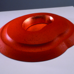
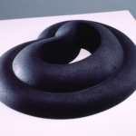
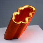
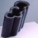
Dear Frank,
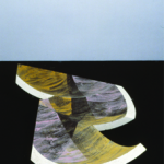
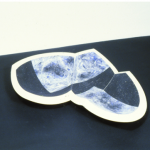
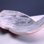
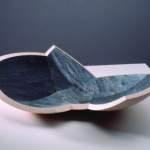
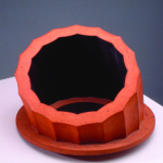
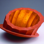
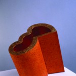
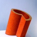
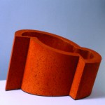
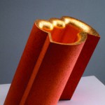
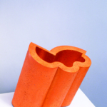
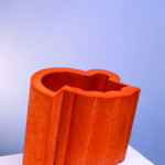
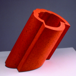
It seems to me that a short while ago we had a small misunderstanding about my feelings for the work Shift and Progression no.3 by Martin Smith. I’m writing you this letter, hoping to get things straight again, making you understand what it is that made my thoughts about the object shift, and made my initial liking for the object progress towards great annoyance.
At first I praised the work and to your question of why I liked it, I answered: “It’s the ungraspable nature of the thing, it seems to radiate from the inside through clever use of material and reflection, it almost seems a mystical object.” At the time of writing it was probably how I really felt, but at this present moment it’s nearly impossible for me to recapture that feeling.
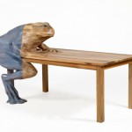
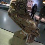
A lot of my initial feeling probably had to do with the context I first encountered the work in. On the Hand Made exhibition it was one of the few objects that managed to attract my attention for a substantial period of time. It was mostly because I didn’t really get what I was looking at. Not many other objects managed to do that, a few examples: a cardboard owl, a ceramic owl, a table of which one of the legs is a frog made out of epoxy, I guess you get the picture. And don’t get me wrong, it is not that I was in no way attracted to any of the things in the exhibition, but the attraction was only visual. With this object I felt, there would be something more to it. But how wrong did I turn out to be.
After I started searching for Martin Smith on the internet, I soon hit a dead end. Apart from his personal website, and a mentioning of him as being a professor on the Royal College of Art in London, there was nothing to be found. His personal website showed a range of works, all ceramic. Browsing through all this, I soon felt I might’ve been wrong.
All his works definitely show his great skill in ceramic techniques, but never did I encounter a real surprise. He seems to work in series, every few years he changes the color of his clay, or adds another material to it, but that’s it. Series and series of basically the same type of object but slightly different. The first impression I had of Shift and Progression, that there had to be ‘something more’ to it than meets the eye, was definitely proved wrong. The website did offer me a quite brief description of his practice, namely: “an ongoing investigation of the formal language of the vessel and the way that it can both contain a space and define a place.”
What exactly was meant by this, I could only guess. Well I did get the formal part. Most certainly, when talking about form, he is exploring the possibilities of the materials he’s working with. But ‘contain space and defining a place’ really annoyed me. Any object can define a place. When placing a banana in a white room, it both contains space, and defines the room as the room with the banana in it. Put another object next to it, and both of them do the same. It didn’t seem to make much sense to me, just an attempt to put a fancy label on what he likes to do and is good at, working in clay.
Then, somewhat desperate I went to the library of the Stedelijk Museum. All they had was an 80 page book, which offered me a brief description of the mans life, and a lot of pictures of ceramic objects I had just seen on the internet. The only thing that I found out there, that seemed to be of any importance, was his interest in exact sciences, and the fact that he first studied to be a geography teacher. This, at least, could explain a bit about the impersonal and calculated works I had seen. But still made me wonder, what did it do in the museum, and why at an design exhibition?
It is possible to say that Smith is a designer of shapes, of course. These shapes, according to the book I found on him, are often the result of mathematic calculations. Also the chemical processes, for things as the glazing and ‘what happens when and at what temperature’ during baking, are approached in a very scientific manner. Even in his earlier period, where he made raku vases and bowls, he would calculate everything so precisely that the surprises that happen during baking, which are a important characteristic the technique, were reduced to a minimum. So the guy kind of struck me as a scientist, and even though the worlds of science and art aren’t that far apart, it’s just not the stuff that manages to interest me.
Then I decided to send the man an e-mail, hoping that he could explain me a bit more about his work, and light that once existing spark again. I asked him what he wanted to evoke with his viewers, what was meant by ‘containing space and defining place’, and whether he as well felt his work belonged in this Hand Made design-exhibition. But the man never cared to answer.
So in short, it was the cold approach and one-sidedness as I experienced throughout his entire body of work, really put me off. Even Shift and Progression now seemed devoid of any interesting aspect I found in it at first. All of the work seemed to me nothing more then just empty vessels, meant only to show off the technical skill of the artist.
Well, I hope this gave you a little more insight in my personal relation to the object and the gradual evolution it was subjected to.
Regards,
Giel
P.S.: I included a few pictures to prove my point. Also one of the cardboardowl and of the epoxyfrog I told you about, just for fun!
