Skip to Content Skip to Search Go to Top Navigation Go to Side Menu


"Mevis & Van Deursen" Tag


In & Out of Amsterdam


Sunday, December 8, 2013

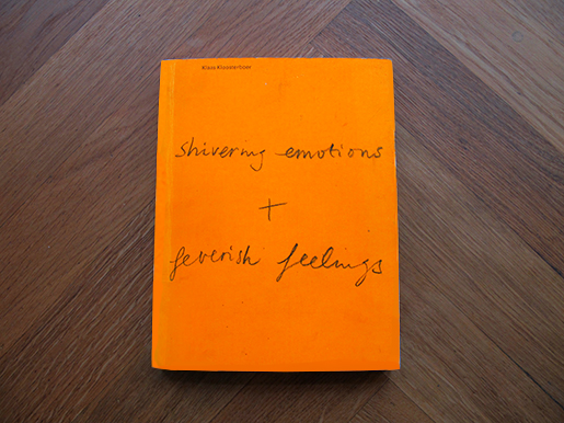
This sparkling red cover with white arrows  caught my eye in the library.  There won`t be more colors in the book (except for photographs). I don’t mention it as a regretful. The retraint use of colours in the book emphasize both the cover and the inside.
cover

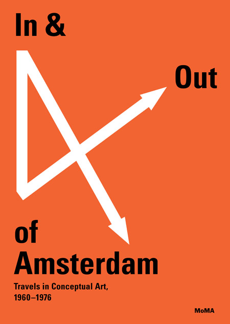
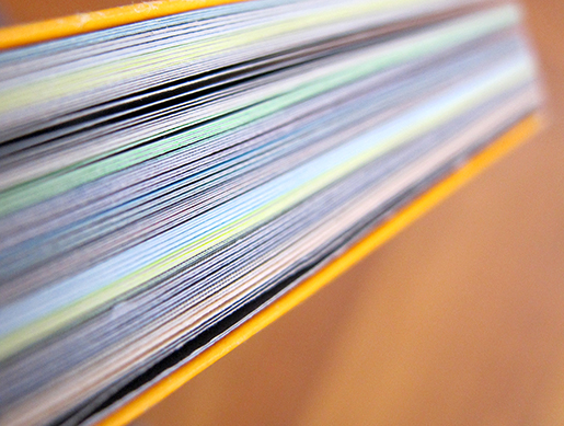
The cover is giving informations on the topic (conceptual art), the location (Amsterdam  and further links) and the period (1960-1976).As an object the book is pretty thick especially because of the choice of the paper. The cardboard of the cover is like wrapping the book which is bound separately with a black textile.
The book is dealing with conceptual art.
This field is generally using a lot of words to translates the works. In that case, graphic designer´s purpose is to communicate the ideas in the most efficient way. To reach this point they have to find a visual language to lead the reader in the way they consider as the most interesting. Here the structure is pretty clear. The book is comfortable as an object (as mentioned above) and comfortable to read.

This is first due to the black bold letters and central texts. Then the colors of the photos are softened and finally the white paper is not too bright.
Now we´re sure the reader is not confronted to practical difficulties the designers still have to focus on how to relay the information and find the balance between text and image.
Divided in chapters, the book first talk about the raise of the conceptual art especially linked with artist who have been working in Amsterdam. Then the book become more visual presenting artists through their works (mostly photos).  So when the book comes closer to the artists and conceptual artworks it becomes visual when you probably expect more text and informations.
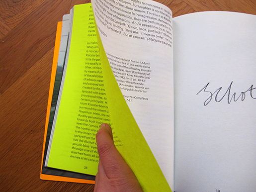
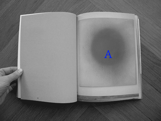
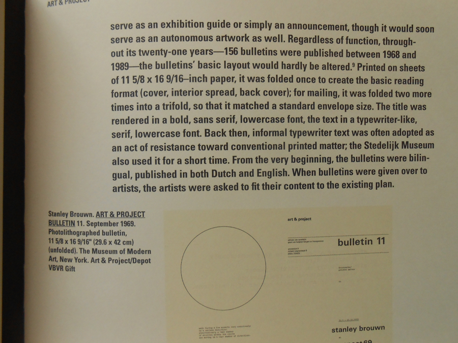
The reader can easily spot the chapters because of the blank left page facing the title written in bigger letters on the right page. The first part of the book is about conceptual art and does not focus on artists so much. To illustrate the ideas developed in the texts and make them understandable images are included.

DSCN1661
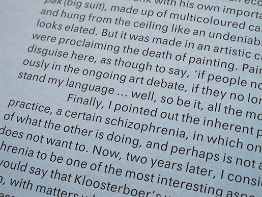
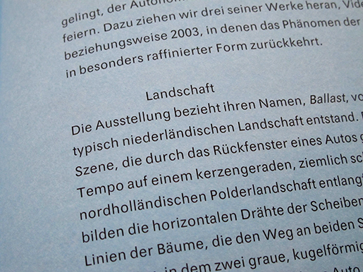
The text placed in the middle leaves a lot of white space next to it. This is used to add  details that are not directly part of the text like information concerning a photo or references. There is only one single typeface used. The only difference is the size of the letters making the text more or less big according to its importance. So this book is really trying to explain the content in an organized and comprehensive way.

DSCN1658 copie


In the end of each chapter is an index and everything is gathered together in the end of the book in a bigger and complete index. This index also contains pictures to be in harmony with the rest of the books logic and design.


Index
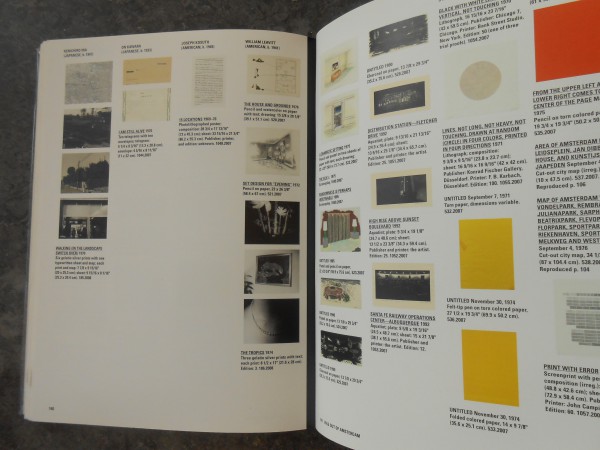
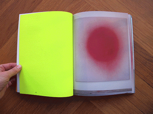
Then we come to the second part of the book based on specific artists. Here the text gets smaller and is present on the first left page of each artist´s chapter only. This because after using a lot of text the reader should be able to have a sensitive and personal approach to the artworks. The presence of the text is only to provide informations that can not be translated through images (biography…). So that we can focus only on the works themselves.

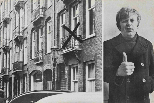
At this point we only have pictures to understand. But still we are not facing the real artworks so the photographs and the graphic design can decide how to introduce them.
First because of the angles and the distance, then by the size of the printed picture in the book and the choice to select colors or not, finally by the order of the presentation and the links created between the chosen images due to their positions towards each other. That’s all the explanations the reader has.
With this system the graphic design leads to a certain way of looking at the artworks while they still give a lot of freedom to the reader.


Point of view

In my opinion the visual communication of this book makes its topic clear and understood but still asks a bit of interest and subjectivity from the reader who has to experience the book (exactly like in an empirical process)  to get  knowledge from it.

Rietveld library catalog no: 706.8 che 1

A hidden paper archive


Thursday, December 5, 2013

A designer makes choices. When it comes to book design, he or she is likely to decide on typography, grid system, editing, binding, format, print technique, paper quality and so on. The sum of these choices create a unified expression that tells us something. It can be a parallel language to that of the content of the book and it can be more or less emphasized and thought-out. Some would say it could even be devious in its intentions.

This is an exploration of the book “Klaas Kloosterboer: Shivering Emotions + Feverish Feelings” from a design perspective. It was published by Artimo in connection to Klaas Kloosterboers exhibition BALLAST at the Badischer Kunstverein. It is designed by the design office Mevis & Van Deursen.
I interviewed Linda Van Deursen in connection to this essay to get further insights in the design choices and the conditions from which the book came to be.

shivering_emotions_cover

The cover consists of neon orange cardboard (around 300 gsm) with the title in what looks like Klaas Kloosterboers handwriting in pencil. The orange cover folds in to almost full width of the very first and last page. I learn from the designer that this is a technical solution to add steadiness to the book. It’s a signature bound soft cover, consisting of a broad selection of heavy stock paper which can result in a weakening of the soft spine unless it is reinforced. I’m thinking it could invite the reader to use the orange cardboard gate folds as an alternative page in any of the books 100 spreads.

shivering_emotions_paper_archive

There’s an intriguing colour spectrum around the edge of the book. This feature clearly communicates that it is a book mainly concerned with visual language or images. It resembles a visual preface or introduction to the book. Each signature consists of 16 pages made from one sheet of paper. Most of the paper types only occur in one single signature, this gives us a clue about the parallel function of the book:

I learn from Linda van Deursen that the book is a sort of material archive or assortment of papers of a specific kind. A rule that she set up for the book was that only two sided paper (meaning the paper has a different appearance on each side) of the type used in posters and envelopes (because they can’t be see through) were to be used. Not only does this create an intriguing visual and physical experience but it serves as a kind of metronome or conductor where the different surfaces of the paper are altered rhythmically but not predictably (you learn the rhythm and then it alters).

shivering_emotions_paper

Rietveld library catalog no: kloo 1


shivering_emotions_sequence

This feature creates a playful element to the structure of the book. For example in the sections that consist of photos of Kloosterboers work, the reading sequence is ACBD where A and C are overviews of two different artworks and B and D zoom in on the same two images. But because of the rule of the two-sided paper rythm, this seemingly logic and rigid set up completely changes. In addition to this, all rules seem to be broken at least a couple of times in the book which is a testimony to the sure instinct and playfulness of the designer.

shivering_emotions_sequence2

The text is set in EF Maxima. This sans serif is used in two contrasting ways throughout the body of copy. The left hand pages are in English and set in larger size (approximately 12 pt) and narrower leading which results in a more contemporary expression. The tracking is on the plus side of the spectrum, perhaps around 10.

shivering_emotions_eng

The right hand side has the same tracking but is smaller in size (approximately 10 pt) and more importantly its leading is much bigger which leads to a surprisingly conservative appearance. This is a demonstration of how drastically you can change the meaning of a typeface with small means. It also solves the problem of fitting the German language in the same amount of space as the shorter English text.

shivering_emotions_ger

There’s a lot of trends in typography and it is hard to define what a typeface communicates without looking at its context and treatment. Also, the way a typeface is repeatedly used will change how we read it. This could mean that a typeface that was originally designed with utilitarian intentions can end up being perceived as elitist or exclusive. EF Maxima was originally developed by Typoart as a substitute for Helvetica. Typoart was a government owned, east german type foundry that was privatised in 1989 in connection to the unification of Germany. If we ignore the complex political situation in that area at that time, and just see Maxima as a typeface created with similar intention as Helvetica but without the same exposure, then I think we could dare call it a humble and uncommercial font. This could be illustrative of the intention behind this design. Because it is clear that Van Deursen is not concerned with selling commodities or increasing value to art galleries through slick design. All the design choices are closely connected to the subject that is the artist. I think this explains why the book still seems so relevant in its form.


Rietveld library catalog no: kloo 1


Log in
subscribe