Skip to Content Skip to Search Go to Top Navigation Go to Side Menu


"Anthon Beeke" Tag


Een blik op Anthon Beeke


Saturday, February 20, 2016

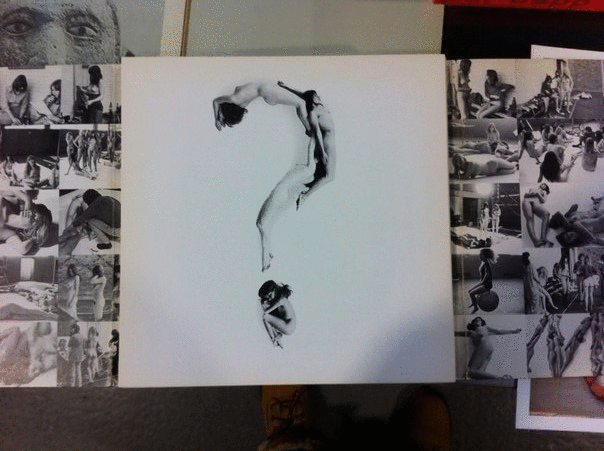
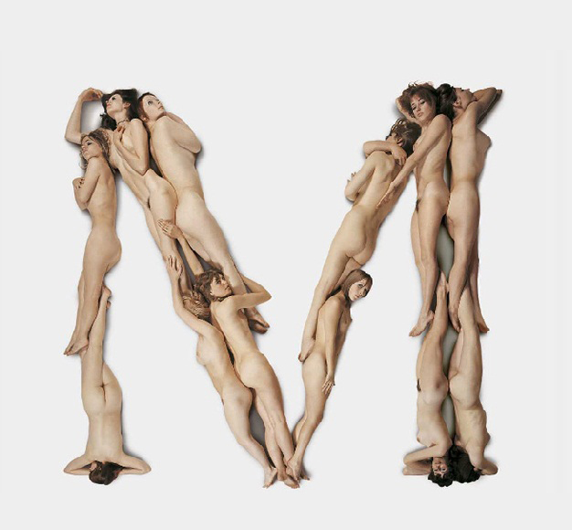
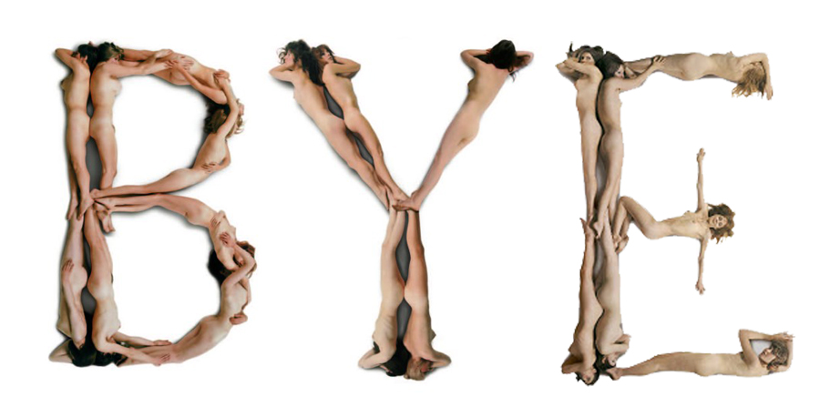
Ik ben geboeid door communicatie en woorden, en specifiek in de manier waarop mensen met elkaar communiceren. Het eerste werk dat ik leerde kennen van Anthon Beeke was het ‘Blote meisjes alfabet’. De subtiliteit waarmee hij die schoonheid vertaalde in die naakte lichamen trok mij heel erg aan. Op basis daarvan heb ik besloten om Anthon Beeke te kiezen als onderwerp. Toevallig kwam ik hem tegen en besloot toen om over Anthon te praten via een persoon die dicht bij hem stond en zo kwam ik bij Aaf van Essen terecht.

 We waren op uitstap in het Lloyd Hotel, waar we een rondleiding kregen van artistiek directeur Suzanne Oxenaar, toen Anthon Beeke en Aaf van Essen net langs liepen. De tweede ontmoeting vond plaats tijdens de open dag van de Gerrit Rietveld Academie, Hierna vroeg ik Aaf voor een interview over Anthon Beeke, met als vertrekpunt zijn werk ‘Blote meisjes alfabet’.

interview Aaf van Essen

 “. . . Ik heb Anthon leren kennen doordat hij een vriend was van mijn echtgenoot en we beide Amsterdammers zijn van dezelfde leeftijd.” Begon Aaf. “Anthon is altijd een kleurrijk figuur geweest in de wereld van ontwerpers en kunstenaars. En dat heeft ook wel te maken met het feit dat hij een hele aparte manier heeft van denken en functioneren. Voor ik besloten had naar de Gerrit Rietveld Academie te gaan, was ik verpleegster. In 1986, toen ik 46 was, begon ik aan de Rietveld Academie. Anthon hoorde dit en zei tegen me: “Aaf, doe die Rietveld niet, kom maar gewoon bij mij, ik leer je het vak.

 Het is ook een lastige man, dus ik dacht ja, als je een nieuw vak wilt gaan leren, dan moet je ook dom kunnen zijn. Als je niet dom mag zijn omdat een ander verwacht dat je het allemaal weet en kent en doet, dan gaat het helemaal niet goed. Dus toen heb ik gezegd; Ik kom wel op je studio werken, maar ik ga wel gewoon naar school.

“. . . Waarschijnlijk kan dat wel als hij al te beschrijven is, ik denk door zijn fotografische kwaliteiten dat je hem zelf ook als een soort foto zou kunnen beschrijven. Als ik hem voor de geest haal, dan zie ik een man met een grote bos wit haar. Een zwarte goede regenjas van Japanse snit. Eigenlijk staat dat voor een soort rotsblok, een eigenwijs rotsblok. Ik denk dat zijn gevoel voor humor hem uit heel veel ingewikkelde situaties heeft gezet. En het is een plastische man, een muzikale danser. Hij ziet in heel veel dingen muziek. En dan zijn dat eigenlijk de ingrediënten waarmee je zo een goede ontwerper wordt. Daar moet je het mee doen”.

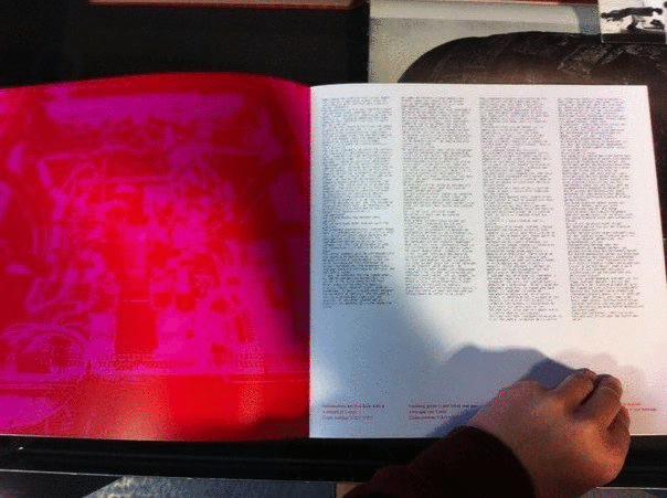
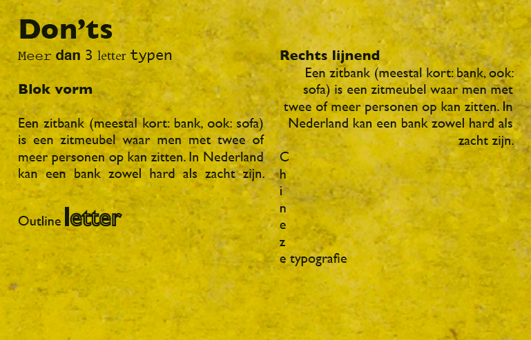
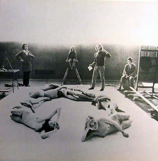
 “. . . Anthon Beeke heeft de schoonheid van de naakten heel delicaat behandeld bij de productie van het ‘Blote meisjes alfabet’ van 1969. Er ligt meer nadruk op de vorm, die van de letters. Het naakt valt minder snel op” Zijn liefde voor vrouwen en het veilige gevoel dat hij ze geeft, is duidelijk zichtbaar in het resultaat van het ‘Blote meisjes alfabet’.

De letter T van Anthon Beeke's blote meisjes alfabet gefotografeerd in 1969 en het cijfer 2 gevormd door naakte zwarte mannen van Naked Numbers 2005-2011.

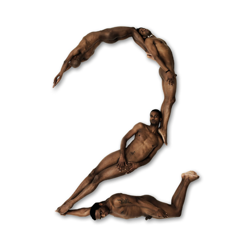
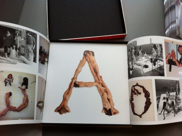
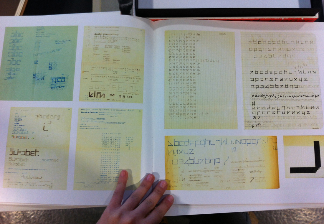
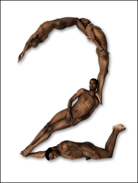
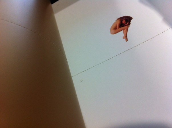
De herwerking van 2011 is in samenwerking met Wim Crouwel geweest. Dit is te herkennen door het gebruik van het typeface ‘The New Alphabet’ in het boek. Dit alfabet is gebaseerd op de opkomende computertechnologie in 1969. Het werd door Wim Crouwel ontwikkeld en gepresenteerd in het kwadraat bladen formaat. Dit komt ook terug bij ‘The Body Type’ waar ze de nummers 1 tot en met 9 in de vorm van naakte zwarte mannen hebben toegevoegd

 “. . . Waar zo een zwarte man voor staat kan je heel makkelijk zo uitvergroten, dat doet hij dus niet [x]. Nu is hij van plan hetzelfde met volumineuze vrouwen te doen, dit is niet heel evident, bij een ‘l’ bijvoorbeeld wordt de vorm ontzettend geaccentueerd. Maar misschien komt hij daar goed uit.

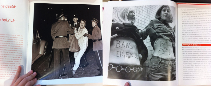
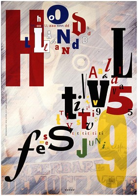
 “. . . Gedurende dezelfde tijd als “the Body Alphabet” was er een culturele revolutie in Amsterdam, ook op het gebied van theater. Deze revolutie heette ‘Aktie Tomaat'[x], zij waren heel erg tegen het traditionele van toneel maken. Toen deze revolutie zijn effect had op toneel, begon je dat ook te zien in het straatbeeld in de vorm van de affiches. Toen deze belemmering was verdwenen en het theater vrij spel had, kon dit ook worden doorgewerkt in de affiches.

Theater-Terzijde-Haarlem AntonBeeke_Zeitgeist

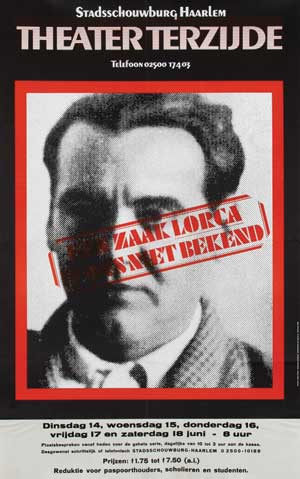
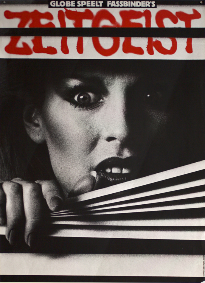
Anthon’s eerste affiche voor een theater was in 1966 voor Theater Terzijde. Sindsdien van 1966 tot 1985 heeft hij de affiches en programma’s voor Zuidelijk Toneel Globe ontworpen [x]. Vanaf 1987 tot ongeveer 2001 bepaalde Anthon het gezicht van Toneelgroep Amsterdam. In overleg met de directeur van Toneelgroep Amsterdam vertaalden ze het toneelbeeld in affiches.
Veel affiches van Toneelgroep Amsterdam bevatten naakt. Dit resulteerde in nog een controverse, aangezien deze affiches overal op straat hingen en dit was destijds erg provocatief.[x]

resolve

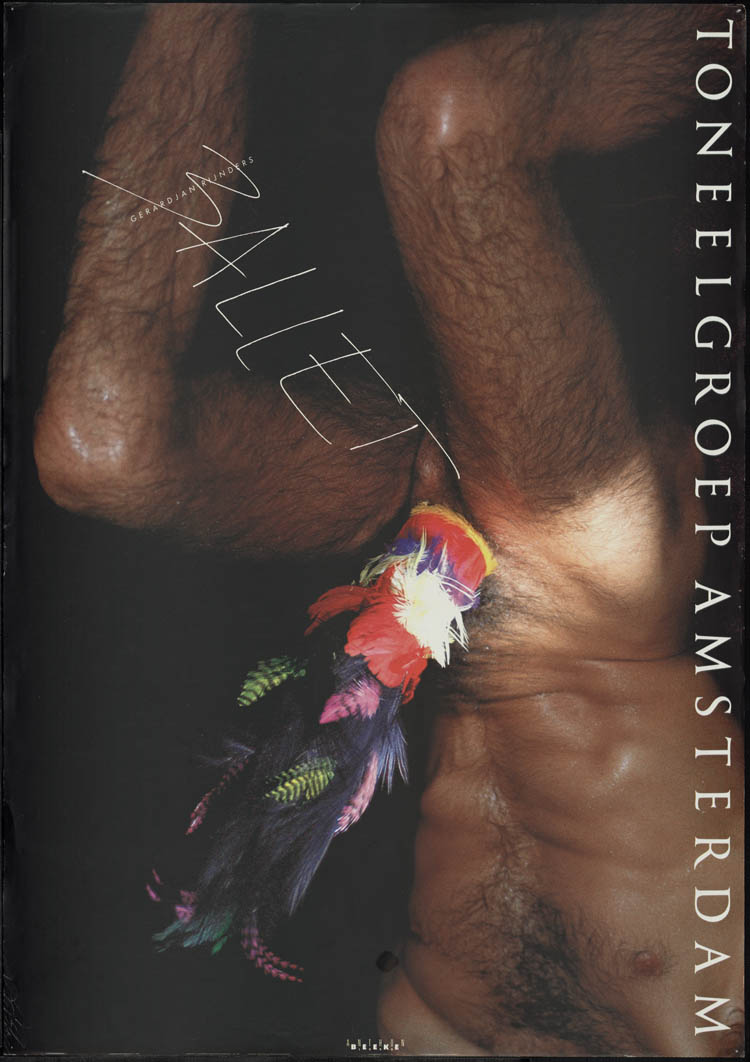
“. . . Ik vond het altijd heel erg opvallend dat dit beeld op straat niet beklad is geweest. Aangezien dat best vaak is gedaan ook met ander werk. Hij vond het zelf niet storend, en ergens wel goed dat het een bepaalde reactie opleverde. Maar dus wel opvallend dat dat niet is gebeurd met dat werk, hij vond het wel geestig, het is ook heel discreet ontworpen.”

 “. . . Ik denk dat Anthon toch op de een of andere manier miraculeus raak heeft geschoten.”

interview Aaf van Essen

Body Type


Monday, December 9, 2013

The subject I write about is a design, which is presented in the book of Anthon Beeke ”Body Type”, despite on this fact I would like to start with a small history part, following by highlighting key points of the book or would I rather say box

Let’s go back to the sixties.Wim Crouwel, who was born in 1928, is a graphic designer, who was influenced by digital developments of that time, saw an opportunity for an interesting experiment. Early computer screens rendered images in fairly large pixels, making traditional curvilinear letterforms difficult to reconstruct, and so Crouwel set out to redesign the alphabet using only horizontal lines. The ‘New Alphabet’ was published in 1967 in Kwadraat-Bladen: A series of graphic experiments (1955-1974).


Animation


One other key figure of Dutch graphic design is Anthon Beeke (1940), who found his inspiration in the spirit of 60’s, a spirit of freedom which relates to politics and besides refers to the topic of feminism. In 1969 he created an othe Kwadraat -Blad ”Beautiful girls Alphabet”, in which you can also notice presence of ideas of feminism. This publication is based on type, which is spelled with the bodies of naked women. ”Beautiful girls” was published in 1969 (it’s two years later then ”New Alphabet”) in the same series as an answer to the one of Wim Crouwel


Animation-1


Considering these two famous and important publications, (because nobody did something similar before) you can see two opposite approaches in design modernist/functional by Wim Crouwel and content based by Anthon Beeke.

Now I can boldly return to the book.

Box-side_redu


The ”Body Type” was published in August 2011 and despite that fact (in the past they have been opposites) for this publication they worked together. Two completely different, I can say loud events of Dutch graphic design, have merged into a single edition. Just like ”Beautiful girls” in the past this book is based on an alphabet with naked bodies but all text of the book is written in New Alphabet by Wim Crouwel. Also one more graphic designer Rene Knip (1963) is included in the work and designed the looks of the publication. With this I mean a book-box, which I will try to describe in details.

guukop

The box follows the tendency of square form (the tendency of Kwadraat-Bladen), front edges are white with a representation of the type ( B O D Y – T Y P E ) and lateral edges are in red with golden text in Crouwels New Alphabet. Inside this colorful box I found one more simple black interior box ,which separates a cover-box with a content of the book with the same color palette and, in my opinion, with the black line this construction attracts much more attention to itself. Besides, opening a box, I’ve noticed a red silk tape, which helps to remove the book from the box easily.

The content of the book is separated in three parts.In the first part you can find an introduction, which was written by Wim Crouwel and a text with images that is related to the publication, to the past and to the roots of the alphabets of both Crouwel and Beeke.

Baas in buik-

Crouwwel-sketches_redu

Flipping through the pages of the first part of a book you can find other examples of typography with images of another famous Dutch typographer and museum curator Sandberg (1897–1984)

Sandberg_Nu_redu


”Body Type” combined in itself works/ styles /approaches of 3 different famous Dutch graphic designers of 3 different generations,in other words this book contains an experience of key figures of graphic design. That is why this publication is not only a book but more like a monument.

The second part of “Body Type” is the alphabet itself. All letters, number of the Latin alphabet are separated from each other. Every single letter placed on a single square paper sheet on a white background. Everything is printed on a quality and a bit glossy paper. In contrast to “Beautiful girls” letters of the alphabet are spelled from not only naked women but naked black black men as well adding a new controversy. By virtue of choice of color and paper this publication looks fresh, interesting and makes us curious to explore its content.

home_bodytype_L_04 Beeke-BodyType-M

In the third part you can find a set of letters and punctuation marks, so you can tear them out and string them up to bring this alphabet to life in words and texts. There are four similar letters/punctuation marks placed on each page so you can cut it, one from another, using a dotted perforated line.

aqHZHwiuH3c


In the end I would like to add a couple of words about the name of the book.
To be honest, I was looking through a list in a library and the name “Body Type” was the first, which I paid attention too. I was trying to look for it more then 30 minutes, but I couldn’t find it. Then I tried to find another book but this name was in my mind and kept me interested. Finally the librarian of Rietveld Library told me that this book is special and it is located in a safe place and I remember that I though “I have made such a lucky choice”. I was thinking how to name the post and I have decided to save the original name.

Anthon Beeke plays


Thursday, September 26, 2013

This is a poster for an exhibition in the Stedelijk museum by Anthon Beeke.

Anthon Beeke-dansendemeisjes-stedelijk

It has been printed in several different colored layers which show dancing figures. Anthon Beeke designed this poster in 1995. He sought to achieve independence from the rules of typography, and from popular trends.  This unconventional move has earned him a unique place in the Dutch graphic design history.

Before I came to Gerrit Rietveld Academie I graduated in graphic design on the Media College Amsterdam. After four years I disliked graphic design so much that it made me come to Rietveld. This graphic design school is very strict and technical without much freedom. Form follows function, as they say. You learn more to become a desk top publisher. I learned about Anthon Beeke but did not really notice because it was not allowed.

But not long ago I rediscovered his work and I really started to admire the pleasure he puts in his work, Form follows fun! And I totally agree with this concept. It makes possibilities limitless. One of the reasons why I came to Rietveld is to create without boundaries, because I really felt constricted. Since he was the first to step out of these rules I decided to chose this poster. It got my attention right away, in spite of the fact that the line of sight was partly blocked by some other objects at the entrance viewpoint.

I think it is not his best poster design but I chose this object more or less because of the artists. The whole poster looks like an accidental moved photo at a party with a lot of dancing. The font that he chose adds to the dancing, it is if the letters are dancers as well. I also like the fact that it is a layered print, nowadays this look is easily Photoshopped, but he experimented with the layers and colours.

Anthonbeeke-dansendemeisjes-closeup

At the graphic design study I learned the Do’s and Dont’s which you have to obey. Of course it is good to obey these rules and if you don’t it easily becomes a bad design, but if you don’t obey and do it well it will become way more interesting then following the rules. It’s more exciting. I had to make a poster explaining typography rules this is a small part of the poster showing the Dont’s.

Don'ts typography

It’s in dutch, this is the translation:

Use more then 3 typefaces.

Align text in Block form.

Use outline on a font.

Right text alignment.

Chinese typography, line the text from top to bottom.

Obvious rules, but if you break them it could be so interesting, Anthon Beeke did this many times and he is one of the designers that could do that well.

Hollandfestival-Anthonbeeke

All the dont’s i learned are in this poster, but he did it so well that its interesting and exciting but also readable and understandable. There is a story behind this poster as well. The theme of Holland festival was avant-garde in the second world war. He used a poster of Dirk Elffers and painted it white.

Dirkelffers-weerbaredemocratie

And the Typography is copied form a letterproof of Piet Zwart. ”Pure stealing, a shame!” Anthon Beeke said. Every time he sees the poster he has to smile, because the poster says on the left side, Designgraphy: Dick Elffers, Piet Zwart, Anthon Beeke.

But what inspires me the most is that you can see in his design that he is having fun making design. In dutch graphic design it’s called grafisch vormgeven, vormgeven means form-giving, giving things form, sounds so much nicer then design. But that is really what he did, he has an assignment and looks at the possibilities (while playing) and starts giving it a form.

viewoncolour-AnthonBeeke-knitting-itsamiracle

This is for a magazine called ‘View on Colour’ which he published with his wife Lidewij Edelkoort. In this cover, about knitting, you can see something you can not think off from the start, you have to play and have fun to surprise yourself and have something to use.

James Victore says something very interesting is the book It’s a miracle about Anthon Beeke’s work.

”Anthon Beeke always kept playing. A lot of other graphic artist look more like accountants with posh watches and they don’t ask themselves what impact their design has. He plays for his own pleasure and to surprise himself. He doesn’t make work for clients, not for commissions, not for the money, its not even about the assignment or design it self – Its about him. And because its about him it’s about us. The more authentic and personal it becomes, the more impressive his designs becomes gives it more dept; it speaks to us, we can here him snigger of fun. He speaks to us because he gives himself to us. Anthon plays”(Translated from dutch version, not original quote)

I have nothing more to add or say because this quote says it all.

Bye-Anthonbeeke-nudeabc


Log in
subscribe