One of the most immediate impressions one has of a Wendingen publication is of the format. It is ironically a very stout and conventional square shape, while not being a standard Din format. This is obviously a considered format, one which was chosen so as to fulfill a specific requirement. Similarly, once the publication is opened, the considerations of lay-outing the page as well as the type, is as immediate. The shortening of the printed area of the page reverts the visual shape of the page back to a more common rectangular format. The lay-outing of the type too is interesting as it plays along a similar functionality. With colour fields being constructed from smaller sets of shapes aligned together. This back and forth in format and form is something that may be interesting to play with on a digital platform such as a a basic webpage, where format differs from screen to screen, and browser to browser. Although this is fairly standardized, there is some variation. The lay-outing of individual elements in HTML then allows for a chance to reformat the page as desired by the user. While this is in no means a finished or particularly useful webpage, a more playful and relevant investigation into these issues is at least a potentially good starting point.
"Wendingen Review" Project
1, 2, 3, 4, 5, 6, 7, something falling, 8, 9, 10, …
Wednesday, April 2, 2014
I went through dozens of Wendingen magazines, but what stopped me and caught my attention, after turning side by side of every issue i could get from the library of the Rijksakademie, was something that literally fell out of the system. A piece of paper that was stacked between the pages of one of the Frank Lloyd Wright issues. In that moment it didn’t matter if that loose inserted paper piece was connected to the text or not. It was something that woke me up, because it was something different. Not only did it change physically how the pages bended, it visually stood out. Within the machine printed optics of the magazine this personal little letter felt fresh, it felt original and uplifting, even though i didn’t know what the signs and numbers written on the postcard sized paper meant. When i talked to the librarian, she told me that very probably the original owner left it in the magazine and they want viewers to just leave it in. This means that this additional subjective extra piece became somehow a part of the magazine. For me however it was not only about just something additionally put in the magazine. It was as well the “ordered” appearance of the paper. The yellowed post card prsented a lot of different elements, like something cut out and glued, different hand writings in different material and color, different sizes and even something struck through. Overall however the card seems still ordered and almost thoughtfully arranged.
Wendingen x Rijksacademie Amsterdam
only a scale model
Wednesday, April 2, 2014
The impact of Ludwig Mies van der Rohe on modern architecture is of similar magnitude as that of Le Corbusier and Frank Lloyd Wright. With his timeless, rational architecture and eternal quest for the essence of architecture his influence can still be felt today. The career of Mies van der Rohe falls into two parts; until 1938 he played a major role in the German architectural world and after 1938 he influenced a totally different world on the other side of the ocean, in the United States.
In the 30’s of the last century the architects of the bauhaus were very aware of their dangerous position in Nazi Germany. In 1938, Mies van der Rohe emigrated to the United States where he was appointed director of the Illinois Institute of Technology (IIT). The work of the architect changed, but related topics returned regularly. He studied in the United States how he could coordinate the technical and constructive capabilities of the U.S. construction industry architecture.
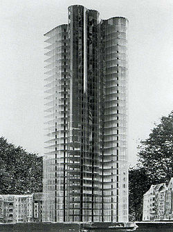
From the Wendingen issues I chose the Glass skyscraper desiged by Mies van der Rohe, Due to the nazi rule it was never actually build. Van der Rohe stated about the building “the exceptional form of the plant stems from the structure of the site and the result is due to the properties of transparent and reflective glass facade, which the architect admitted openly: “Tests on a model of glass showed me the way and soon I realized that by using the crystal is not achieving an effect of light or shadow, but rather to achieve a great game of reflections of light. ”
I do think that is one of the reasons why these buildings are seen so frequent until this very day. The scale model shows how far ahead of his time Van der Rohe was.
Wendingen 5-3 1923 Rijksacademie Amsterdam
Similarity
Wednesday, April 2, 2014
When i first went trough the pile of Wendingen magazines something struck me when I saw the cover of the “techniek en kunst” edition. At that point i didn’t really know what it was about that edition, but when thinking more thoroughly about it I had the feeling that I had seen it before. Going through my archive of pictures I found a poster designed by Karl Gerstner that had a lot of similarities. It left me thinking how amazing it was that something that was designed an odd thirty years later had a lot of the same qualities. The cover of the Wendingen magazine was designed by Wim Gispen, one of my favorite Dutch industrial designers. Before this discovery I only knew Gispen for his famous chairs, lamps and interior architecture in general. Unaware of the fact that graphic design at that time was not really labeled a profession, designers also did graphic design on the side. Though you can see that the cover designed by Gispen is an early design and not really modern any more it still has some modern qualities.
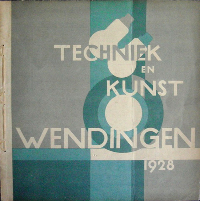
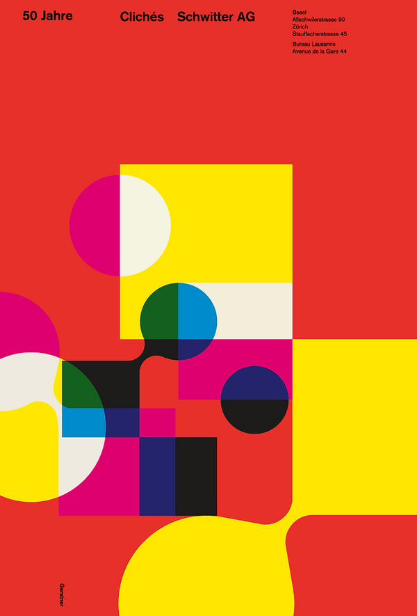
The use of shapes, circles, overprints and probably a grid in my opinion is quite modern. I think it fits in the same style of work as the early Swiss style of graphic desgin. That is why it reminded me of the work of Karl Gerstner a Swiss graphic designer that was part of the Swiss style. A movement that I am a big fan of because of their simple use of shape and subliminal use of color. Because Gispen is more linked to “de Stijl” movement I would have never expected that he designed the cover for the Wendingen Magazine but overall I am quite happy that I picked this copy because of the insight it gave me in early graphic design and the progression it went through over the years.
Wendingen 9-2 1928 Rijksacademie Amsterdam
Finsterlin – A Visionary Architect
Wednesday, April 2, 2014
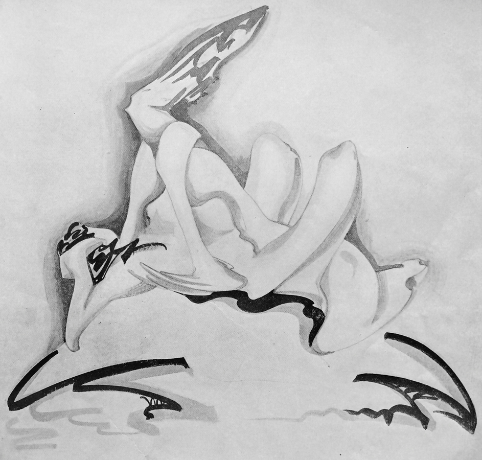
Hermann Finsterlin was active in the German expressionist architecture movement in the early 20th century. World War I combined with the political turbulence and social stirring that followed the German Revolution resulted in the utopian and socialist attitude of the expressionist. There was an underlying effort to achieve the NEW. The style was characterized by: expression of inner experience instead of realism, distortion of shape for an emotional effect, and the study of psychological effects of form and space. The research of dreams and the unconscious influenced Finsterlin [x]. Nature was also a source of inspiration. Finsterlin studied the naturalist, Ernst Haeckel [x].
Because economic conditions limited the number of built commissions it resulted in many expressionist works remaining as projects on paper. Finsterlin never built a permanent structure which entitles him a visionary architect. However I believe this is not a consequence of the financial climate but because he was a radical expressionist and produced studies of the most unrealizable buildings. Finsterlin was an idealist, he allowed insight to a fantasy world which was impossible to visit. That the presentation of his concept was more important than the actual finished product is an aspect which I like and can relate to. The artist Sol Le Witt said that ”…the idea or concept is the most important aspect of the work. When an artist uses a conceptual form of art, it means that all of the planning and decisions are made beforehand and the execution is a perfunctory affair…” I believe these words and that they can be applied to Finsterlins work, as conceptual art questions the nature of art, Finsterlins architectural work questions the nature of architecture.
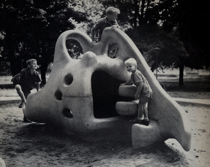
I find Finsterlins work to be pleasing because I draw parallels to the Danish architect and sculptor Egon Möller Nielsen’s playsculpture Tufsen from 1949. As a child I would endlessly play on the abstract and surrealistic sculpture. It was my favorite thing to do in Lund’s city park. The possibility of not simply admiring the sculpture but also physically experiencing it was fantastic. Though Finsterlins work remains on paper his work is still regarded as architecture and not drawing or painting and that that is enough is good. But it is a paradox because I also have a desire for the work of Finsterlin to really exist.
Wendingen 6-3 1924 Rijksacademie Amsterdam
8 Portraits – Peter Alma
Wednesday, April 2, 2014
Peter Alma was a Dutch visual artist who studied in the Den Haag art academy and in Paris. He was very influenced in the communist movement and his art has been inspired by his believes. A lot of work have been done on public buildings in Amsterdam. The most famous among them was a mosaic on the old Marninxstraat swimming pool which was placed in the Amstel station after its destruction.
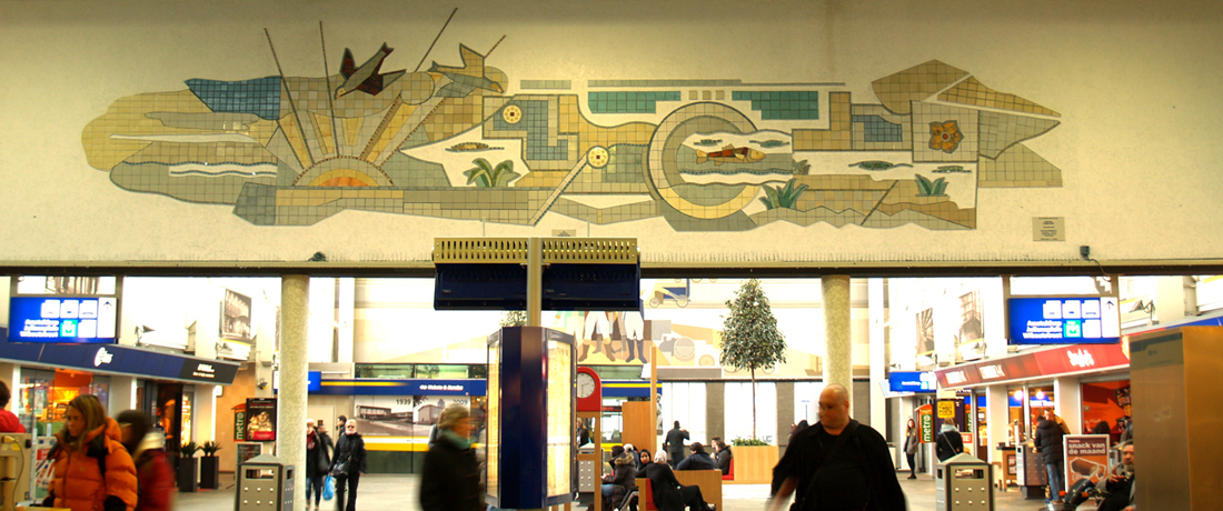
His works represent a lot of industrial elements and workers. He works mostly with outlines and bold representations.
In the Wendingen magazine, he drew eight portraits of different social or religious communities. I choose the one where he represents the catholic church clergy. Although I saw his work in colors at the station and I didn’t like it, I was immediately attracted to his black and white portraits. I really liked the fact that he putted the cross instead of their face. To me, it looks like a critic of the consequence of a religious belief and especially with the catholic church. We can think that their religion make them blind and is the only thing you see on them. The face shows emotions and in this case, their face shows only this religious sign.
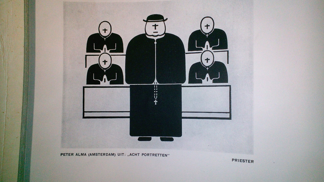
Wendingen 9-11 1930 Rijksacademie Amsterdam
Calcite Stalactite
Wednesday, April 2, 2014
In the Wendingen issue, Kristallen Wondervormen der Natuur from 1924 i found this picture of a calcite stalactite. I choose the picture because I did not remember to have ever seen anything like it and that made me curious. After a bit of research I learned that a stalactite is a type of formation that hangs from the ceiling of caves, hot springs or manmade structures such as brigdes and mines. Limestone caves, where most stalactites are found, are mainly composed of calcite, a rather common mineral found in sedimentary rocks. Stones and crystals have been a huge passion of mine, for as long as I can remember. The interest started in an early age, as my parents took me, my brother and sister for long walks up and down the coast-line in Denmark. We were looking for fossils, amber, seashells and stones. We never really knew why we were doing it, but it soon got competitive. Who would found the most exquisite one? The biggest? The funniest? And we would carry large heavy amounts back to our house and place them carefully, in an order, on shelves or window sills. My mother keeps collecting and my parents house have turned into what could be called an exhibition of stones and stuff. My father sometimes forces her to get rid of some of the stones, because he says “it doesn’t make sense”, but my mother took me to the farthest place of their backyard; a wilderness of weeds and showed me where she get’s rid of the stones. The pile is enormous. When asked why stones are so fantastic, my mother says: because they are ordinary and exquisite and they look beautiful in the rain. Later I started making animations where I would scan some of my favorite stones and give them simple movements. Maybe they would turn around, or switch back and forth between a crystal and a flintstone. I too like the normality of stones and I embrace that my love for them doesn’t make any sense at all.
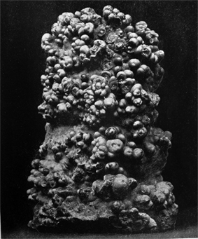
Wendingen 6-11 1924 Rijksacademie Amsterdam
Japanese influence to western modernism
Wednesday, April 2, 2014
“the west discovered the quality of space in traditional Japanese architecture through a filter of western architectural values”
"Myths of Modernism: Japanese Architecture, Interior Design and the West c. 1920–1940" - McNeil, Peter (1992).
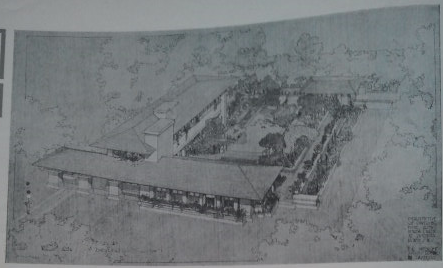
In 1925-26, seven issues were devoted to the up until then life work of Frank Lloyd Wright. The cover designed by him, used bold red and black graphics. This cover, one of several created by Wright, is one of the first European publications to promote and document the work of an American designer. It has special title: “The life-work of the American architect Frank Lloyd Wright,” colored cover by Frank Lloyd Wright.
This richly illustrated collection of Wright’s early architecture includes essays on his work by architects of the period and by Wright himself. Features more than 200 photographs, plans and drawings of his early residential and commercial designs.
Frank Lloyd Wright 1925 Wendingen Series – Can be found at the Rijksacedemie in Amsterdam. If you have enough time and love books and have a special interest in this series become a member for one year with a small fee, it’s worth it.
Through the many drawings and photographs in this series I could see so many types of architectural styles from Mayan to Indian temples and Japanese style. It is what attracted me to the picture you can see in this post. I could see many similarities in Japanese architectural elements that appear in the pictures and drawings repeatedly. I have a great interest in Japanese culture and architectural elements also play their role in that. The nice thing about these buildings is that they are build outside Japan in United States, and with materials used of course different and available in that time.
I chose the drawing of one house specially designed for the 21st governor of Wichita Kansas, Henry J. Allen. Who hired Wright to design his home in Wichita, Kansas. Allen’s home is the only residence designed by Wright in Kansas. Like many Japanese homes the garden has a special place and for the big part the home surrounds it.
I can see Wright was influenced by the functionality of this style which surely must have influenced his later modernity. He of course visited Japan and not only was he influenced but the reverse also occurred.
A DVD was made with this concept:
MAGNIFICENT OBSESSION: FRANK LLOYD WRIGHT’S BUILDINGS AND LEGACY IN JAPAN [link] an excerpt can be seen at YouTube [link]
Wendingen 7-5 1925 Rijksacademie Amsterdam
Massa
Wednesday, April 2, 2014
The meaning of political issues in modern society is overwhelming, and the policy influences on Art as it has never done before. As far as we are able to refer our reality, that we have now, to the images of the past, we can clearly understand our society’s statement. De Stijl by 1.1928.8 “Wendingen Beeldstatistiek / Sociologische Grafiek” depicts a lot of political and sociological drawings mostly based on issues of the beginning of the 20th century. Supposedly, trying to fight everything old and well-established. The in that issue well-presented artists, show without hesitation a wide range of problems, by using sociology and statistics as a way of inspiration.
What i like the most about them is their honesty to themselves and the impudent way of story-telling. Also the graphics themselves are impressive a lot more than modern one’s as i think they creates their own value. Everything what i mentioned we can fully see in Franz Wilhelm Seiwert work “Massa” . Of course something will be still missing, and that’s why i like it the most, because being truly political, it stays neutral in a certain way. The word “massa” basically means “crowd” and what we see in the picture it is a crowd, but what is crowd seen as a political issue? 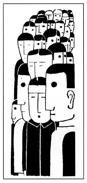 Massa becomes more than just a synonym, it gives it much deeper meaning, you don’t need leaders, bombs etc. to show the initial blind and violent power in the world, when people become pixels, being strong and weak at the same time. It is also amazing example how title can develop the whole idea.
I think everything that makes it so simple and scary strikes me the most, and of course in that case it works extremely well, but I also can not help but notice the value of the other pictures in that exact issue and most of them being drawn by different artists from different countries somehow relate to each other, and that is amazing as well. have a look…
Wendingen 11-9 1930 Rijksacademie Amsterdam