With the first design lesson we started to take inspiration from the Rietveld building. I feel quite overwhelmed by the infinite possibilities that it offers, rich in detail and at the same time simple forms.
Now almost a half year has passed but I still feel like I have only just touched the surface. I could go on for years getting inspired by him, he may have already become one of my idols.
THE GARMENT
We were asked to design a garment, inspired by the building, 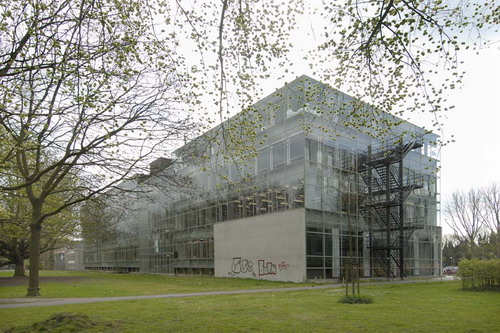 but also a practical piece of clothing for students or/and employees of the Academy.
I thought about the transparency of the building, which Rietveld used so that the students can spread freely in the premises to work non distracted. To connect the inside with the outside was his clear intention.
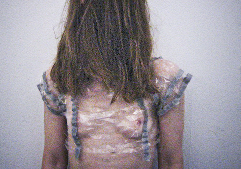
So I started with a pinafore with coated fabric from which the water or paint of the working students can drip off. In the front I placed a mood-board, like a display out of transparent fabric which you can use to demonstrate your current interest (connecting inside and outside). You can put a picture inside or you show your naked body, if you`re proud off it.
A detail that I wanted to use were the white brick walls at the front of the building, which protrude 15cm from the glass. Rietvelds intended each material to have its own space. So I made two padded retangles out of a white fabric. They can be used as a pad and at the same time as a pillow on which you can rest in the meantime.
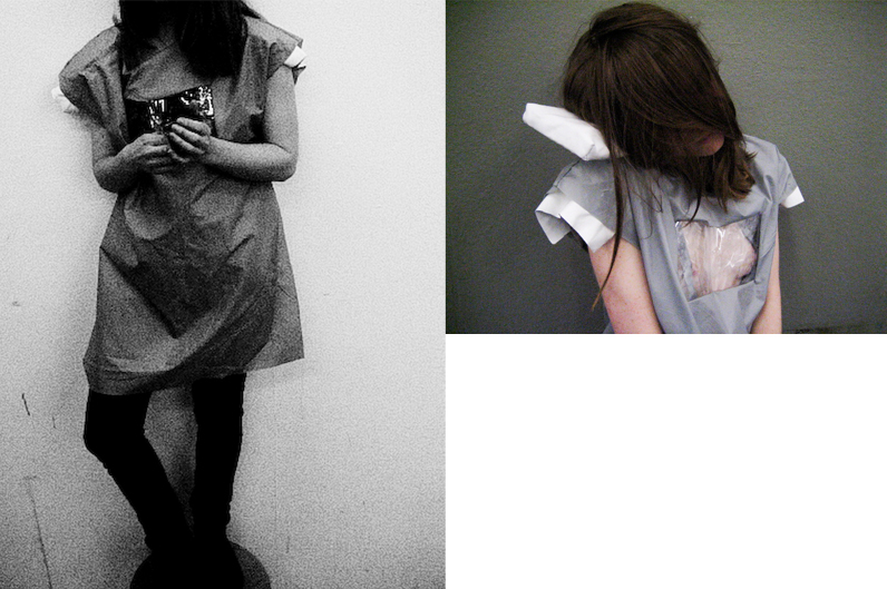
I made a second piece because I also wanted to work just with an all-optical process without any useful effect.
I took the gray vertical bars that crossed with horizontal rows of far reaching windows. I tried to create something that respects the human body with the delicateness of transparent and thin lines. Translating the skeleton of the building in a second skin.