Keeping my keywords in mind I drifted around during two afternoons, allowed myself to get a bit more ’lost’ in the library.
This book was squeezed in tight between other books on the shelf, but that only made it stand out more. I noticed its crooked pages seen from the top, making an interesting pattern.
I recognize the look of those pages. I feel like I know them well.
It is clear that this book at some point have been soaked completely wet in the top. And after the drying the pages now take on this beautiful soft curve, reminding me instantly of rivers. Somehow once material have been soaked it always leave a trace of water.
Clear nostalgia, I have tried it myself. Being caught in the rain with school books, drying them in frantic desperation on radiators and in front of the fireplace.
By instinct I smelled the book. Not took bad for being drenched! I only got a fragile musky scent from its pages.
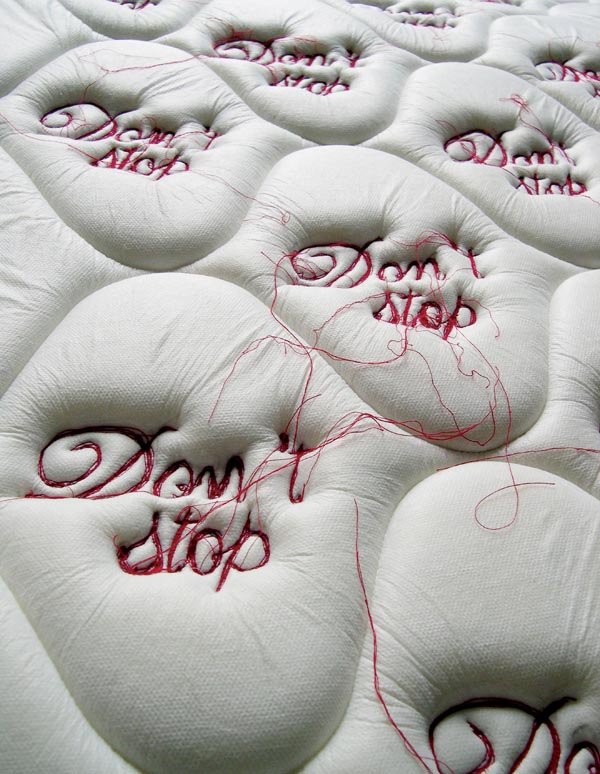
I almost laughed out loud when I finally saw the books cover in all its glory: A tilted shoot; blue skies over a crystal blue ocean, a wave spilling over perfect white sand. In the sand a heart is drawn, and the flamboyant bold letters “LIQUID LOVE” is plastered in the middle.
Incredibly kitsch and yet irresistibly charming. –I both love and hate it.
I mean – who came up with that idea? For what reason? Amazing, I was stunned in full five minutes taking in the glory of the scenery.
It is clearly a book with personality.
Scenes like this are quite ionic. The island ‘paradise’. Blue skies, ocean, alone on a welcoming beach. The heart is really what makes this over the top – a sign of silly, clumsy first love. Desperate to prove itself and has to take form as initials carved into trees and hearts traces in the sand. And then you can watch as the ocean swallows it.
Then title in itself is quite spectacular “LIQUID LOVE”. The ultimate seduction, dripping from the title with desire. A love that is liquid, able to sneak in anywhere, binding, making you captured in its grasp.
By making this third choice I reveal my own fascinations. When choosing a books; wear, fragility and imperfections intrigues my curiosity and help me create a personality in which I can indulge.
I looked up books with my first keyword: soft.
Soon I got guided to the first floor in the library section 779,0 .
It was my first time in that section of the library, and that somehow made it feel like an adventure. A search for something I didn’t even know yet.
The section is all about textiles, wowing, carpets and all subjects related to fabrics. That pleased me, and I would occasionally take out a book I found interesting.
But then as I was gliding my hands though the shelf, I found it: A soft velvet book, in the shade of deep marron red. “De fluwelen verleiding” by Hans ferrée.
My immediately impression of the book reminded me a lot of my previous choice. A5, slim and with an unfamiliar language on the cover.
But the more I looked the more it gained its own personality and charm.
It makes quite an impression: velvet make one think of value and the rich cursive letter speaks of abundance. It claims your attention – this book is far from modest.
The nature of the velvet welcomes you. It felt like it had been waiting there for me, begging to be touched. The color made it immediately important – royal. Such a deep red color gives it a certain association with power, history, strong emotions, and even a touch of danger – a blood red warning. A glimpse of fobidden fruit.
The title “De fluwelen verleiding” is written in clear-white cursive and quite demanding, as the take on a certain space on the cover. The text quickly realized to be Dutch by Henk Groenendijk, and translated to: “The velvet seduction”. Amazing. Suddenly the book seems more erotic and sensual.
In the middle of the front there is an odd symbol: an interesting graphic mark in black and white. It is the only shiny part of the book, which only adds to the mystery. The pattern of the mark reminds me of a small carpet on a loom. A quite nostalgic feel.
The back is without words, as to say that red velvet is enough information, and the spine quite worn, the letters almost dissolved. Maybe from the tool of time, or maybe from greedy hands?
You could imagine such a book to be too much – distasteful and kitsch.
But for me it is quite the opposite. I see this book as a classic.
In the library, I was first overwhelmed by the fact that I had to make a choice.
…
Because of my mood, I was drawn to all the books which seemed to hold a certain amount of history – in other words, old and mysterious.
I was lingering at a big blue book with no inscriptions, when I first saw it:
SCHRIFTKUNDE, SCHREIBÛBUNGEN UND SKIZZIEREN
Ein kleines Lehrbuch der Schrift für Setzer und Graphiker – Von Jan Tschichold
Almost too thin to be of any importance. A5, 77 pages, and rather uneven around the edges. The color is a light slightly yellow brown, the main title in black capital letters and the further inscription in dark toned orange cursive.
Maybe I felt a bit of myself reflected in the design, or maybe I was drawn by the nostalgia and romance I often ascribe to objects which are a bit ‘old-fashioned’. A weakness of mine.
Immediately I felt the need to give this book a certain personification.
To claim that this book has a character, and with it a history hidden in its scruffy pages. It is almost stoic, with its simple design.
Moderate, German = serious, important.
The plastic cover for protection is exhausted, and has been repaired, giving the book an even dodgier look. The plastic reflects the light and makes me think of grease shining on the forehead of old sweaty men.
Although my German is a bit rusty, I try to decipher the title; SCHRIFTKUNDEN – ‘the art of writing’.
The text on the back is a bit more confusing, but overall I get some words: Typographic, graphic art, learning and maybe something about photography too.
The backside only confirms my notion of this book and its author.
Jan Tschichold makes his own introduction of the book, mentioning its precise size (148 x 210 mm), number of edition (112), publisher, something about the paper and the prize of the book (5 Franken), which I find amusing.
Typography – the artwork of creating letters and numbers.
The beauty of an alphabet has always fascinated me.
I remember making up my own alphabets as a child:
Aa, Bb, Cc, Dd, Ee, Ff, Gg, Hh, Ii, Jj, Kk, Ll, Mm, Nn, Oo, Pp, Qq, Rr, Ss, Tt, Uu, Vv, Xx, Ww, Yy, Zz, Ææ, Øø, Åå. I would write them over and over again.
Different sizes, lengths of the lines, curves, dips and turns,
Words as drawings, numbers as symbols. Somehow it was important for me to claim the letters. Taking over, making it into my personal alphabet, in a sense conquering the language.
After this notion I felt softness. A sense of safety mixed with the slight sadness of nostalgia. I remembered other things. Smells, touches., sounds.
And I felt grateful.
Tania Candiani, Woman, Mexican, 1974, Textile, Language, Artist …
Tania Candiani was part of the exhibition“ The future of fashion is now”, in Rotterdam. In this show, designers and artists try to show some different and new ways to see to the fashion world.
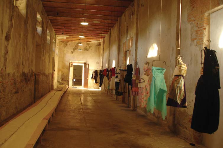
Tania Candiani exposes a big roll of fabric joined with some clothes and dresses. The finality of this work is an installation with fabrics, thread, metal hooks, sound and video. This work was showed almost at the end of the exhibition, a space that, according to me, didn’t support it as much as it could have. Therefore, all my attention wasn’t driven towards the installation as a whole, but only on this big role of fabric.
The title “ La Constancia Dormida “, which stands for Constancia Asleep, makes me think of the collections of stories, including Constancia, y otras novelas para vírgenes (1989; Constancia and Other Stories for Virgins) by the Mexican novelist and short story writer Carlos Fuentes. The theme of these stories, which is about the people and culture from Mexico City, is maybe a influence in Tania’s work.
The role of fabric, that I mentioned before, was exposed on a table and stitched with text. The language used was Spanish and it was about thoughts, feelings and stories of one certain group of people or community, that were influenced by their economic, political and social environment. This context situates her work in the last of the four themes which divided the exhibition: “Fashion Activism: Community and Politics”.
Being influenced by the reaction of these people, she used them as her subject for her story-telling. The textile is then used as a narrative tool as she explains it in one of her statement: “ My research processes take as starting point language, text, the political implications of the domestic, of what is public and private, and of “the others.”
“Translate strategies amongst systems –linguistic, visual, phonic– and practices, generates equivalences and associations (…) textiles have been present in my work as tailoring, as a narrative resource and as labor, socially embedded with meaning. Tailoring as design is a contact point with architecture, where the space distribution of the plans as sewing patterns re-signifying the idea of inhabited space or the utopia of an space that could be inhabited“.
Tania Candiani – Artslant
Tania Candiani – Lot 88
I chose Tania’s work because I really like the simple and minimalist way she approaches two big ideas, in one hand the fashion world and in the other one, a more conceptual idea about community in a political and economical environment. Also, the way she uses textile and combines it with text gives me a big and strong feeling of nostalgia. The way she characterizes the political and human energy really fascinates me and awoke my curiosity. This feeling of nostalgia that is present in her work, makes me land back directly to my home country. This nostalgia and spirit of story telling is something that characterizes the Portuguese personality and community, bringing me even more closer to her work.
By listening to the people in different environments, Tania tries to save the stories and the atmosphere into the fabric by sewing it, and giving it an individual perspective. Through this act of sewing, I see Tania’s work as a memorial where she keeps all the moments and happenings, as a saving for the future, which for me is a really beautiful act. The act of sewing, reminds me of a scar or a tattoo that Tania is stitching in the fabric. By expressing these left marks, it connects us to our individual or common marks, which originates from situations and memories that we experienced. These marks which makes us the person or the people that we became. So it’s like creating and materializing all the spirit, thoughts and feelings from a specific and certain place, time and community.
This way of making art reminds me also of some works, for example, Louise Bourgeois, Tracey Emin and in the traditional bordering from Portugal.
Louise Bourgeois
Tracey Emin
By having this in mind, I realize that textile can be really strong, powerful and expressive as a subject or a material. It was interesting to see how her work can become, in a way fashion but still textile with a sculptural character. It questioned the fashion world and trying to find or to create this small limit between fashion and textile, becoming in the end something else. Different than the world of fashion that we know now, but still an expressive future form of fashion. This makes her piece relevant, for me, in taking part of this exhibition “ The future of fashion is now “.
17 Rietveld Foundation Year students visited London in the first week of October 2013 where they composed their own London collection of design highlights.
Items were selected from the collections of many renown institutes like the British museum, Victoria & Albert, The Design museum, Off-site ICA or galleries (The White Chapel, Ravenrow etc…..). What is interesting for us? What do we like and why.
Previous to this trip we did visit the permanent design presentation in the Amsterdam Stedelijkmuseum. Compared to the items we selected and researched there [project: Design in the Stedelijk-3], this show presents a personal comparison between that and those of the London institutes.
If you click on them a caption will appear –just as a in a real museum– presenting information and a personal reflection on why that item was selected.
Researching contemporary design we present this “The London Supplementary Design Show” as a mirror of our own selection motives, an imaginary online exhibition space with items carefully selected for you.