Skip to Content Skip to Search Go to Top Navigation Go to Side Menu


"fonts" Tag


Embellishing my knowledge in Ornaments


Saturday, October 27, 2012

ornament

noun |?ôrn?m?nt|

a thing used to adorn something but usually having no practical purpose, esp. a small object such as a figurine.

• a quality or person adding grace, beauty, or honor to something : the design would be a great ornament to the metropolis.

• decoration added to embellish something, esp. a building : it served more for ornament than for protection.

adorn; beautify : the men and women in the Stone Age ornamented their caves.

Apart from an ornament being a quality or having to do with religion and music or being the popular Christmas Ornaments, it’s all about adorning, and beautifying. And this is no different with Ornaments in the type world, from old to new, it’s the same bull. (pardon my english)
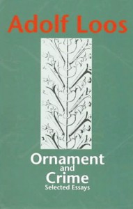
There are many great book to dive into like this famous publication “Ornament and Crime” (1908) by Adolf Loos, produced in the name of ornaments, at the birth of modernism.

The forms used in the type ornament or indeed in any kind of ornament, may be based upon, but should not be imitations of nature. All ornamental units are derived from one of two sources. they are obtained either from natural forms, such as plants, animals, fish, etc., or from forms not directly traceable to nature, such as the elemental geometric forms– straight and curved lines, triangle, square, circle, etc., and their combinations.

Well searching for these buggers is the thing, you type in on your computer [ornaments], you’ll find some ornaments because crafting is so in and do it yourself, and among these you find some of the type ornaments or sites that you can buy a certain font that is ornament based that’s great, but that is not the point. (kind of.)

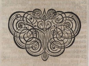
And for my search I typed these, typeface ornaments, printers ornaments, dingbats, Ornaments. I thank the search of printers’ ornaments”, gave me this following site that is gold. (click image)

(more…)

Emigre


Monday, March 14, 2011

Not so long time ago the Museum of Modern Art in New York has acquired

23 digital typefaces for their design and architecture collection.

Included are five Emigre font families:

Jeffery Keedy’s Keedy Sans                

Jonathan Barnbrook’s Mason Serif        

Barry Deck’s Template Gothic                 

Zuzana Licko’s Oakland                        

P. Scott Makela’s Dead History                  

This acquisition marks the beginning of MoMA’s effort to built a collection of typefaces documenting designs covering the twentieth century. These fonts are synonymous with the early days of the digital era. In their designs they exhibit the experimental variety and technical challenges and opportunities brought to type design as a result of the introduction of the Macintosh computer. No type collection is complete without them.

In 1984 Rudy VanderLans and Zuzana Licko

launched a type company named Emigre, based in Northern California, making it the first contemporary type foundry to sell original fonts made on and created for the computer. In addition to designing and licensing over 300 typefaces by a wide range of designers, Emigre also published a magazine for 21 years that published criticism and essays on  graphic design while providing a beautiful showcase for Emigre’s fonts.

right: over of first Emigre magazine

Founded in these years, coinciding with the birth of the Macintosh, Emigre was one of the first independent type foundries to establish itself centered on personal computer technology. Must to say that Zuzana Licko was among the first to create typefaces made of pixels and composed of dots on a grid to be printed on early dot-matrix printers– From the beginning Zuzana Licko who is responsible for many of the beautiful and most popular typefaces in the Emigre library started to create fonts digitally because as left-handed she couldn’t be the best calligraphist and draw it by hand. She was using Fontographer- an application for designing fonts and exporting various font file formats As excellent designer Rudy VanderLans was also a good photographer– but the most I liked his Historia Type Specimen. He put different typefaces in one. It’s really amazing how he could do it without contradictions of fonts! Each “layer” is specific but together they creating good composition and looks very nice! He believed that any font can be successfully combined with any other font. It’s not so much a matter of which font combinations to pick, it’s a matter of how you use the fonts in combination. Size, color, tracking, contrast, layout and overall purpose determine how fonts can be combined successfully.

Emigre tried to be every time on the edge, they designed type faces, wrote articles, made their magazine like fresh air to designers and organize their exhibition as well! When one journalist asked them to look back what the did and their plans they answered they haven’t retired. They are still full of energy and looking into the future, and days are filled with new, exciting projects and creative challenges of all kinds. I think it’s the best way to be your own and never stop, only look forward and never regret about some failure. Emigre is not a company is just a group of people who are interesting in what they are doing! It the secret of any success!

http://www.emigre.com

In our house we had a cat…


Thursday, November 12, 2009

Subjectively searching for a very unsubjective assignment, but still with the subjective thought in mind that it is not possible to be subjective in command, I saw a large white book. The title is not really that interesting, but the bigness of the book attracts me. It might be worth taking a look on the inside. So that is what I do. The whole book (798 pages) is filled with the same text in different sizes and fonts. If the book was on sale, I would buy it. But it is on lend, so that is what I do. It is fascinating to read the same text (‘In our house we had a cat with the grandiose name of Gonnosuke …’) over and over again. If not knowing the purpose of this book (a sort of shopping guide for fonts), you could think it was written by someone who was or high or compulsively neurotic or both.


Log in
subscribe