Typeface as Program: Applied Research and Development in Typography

Designed by David Keshavjee and Julien Tavelli
The book “Typeface as Program” is a book about the graduation project of David Keshavjee and Julien Tavelli. They graduated at the ECAL/University of Art and Design [x] in Lausanne, Switserland.
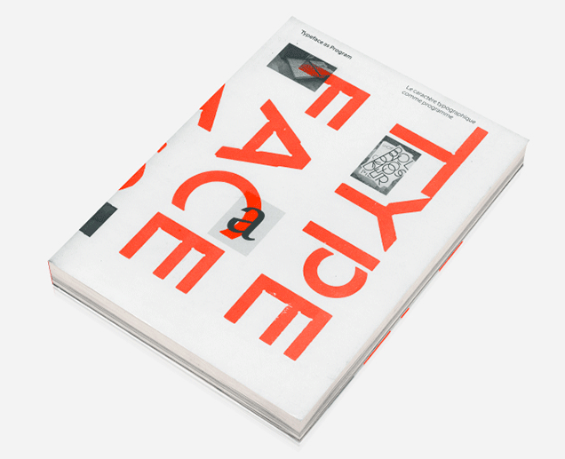
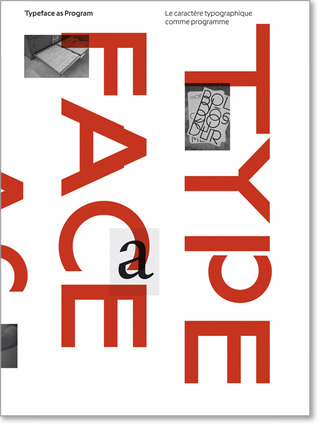
The first thing you will notice when you see this book is, of course, the cover. As seen in the picture, this cover contains the colours red, white and black. I think this, and the typeface on the cover appealed to me the most at first sight. It also seems like a book that makes you move closer, because you see the cover but you cannot read at first side what is written on the cover, because it’s vertical. You also do not yet really understand what it is about and what you will find inside. As the title is situated very small in the left corner, it draws you come closer. When you read it, Typeface as Program, more questions pop up. What is this book about? Why did they situated the words like this?
When you open the book you’ll see a very outstanding orange colour which I really like.
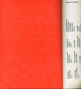
Next you will see the table of contents and introduction. What I don’t really like about that is that it’s vertical written, so you have to turn the book which is not very practical. It does look nice.
What I already mentioned in the beginning, is the typeface. If you actually start to read this book you’ll find out the whole book is about this typeface and how they developed and produced it.
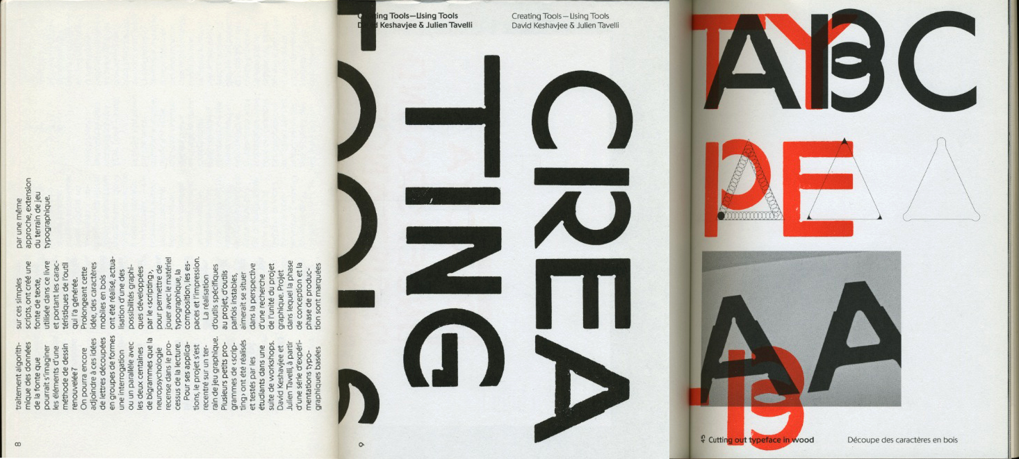
A view into the book about their graduation project
The size is a little bit smaller then A4-size, which I also like because it fits easily into my bag, and A4 mostly doesn’t. The cover is soft but not too soft. The size and the material makes the book approachable because it is not too big and heavy to open it.
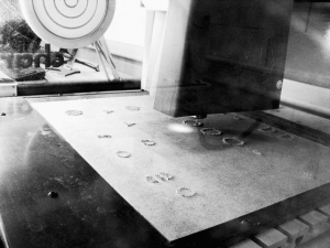
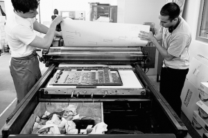
The book is representing the graduation project of Keshavjee and Tavelli collaborated by other people. The project “Creating tools, Using tools” earned Keshavjee and Tavelli the Federal Design Grant in 2009 [x]. This project is realised by several steps. They decided to develop their own tools. First they programmed a script that could automatically generate character sets based on a group of specified variables. Then, with the digital font they created, they made wood types and an automatic layout tool.
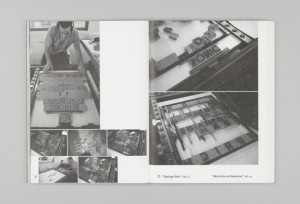
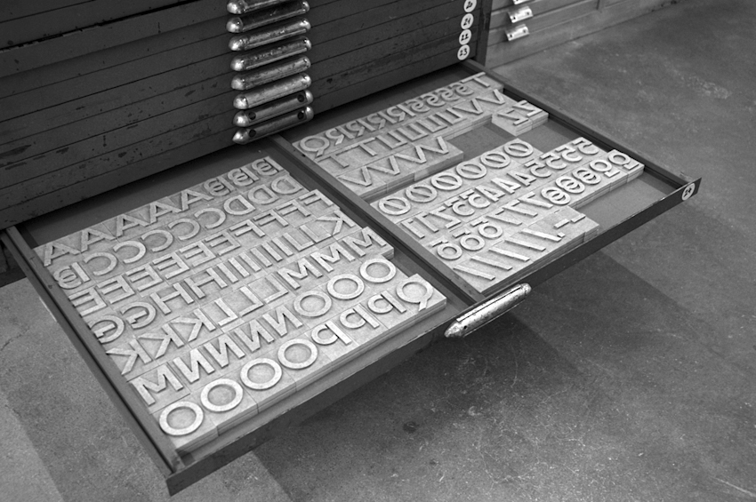
Pictures of the handmade woodcuts they made for their typeface
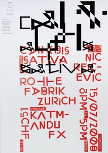
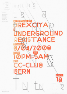
By combining these tools, they printed the posters seen in the beginning of the book. Using a digital font and manual wood types, they wanted to contrast different kinds of typographic languages.
In the result you can see the programmed randomness. Their type design is impossible to regenerate with either only traditional- or digital methods. The typeface was based on the idea that the, let’s call it, “DNA” was only containing the letters “o” and “n”, and from those two letters on they built the complete Latin alphabet.
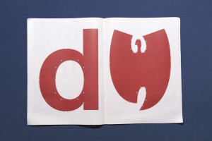
The typeface is called “Programme”. Primitiv is the first version, which was automatically generated. Its very light, almost like a sketch with a skeletal structure. Later they made more calligraphic cuts. In the typeface it’s possible to see marks made by pen, brushes or computer. The typeface looks, even though its automatically generated, almost like an old typeface.
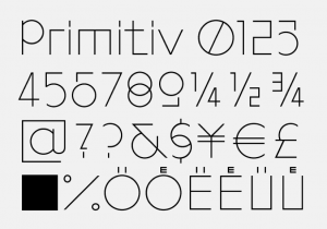
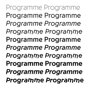
Programme, 2009, Keshavjee&Tavelli’s typeface they made as a graduation project
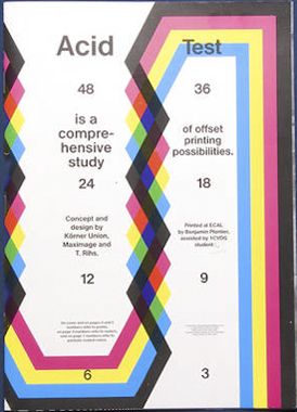
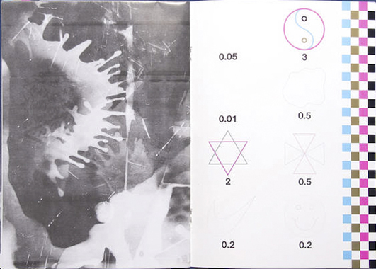
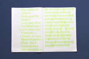
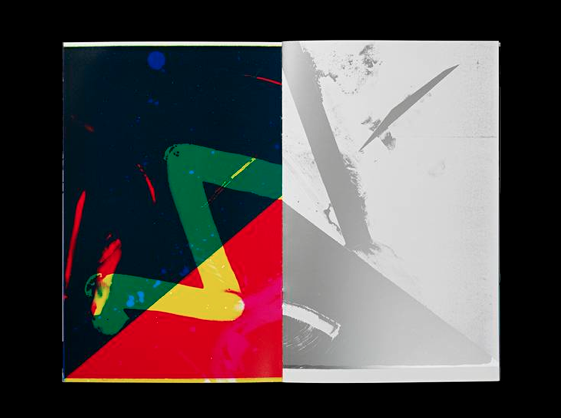
After their graduation project they, of course, didn’t sit still. They continued a lot to work in an experimental way combining different tools and using them in a twisted way, to try to reach an innovating and interesting effect. Seen in the catalog “Acid Test”, their first experiments with chemical products.
Acid Test, 2010, in collaboration with Tatiana Rihs and Körner Union
In this book, they tried to work completely manual, without computer but with for example tape, razor blades, acids or brushes. They were trying to understand better how colours on colours overlay and how chemicals would react on other material. “Les impressionists Magiques” is a final product of the best outcomes they got by using these new tools, shapes and gestures. They try to see the good also in “mistakes” and unexpected surprises. It marks their work. They push tools to their boundaries and use them in a wrong/different way to get new results.
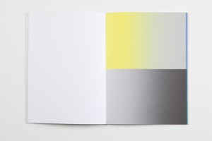
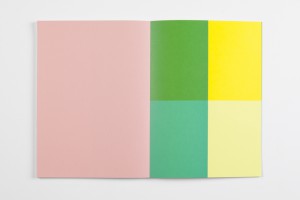
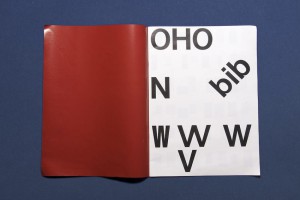
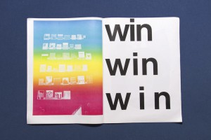
They made several more catalogs, booklets, posters for festivals and record covers. Also, they work a lot in collaboration with other artists. Their latest is “The Most Beautiful Swiss Books of the year 2013”. Again they combined new methods, for example all the parameters in the book are changing all the time. Furthermore are some pages glossy and some aren’t. I think this is an innovating view on typography to use subtle and original gestures. They also used different screening types. This all comes out in a book full of varieties [x].
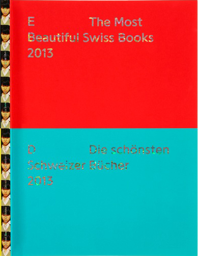
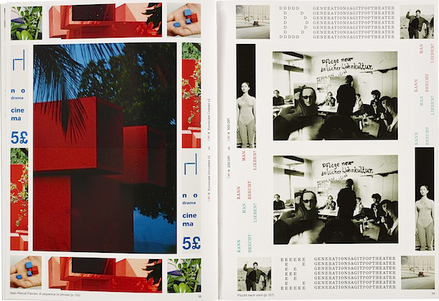
The most beautiful Swiss Books, 2013
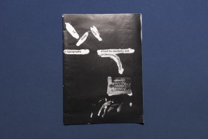
La Grida Loca (2010) is a short booklet for graphic design students. It is about common mistakes and solutions for graphic designers and it also contains designer tips — in collaboration with Körner Union.
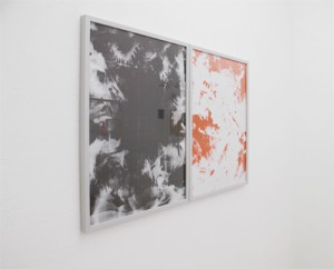
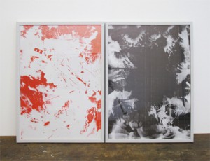
Untitled, in collaboration with Körner Union and Tatiana Rihs
Rietveld library catalog no : 757.3 kel1
