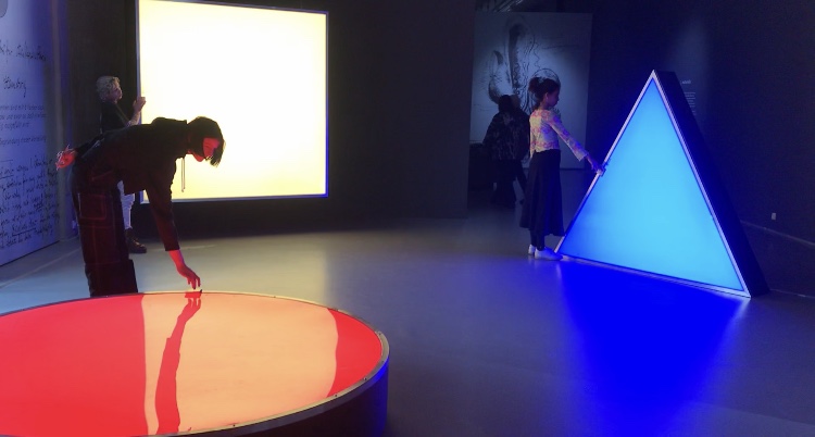
When I first heard “Bauhaus,” my first impression of it was just “big movement important in the history of European art” Because I didn’t have much interest and think it was not really related to me but the Boijmans Museum’s exhibition of Bauhaus, where I went without any expectations, influenced me more than I expected.
The systematic learning of basic things, such as materials and colors, seemed boring at first glance, but turned out to be the most dynamic and interesting things. Exploring the properties of materials, understanding the various and contrary things, geometric shapes and colors are the most essential elements for art, but I had missed them.
Through the writings of Johannes Itten, founder of Bauhaus Vorkurs (preliminary course), I could understand exactly why Bauhaus put so much effort into these things.
Let’s take a look at the works that I saw at the exhibition and the writings of Johannes Itten together.
Two of the most distinct elements of Bauhaus: Geometric form and primitive colors
“The clear geometric form is the one most easily comprehended and its basic elements are the circle, the square and the triangle. Every possible form lies dormant in these formal elements. They are visible to him who sees, invisible to him who does not. Form is also colour. Without colour there is no form. Form and colour are one…Geometric forms and the colours of the spectrum are the simplest, most sensitive forms and colours and therefore the most precise means of expression in a work of art.” •1
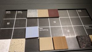
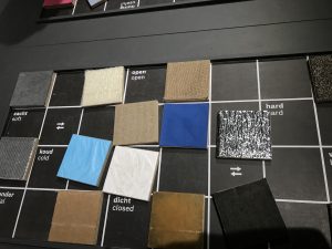
It was like the playful work of children. It made me think differently about the concepts and the properties of materials that I had been knowing.
“ Forms and colours were discussed and presented in any number of polar contrasts. These contrasts can be presented as intellectual concepts…The students had to present these carious contrasts, separately and in combinations, in a manner that allowed our senses to perceive them convincingly.” “All artistic effects are based on the creation of contrasts. We not only studied their contrasts – smooth-rough, hard-soft, light-heavy—visually but also explored them with our fingertips…To deepen and control the experience, students had to contemplate, touch, and raw these textures until they knew them by heart and could reproduce them out of their inner perception, without the natural model.” •2
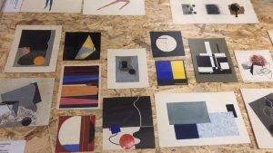
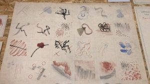
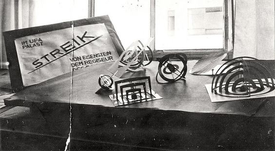
Among the many exhibited items, the drawings that caught my eyes turned out to be Vorkurs works.
I was fascinated by these rhythmical lines and colors
“ The teacher’s most difficult problem is the liberation and deepening of the inner spiritual sense of perception. To conduct exercises in that area one needs a very pliable, labile material which reacts immediately to the slightest motion of the hand. I used india ink brushes and soft charcoal” “The success of these studies wholly depends on the student’s ability to overcome his intellect and the function of his senses and give himself totally to spontaneous feeling. An inner automatism quite naturally gives a convincing outer form to his feelings.” 3
Johannes Itten’s ideals of education were very impressive and as a Gerrit Rietveld student, I related to that.
Itten found it difficult to judge students because they all have different talents and characters.
So the vorkurs was built, and students were able to have time to think fully about their interests and aptitudes as they went through this course. I think it is the same reason why Rietveld Academie persists in the basic year while many other schools have given it up already.
Students at Bauhaus had to explore and enlighten themselves without relying on the knowledge from the outside. Itten emphasized inner growth and self-examination, so he went back to the quest for more basic things and helped discover students’ interests and talents through them.
I felt lost when I came to the Rietveld Academie at first. I was used to the crammed Korean education, that was why it was difficult and awkward for me to think about myself and being on one’s own. Now I’m used to it and this new way of education has given me a chance to think deeply about myself.
Drawing and painting, theory, design, mixed media and sculpture, learning these five subjects, and using various workshops, I could see what I liked and disliked, or what I didn’t do well. The fairly free atmosphere of discussion and feedback also helped me broaden my horizons.
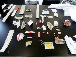
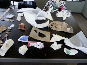
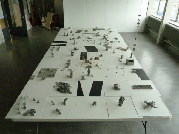
Pictures of Rietveld Academie basic year class
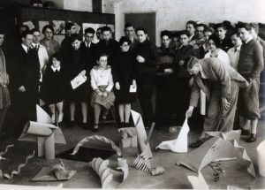
pictures of Bauhaus vorkurs
Interestingly, both educations seem to be exploring materials.
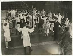
They have a lot in common, but the reason Bauhaus’ education seems more interesting to me is probably because of the physical exercise. Itten gave the class exercises in relation, breathing, and concentration to achieve a spiritual state and physical readiness during the instruction period.•4
He thought the training the body as an instrument of the spirit is essential to an artist’s creativity. That is why, before attempting class, the students were asked to limber up their bodies and minds by physical jerks, controlled breathing, and meditation.•5
I agree with his opinion as a yoga and meditation lover. I believe that the body and mind are connected and the brain also moves more actively when the body is ready and activated.
Imagine, wouldn’t it be more fun and energetic if we did yoga together at school or if we did weird exercises before we painted?
pictures of Bauhaus Vorkurs physical exercise
pictures of Rietveld Academie basic year class E’s aerobics performance
Maybe ‘Basicyear’ is the most important time as an artist. This is because it is an opportunity to experience many challenges and failures without constraint. So far, I have been busy just completing my assignments. After learning of Bauhaus’ educational philosophy, I began to reflect on my attitude and to think about how to deal with my work in the future. I will bear in mind the philosophy of Bauhaus, which is attentive to the sounds of body and mind, faithful to the basics and always exploring.
•1,5) Frank Whitford, Bauhaus, Thames and Hudson, 1984, London
•2,3,4) Gyorgy Kepes, Education of Vision, Studio Vista, 1965, New York
