Skip to Content Skip to Search Go to Top Navigation Go to Side Menu


"Hansje van Halem" Tag


Adolf Loos vs Hansje van Halem and the importance of ornament in the contemporary world


Thursday, October 19, 2017

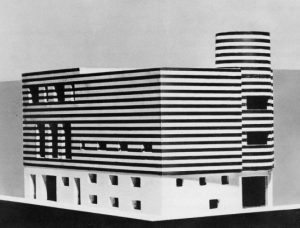
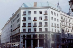
Adolf Loos was an Austrian and Czech architect and an influential European theorist of modern architecture. One of his famous buildings, Looshaus, is now one of the most representative architectures of the modernist movement, although at the time it was established it had received great opposition and contempt.


The industrial revolution, the sudden accumulated wealth, and the people who longed for the appearance of the nobleman came to the city to compete with the idea that they should be more splendid than anyone else and it is natural that such people despised Looshaus. Anyhow, Loos was established with his opinion, he believed that the ornaments were not beauty, but more as a self-display and that if an artist made commodities for aesthetic purpose, it would not reflect the way people live and would not have the necessary function. The ornaments were a crime for Adolf Loos, a waste of the craftsman’s time, they were made for the main purpose of aesthetic pursuit and must be eliminated from architecture and design. He said that if an artist produces household items for aesthetic purpose, it does not reflect the way people live and it is a crime to make the worker spend so much time on such a useless thing. Therefore, he can not be called extreme functionalist, rather, his ideals were to produce household goods and to build buildings by reflecting the people’s real life at the time. Alfred Loos want to send his message to people who are captivated only by their splendid ornament and life and who are trying to forget their past without being true.


59291451bfcde2e8a4f4df61c4343021-loosbuilding-535x408


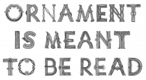
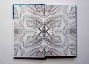
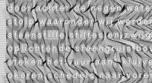
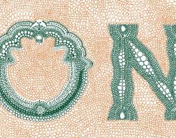
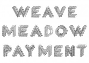
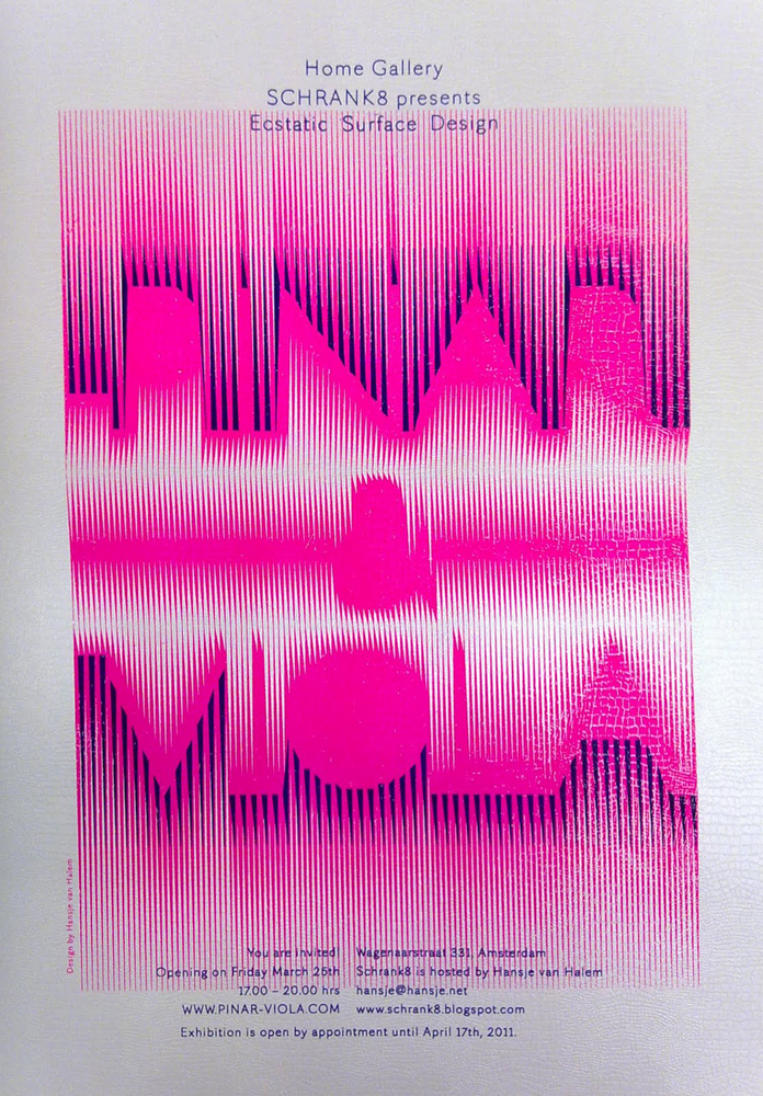
Hansje van Halem is an Amsterdam based graphic designer, she is mainly interested in typography, book design and other printing techniques but she also experiments with computer processed graphic patterns and drawings. Her work is centred on “exquisite” typography, it is a fusion of ornamental patterns and letters which become more then letter-forms, they are ornaments wth a specific function, they are meant to be read.


Ornamentismeanttoberead


There are 100 years between the idea that Adolf Loos had about the use of ornament and the way Hansje van Halem is using it today, and it is very interesting to see how, although their point of view regarding it is so distant from each other, there’s still a big connection between two, both indeed are giving great importance to the “function” of their work, Loos eliminates the ornament because there is no function in it and van Halem on the other hand gives a function to it though the use of typography.


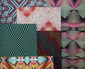
23602106_333892837084262_1573328493_n


But how are the contemporary artists and architects actually reacting to the Adolf Loos’s ideas nowadays ? There are different manifestations of the ornament’s resistance in the contemporary architecture, The London-based FAT (Fashion Architecture Taste) for instance consider ornaments as an important and indispensable part of architecture, Charles Holland, partner of the FAT says in an article from the Financial Times: “The Loos argument is very interesting. As I understand it, he was saying that ornamentation was a waste of labour, effort and craft. With contemporary techniques and manufacturing it is possible to achieve a lot of complexity and intricacy with very little effort, so there’s a weird reversal of his argument. We regard ornament less as a guilty pleasure and more as a communicative tool. There is traditionally a kind of puritanism in the UK, a rather macho approach in which engineering and high-tech appliqué is OK. It can all be justified in practical terms but I think we can look more critically now at a modernism in which the motifs of industry were applied to architecture to make it look modern, which in itself is a kind of ornamentation.”

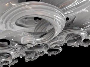
The current computer technologies are also playing a big role in the contemporary w  orld, this modelling and manufacturing technologies has allowed the mass production of the most complex forms and ideas. Evan Douglis is using this technologies to create new strange, forms which recall baroque and rococo decoration in their own new digital world, he also says: “The technology and the software at our disposal now gives us enormous control over form, equations can become a material presence. We’re interested in that intricacy between pragmatism and retinal exuberance – it’s something that bridges the disciplines, from architecture to furniture, interiors and product.”


23602226_333892887084257_1985383228_n


This new digital tools are helping designers and artist in their work as never before in our history and are also an easy way to experiment with forms, letters and of course ornaments, it makes the whole procedure more interesting and exiting, this is how Loos’s position, after a century, is slightly starting to become invalid, and the ornament on the other hand is on it’s way to decriminalisation.

a cooperative research by Yuriy Krupey & Eun Seo Lee
Hansje van Halem


Sunday, March 6, 2011

De computer heeft gezorgd voor drastische wijzigingen in de manier waarop lettertypes worden ontworpen en gebruikt. Het lag voor de hand dat grafische ontwerpers zouden reageren op de ontwikkelingen die hun traditionele manier van werken bedreigden. Ze ontwikkelden andere, soms ook traditionele, oplossingen voor de nieuwe weg naar de toekomst. Dit deden ze omdat ze bang waren dat mechanisatie tot een verdwijning van standaarden en gevestigde typografische regels zou leidden.

Tegenwoordig integreren veel belangrijke grafisch ontwerpers typografie, belettering en beeldproductie, waardoor ze meer opschuiven in de richting van de beeldende kunst dan in die van de vormgeving. Microsoft kwam in 1996 met het “Core fonts for the Web-project”. Microsoft wilde hiermee een standard set lettertypes gratis verspreiden. Deze lettertypes moesten goed leesbaar zijn op het sherm, verschillende stijlen bieden en ook geschikt zijn voor internationaal gebruik. Uiteindelijk zijn de volgende lettertypen hiervoor gekozen: Andale Mono, Arial, Comic Sans MS, Courier New, Georgia, Impact, Times New Roman, Trebuchet MS, Verdana en Webdings.

Dit zijn nog steeds de meest gebruikte fonts op het web. Bovengenoemde lettertypes zijn natuurlijk ontworpen om een tekst makkelijk leesbaar te maken, zodat je als lezer snel informatie kunt opnemen. Maar niet alleen handige fonts worden ontworpen. Er is namelijk ook behoefte aan sierletters, of aan letters die interesse wekken en waarnaar je aandacht getrokken wordt. Deze letters kunnen goed gebruikt worden op bijvoorbeeld posters.

Een voorbeeld van een ontwerper van sierlijke letters is Hansje van Halem. Zij is afgestudeerd aan de Rietveld Academie afdeling grafisch ontwerpen met een vorm van typografie in het jaar 2003.  Ondertussen heeft ze nog een aantal letters ontworpen, maar ze richt zich tegenwoordig vooral op het vormgeven van boeken en ontwerpen van patronen.

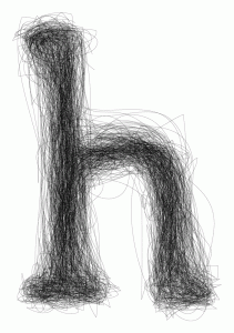
Sommige van haar ontworpen letters zijn ontstaan in opdrachtverband, of tijdens het tekenen van hun plek binnen een andere opdracht. Het afstudeerproject is een alfabet, opgebouwd uit een x-aantal lagen geschetste letters. Ze nam het frame van de letters van een al bestaand lettertype en tekende vervolgens deze letter daarin op de computer. Door een aantal lagen te kiezen is het mogelijk om heel precies te zijn met de dikte van de letter. Dit maakt het erg interessant, want zo kan het er telkens weer uniek uitzien door te spelen met de aantal lagen. Dit font is de enige die ze als totaal alfabet heeft ontworpen.

Verder heeft ze eigen ontworpen letters gebruikt voor posters of boeken, maar hiervoor alleen de letters getekend die ze nodig had. In deze voorbeelden komt ook meer haar algemene stijl naar voren dan bij haar afstudeerproject. Bij het zien van haar werk, is het duidelijk dat ze onder andere inspiratie bij ouderwetse technieken vind, zoals breien en kantklossen. In haar ontwerpen werkt ze niet zo zeer aan de vorm van de letter, maar meer met de invulling. Ze gebruikt bestaande letters en “tast” die vervolgens aan door middel van een systeem of regels die ze zelf bedenkt. Hansje van Halem gebruikt voornamelijk lijnen in haar werk. Dit doet ze, omdat ze op deze manier makkelijk met zwart en wit grijswaarden kan bepalen. Er is een constante spanning tussen dikte, schaal, structuur en handschrift. Door de computer is het mogelijk om met haar systemen ervoor te zorgen dat er geen onregelmatigheden ontstaan, maar juist dat vind ze erg interessant. Hierom gebruikt ze vaak kleine tekens van oneffenheden, verloop, zichtbare vermoeidheid en ontwikkeling en zorgt ervoor dat het nog een extra laag krijgt, wat de aandacht van de lezer langer vasthoudt.

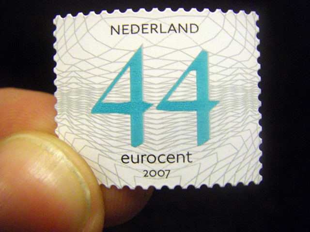
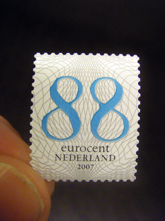
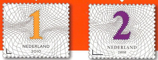
Naast haar interessante afstudeerproject heeft ze onder andere ook het ontwerp gemaakt voor de Nederlandse postzegels van 44 cent en 88 cent. Bij de zegel van 88 cent heeft ze de cijfers zelf ontworpen en de tekst in het lettertype “Spectrum” erbij gezet. De ronde vormen van de achten komen terug in de kleine tekst eronder. Bij de postzegel van vierenveertig cent is het lettertype “Johnston” gebruikt. Het patroon op de achtergrond van beide zegels heeft ze ook zelf ontworpen. Deze zorgen ervoor dat de speelse, schijnbaar met de hand getekende cijfers toch een zakelijk/serieus uiterlijk hebben. Later heeft ze ook de aanpassingen gemaakt naar de nieuwe 1 en 2 zegel. Vooral de toegevoegde kleuren vallen daar in op

De letters van Hansje van Halem zijn sierlijk en interessant. Kleine krabbeltjes maken een letter gedetailleerd, maar storen de eesbaarheid niet. Soms is het zaak een moment te focussen om te ontdekken hoe de letter werkt, hoe het is opgebouwd, anderen laten duidelijk een systeem zien. In ieder geval is de concentratie en een passie voor ontwerpen in elk ontwerp terug te vinden.

Meer voorbeelden van het werk van Hansje van Halem en ook de periodieke tentoonstellingen die ze organiseerd met mede kunstenaars en

ontwerpers in haar huiskamer SCHRANK8 kun je bekijken op haar site


Log in
subscribe